I can’t believe I have never written a post on what to do AFTER you’ve chosen a paint colour and now you need furniture. You might have heard me say this before, but you shouldn’t choose your paint colour first.
However, maybe you just found my blog or you are feeling stuck now that your wall colour is painted. Well, I have some resources that can help you get unstuck, so keep reading.
Make paint colour easy
Have you ever been faced with a colour choice and ended up making the wrong one? Now what? These books will help you with that.
And they don’t overlap.
In How to Choose Paint Colours, I walk you through my system and how it works:
On Page 28 you’ll learn the 3 most useful ways to describe colour.
If you are a colour consultant, don’t miss page 30 and read it many times. It’s the secret to convincing anyone that the colour you’ve chosen is correct.
On Page 34 you’ll learn my system in the following pages. And when you learn the shortlist of the most useful neutrals you will no longer need to search endlessly online or call a paint store to determine the undertone of a neutral or worry about the LRV of a paint colour. All you have to do is compare to the colours in my system. These books illustrate how.
And the best part is it’s transferrable to any other paint system out there.
A decorator’s guide for choosing white
Are you stuck on which white to choose for your house? Maybe you need a complex cream or greige instead? Narrow down your options and learn how to determine the best one for your home in my white eBook.
Discover which is the right white for your cabinets. On page 43 you’ll learn why it’s not necessary to overcomplicate your choice. I’ll show you how to find the one that coordinates with your existing hard finishes or the new finishes you will be installing in your kitchen! If you’re building a new home or planning a renovation, this book is a MUST-READ.
On Page 60 you’ll learn why one of my clients painted their walls white and ended up seeing green undertones.
On Page 64 you’ll learn the best way to choose the right ceiling white.
On Page 68 find out why it’s a big mistake to choose the white for your trim on the same paint strip as the colour you just chose for your walls 🙈
And so much more! You’ll also receive my bonus book of paint colours that will narrow down the world whites (likely thousands) and give you ONLY the MOST useful ones. Best of all, they are listed by undertone because this will make the selection process much easier!!
How to decorate (if you’ve already painted)
The easiest way to shop online is to create a mood board so you can see how everything will work together! My How to Create Mood Boards online training is such an easily digestible course. I mean how many courses have you bought and never took the time to complete? This is a course you’ll want to watch over and over.
And now, if you join my True Colour Insider Community, you’ll have access to the course for free! Along with a supportive community to share your ideas with for support, feedback and inspiration!
I get reviews like this daily from someone telling me how helpful this course is:
Here are the last two reviews I received:
Concise, jammed with information that is actually helpful, and a resource I am grateful to have at my fingertips. Sara W.
I’m so excited about being able to utilize the paint dots on my mood boards. True game changer!! Karen L.
Let’s put it into action, shall we?
The most important lesson in this course is learning how to create a mood board, which is essential for making sure all your items not only look like they pull the room together, but arrive in the colour you expected them to be. If you’ve never put together a mood board before shopping online for home decor, you are truly missing out.
I recently received an email from a reader that said:
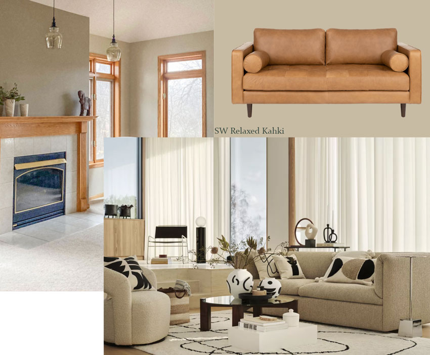
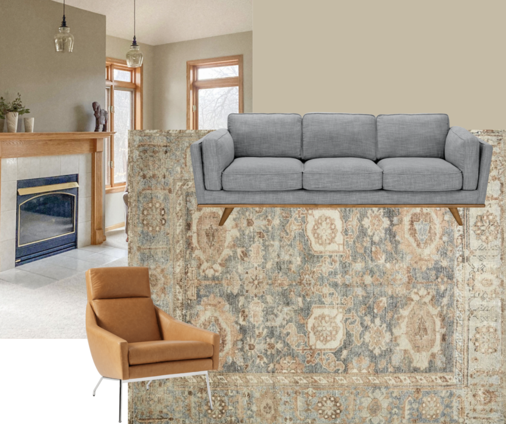
“My husband and I recently painted our open layout home Hirshfield’s (Diamond Vogel) paint color Soft Leather #0336 at 50% strength. He says he will never paint again, nor will he pay to have it painted, so I must understand it and its undertones in order to redecorate.”
Does she need to repaint her walls?
Let’s get the lighting objection out of the way
Let’s find out how to decorate from this point.

Need help creating a timeless exterior?
I can tell you that if you’re considering making ANY changes to your exterior in the next 12 months – this masterclass is what you need RIGHT NOW before you make a single decision you may regret later.
Every choice is a colour decision. Every. Single. One. That means you need to understand how to coordinate colour AND know which elements should be considered FIRST to get it right.
This is the ONLY course that will guide you step-by-step to choosing the perfect colours for your exterior using my proven System for Specifying Colour.
Watch Module 1 for FREE here! This course has a total of 16 modules.
One of the most valuable lessons you’ll gain from this online training is how to narrow down your choices to a select and optimal few. This knowledge will empower you to make THE RIGHT selections for your exterior and eliminate the fear of making an expensive mistake. You can’t put a price on that.
Not only that, it will help you navigate the trend cycles to arrive at the most classic and timeless look for any exterior.
This Masterclass for Exterior Colour Selection is the fast track for learning to choose exterior colours like an expert. Everything about exteriors that I’ve learned, tested, and perfected over 20 years has been packed into clear, universal principles that anyone can learn and apply to their home’s exterior.
But wait, there’s more!
Last fall I created a private Facebook group exclusively for my masterclass students. This bonus Facebook group is already shaping up as the best place to find community support with fellow students (who also understand my system) for exterior design ideas, feedback and inspiration.
It’s your place to ask questions, share photos, and read others’ posts for inspiration.
And this course comes with lifetime access. That means you can use this to improve every exterior you’ll ever own, for the rest of your life.
Click here for full details on the course!
Get her a gift card
Not sure what to get mom (or your wife, sister, etc?)?
Give her the gift of CHOICE! Gift cards can be purchased in any amount starting at $50 and applied to eDesign service, online product or training event they choose. Get yours here.


What great analysis and advice! Very good.
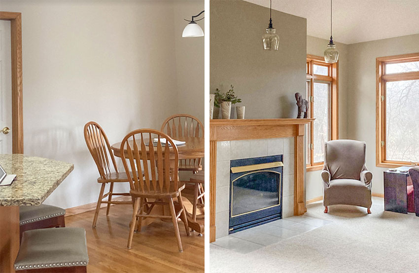
I am admittedly a sucker for oak floors, but I LOVE that color on the walls! It will be exciting where she takes it with her furniture selections.
Is her husband open to replacing the granite countertops? Her colors look great other than that. I love color option number three, so pretty!
I agree! Love the rug and the pretty couch color pulled from it.
An orange-beige would have worked with the wood-trim windows too, right?
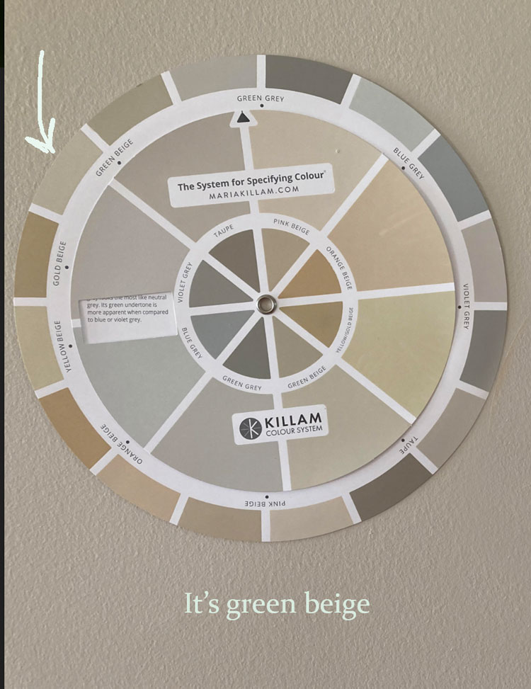
Yes and the decorating still needs to work with it too. Any neutral except pink beige truly would work with that trim. And colour. Yay for colour! Maria
To me it could also be both taupe and pink beige, as well. I would appreciate your comments. I have your color wheel and love it’s quality. But, when trying to use it, I can’t really see or chose only one undertone. Just like in this case, to me the match could be either of three. Please explain.
This is a great question. The wheel helps you eliminate most of the neutrals that it’s NOT, but you still need the large samples in the system to then finalize which neutral it is. Neutrals are way harder than colour to see without large samples. If you were matching a pink duvet cover for example, you could pretty much find the colour with a tiny sample. . . with neutrals, even though a green beige or a green grey seem very close, when they are painted on the walls, one will work while the other one will be totally wrong. So if you don’t think you need 50 samples, then order or paint up 3 samples from my system that you think it might be and then choose! Hope that helps, Maria
Yes, it helps. Thank you!
Hi Maria,
Thank you for answering Elizabeth’s question! I had been wondering the same thing about seeing two or three possible matches. I received my Colour Wheel soon after all the painting was done, but painting large samples definitely helped me make the right choices. The Colour Wheel confirmed them. Color me happy! Your e-books guided all of my paint decisions and saved me from making costly mistakes. I can’t tell you how many times I read and re-read both books and collected paint chips to really understand each neutral and color. The house flows beautifully from the kitchen, living and dining areas to the bedrooms and baths, Thank you for your blog, e-books, and priceless information!
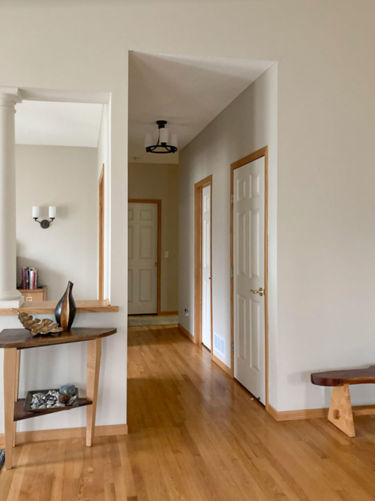
I hope she’ll send in pics when it’s all done! I do think the interior doors in the hallway should be repainted.
Those white interior doors bother me too. With the khaki wall color and oak trim, the doors just look like they have a coat of primer on them.
I agree. That white should be toned down.
I am looking for Maria’s thoughts on what colour the doors should be. A few people commented that they disliked the white doors, which I did not dislike. I wish to replace the
doors and closet doors in our home and I also have wood casing that won’t be replaced. My casings are a bit darker than the oak ones pictured. The replacement windows are white. My floors are oak too. I recently purchased your color wheel and both books but have not yet studied them. When I saw this post I thought that I might have found my solution since I did like the white doors with the wood casings.
Thank you, Maria for a great post! I love your decorating examples and advice. Having moved into this home, which originally featured all orange-yellow or jade-green sponge painted walls, I just could not live with them and went out and chose a neutral paint color that I thought at the time looked like a nice green undertone gray, which was confirmed by the paint store color consultant. Unfortunately with Covid shutting supply chains down, we chose to live without furniture rather than make a decision based on limited selection and sense of urgency. That meant I was, indeed, staring at painted walls for two years and obsessing over every color shift, worrying that a I had made a poor choice. With the undertones known, and color shifts understood thanks to you, I can now choose new door colors (the previous owner did just leave them primed). The granite will be staying for at least 5 years, as we’ve scheduled a major lower level remodel, and plan to redo the upper level when the older furnace expires and we can then open walls upstairs to remove the old flue and add a sizable pantry and expand the tiny mudroom with the additional space. I am going to read and probably re-read every post on your blog!!
I hope to return and post after photos based on your advice.
My books are a few years old. Have there been edits or updates since then?
Maria, I was wondering that as well!
Are there different colors listed than before?
Thx!
The book was updated 2 years ago. Maria
Might take a break on reading this blog as the sales approach is intense.
Firstly, I accidentally hit the like button on your comment and there is no “unlike” button.
I’m pretty sure Maria’s blog does not pay all of her bills. She’s strong enough to go after what she wants in life and has the skills do it. In order to have a successful E-Design business and pay all of your employees so they too have a roof over their heads, you’ve got to pitch your own skills or pay someone else to do it for you. Again, smart lady for pitching her business on her blog.
Maria gives us tons of free advice in her blog posts at least twice a week. I’d love to be able to afford all of her online packages and the only reason I personally get upset when seeing her plugs is because I don’t have the funds to buy them all.
All I’m saying is please keep in mind that she has an empire to pay as well as her own bills.
I know that the products are mentioned frequently, but I don’t mind it. I understand that at any time someone not yet familiar with the blog may stumble across it while searching the web for decorating ideas or paint color information, as I once did, and be thrilled to discover there are such resources available. Were they not mentioned in each post, they could be missed by newcomers. I also overlook it because Maria is being very generous compared to most online design bloggers with her examples and informative advice and I consider it a small inconvenience to hear about her fantastic products frequently, in exchange for her (free!) knowledge. I highly recommend the eBooks White is Complicated and its companion on choosing color and understanding undertone. I just recently purchased them after this experience to build my confidence, and the care taken to provide the purchaser with a well-written, no typos, extremely well-illustrated with clear photographs, with paint color names provided is exceptional. Maria does not just have her few favorite combinations like others, rather, she explains everything and empowers her readers to make their own unique choices.
That wall colour is so calming. I love Option 3. I usually prefer richer and deeper colours but that is so pretty.
Haven’t read what you wrote yet, but the trim is the only hing I can see and it I hurting my eyes. Too much up and down lines in that hallway.
This reader submission for the color in question was 50%. I would like to better understand how the % changes the appearance on the wall. Would you discuss this in a future blog post?
Hi Laura, I don’t understand what you mean by 50%? Colour changes in the light throughout the day but if it’s chosen to coordinate with the furniture, you won’t notice the colour shifts. That’s why in our eDesign questionnaire we ask if the room is bright NEVER “Is it West, East, North or South” because first, that’s impossible to predict and secondly, colour is way easier than that. If someone paints a room green and it goes up and doesn’t actually match the duvet you tried to match, no one blames that on the light, we blame our poor colour selection and we paint again. If a neutral goes up and it’s wrong, we blame the light? I’m here to tell you that my eDesign department does between $50,000 – $75,000 per month in sales and we successfully are able to choose colours and neutrals that are correct. The proof is right there. If you learn how to choose the correct neutral, you don’t need to worry about the light.
In my 25 years of being in this business I can count on one hand how many times the NEUTRAL had to be corrected because the LIGHT somehow shifted the colour so it didn’t work. Hope that helps, Maria
Took me a minute, but I think I figured it out. I suspect that Laura’s comment regarding 50% refers to this comment in the post:
“My husband and I recently painted our open layout home Hirshfield’s (Diamond Vogel) paint color Soft Leather #0336 at 50% strength.”
Yes that is how I interpreted it too. The color (formula) was cut by 50%. To do that they add less color drops to the white or tint base so it comes out lighter than the original. I like the wall color too but I could never live with the stained trim. In my opinion there is enough wood with the flooring, chairs, tables, sofa legs, etc. Of course once you soften the room with a rug, upholstery and some window treatments things will change. Still, I’ve never been a fan of stained trim, just one of those things that never appealed to me. I’m another person that wishes I learned about undertones 30 years ago. Learning by trial and error can be disappointing, expensive and perplexing. Maria, your blog and ebooks have really made a difference. Thanks
I LOVE the rug suggestion, it’s perfect!
I think the paint color she chose looks beautiful with the woodwork and I love the cognac couch idea. Love the rug too! I’m not a fan of beige couches. Disaster waiting to happen in my house.
Does a cognac couch go with any neutral paint color, or does it have its limitations?
Maria is right about if she did white walls it would look like primer on the walls. when I got married in 1993 we had all golden oak wood stained trim, windows and doors and we did a color similar to SW Alabaster and I still think that color was too white for my trim. It always felt unfinished until i painted it a darker golden beige similar to BM Navaho White.
While I understand the concrete concepts, it always looks like wizardry on a mood board {wink}.
The hallway shot, rather than a flat wall was submitted to show how the color looks both near and well-lit as well as how it transitions as the light dims, and in shaded corners, also in comparison to the white of the doors for color context.
I think this wall paint color works really great. Of course Maria’s advice is spot on. I wanted say that I the Sven cognac love sofa it is horrible. The colors is sometimes way off, the support is horrible and it doesn’t last. I returned it after a lot of fighting. I did get the Amazon Rivet brand that is exactly the same style and it comes in a love seat and a full sofa and I LOVE IT. It is called the Rivet Aiden Mid-Century Sofa. Ordered on a Monday got it Wednesday.
“The light is only ever a problem 5% of less of the time.”
It was a huge difference in my case! I have loved the BM Acadia (Ivory) in my Hawaii house for 16 years. It has just enough creaminess to be warm and not harsh, but no hint of yellow. I have BM Simply White on the ceiling which is lighter and “whiter”, but blends.
So I tried those colors in my new build in Idaho. (Nothing in the house but plywood sub-floors.) BM Acadia looks horribly yellow (but not yellow enough to be a yellow color) and would have been a huge mistake. Even holding up samples between the two houses, the colors look completely different in each house. Simply White in Idaho looks like Ivory in Hawaii house.
I’ve since been told northern light has more yellows that equator light.
Yes it’s white. White reflects and it’s not a colour that will look good in most homes, hence my 5% statement still stands. I guarantee there’s a better colour than a nothing shade of ivory that will make your furniture look amazing. Maria