


Looking for a timeless exterior update with colour – as opposed to the white and cream trend we are seeing everywhere? Remember, colour is also timeless so I’m sharing two fresh and updated home exteriors with blue. Take a look!
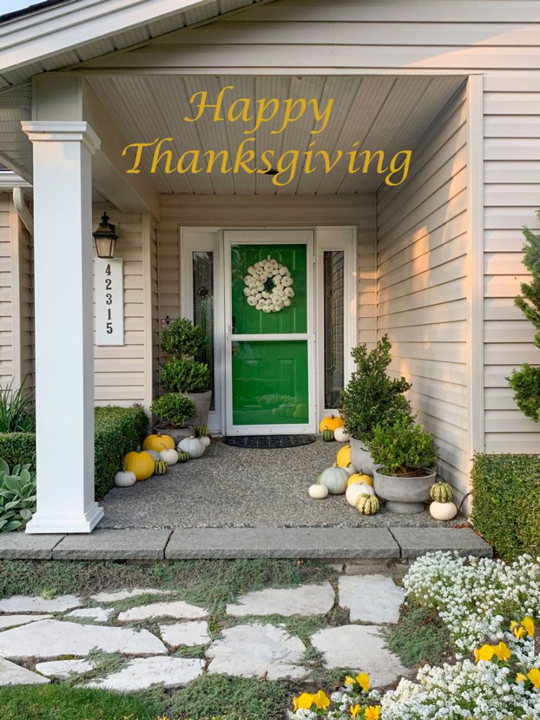
Happy Thanksgiving weekend to all my fellow Canadians!
Today I’m sharing a couple of really fun eDesign before and afters with timeless blue exteriors!
ALL DAY LONG we get requests for all-white exteriors. And while we love a fresh white exterior, when the whole neighbourhood is being whitewashed, it’s nice to create a little variety and choose a colour!
A timeless home update with colour
One of my favourite colours to create a fresh look that is NOT WHITE is navy. If you have a relatively traditional exterior with ample white trim, you can pull off a dark and dramatic navy. When charcoal houses are starting to look dated, navy still looks timeless.
While I help clients get just the right white look for their exteriors all the time, it’s really fun when they are open to some colour!
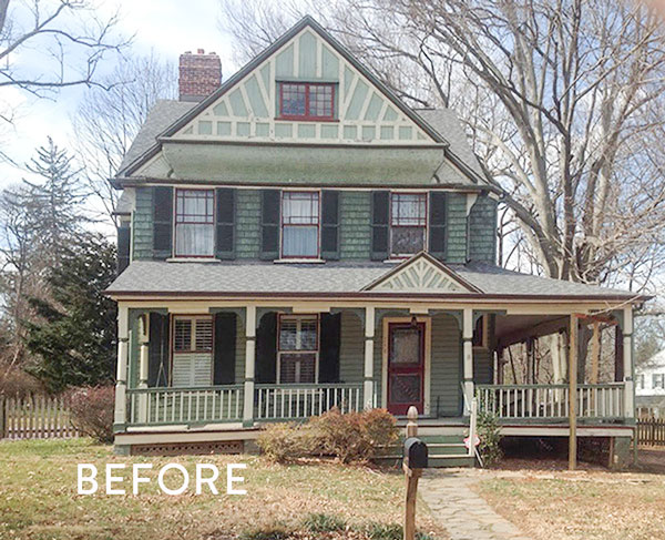
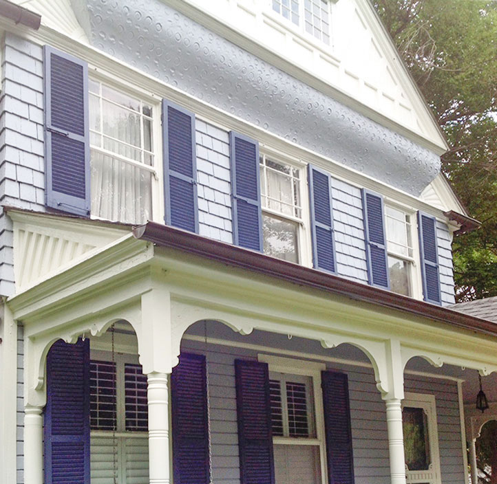
Here is Sue’s house before. She was clear that her colour scheme was overdue for an update.
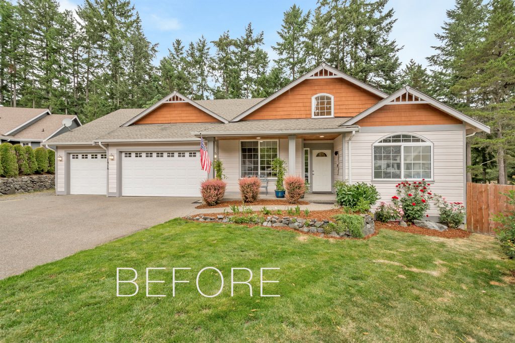
She needed a new roof and wanted to be rid of the orange cedar detail in the peaks. SO many builders did this darker contrasting trim look in the 90s.
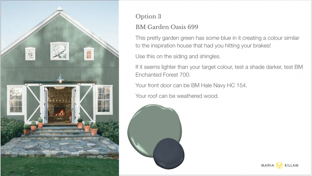
Since she was open to some colour and had fallen in love with a green home in her neighbourhood, we gave her a pretty green option among others (below).
This is what my eDesign specifications look like:
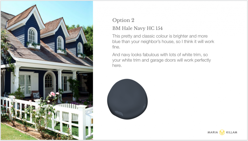
Ultimately, after painting up her large test boards and polling her friends and neighbours on their favourites, she ended up going with this option:
I also recommended a new roof, and here is the beautiful after!
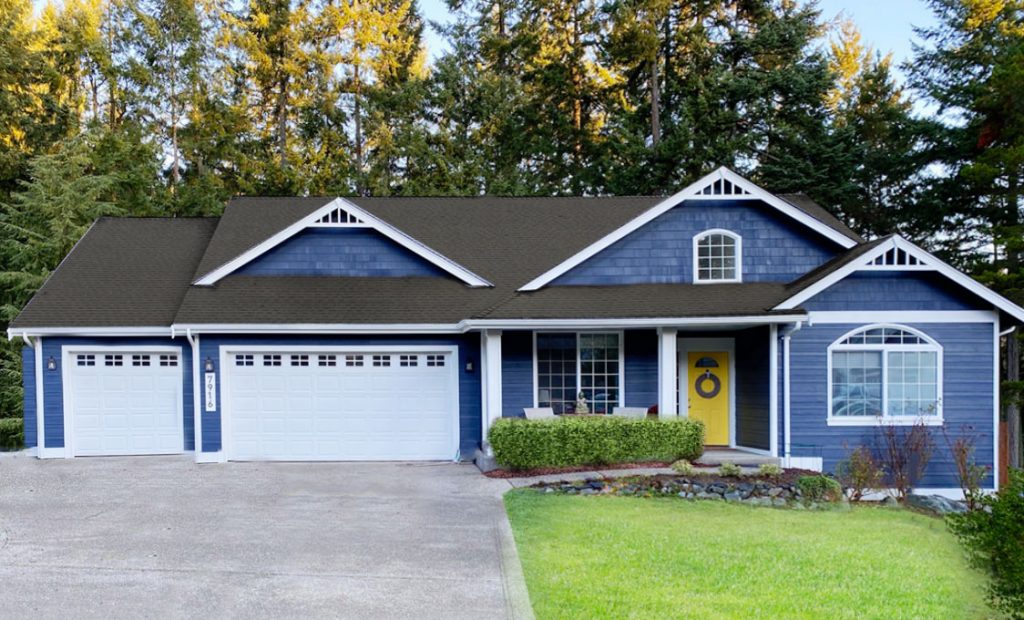
Body: Benjamin Moore Hale Navy
Sue, and her neighbours, are delighted with the result!
By the way, on most homes, when the garage doors are at the front of the home, it looks better to paint them the body colour to blend, but with this rich navy, keeping them white is a crisp way to balance the dark body colour. And her garage doors are pretty enough to highlight with their inviting windows.
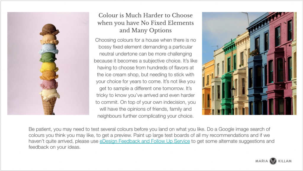
Limitations on choosing non-neutral colours for exterior come not only from pressure from history’s most ubiquitous trend, the white farmhouse trend but also from having earthy fixed elements like brick or stone. If you have lots of either or both, that’s when you need the right neutral undertone to perfectly coordinate.
But if you don’t, if your house is mostly siding or stucco? That’s when you really should consider a PRETTY COLOUR over a neutral! Then you can say, my house is the pretty blue (or green or yellow or pink one).
Updating a Drab Green Victorian
And did you know that the exteriors that are the hardest to choose colours for are the ones where the sky is the limit?
That’s why I added this to my eDesign presentations for this kind of project (below).
My lovely client Julie and her husband purchased an eDesign consultation for ideas to freshen up their charming Victorian exterior (below).
To be clear, I am not a Victorian colour scheme expert, where details of the mouldings are picked out in various contrasting colours etc. That is not one of my specialities.
However, most often the answer to achieving a fresh and updated look for a house like this is to respect the historical nature of the house in the colour selections. And in this case, simplifying all the fussy trim accents with a single white. This gives it a clean and unified look. All at once, it respects the character of the house, yet also updates it.
This is the approach I suggested for Julie’s home.
The fresh and pretty after photo is below.
My eDesign process when colour choices are limitless
But first, let me just share with you. Once I sent them some original palette suggestions based on their stated preferences, we DID have to have some follow up consultation time to get them into a colour scheme that worked for them.
Most often, when picking colours for exteriors (that isn’t a neutral), the client is on a bit of a self-discovery curve.
Do I really like green? Or am I thinking green because it’s already green and I’m used to it?
Do I prefer a warm sunny look? Or something fresh and cool?
Do I lean towards traditional warm blues with a hint of green? Or am I comfortable with a cooler blue with a touch of periwinkle?
Mint chip? Tiger tail? Rocky Road?
The sky’s the limit. And it comes down largely to preference. And comfort zone.
So, if you know what your favourite colour/flavour is, great! We will help you get just the right hue of the colour you want, and maybe a few suggestions you hadn’t considered for fun (it’s important to push that comfort zone sometimes)!
Maybe you aren’t sure about your colour preferences? That’s when it’s tough to know if you’ve arrived at the perfect colour.
We started in the realm of greens and blue greens, but after some testing, we ended up with this lovely cool and crisp tone on tone blue scheme below:
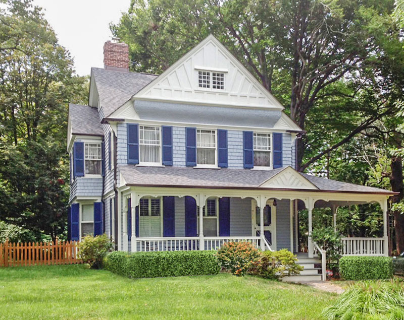
Body: Benjamin Moore Oxford Gray, Shutters: Benjamin Moore Evening Dove
All the fussy trim details were painted out in a creamy off white, BM White Dove OC 17, so that they became subtle, sculptural interest instead of busy accents. This is much more pleasing to the contemporary eye. The gables could have also been blue with white timbers, but the white simplifies the look nicely.
They were so nervous to take the plunge and so well-rewarded when they did!
Plus working with colour is so much more fun than trying to make this beauty into a modest white farmhouse.
Here again, is the before:
And the after!
Over to you my lovelies! Would you consider painting your house blue?
Thank you so much to my clients for sending me after photos! Do you have “after” photos from an eDesign consultation? I’d LOVE to see them!
If you’d like to learn how to narrow down the RIGHT paint colours to coordinate with your home’s exterior, check out my Masterclass for Exterior Colour Selection here.
If you’d like help choosing your exterior colours, see my eDesign packages here.

My house is a dark blue-gray with periwinkle blue trim and white windows. I don’t think I will ever tire of it!
Great post! Has anyone come across a blue that is’t as bright? Perhaps a “muddier” blue that would also lend to a timeless/classic look?
I would paint my house aqua or the color of a bluebird.
The term muddy green isn’t fair to the house before. It’s still a pretty color scheme. The blue is pretty and simplified as well so both schemes are beautiful.
Maria, I love all your posts but the Before & Afters are my favorite!!
I did paint my house blue! Hale Navy, with Oxford White trim. I absolutely love it, 10 years later. It looks really pretty, both in the summer and the snowy winter.
I did paint my house blue! I chose BM Kensington Blue, with BM Thicket for the gables and a BM Dinner Party front door. I absolutely love it, even three years later. And the neighbors use it as a landmark!
I’m a neutral loving gal so I wouldn’t paint my house a colour. I put my colour on my front door instead. I think it also depends on the style of your home. I do love the crispness of Hale Navy and white trim.
Hi Maria, My current Tuscan trend home, is a Sherwin Williams blue green called Retreat (it looks more blue because the home is situated between two green houses), it’s not too clear or bright, and very crisp looking with SW Accessible Beige trim. For my new build I’m considering SW Foggy day which is more blue, but still subdued. SW Storm Cloud was too bright, and SW Downing Slate was a little darker than I wanted.
Our house has clear yellow siding, which is fine, but I would love blue if I could have it. I would also have loved the original wide redwood siding that the previous owners covered up with vinyl. When the back room was being enlarged in 2013 and the siding on that section was removed, the gorgeous redwood was revealed. It made me feel sick. At that point, after so much remodeling had been done, I didn’t have room in the budget to strip the whole house of the vinyl. And in the front, where the western sun beats on the house, the redwood could have been in bad shape. I don’t even know where you could get such wide redwood boards today, without paying a fortune for them. But with the redwood, we could have painted the house a pretty blue.
I prefer the “before” scheme on the Victorian. I love to see the details highlighted on great old homes created by craftspeople.
I love the navy blue houses a lot, but blue fades very quickly in our hot Texas sun. Are there any other darker colors ( greens, grays perhaps?) that might not fade as much or quickly? It’s expensive getting houses painted every few years because of fading!
IMHO, on both accounts a beautiful transformation from to drab to fab! Such a vast improvement!
Wishing you and yours A HAPPY THANKSGIVING, Maria. -Brenda-
I love how both turned out! I also looove the other option you proposed for the first example: BM Garden Oasis. Would it work with a green roof or would that be overkill?
Those two house turned out so beautiful! I have a southwestern style home here in the Phoenix area. Our whole neighborhood is designed to blend into (and be in harmony with) the surrounding desert hills; therefore, we have a certain color palette that can be used, even on our custom homes. (Colors must be approved by the architectural review board.) I don’t mind one bit. I love our neighborhood even though there isn’t a lot of color variation in the homes. It suits the area. BUT, I love looking at lovely pictures of different styles and colors of home exteriors, so thank you for this post!
I love the blue choice, but green would have been pretty too. I have enjoyed your ebooks and educating myself and I have a question. If the front stone on a white house has a warm beige undertone, with some grey, what is the process for picking a trim color in any option such as blue, green, red etc? You look for chips that mimic that same warm beige undertone? Is the wheel helpful in this process? Thank you!
What color should the INSIDE of a front door be painted? Should it match the trim? Or the walls?
You have options. It could be the trim colour, or it could be a colour that relates to your entry. Usually not the walls unless all your trim and doors in the house are the same colour as the walls. Hope that helps, Maria
I just had my home repainted, but because we have to get approval from our HOA for changes, I stuck with the same exterior colors. The cedar siding is stained in an opaque deep charcoal color–almost black with a tiny touch of blue. The windows and trim around the front door and trim around the garage doors are white. My front door is SW 7583 Wild Currant (a deep red that leans to cranberry).
After reading your article, Maria, I’m having and “Oh no!” moment: my two front-facing single garage doors (no windows) are also in the deep red, with wide white trim around them. They have been this color for over 18 years. We just had the garage doors replaced, so they were white for a short time waiting to be painted. I considered leaving them white, but in my opinion, the white seemed to stick out too much (unless I just wasn’t used to it), so we had them painted. I also considered the very dark charcoal color of the siding for the two garage doors, as you suggest in your article, but I was afraid it would look too black and heavy on one side, and the red broke it up and, I think, gave it some balance. I’m going to take a look outside to see if maybe switching to the siding color would be better.
Love both exterior makeovers!
Maria and e-Design team, Thank you so much for including my house in in your post (the Hale Navy one). To Mar who asked if there was a “muddier” blue, in person Hale Navy reads as a darker navy than it appears on your computer screen in the photo above. It’s very true to the sample navy on the eDesign information I received. Don’t be afraid to test it if you’re looking for a true navy.
We just suffered hail damage to our siding in the big hail storm in Calgary. I’m considering a navy/deep blue for my siding and wondered if it was timeless. This post has been so helpful- with all of my thick white trim on my windows, white porch railings and newer white garage, I think I can pull it off. Scary, but exciting to go from a pinky taupe to a blue that makes my heart sing!
I meant “white garage door” not white garage. 🙂
Should the garage doors match the siding color if the garage doors face SW with the sun beating on them? Won’t they not fade at the same rate and then look bad? What if we ever want to paint the house a different color? Also, what if we have one 10×10 garage door and two larger ones on the front of the house, should they match the siding color? What about white garage doors? Our house is SW Dockside Blue with white windows and trim. What about the style of the doors?