This eDesign project is a champion of colour AND it illustrates one of the most difficult decorating challenges – creating colour flow throughout your home. This post is full of colourful inspiration and hot tips for home renovation.
This blog is called Colour me Happy because there is nothing I love more than helping clients bring joy into their worlds with colour.
When I started doing eDesign, I offered a very popular decorating package. And while my team and I loved doing these, we quickly got too busy to offer it. However, I want to share a client’s project from a few years back because it’s a lovely example infused with colour.
A colourful eDesign home renovation
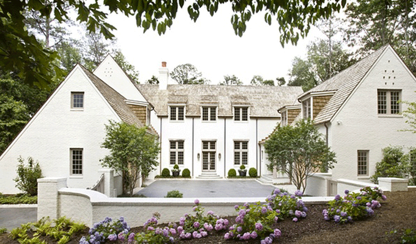
This young family wanted a colourful, retro vibe for their classic Garrison style home.
They wanted to refresh the look of the Garrison style exterior as well as furnish and decorate the interior to reflect their fun-loving style.
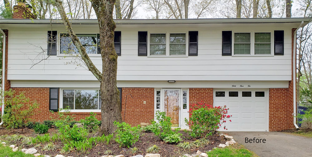
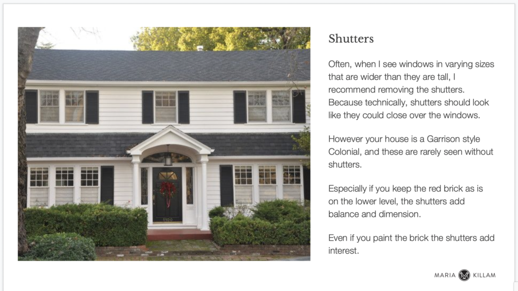
While in most cases wide windows shouldn’t have shutters, sometimes they are necessary for balance. This home is one of those times. Shutters here add an element that creates some dimension so that the lower and upper level look more integrated.
This is the eDesign advice we provided on that below.
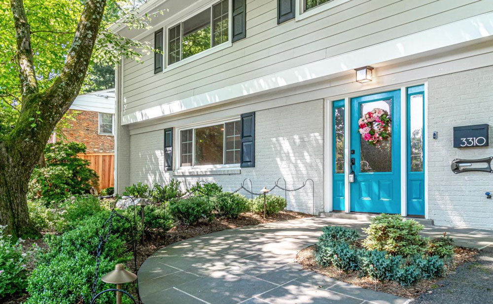
To reflect the colourful look they wanted on the inside, the exterior front door needed a punchy welcome.
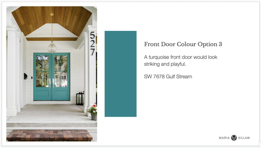
The new front door colour turned out so pretty! The upper siding and lower brick were softened with a new paint colour in a versatile and fresh green grey paired with crisp white trim. This allows the pretty new door to be the focal point.
Where to begin your home renovation
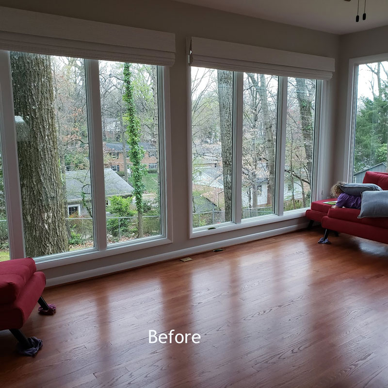
The first consideration of any renovation is whether the existing floors will work for you. Realistically, it’s much easier to change out the floors before you move in all your furnishings. In this case, they decided the very warm reddish wood floors were too formal and dated.
They opted to make the whole space more current and airy with lighter wood floors.
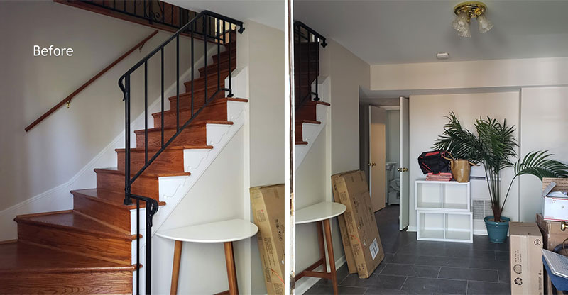
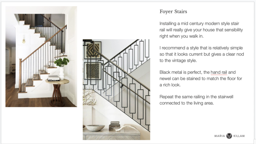
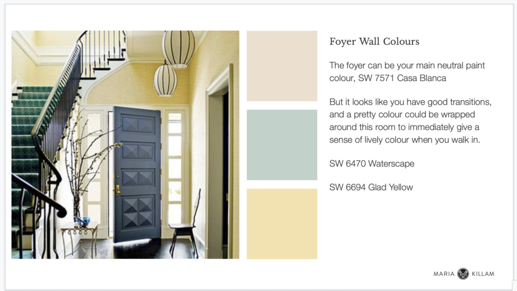
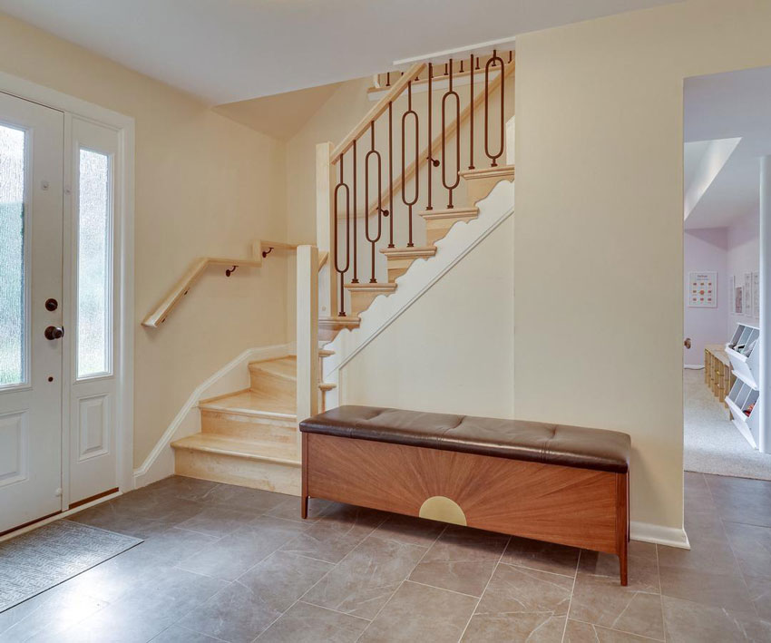
The interior boasts a nice sized foyer. But it had a dated staircase that didn’t fit the look. Since the railing is a dominant feature of the first space you see when you enter the house, we recommended updating the railing to something with a clean mid century modern style.
Here’s a look at the advice we provided.
And, here’s a look a the new entry after with new flooring, railing and wall colour.
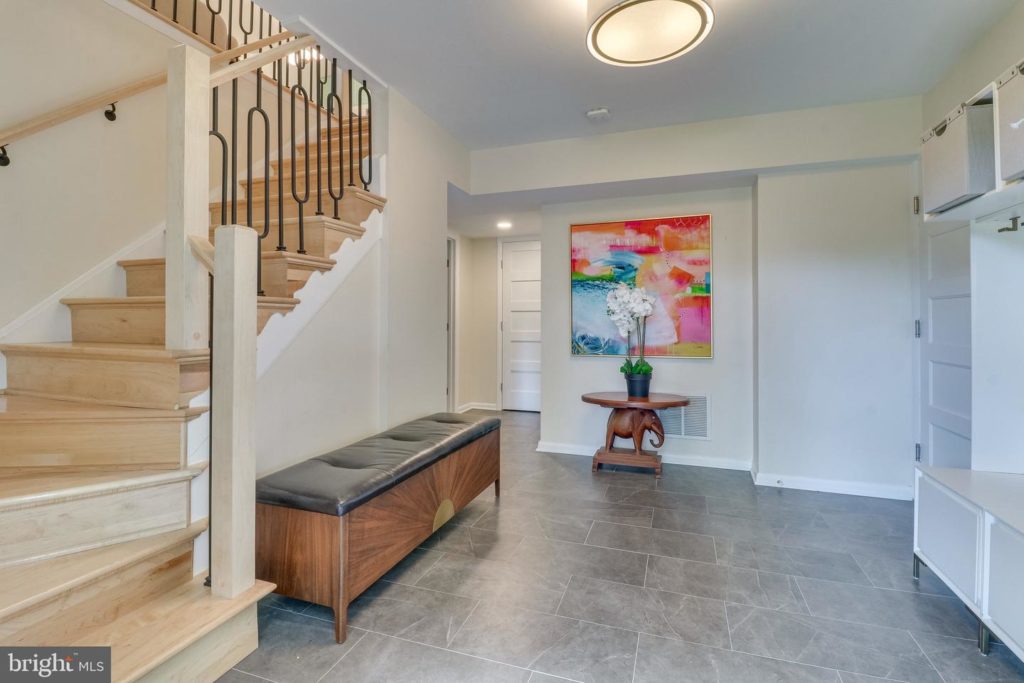
Take a closer look at the railing above and below with walls painted SW Casa Blanca, which happens to be a pretty orange beige complex cream from my System (find a complete list of system colours here).
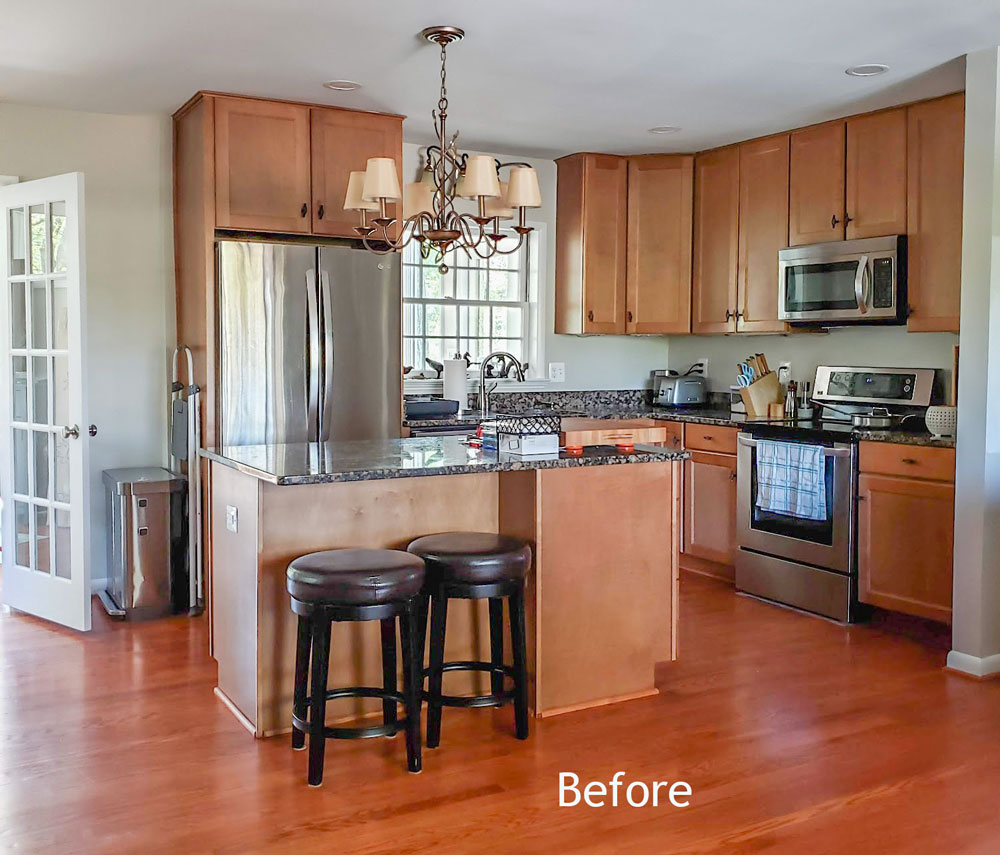
As you can see, the kitchen was standard builder-grade wood (below) but the layout was functional. So they opted to paint it a fun colour with minor changes to the cabinetry and new lighting. They also added new black countertops and a crisp white backsplash.
Add a pop of colour to existing kitchen cabinets
These pretty white appliances dramatically update the look of this kitchen. Notice how they also used bookshelves to square off the existing (and a bit awkward in shape) kitchen island because a kitchen island should look like a piece of furniture.
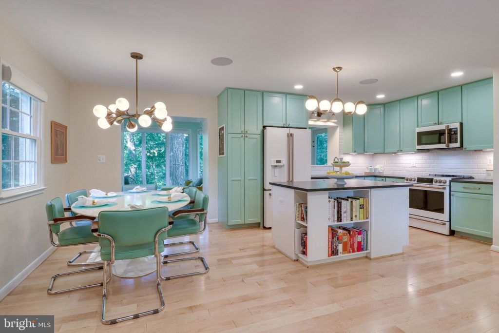
BEFORE you add a fun colour like this to your kitchen cabinets, here’s a hot tip. Make sure you FIRST start with a decorating plan for your adjoining living room.
Why? Because instead of choosing between hundreds of colour options, it will immediately narrow down the right colour options for the cabinetry. The world is NOT your oyster in this case.
Typically, you will have one or two perfect options that relate to your decor. Much easier, right?
Colour flow starts with colourful living room inspiration
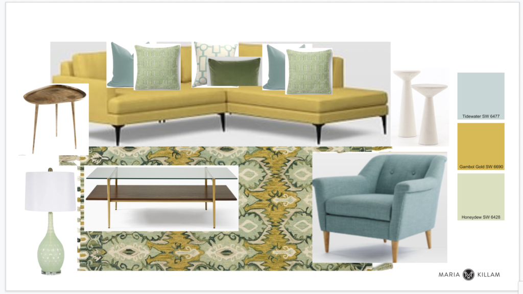
The first step to decorating successfully is to have what we call a “jumping off point” or an inspiration piece that sets the colour palette.
Often a patterned fabric or area rug is a great starting point for your decorating palette. In this case, the client had a collection of gorgeous modern paintings by his very talented mom.

Using their artwork as inspiration, it was simple to pull the mustard and orange from the art and compliment them with a pretty teal turquoise.
The chair and rug were chosen BEFORE the kitchen cabinet colour. Thus, it provided a short list of cabinet colours to choose from that would coordinate nicely with the living room palette.
THIS is how you create flow with colour, and it’s one of the most popular takeaways from my Specify Colour with Confidence course.
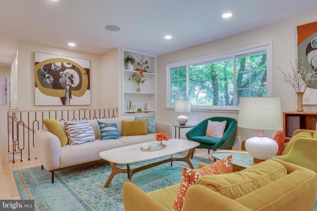
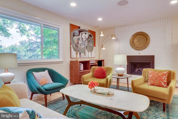
I just love colourful retro vibes of this well-decorated living room!
Once you have a colour palette selected, it typically starts with the living room. Then, you can then create variations of the colour theme for rooms throughout the house. See how I did that here in my home.
Colourful bathroom inspiration
A guest powder room should relate, but can also be rich and colourful. White walls in a powder room are mostly a missed opportunity for creating happiness with colour. In this tiny space, every element is an opportunity for interest.
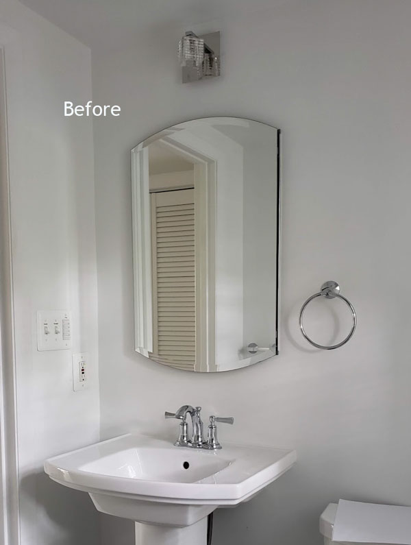
Here’s our eDesign advice for bathroom hardware and accessories.
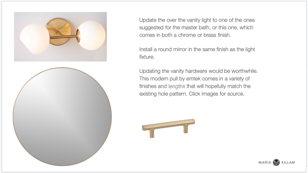
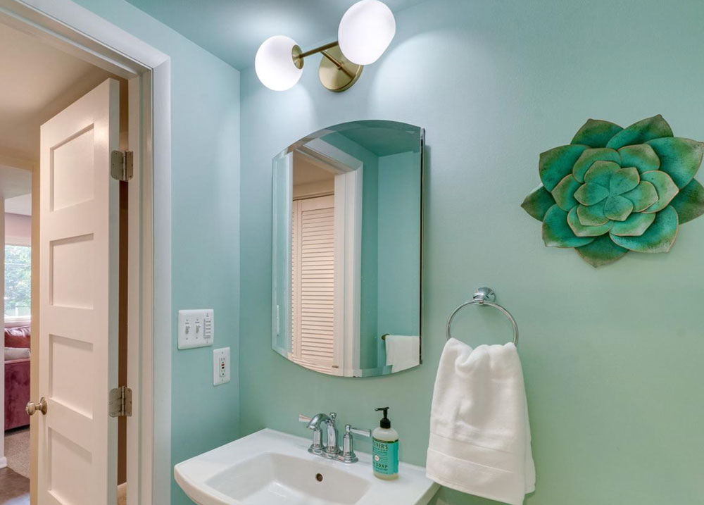
They chose a pretty turquoise wall colour for the powder room along with a new light fixture as recommended.
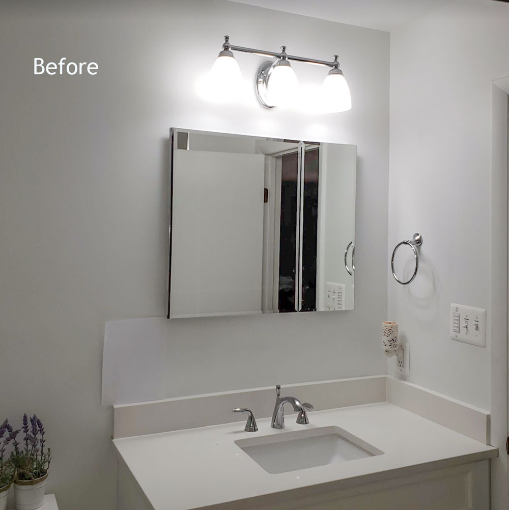
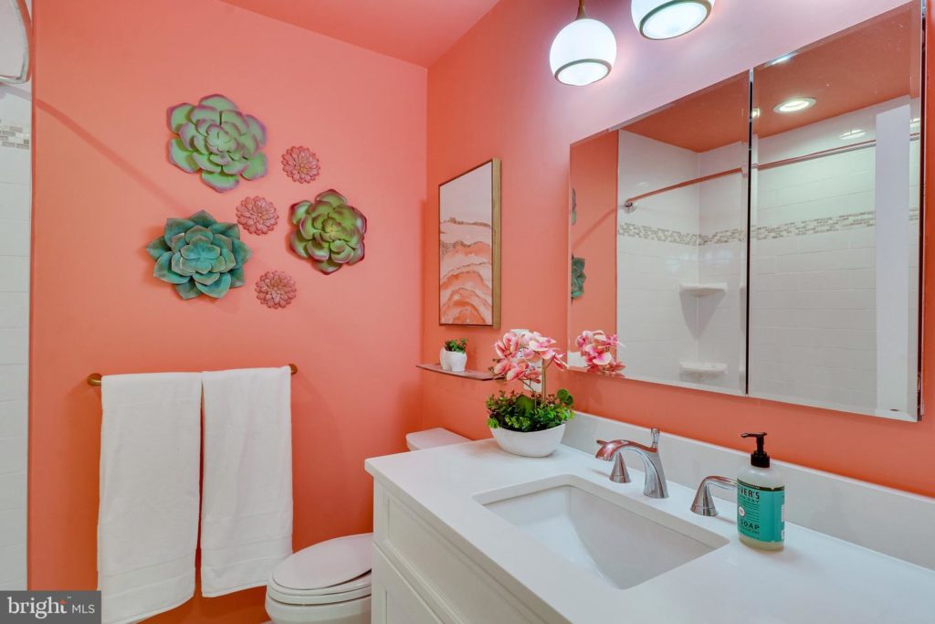
And the shared bath was painted in a warm coral wall colour.
Why do I prefer all white finishes in a bathroom? Because classic white bathroom fixtures mean you can endlessly change the wall colour to suit your whimsy and decor. And that makes decorating more enjoyable.
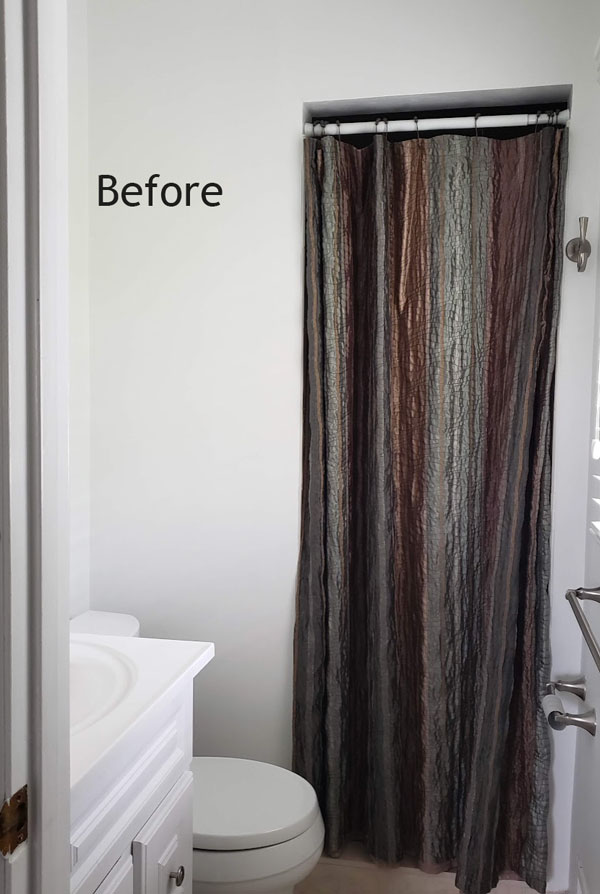
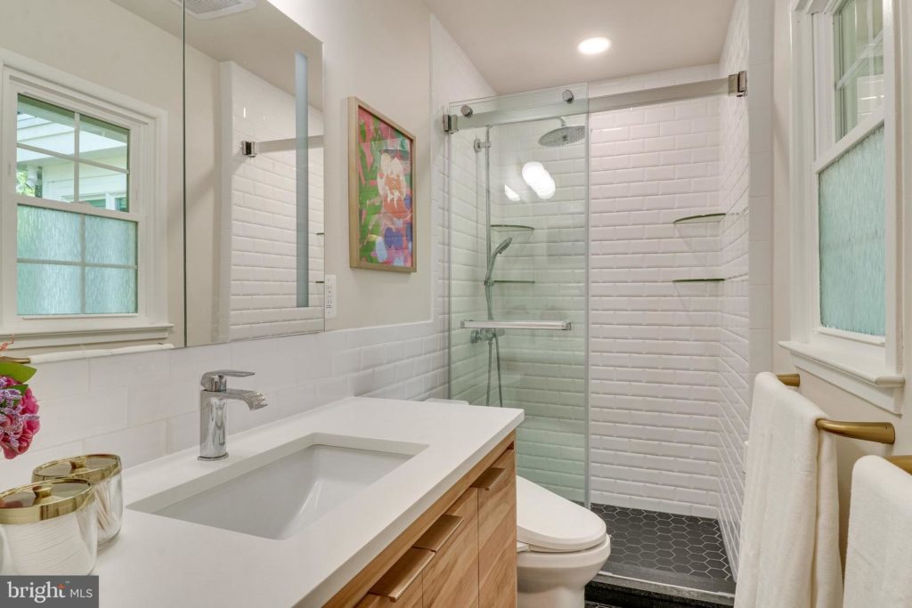
Another way to add interest and colour to a white bathroom is with art and accessories. This bathroom below has a window, which means that a super pale neutral wall colour looks good.
In a windowless bathroom, it’s better to go with stronger colour on the walls. HOT TIP: low light makes pale walls fall flat.
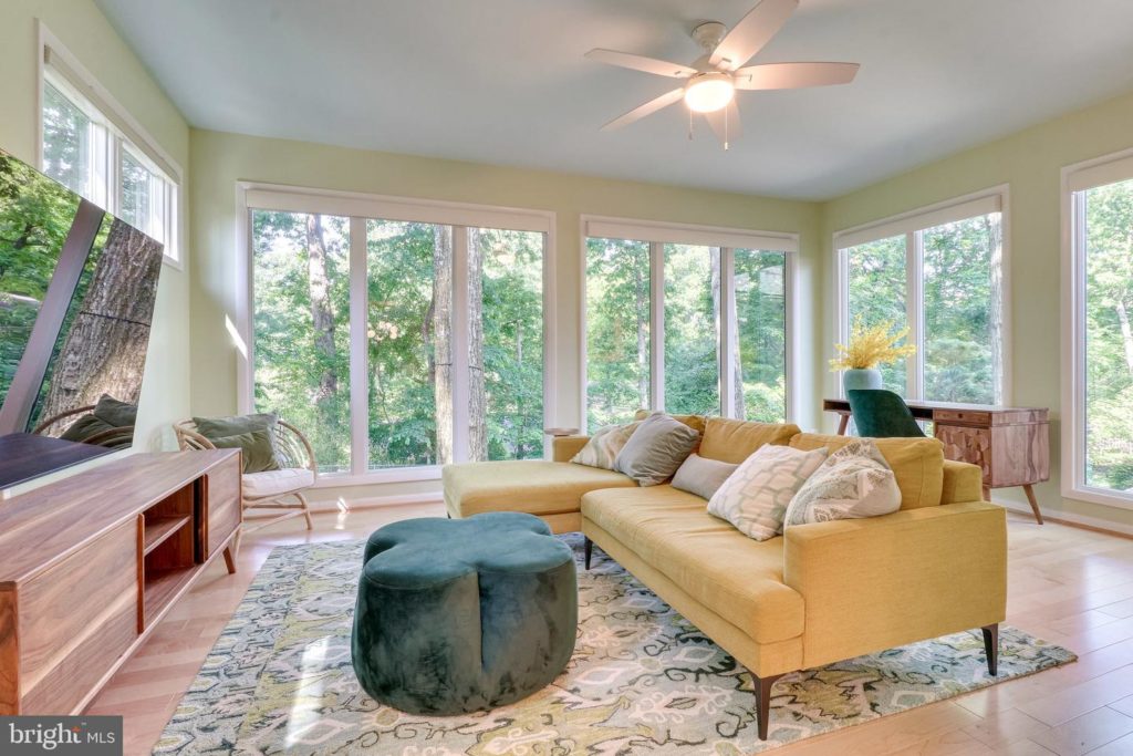
A decorating mood board
When you’re decorating an empty room, it helps to start with a mood board first. The colour palette was inspired by the living room but then we gave the sunroom it’s own personality.
The combination of the mustard sectional with turquoise accents continues flow with the main colour scheme in the living room. Soft greens were also included to connect with the view of the outside garden.
The results are colourful, beautiful… and HAPPY!
And there it is! This family was so much fun to work with since they really embraced colour and were not afraid to see it through.
This eDesign project is such a great example of creating flow with colour throughout the house. And colour flow comes together ONLY if you have a clear plan in place first. It never works to go buy a sofa in whatever safe neutral is trending at the moment and then try to toss in some colour with pillows alone.
Always start with a plan. It’s easier than you think! Learn how with my Shop Online with Colour Confidence
If you’d like your home to fill you with joy when you walk in the door, see all our eDesign packages here.
Become a True Colour Expert this Fall and learn how to choose the best colour to pull a space together QUICKLY and EASILY, register here.
Related posts:
Inside an eDesign Online Paint Colour Consultation
An eDesign Front Door Colour Consultation; Before and After
Black Contemporary Exterior eDesign Consultation; Before & After


This home screams happiness to me!! So uplifting!!
Absolutely LOVE everything about this house and the colour selections. What an inspiration.
I love color. I do like gray as my go-to neutral backdrop, but I am done with the all gray homes I see where I live. And lucky for them to have wood cabinets because then painting is an option! The laminate cabinets the builders are using today limit you so that your only options are refacing or replacement, both of which are more expensive than painting. From a sustainability standpoint, laminate cabinets are a mistake. It’s wonderful today that there are many companies offering custom upholstered furniture in almost every color under the sun, so buying a sofa in a color you love is much easier than ever, and the prices are reasonable.
I really love the painted exterior. I’m sure they are happy every day they come home and see their lovely home.
One word “ fabulous! “
I like the colors! The exterior is gorgeous too!
Turquoise walls in the bathroom, super fun!
It’s so fresh and gorgeous! Love the exterior, and the interior is such a fun change from all the grey we’ve seen the last several years. I have a different decor style, but I could happily settle in there with the all wall and kitchen cabinet colors.
You often suggest kitchen cabinets should be white so they can be timeless. Is there a reason why you didn’t suggest white for the cabinets and incorporate the blue in other areas in the kitchen, like the island? Just curious. Love your work.
That’s a good question! As long as the hard finishes remain timeless, any kitchen needs to be painted after 10-15 years and it’s still easier to do that than to start replacing countertops and backsplash, etc. Maria
It’s a colourful, happy home for a young family. My only question is why is the fireplace not a focal point? I’ve never seen a fireplace totally ignored in a room.
I can appreciate the work.
For myself that’s color over load and would be as ad for myself as a house with no color for others .
Different strokes for different folks .
Thanks for sharing
I don’t like it on any house when I see that the sidelight panels flanking the front door are painted the same colour as the door. I would have painted them in the trim colour or the same colour as the outside walls. Let your front door stand out on its own. Love the pop of colour on the front door anyway.
The sunroom is my favourite.
What a happy house to wake up to each morning!
Marg
In this case, the house has such wide horizontal lines, that having only the door in a bright color might have looked out of proportion.
This is Mid-Century and color done RIGHT!
What a happy house!
This house makes me smile! I love the updates and the colors used. I absolutely adore the living room and sun room, but I really like every room you’ve shown. Bravo to the homeowners for creating such a beautiful space to live in (with Maria’s help, of course ;))!
I am so happy to have found your site. I love every bit of color and furnishings in this house. It is SOOOO happy! I am so tired of the antiseptic white everything and the dated grays. This is beautitul and inspirational!!
I’m absolutely in love with the coral bathroom and have saved that picture for my inspiration board 😍
Maria, do you think pale wood flooring will date a house in years to come?
This whole house’s color flow is a dream for us ordinary folk. We are moving in a 8 months and the idea of having all the colors in harmony feels like a unattainable reality.
I absolutely love this home! It’s so refreshing to see all this wonderful color. I get so bored with all the black and white and grey everywhere. Color is life!
This is so happy and colourful! I have more classic taste, but I can appreciate the modern retro vibe. It reminds me of the house I grew up in. My dad loved modern, yet my Mom liked traditional. My son and daughter in law just purchased a 60 year old semi detached home and she wants to paint her kitchen cabinets a soft turquoise. Wish you still did e consults!
What an amazing colorful transformation! I would love to see more posts about house styles and shutters! I have a classic raised ranch home and I took my shutters off after seeing some of your other posts about shutters. Now, I’m wondering if I should’ve left them on. Every time my mom pulls in my driveway, she asks me if I kept the shutters somewhere -you know, just in case I decide I want to put them back on- because she likes it better with shutters!
This house feels alive! Love it!
I used to look at some houses and think that there’s nothing that can make them look good, but after following you, I see that is totally untrue! What’s more amazing is that just changing colors can make a magical transformation. If I could only “see” colors the way you do!!
Absolutely Beautiful. I especially like the turquoise bathroom. What is the color and brand for that bathroom. It appears bluer than turquoise to me, and it is exactly the color I need for my living room. I am going for a beach them throughout.