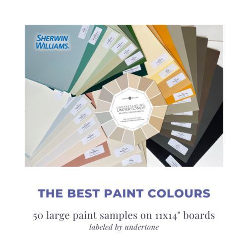
Colour Wheel Explainer
For the love of all things neutral, let’s get you UNSTUCK already!
For the love of all things neutral, let’s get you UNSTUCK already!
We’ll be adding more questions and videos to help you use the Understanding Undertones™ neutral colour wheel so make sure you bookmark this page in your browser.
Didn’t find an answer to your question? Submit a question here.
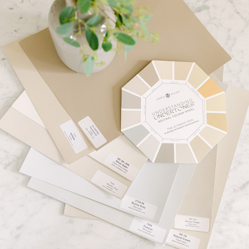
Use this tool to save you time, money and headaches when building, renovating, buying paint or choosing decor and finishes for your home.
Compare this wheel to anything neutral – furniture, fabrics, rugs, paint, countertops, tile, flooring – to narrow down which 1-2 undertones are a close match. Then compare to the paint colours in my system to confirm the exact undertone you are working with.
Once you’ve identified the correct neutral undertone, you can use this information to:
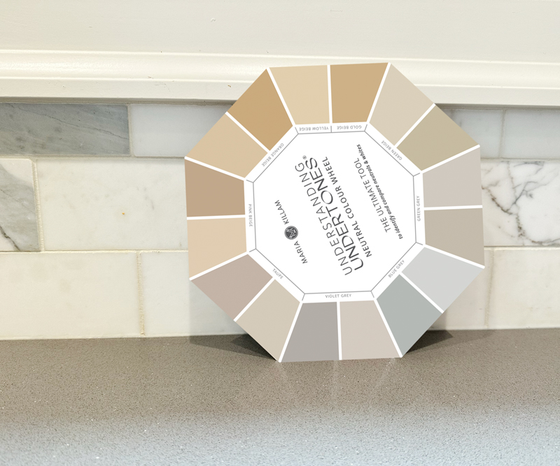
Since the new colour wheel no longer spins, we’ve added the descriptions of each of the 9 most useful neutral undertones here for your reference, plus links to helpful blog posts.
Pink Beige: Often described as warm (the colour of a latte), pink beige is the most limiting neutral undertone.
→ Everything you need to know about pink beige
→ What everyone should know about beige
Orange Beige: The colour of sun-washed terracotta. Consider orange beige if yellow beige is looking too green.
→ Orange beige complex cream in my primary bathroom
→ What everyone should know about beige
Yellow Beige: This undertone shows an obvious yellow undertone, making it easy to identify. A good substitute for brighter chromatic yellows.
→ What everyone should know about beige
Gold Beige: A deeper and muddier yellow-undertone neutral, gold beige is always mid-tone or darker, and never paler.
→ What everyone should know about beige
Green Beige: One of the most versatile neutrals, green beige can help earth tones appear fresher.
→ What everyone should know about beige
→ How to identify the undertones in fabric
Green Grey: The colour of concrete, green grey looks the most like neutral grey. Its green undertone is more apparent when compared to blue or violet grey.
→ How to identify the undertones in fabric
Blue Grey: The coolest neutral undertone, blue grey is relatively easy to identify, as it shows an obvious blue undertone.
→ Help! My light grey walls look baby blue
Violet Grey: Use violet grey when violet undertones exist in a colour scheme, can be paired with pink beige or taupe.
→ Adding colour to an all-grey room with a violet grey stone fireplace
Taupe: Warmer than grey and cooler than beige, taupe is a combination of beige and grey with a pink to violet undertone.
2. Identifying the undertones of kitchen cabinets.
I get this question a lot, so I decided to answer it in a blog post. You can read it here.
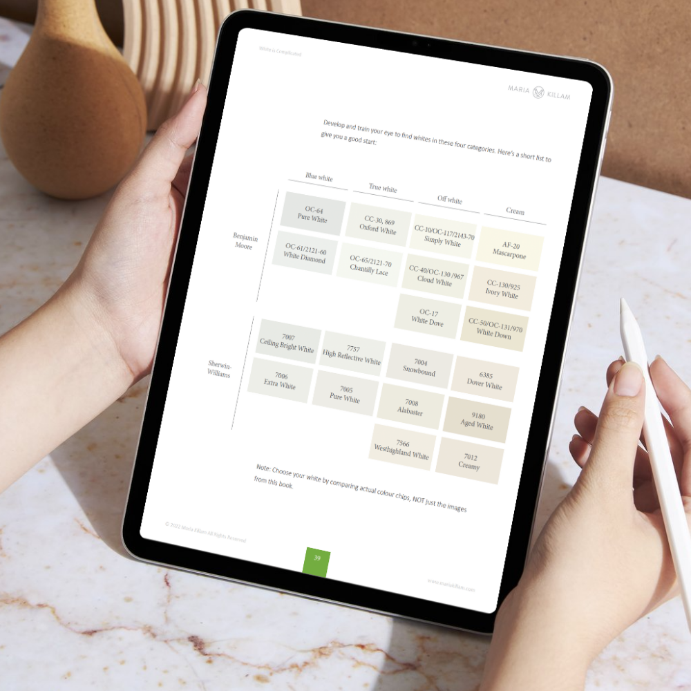
The 4 gradations (meaning, from cool to warm) of white in the Killam Colour System are found on the back of the Understanding Undertones neutral colour wheel.
Please note, there isn’t a direct connection to how the whites are placed on the wheel in relation to how the neutrals listed on the front. For instance, that means you cannot assume that one of the whites on the back is the best trim colour for the neutral listed directly opposite of it on the front side.
Here are some general guidelines you can use for choosing a trim colour:
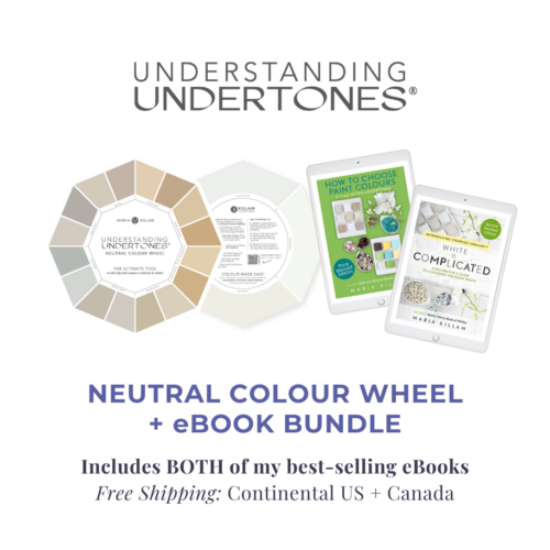
To learn more about the best trim colour for your home download my White is Complicated ebook here.
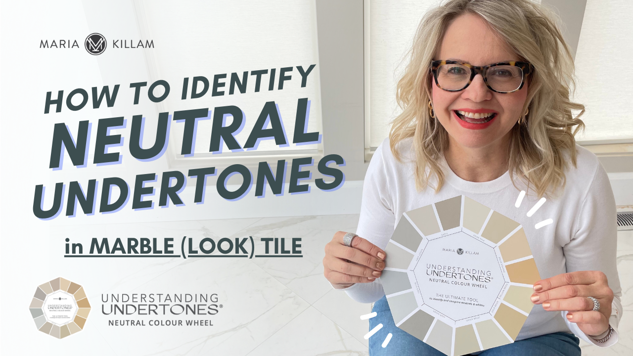
Some finishes like tile, countertops or fabrics are made up of multiple colours in tiny little bits that make you lean in close in order to identify all of them.
BUT, that’s when you want to STAND BACK to assess what ONE colour the entirety of these could be described as. Maybe even squint your eyes a bit.
The OVERALL READ simply means if you stand back, what is the overall undertone you see – even if there are multiple undertones in the item.
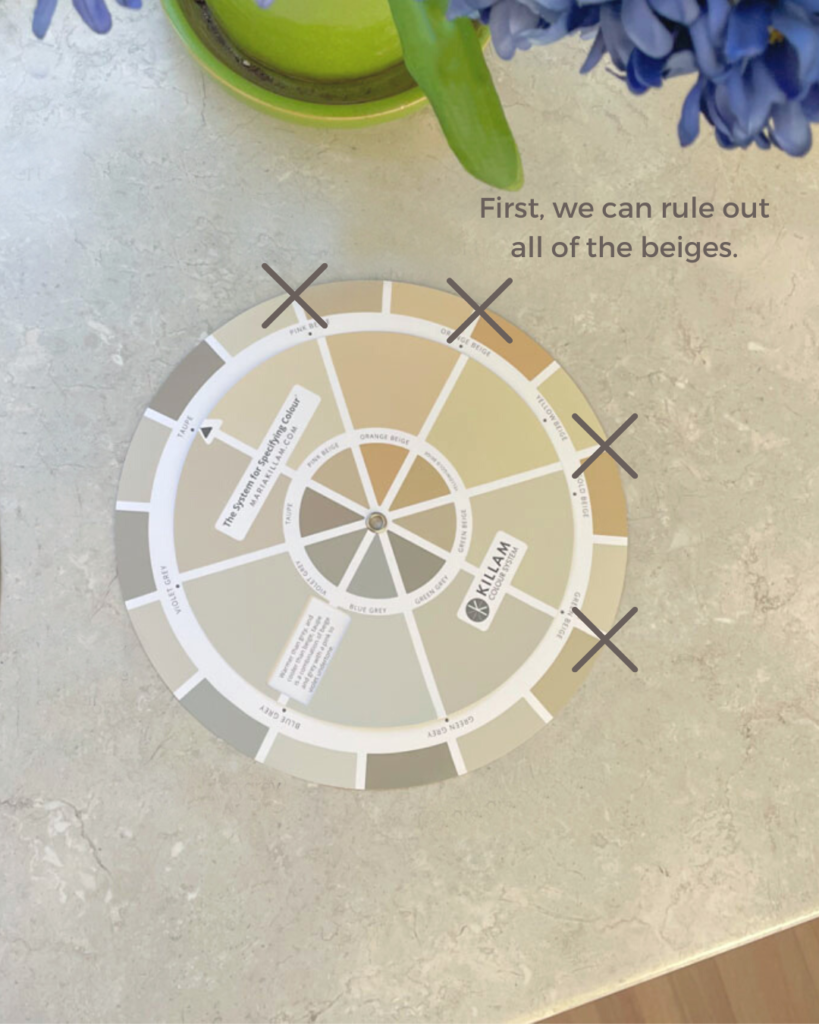
Let’s take a closer look at this countertop, for instance. In this case, we can easily eliminate all of the beiges.
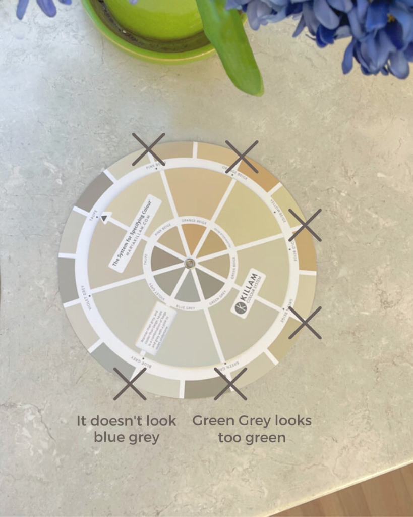
So, that means it’s likely a grey or taupe. But, the green grey looks to green when compared to the countertops. And, it’s definitely not a blue grey.
You can see the wheel reveals that the overall read of this surface is in the realm of violet grey to taupe.
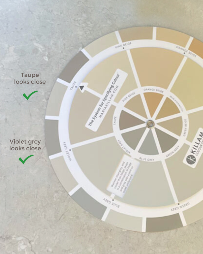
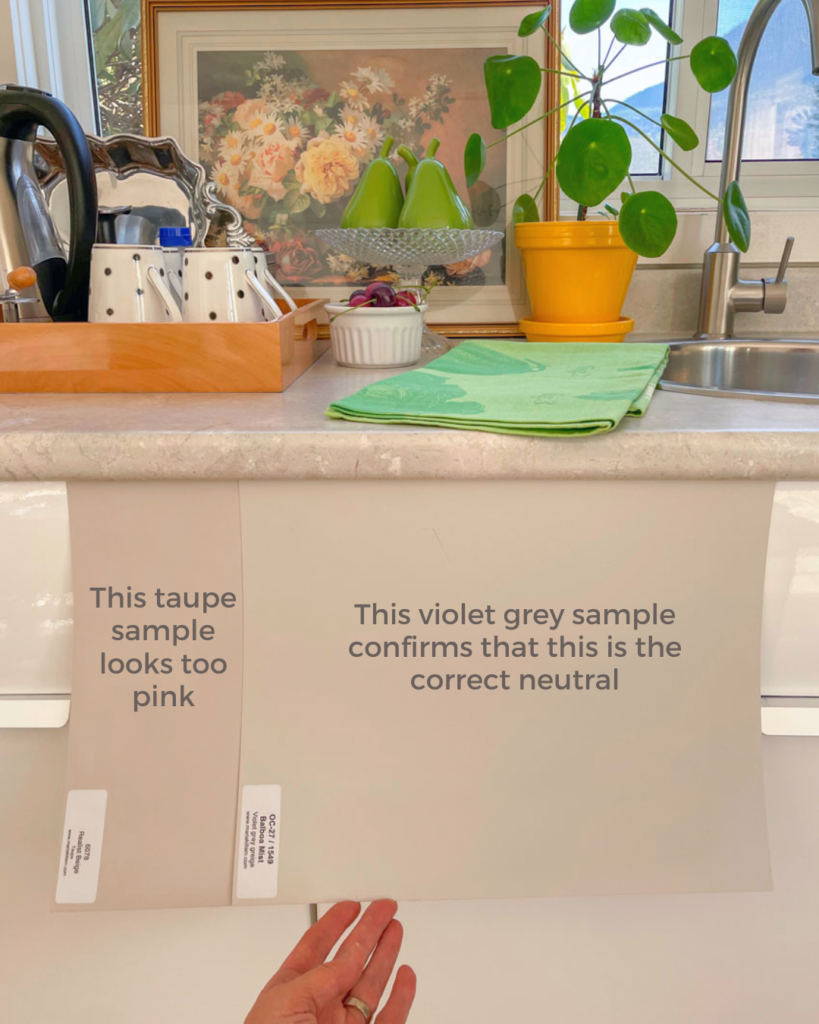
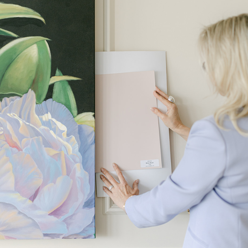
To confirm EXACTLY which undertone is the BEST MATCH, use large painted colour boards from my system to compare.
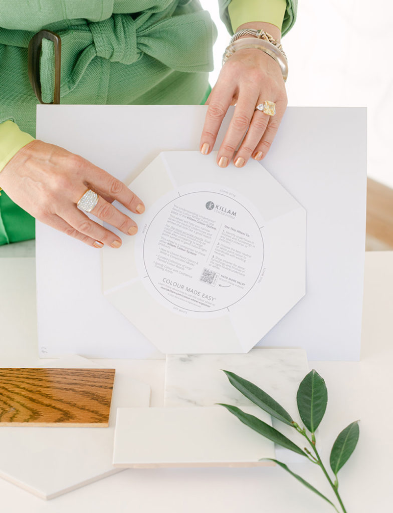
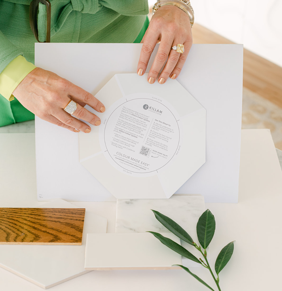
When identifying or testing paint colours, it’s important that you view your paint colour or sample in the same orientation as it will be painted – instead of setting it flat as most of us might do. So, we flattened the edges to make the wheel easier to handle in an upright position.
Watch the video above for an explanation from Maria. Here’s a summary of what’s changed:
No, you do not need to purchase a new one if you have the real-paint neutral colour wheel from earlier in 2022.
This new version includes a few minor changes to eliminate some of the confusion of past designs. We removed the top, spinning layer, made the real-paint deposit areas a bit large, and flattened the sides so it can be placed vertically more easily.
We think you’ll love using this new one even more, but feel free to hang on to the old one. Both wheels are accurate visual keys to the 9 most useful neutral undertones.
Since the launch of the new Understanding Undertones Neutral Colour wheel, we are fielding lots of questions about whether the other colour wheels are still useful. I have some good news if your purchased the wheel in 2022…
Identifying the undertones of neutrals is key to choosing the right neutrals for your home. But you might be wondering, now that I’ve identified the undertone, what do I do next?
The great news is you are WAY ahead if you already know which neutrals you are working with so you can choose the right neutrals to match and repeat in your room. But there is so much more to know about decorating with colour that can’t be found by simply combing this blog.
The best way to get ALL the answers for YOUR HOME is to sign up for one of my two-day colour training events.
True Colour Expert Training: This training is for ANYONE who wants to elevate their colour and decorating skills. It’s also the first step if you want to break into the world of colour consulting. Already in the design or colour business? THIS is your masterclass in colour. Learn more here.
Create Your Dream Home: Learn how to decorate, renovate and build your dream home using the Killam Colour System® – perfect for anyone tackling a home project big or small who wants to get make the smartest investment with their time and money! Your spouse is invited to attend with you! Learn more here.
🇨🇦 The Neutral Colour Wheel ships from a location in the US 🇺🇸
A leading Canadian colour company approached us to create our Neutral colour wheel. We engaged their services, but just before production began, the pandemic hit. During that time, the company closed their entire Canadian division and relocated all production to their U.S. headquarters.
This company was renowned for producing materials for Benjamin Moore and Sherwin-Williams, so we felt compelled to maintain our production contract with them. Importing to Canada would have significantly increased costs, so we decided to ship directly from the U.S. Currently, while our manufacturing, packaging, warehousing, and shipping costs are paid in U.S. dollars, Canadian customers pay in Canadian dollars. Maria made this decision to keep the colour wheel’s price as affordable as possible.
Recently, this company has been acquired by a Canadian firm, and we’re hopeful they might return manufacturing operations to Canada.
Maria Killam is an acclaimed decorator, stylist, and a leading authority on colour. Known for her revolutionary Killam Colour System™ and her innovative Understanding Undertones® Neutral Colour Wheel, she's also an educator, sharing her expertise and insights on all things colour along with her timeless design aesthetic. Colour Made Easy™
© 2025 Maria Killam | Timeless Colour. | Site Made With ❤️ By Brand Overture