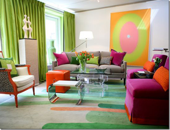
This room was designed by Eileen Kathryn Boyd for the 2009 Kips Bay Show House and I found it on House Beautiful. If you have never seen her website, it’s one you shouldn’t miss!
I am on the hunt for reasonably priced art for a client and it’s hard to find, I think I need to find an artist and do a commission! There are so many talented artists out there, I just need to find some! Love the simply, contemporary piece in this room.
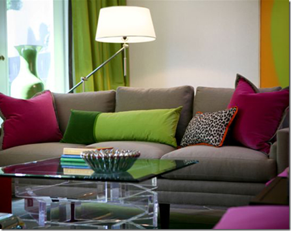
Also, I adore the pillows she designed. I NEVER design a room without the right toss cushions, I really feel they make or break a space and I’m always looking for new ideas for piping combinations and unique shapes!
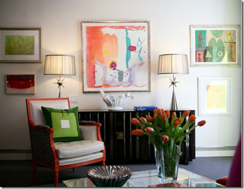
See how the artwork has been arranged here? First the lamps were placed on the console, then the art was installed around them. Even the two bottom pieces on each side where placed based on the fact that the chair was displayed on the left. That’s why the basic rule of ‘hanging art at eye level’ is too hard for most people to follow and best left to professionals!
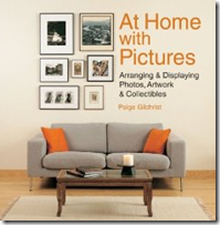
Just hiring a designer FOR THIS TASK ALONE, will make a world of difference in your home!! If you need some new ideas, a couple great books I recommend are Decorating with Pictures:
And At Home with Pictures they are both a good resource, but if you are going to pick one out of the two, I thought this book by Paige Gilchrist was the best one:
Related posts:
Colour me Kelly Green! (A Jamie Drake Manhatten Residence)
My Interior Design Style (Another Jamie Drake Residence)
The New Hollywood Regency (A Kelly Wearstler Residence)
Kimberley Seldon on Decorating with Beige
Colour Love (Stephen Shubel Design)
John Saladino on Creating Scale











Love the colours in those rooms. Fun! but yet very elegant – This is a great example were colour can be elegant.
Really well done! Have your tried Etsy for less expensive art? Let us know how you do…since most of my clients are in “need inexpensive art” category.
Gorgeous rooms! Great info about the pictures too.
I’ll have to check out these books, Maria.
I do feel like a room looks empty without art and pillows!
xo
Brooke
I LOVE the colours 🙂 They’re so vibrant, but not overwhelming. Fantastic room!!
You should get in touch with Matt LeBlanc, the abstract artist in New Brunswick we’ve featured on our blog a couple of times. He does custom paintings, and I’m sure would be more than happy to create some pieces for you 🙂
Kelly
Maria, this is a beautiful post the art as a focal point in these rooms is phenominal. I have a solo art event/ show on the 8th I will post about soon.
I’ve ALWAYS wanted to go to the Kips Bay Showhouse!… The designers always manage to whip up such inspirational spaces.
Great colour! Love her work; she has been on my blogroll since the beginning. I wish she posted more. Lovely work.
People either go bold or they go beige!
Bold takes a lot of courage but boy does it look like fun! Great books…
pve
What a gorgeously fun room! The color combinations are unexpected but compliment one another very nicely. Love the chairs and large artwork and that great rug!
Fabulous colors….I am a big fan of such color combinations and I have told uncounted times my sorrows about the reluctance in general to more bold colors….
YES, it can be elegant and bold!!!
Love that post! Thank you!
XX
Victoria
Wow, can you say SUPER saturation!? Lovely room, Maria. You still have a fan (who happens to be an artist!) in Cleveland, OH!
wow!! there’s no way you can be sad in a room like this, amazing!!!
I had the pleasure of seeing the Kips Bay Showhouse with an architect friend and a textile designer friend (we were in NYC for a field trip of sorts with our children’s school). It was an amazing experience seeing the home with their expert and trained eyes right along with me…but it would have been even better to see the house with you! There were lots of bold and interesting color choices throughout the entire home.
I really liked this room, and I immediately noticed the artwork. I think it photographed a bit differently than it looked in real life – it looks much more vibrant in the photos. I admired the art selection and arrangement, but it is so interesting to see it through your eyes! I did not even notice that the left side is arranged according to the placement of the chair. Fascinating. I am going to look into the book you recommend, because to me, selecting and placing the art work is something that completely differentiates a home and gives it a certain quality that I love.
As far as finding reasonable art – I would look into art fairs and markets in your area, art schools too – both the professional art schools and the local art schools. There are some amazing artists at both of these types of places. Many local art schools have shows and sales.
love the room! Thank-you for your kind support too!
Well…all that green and hot pink reminds me of…my place, so I need to say that I love it.
Art: Graduation is here and you should check Emily Carr and Cap University graduation shows, some students are amazing and with a good eye you never know in the future…
Photography could also be relatively inexpensive (or astronomical in the order of million dollar of course)and create a focal point in a room. Check “Exposure Gallery” a non profit association with several stunning artists, emerging and established but all affordable (I am part of the Board but since we are not commercial, we are not involved in sales and we don’t take commission I believe I can safely promote the gallery, open since 1990, when photography was not even really on the map in Vancouver).
I usually like a dominantly white colored room. But I must admit, the colors do look good in the design of the living room.
great rooms! hanging art is really tough!
EKB has a wonderful sense of color. Her designs are fun and elegant at the same time..not always an easy combo.
Wow Great post!
Book list is great too,=. Can always use more design resources in my library!
Try local art colleges to commission art work.
I totally agree with you about pillows— I never design a room/ furniture plan without their fabrics in mind…
Also, love the way the art’s arranged!
xoxo
Maria!
I love love love that apple green and that is what hit me on the first picture! Those colors all together are fantastic.
Have a great day!
Blessings…
Those citron colors are so great for spring!
Betsy
I love the Artwork on the Wall… and how it is arranged!
Please let me know if you are interested in any of my work. I can paint on a much larger scale for commission as well.
I’m fascinated by the trio of different coffee tables grouped together in the colorful living room. I’d have never thought of it.