I’m excited to share an eDesign new build exterior today! It’s amazing to see a home come to life from a simple drawing to full blown beauty!
Here’s the initial drawing my client sent in for her consultation.

My team and I were impressed with this plan because a house designed with a symmetrical and balanced exterior is an exceptional and rare thing. Most often the look of the exterior is compromised for random interior layout wish list items that create chaotic roof lines, random window sizes and masses. So I’d like to give a shout out to her builder, Mark Peterson of Peterson and Son Builders (Trinity, NC)!
The world needs more beautiful builds like this!
Beautiful Bones
She sent in this photo of her newly built house and I immediately could see it needed shutters. It’s so rare that a home is designed with perfectly symmetrical and proportioned windows that work beautifully with shutters. I’m usually suggesting that clients remove them from the wrong size and shape windows.
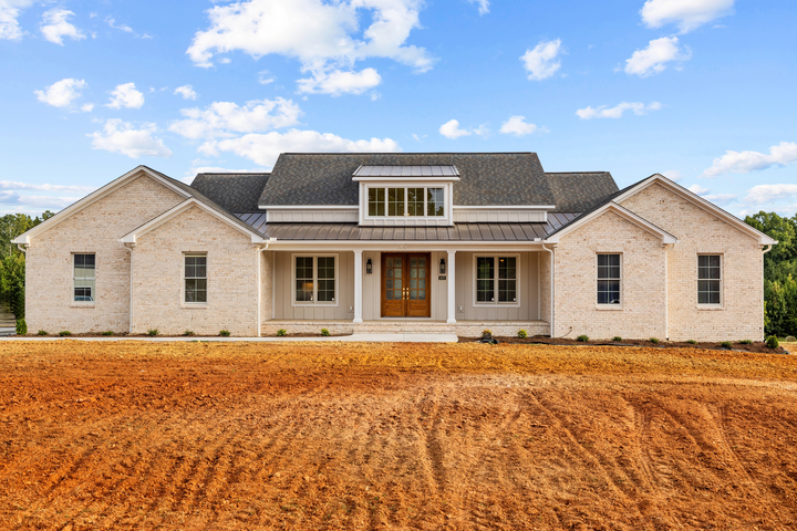
However, you can see that this house is already beautiful, freshly born, as it is, from a field of dirt.
An important detail
So I had it photoshopped with shutters (below). My client is currently having shutters made.
Now the windows across the facade all feel the same size as the ones in the recessed porch area. Perfection!
Landscaping for curb appeal
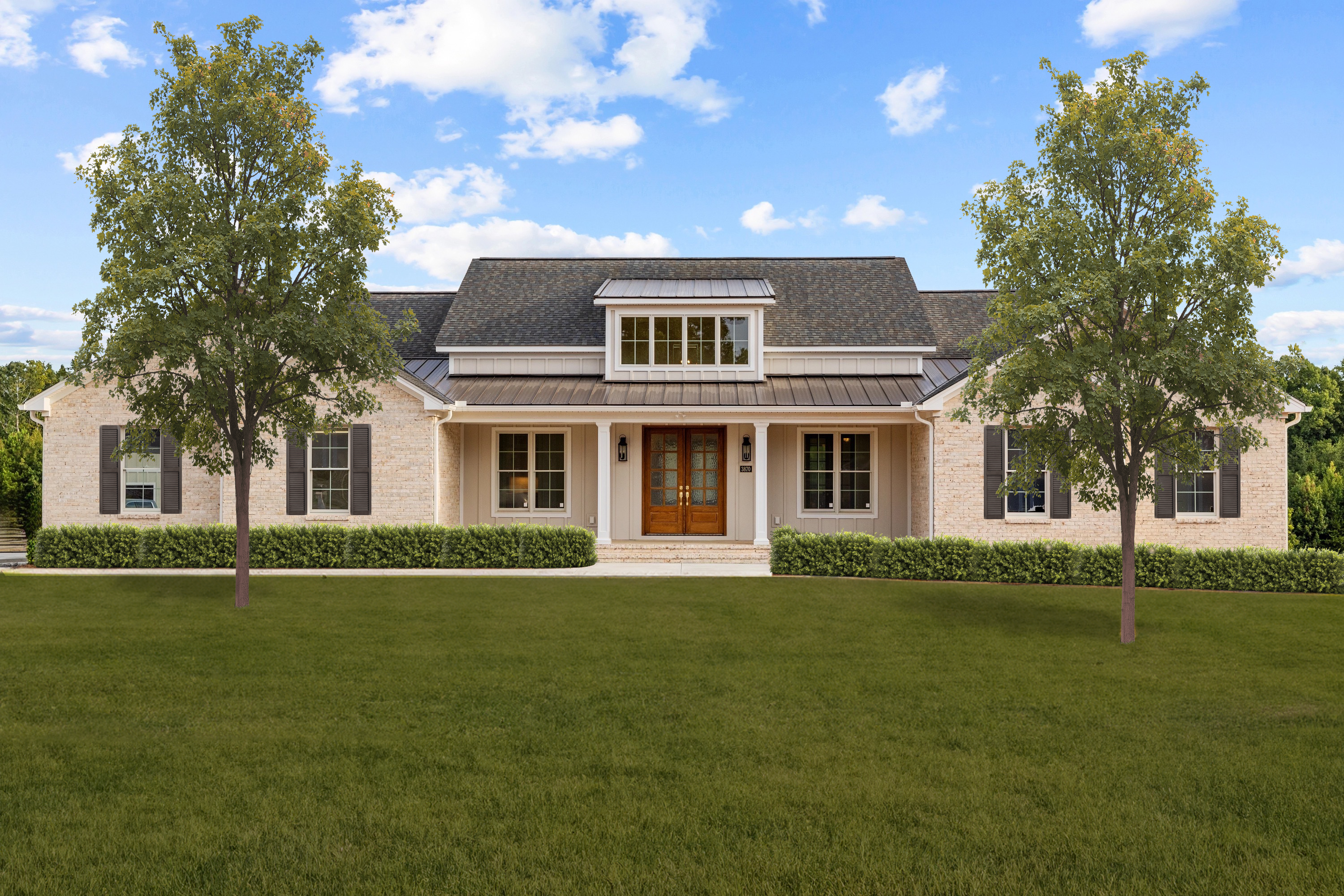
Except wait! Every exterior needs beautiful landscaping. Landscaping is to exteriors as decorating and styling is to interiors. It’s everything.
So I had the landscaping photoshopped in.
So pretty right?
Can you spot the difference?
Play a little game with me. Can you spot what’s different in the next two almost identical images?
How about this one below?
Let me know what you see in the comments below 😀
It can be tricky to know whether to add or remove shutters on your exterior. Let me know in the comments if you’ve wondered about shutters for your house 🧐
Create your dream home with me
By the way, on top of ongoing practice and colour training, we will be discussing all kinds of nuances of decorating and design just like this while we make connections with like minded friends near and far in my new interactive community space! I’ll also be sharing details and insights on projects like these inside!
If you haven’t joined yet you are invited! Join here.
And if you’re building or renovating, I can guarantee you’re working too hard and spending too much money to be disappointed by getting some of those make it or break it details wrong. My eDesign consultations are more than worth it for all the colour and detail mistakes you’re likely to make if design is not what you do. You can find them here.
And there are still a few spots in my Create Your Dream Home course in October! Learn how to turn your vision into reality and sign up here.
Related Posts
Springing Forward: My Landscaping Project (and a favorite new garden)


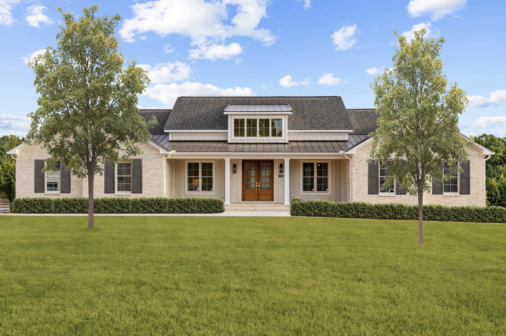
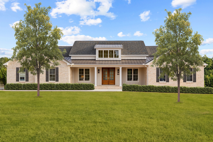








The shutters in the first photo are wider than the second.
Shutter size – first photo they’re wider than what you recommended, second they’re narrower.
The shutters are different sizes ( I like the wider ones ) and different type of grass, Kentucky bluegrass vs bluegrass?? ( I like the Kentucky darker green ) .
I like the wider ones too. The narrow ones look a bit “mean”.
While ordinarily I agree with the rule that shutters should be of a proportion that will properly close over windows, since it prevents use of shutters that are far too narrow, in this case I prefer the wider shutters. The wider ones balance the façade far more effectively. I also prefer a lighter grayed brown for them.
I’ve been reading your blog for years and based on your advice we have made several changes to our exterior. The bottom half of our home has stone in greys and taupe. When we bought the house it was painted a pale yellow with dark green shutters. We painted the house SW Acier grey and removed all the shutters. When we had the windows replaced, we decided to go with white mountains because we felt it was more in keeping with the style of our home on the coast of Maine, unlike many of the older homes which are replacing their windows with black muntins. We have wide bay windows (3 individual windows in each on the front, and 3 single windows across the top. To balance the first and second floors, we decided to only add ivory colored shutters to the 2nd floor. I’m anxiously awaiting their installation! We also added larger dark coach lights that would be more visible against the clapboard and tie in with the rod iron railing. Thank you for guiding us to the right decisions all these years!
Shutters are wider I top image.
So much better. Ahhh.
xo,
Paula
At first, I thought you changed the color of the house but then I realized that it was the shutter width that was changed. lol
Me too! 🙂
I think the grass made the bricks appear different in color but not sure.
Shutters are wider in one photo and narrower in another one.
Shutters are different widths. I might be going crazy but the house colour seems to be more towards a pink beige (?) Being a Phtoshop user for a long time I know how helpful this cool can be for testing out different options 🙂
I immediately thought pink beige too! 😂
It looks like the last three photos have 3 different shutter sizes. The first landscaped photo has the shutter size ‘just right’. In the next two almost identical photos, the shutters are too big and too small to close over the windows. Great lesson!
I agree. The original one is just right. The next two are too wide or too narrow.
Side note – I’m curious if the landscape should be symmetrical vs. well-balanced. I think over time, it would be difficult to keep up a symmetrical landscape. Also, a well-balanced landscape would be more relaxed, perhaps enhancing the symmetry in the home.
Obviously there should be a lot more landscaping here, we just added the grass, shrubs and trees to make it look finished! I recommend my virtual landscape designer MaryAnne White to give you a DIY plan if you need one! Maria
Thanks to your previous recommendation, MaryAnne completed a design for us earlier this year. We are still working on the plantings as time and budget permits. Really sets off our home. She is great to work with!
Skinny (ick) vs. Wide (ahh) appropriately sized shutters.
Btw, the house color looks peachy. Guessing it’s just a photograph or screen thing.
No the client chose a warmer brick than I specified, trends are getting warmer after all, but as long as you choose the right colours to coordinate, you get a beautiful result like this! Maria
I must be in the minority. I prefer the taller shutters to the wider ones.
I’m with you. I think the wider shutters look heavy.
Love the thin shutters which make sense with the windows. The wider ones have me doing a double take.
I prefer the thin shutters too. The wider ones make the house look “squat” and emphasize the sides while the narrower ones make it seem taller with more emphasis on the front porch and entry. IMO.
Yep, wider shutters,phew!
One photo has shutters that are too big for the windows they would cover. If they were closed they would overlap.
That’s exactly right. . . Maria
I’ll just say it – the windows are too small – too narrow. I doubt the interior rooms have much light with the small windows.
My first thought too. I prefer lots of natural light.
I agree. I hope the windows on the sides and back are bigger.
The wider shutters in the second rendering are better. The trees are rendered more nicely in the first one (shadows and better canopies).
It took me a few looks, but I see that it is the shutter size. I really like the original image the best. Kinda like Goldilocks, one was too big, one was too small, but the original one was just right. Love the house. With all the symmetry, what seemed to catch my eye the most was that the trees were not placed in line with each other and that bothered me a bit. The one on the right is more forward than the one on the left. If it were my house, I would like the trees to be placed exactly the same distance from the house on both sides. The more forward location is better, in my opinion, as it gives more space for the tree and balances better with the house. If there is a need for something to stand out and break up the symmetry, I would lean towards planting a unique shrub grouping or flower bed one one side of the yard to create a separate focal point. Hope the new owners enjoy many happy years in their new home!
Yes obviously an overall landscaping plan is needed, I just added some green to make it look finished! Thanks for your comment! Maria
I personally think the windows being shuttered are too small for the scale of the exterior walls they’re on. Therefore, the larger shutters give the visual appearance of the windows being appropriately scaled.
I think the wider shutters attract all the attention which should be on the entryway porch.
Enough said about shutters but the house does look best with them.
I do not care for the trees that seem plunked into the soil. After several years they will be covering a good portion of the house standing all alone on each side. Better landscaping will make a difference.
You and your team are so creative, talented and extremely knowledgeable even if I didn’t care for the 2 trees in front. You have done a superb job with this home. 👏👏👏❤️
The trees aren’t real. Maria just photoshopped them in so the front looks a little more finished.
Hi Maria – The windows on either side of the door don’t have shutters. Is it because it would appear too busy. Just wondering. Bonnie
It’s because the windows are too big for shutters! Maria
What a beautiful house! I also love the symmetry. And the shutters that are correctly proportioned (as if they were functional.)
To me the home looks better with the more narrow shutters.