Four years ago, I decorated Elizabeth’s living room with IKEA upholstery. It was the quickest and most inexpensive way to get the whole room done at once. Go here to see the before, before pictures her kids were older and it was time.
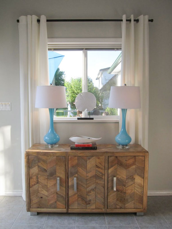
First, here’s the entry, the MERETTE grommet curtains came from IKEA. They still sell them work great if you need off-white curtains to soften a window and custom drapes are not in your budget.
Before
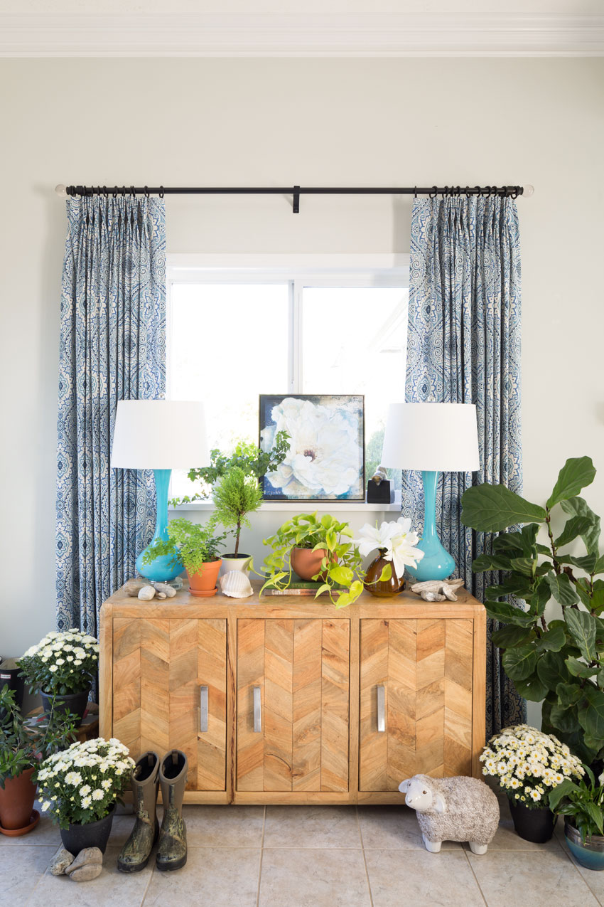
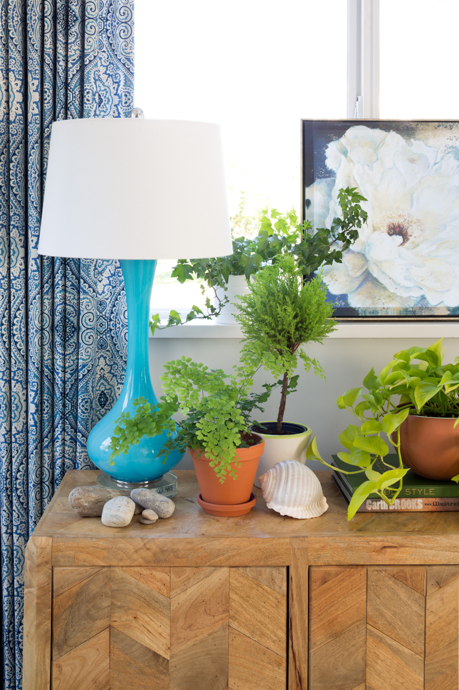
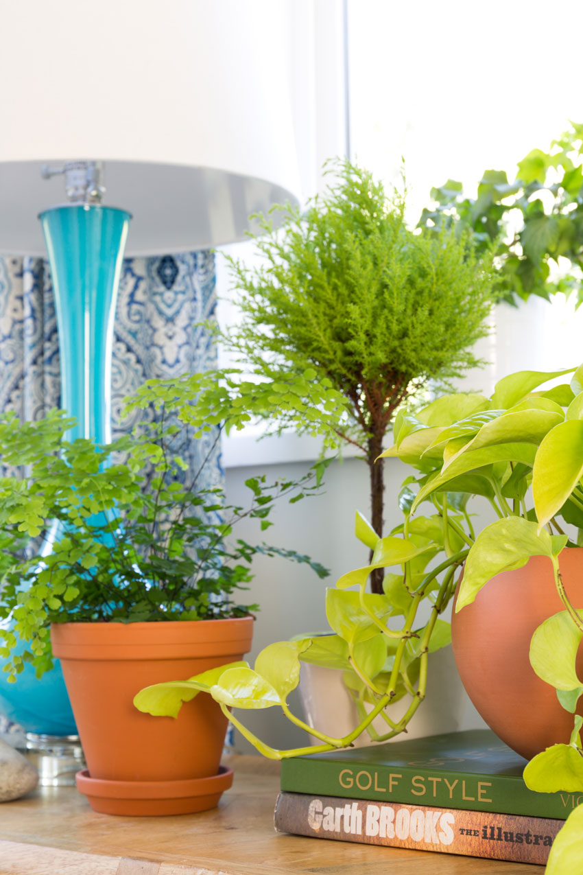
As it’s unusual to have a window above your entry console table, I found a little piece of art and propped it up on the window sill for this round of styling this area (below).
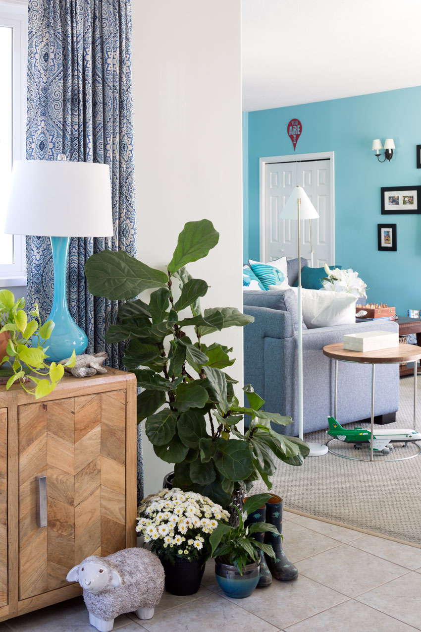
After – This time we added custom drapery. Can you spot the cute face (you know I can’t resist them)
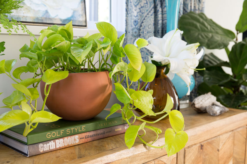
The entry table is always covered with stones from their walks and bike rides to the Vedder River.
Photography by Barry Calhoun
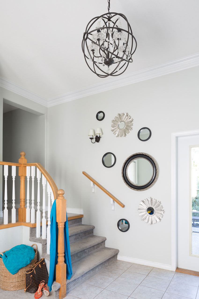
This is the other side of Elizabeth’s entry. The handrail made hanging art awkward so we installed some mirrors instead. The herringbone pattern on the oak entry console keeps it current while repeating the oak banister on the stairs.
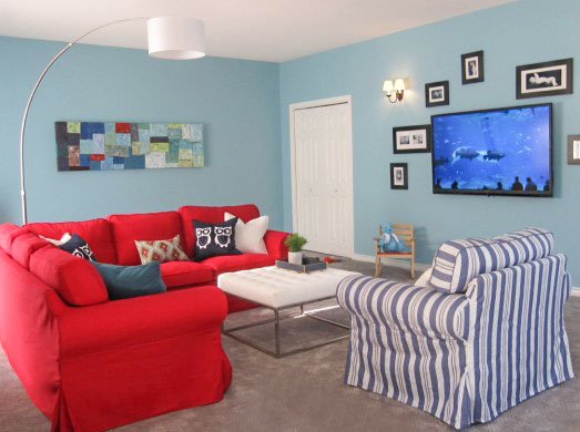
The reason they needed new furniture was because the existing sectional had become really lumpy and uncomfortable. In fact, Elizabeth reported that it’s been lumpy for two years. Which is bound to happen in such a well-used room. And let’s be clear, you get what you pay for.
The IKEA Ektorp (below) is still a great, classic style if you have a room that needs to be decorated on a budget but you’re not on it all day and all night with your kids, your friends, watching TV, etc.
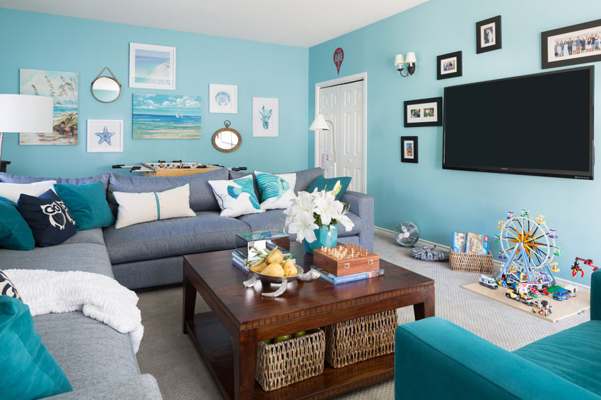
The turquoise wall colour and the family pictures around the wall-mounted television stayed the same.
Before (the first re-decoration on a budget)
Here’s the new sectional and chair (below). I specified the same style for this living room I decorated three years ago for another client.
I loved the high end, contemporary look and feel of the longer, larger cushions. The standard seat cushions are feather wrapped which make it really comfortable. This style only comes in one size though, so I was happy that Elizabeth’s living room had the space to accommodate it.
Coffee table from Wayfair Similar here and here.
And the boys still have room to play with their lego (there’s more space behind the teal chair-not shown).
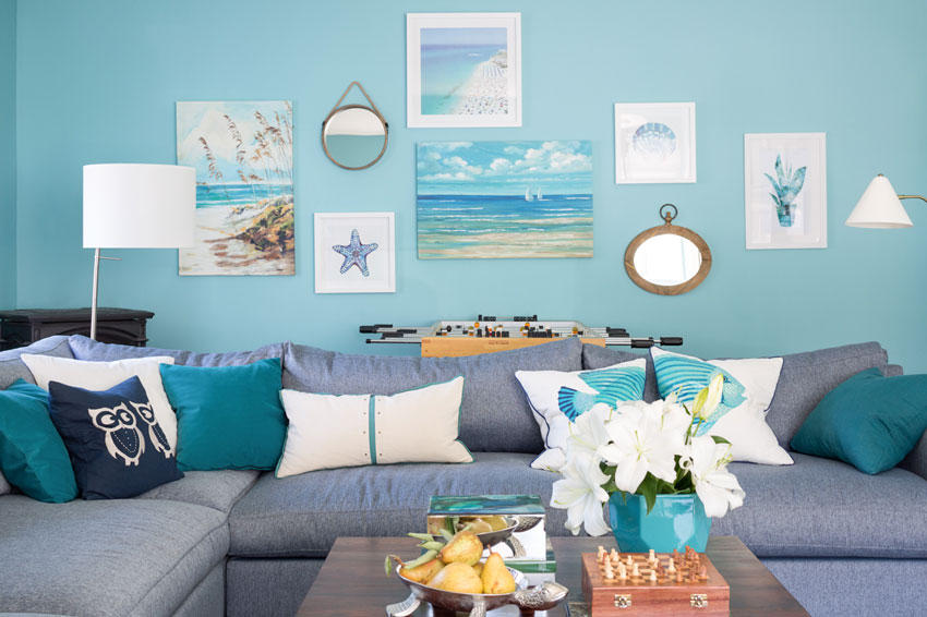
Elizabeth wanted this room to feel coastal! The wall colour is BM Passion Blue 2053-50.
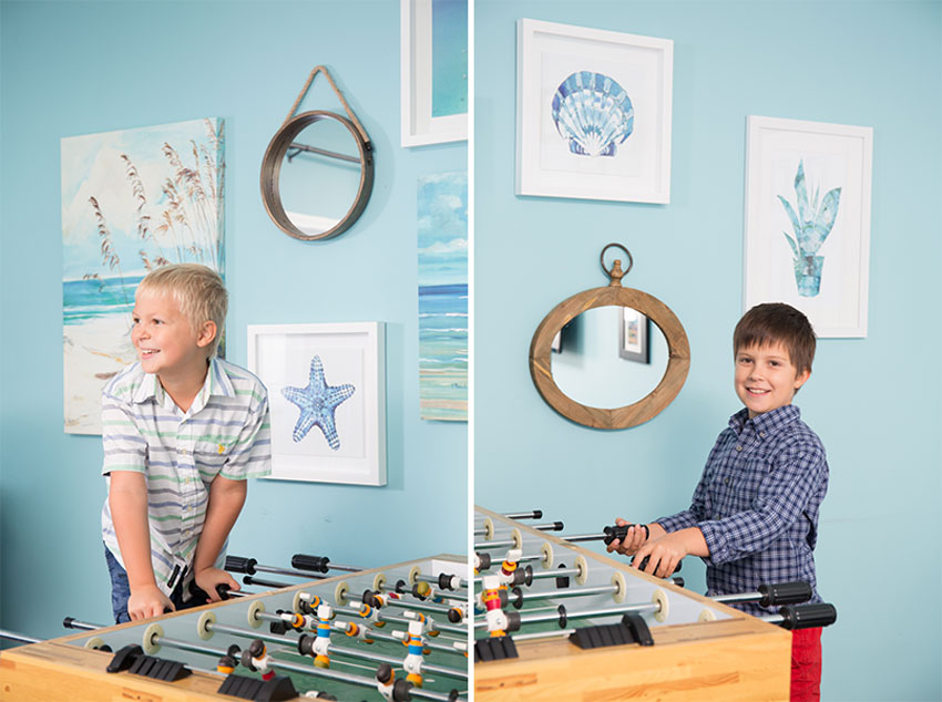
Markus and William
During the photoshoot, I had Barry capture some photos of my sweet nephews playing foosball! They grow so fast, here they are just 6 years ago!
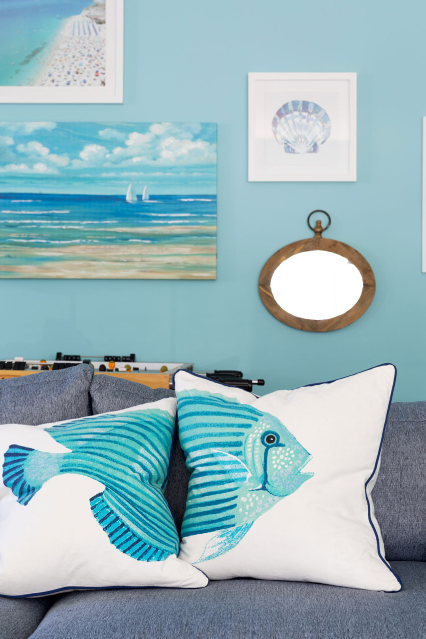
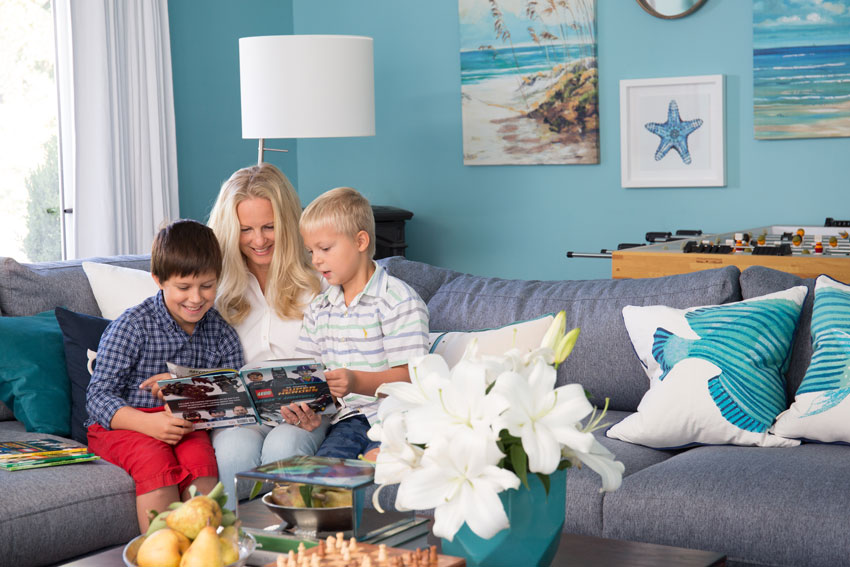
She loved the fish pillows I found at HomeSense!
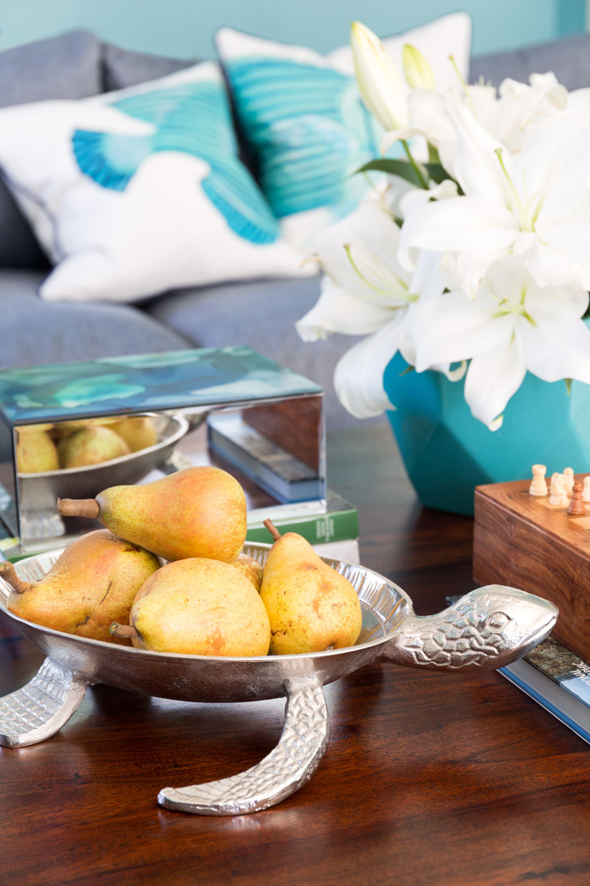
The turtle bowl also came from HomeSense. The pears are from a tree in the backyard.
And here is Elizabeth with William and Markus! Elizabeth homeschools her kids so they spend a lot of time reading.
I hope you enjoyed the transformation!
I’m here in Atlanta and excited to meet 27 True Colour Experts on Tuesday when my second course of the Fall season begins!
Related posts:
The Best Colour for your Childs Bedroom Furniture: Before & After (William and Markus bedroom)
What’s Missing if Your House is Not Trendy; Who Cares! (Elizabeth’s House)
Refresh of my Mom’s Kitchen and Sitting Room; Before & After







Maria, I love the way you staged everything. The new sectional looks so comfy and will hold the whole family plus friends of your darling nephews! I shop a lot at Home Goods. You just can’t get pillows that cheap especially down filled any place else.
Have fun with your new class in Atlanta!
I usually love your designs and pics, but sorry there are too many props in these pics. Very cluttered from top to bottom. 🙁
I agree that two gallery walls is a lot but it was the most inexpensive way to get art with the colours that worked and the look and feel we wanted. And this is also a kids playroom as well as a living room!
Thanks for your comment,
Maria
Beautiful! I also love that she homeschools. I do too!
Sorry but this room is not aesthetically pleasing nor does it look professionally done. It looks like an amateur threw way too many things together. I could not and relax sit in this too-busy space.
Wow! Has it been FOUR years??!!! It seems like only yesterday that I read the original post. The boys have gotten so big! Lovely room, I am in the process of downsizing into a condo and I may just go for this look!
I love the turquoise and teal and gray together! And I LOVE how you kept it “real” by leaving in the boys’ toys and rock collections, etc. in the photos. That is how most of us really live after all–if we have kids and it is not a “formal” living room that is only used for “company!”
Some of the comments by others, above, about there being too much “stuff” in the photos might be appropriate if you were “staging” this home for the purposes of selling it, or to prepare for a glamorous magazine photo shoot, but you are showing us how you designed with the lifestyle of the family in mind, complete with the kids’ “décor and accessories” (toys, rock collections, etc.) that are bound to end up there anyway! Thanks for being real!
I love the drapes- gorgeous! By the way— I love the two large canvas paintings on the wall. Would you care to share where they are from? I have been looking for some large coastal art for my bathroom! (Speaking of bathrooms–I can’t wait to see yours when it is done!)
Agreed! This is a real family living their lives.
I totally agree Phyllis – this is a family living in their BEAUTIFUL home as they choose. It looks STUNNING!!! Well done Maria – I’m sure your sister, your nephews and you are very proud of the outcome as you should be ?
I love this update.
But the reason I am commenting [my first time!] is to send encouragement and props to your sister for homeschooling her two boys. I homeschooled my two sons [now ages 22 and 24] and it was the greatest gift we gave our family. They are home this weekend for Thanksgiving, but have launched into wonderfully successful years at university and into great careers. Bravo to Elizabeth and her hubby. It’s not an easy road to homeschool … but it’s so worth it!
I love those custom drapes and the extra greenery.
Maria
Yes ,thank you for keeping it real!
Loved that it show cased a real family with a real life !!
It was surround by the life style of the family that live there!!
I’m sure your sister and family will enjoy their beautiful new designed space !
Thanks for Sharing !!
Nancy
nicely done Maria
The new curtains and lounge are very swish, and love the slash of green from the plants. You have been busy with your family Maria. Those nephews of yours always look like they are brimming with healthful energy, it’s fun to watch them grow and change. (Also, I don’t think I’ve seen Elizabeth with there hair loose, she looks more like you!)
Have a great workshop.
It’s fresh and lively!
Truly a breath of fresh air! Thanks for sharing your family’s homes … homes where people can live comfortably ,,,,
I think it all works well and looks family-centered and bright and cozy. Keeping it real: For me the walls are too cluttered, something about 2 walls with full galleries and too much space between each piece on the walls.
I too love seeing houses that are really lived in! These rooms, however, are very busy and the gallery walls are overwhelming. The family pics in the heavy black frames around the tv are heavy and oddly spaced, don’t fit with the rest of the room. I also think you could have achieved a coastal feel without so many starfish, turtles, fish, etc. Simple would have been better. I’ll bet they love the sectional for reading and snuggling up for movies!
Hi Maria,
Your sister is so lucky to have you help her. It must make her so happy to come into her newly decorated family room. What a great idea to add the art onto the windowsill over the console table!
Nicely done!
Do love the colour palette and many of the elements (in particular the custom made drapes ) and how the spaces reflect the lifestyle of its occupants. That said and not to offend; unfortunately though I do not see the purpose of having the three wall galleries and question their composition BUT by same token realize it would be a very mundane world if we all liked the same flavour of ice cream .. ☺. In other words as it is Elizabeth’s home, it is ‘her’ preference that counts and not mine.
-Brenda-
Maria, your incredible talent is always the first thing I see whenever you post …. I must admit that just this once, I noticed your sister’s gorgeous blonde hair!!!! To die for. Gorgeous hair and a gorgeous turquoise / navy room. What more could a girl want?!?!?! Love this post. 🙂 🙂
I respectfully disagree, M, and here is why. This is a REAL room. This is a room that any of us could live in…and really KEEP IT looking that way! I think there is a place for the “staged” look…but also a place for the warm look. This post about a family living space is not cluttered at all, in my opinion.
Love the sectional! Where did it come from? Am local so would be easy for me to get…
I don’t normally like patterns but the pattern on those drapes really works.