Sharon, one of my lovely True Colour Experts, recently finished a renovation and complete redecoration of a dated 1990’s home. The project turned out so special and beautiful that I asked her if I could share it with you and she generously agreed.
Sharon is a talented decorating enthusiast who took my Specify Colour with Confidence course in 2016 after completing a consultation with me for her previous home.
I posted the before and afters for that project here.
She added her new found colour confidence from the course, to her natural flair for decorating, to create a truly beautiful and unique home.
Wisely, she began with some inspiration. A fresh take on Chinoiserie by designer Mark D. Sikes (below).
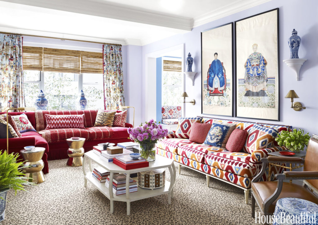
Inspiration room by Mark D. Sikes via House Beautiful
It’s important to have a starting point
Using her inspiration and love of decorating, and armed with my system and colour boards, she took her home from a dated before, to an enviable after.
Having inspiration for the look you want to create with decorating at the outset of a project is powerful.
Committing to a vision makes all the decisions you will have to make in a renovation project so much easier. Because you are guided by a clear direction.
Here’s her dated 90s generic kitchen before:
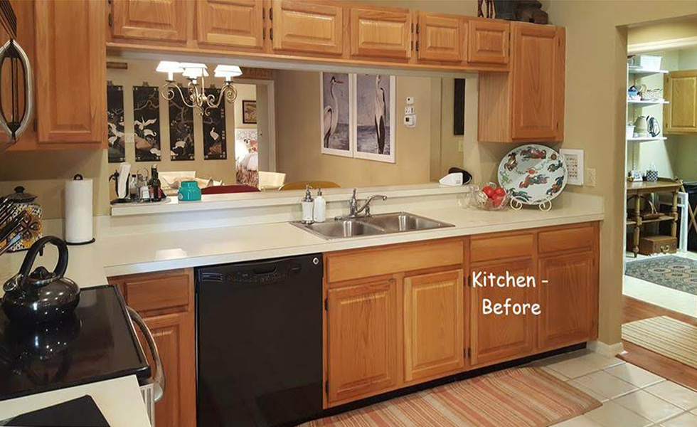
Sharon’s kitchen before
And here is the stunning after! You can see how her inspiration informed her choice of colours and details in her beautiful new kitchen below.
I think we should pause for a moment to gaze at this fabulous kitchen that should be somewhere in a magazine!
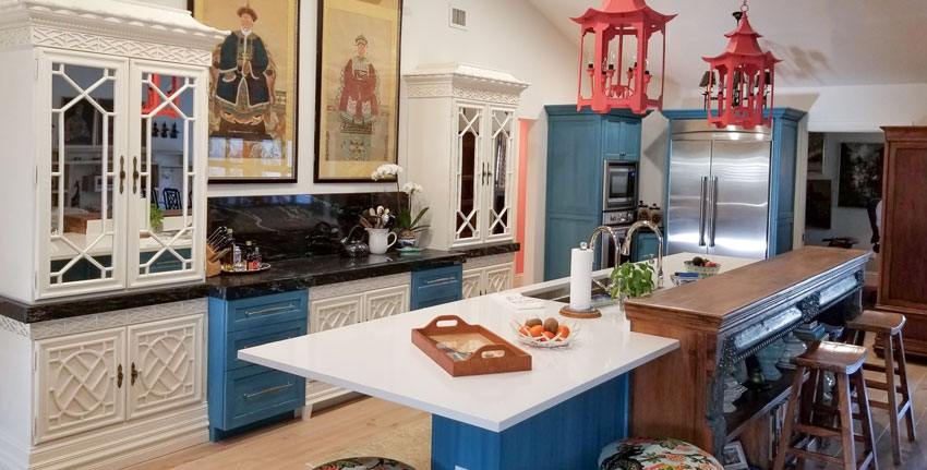
After The cabinets and walls are BM White Dove | Blue cabinets: Provence with white wash and white wax
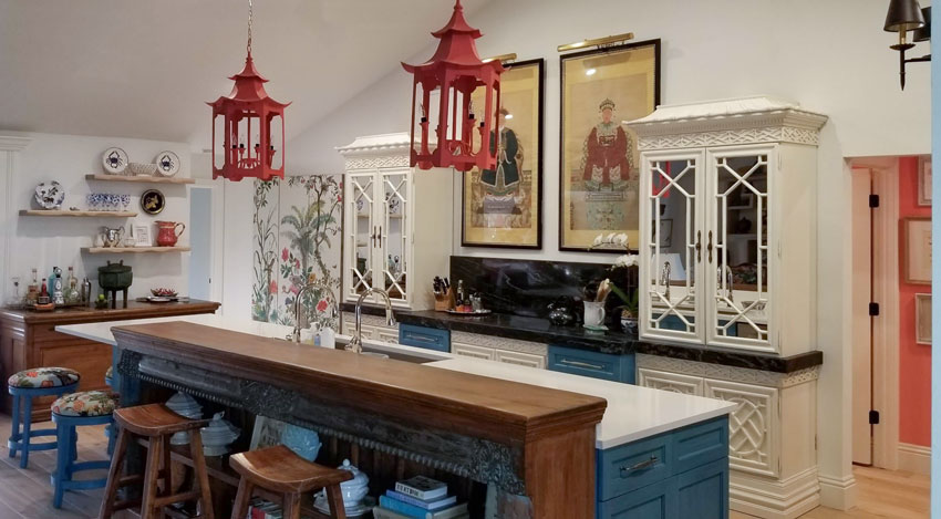
Here’s another view
A truly unique kitchen
It really is hard to believe that it’s the same kitchen as the before picture isn’t it?
Her new kitchen is so full of personality and interesting details. And because she had a look and a feel she wanted to create in mind, she could fearlessly commit to the punchy colours and whimsical chinoiserie details in the cabinetry and the beautiful coral lanterns.
You can see that she’s repeated the coral in the hall for flow as well.
And the ornate bookshelf attached to the island feels so custom and special, and repeats the antique feel of the art.
It’s clever how she incorporated her bamboo trellis cabinets, which she had before the renovation, into her kitchen cabinetry. In order to find the colour that matched them best, she used my large colour boards.

Here is the living and dining area (below), you can see that the coral and blues are nicely repeated and the Chinoiserie theme is carried through. There a lots of interesting and pretty details for the eye to enjoy, which is what creates a cozy layered and pulled together look.
Here is what the living room looked like before (below).
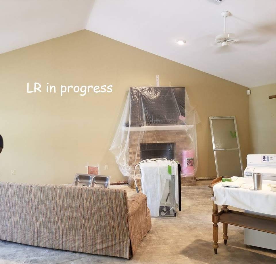
Sharon’s dated 90s living room before
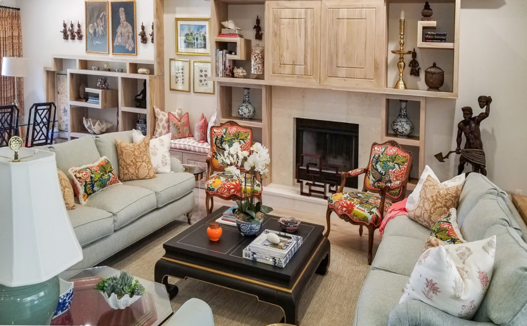
Sharon’s lovely living room
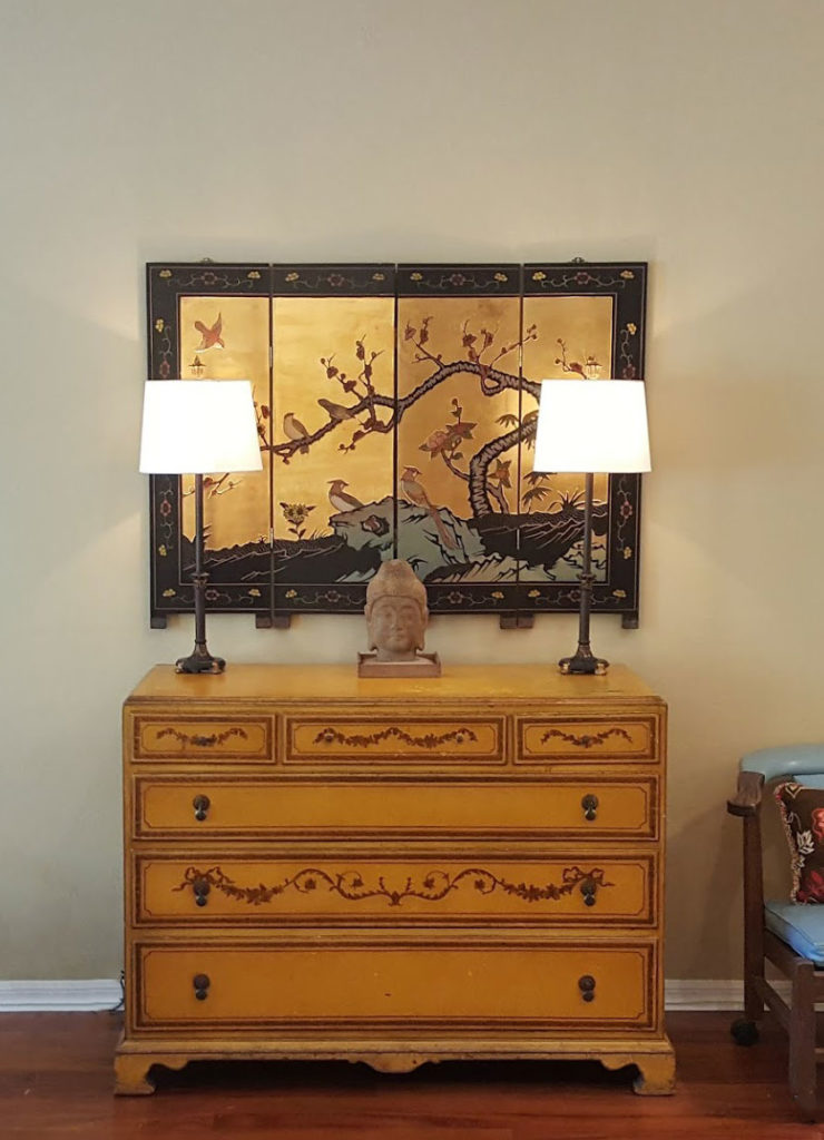
A vignette in the dining room
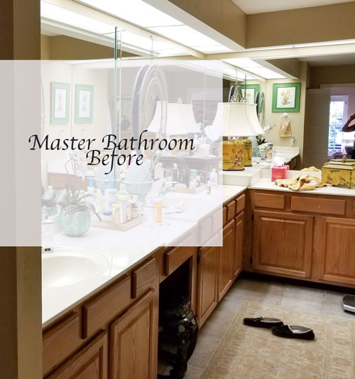
The master bathroom creates beautiful flow from the kitchen
Her master bathroom renovation has a similar look and feel which really creates flow in this house:
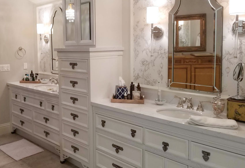
After Walls: Gray Owl | Cabinets : White Diamond
Here’s the before and after again:
After
Gorgeous work Sharon! Thank you so much for sharing your home with us.
This is what Sharon said about the workshop:
Finding Maria’s blog was the beginning of a journey. Finally there were answers. Finally someone was demystifying the secrets of color that I couldn’t decode.
When an interior designer’s work is shown in a magazine, you are rarely told why they did what they did. It is very frustrating for a non professional.
I took Maria’s course to find out why some colors don’t work together and others do. I finally got it.
The confidence of being able to figure out what the colors should be allowed me to dive into my renovation project would not have been possible without her course.
Like Maria says, once you see it, you can’t unsee it. I have always loved color, and want to get it right. With Maria’s course you’ll get it right.
My Toronto course is totally SOLD OUT, but you can register here for Atlanta, San Francisco, Houston or New Jersey.
I also wanted to share that my home was recently featured in Luxe Lifestyle Magazine, here is the article:
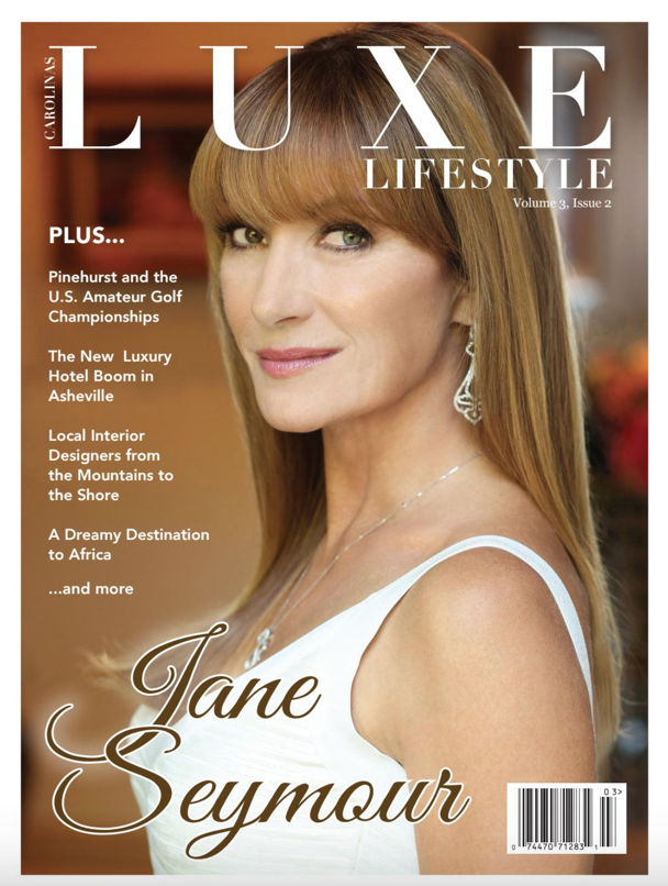
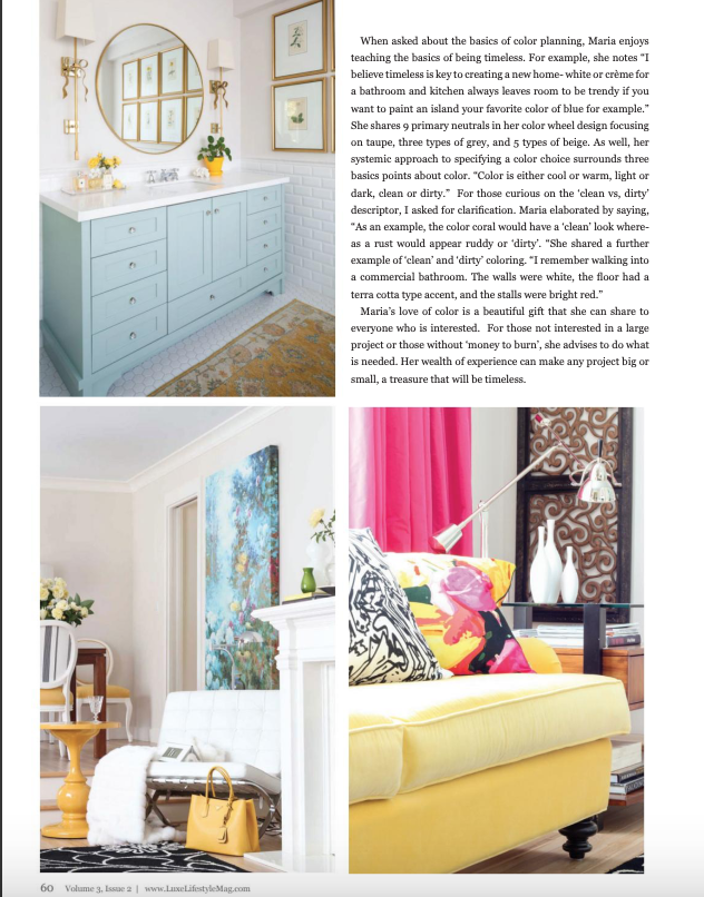
You can flip through the magazine here. This story starts on page 56
Hope it’s Spring where you are! It only arrived for us on the weekend!
Related posts:
5 Gorgeous Rooms to Copy the Hot Trend you Need to Know


What is the white color in the kitchen cabinets did she end up using ?
Thanks
Maria /
Just find the white color as I read back through this it !
I do like the white with the off white .
The blue kitchen cabinets are Provence by Annie Sloan Chalk paint with a white wash and white wax. The white cabinets were not painted they came that way and were left as is. White Dove came closest to their color.
Gorgeous. It’s so refreshing to see a kitchen with character. As a kitchen designer I think my eyes will fall out of my head if I keeping seeing white kitchens with grey islands and marble-look quartz tops for much longer.
Lovely! Beautiful! I’m curious about the floor in the master bath. It looks like it may be similar to my floor which has been determined to be a green gray undertone with some taupe also. I’m just curious about the choice of White Diamond. Maybe I don’t need to be so upset about my floors anymore! I used Simply White but still wondered if I should have used a creamier white with my floor. Just curious if anyone has a response, I’d love hearing it.
I think the tile might be similar to yours, but there is so much beauty in the room, your eye looks elsewhere and ignores the floor. The space is crisp, classic, and a treat for the senses. I’m so lucky to have seen Sharon’s home in person. I applaud her style and joie de vivre.
Thank you. The floors in the Master Bath were in the house when we moved in, I didn’t change them, but did the same exercise with my color boards and picked the color that I thought went best.
Great job! Where did she get the sofas?? What color is the fabric?
Thank you, I bought the sofas through a retail shop in Naples, Fl. that specializes in newer on trend consigned goods, but also now sells new furniture. They are Robin Bruce, and the color is Sea Foam Crypton fabric.
What a beautiful home, Sharon! I love all the interesting details and colors. Your lanterns are wonderful! I’m also coveting your inspiration room.
Congratulations Maria on the great article! Your explanation of clean and dirty colors will make sense to everyone. We’ve all seen it.
Spring is cautiously springing forth here in Southern Oregon after a snowy February.
I adore Chinoiserie. Outstanding work here!
Wow, wonderful and it reflects your inside self, not a manufactured look.
You must be a very patient lady and your patience reflects it.
Beautiful. I hope this is her forever home and she gets to enjoy it for a loooong time. Such a transformation. Well done!
Congrats on the article, Maria.
Hi Maria,
Thanks for showcasing Sharon’s home. I’m so impressed with her ability to personalize her home.
It’s not what I’m used to seeing. Most pictures of professionally decorated homes are so vanilla.
Bravo, Sharon! Bravo!
WOW! Can I hire her? Unbelievable! It’s especially shocking to me because I just hated her inspiration photo… and yet, I LOVE what she did. Just WOW!
Wow, it looks terrific and so full of personality. I’m wondering if she customized some cabinets for the kitchen with trim and new doors (the color board picture shows them unassembled) or bought them that way. Would love to see a better picture of the dining room. Great job and great inspiration for us timid souls.
Thank you. The blue cabinets were new, custom. They came in without paint and were painted in place.
It a genius how she balanced that off center fireplace!
I didn’t catch that detail… will go back and look. But, it is magnificent and refreshing.
I love Chinoiserie. This Kitchen makeover is amazing. It’s beautiful, ground-breaking, and brave. I love the color scheme and all the details, features. There’s a lot to learn from studying these pictures/room images.
I wish there was a Before/After floor plan included. And I, too, would like to see more of the Dining Room.
Someone else pointed out the genius way Sharon balanced the off-center fireplace that would send the best designer into a small tizzy.
My only criticism would be the corner between the large refrigerator and small oven and microwave. But, overall, this is an outstanding Kitchen Makeover.
Thank you for sharing.
Maria thank you for showcasing Sharon’s beautiful home. Her kitchen is the most innovative one that I have seen in a long time! It is very thought out and everything balances. Love the blue island and the way she interspersed the blue on the base cabinets. Good job! Also I love what she did in the bathroom by wallpapering a section with wallpaper then adding a mirror! Lovely home!
Also i want to give you Kudos for your article in Luxe magazine! You certainly are now running with the big dogs!!
Where is the cooktop and hood? Is it where the tea kettle is? The photos make it difficult to see.
Hi Kathleen,
I had that same question: where is the cooktop and hood? It looks like a cooktop could go on the black granite countertop section opposite the sink between the two white Chinoiserie cabinets. Not sure though.
I think you are correct about where it is. There is a weird line/shadow running across the front part of that section of counter and a change in how reflective the counter is in the spot as well (look at how the tray to the left is not reflected by the counter in front of it, but very clearly reflected in the surface just to the right of the tray). I think the tea kettle is on the right back “burner” of a glass cooktop. However, this is the lowest profile glass cooktop I’ve seen, if so. And the controls are either invisible or some sort of touchscreen type thing in the cooktop I guess?, because I can’t spot them. This must be a very nice cooktop!
Gorgeous, creative, unique…I love it all!
Great article and incredible transformation! Those decorative plates remind me of the traditional blown glass ones we have in Murano!
Congrats on having your home featured in LUXE magazine! Very exciting! 🙂
Truly amazing makeover! While it is not my style, I love how the theme is carried out seamlessly throughout the house. Well-done!!!
DITTO as excellent job Sharon on making your house ‘your home’ . That said; though not quite my style either, do appreciate many of the elements.
@Maria: Congrats on being featured in Luxe Lifestyle Magazine, as IMHO totally well earned. -Brenda-
What a beautiful home Sharon has created! Her kitchen is so fun and unique, and I LOVE her living room and bathroom. I totally want more photos…more close-ups of the details, other rooms, etc. I can’t stop looking at the beauty 🙂
Maria, congratulations on being in Luxe Magazine! Such lovely pictures of your home and a good article, too!
Thank you for sharing your cheery home Sharon. So much detail and a feast to the eye. I had a little smile to myself when I saw the coral hall wall, you have learnt well girl.
Thanks Maria for adding the link to your article – you are certainly spreading the word. Hurrah!
I really prefer the new colour wheel – before you took out the inner colours I, too, worked from these outwards. Now, with the undertones larger and next to each other it is blantantly clear. Great move for beginners I think. I am impressed by your never-ending quest to make your concepts clear, use-able by all, and accessible world wide through your blog. Thank you so, so much.
Maria, I wonder if you could comment on the different whites that I see in Chinoiserie kitchen (white dove being a bit warmer and the brighter cleaner white of the countertop). Also the before and after picture kitchen is very much like the situation I am facing. Bright white backsplash, yet the painted cabinets appear warmer.
Thank you kindly,
Ro
Looks incredible Sharon. Can’t wait to see it in person