


Before you read this post, please read this:
The new colour wheel is NOT AVAILABLE on the site yet. It will be printed soon and my subscribers will be the first to know when it’s for sale.

Maria Killam in Dallas
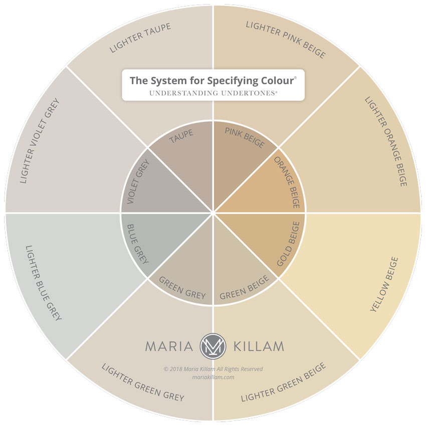
So this was what my wheel looked like when we printed it last year (above).
After giving it to all the True Colour Experts who attended my live colour training in 2018, we then sent out a survey. Before I printed thousands, I wanted to make sure it was clear and easy to understand.
This was the primary feedback we received:
People were confused why I included the primary colours
AND
Everyone assumed the whites on the wheel related to the nearby undertone – they did not
You can technically use any of the whites with any of the undertones. Whites don’t relate to neutral undertones.
In other words, if you have blue walls or blue grey walls, the ‘answer’ to which white trim goes with either of these is NOT a blue white. It could be, if you were in a bathroom with Carrara marble for example. But it could also be any of the other gradations of white in my system depending on what is happening in the room.
Whites should always be chosen or specified based on:
1. How light or dark the wall colours will be as well as how earthy they are.
For example, you can choose a crisp, true white for a navy blue or dark emerald room, but if that room is dark brown or gold beige (because the latter two are earthy colours), a true white will be too white. Then you might need to specify a white closer to cream.
2. Which gradation of white you identify in your existing fixed whites in the interior or exterior.
I have seen too many kitchens and bathrooms where the white on the cabinets is either too stark or too creamy or in no way relates to the countertops.
The countertop and/or the tile. That’s the first place to look to coordinate the right white or colour your cabinets should be painted.
Studio 52 (The whites here are perfect)
And, since the background of most fabrics is off-white or cream, true white should be used less frequently than an off white.
If you really want to learn the best process to find the right white to specify in any situation, my White is Complicated eBook is what you’ll need.
This way you’ll actually get your whites right. Much better than the other way: endlessly polling friends, family and famous designers to find out which white is their favourite. How does that help you be sure it will relate to YOUR room?
So here’s what I learned: I was trying too hard to have both my system of understanding whites and my Understanding Undertones® system on the same wheel.
And, as it turns out, you cannot print whites accurately.
All fan decks are painted, not printed. Otherwise it would be impossible for them to be accurate. The printing process can cause the product to vary widely from the start of the job to the end.
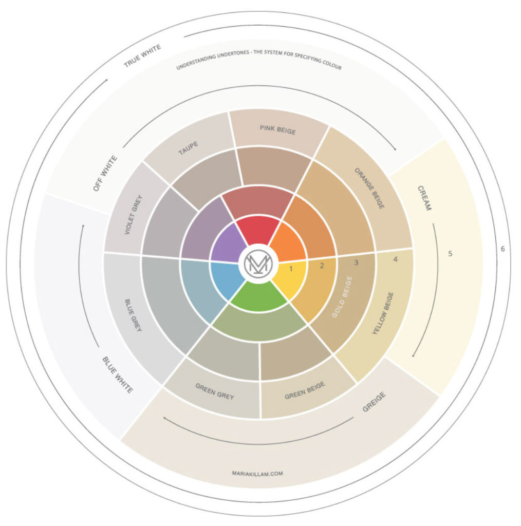
So here’s the new wheel:
Much easier to see right? It’s cleaner, so you’re clear that this is about neutral undertones. And it doesn’t need the primary colour wheel on it because it just added an unnecessary layer of confusion. Besides, everyone knows what the primary wheel looks like.
Simple is always better.
In Palm Desert last month, one of my fabulous readers who lives there, generously came to meet with me so I could understand firsthand, how someone might use the wheel.
I’m too deep in it to be able to imagine different ways of interpreting it. I’m obviously not consulting my own wheel the way someone else would.

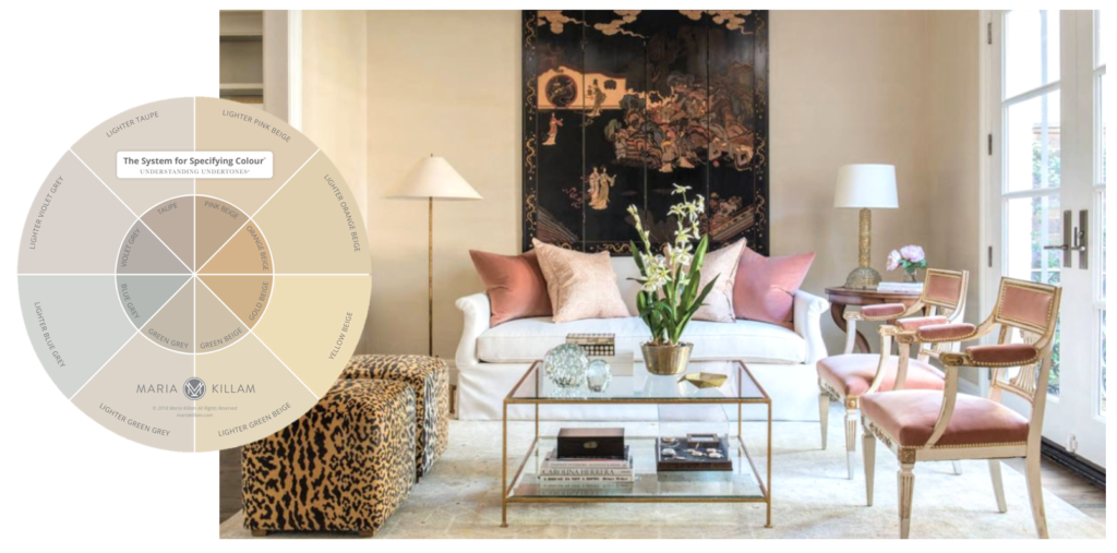
When I asked her how she might instinctively use the wheel she said, “Well, I like red. So I would find red on the wheel and then look to see what undertone corresponds with red.
Well pink beige or taupe are the neutrals that correspond with red according to the wheel (below). However does this mean they are the only or best two neutrals you could use to decorate with red?
Absolutely not.
So we removed the primary colours and whites altogether.
And I’m so grateful for that insight.
On the back, I’ll have the instructions for how to use the wheel and how not to use the wheel.
But let me show you how powerful this wheel will be:
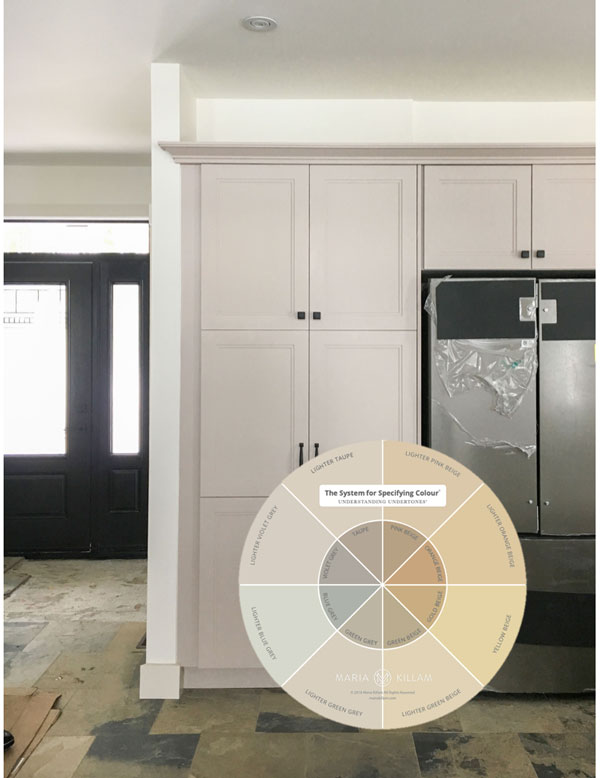
You might remember this kitchen from a previous post I wrote here:
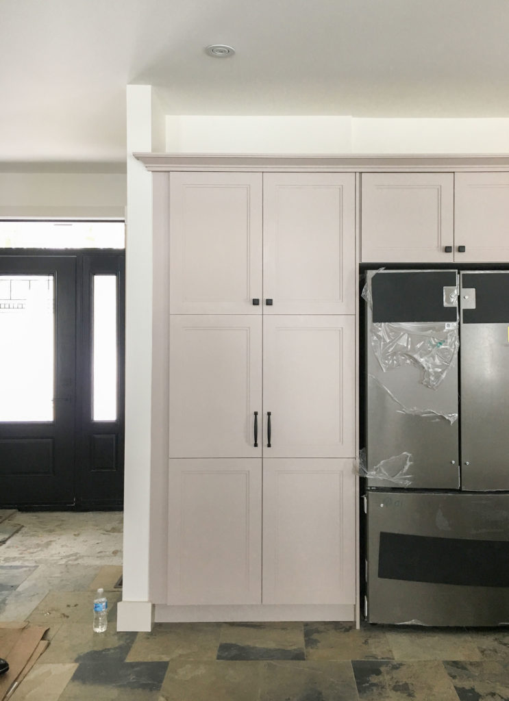
My reader had chosen a taupe and when the cabinets were painted and they looked so pink in comparison to the slate floor, her cabinet maker suggested she ‘observe the cabinets in all the lighting throughout the season’ before she decides to repaint them.
If you read the post, you’ll know that it had nothing to do with the lighting. It was simply the wrong undertone.
If you missed the post, test your eye next.
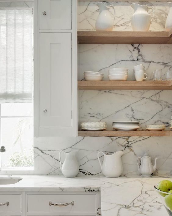
Look at the following image and notice which undertone looks the closest from my colour wheel:
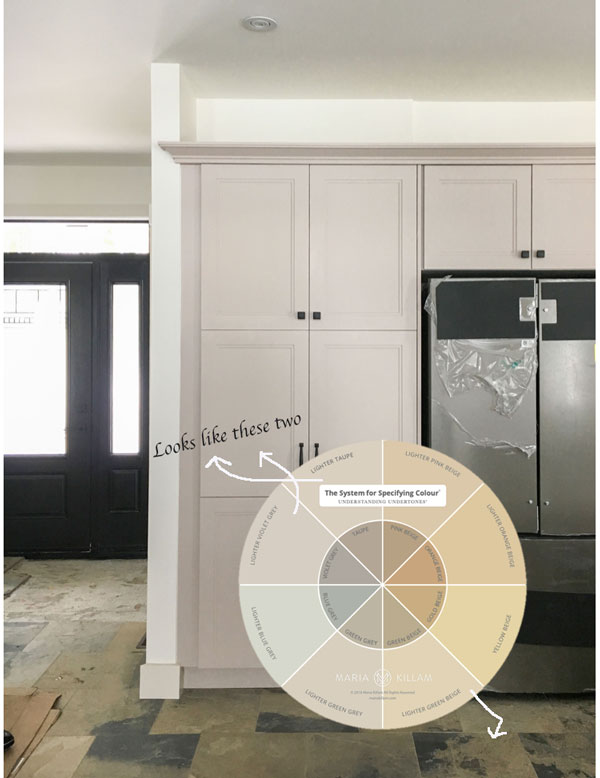
It’s pretty obvious right? If we could go back in time and give my lovely reader the new colour wheel, before making such a huge, expensive mistake, she would have been able to place the wheel directly on the tile floor and discover that the right colour was in fact in the realm of green beige.
Then you would go to my curated list of colours (4 or 5 per undertone) and choose the one that works the best.
You can download my How to Choose Paint Colours that includes my Bonus Book of Curated Paint Colours here.
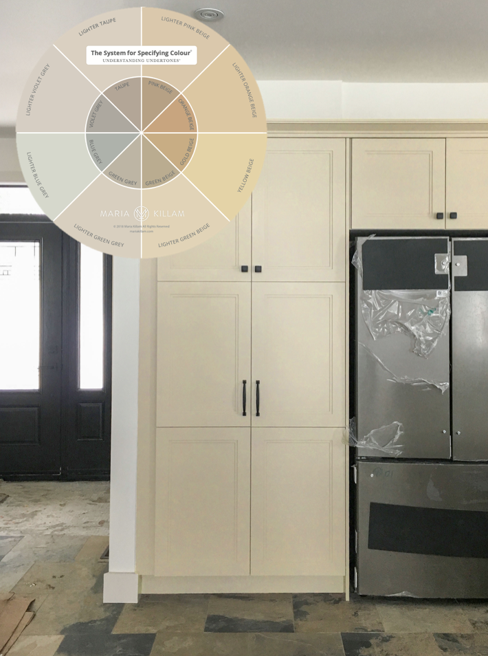
It’s really that simple. Here’s what the same kitchen looks like, photoshopped in the right colour:
Here’s another room by Sarah Richardson. Which undertones do you see here with my wheel to guide you?
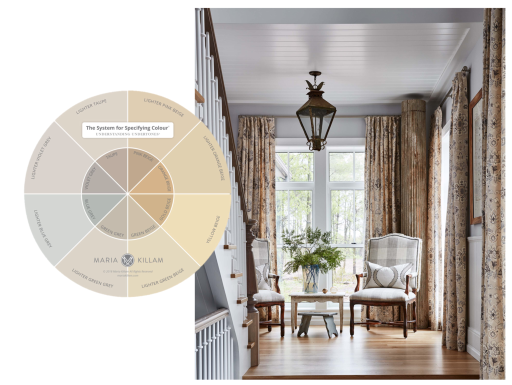
Answer: Walls, blue grey | Drapery. taupe and orange beige | buffalo check chairs, taupe
What about this lovely room seen on Cote de Texas blog. What’s the undertone of the walls? If you’re not sure by looking at the lighter one, make sure you view the darker one as well to keep you on the right track:
Orange beige walls (I know, they’re back)
Or, what if you’re shopping for rugs? It becomes a lot easier when you know what colours you’re looking at:
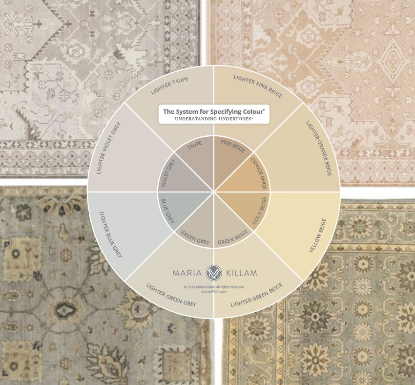
One Kings Lane Top left | Top right | Bottom Left | Bottom Right
That’s how you use the wheel. In fact, when it’s available, it’s probably best if you don’t leave home without it.
The new wheel will be printed soon. I will launch it first to my True Colour Experts and then on the site.
PLEASE NOTE, it is currently NOT AVAILABLE for sale on the site yet. Blog subscribers will the the first to know as soon as it’s available.
However, the first group to receive it will be participants who attend my Specify Colour with Confidence workshop this Spring.
I have added a new exercise to include the wheel and I will show you how to use it powerfully, to shop online AND specify the right colours in your eDesign business on Day 3.
If you understand undertones, you can snag the wheel from this blog post and start using it immediately.
You’re welcome.
True Colour Expert Michelle Marceny with the Color Concierge had this to say about how she’s using the wheel in her business every day:
A year ago I launched The Color Concierge, an online color consulting company. I have always loved color, and was inspired by your blogs. I flew to Dallas for your Live Color Consulting training, and I am proud to be a True Color Expert.
I believed so much in your training that I also invested in the course for Maddie, the other color consultant at The Color Concierge.
The course was the best investment I ever made.
I can honestly say that after learning your color system, I see the world without filters, and it is the foundation for The Color Concierge business. I learned so much that I came back a year later to retake the course, and it was also a great investment in the business.
One of the amazing tools is your Color Wheel. I use the electronic version every day as an indispensable tool to diagnose colors in my e-design business. The color wheel goes with me to every consultation.
Keep up the amazing work. I am always learning new things from your blog, and the True Colour Expert Facebook page.
One more thing. . . even without my business the Live Color Consulting training would have been worth every penny. We are building a new house, and without the training, it would have been a disaster. Thank you!
Specify Colour with Confidence Spring schedule
TORONTO, April 1-3 is SOLD OUT
Seats available in these courses below:
ATLANTA, April 10 – 12 (We won’t be back again for two years)
SAN FRANCISCO – April 15 – 17
HOUSTON, May 8 – 10 (We won’t be back again for two years)

Brilliant! When you produce these, I’d love it if you added the note “if you can’t determine the undertone by looking at the outside of the colour wheel, check the darker colour in the centre”. I hadn’t even thought of doing so, and it would be helpful to others to remember your helpful hint. Can’t wait!!!
Yes the outside of the back will have the dark colours! Thanks Jil for the suggestion! Maria
I’m so happy you simplified the wheel. I felt so stupid when I couldn’t understand what you were saying with it. I’m not a decorator or colour expert, just a long time fan and follower. I could see the matches in this post easily. I will look forward to further posts that show the actual uses.
So. much. easier. 😉
Great job, Maria. With this tool I wouldn’t have had to use little paint chips from my collection to determine the undertone of the walls (yup, light orange beige!) and “Tuscan” hard finishes in our new apartment.
This is SO much better. And although your explanation of how to use this version is excellent, the wheel is so straightforward I was able to see its application without your instructions!!!!
Thank you for listening to the feedback you were given and thanks to your followers for giving you their insights.
This is what makes you great at what you do – you are always eager to put forth the best info and products, even if it means making revisions!!
Can’t wait til the wheel is ready- even though my house is finished, I want one!!!!
Awesome awesome awesome! I am an amateur my-home decorator with a good eye and I can see how very powerful this tool is. That’s not marketing hyperbole you’re just throwing out there – it really is powerful.
Bummer, the whites and primary colors made me understand it SO much more. Now it looks more like a sample wheel, as opposed to a color wheel which shows relationships to whites
Hi Margaret, maybe my post was not clear, because the whites are NOT related to the undertones they did not belong on the undertones wheel. AND as it turns out, you can’t print whites accurately they have to be painted. Thanks for your comment, Maria
Yes! I love seeing the progress from the first draft. This is great!
I love the simplified wheel. This is going to be an awesome resource.
So exciting!
If you keep blowing my mind like this I’m going to need a helmet when I read your posts.
This looks great! As a color enthusiast because of your blog, I’ve been carrying around color boards, guessing the undertone and using the boards to check myself. One of my current favorites is greige so I’l be interested to see how greiges work with the new wheel. Will a greige still fall into one of the sections of the wheel based on its primary undertone or is it more likely to be in the green/gray or green/beige area?
Because greige has become so popular, we technically have them in pink beige and taupe now not just green beige and green grey, they are all on my bonus book of colours 🙂 Thanks for your comment! Maria
What is your bonus book of colors?
Hi Maria, congratulations on completing your color wheel! I can’t wait to purchase it. Did I miss an update to your Bonus Book of Colors? I can’t find any greige listed.
We are sending out updates to everyone who has bought the book, I have recently added all the colours that are available in large sample sizes as well as the greige colours! Maria
Yay! Thank you!
Kudos Maria! Your color wheel is spectacular and to think they say you shouldn’t reinvent the wheel; you made a better mousetrap (or color wheel)!
LOVE your new color wheel. It truly makes so much more sense!
Looking forward to acquiring one of my very own!
I want one!!! Please let us know when they are available. Thanks.
I hope I can order one when it’s available. Then maybe I’ll finally understand what you’ve been teaching us all these years. ?♀️
I can hardly wait. Even the first one was exciting, but this is so much better.
By the way, since I started reading your blog back in 2011, I find that my color memory is much improved. I can often match the color and undertone I’m looking at with the one in my mind. I’ve even done this for major purchases. I get things home, and they match. I could never do this before! But it will be wonderful to carry the wheel with me for no mistakes, ever!!
Maria,
Congratulations! It’s perfect! What a wonderful tool to have while working with my clients. Thank you!
Hello Maria,
I hope the diameter of the circle is bigger and the labels for each section in a bolder black font . The older one is very hard to work with.
Ann
Yes they are bigger, the other one was way too small all around! Maria
Perfect!
Fantastic!! I really like the simplicity, and I’ll really be able to use this! Can’t wait to order one. Thanks!
Maria congratulations! This color wheel is brilliant! It is so much easier to understand and use. I even used the printed one that I downloaded to check out color of clothes that I was purchasing to make sure all the undertones worked! This is going to be a lot of fun to use for many applications! You are genius!
Hi Mrs. Killam, I bought your ebook understanding undertones. Have not read all of it. I like this color wheel. So I ahve a question. With the wheel, I can tell me it helps to undestand the undertones, but does this help me to and buy the right paint color?. When I pick out the piant color, then I suppose I use the buy the paint that has the same undertone of what I am trying to match up? Thanks.
Yes, once you identify the undertones in the room, choose the one that will pull the room together. So you want to be looking at the colour of your carpet, or sofa, or drapery. . . then choose the two lightest undertones and choose the one you like best! Hope that helps, Maria
Maria, I absolutely love the newly revised lol colour wheel!!! Perfection. Genius! Can’t wait for it to become available. Now I’ll need to buy those sample boards. It’s true. When you add up the cost of the poster board, sponge brushes, paints etc.–it is well worth the investment to buy yours. And a lot less hassle hehe. Thank you. This wheel will be an absolute game changer.
So we’ll done Maria! I love that the color goes right to the edge for best match possible when laying the wheel over a surface. And, I really love all your testing and tweaking that’s gone into making this tool really valuable for us. Thank you!!
Great post – so helpful to see the color wheel in action. Can’t wait to get my hands on one when I see you in New Jersey in May!
Great post, can’t wait for the wheel!
You are a gift to all of us that want a happy home! We’re building a new house and I can’t make a move without checking with the advice you’ve given to all of us.
A few things I’d like to see on your color wheel, or should it be called ,”The Wheel of Undertones.”
1st: I’d like to have another row that reflects the “lightest” value. Ex.: Lighter Green Gray, and then a “Very, very light Green Gray.
Reason: The lighter you get, I’ve found the more difficult it is to see which to choose.
2nd: Since you talk about “dirty” and “clean”,it would be helpful to have two more rows added on to the wheel that reflects these
values so we can easily see the differences for each segment of your wheel.
Love your approach to timeless choices!
Hi Kathleen,
The reason I am not going any lighter on the wheel is because the printing process is limited, you can’t get super accurate. Anyway, the wheel will help you narrow down which undertone is right (your furniture is not going to be the palest of greige, etc. so then you go to my bonus book of colours as I mentioned above and choose the lightest undertone if that’s what you’re after. All you need is my curated list and you’ll be able to figure it out!
Hope that helps,
Maria
Maria-
What if I see more than one undertone? Would I go through the colours boards and compare until I find the correct one?
Yes that’s exactly what you would do, but the colour wheel would at least narrow down your options immediately. Maria
Maria, What if the item is multi tonal?
This is actually brilliant. Thanks for this eye-opening post, I get why sometimes it’s really difficult to pair neutrals – your wheel is going to be a life saver for a lot of people.
Just from reading your blog I see colour differently. I was buying paint the other day and a chap came in with three gallons of Abalone Benjamin Moore, he showed the clerk a photo of his purple wall and both he and the clerk scratched their heads and said it was the weirdest thing that the light made the paint purple. Boy, did the clerk give me daggers when I chimed in that Abalone is purple based.
Love the photo with the combo of the Blue Grey, Taupe and Orange Beige. So in other words you can use a combination of the 3 undertones?
They don’t clash, however in that image the drapes are taupe and orange beige and the buffalo check on the chairs is taupe so in actual fact a taupe on the walls would have made more sense than blue grey. However, the room is styled so beautifully no one cares. However the general rule of thumb is that you shouldn’t repeat more than two undertones in your decorating, it starts looking like you couldn’t decide on a colour so you just kept choosing a neutral. Hope that helps, Maria
I love those white kitchen cabinets. It makes the room look and feel clean.