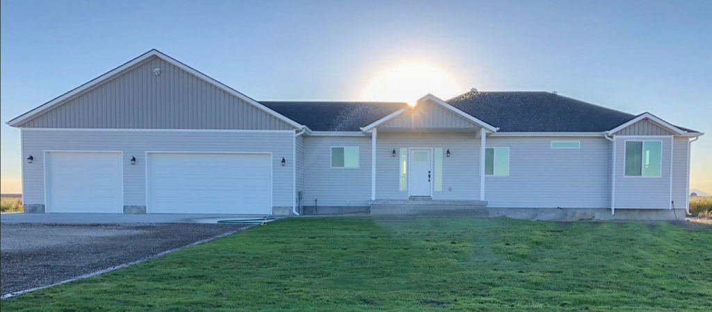
I recently received this question and photos from a reader:
I have loved following your blog, especially during our recent new build.
We didn’t have all the money in the world to put into our house, but we were very good at getting what we want and keeping under budget. And yes we did follow the trend I guess by going with a grey exterior which is already outdated, but I still like it.
So my question, what can we do to amp up our exterior? Obviously we need some landscaping, and that will come, but something is missing and I’m not sure what it is.
When we started building we had budgeted to add rock halfway up like you see with lots of homes, but I remember reading you didn’t like the halfway up, that you prefer all the way around? And I don’t like when the homes have 3 or more different sidings/rock/shingles. We want to add some stone to the pillars to beef them up, originally I would have loved the thick wood beam pillars, but the upkeep wouldn’t go well where we are with the weather. (We are built in the middle of a farm field, with lots of wind, and no coverage.)
Is the problem the architecture?
Originally the architect had drawn an extra triangle thing above the front door, but it just felt like extra unnecessary stuff, were we wrong to leave it out?
We also changed the plan by lining up the two garage doors so they were the same size instead of having one stick out further. Keeping it simple, and practical.
Would adding stone to the pillars help? Or adding it to the house? Both?! I thought about shutters but I don’t think they’d fit and look real.
I’m just confused on what’s missing. Can you tell me please?!
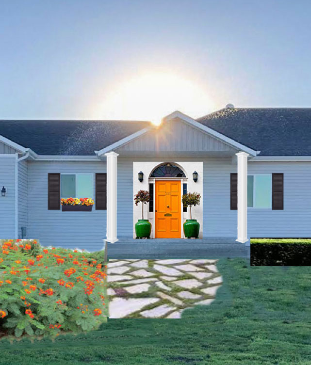
The biggest issue is the windows on your house, they are too small and there is no symmetry. I asked my fabulous landscape architect MaryAnne White out of New York and she suggested the window box below the one on the left that’s too short and the shutters.
Also, your columns should be a minimum of 8 inches wide. They will definitely look better without stone. It’s great that you opted not to install stone halfway up as is often done. It’s not necessarily bad to do that, it will just look slapped on in most cases unless it clearly is an integrated part of the design.
There’s nothing wrong with your pretty blue grey siding, it would look way more trendy if you had painted it a dark charcoal or something close.
As you said, landscaping will make the biggest difference and I have photoshopped in some flagstone as well as a boxwood hedge to add interest.
Obviously you’ll need a much better plan than this, Maryanne can help you with that! Contact her here.
For those of you who are new to this blog, MaryAnne helped me completely redesign my front and back yard 6 years ago (All via eDesign, long distance). I think of her every single day, because I love my landscaped yard so much!
See all the before and afters here.
I have one more plug for MaryAnne and that is this: landscape design is technically the least expensive part of landscaping. It’s the plant material and labour that adds up really fast. And if you’re doing it yourself, wouldn’t it be so much better to have a great plan rather than just running to the nursery on your own and ending up with a yard that’s just ‘meh’?
Just sayin’.
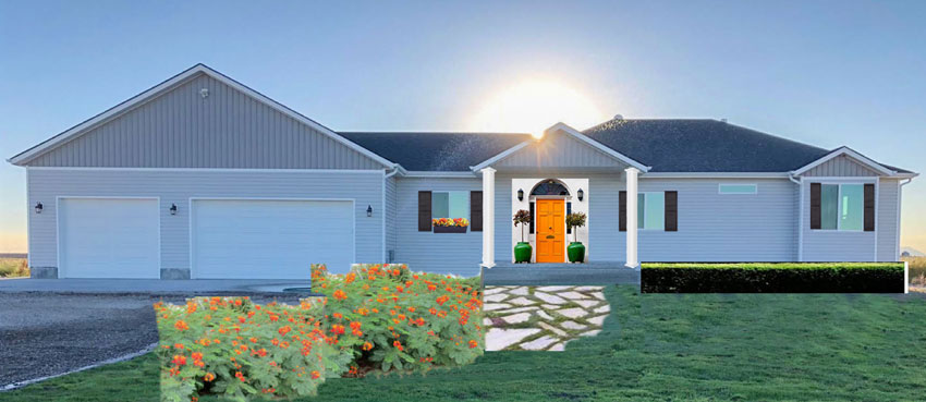
While working on this post, I sent MaryAnne a photo of the boxwood hedge I inserted via photoshop. A little while later I sent her the photo with the flagstone, she replied:

MaryAnne’s other suggestion would be to add a pergola over the garage (below). She also suggested adding fake mullions for the windows (shown below) so they look less like inexpensive sliders.
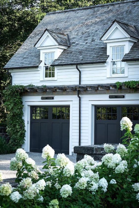
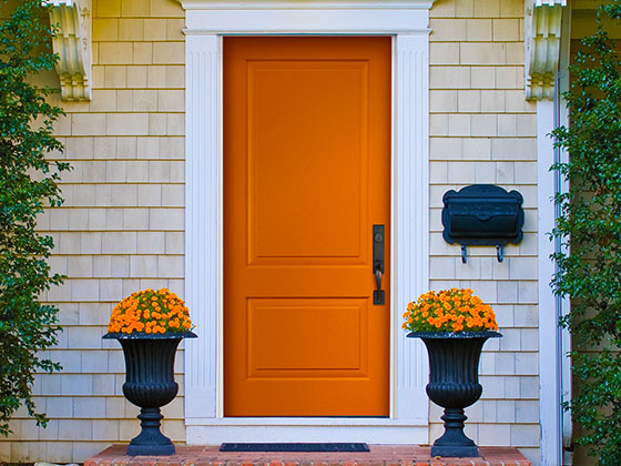
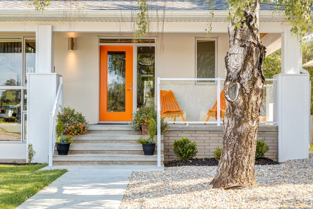
And don’t forget the front door can add a great punch of colour! Repeat the colour in orange flowers or patio furniture if you are someone with a patio outside your front door.
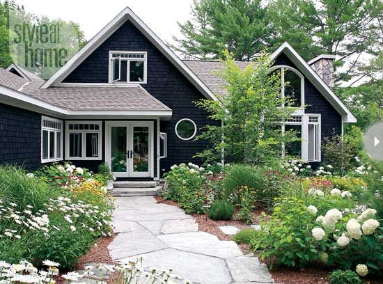
Here’s some more flagstone inspiration:
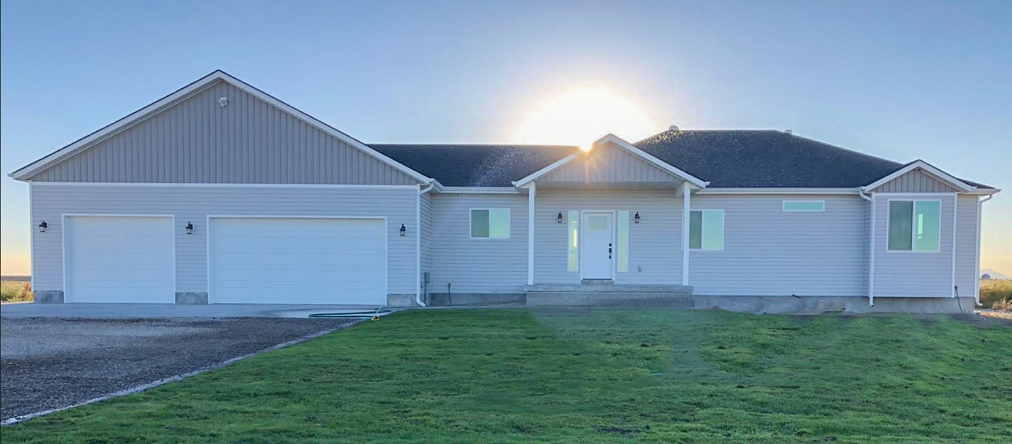
Here’s the before and after again:

Hope this helps! And if you’re building a house, don’t forget about the front windows! I assume my lovely reader has windows in the back of the house, but I see this all the time where the front has barely any!
If you have a question for my Ask Maria column, email me here. WITH PHOTOS! I can’t help without photos.
And hey, don’t make a mistake with your exterior colour, I can help here
There’s still time to jump into either Houston or New Jersey Specify Colour with Confidence events in May! Register here.
PS. I am speaking at the Westcoast Small Home Expo on the MainStage, June 1 & 2, at the Tradex Center in Abbotsford (my own back yard). I’ll be speaking about the 10 Ways to Love your Small Space; 5 Things to Do and 5 Things NOT to do! The tickets are only $10 each, get them here.













I never would have thought of the windowbox! What a difference that and the shutters makes. I think a small specimen tree/tall shrub like a camellia would look nice on the right under that rectangular high window.
Ditto Katherine, I totally agree! Also, eventually get larger exterior lights.
Or a trellis with a wonderful climbing rose on it, below the rectangular window! Yes, definitely something is needed there.
Loved this post and all the ideas.To the reader who sent the photos- thanks for sharing! I would suggest larger lighting. Your lights need to have more impact. I recently renovated a very plain rancher and improved the exterior a lot by changing the lighting and the garage doors. If you have a front facing garage, those doors are almost a third of the space! You can add the inserts that look like glass and that would help.
I would beef up the light fixtures too. They look too small.
Hi Maria, I’m a new commenter here–love your blog. (I’m a landscape designer–but not really practicing now, just dabbling when I can).
I think your matching symmetrical pots at the front door only emphasize the asymmetry of the front porch and the house–and not in a good way. Some big pots and a bench (on the right, perpendicular to the house) are definitely in order, but they need to balance that asymmetry. Always go bigger with pots than you think you need, they always look smaller.
Beefing up the columns is a must and a pergola over the garages is one of my favorite ways to help that space. Even without plants, they look great.
It’s a shame the windows are so small, the shutters and the windowbox do help. But plants can help too. Katherine’s suggestion of a specimen under the high window to the right of the porch is great, I’d suggest a small tree with great winter interest–a coral bark Japanese maple would be fantastic against the grey house. (That’d look great with a coral or orange door!) Be sure the tree has and is maintained with a good structure–careful training and pruning is a necessity.
I’d definitely suggest curving beds for this home. Boxwoods are great, but don’t grow well everywhere and are quite costly. There are some wonderful hollies we use here in North Carolina that are easy care that might work; dwarf yaupon holly is one. But that plant choice depends on the climate.
This landscape is a blank slate, and I’ll echo the suggestion that the owners start with a professionally designed plan. It’s well worth it.
I absolutely agree with everything Lynn posted, especially about curved beds instead of boxwood.
So this was not a plan designed by MaryAnne. Simply an effort (by me) to show how much better it would look with Landscaping. Obviously MaryAnne’s plan would be completely different, not to mention, much better than mine. Maria
Maria, I have been reading your blog for years, just wanted to let you know I’m still here with every post even though I don’t comment much. This transformation is really great, love the before and afters, gives me inspiration! Love you seeing you grow your brand
Landscaping was definitely the first thing I thought of when I saw your readers photo. I hope she has a green thumb and lives in a climate where she can plant some lush hydrangeas or something! It will look fabulous when she is finished!
Hydrangeas are beautiful (I have 5) but something with more seasonal interest is also needed. Hard to know what to suggest without knowing her climate zone. Grasses can be gorgeous and will sway in the wind. They stay quite well unless the snow is very heavy.
Hi Maria, I would also recommend beefing up the windows by adding casings and headers. The windows look so lost. Just a thought!
I can attest to the transformation that landscaping can do. My grandparents had a beautifully landscaped yard when they were alive. It was a fairyland to a child. When I saw what the house had looked like before all the planting, it was a shock. The landscaping added so much dimension and made the house itself appear more significant.
Trees!
Thought I would give you a visual for the garage doors.
https://www.clopaydoor.com/coachman
I totally agree with the lighting. I found three on Houzz.com about twice as tall as I already had and more up to date in design and installed them myself. They made a huge impact for less than $200. I didn’t have the money for a pergola. I put a chain on a hook under the eave and am training a vine on it. It covered the chain first season. I’ll train it to go over the doors as it grows. Work in progress and slow, but hopefully the end result will soften the expanse of garage doors without the construction expense.
Thank you for your suggestion!! I’ve always wanted a pergola or a vine over my garage and there’s just no way to do it with our low roofline (and low budget). I’m going to try your idea out!!
About column size… there is an *excellent* book outlining the formula for getting the proper size. Get Your House Right: Architectural Elements to Use & Avoid by Marianne Cusato . I can’t say enough good things about this book! It’s like Maria Killam for architecture. 🙂 Thank you to the reader who submitted this question about a real house. 🙂
I second the book suggestion- it’s an excellent resource! And the reason I was going to suggest the porch needs a lintel the same color as the trim over the columns (the horizontal piece supporting the porch gable). I think that’s the name- oh dear, time to get Cusato’s book out again? It looks structurally unfinished as it is.
Or maybe it’s called the “entablature.” Anyway, this porch doesn’t have it and that could be part of that “something’s missing” feeling.
Interesting post! I always wondered why architects don’t use more symmetry in their designs. Anyway I agree that the posts on her entryway needs to be beefed up. The flower box is also a good idea to change the size of the small window on the left. Larger coach lights will help beef up the look of the house. I like your photoshopped rendering Maria! With a landscape design I am sure it will look 100% better. Hope she will post the after picture!
I think you’ve covered everything I was going to mention. The windows, lighting, landscaping, & the porch posts. And congratulations to her & her new home. How exciting!
DITTO …. as the same goes for me. ☺ -Brenda-
Great ideas but how about a deck? A deck is not beyond DIY skills. If you stretch a deck across part of the front of the house you will have instantly drawn the eye and attention to the important part of the house – the living area. You could just do the right hand side, ending it before your last window bump out on the right as you face the front door but both sides would be an advantage. Could be decking or concrete. Now, in stages as the budget allows: add a column at the end, and a couple rafters then some hanging plants (faux if the weather doesn’t allow for real), a couple chairs from a garage sale or matching black rockers, a little table, some pots and plants or large items of interest;a swing on the left hand side, and presto, the large garage section of the house no longer seems to dominate. Thanks for a fun hour drawing designs.
On the pergola picture — what is below the pergola and above the garage doors? Is that some sort of lighting fixture? If so, can you send a link as to an example? Thanks. Interesting.
If you look at Maria’s house, before and after landscaping, you will see what a difference that can make. Especially with a super talented designer!
Do not consider the box hedge, it is way too linear for a house already with such straight lines. Depending on your climate, pick a small, decorative tree to go in the area in front of the high, shallow window. Do not plant it close to your house!!! Just keep a mulch for a few feet perimeter so that area doesn’t have to be watered near your foundation. Have a curving bed around it the tree, depending on what you decide for the steps and walkway.
Yes, it looks like you could have larger outdoor lights. I do remember a real estate agent telling me how she advised one of our neighbours to buy the biggest ones that were sold (that house was very large).
A window box is nice, just make sure that it is large enough and that it is accessible for watering. I probably bought my current house because it came with integral window boxes, I love them and have drip irrigation to keep the plants moist. In the winter I fill them with pine branch cuttings, easy for me to get for free. But you can be creative.
A bright front door will be wonderful for your home. Pick your favourite colour that goes well with the siding. Have fun!
Pleeeeaseeeeee! No Eyebrow Window at the front door! Don’t turn the posts at an angle – just make them a bit bigger. No pergola at garage if you are in a harsh winter area – just more upkeep. Yes, Use some Color on the Front Door and Shutters.
I have a Ranch Style house and have window boxes and I absolutely LOVE them.
I’d suggest painting the garage doors the same color as the house. The white just calls more attention to them. I’ve never understood why so many homeowners use a trim color or different color on front-facing garage doors. It only emphasizes the garages.
And may I suggest larger light fixtures on front of garage and by front door? Cottage style come to mind and they, with the pergola, would add quite a bit of charm to the exterior.
Maria –
I called your landscaper designer .
She is definitely a breath of fresh air .
I’m hiring her to give us a design for our front lawn area .
I’m very excited to see what she comes up with.
This will be interesting NY meets Billings Mt
OMG, I love MaryAnne what a great comment. The ideas you shared with your reader are terrific and I love the orange!!!
Everything you teach free is such a gift and you have a great sense of humor.
Now, on to a totally different non decor question. Where did you get your fabulous eyeglasses? Love them. Of course, if you had on Dollar Tree glasses they would look fabulous on you.
Thank you Maria.
Boxwoods by all means! They need should NOT be planted in a straight line – think low with curves that can be inset with something that maintains a structure (bones) throughout the seasons. Add colorful blooms as well. So many depend on landscape shrubs which have only a short season leaving the area looking bare the majority of the year. Window boxes are truly a good idea if one is prepared to maintain watering, deadheading, feeding, etc. Consider adding a shrub/tree with berries so that one may enjoy watching birds thru the winter months.