Drive around any lovely neighbourhood or new build site and you’ll probably notice a lot of white and cream houses popping up. This trend is definitely taking over neighbourhoods all across North America. Here are my thoughts about this colour trend.
Shhhhh. . . . don’t tell anyone, but I’m starting to think beige is actually not back. Not for wall colours anyway.
Cream, yes.
Definitely white (and when I say white I mean art gallery white).
Beige, no.
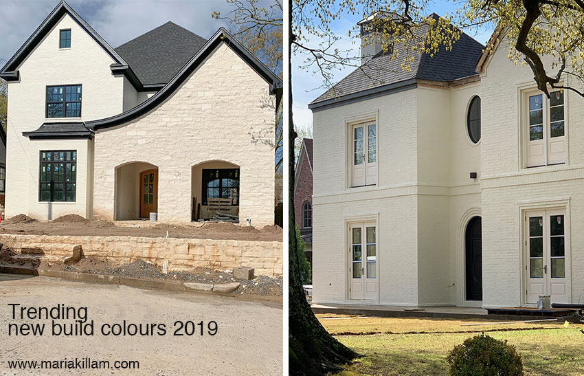
My Spring workshop 2019 season is in full swing. And recently, Terreeia and I (in our travels) drove around a lovely neighbourhood where I saw at least 6 or 7 new builds.
The new trend taking over your neighbourhood
Every. Single. House. Was White or Cream.
That is… white or cream houses with black windows (the house on the right had black windows all around the rest of the house).
The end.
Please read this before you choose black windows for your new build.
When I was discussing this with Tricia (my senior colour designer) I mentioned that I wished I’d started taking photos sooner once I noticed that the 6th or 7th new build was identical. She replied, “Well you can’t notice the pattern until you notice the pattern.”
Oh. Well that’s a smart observation isn’t it, haha.
It got me to thinking. It makes sense that white (or cream) interiors and exteriors are such a huge trend.
The White Trend
The colour pendulum had to swing all the way back to white.
Because we’ve been adding colour to the white walls our parents or grandparents had for 30-40 years now.
The pendulum eventually had to come back to white because it felt the most current.
The brown colour trend came along (right after the sage green trend of the 90s which was earthy) and everything went even earthier, faux finished and very BROWN.
Then the grey colour trend arrived and we cooled it all down and added brighter, happier, cleaner colours.
Then. . . halfway through the grey trend when the oval-back french chair (upholstered in grey linen) trickled down to every nearby big box store for the bargain price of around $199 (so prominent that I had even started calling it the Parisian grey trend), the farmhouse/shiplap look started to overtake it. And we know exactly who to blame for this 😉
In the last year, suddenly everyone I spoke to (who is designing a new build) is doing “the farmhouse look” with black windows and a stark white exterior.
One of my friends, when discussing the plans for her new build, justified her love for this look by saying, “Maria, our house IS in the country, so it will be a FARMHOUSE anyway.”
Busted.
Hey, there’s nothing wrong with trends as long as you don’t overdo the whole thing.
I write these posts to reign you in so you don’t just close your eyes and continue to say BLACK or WHITE or GREY when faced with yet another colour decision. Because trends do not translate for every home in every location.
The Black Trend
And can we talk about black for a moment since it’s suddenly being just as heavily overused as white?
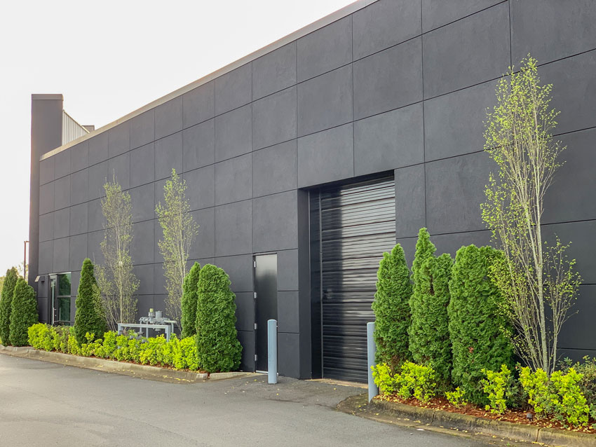
It’s like white is the new residential exterior colour and black is the new commercial exteriour colour.
Photo by Maria Killam
Kelly green looks amazing with black. If you’re going to just go black-on-black, this is the way to make it look good (like with the landscaping above).
But let’s be clear, this is the best photo I got from this black-on-black commercial building. Overall the look was bleak and overwhelming.
And what about this new restaurant? Not so much. I’m depressed just looking at it.
This black exterior trend might be much worse than when grey hit mainstream and I wrote about it in 2011 being used in commercial buildings here.
And one more thing, to add on to the post I wrote about black windows here.
Check out this house and how the windows were covered AFTER the homeowner realized they were not going to hang drapes everywhere, nor did they want to hang black 2″ shutters or blinds either.
White louvered shutters or standard 2″ blinds do not work with black windows.
Please read this before you choose black windows for your new build.
Photo by Maria Killam
Over to you my lovelies, are you noticing this same trend? If anyone actually has painted their walls beige, please post the exact colour in the comments below! That will help everyone.
Please note, I am not FOR or AGAINST any trend. There’s NOTHING WRONG with brown, black, grey, white or cream. But it’s the OVERUSE of any of these neutrals when they become the TRENDY neutral that SCREAMS: “I just decorated or built my house in the ______ trend!”
PS. Here’s the poll I did yesterday on my insta stories.
Part of colour confidence comes from understanding trends and where they are going in your neighbourhood! That’s a big part of the conversation when you’re selling the right colour to your clients.
Learn how to choose the right colour and sell the right colour at a Specify Colour with Confidence event near you. Register here.
Related posts:
What’s next after the Grey Trend?








You are right. That restaurant looks depressing. Reminds me of a ghost town. No life. Obviously you weren’t consulted.
I’ve been doing a lot of color consultations in Tuscan brown homes where I end up specifying Manchester Tan or Feather Down because they work best with the finishes. Clients keep telling me they are sick of gray and prefer the warmth of a beige or warmer greige. Some do ask for gallery white but many intuitively understand that it will look harsh against their earthy hard finishes (or maybe they read your blog!).
I am late to the party but just wanted to say that I used Manchester Tan and Feather Down to update my Mediterranean home as well. I didn’t use a designer so this makes me feel better about my choices! With all of my warm finishes, the color looks more on the greige side than tan and I’m loving it. Now I am onto the exterior paint color (dijon yellow) and not sure where to go with it. Creamy white would be nice but I am surrounded by green and somehow it makes the big square two story look odd. Like the white house in the middle of a scrub palm forest.
Yes! Gray is cold and dreary. My various shades of beige are warmer and friendlier. People that seek to be always on trend are going to be dated in no time- my decorating style seeks to be elegant, classy, and timeless.
Our walls are SW Accessible Beige… Aack.
I’ve painted most of the walls in our house Behr Chocolate Froth. I’ve used a lot of black and muddy grey with it. Love it!
I just recently painted my dining room BM barren plain and used cloud white for the lower section below chair rail.
Maria
I don’t think beige is coming back no one I know is wanting it .
They r fine with greige
But not beige .
To soon I guess …
But black yes it’s every place and what looks good with black : white and gray and color…
Chose SW aesthetic white for our new construction interior walls with Alabaster trim. Not really beige, not really gray.
I painted BM Muslin. I wanted a beige to go with my existing furnishings. Maria picked the correct one for me. It has a pink undertone. I have bright white woodwork. I am very happy even if I am not on trend, lol.
Hi Suzanne, well as it so happens since beige is back, you are technically on trend, however everyone should choose a colour that works with their house! That’s always the best colour for anyone! Maria
I recently painted my master bedroom BM Muslin. I love it. I might be a little obsessed with it!
I just did SW Accessible Beige in my kitchen and main living area. This color hovers between mocha and grey in my house depending where you are looking. Wouldn’t have necessarily been my first choice but I’m dealing with some very warm hard finishes that cannot be changed at this point in time and I had to work with them. Thanks for all your insightful posts Maria!
I have beige walls, very light beige, almost cream. But I have a 1920 craftsman house with brown stained wooden trim in every room on the main floor, so it lightens up the craftsman look while still looking good with the woodwork.
Hi Maria!
Just had a client who’s former house was in Virginia with beautiful light walls (southern exposure, tons of windows so it worked beautifully). Not the same with her new home…dark, heavy, northern exposure. She DID NOT WANT BEIGE in any way, shape or form! She said it reminded her of hotel rooms. We ended up with SW Gossamer Veil which looks nice with the existing double cherry base millwork, doors and window trim she insisted on keeping.
We are also seeing the white farmhouse trend over in our area. Every other house seems to be white with black windows. Being a ranch girl, I’ve always loved the look, so I admit we built a “farmhouse” type house on our property (in the country) a year and a half ago :). But no black windows! It’ll still be pretty in another color in a few years when I try something different but keep the white trim to go with the white fences.
BM Muslin is an amazing no fail color that everyone loves! In my opinion, that color will never go out of style and in a few years, you will be ahead of the trend when beige does come back!
And EVERYONE should choose the RIGHT colour for their home and furnishings (just like I do for my clients), NOT just white or cream or beige or grey just because they happen to be trending! Thanks for your comment, Maria
Hello Maria! Yes, cream and white residential exteriors are everywhere! And the only beige I’m specifying for walls are the green beiges to help my Tuscan brown clients update inexpensively (Manchester Tan most recently.). I’ve also seen residential homes being painted all black – the 70s style contemporaries. I like the white/cream exteriors but I fear they’ll be ubiquitous in no time and then of course they’ll feel less special and we’ll need something fresh. You’re on it!
I just painted my house beige – – it’s Sherwin Williams Malabar. This is replacing the Tuscan colors that were from the previous owners – – SW Restrained Gold, Camelback, and Latte. There is a lot of travertine, granite, and some heavy metal light fixtures, wood cabinets. Not saying I did the right thing, but I wanted to use blues and greens and now that things are cooled down a little it is working.
I painted every wall in my new home SW Malabar. I couldn’t be happier.
I painted my master bedroom with cherry floors BM Abingdon Putty. I wanted something cozy for New England winters but livelier than beige or gray. I initially wanted cream but it didn’t really show up or set off any of my older wooden furniture pieces. I’m happy with Abingdon Putty — it’s still a neutral that a variety of other colors can be layered on but it has a bit of life of its own. I think it will look great with white plantation shutters on the windows.
Black and dark grey are going BIG around my area for the exteriors of 70s apartment complexes and 60s ranches. At first, it looks really great! Instantly, the building looks modern, current and updated. But, I swear, one year later, you can see every mud splatter and bird dropping. If it’s been dry, you can see the dullness from a dust or pollen sheen. It’s like trying to keep those dark wood floors clean, i imagine.
What are the prettiest cream colors?
I see a lot of cream walls on various accounts I follow. It looks pretty to me as long as there is no pink undertone trying to show itself!
In Northern VA, the trend is moving away from “craftsman” style homes with darker, earthier colors and chunky and terribly out of proportion tapered columns, to white farmhouse-style with lap siding and board and batten details. Every single one is white with black windows. I’m even finding I’m becoming turned off of ANY window in a darker shade in a new build because they are just so rampant here and read trendy. With that being said….I’m currently in the process of building a white (CREAM!) colored home, and am blatantly aware of falling into this category! No lap siding or shiplap here…. shingle roof, cream colored shakes, and cream windows. Simple rooflines. Classic proportions. To be continued! ?
Interested in the color “cream” paint you used for the exterior and if you are happy with your choice.
I’ve freshly painted my interior walls beige with green undertones. (It was originally a yellow beige.) It looks fantastic with bright white doors and trim. The exterior of my house is a grey beige with bright white window trim. This allows me unlimited color possibilities with accent colors inside and out.
I just repainted my entire living and dining room BM Marscapone – a warm rich cream with almost yellow undertones but still very neutral. I’m very happy!
Next: finding just the perfect pale blush for my large accent wall, just for a little interest.
Hi Maria,
I thoroughly enjoy following your instagram and blog. We just painted our walls SW Shiitake. Very happy with the color choice, even if it isn’t a trending color.
Interesting Maria as I have noticed white farmhouse look with black windows in Saskatoon, Saskatchewan lately in different economic areas up to over $1 million. I like the idea of cream sounds so dreamy, exciting!
Maria, I am not a professional, but have a true desire to learn to improve myself. I love your postings and absolutely agree with many of your comments. You have such a fine eye for detail, and explain it to us ordinary mortals so well. I love to read what you have written and try to learn from it all. But I wonder if the problems you address in this article are really because we now have so much information from so much media (not yours, but there are so many inferior blogs and home improvement shows that are not reality-based, but meant to sell products) that we think we are following the trends, and we are actually following bad advice, or advice that we do not understand fully. I fear that many decorating mistakes come from this. I was a language major in my younger days, and quickly realized that although people’s hearts might have been open and welcoming to others, there was the inherent problem of not understand nuances in a foreign language that made the meaning obscure. Color is the same way–subjective in the sense that lighting and other factors in a room can change what we think we see. Then throw in human nature. People want to be “current” in their decorating, and some may be afraid to be original because they are not confident. So they copy what they think is trending and it doesn’t fit with their situation. I admit that I do not have the confidence in my own decorating abilities to just do what I want to do and will resort to copying a trend. But slowly I have come to understand that each situation is different. As I become educated, I become more confident. But many of us do not have the luxury of time or resources to keep experimenting with different trends. I have not painted my walls beige, but I am considering it. I last painted in 2005-2007, so color was current back then. The walls were what I called “blah beige” when we bought our house 33 years ago. I grew up in a house with different colored rooms–it was 50 years old when i lived there, and it became my comfort zone to have color every room in my house. I painted a color that was right for the lighting and my decor in that room. Happy rooms. That is not the style anymore, so as I consider that this will be the last time I paint my house, it will need to be acceptable to the average home buyer of the future, so blah beige may again be the answer. So be it. But my soul will still cry out for the vibrant colors that bring joy to my soul. Why is it so wrong to want to an individual in today’s world?
Thank you for your thoughtful comment. I am basically reporting on this trend, not to be confused with that I think everyone should paint their house white or cream or beige! Colour is ALWAYS more timeless than the current trendy neutral. There’s a place for all neutrals, but they should never be automatically chosen. Hope that helps, Maria
I am currently painting my interior walls Behr Creamy Mushroom, which I would say is somewhere in the beige spectrum (I’m not the expert, you are!). Our house was built in 2004 and the people who built it definitely did not have a color consultant! The creamy mushroom color does a nice job of tying together the finishes in our open living room and kitchen. We painted it this color in 2013 when we moved in (it was an awful mustard yellow brown color…), and I’m currently repainting (the same creamy mushroom color) in preparation to sell the house. Our new build will have interior walls somewhere in the white or cream spectrum though – it will be northwest contemporary in style, and the exterior will likely be a mix of charcoal siding and natural cedar.
I have a few friends who are real estate agents, they all say they would rather see a beige then grey or white because beige comes across as a warm, home-like feel where as grey and white seem too stark/cold. I’m not a big fan of the white wall trend unless it’s a cream on a stucco wall or a type of Venetian plaster.
Meant to say, they would rather see beige walls inside a home then gray or white walls. I love a white exterior. It’s classic and timeless.
We painted our walls BM Pale Oak in our new build and absolutely love it. It contrasts with all the white trim just a tiny bit. The color makes me think of a cup full of cream with a splash of coffee in it. It’s the most soothing color imaginable!
@Pat: ♥ ♥ ♥ Pale Oak as well. -Brenda-
Is Sherwin Williams Natural Choice considered a beige or a cream? If beige, does someone have a cream color that they would recommend to contrast with Pure White? I’m looking for a neutral (practically nothing) color that has a very minor but noticeable contrast to a pure white trim.
Hi Jess, Just painted most of the interior of our new build SW Neutral Ground, SW Natural Choice was also considered but it did feel too beige to me. Anyway, while Neutral Ground is not too exciting on its own, but it really sets off my colorful artwork and manages to seem warm in my northern exposure and cheerful (not hot) in my Southern exposure. Kim
Black exteriors have been a trend. A renovated shopping mall along the freeway in LA was redone in a black exterior. Wonder how soon it will fade?
I don’t understand black exteriors – especially in warm climates. I have green gray stucco and a black roof and it gets terribly hot in the summer time. Black would be an instant Easy Bake oven. White exteriors are more energy efficient in warm climates.
It’s here for 10 years and more by the time everyone figures it out! We will see a lot more black exteriors before it’s done! Thanks for your comment! Maria
Black has reached us here in SE Florida, with new construction and updates to commercial buildings. Our town little used to look like Old Florida; think the Keys. Can you imagine? I think this trend should be saved for large cities and definitely not the South where is it 80-90 degrees 9 months out of the year. Ugh.
Thank goodness beige isn’t back anytime soon! I’m not ready for it, don’t even think I could spec it if I needed to!
haha
2 years ago I painted my living room and master bedroom with SW Kilim Beige. The trim is SW Creamy. It still feels fresh and I still love it.
Last week I painted my bonus room/office 100% Creamy white, all surfaces except the floor. I did it to minimize the multiple angles in the walls, but I do love the look. The angled walls sometimes appear gray depending on the light, but the straight walls always look white. Light can be tricky with white paint.
I have beige in my hallway and stairway and color everywhere else. I had noticed that I’ve been very drawn to the farmhouse look and white in general, but I still love color. In fact I lost out on a contract for an 1850’s farmhouse that would have been amazing. Still shopping for my next house / renovation, but I’m not seeing the creams and whites in my price point in Hampton Roads. On a separate note, my craft room is kelly green with black furniture and accents and the contrast is beautiful. And it’s interesting watching some of the home renovation shows where all they can manage to suggest is white, grey, or black. You catch on to this more when you stream a few together. I’m not a fan of grey, so this always jumps out at me.
I just did a color consult this week, and the owner had lived in her “builder” house for 10 years and wanted to warm up her walls. They were very gold & cherry cabinets, brushed nickel light fixtures- but good thing she did have warm brown wood floors (no bossy tile!) She LOVES warm colors- and she LOVED her burgundy drapes! No gray walls for her! We ended up with Grant Beige on the walls in the main area and Fairview Taupe in her bedroom (she has huge windows and wanted to feel warm and cozy) so went with a darker color.
SW-7010 white duck has come into play for a wall colour for some of my staging jobs.
This colour has helped to pull 3-5 colours together ( I.e.wooden stairs, tiles, wooden flooring etc. )
The last house I did just screamed it wanted to be beigey. It was the weirdest thing, I don’t do beige but this small ranch said beige. We also had to work around navy and white kitchen backsplash tiles that we did not want to remove. The navy tiles were a curiosity but I was up for the challenge, I figured the worst that could happen, I would have to replace the backsplash. SW Whitetail on upper kitchen cabs, SW In The Navy on the lower cabs and here’s where the beige came in: SW Sandbar on the walls in kitchen and living room, the basement family room was SW Malabar and the basement laundry and hall SW Natural Linen. That house hugged you the moment you walked in to where you expected wafts of a baking pot pie and chocolate chip cookies any minute.
I would love to see pictures of this!!
Annie – your mention of the beige SW colours you used are just what I have specified for a client who is building. They do not want anything grey on the walls or white so I have been struggling to go back to beige but hearing your comments makes me feel confident that it will look fantastic. We are planning on using Cavern Clay as an accent. Kitchen cabinets are going to be a clear walnut. Thank you for posting.
I love how honest your are. I’ve been drawing plans for home for 15+ years and just recently started helping friends pick materials. As soon as my kids are in school I’ll be at your trainings! I was able to steer a very good friend away from grey cabinets and shiplap in her basement reno and towards white cabinets and white subway just from reading your blog. Her suburban 1930s colonial would feel dated in a heartbeat in her direction and she feels so much happier with the choices now! When you know what’s right it’s better to know WHY. Thank you for writing!!
Just painted our downstairs SW Accessible Beige and SW aesthetic white. it works with finishes and furniture. Added white linen drapes, lamp shades, pillows throws ect. I love the white, cream, farmhouse and scandi look. I like the black paint on 70’s houses to update them here in Minnesota. They look good with the mature green landscape and our white winters and springs.
BM Hush. But I’m not sure if that’s considered beige or taupe? It works in our 1920’s tudor with original wood trim. Our dining room, however, is cream–BM Albescent–and I’ve gotta say, I LOVE it.
Yes, I am using and loving SW Accessible Beige!
I have BM Classic Gray in my Foyer/LR and hallway…it is definitely a true barely there gray w/a pinch of warmth. However, I used BM Wind’s Breath in my kitchen (that’s what I originally wanted for the other areas but 4 yrs ago, the internet kept telling me to go with Classic Gray.) Wind’s Breath leans slightly more beige than Classic Gray. Both colors are extremely neutral, unless I tell someone that the colors are different, they don’t notice (rooms are separated by cased opening, trim is BM White Dove.) What I love about both colors is that you can put ANY color with either of them and it works! I do have color in other rooms in my house, but I am extremely satisfied with simplicity of the boring wall colors in the main areas. Like Maria says “boring = timeless!”
On Madison WI’s State Stree they made one owner remove the new black paint.
(It looked terrible!)
“Painting it black was mistake, co-owner of planned State Street coffee shop says”
https://bit.ly/2VERUhP
Boring Bleeker Beige here. Lots of regrets!
We are getting our house on the market in a couple of weeks?. We listened to you about how wonderful a color BM OC23, Classic Gray ( pale odd white) is and it is perfect. It goes with my 90’s oak cabinets and my Berber off-white specked with brown carpeting and my white trim and white kitchen flooring. It is a chameleon, changing tone in different light. Beige would not have gone with the carpet. I am so glad we did this color, I would use it again.
The painters seemed to love it and they are tired of painting gray everything!
THat’s absolutely right, the right colour should match your house! Not to be confused with just painting it white or cream! Thanks for your comment! Maria
My Mother painted her whole house (except bedrooms & bathrooms) BM Manchester Tan at half strength. I think that color is a beige… The look is gorgeous! It feels fresh, light and airy but isn’t too stark. The house now has a creamy glow. She has off-white/beige tile floors and dark wood cabinets in the kitchen. She loves how it came out and I do too!
I did the same thing with the 50% Man Tan to lighten up the hallways of our open concept home. It looks similar to Feather Down, which I painted my darker dining room and everyone thinks it’s all the same color as the 100% Man Tan that I have in the main rooms. I’m in love with this color because it changes drastically from room to room. I hate the name of it and thought it would be too beige but in fact it looks gray in my northern facing rooms and every corner of my south facing rooms. My home has such warm finishes (floors, granite etc) that it updated my “Tuscan” house beautifully. NO regrets! I am even thinking of painting the exterior this color or Feather Down but my painter wants only SW and I don’t want to go down the road of color matching.
I’m confused by this. Are you for or against this latest trend? I just painted my interior main floor greige – BM OC-20.
I’m not for or against any trend, what I’m against is the OVERUSE of the current trends, like suddenly painting entire, massive buildings black on black. Hope that clears it up! Maria
Hi – I chose a relative unknown BM Almond Bisque CC-280 for my condo walls 7 years ago based on a paint chip and a desire to have a light, warm space with no pink beige undertones. My ceilings and trim are a very light BM Bavarian Cream OC-123. Both have yellow undertones, and even though my condo faces west and I have no window coverings (due to my private ravine view) so lots of natural light, I am very happy with my choices! I have considered repainting the walls in a more neutral cream like BM Creamy White OC-7 or a green beige like SW 6148 Wool Skein but I think they look a little dull and drab in comparison and don’t seem to have as much depth.
Almond Bisque happens to be a darker version of my cream sofa and with the fern green accents and dark brown hardwood flooring in the living and dining room, I am in no rush to change the paint colours!
Dana – I used Wool Skein in my former kitchen and at night with the lights on it looked a little too green for my taste. I used Maria’s boards before I painted, and it’s fine during the day, but I would be cautious choosing this color. We were moving, so I didn’t experiment with different light bulbs.
Wool Skein is a green beige, that’s why it looks green. Not related to light bulbs. Hope that helps, Maria
My “new to me” home doesn’t have a lot of light, so white was out for me. I love color (red sofa and purple/rug and accessories sounds crazy, but it works in person), but it can be hard to select color for an open floor plan. My walls are BM Manchester Tan, trim is BM Simply White with ceiling in BM Swiss Coffee. I’m shocked that I love the feeling that this combination evokes since I have no clothing in tan, brown, or beige. And, no, I wasn’t trying to work with Tuscan finishes. It is just a beautiful backdrop for my colorful art and accessories.
We live in a world of trends. I live in the mountains and got very tired of the “mountain” look when it was not always well done. I am now very tired of grey, grey, grey. Every house seems to look the same and with the minimalist look as well. Not a lot of creativity out there. I do think black will remain a good decision whether as accents or more than that. I personally love black when used with lighter background colors. Hope someone replaces the grey look soon.
It is being replaced, with black, white and beige including strong, dramatic jewel tones 🙂 Maria
Re the restaurant; totally agree with you Maria about its awnings and their lack of contrast. In fact, my knee jerk reaction was the addition of copper somewhere (preferably coated to retain its lustre) might give the building some life! As for new builds and the use of black windows and/or white/cream brick exteriors, I am wondering if the popularity of black shingled roofs are dictating their use? (Just a thought.) -Brenda-
I recently painted our newly developed basement BM Classic Gray hoping for a light warm gray or greige and it went completely beige. If I stare long enough I can almost see a hint of gray but it’s mostly just beige. I wanted something light and neutral and had been thinking white but there’s almost no natural light in the basement. Our house was built in 2013 but decorated in the brown trend so I was really excited to have no traces of brown in at least one area of the house. It makes me so sad everytime I go down there. I hate beige.
So you’ve mentioned “art gallery white” in a couple of your articles. What is a Sherwin Williams or Benjamin Moore color that are those shades!
I consider art gallery white to be anything in the realm of a true white or off-white, so for example, BM Cloud white which is an off white would look pretty darn white in most houses and literally stark white in a house where white does not belong! Maria
yes, the “fixer upper” trend seems to be permeating everywhere, not just in homes. A HUGE mixed use development recently went up near me and the exteriors are all white with black windows.
I have bleeker beige on my walls and looks great. Many people have asked for the color to paint their walls.
Last year on the advice from Maria’s eDesign team I changed my wall color from SW Blonde in my LR, DR, hall which I had since 2006 to BM Feather Down and I am very happy.
I prefer to live with warm colors so I used Crema Marfil in my bathrooms (no Carrera for me!), and I discovered BM Maritime White works very well for the walls. Kelly Moore Swiss coffee is the trim color throughout my home.
I’ve noticed regional differences in design choices so I’d love to know what state each person who comments is from. What do you think?
There really is no regional differences other than it takes longer for the middle of the country to clue in to what the trends are. Everyone in the brown trend installed the cliched brown kitchen and the same thing happened in the grey trend! Your colours sound absolutely perfect 🙂 Maria
I was just reading Better Homes and Gardens April issue and they featured a home with beige everything. I’ve also noticed a lot of beige at Target, specifically in pillows. Maybe it is just making a slow comeback?… I’m a total amateur and am fairly new to your blog and have learned an amazing amount of information so far. Thank you for what you do!
Beige is back for sure just not in walls! That’s what this blog is about! Thanks for your comment, Maria
I chose a trim that matched my refaced cabinets. After going thru Maria’s boards countless times it turned out Cloud White was the best – then I wanted a neutral that was very light, but also contrasted with the trim (and cabinets) and I chose Shoji White. I love it! It looks great with my new blue sofa, my old cherry furniture – I couldn’t justify getting rid of such well made pieces. I think Maria grouped this in with whites/off whites, but it does edge towards beige. I wouldn’t want it any darker!
Oh wow, I hadn’t noticed that black commercial exteriors were becoming a thing until you mentioned it! My church (the modern kind building-wise, located in what used to be a grocery store plaza 20 years ago) recently updated its aging all-brown exterior and replaced the roof shingles with black metal standing-seam roofing. When I first saw it my immediate impression was darth vader’s helmet! Thank goodness the big sign front in the middle of the plaza roofline is backed with warm mid-brown wood and white letters. Doesn’t a church want to look welcoming instead of foreboding?!? Anyway the stone columns and stone veneer are still mixed orange and purple undertones, and the stucco paint is repainted a similar pale taupe as before, so clearly nobody took your class or was paying attention to the existing hard finishes when adding a charcoal black and wood roofline ;-P
Not really beige, but my walls are Benjamin Moore Pale Oak. They are like a fresh take on beige and cream but touch of gray.
That’s the perfect taupe! Maria
In mid 2017 I moved into a very Tuscan-influenced house with bossy terra-cotta tile floors and orangey yellow walls. We repainted with SW Maison Blanche (pink beige) as a neutral running throughout the house. I was inspired by your posts on dealing with Saltillo tile floors. For furnishings/styling we went the Mark D. Sikes approach with lots of blue and off-white. The house now has a fresh, timeless look.
I think some of the current choices depend on the age group. Younger, healthy driven families in my area are choosing to live on farms so their children can play freely outside, they can grow their own food and sell it, and the crime isn’t as big of a concern. They are building houses with homeschooling in mind and using sustainable, less toxic materials. Yes, they may be fans of Chip and Joanna, but I think the Gaines’s success has more to do with what they represent, not what they suggest.
I love your blog, Maria, and it would have made life much easier if I had purchased your e-books before we did some renovations on our townhouse on the Big Island of Hawaii! I do see a lot of light grey, white and pebble/sand tones lately here. My husband absolutely hates grey 🙂 so for our place I tried to blend with the orangey, reddish tones of the hard surfaces. I chose Benjamin Moore Blanched Almond for the walls. It’s close to Stonehouse, but with just a bit more orange undertone. Simply White trim. Next up is the kitchen in the great room. Not sure if I’ll go with cream colored cabinets or soft wood tones. Right now they are too dark and reddish for my liking. The granite is going too.
My house in Kona has Simply White ceilings and Acadia White walls (formerly called Ivory). It faces the ocean and looks awesome.
Four years ago I had my living, dining and kitchen areas painted BM Hush. We get light from windows on the south and north walls – we get light in the morning from an adjacent bedroom and in the afternoon from a door to our back deck. I truly love the color. It feels very inviting. My painter at the time told me that everyone was painting everything white – I told him I know – as I knew I was doing what I wanted and felt right to me. This is my first purchased home and I had been living with all white walls in rental homes for the past 20 years – I had all ready been there done that.
That was just the right thing to do! Thanks for our comment! Maria
We have a mix of beige, taupe and gray. Benjamin moore’s Litchfield Gray, Collingwood, and Shaker Beige in bathrooms. Lots of taupe, peach and pink beige tile throughout the house, so it is difficult to be current.
If it relates to what’s in the room, that is ALL that matters. Thanks for your comment! Maria
I think a black restaurant can look like there has been a fire inside and outside.
Maria, you made my day. I am in the process of finishing a complete redo of my house. The walls and finishes are mostly white, cream, and ivory. I am thrilled with how it looks.
Even though I took your class, I was not prepared for the fact that each time a new white, cream, or ivory element is added, the way the colors look together changes. Not being a decorator, it is just something that is evolving as we get closer to finishing. But, I am very happy with the results.
The contractors thought it was too matchy, matchy, but I told them that color is in the furniture, the lamps, and the rugs. I have red sofas, etc. As we come closer to finishing, they are also very happy with the results.
I had repose grey on walls and accessible beige was painted over it with a much more pleasing look. I am still earthy with creams and whites with a little black, grey charcoal color, warm natural leather with green and dark teal accents. Floor to ceiling windows overlook nature, so it all blends seamlessly
I have used muslin from BM throughout the house and love it.
Love your posts! We’ve covered all our 90’s red/yellow/greens with SW Accessible Beige. Our home has north and south windows. SW Olympus White did great in north facing bedrooms. Behr Drizzle in the southern bedroom. Behr Ultra White trim is my favorite!
I like beige. I painted our hallway & kitchen Shirwin Williams Dhurrie Beige, and the kitchen opens up to our sunnier living room and I did the living room in Tony Taupe. Everything else is white, grey & small touches of black. I find the beige very soothing. The house had white walls previously and it was so cold and lifeless. I love white walls in pictures but just did not work in this house, but I would definitely give it a try in another home. Also our house exterior is white, so guess we’ll be considered “trendy” for a while haha
What color white did you use for your exterior? We will be painting our house white very soon and I am both super excited and nervous at the same time.
I painted our kitchen & hallway Shirwin Williams Dhurrie Beige and I really like it. Maybe because I haven’t lived with beige before, but I find it very soothing & soft.
Oops sorry I thought my other comment didn’t work
My house (in Idaho) was done in 2014 by the people before me. The walls are Elmira White which definitely look beige to me, and the trim is a fairly white white (maybe Dove White.) I actually like the way I can use whites or creams, and they both work. (That said, my last 3 houses were beige and I’d prefer whiter just because I’m sick of beige. But the outside is mountains so maybe whiter white would be too stark.)
Painted most of the interior of my home with Benjamin Moore Sag Harbor Gray and Carrington Beige. Have wood trim and refuse to paint it (built in 1989), but these paint colors enhance the richness of the wood. After 20 plus years, I still love these colors — almost any color can be used as an accent and looks great.
I painted my walls in living room accessible beige sw over repose grey. I’m earthy. Floor to ceiling windows surrounded by nature. The beige goes. Repose did not. I recently painted over dark grey walls in bedroom. I used ivory lace. Sw. Of note in adjoining cream kitchen I installed white marble look quartz. Previously black granite. This room painted softened green sw. I use grey very judiciously. It’s tricky. Something designers may not know is at age 60 my eyes need lighter colors. Our vision darkens.
Our new mountain home is almost complete. My last two homes in the South have been gray and white exteriors with gray based aquas flowing through the interiors. The last one had espresso cabinets and dark distressed wood floors. I painted the front door black inside and out and the foyer side of the office French doors were black too. Everyone loved the house, said it felt relaxing. It sold in 4 days. The mountain house is a totally different and new direction for me. I wanted the cabinets you describe but don’t feel they’d look right with the furniture I already own, including a cherry dining suite. The exterior is Hardieboard in Timber Bark with Espresso trim. It blends into the woods. The gathering room is Sherwin Williams Colonnade Gray which looks to have brown undertones. My cabinets have Old English Chestnut stain, the beams are Provincial. The floors are 5.25” distressed walnut planks. I stressed browns, no red undertones. My countertops will be Silestone Soapstone in a leathered finish which is very real looking. The backsplash is a white subway called Grunge with lightly distressed black and rust accents. The insert over the cook top is a slate and marble mosaic. So far it looks fabulous.
just painted my living room Sherwin Williams Antique White with Benjamin Moore Simply White trim and ceiling. Love it!!
I couldn’t settle on colors when I bought my house 15 years ago. The entire inside was poop brown, ick!
Overwhelmed by the paint section at the store, I went to a local used building supply store to settle on 6 or 7 cans of paint from the 20 colors they had available. One of those cans was a cream color that looked great in my dark bedroom. Pittsburgh Paint called it “Vanilla Sparkle” at the time. Over they years that color has exspanded in the bathroom, hallway, one living room wall & now my kids want it in their room. It’s a nice warm color to match anything and brighten a north facing or small window rooms. No idea what it’s current name would be now.
With everything getting totally covered in icky grey over the past 5 years (and still going strong here) I love coming home to happy colors. Grey in bits is ok, ceiling to floor and then the entire exterior is umm…. too much.
We just painted the walls in our new build SW Accessible Beige. There’s tons of light but it’s North facing. We have medium-dark wood trim and I think it looks great!
We just painted some of our interior BM Pale Oak, the other bedrooms were already White Dove. The kitchen, dining and hallway are a pretty green (light) that has been there for 20 years. hehe We added an outdoor living space so I wanted my exterior color to be calm and soothing since it becomes an interior color when we are on the patio. The exterior is BM Edgecomb gray with white trim. It’s a great color and on our street, anything goes and we have some crazy color houses. We are the end of a cul de sac with no neighbor really on either side. I think it looks good. It’s more creamy than beige and has a nice contrast with the white trim. The only black is the address numbers and “porch” minus the porch lights over the garage door. It’s a done deal, so I guess we are in the trend. Hopefully it lasts.
We live in Arizona, and have a ton of light coming in from the nine transom windows above the regular ones. I like beiges, because they seem to match everything in the house. Currently, we have painted the room with Sherwin Williams NOMADIC DESERT, and have Pella Windows with a creamy white inside trim, so color matched that for the rest of the wood work. The floor plan is very open, so this color scheme seems to work.
We used Nomadic Desert in our Wyoming home because it looked so great in my sister’s Oklahoma home. Wow-when the paint job was complete it was insanely Pink!
We had to change it. I just loved it in her house.
I painted my living room, dining and kitchen BM Pale Oak that matches my couch. My bedrooms are painted BM Ballet White. My finished basement BM Edgecomb gray. My garage and family room on the lower level BM Desert Tan, Laundry Room and half bath BM Mystic Lake. All trims, doors BM Simply White. The colors flow together beautifully.
I am happy with my choices. Neutral walls except for certain areas. My exterior is a medium gray with a green cast, black fence and lights. Next project is landscaping with deer proof planting. Love your articles, blogs and books. The color wheel is helpful and amazing. Thank you and stay safe.
My house is a split level built in 1961.My decor is mid century modern that goes with the house style.
White Kitchen, pale gray tile floor that I hate.
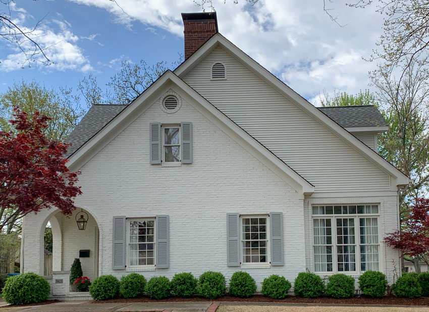
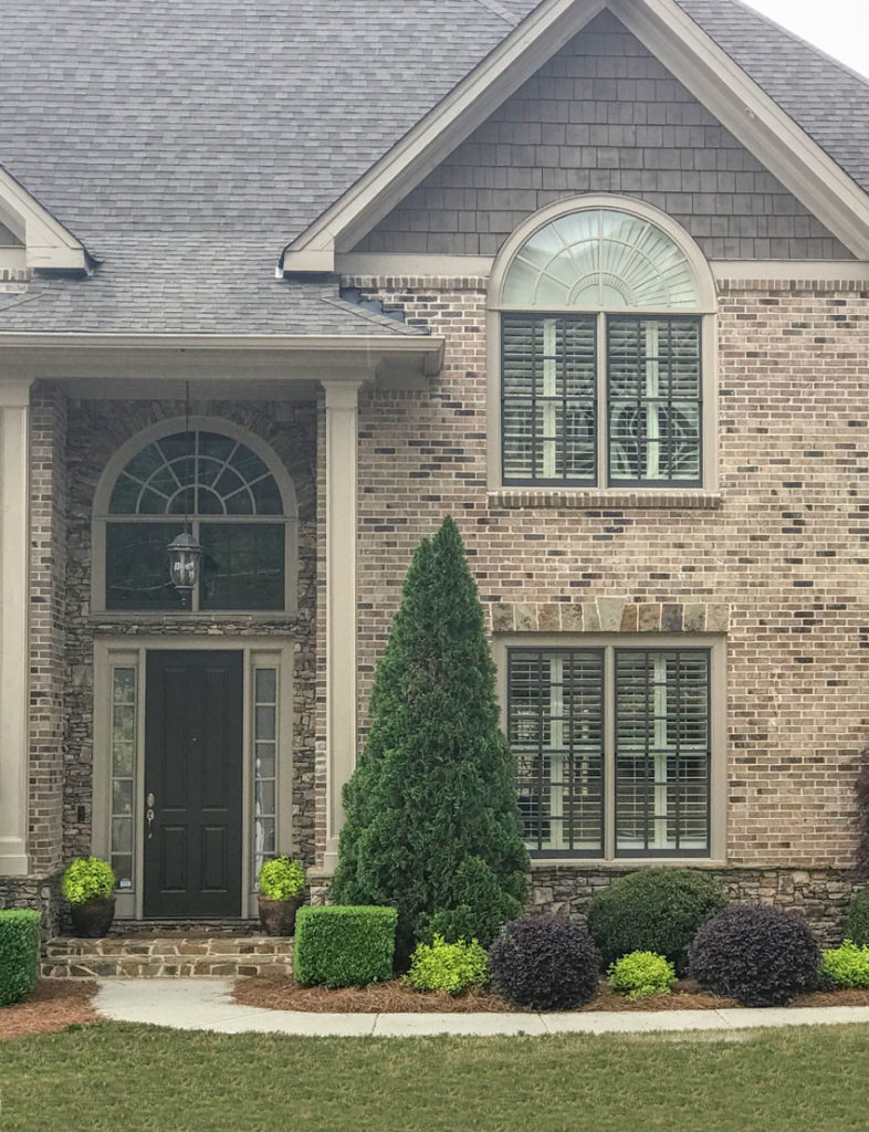
Would you mind sharing the color of the cream painted brick house in the article. I am interested in the color of the house, the color of the trim and especially the color of the shutters. Thank you.
I have Porter Delicate White on my interior walls and trim. Navajo White in bedrooms.
I am not a color specialist, designer or decorator BUT when we drive by million dollar new homes and see the exteriors most are dreadful. Definitely no street appeal. It’s like whoever is selling brick and stone has a huge succesful business but the homes do not look appealing, Painted homes look off. I would never consider these homes to dictate what is in and what is not.
To be honest I’m surprised it took you so long to write this post! In Southwestern Ontario that’s all anyone is doing is cream/black or white/black. This trend started about 4 years ago here.
I hate seeing whole subdivisions where every home is the same and so trendy. We have 2 subdivisions side by side and from a drone that all you see is a sea of black and white. Don’t get me wrong I do love the combo but Im rather tired of farmhouse no matter what version you call it!
Black windows can look great or not so much. Personal preference. Like tortoise shell glasses that frame your face. Sometimes overpowering sometimes perfect.
I’m in the process of having my living/dining/kitchen painted Sherwin Williams Neutral Ground. It is a very pale shade of beige, and I absolutely love it. It is everything I was hoping for in a wall color. My rooms have a lot of natural light coming from east/west windows and the paint color changes slightly throughout the day in a beautiful way. I didn’t want white (too stark) or cream (too yellow). I’m thrilled with Neutral Ground. If you’re looking for something new that isn’t gray or white, check it out.
Hi Maria, this post was so enlightening! I think black windows look amazing with cellular or roller shades or curtains, but that photo with the plantation shutters is bleak. Looks like a prison.
Thank you for these insights. Even though we specify exterior paint colors every day, thanks to your training, there is always something new to learn!
Here in Las Vegas, beige/tan/brown has never gone out (for exteriors) and likely never will. The shades may have cooled down, but they are still very much in the realm of beige/tan/brown. In very modern new builds they are peppering in cooler colors, like perfect greige, alpaca and silver plate-but in the same community there are still the balanced beiges and shiitakes. As far as whites go, they are extremely uncommon because of how bright, windy and dusty it is here. Only really in extremely high end communities that have a lot of poured concrete and grass; which is not the norm, most people landscape with gravel here.
I chose BM Soft Chamois for the walls and Chantilly Lace for the trim of our new build. I actually think the Soft Chamois is a little more beige and darker than I thought it would be but we’re not changing it now. I picked it for it’s versatility according to Maria’s choosing whites e-books. I hope it will be as versatile as I thought when we are all moved in.
We chose dark blue with white trim and windows for our exterior. We are the last house to be built in our neighborhood and there are a lot of white and cream houses! I wanted something different but classic. I’m thrilled with it and several neighbors told us that they love the color!
I’m really late to this party but even now the white B& B exterior with black windows “farmhouse” look is going stronger than ever in N. FL. Two years ago we painted our large LV SW Creamy with BM Simply White. Floors are medium gray/brown. The 28’ceiling is very high dark wood planking with scissor beams. Exposure is E-W with light also coming from open rooms N-S. Simply White open staircase with dark brown treads. We LOVE it. SW Creamy doesn’t look yellow but a warm white. Jute rugs with lots of collected antique landscape paintings provide color. A great background for views of the water. Since we will be downsizing in several years these seemed safe colors for us now & a blank slate for a future younger owner – we hope.I’ve been agonizing over using SW Accessible Beige is an adjacent open dining room. Comments shared on this site have been very helpful!
We have had two homes with Duron Parchment walls and Chalk trim. Luscious cream colors that let our art and fabrics sing!
I have hated the gray trend. Gray makes me look dead–and enough of it makes feel that way, too.
Terrie
Could you please tell me what brand and color the trim paint is in the last photo (the brown brick house)? Thank you!