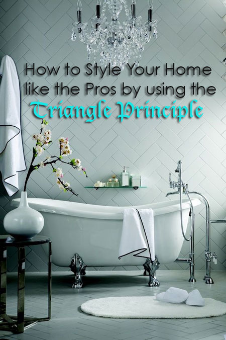
This is a guest post by Heddy Bing from Urban Spaces Design. Heddy is an interior designer who specializes in retail design.
Hi, everyone! I’m thrilled to be a guest blogger here today. Maria is brilliant. She has great taste and style, and I’m delighted to be featured!
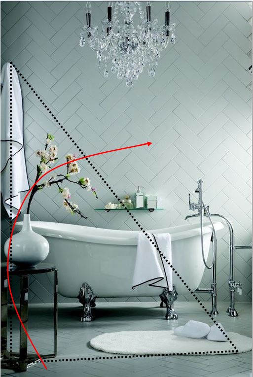
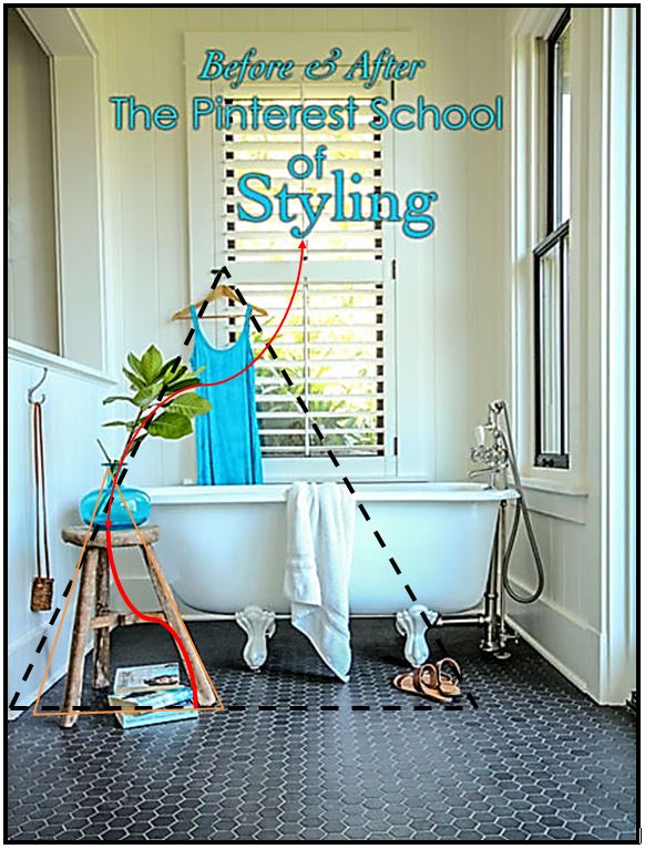
I sent Maria an email after seeing this post, Before & After: The Pinterest School of Styling. She used the triangle principle so perfectly that I drew on the image to show her (4th image below).
She loved it and asked me to write this post to illustrate this principle further!
This is a great opportunity to highlight the things I love about styling, and also show you how it works when styling your own spaces.
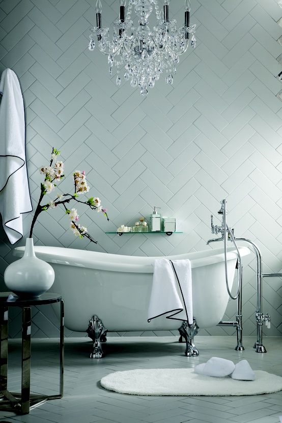
Here is the photo Maria used for her own inspiration set up:
Everyone would agree that this is a lovely, classic image. We love the black and white details, the chrome fixtures, the herringbone tile, and the glamorous chandelier. What you might not notice is that it could have been even better if the photographer had maximized the Triangle Principle.
What’s the Triangle Principle, you ask? It’s a theory of setting up your images with the three points of a triangle in them. That triangle creates a frame of sorts, within which you methodically place the items you want your viewers to focus on. Can you see the triangle above? (It might surprise you.)
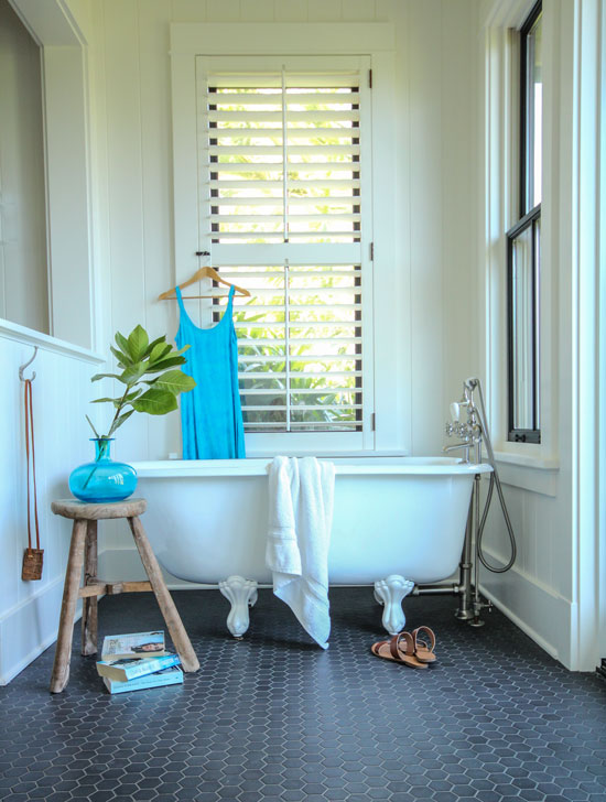
How about in Maria’s photo, below?
Here are the two photos again, only this time I have drawn the triangles in:
Here’s Maria’s photo. Her triangle captures all the elements of the lifestyle setting. In the inspiration photo, however, the triangle ignores that pretty chandelier and make it irrelevant because it doesn’t connect to anything.
The branches in both photos skillfully direct our eyes inward toward the setting, as indicated by the red arrows.
One way to make Maria’s photo even stronger would be to remove the towel, or perhaps puddle it on the floor beside the stool. This would bring your attention to the beautiful claw foot tub.
Here’s how to use the Triangle Principle when decorating or styling for you or your clients:
1. Draw the Lines of the Triangle
You’ll notice in Maria’s image that the eye looks though the entire scene, starting at the leg of the stool –> to the turquoise vase –> to the branch –> and finally, to the top of the hanger and out the window. The lines of the triangle keep our eyes engaged exactly as intended.
In the inspiration photo it’s almost identical, except that, after the branch, we have nowhere to go except to the tile. Again, we have missed the chandelier.
This is why it’s really important to set these lines of the triangle.
2. Create Tight Groupings (Tighter Than That)
I’m not a professional photographer, but it always amazes me that the camera lens physically separates objects, seemingly against the laws of physics. Just when I think I have a tight grouping, I’ll take the photo and find that objects have drifted apart from each other.
How does this separation happen? Here’s a quote from my favourite photographer, Rebecca Kirstein:
“In photography, our eye sees the equivalent of a 50mm lens. Different lenses of varying focal lengths change our perspective. So, when we shoot with a wider angle lens, it tends to make objects appear farther apart. Conversely when we shoot with a zoom or close up lens, it creates what is referred to as compaction, and the objects appear closer to one another.”
Make sure that you overlap the objects in your triangle more than you think you need to. You’ll notice in both photos above that there is significant overlapping of objects. Stool in front of tub, books in front of stool, and so on. Maria even takes care to overlap the branch with the dress.
Creating this physical relationship between objects makes a photograph look considered, as opposed to just like a random collection of things in a triangle. Careful overlapping is inviting, and it elicits an emotional response.
Let’s look at a few more images that follow the Triangle Principle:
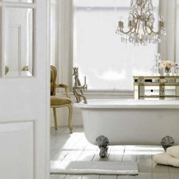
In this image (below), the triangle is created from the base of the tub on the left side –> to the top of the chandelier –> and back down through the items on the mirrored dresser to the towels on the right. In this case, the chandelier works because it is close to the dresser. It forms the top of the triangle:
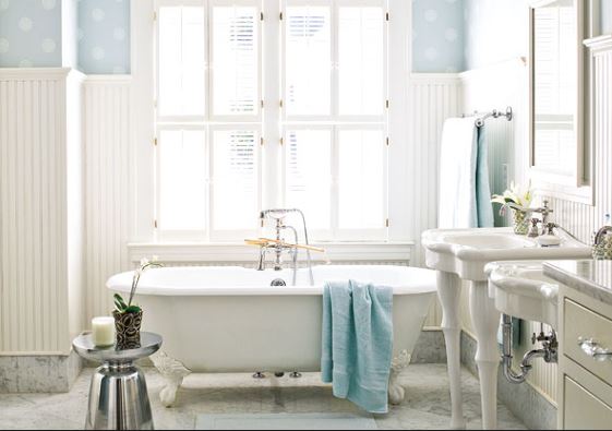
In this image (below) there are two possible triangles. The first is from the stool to the top of the shuttered windows and back down to the floor via the legs of the sink. The second is from the stool diagonally to the blue towels and again down to the floor via the legs of the sink. In this case, the off-center placement of the towel means we focus more on the tub:
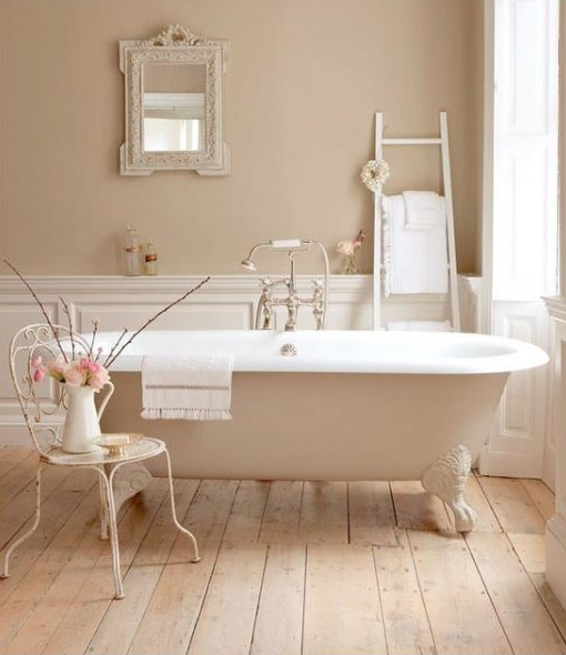
This one below is definitely my favourite: a romantic, French-inspired setting. By now, you can easily see the overlapping and the triangle that was formed:
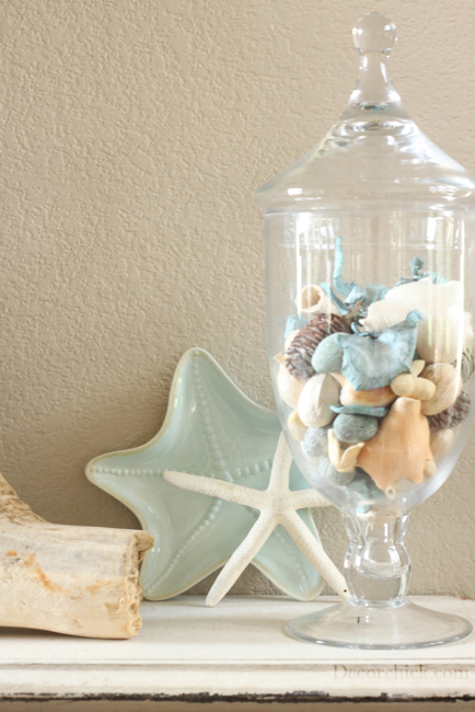
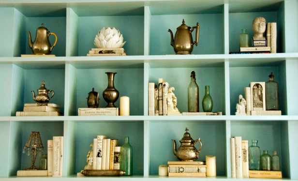
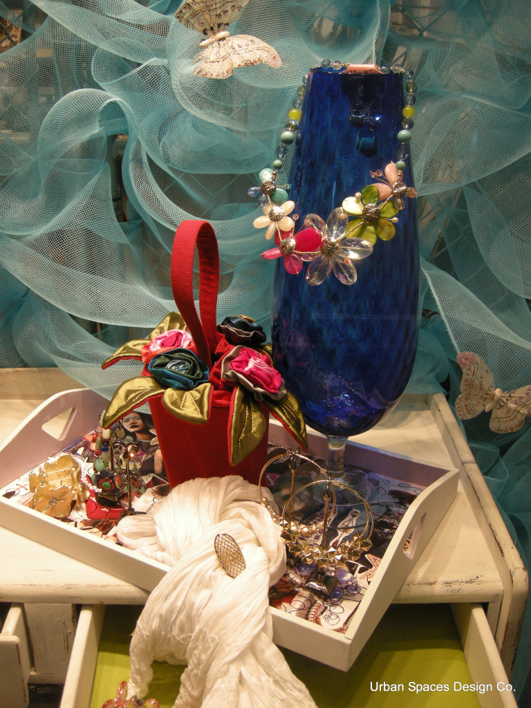
The Triangle Principle can be followed whether you’re styling your fireplace mantel, a bookcase, or a display in a retail store. If I am ever in doubt about how a scene looks, I take a photo because it is so CLEAR in a photo. In fact, I take photos of all my work, even before professional photographers step in to make the magic happen.
By now, you’ll easily be able to see the Triangle Principle at work in the images below:
Image via Decor Chick
image source
I hope you’ve all found this post inspiring and thought provoking. To find out more about what I do, please visit me at Urban Spaces Design Co.
Thanks Heddy for this very informative and helpful post! I have never thought about the triangle principal when I assemble vignettes, more when I’m looking at hanging artwork in a room or positioning furniture against the wall! Nice to know I was instinctively doing it right!
Do you use the Triangle Principle?
Related posts:
How to Style a Kitchen for a Photo Shoot
10 Styling Lessons from Jeffrey Bilhuber
If you would like to transform the way you see colour, become a True Colour Expert.











LOVED this post! I’m just starting to work on professional shots (with a photographer) but I have always found the styling to be tricky for me. So tricky, in fact, that I have worked with a stylist to help. From now on, I will be using this TRIANGLE PRINCIPLE.
Absolutely fantastic post! I have SO often wondered why, oh why does the pic look so unconnected. This info will be kept and used immediately!
Maria, I also found it so interesting that you are taking all of your pics on your iPhone 6! That (and this article) give me so much confidence that I CAN take pictures of my work that are worth sharing.
Hi Kelly,
Not the professional looking ones like the laundry room I posted a couple weeks ago, but when out and about I’m using my iPhone 6. And I do Photoshop them too, to take out the shadows, etc. just so we have full disclosure here 🙂 But it’s still an awesome camera, way better than the Canon I used to carry around in my purse! Thanks for your comment!
So cool. Geometry is fun! Excellent results. Thank you!
xo Leslie
I have used this when placing accessories, but I have never thought to step back and see the larger triangles. In some of the photos, I still had a hard time seeing the triangle, though.
I had a problem with the shelves. I just can’t see a triangle there.
There are two triangles in the shelves. Starting on the right side, you have the cream colored accessories descending right to left, and on the left side you have the brass colored accessories descending left to right.
I’m not seeing triangles either. Especially in the shelves.
There are two kinds of triangles, they are shown in image 4 & 5, now that you have those in your mind look at the bookshelves again.
This is not about rules anyway, you can never have those in decorating, just consider it a guideline!
Thanks for your comments, obviously this needed clarifying!
Great post! First, Rebecca Kirstein’s comment about shooting with a wide angle lens making things seem further apart is so right on. So many realtors in our area are using this technique to show homes on the internet and it’s very off-putting to me, especially when I know what the floor plan actually is.
Although I guess I’ve unconsciously used the triangle principle when creating vignettes in my home, moving things around and around until something in me says “yes”, I laughed when I realized I have an enormous triangle in my LR already – my “sofa” wall is vaulted, running 8′ from the window to about 15′ where the wall ends at the open foyer. I’m two and a half years into getting it right (being vertically challenged, with only two hands and living alone is an extra challenge). What’s funny to me is that with the number of homes in my community with my floorplan, I think I’m the only one who feels there needs to be something more on that wall besides one large art piece over the sofa.
Thanks, Heddy and Maria. This was inspirational, reinforcing and downright fun!
no, but I will try it now, interesting how our eyes see things…x
Great guest post Maria! Thank you to Heddy! It is a great reminder that the lens sees differently than we do, and once articulated in this simple way it is an easy way to remember how to set that stage!
Very useful post – thank you!
LOVED this post, it put into words a concept I’ve been struggling to understand — why some accessorized spaces feel balanced and just right, and why some might feel disjointed.
This was an amazing read! I’m just starting out and was trying to figure out why things looked good to me when I styled them but then didn’t in the photos. Thank you so much for posting this!
Awesome post. Interestingly enough I have done it quite instinctively as well. Interesting pointers on how much to overlap so that more of the objects are in the scene you are trying set.
Will check out your website Heddi Bing.
WOW. That is some powerful info! Thanks Heddy :>
Thanks Maria for inviting Heddy to write a wonderfully informative piece. I feel enlightened.
LOVED this post. Thank you BOTH! I just moved something on my mantle that was bugging me. Now, not only do I know WHY, but one me and it’s no longer an issue!
Only two of the images showed on my screen. The rest had little ‘?” And when I clicked it said poster had exceeded band width??
Same here…
same here
Thanks for letting me know, I am working on it!
Same problem for me – even the Urban Spaces Design Co. link says Bandwidth Exceeded. Diann
Hi everyone. First of all…thank you Maria for guest posting me on your blog.
Secondly…. I love everyone’s comments! and thank you for all the follows of my site.
and thirdly.. as you have figured out….I am having problems with a server which is so…frustrating and somewhat embarrassing as I’ve now let Maria down and caused her grief! Hopefully this is fixed sometime very soon. Again, my apologies!
Maria, This whole post was so enlightening and informative. Luckily I did not have trouble viewing anything.
I will post this on my website.
Thanks again to both of you!
Wow, really interesting post. I’ve never thought of styling in this way, I just do what I think looks right. But, will give it more thought from now on.
Hi Maria! I haven’t been over here in awhile. You know what I love about this post? That the triangle concept really applies to any still life or image – specifically creating imagery for Instagram and Pinterest. Great tips!
S
That is totally true Scarlett! Unless things connect we have ‘no where to go’!
Wow! It appears I’ve been unsubscribed! Anyone else have that happen? I have a lot of catching up to do.