Your open concept floor plan can present some real decorating challenges — such as how to create flow from room to room with your paint colours. Here are my best decorating tips on how to transition paint colours in an open concept home.

The open concept home popular in the last few decades has become as common as just plunking an island in the middle of your kitchen when you renovate.
No one even thinks about whether it’s really the right thing to do, it’s just what we’re doing.
This past summer I toured an old house where every single living area had its own room. And the rooms were so awkwardly laid out that you’d have to take down all the walls on that main floor in order to create a more open plan that would make sense.
However, when it comes to living in and decorating open spaces, they pose some very real challenges as I talked about in this post.
Aside from the difficulty of creating a cozy and intimate feel, defining the various zones with groupings of furniture takes considerable skill. As does making sure that the colour palette and style of the furnishings throughout all the connected areas relate.
Creating FLOW is an important colour distinction I teach in my true colour expert training and it becomes even more important with this type of layout, because we are no longer simply decorating separate rooms. In open concept homes, we need the kitchen to speak to the great room, the dining room, the foyer, the hall, and so on.
And it mostly doesn’t work to transition paint colours on drywall returns without the natural break provided by traditional moldings and doorways between rooms. This is exactly why colour trends have moved to specifying one fresh neutral wall colour to use throughout the main, open plan areas and to add colour and interest with decorating.
When high contrast paint colours meet each other on a raw drywall edge, the look is jarring and unfinished. Many of us just put up with it in order to have that cozy navy dining room, but it’s far from ideal.
With the growing trend of creating moody rooms with deep colours on the wall, the problem of transitioning from the pale, fresh neutral paint colours necessary for making the best of on open concept space, to a dark and dramatic one in the dining room or study, for example, is a common one.
My lovely reader Kari reached out to me with this dilemma:
Maria, your post on establishing flow between the master bedroom and bath prompted me to write you about my own flow dilemma.We have a center hall Colonial built in the ’90s. It’s on the smaller side, and the builder treated the downstairs floor plan more like an open concept with minimal division between the rooms.We recently painted the family room BM Yorktowne Green, and I love the dramatic, moody feel. But where I failed was in realizing how choppy it would become when I tried to change colors in the hall and kitchen. I hate the contrast of two colors where the drywall touches. We don’t really have doorways, so there’s no molding to separate the colors.Option 1 is to attempt to add some trim to help define separation. This won’t be easy as everything is very open.Option 2 is to paint the entire downstairs one color.I would love a post on color flow for a situation like this! Thank you, Kari
How to Choose Paint Colours for an Open Concept Home to Create Flow
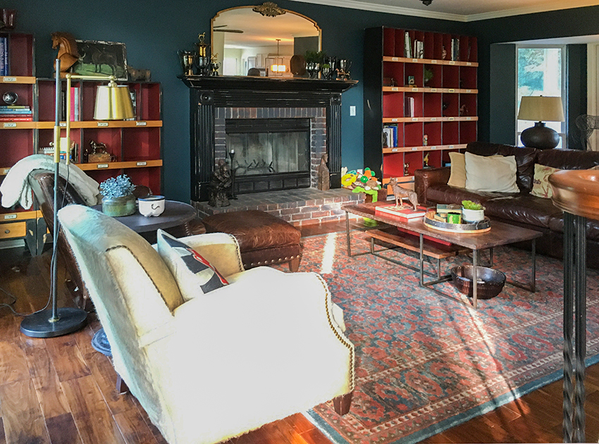
You’ve created such a cozy look and feel in your family room. I’ll bet everyone loves to hang out in there!
Kari’s cozy family room
I can’t see painting the walls in this room a paler colour to satisfy the ‘rules’ and ‘best case scenarios’ of adhering to colour transition. So, we need a creative solution here.
The thing to keep in mind about any high contrast colour combination is that it attracts the eye. Our brains are wired to notice contrast. This is why if you want a space to feel open, soft, soothing, and continuous, you keep the colour contrast low and subtle.
If you want it to feel dynamic with ample interest, you introduce contrast in thoughtful and deliberate ways. The best rooms typically employ both strategies well.
This is why I very rarely specify feature wall colours (it’s a custom situation). Why would you want to stare at the corner where two wall colours meet? They are very difficult to both balance and integrate into a pleasing design.
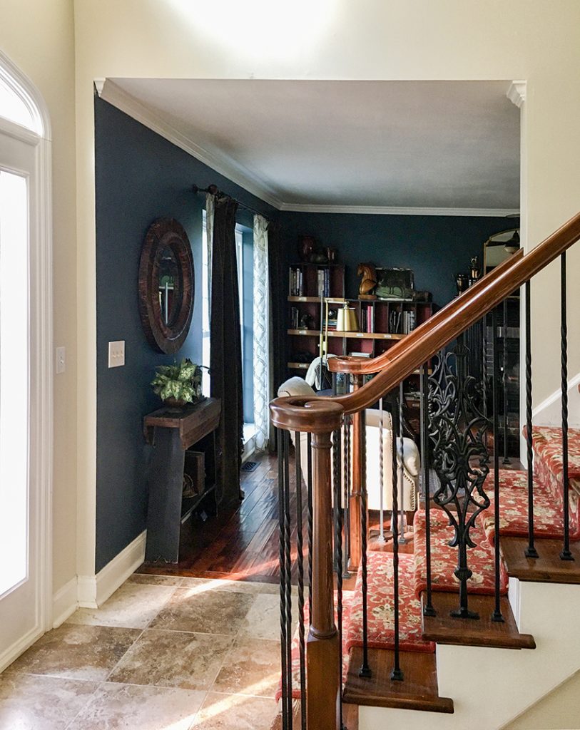
The stark contrast on the corner between Kari’s foyer and family room is clearly attracting too much attention. It’s not terrible, but it’s not awesome yet.
Transition from the light wall colour in the foyer to the deep green in the family room
The investment solution would be to have the archways into the room redesigned with proper moldings so the transition is more intentional and finished. Colonials are meant to have traditional passages between rooms, so this might be a worthwhile upgrade.
But if the budget just doesn’t allow redesigning the openings to the room, here are some helpful decorating tricks:
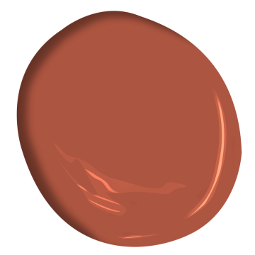
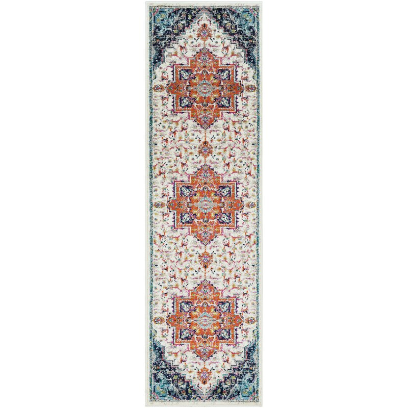
- Choose an equally rich colour for the inside of the front door and add a bold area rug that combines the family room wall colour with the colours in the stair runner.
- Or consider installing artwork on the stairway wall that pulls in the rich colours as well. This would layer the colours and create better flow.
A pretty red orange for the front door Benjamin Moore Salsa Dancing AF 280
And, while these ideas would be an improvement, they won’t make the stark line where the colours meet go away. It will only distract from it a bit.
How to Transition Paint Colour with a Portiere or Door Drape
My favourite idea for making this transition work is to install a portiere or door drape.
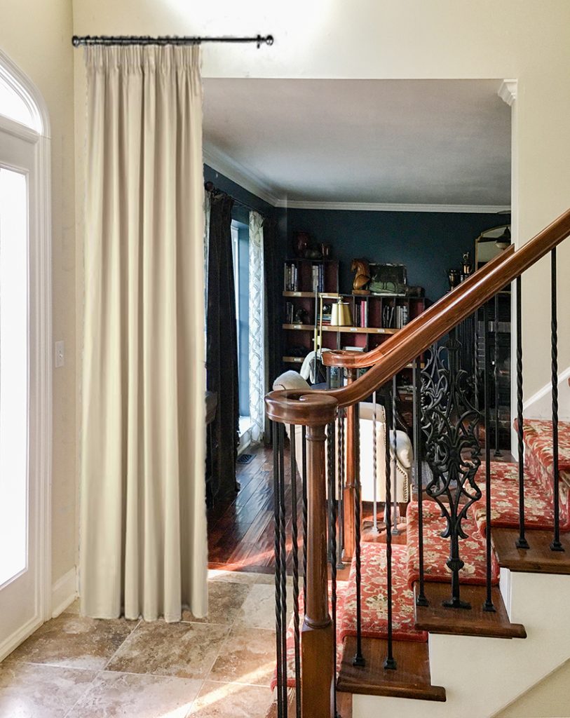
In Kari’s case, there isn’t room for drapes on both sides of the opening because of the stairs. However, a couple of panels can be gathered to one side. And while these panels will diminish the size of the opening somewhat, it will help create a much softer look.
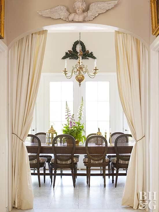
And it will give the dark and moody room an even more inviting sense of decadence and mystery. Since space is tight, the drapes can be sashed like the ones above to maximize the opening.
Here is a quick mock-up of the family room entrance with drapes to one side:
Room mock-up with portiere
Now the eye is not held captive by a hard contrasting line. Instead, there is some luxurious softness.
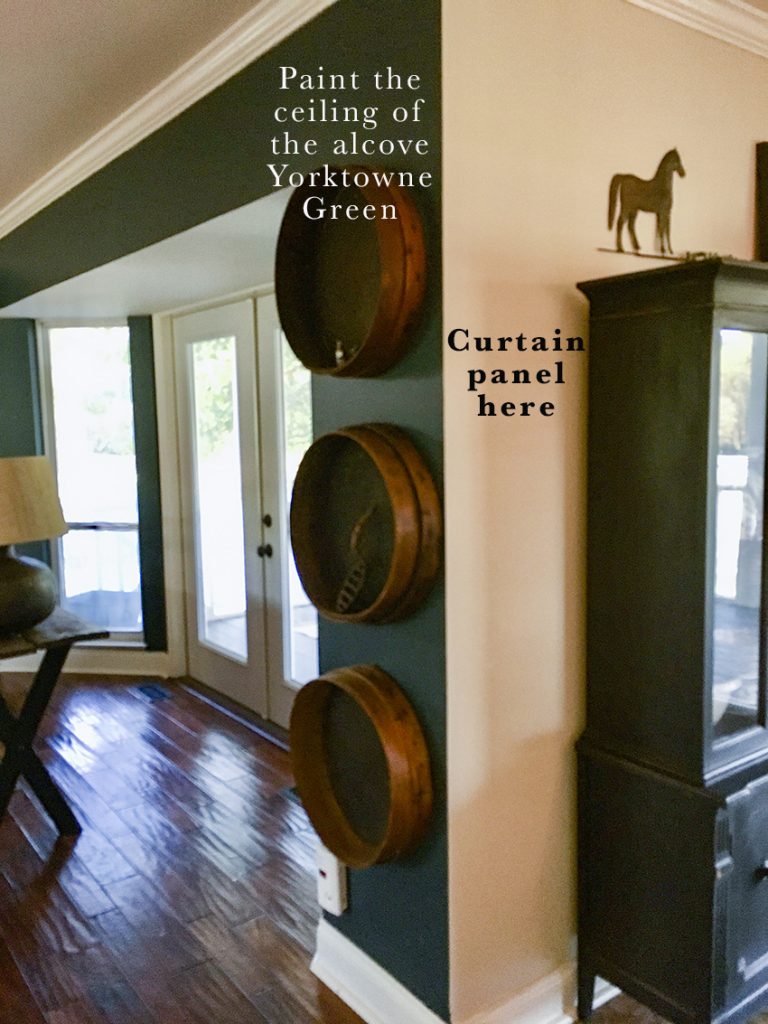
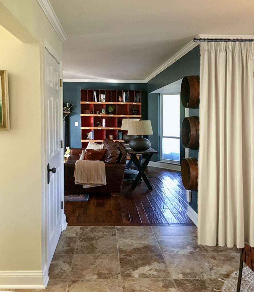
She can handle the entrance on the other end of the room the same way. I also recommend that the ceiling of the alcove be painted the wall colour to soften the contrast here too.
Second entrance to the family room with the same harsh colour transition
Portiere to one side to soften the wall colour transition
On this side, the curtain rod would likely need to be fastened to the ceiling so the curtain can overlap the entrance by at least a few inches.
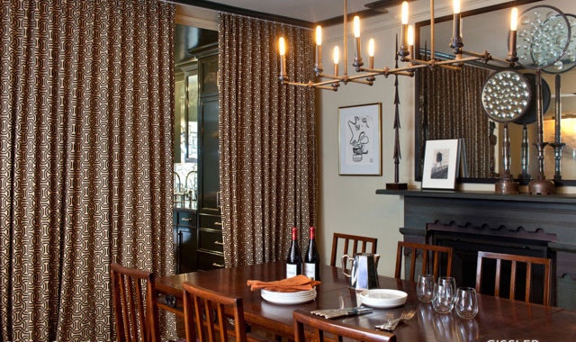
Portieres are a very decadent and traditional look, but I think they are ripe for revival. Especially now when so many of us struggle to create intimacy in rooms such as dining rooms with huge drywall archways open to the rest of the house. Drapery always brings a sense of layered luxury and coziness. And they also do a great job of dampening sound.
A cozy dining room by Glenn Gissler Design via Dering Hall
Do you have a room in your house that could be improved with some pretty drapery in the doorway?
If you have a question for an Ask Maria post, please take photos with good natural light and email me here. Please note, it’s rare that I can create an Ask Maria post WITHOUT photos.










As interesting as the moody colors look, I’m just not a fan of this new “old” trend. I just removed these colors from my open concept home….. along with all of the heavy entry drapery into my dining area off of my two story foyer. To me it just sends me back twenty years ago. Trying to make those deep colors transition from room to room was a major problem, which I was pleased at the time. As for me, I’m staying with the fresh light colors in my large open concept home.
That idea is sooooo great.
I would love to see the front door painted the same dark/beautiful moody color as the adjoining room!
You are a genius Maria Killam.
Thank you for sharing all your innovative, creative designs.
I like the first idea, paint the door and add art and accessories in like colours. I find the curtains, while solving the “eye issue”, looks very old fashioned, like drapes around a bed to keep out drafts.
It’s wonderful how those drapes soften the look. So much better!
Maria, your curtain/drapery solution certainly looks soft and flowing but I would never incorporate it. Having put up with puddled draperies for too many years in several homes, I find floor maintenance around fabrics touching the floor, aggravating and inefficient. Vacuuming or mopping requires knotting the fabrics or hooking them onto something off the ground. Also, handling of the materials will ultimately affect the fabrics. When entertaining and pathways become tight, they could present a tripping hazard.
Sorry, not a fan. I would use accessories to create the flow, especially near an entry way.
Such a simple and elegant solution. I completely agree that portieres deserve a revival!
On a more practical note, this is also an easy way to trap heat in a particular room, saving a little money on the heating bills in the winter – and it would do a better job of creating ‘warm’ and ‘cool’ rooms, minimizing the age-old battle of the thermostat 🙂
I have LOVED Portiers for a very long time!
As a matter of fact, I prefer them over a closet door. So much less hassle! And they create a soft transition at a (sometimes) lower cost.
We don’t have to wait for these “trends” to take hold to utilize these great classic solutions.
I say Go For It—now.
That’s my 2 cents!?
Its a great idea, I hope it does make a comeback. I have always loved the look when I’ve seen it in pictures. I have used it in bathrooms a few times when the door to the toilet was awkward, to create privacy and softness.
Interestingly, I have a sitting room that is likely underutilized due to a lack of intimacy, I asked my decorator if she thought it might be a good idea to put up curtain panels and she said “it would close off the room too much, and look awkward from the entry” …. but I agree with you Maria.
What a great idea! A truly creative and doable solution to a problem many people can relate to.
I totally agree! I am not ready for the revival of the curtain at entrances. They still feel too outdated for me to bring them back. I would prefer the painted door and area rug and accessories a 100%!
I am seeing a little of that trend here in California but I’m not a fan. I think the whole idea of tearing out walls in order to make the house look larger then requires that large space to have a united color on the walls. If you want to make one area look moody it can be done with accessories such as rugs, art, pillows, painted furniture, colorful upholstered furniture, etc. To me that makes it easier to use color on the wall in the private areas such as bedrooms, bathrooms, sitting rooms, laundry, etc. Otherwise trying to make an open are look different you might as well go back to separate rooms in my most humble opinion. Do I sound opinionated? Lol
I can appreciate those ideas and colors but def not for me. Too dated feeling and heavy. I too love the fresher, lighter/mid-toned colors in open concept homes.
I saw that in a restaurant once, thought it very lovely and french looking. Would your drapes in that room need to be the same?
Thanks, Maria! Several ideas that, of course, had never crossed my mind. You are magic!
I love the idea of the door painted in such a pretty color and adding art work.
If this was my home I would add the molding anyway. I don’t care for door ways with no trim work.
The drapes would be a big no for me. That idea reminds me of magic or puppet show.
Interesting ideas Maria! Can’t say I like the drapery idea as well. What would you say if only the fireplace wall be painted dark green?
I’m not a fan of accent walls I think they have their place but it’s a custom situation. In this room I like the drape idea best but I love drapery, it transforms any room it’s in. Maria
The drapery idea! Brilliant!
I am pro-portiere, in the right setting. Millwork first here though! If portieres were used, I’d want the rods to extend over the entire opening, even though the curtains can’t go that far, in order to trick the eye into seeing them as functional. I also think that adding something modern as a counterpoint when using something very traditional keeps rooms from feeling too heavy.
I should have started by saying thanks for creating this post…I love how you share your thoughts so generously and get people thinking.
Your drapery suggestion was a perfect inexpensive solution compared to what the cost of mill work would be. I have an open concept floor plan and it was very challenging trying to find a way to add color and have it blend from room to room without having it look like a patchwork quilt. I ended up painting the two outer rooms (family room/kitchen area and living room) the same color, SW warmstone, and the middle room (Dining room) SW peanut. Even with the color change in the corners it turned out pretty good.
I love it and would have never thought of it on my own. My house is basically in three parts – a hallway with all the bedrooms off of it, a kitchen/living/breakfast space that’s open on the back of the house (SW Sea Salt), and then the front of the house with the most windows is the dining/sitting room/entry (only actual room definition is my library shelves and the sofa facing them). I just painted the front half deep, dramatic teal-grays and it looks amazing, but has the transition issue between the areas. The front and back half do have casing in the transition, so it does look much better.
I don’t mind the colored wall abutting the white at all. In fact I love the crisp look of colored walls against adjacent white ones, especially when the ceiling is also white and crisp. Just count me in the “feature wall” category I guess.
Hi Maria, fast forward 6 years do you still think this would be an on trend or classic solution? I stumbled on this older blog searching a solution for my open-ish concept but I wasn’t able to find any examples, was wondering about your updated thoughts!
It’s 2025 now, and I was looking for a way to transition wallpaper/paint in my dining room and living room to the 20 ft foyer in between the two. There is no millwork or edge, just one connecting wall. I think curtains will be just the trick! It will hide where I stop the wallpaper. I’d be open to any other suggestions, as this is a topic I can’t find much on. ALSO…. I’m laughing at the comments from 2019 because color drenching is in style now. Ha!