Seville was the first stop on our trip to Spain and Italy. We stayed right in the downtown core in a lovely boutique hotel that served afternoon tea and a lovely buffet breakfast each morning.
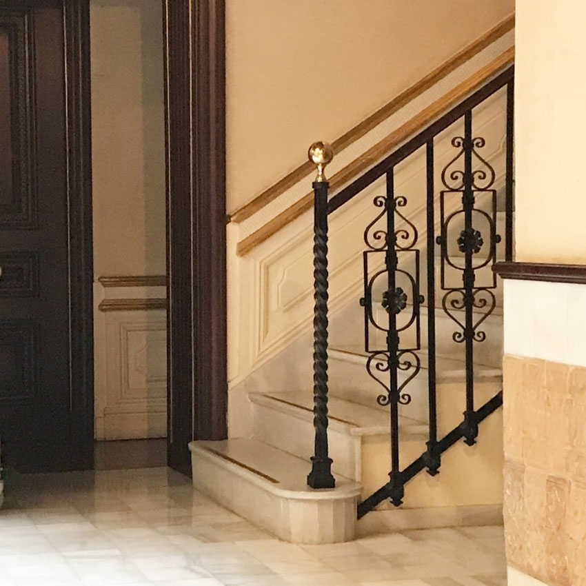
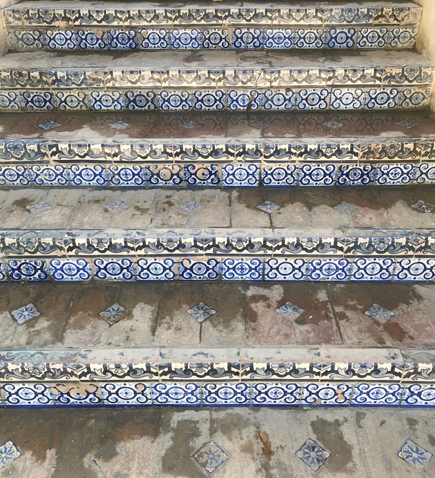
Back home, I have walked into so many homes where there is an elaborately ornate staircase design that often looks totally out of place. Now I know where the design was inspired. And it fits right in here. Along with the tile after one of my followers on Instagram noted “There’s no subway tile Maria”.
So that’s what inspired this post. Which was easy to write because I took so many photos of all the tile work.
I know many of you, who are longtime readers, might fall off your chair or drop your morning coffee but here is where decorative tile has a place:
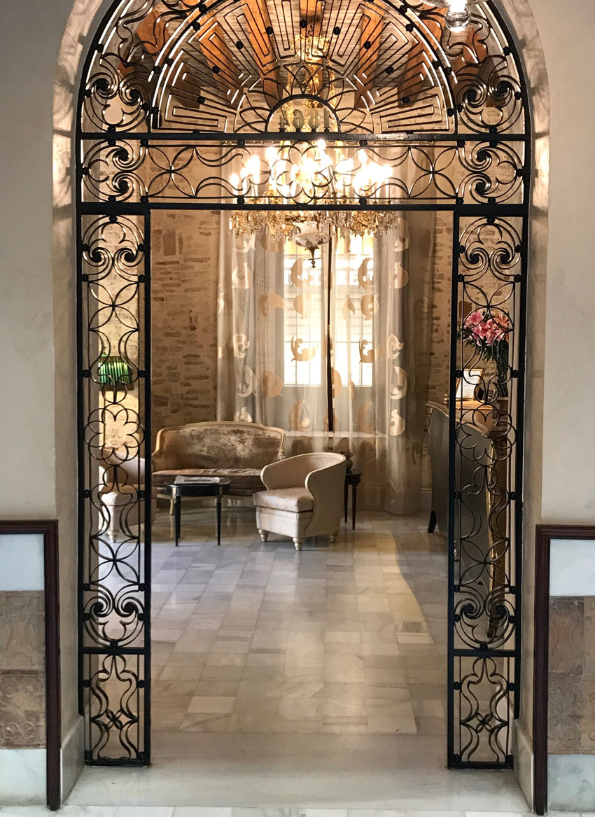
This was a doorway in the reception area of the hotel:
Here’s the staircase (below):
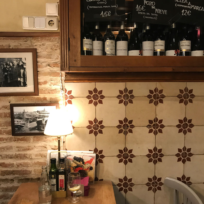
The first night, we had dinner in a nearby restaurant. I liked the way the muted red encaustic tile related to the bricks on the same wall (below):
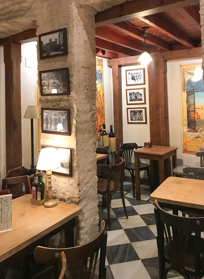
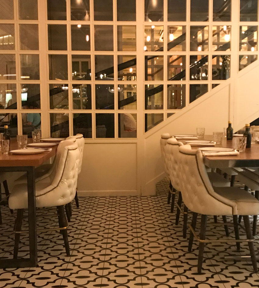
And it also worked well with the black and white tile floors:
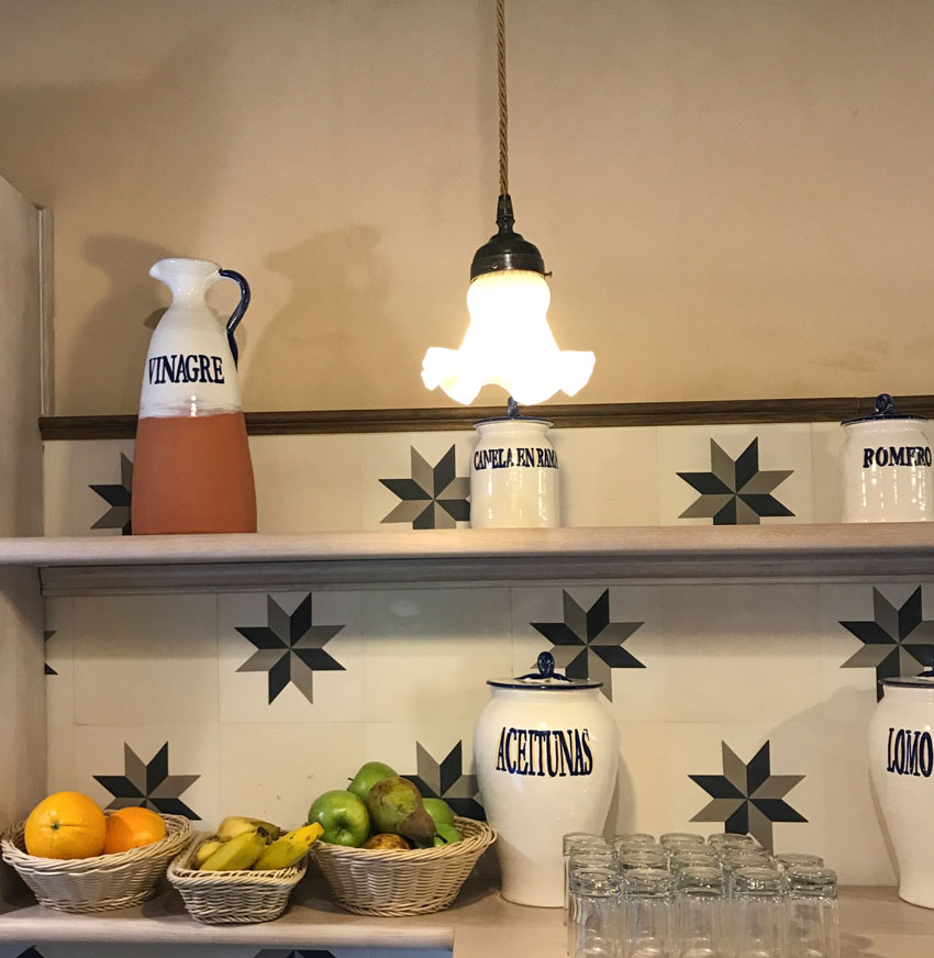
This was the backsplash tile in the breakfast room, back in the hotel (below):
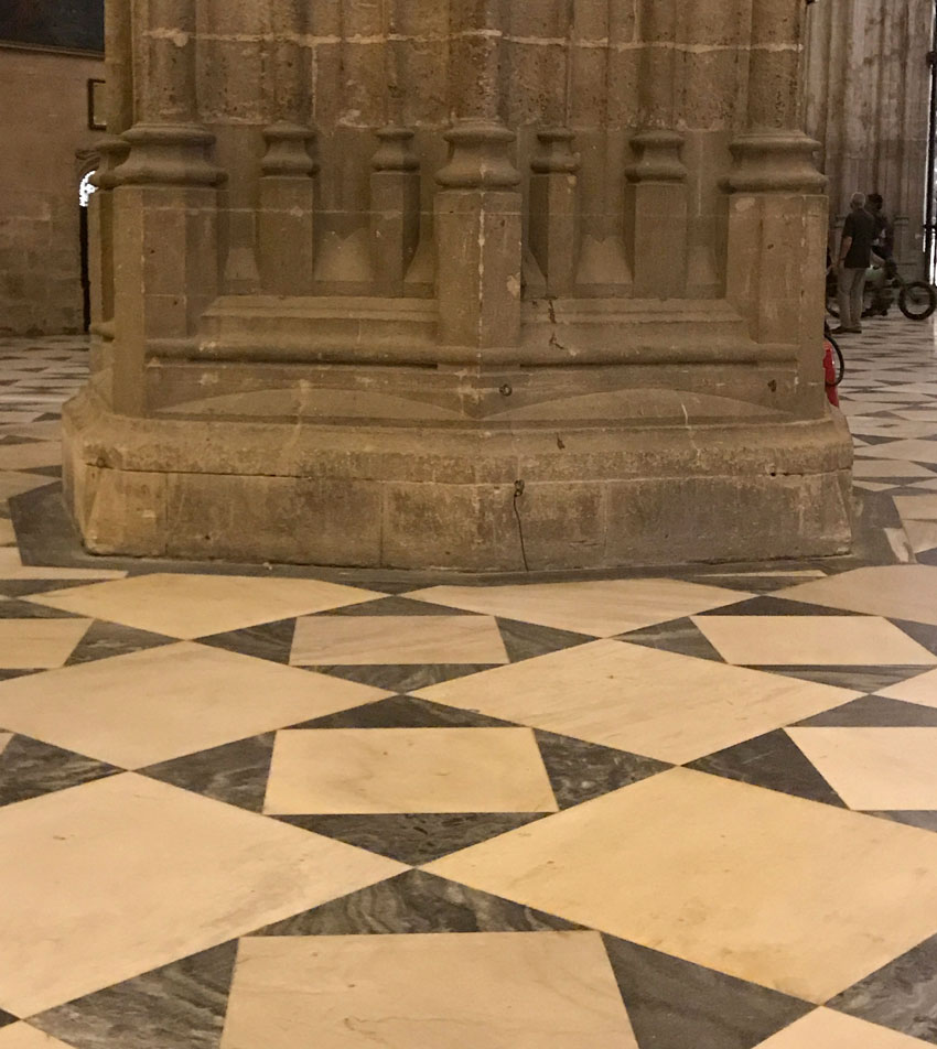
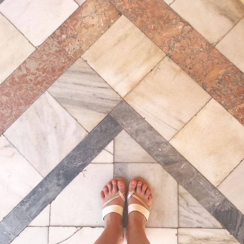
This was the floor in the Seville Cathedral nearby (below):
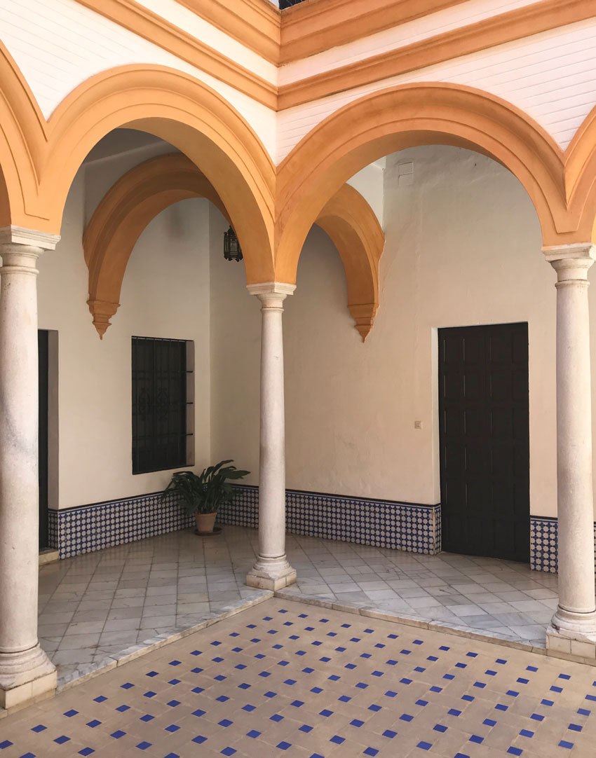
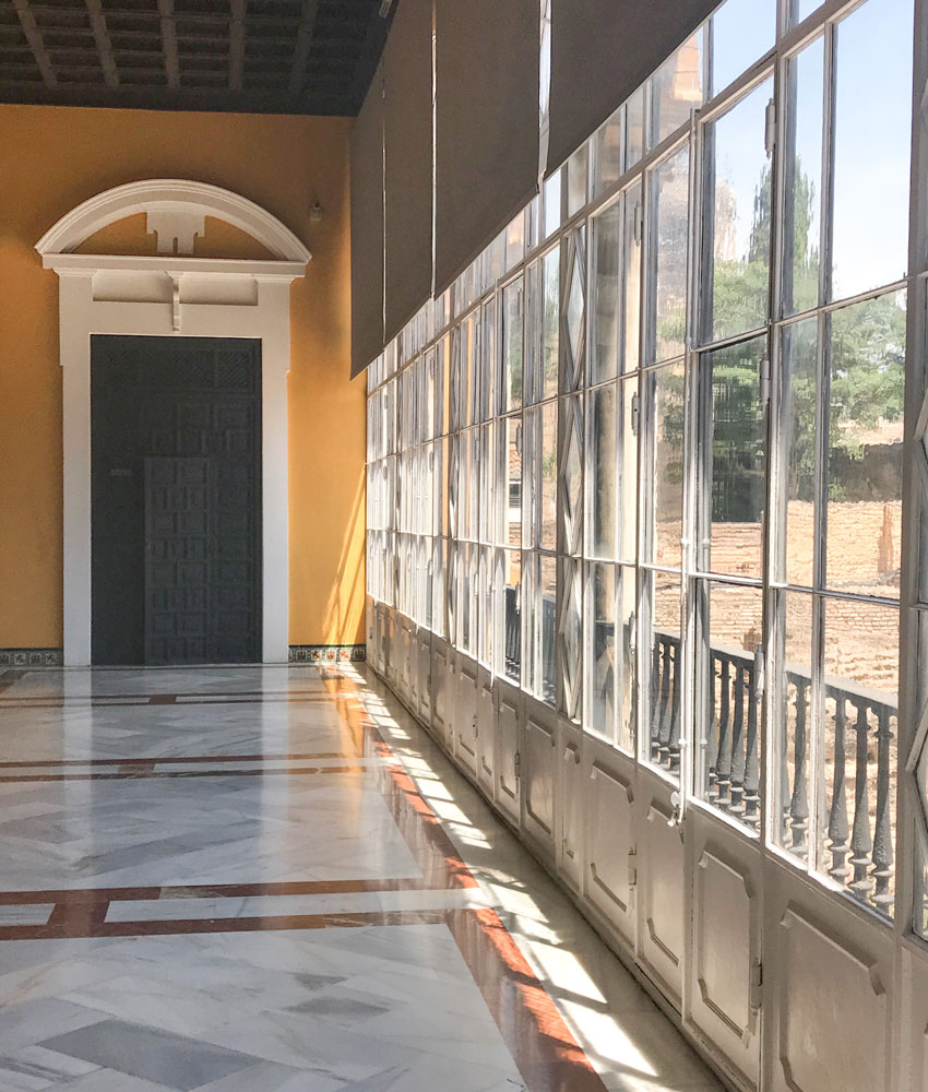
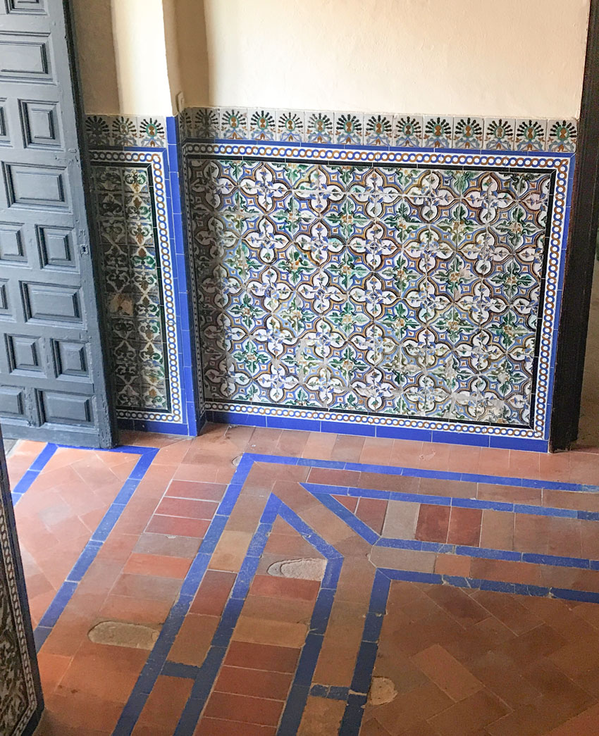
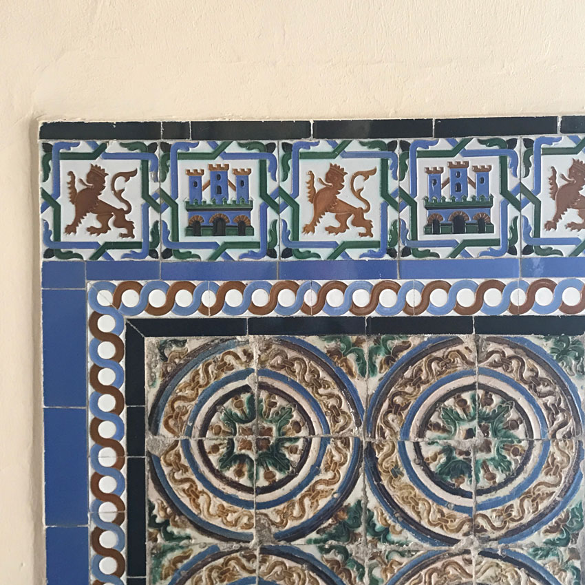
Then we toured the Real Alcazar of Seville, castle and gardens. Gorgeous tiles everywhere (below):
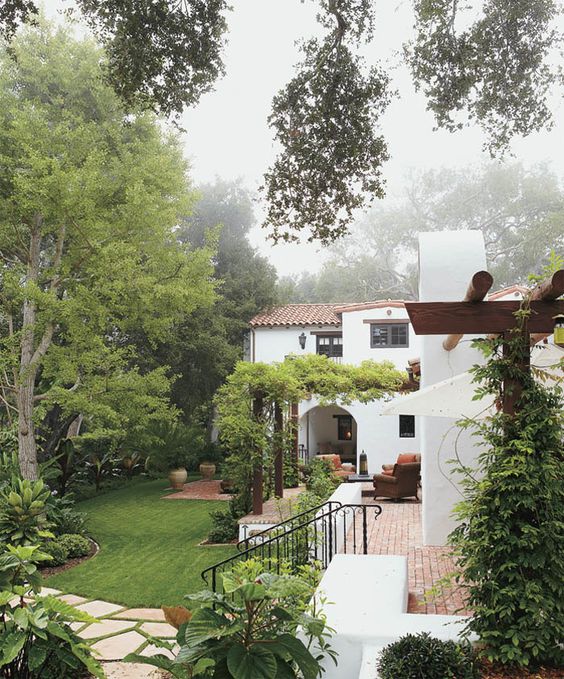
When does this kind of tile work back home? In context with a Spanish/Mediterranean style home, with an exterior that possibly looks like this:
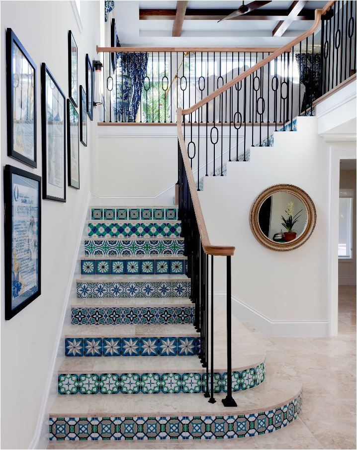
An entry staircase with iron railings ornate or not (below):
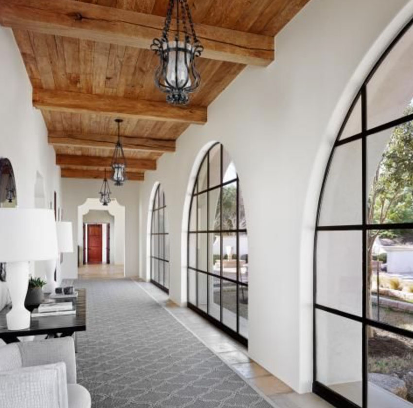
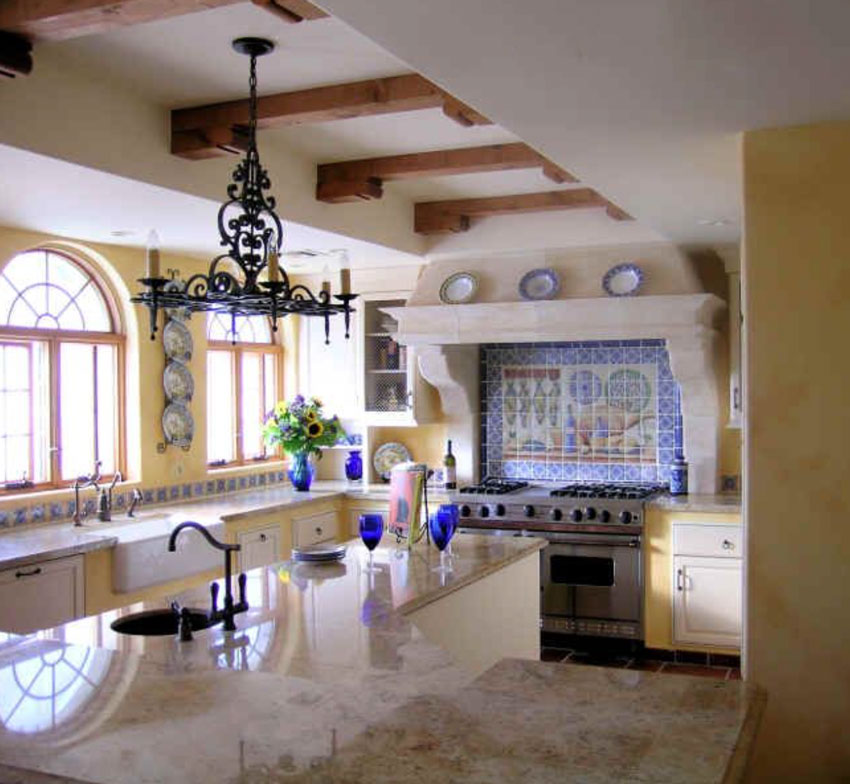
Wood beamed ceilings, ornate, spanish style pendants, black, arched windows, all belong in a house with this colourful tile (below):
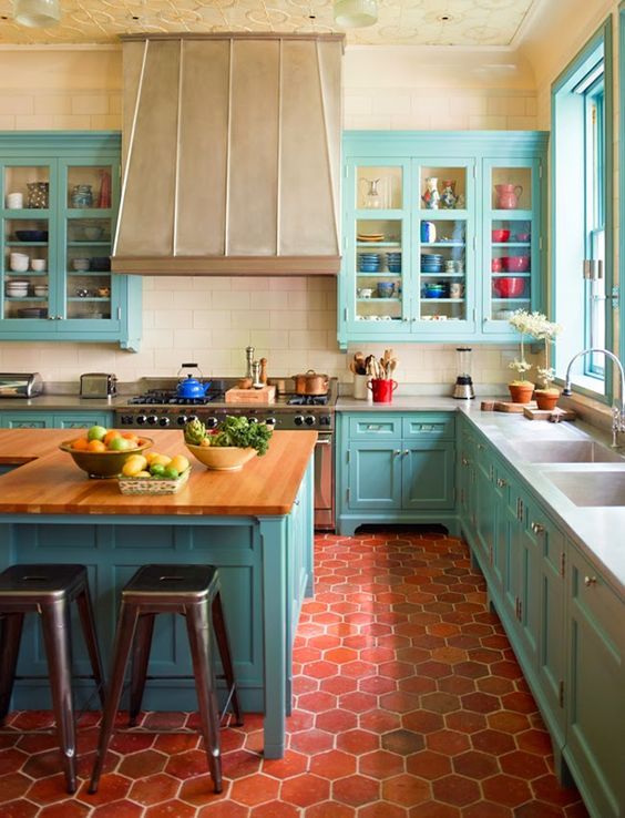
You could also design a terra cotta floor with a turquoise kitchen (below):
In this Spanish kitchen with the beams in the ceiling and curved plaster hood fan, I could even live with the blue backsplash because it’s been repeated in the plates and tile underneath the window.
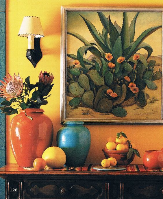
Perhaps your styling might look like this with the Spanish style wall sconce as well:
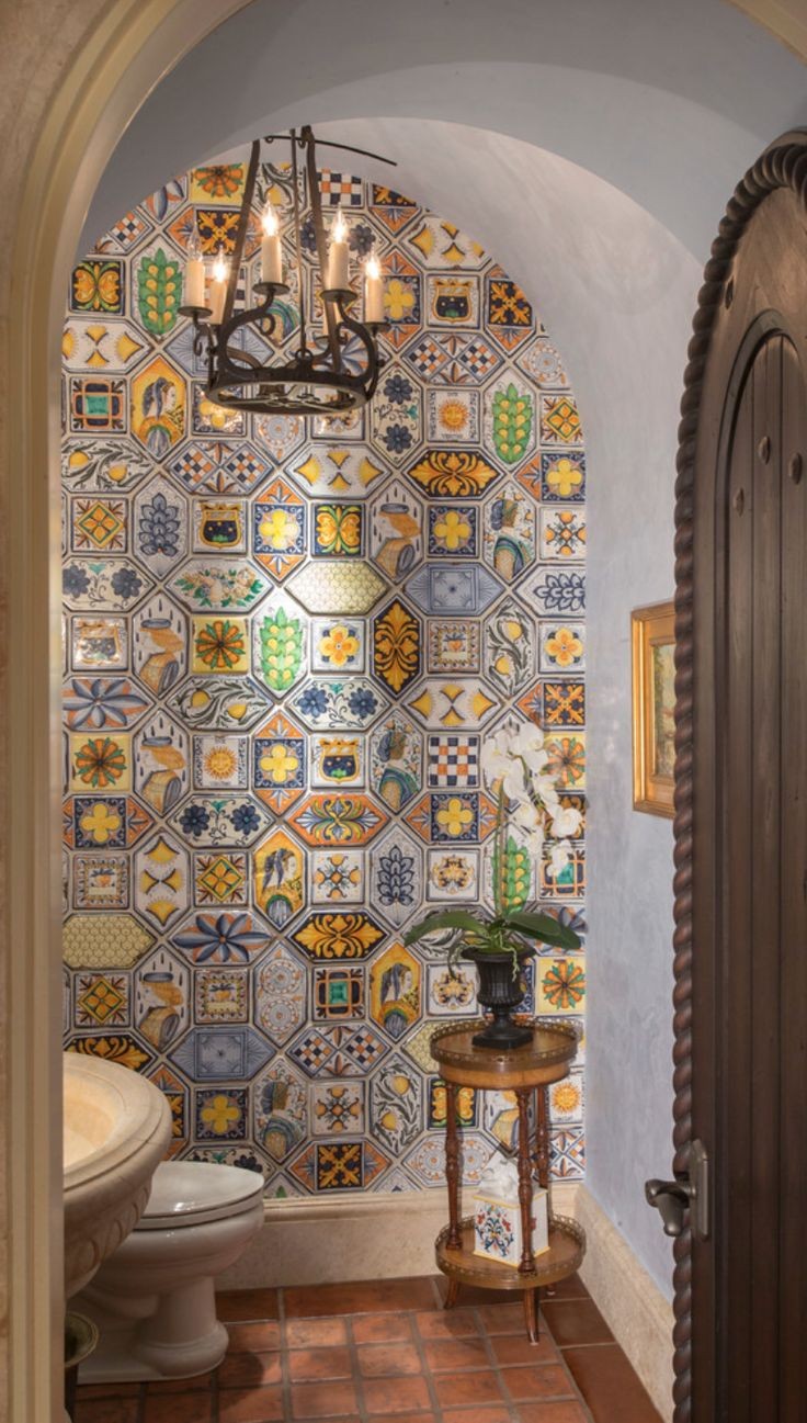
In a Spanish style home, your powder room could look like this (below). Notice the arched doorway and perfect light fixture.
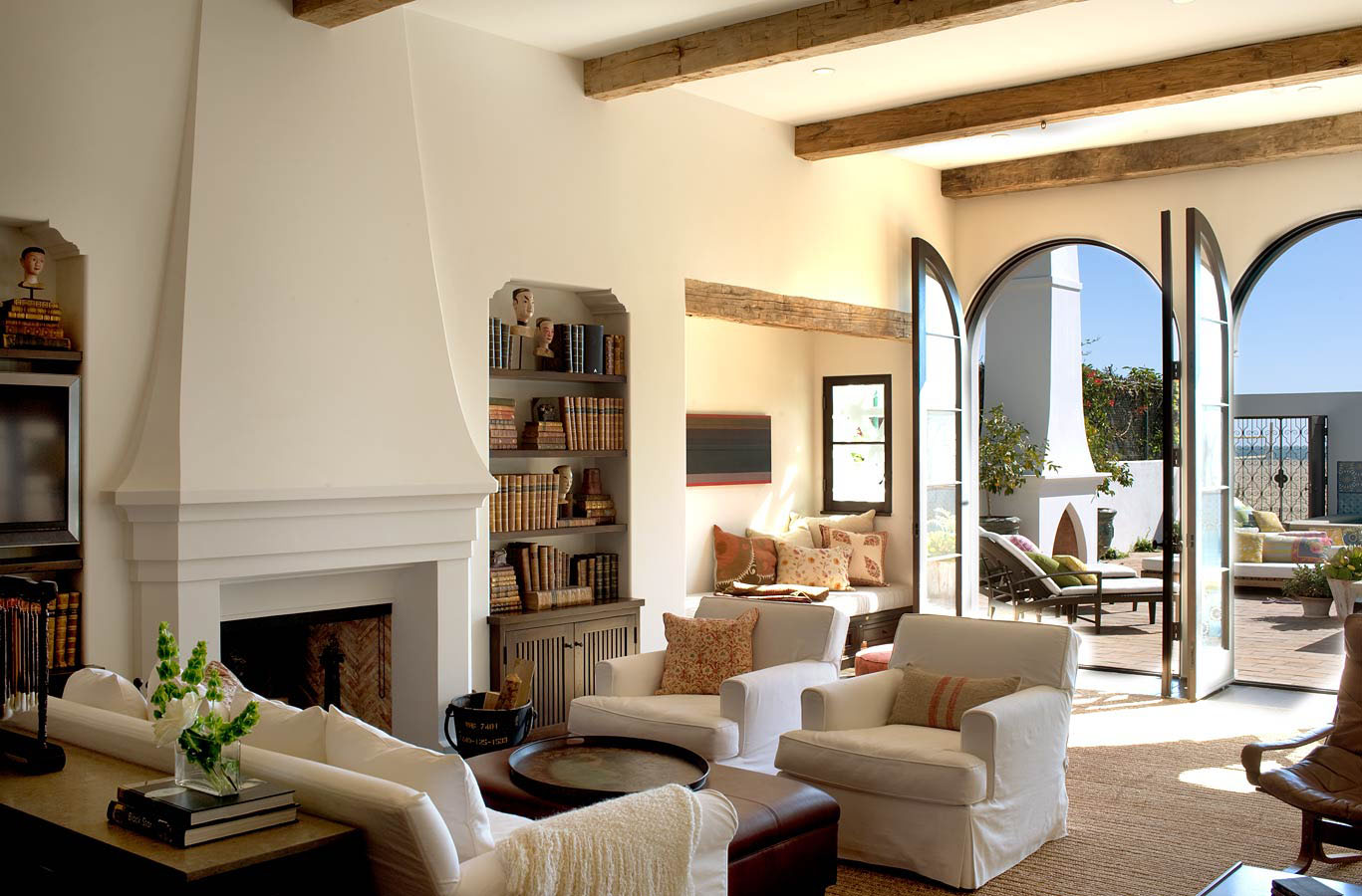
I love this fireplace design (below). So classic and timeless. Again, notice the beams and the arched french doors. The beautiful outdoor fireplace too with the iron gate.
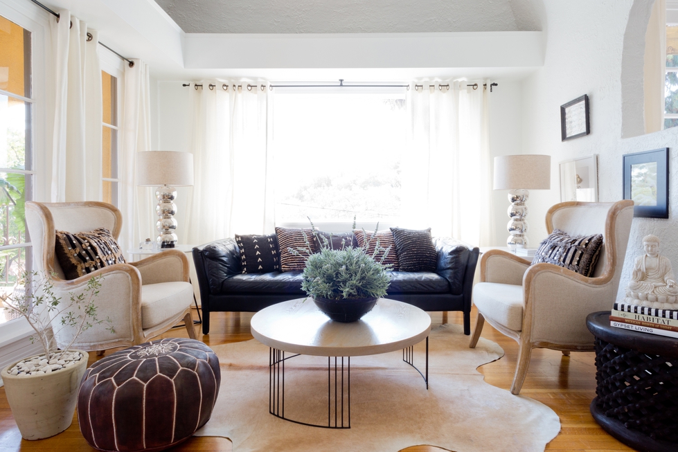
It’s rare that I think a black leather sofa looks good but here in this more neutral ‘Spanish inspired’ living room, it works. Because there’s not too much black to make it heavy and masculine (below):
What I have seen all too often is people will go on a trip to Europe and fall in love with a particular style and when they get home they start adding these random design elements that in no way work with the existing style of their home.
That’s where random arches that have no place suddenly appear, or the busy, ornate staircase railing I mentioned at the beginning of this post or random rows of tile on a staircase kick that in no way belongs.
Decorative tile has a place. And that place is definitely not as a random strip in your kitchen backsplash or shower surround.
At least if you’re going to introduce accent tile, go big or go home, (like the bathroom image above) but don’t just install bits and pieces of it. Decorative tile is like a strong wall colour. If you’ve decided to paint a room red, go for it, don’t just paint it on a single wall, that rarely works.
Related post: A New Way to Design Accent Tile: Ceramic Architecture
Here are a couple more images once we arrived in Barcelona:
Here I am sitting outside at dinner in a Tapas restaurant in Seville:
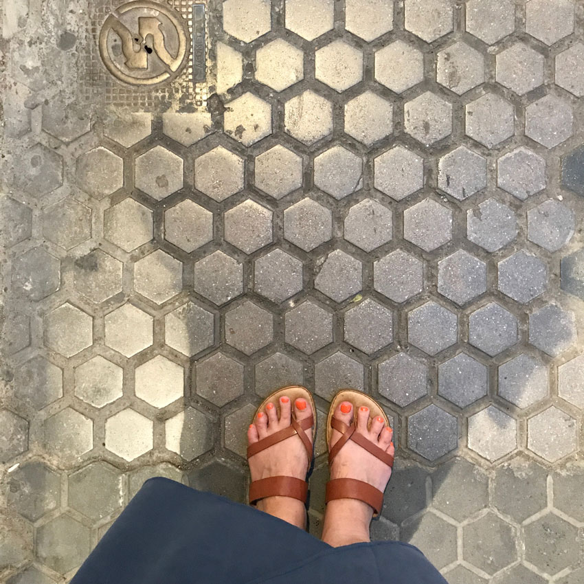
The sidewalks in Seville were mostly concrete in a hex shape! Isn’t that incredible? You can see it behind me too in the photo above.
Hexagonal concrete tile in Seville
You’ll notice white walls are big in Spanish design. If this is the stye of your home and you need to choose the right white, download my ebook, White is Complicated; A Decorators Guide to Choosing the Right White, here. Or take advantage of our eDesign services here, to find your perfect paint colour.
We fly into Naples tomorrow and our first stop on our Amalfi Coast tour is Capri Island! I can’t wait, follow along on my Insta stories here.
Do you like Spanish style design?
Related post:
Why Stone and Accent Tile are Not as Important as you Think
One more Reason you Should Skip Accent Tiles Altogether
Ask Maria: What Mood does Black and White Convey, Warm or Cool?








I really like the tile patterns, but for me would leave them in Spain, as I couldn’t live with them in my home. (I’m having trouble using a very patterned spoon holder an friend gave me, although the shape is fantastic for resting cooking spoons on.) If I was Spanish I might feel very differently, in which ever country I called home, and use something very familiar to me.
Isn’t that what I said in this post? I sure hope that’s how it landed. Yes, leave it in Spain unless you have a Spanish house like the photos in this post 🙂 Thanks for your comment! Maria
What is the Spanish equivalent of classic white subway tile?
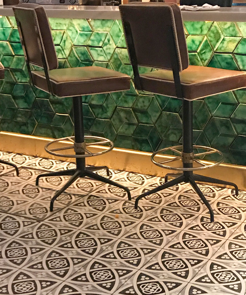
Something with a texture I would say. Like the green tile in the photo with the bar stools but in white or cream. Maria
Yes! I see! And solid color. I just watched your instastory of the turquoise and white tile bathroom. Solid colors = timeless. Thanks for sharing! I love learning about this.
I think that hand painted bright color tile is classic and timeless in Spain. I have probably hundreds of photos of tile from all around Spain (& Portugal). As those two countries explored the world, they took the style with them in their colonies. Italy is known for the granite and marble work that you see where you travel. Subway tile was used in the subways of New York, where lots of people have traveled through and “colonized” current design. Imho.
All that beautiful tile…..i have seen so many beautiful buildings and rooms all over Mexico (hint, not in the tourist areas). Did you see any tiles surrounding round doorways? I love that look. I especially love the bathroom photo.
Hopefully after seeing Spain you will want to avoid that ugly subway tile! Not classic at all, just another fad, but an awful one.
Growing up all over Europe, the only place there are white subway tiles are:
1.) in public toilets
2.) hospitals
3.) institutions
4.) large industrial kitchens
So, I don‘t share the love of subway tiles, per se. But understand their role in modern and classic design.
I grew up in the USA, but I associate white (and putrid green) subway tile with psychiatric hospitals, where I did a clinical rotation early in my career. It is interesting to hear that the tile is used in similar settings in Europe.
I think white subway tile it is a trend, but folks are so enamored with it that they can’t see they are in the middle of a trend.
Well I have to disagree, something classic and timeless can still be ‘trendy’ as subway tile has been during the ‘grey trend’. This post explains my point further: https://mariakillam.com/subwaytile/
And it’s just my opinion, doesn’t mean it’s right. Thanks for your comment Susan! Maria
Maria, I keep meaning to chime in on subway tile sometime and this seems like the time: Architect Victor Horta’s Art Nouveau house, now a museum in Brussels, built turn of the 19th-20th century — has white subway tile in the bathrooms.
I grew up in a Spanish style home (in the southwest). Arches, iron railings, white walls and bright tile (though my mother imported Portuguese tile). I love Spanish style, but where I live now it would just be out of place.
These are great pictures of some beautiful public spaces. But I wonder what the average home looks like.
I love all the colorful tile. I think I would tire of it in my home though. And my suburban boxy home couldn’t support it.
Beautiful pictures,,I appreciate you writing wonderfully detailed post about my most favorite style:)
Our current house is Spanish Ranch…most of tiles I felt hard for would leave me broke(all handmade..the whole poit here is authenticity which can rarely be achieved otherwise in such tile), so I did go with colored subway in some places-the home is later attempt on Revival so didn’t feel like I have to adhere to style very precisely. But I also chosen terracota lantern shape tiles for bathrooms, and pretty amazimg star and cross mosaic for steps(only two steps..or again, would leave me broke lol.)
We still have to do hardscaping in the backyard so I’m studying several books on the style which I have in my home library, to understand what’ll fit our house best.
I do love patterns, and if I love something-I’ll never ger bored..I become very attached, in fact. The number one choice tile for the kitchen backplash-which I couldn’t afford-is still my inspiration, I kept the sample, and often look at it like it’s Venus of Milo, and sigh..:)
We’ll need to redo our fireplace at some point, maybe I’ll have more disposable income by then lol.
My love for the style started with me living many years in the Middle East. Never been to Spain(unlike so many of my friends and family)-but the older buildings definitely have there this Moorish-Spanish influence, arches, court yards, gated entrances.
And yes, as an answer to one of the comments-most prized old houses will often have patterned tile flooring, usually cement where I lived. And it’d look and feel very natural.
So it’s obviously a matter of context. I’m very lucky to live in a house that is my favorite style. It is in Southern California that belonged to Spain then Mexico so historically (and in terms of similar climate of course, materials used traditionally for building, etc) using tile like that makes all the sense in the world. It still needs to be well considered..say when we get to hardscaping I know the mass of my house is too small to balance a very big expance of bold pattern everywhere, or red saltillo..so I’ll have my restrictions too.
Everything can be smashingly beautiful when it’s well considered, and is part of the whole, and is authentic to a house and to its owners.
(I was born in Eastern Europe, and we had subway tiles only in public restrooms-my husband developed strong association with them being, well, very public-restroom-y…took me a long time to presuade him to use them at all. Handmade nature of tiles helped, also them not being white.
Our subways were very opulent..granite, mosaics..no subway tiles:)
we didn’t have tiles in kitchens or bathrooms back then, when I was little. Any tiles. It was just washable paint.
So no previous associations here.
The more one travels, or lives in totally different places, the more one understands the context-and it becomes quite fascinating process, to figure out why you love certain things more than others. And of course it can change too-you become exposed to something, and slowly become more attached to it. Or your previous bad memory fades after decades of living somewhere else..
So fun to see your comments on a different style than what we are used to seeing here in the states.
It would be nice to see pictures of an average home in your travels if possible. Love the pics of
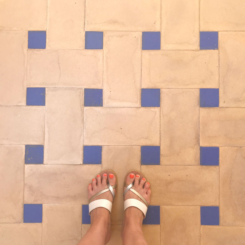
your feet on the walkway.
Cant wait to see your pictures of Capri. Its been years since I’ve been there but the views from the
town at the top were stunning!!
You look so relaxed and happy in the tappas picture. Travel suits you!
Love the colourful tile, in Sunny Spain. Occasionally love it here in the sunny Okanagan, in the rare home or winery. Do not like it on the coast, where I think the cooler, mystical, coastal climate calls for a cleaner, modern aesthetic with post and beam and lots of glass.
Looks wonderful! I grew up and inherited the love of the Spanish tiles. As you saw all these tiles are strongly influenced by Moorish design, which does not reflect human beings in the tiles only design elements, lines in particular. I’ll bet you also saw a lot of red geraniums in pots! Can’t wait for your next posts Maria!
What a wonderful holiday you’re having. Thanks for taking time to create this post and to share the amazing beauty of Spain with your readers. You look lovely in that pic. And those toes…. The things we experience do seems to find a way into our lives when we get home. I wonder how this trip will shape your aesthetic – guess we’ll find out! Enjoy!
It’s wonderful experiencing different decor in every country. Tile is very old as we have seen it in many countries. I love the Spanish decor – something to enjoy! Actually I love decor of every country we have been in and where I live.
Your post gave me pause for consideration of a different style for a condo reno in Maui. The powder room tile is timeless and beautiful The outside of the condo is Mediterranean style so it might work. Will give some thought to incorporating turquoise like that kitchen. Flooring will be the most costly element. Have to think of an alternative to terra cotta. Thanks for the inspiration.
Since childhood, I have always LOVED hand-painted Mexican and Spanish tile, but I’ve never lived in a home that could carry it off. As a newlywed in 1966, I bought four classic yellow tiles with a blue painted bird and carried them around for decades, hoping to use them somewhere. Years ago, I walked into a newly-opened imported pottery store here in my home town, filled with gorgeous hand-painted tableware from Spain, Italy and Mexico and blurted out “I want to work here!” And I did for two years. What a wonderful time I had changing about six dinner table displays every couple of weeks! I still have a set of my favorite pattern.
But at this stage of my life, to live with busy tile on a permanent surface would be…well, too busy. 🙂 And it’s a huge “go big or go home” commitment, as Maria said. I visited a “go big” home in southern Utah and tile was everywhere, and it was in context with the Southwest architecture style. Just gorgeous. Even the bathroom sinks had painted designs. The couple who built it had bought most of their tile on EBay, a tip for those who want tile without going broke. Would you believe that Amazon has Mexican tile stickers, which would be great if you want to try before you buy.
For the same reasons others have stated, I could never live with subway tile, even in a classic home context. But I do appreciate Maria’s commitment to color that sings in harmony with white/off-white backgrounds. Neutral backgrounds allow me to make use of color and pattern in furnishings that can be easily changed without tearing off tile. But these tile pictures make my heart sing!
This is great for me to see because we just bought an adobe house in New Mexico, and I want to do right by it. I’m debating saltillo tile for the floors–I know it’s classic for this style, but still not sure I want a bold floor color. Enjoy the rest of your trip!
One thing that was difficult when we visited Italy is that the NOT honed marble etc floors were a hazard when it rained. I WANT the turquoise kitchen with terra cotta floors. Gotta move as they would not fit my 72′ more modern raised ranch (but oh yeah need to finish with the kitchen remodel in said ranch first) 😉 Thanks for sharing!
Yes, polished floors were a hazard in New York, too.
I will work with subway tiles in bathrooms and kitchens for clients but in my own home, after getting to NYC when they were renovating them in the early 90s, I still have my very bad first impression of them in their decrepit state. Imagine a house remodel underground in the dirty rain, and it’s not gonna be where I shower, bathe or eat like the posters above and their instutional settings.
Love your posts and learning your perspective on this. Although the tiles are beautiful on their own, I could never live with them in my home – just too much color and “movement” for my calm nature.
Also, I covet those silver and white sandals of yours….
In the early part of the 1970’s “spanish style decor” was all the rage where I live (southern Ontario). Couches were gold and black velvet or red and gold, lamps were black wrought iron, wallpaper was flocked, paintings of bull fighters and senoritas were on every wall. I learned to hate it, however looking back “what did Spanish decor have to do with southern Ontario?” Nothing of course. This is many trends ago now, but I can certainly appreciate this decor style where it belongs. Exactly as you said Maria…..”leave it in Spain”. Or anywhere it truly belongs. And yes…..those sandals…….love!
Just love seeing all of your pictures! There is so much eye candy over there that it is almost overwhelming. As you stated it belongs there and goes with the style of the buildings. In our travels we enjoyed seeing different styles, colors, designs and architecture but wouldn’t want them in our home here in the states! It sure does get your creative juices flowing however. Enjoy all that you see because you may not get back there soon. Sure wish I could travel more because it is so inspiring! Instead I have all of Rick Steve’s travel videos. I just love them! lol
Have a wonderful time on the rest of your journey.
I am renovating an old Spanish Mission style house in South Florida very similar to the one in this blog post, with terra cotta terraces and dark brown/black windows and porches. I’ve been reading your materials to chose the white for my exterior. Which white do you suppose they used on the exterior of the house shown? It’s exactly what I would like to achieve on my exterior.
Thank you for the inspirational post. I’m very much looking forward to following your trip!
Enjoyed this post! Have fun! 🙂
Great post, thanks! Love seeing all the colors and patterns. Those hex concrete sidewalks are great! Sounds like a wonderful trip!
I love everything about these pictures! I might need to learn Spanish and move 🙂
Well, I agree with your tile comments, Maria, but I’d like to comment on your SMILE! Great photo of you enjoying the Tapas restaurant in Seville! Have a wonderful vacation.
Maria! You can’t do a post on tile from the south of Spain and not show photos of the Alhambra!! That’s the mother ship!
Even though I do love decorative tile; totally agree with you Maria that one has to be selective as to where it goes and belongs. To conclude and as they say in the lyrics of the musical Broadway hit ‘My Fair Lady’; “the rain in Spain stays mainly in the plain” … or at least it should. 🙂 -Brenda-
P.S.: Hopefully the Airlines has found your luggage by now.
The bossy staircase with the multiplicity of tiles is awesome. Enjoy your trip, it is fun to armchair travel along with you! When we were in Seville we took a magical tour of the Alhambra on a full moon night. Incredibly beautiful ceiling pendants looked like upside down wedding cakes. Tiles are cool and comfortable in hot climates, my dogs flop on ours after they have been out in the Texas sunshine!
I’ve read a lot of the comments that say how they love the Spanish tiles, but it would never go in their ranch style home. I would have thought so, too, especially here in New England. I have a colonial, and like the look of neutrals ( “let my eyes” rest) with pops of happy color that I can change. My neighbors home is a small, nondescript raised ranch, but he is from Mexico. At his front door he has created a small, shaded area that feels like a courtyard, with beautiful tiles and plants in colorful ceramic pots that are mainly hidden from the street view with landscaping and a more traditional plain stone raised boarder to the walkway to the door. Inside, from the two story foyer on, it is as if you have stepped into a Mexican hacienda. You completely forget that this is a suburban stock raised ranch. In the back yard he continued the theme; next to the classic deck he created a patio that is almost completely obscured from the street (and my yard) with standard New England trees and shrubs, but from the house side when you step down from the deck you feel like you are in a Mexican cantina. I don’t know how this will affect his eventual resale, but it completely works and has changed my idea of how you can style a home to fit your design aesthetic. I think it works because it’s consistent, not just the kitchen or foyer, but the whole home.
Actually the terracotta tile works well here in the US. Consider that it is popular in the Southwest. I live in Maryland (far from the Southwest) and am considering the terracotta tile for my kitchen. It would work well with light blue or off white cabinets, white quartz counters, and a backsplash to go with it. I like the multicolored tile from Spain and Portugal and the Delft tile from Holland, but would actually prefer a blue scalloped tile for a backsplash to go with the terracotta floor tile with small multicolored tile inserts at the corners and pale blue cabinets, and quartz counters.
Right now my kitchen, is rather dull, with tan wood cabinets, an off white tile on the floor, dark granite counters and the walls painted yellow (Afternoon by SW).
I also want to install one of those circular mirrored skylights to allow for more sun in the kitchen, since it doesn’t have any windows.
OF course it can work in the US as long as you don’t end up with a ‘Spanish inspired kitchen’ in a house that is not designed to look Spanish. And in the end it’s your house and you can do whatever you want. Hope that helps, Maria
I love Spanish tiles and I think they have a great place in Southern California. Especially in Santa Barbara. And in certain historic Los Angeles neighborhoods there are MANY beautiful examples of Spanish tiles in bathrooms and on stairs. And many Spanish inspired back yards. Almost 50% of our population is Hispanic, so it fits. Barcelona is one of the sexiest and most beautifully designed cities in the world. Tons of inspiration.
Hi
Do you think I can use portuguese/ Spanish blue tiles on the floor? I mainly see them on walls…
I love the stairs, will definitely use that in my house in Portugal!
What’s the name of the hotel you stayed in Seville? I love it! Thinking of visiting!
Thanks for the article and pictures!
Thanks for these inspirational photographs that feature a variety of fired clay products from contemporary to classic azulejos. Here in the U.S. we have lately overworked the basic white or gray tonalities in our decoration, favoring monochrome with color accents over the artfully balanced color schemes that are preferred abroad. The wide range of Mediterranean tiles and ceramics offers the opportunity to incorporate beautiful effects of color and pattern that help us get past the sterility of the present moment. I am not a maximalist decorator, but I am fascinated by the way Moorish design can incorporate patterns within patterns within patterns without creating a chaotic reading of the space. Such balance, once achieved, never fatigues the eye or bores the senses. Seville, Cordoba, and Granada offer many exquisite examples of this ideal.