Hi, everyone! I’m Patsy Overton, a True Colour Expert™ in Atlanta, Georgia.
My business began as a home staging company in 2007. Several years into it, I was frustrated that the work wasn’t more consistent so I searched out services to add which would fill in the gaps. (Never mind that the housing market had just crashed and was the worst since the Great Depression, right?)
I saw a conversation online about being trained in color, signed up for the course, picked up a certification, and began calling on paint stores to let them know I was available for hire. Guess what? The phone began ringing immediately! Who knew there were so many people out there needing help with color? Today, I am working full time as an interior and exterior color consultant with a few decorating and staging jobs along the way.
Color me employed.
How did you become aware of Maria Killam and her true colour expert training?™
Back in January 2011, only a few months after my initial color training mentioned above, a fellow designer told me about Maria and what an absolute genius she was when it comes to color. I was anxious to learn more and hone my skills, so I looked her up online. I was surprised and delighted to see that she was holding enrollment for her True Colour Expert training to take place in just a couple of weeks, practically in my backyard! I signed up, didn’t even have to pack a bag, and drove 20 minutes to the training facility — a local Benjamin Moore store. Here I am with Maria at the course:
Patsy & Maria
Color me trained.
What’s your favorite colour? Why?
Hands down, my favorite color these days is Sea Salt SW 6204 (Sherwin-Williams).
Several years ago, I happened upon an article in a home décor magazine by a fancy schmancy New York designer touting Comfort Gray SW 6205 as “the perfect color.”
Why?
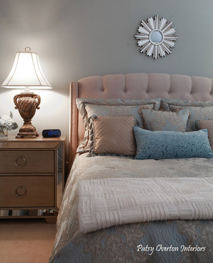
Because, according to him, it is the perfect blend of gray, blue, and green and is constantly changing. That sounded interesting, so I rushed out to the paint store, purchased a can of paint, and painted my then-home office Comfort Gray. He was right! I loved the color and began specifying it for my Atlanta clients. Here it is in a bedroom:
Bedroom in Comfort Gray SW 6205
So what does that have to do with Sea Salt? Thanks for asking. Sea Salt is on the same color chart as Comfort Gray, only one shade lighter. From time to time, I felt the Comfort Gray was a bit heavy for certain spaces, so I began specifying Sea Salt and found that EVERYONE loved, loved, loved that color! It was a hit.
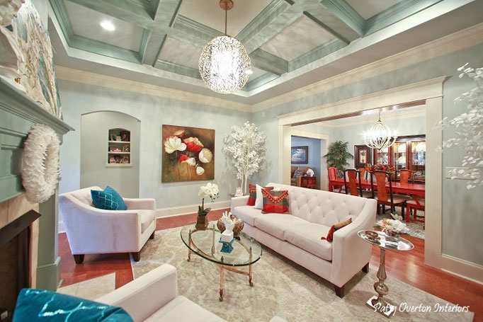
Last year, my husband and I moved from our 23-year-old two-story traditional home to a condo. Guess what color I used as my background neutral throughout the house? Yep, Sea Salt. It makes me smile every day.
Living Room in Sea Salt SW 6204
Color me Sea Salt.
What is the most important colour lesson you’ve learned?
When working with neutrals, you cannot tell what you are dealing with unless you are constantly comparing them one to another. (Thank you, Maria!) No neutral stands alone. Sometimes, when you are trying to pull together several different fixed neutrals in a home with varying undertones, the best choice is to jump to a color.
Color me informed.
When it comes to colour, what’s hot? Which color do you think is timeless, and which colour trend would you love to see disappear?
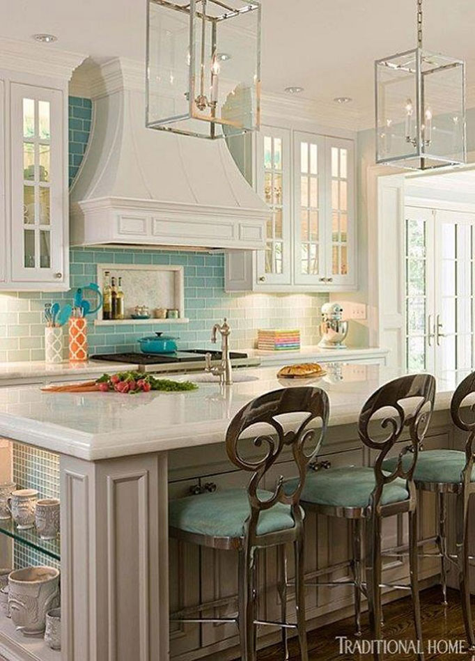
Down here in the south, varying shades of turquoise are hot — for front doors, kitchen cabinets, and accents.
In my opinion, the only timeless color is white. (Have you read any of Maria’s posts on white subway tiles? Thought so.) It just doesn’t get any more classic than white. And if I NEVER see another red dining room, I’ll die happy.
What do you think is one of the biggest mistakes homeowners make with interior colour?
That’s easy: jumping color palettes. I was initially trained in color on the Sherwin-Williams fan deck, and I learned that the deck is subdivided into five color palettes. Each palette encompasses all the colors of the color wheel, but they are in varying degrees of saturation. For instance, palette #1 is the most gray-scaled, palette #2 is a little less gray-scaled, etc. Once you reach palette #5, you are dealing with fully saturated color. In order to get the best look for your home, you should stay within the same color palette (saturation) for all your paint color choices.
Color me palatalized.
What do you think is one of the biggest mistakes homeowners make with exterior colour?
I could write a book. Five to six years ago, when I first began working as a color consultant, I was very surprised to get requests for exterior color consultations. For some reason, it had never occurred to me that there was a need for help outside, and I had no idea how to proceed. This was before I was aware there was a Maria Killam to call for help, so I had to learn on the fly.
As a color consultant, you are always looking for a starting point. Inside, it could be tile, granite, artwork, a rug, fabric, etc., but what about outside? The same principle applies there, but most homeowners don’t know this. (I am thankful they don’t, or I would be out of a job.)
There are three main elements to take into consideration when choosing exterior color:
- What is the look and feel of the subdivision? You don’t want your home to stick out like a sore thumb, no matter how beautiful it may look on its own.
- What is the architectural style of the home? Your colors should follow suit.
- What are the unchanging elements of the home? Okay, this is where you can really screw things up. The starting point for finding the right color palette for the exterior is to take note of the roof color, brick, mortar, stone, and anything else on the home that is unchanging.
I worked with a homeowner just last week who had found a color she loved and wanted to use it for her siding. She said, “Let’s go out back and take a look.” I told her I was very sorry, but that’s not how we go about selecting the right palette. We MUST start in the FRONT so that we can see how the color she has chosen relates to the fixed elements of the home. Needless to say, when we checked, we found that her color had no relation whatsoever to the brick, mortar, and roof color. I explained the right way to find the best color family, and we ended up with something that worked beautifully. Please don’t make the mistake of ignoring the unchanging elements on the exterior of your home. You will end up with a hot mess.
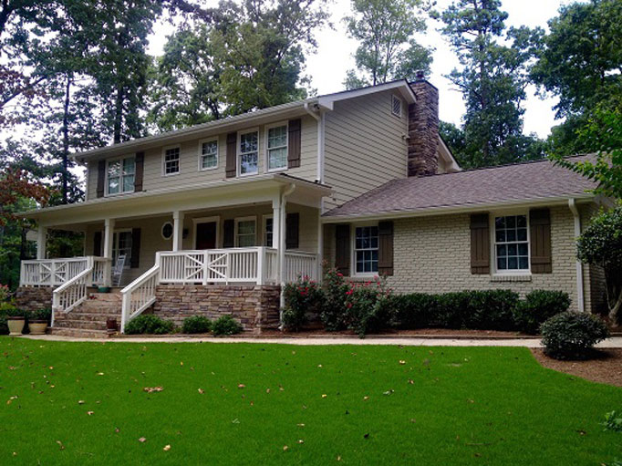
Shown below is the “before” of an Atlanta home I consulted on this summer. While the existing colors work fine with the unchanging elements, the homeowner’s goal was to update with a body color “less tan”, and to lighten and brighten the overall look.
The homeowner wanted a natural look, very much in keeping with the woodsy surroundings, yet brighter than what she had. She and I took note of the roof color and tones in the front stone steps. We then glanced at the homes to her right, left, and directly across the street to ensure we were not copying their looks. Here is the palette we decided on:
Trim: Panda White, SW 6147 Body: Relaxed Khaki, SW6149 Shutters: Superior Bronze, SW 6152And the result?
What a difference it made to paint the front posts and handrails the trim color! Also, the lighter, cooler body color gave the house an immediate update. The homeowner is ecstatic with the results, and so am I.
Color me experienced.
Which part of participating in the true colour expert training™ created the biggest breakthrough/aha moment/insight for your business, and how did it help you move forward?
In that course, Maria taught me everything I know about undertones.
When I took her class, I had already been working as a color consultant for a couple of years and had a fair amount of experience under my belt, but during the sessions, Maria began to explain undertones and how to detect them.
That is when I realized how little I knew about the subtleties of color. Her course gave me great confidence moving forward, as I could specify neutrals from a place of knowledge and understanding, rather than educated guess work.
But I had another “aha” moment I’d like to share with you.
After being trained by Maria in person, I came back home and began devouring her blog posts. It was there that I read, “If you are working with a color consultant who is not using large color samples, RUN!!!”
That got my attention. I immediately ordered a HUGE supply and began using them right away. Just recently a client said, “I’ve told a number of people since our color consultation that, with all the designers and decorators I’ve worked with over the years, none of them have ever used the large color samples like you did. What a difference that made!”
Color me armed.
And one final tidbit I picked up along the way from Maria is this: when using large color samples to assist in making color selections, always sample the color against a white background to get a true read.
This is soooooo important. When you put the color sample against the existing wall color, it “throws” what you are trying to get a read on, but if the color sample is surrounded by a white border, the color reads true. (My clients are always impressed when I share this bit of knowledge. It’s always the little things that make a huge difference.)
Maria, thank you for making me a much better color consultant than I was before taking your course. The knowledge you share has put money in my pocket. I will forever admire you for your honesty, transparency, and sunny demeanor.
Color me happy! 🙂
Patsy Overton – True Color Expert
— Thanks, Patsy, for such a fun and thoughtful post! See more of Patsy’s work here. If you’d like to become the next True Colour Expert™ in your area register here. Related posts:5 Steps to Choosing the Right Exterior Colours






I absolutely love Sea Salt but hadn’t thought of using it in a living room – might have to rethink that, as your home is gorgeous!!
Thanks, Jil. I had another client who did what I did here — used it all over her large two-story traditional home in Atlanta. When you use it everywhere, it becomes a backdrop. So pretty.
What a great post Patsy! In addition to being a talented color consultant you’re a great writer! I love the before and after of your exterior consult. Great work!
Thank you, Cathy. I LOVE doing exteriors. Since it’s what everyone else sees, that’s where the stakes are highest.
Oh thank you for this very helpful information. Your choice of colors are beautiful. I do tend to lean toward warm and cozy but this looks so refreshing.
I might have to be a bit more outgoing.
Thank you
Go for it, Lynda! Yes, light, bright, clean and refreshing are definitely the look of the day.
We use Sea Salt for our inspiration in mixing plaster tones. It make such beautiful modeled variations with a bit more grayed tone. thanks for such a wonderful post!.
Oops! I didn’t reply here. Thanks so much, Leslie.
Love the article and love the Sea Salt!
It really is my favorite, and everyone I show it to just love it. Thanks, Lajuana.
How interesting! Thank you, Leslie.
Great read! Thank you for the post. Did not know about the SW palettes and loved reading your tips on how to pick external colours. Now off to see if SW Sea Salt will work in the guest bedroom – at first glance I think it will pick up the same green in the bed cover 🙂
It will probably read more blue against the green, but that combo will work. Good luck!
Great post, Patsy. It’s always interesting to hear what other color consultants learn from Maria.
I’m wondering if there’s an equivalent to Sea Salt in the Benjamin Moore deck?
Thanks sharing your knowledge.
Marsha
(P.S. I was just in Atlanta last weekend. I live north of you in NC.)
Thank you, Marsha. You should’ve stopped by last week! : )
On the Ben Moore equivalent, I just whipped out my “Affinity” palette and Crystalline AF-485 is pretty much a dead-on match. Try it and let me know what you think, ok?
Thank you for checking!
You rock, Patsy!
I try 🙂
Great post Patsy! I, too, love Sea Salt. Love your exterior approach!
Thank you, Sarah. Let’s hear it for Sea Salt!
Patsy, what a great post! I too love Sea Salt and have it in my master bedroom.
The makeover of the exterior home you showcase in your blog is stunning! What a transformation and a true testament for the power of colour. I really love the white railing as now you can see the great design!
Another Sea Salt lover. We must be everywhere! Thanks for your kind words. I agree that brightening the railing on the exterior made the biggest difference in that home.
How did you select which colors to order as large samples? (I wish I could have them all…). Are there some particular shades that are must-haves?
I actually went overboard and ordered just about everything. I realize now that that was a mistake — I have so many large samples I never use. You need to start out with 8-10 shades of whites, light grays and, yes, even some beiges. Or make it easy on yourself and get Maria’s collection!
Thanks ! for the excellent article! I can see why Sea Salt is a favorite , might be mine soon! What a refreshing color and article on color learned a lot!
Thank you, Chere! So glad you learned something from my post 🙂
Wow! The after photo looks spectacular! Your client must have been thrilled. Well done!
We were both thrilled. Thank you, Shelley!
Patsy, this is an excellent post. Beautify after photos. I agree that Maria’s class regarding undertones is a must have for anyone specifying color. I recently specified Sea Salt for the interior of my Financial Advisor’s new office building. She loved it and everyone that enters asks about the color.
Wow what a wonderful post! I have very seldom used SW paints but I just got out my SW paint deck and bingo Sea Salt is just what I am looking for. I have been wanting to paint my family room a newer color that would go with my yellow beige travertine floors and I think that is what I have been looking for. Also I have a new client that I think will love it. Thank you so much for this post! Maria must be very proud of you. She has taught us so much.
Love all of your pictures and advise.
Another Sea Salt convert… great! Thanks, Lucy. Yes, where would we all be without Maria?
Wow – your before and after exterior pics are spectacular. What a transformation – a completely updated house. Painting the porch railings really made the whole thing pop and the base color is perfect for the stone work. Great Job!
Question: In you pic of living room with Sea Salt the room has a soft teal look. Is this because the accessories were teal? Does the comfort Grey have more of a gray undertone?
Thanks, Vicki. Yes, the Comfort Gray goes a little more gray; but in the living room I used Underseas SW 6214 as an accent color on the fireplace surround and the coffered ceiling trim. Squares in the ceiling are painted Sea Salt.
great job! i love reading these posts from other colour experts.
I do, too, Heddy. Thank you!
Patsy, you have made me want to rush over to Sherwin Williams to check out the palettes as well as your colours. Thanks for such an interesting and informative piece!!!
Do it! Tell them Patsy sent you 🙂 Thank you!
Great article Patsy! You have a great writing style. Agree with everything you said- I too have learned soooo much from Maria! Beautiful job you did on that exterior.
Thank you, Kelly. Where would we all be without Maria? Caught up in the spokes of the color wheel for sure.
Patsy, wow, you are a very talented writer! You should join the blog world for sure! I also love Sea Salt, especially for shutters on a cream or white house! xo Ellen
So if you are building a home, should you choose the roofing colors based on the colors you want your exterior siding to be? I realize when repainting you are “stuck” with the color of your roof. But I am building a home from scratch and wondering how I can use the roof as a non-limitor?
Good question, Kristin. In my opinion, the best roof color is something that is multi-faceted with both warm tones and cool; that way you are not “limited” by color when it’s time to repaint. For instance, you wouldn’t want to use a brown roof with gray siding, but a roof containing both browns and grays will go either way. A charcoal gray roof can be used with any body color, but that’s not what you want if you are using an architectural style. I hope that helps.
Yes, SW Seasalt is beautiful and my clients love it. My own home’s living-dining area gets inundated with sunlight & high temperature’s of central Florida. To counteract that and to bring in a cooler feeling I used Ben Moore’s 2139-50 Silver Marlin. The paint chip looks grey and I’m not a grey person. But up on the walls I call it my greyed down blue-green. And it’s true. Some times it’s more green and sometimes more blue-grey. That’s what differences in natural light can do. Thank you Patsy for a fantastic article. Your photography is gorgeous! Hope you will write again.
Aw, shucks. Thank you for wanting more from me! Haha. You are right about the light and Sea Salt or Silver Marlin. In my home, the Sea Salt is much brighter than in other spaces where I have specified it — partly because my trim is very creamy. Thanks for commenting 🙂
I love how you have explained the different palettes in the sherwin Williams colors. I have a brown metal roof. The color is very similar to SW7040 Smokehouse. and cannot seem to find a color for the body of the house. (Brick). I have white trim. I tried backdrop SW7025. But it looks a little too dark. Could you please help me with some suggestions. Florida.
Miriam, I realize you’re not asking me, but my 2c:
Backdrop is too purple. You could probably use 6149 Relaxed Khaki as in the example above. Or, look at something like SW 7050 Useful Gray or 7051 Analytical Gray. Both those have warmth and a touch of green, so they generally sit well outdoors.
Thank you so much for you reply. Do you know of anyone we could hire to help us with our exterior remodel here in Vernon, Florida? A color expert that is, of course.
Nice post Patsy! I work for a design build firm, and they have decided that we will only use Sherwin Williams paint. I have always used Benjamin Moore, so I am working hard to familiarize myself with the colors. It’s good to hear about fail safe colors like Sea Salt!
It’s funny that you mention that turquoise is hot in Atlanta! I live here and just painted my brick ranch white…with a turquoise front door! I love it!
I would love to see your home! I’ve seen the look you describe and LOVE it! I’m totally into painted brick these days. Fabulous. Let me know if I can help familiarize you with SW colors.
Hello Patsy,
I really enjoyed the blog post and you are quite funny too. Your voice really comes through and I’ll bet you are a lot of fun in person.
I also love Sea Salt. I was lucky enough to be contacted by House Beautiful for their color column and I sent two options and one was Sea Salt. They selected St. Bart’s (SW 7614) because it followed their theme better but Sea Salt jumped right into my head when I got the call. I have yet to find a client who doesn’t love it. Even with a coastal moniker, I had it painted in a bedroom in Colorado and that client loves it too.
By the way, maybe it’s just me or I waited too long to read this post, but when I click on your photos, I only get your blog and it says “photo” not available. If this is a glitch that can be fixed, I’d love to see them. If it is my fault (I am actually doing this remotely from Europe while on travel), I apologize.
Thanks,
Pamela