


The sun is out, it’s getting warmer, and I have received the occasional request to start writing about specifying exterior colour. I have a lot to say about this topic as well but I’m starting with a short post today; an exterior in the West End of Vancouver, to show you 3 undertones :
1. The body (siding) which is a green/gray
2. The stone which is pink (my favourite – NOT)
3. The pillars, balcony and fascia which are a very creamy yellow
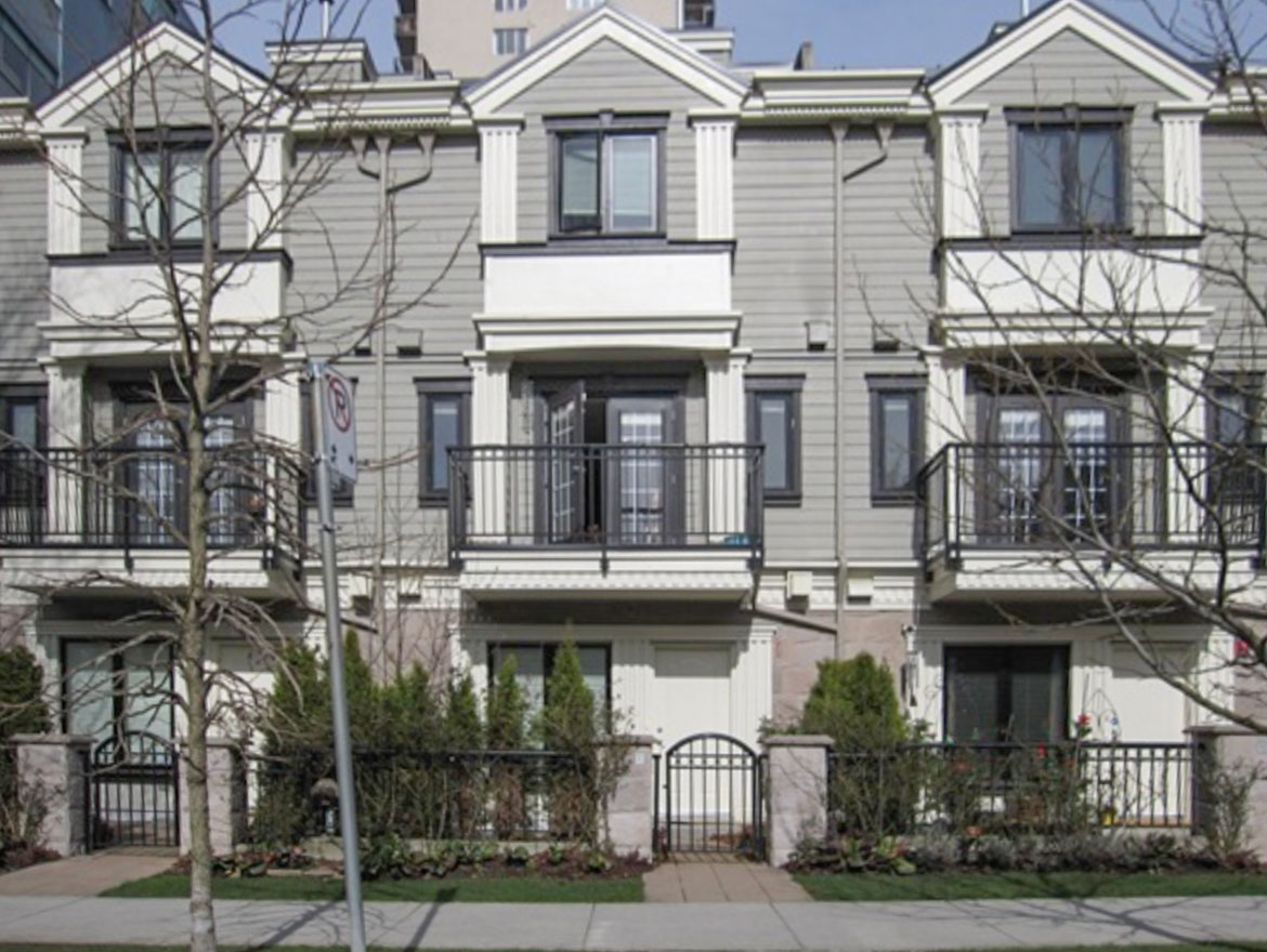
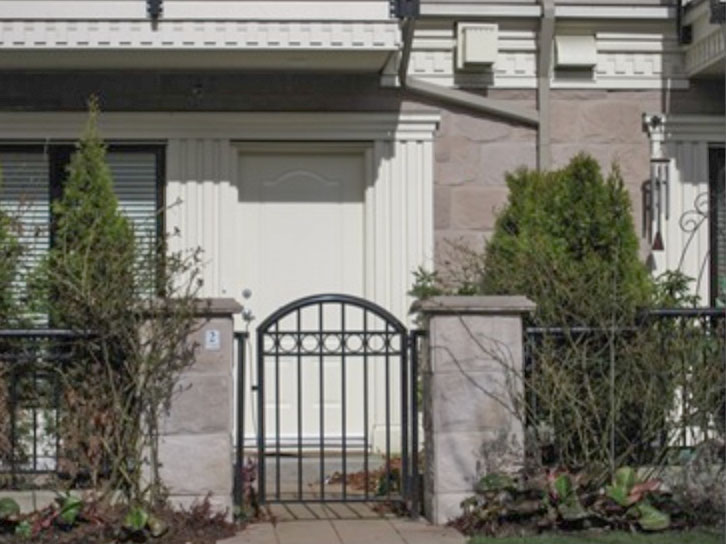
The colours are washed out by the sun but you can see the stone up closer in this photo along with the trim colour.
And just so you know, I don’t think it’s really bad, however, I was motivated enough to stop and take a photo to point out a couple things. . . you’ll have to check back later in the comments to find out!
Related post:
What Everyone Should know about Beige!
Clean vs. Dirty Colours

I don’t know, but I can’t wait to find out! When we bought our house, the front door obviously clashed with the brick so I repainted it. It still looks wrong, so I’m hoping to learn a thing or two before attempting another color.
My guess is that pink stone is a “dirty” color. Also, does it have something to do with warm versus cool colors? If you want it to pop, you would use complementary colors. Can’t wait to hear what you’ve got to say about it. As it is now, I find it hideous!
P.S. I like the new yellow background color!
1.- The front doors don’t stand out at all – they blend with the trim colour. The front doors should be the focal point.
The french doors in the juliet balcony and the upper window are dark which are making the exterior feel unbalance.
2.- The trim colour and the fact that the main body is green are accentuating the pinkiness in the stone.
3.- The colour of the trim is washing out all the architectural details. A middle tone or richer tone will create contrast with the shadows in the flaute detail of the columns enhancing them.
I also will probably add a darker colour in the main floor and a lighter to the second and the third floor to balance the visual weight.
I am sure you will have better explanations – I just want my A+ ok (lol)
Sorry but I don’t see any yellow in the trim, but if there is a yellow undertone it clashes with the pink undertone in the stone.
I don’t see any green in the facade…it looks more on the brown side…it may be my monitor?!
In any case this is not for me a very bad example of exterior colour in Vancouver, there are waaaayyyy worse examples.
What bothers me more is the style…what are those kind of “ionic order” columns doing there? and the rest of the decoration? They should belong to a neoclassical style building…what was the message of the architect? I am confused? I am pretentious? I wish I was…?
Looking forward to Maria’s final explanation.
The main problem is the combination of the wrong undertones — a pink based beige on the stone with a creamy yellow on the trim — these two undertones don’t go well together (the apartment actually brings to mind the kitchen tile and countertop you posted about yesterday!)
In addition, the creamy yellow on the trim is a “clean color” next to the siding is a more muted “dirty” color. To top it all off, the black around the windows is just awful!
to me it seems like warmth and coolness together in undertone would be a big issue, plus too much sameness, maybe needs a bit of depth somewhere (I’m no interior/exterior decorator).
wow… a fun little test…
i say deanna is on the right track: too many undertones that actually don’t work together. possibly a change in shades as opposed to tints would have been a better choice – at least from my taste point. imogen (i love that name) is probably also right about the warm and cold clashing.
ivan’s got some good points too about the front door colour and… well, they are all good points!
but as you said, it isn’t completely bad… it’s just not quite right! 😉
Hi Maria
Waiting very patiently for your explanation as well. Exterior colours are so hard to choose as the outside light plays a big difference to how they all look together. Sometimes the colours on my house look so washed out, but then there are moments during the day they look great together. I am also interested why you dont like pink undertones? I have sooooo much to learn about colour…must go and re read all your posts…I just love your blog!
Mrs B
Can I ask you a favour? If you are inclined, would you be so kind as
to pop over to http://style.la-mimi.com/weekly-fashion-idol/vote-for-your-favorite-fashion-idol/
I just would love if you would vote for your favourite. Better if you vote for me. 🙂
Thank you
The Seeker
Thanks everyone for your comments!
Mrs B. brought up a good point, she asked why I don't like pink undertones. I am currently working on a master bedroom that has varying shades of darker pink undertones and it looks warm and beautiful. Done well it looks great.
I have seen so much pinky beige wall to wall carpeting from the 80's( that is now so dated) I guess that's why I've developed an aversion to it. Sometimes I worry that I should pull those colours out more often because a lot of people see them as being warm & cozy. Conversely, I have had so many women say to me "Please come over and pick a beige for me, I always end up with pink on the walls"
What I really think is awful is pinky beige with yellowy beige together. In this exterior it is not really bad as it's a cream not a beige on the trim but I would not have chosen it (it's OC-92).
The first thing that bothers me about this building is that again (to De Anna's point – like in my post about kitchen colours) there are 4 colours here that don't relate to each other.
The challenge here is that the stone is so pink that I would not repeat it on the building. Therefore, instead of introducing a 'colour' like the greeny gray on the siding (HC-101) which to "Meade Design Group's" point makes the pink stand out even more as green and red are complementary colours. I would have chosen a way more neutral shade, a warm gray like 996 (or CDN CC-460) and I would have painted the balcony's the same colour. I don't like the way the house looks quartered because of the heavy concentration of cream trim in the middle of each section.
I agree with Brillante, there seems to be mixed styles on this building making it difficult to choose what should be enhanced here.
I would keep the black where it is on the building but I would have repeated it on the fascia on each point, it looks like the roof is floating without any black up there. Also, I didn't even notice the front doors until Meade Design pointed out that they were painted the same colour as the trim, so I would repeat the black here.
Then I would have painted the rest of the trim and pillars 'white' (0C-17 White Dove) not cream.
What would be the equivalent to the cc-460 in Sherwin Willams? I love your suggestions. I have pink tones in my stone and roof so I think that would be best for my house.
Congrats on the Post pick of the week mentions! It’s so great when someone can express the visual world of color w/words. Thanks!
I love to hear about the the variety of your sense of color combinations Maria! Great!
I am wondering if you would still pick the same paint colors today-