
Here’s this weeks question that made the top of the list because I think this is a common issue so hopefully it’ll help a lot of you!
“Maria, I know a lot of what I did wrong when choosing a paint color for this office now that I’ve found your blogs and books! (For instance, I started with picking the artwork rather than furniture, and I obviously did not take into account the undertones in the fixed finishes.)
That said, could this blue possibly work well enough if the florescent lighting was changed?
Or how else can I improve on it without totally repainting the office?
Also, what would you recommend for a furniture color, again, without repainting?
If it has to be repainted, and the landlord won’t replace the lights, carpets or anything else, what do you recommend?”
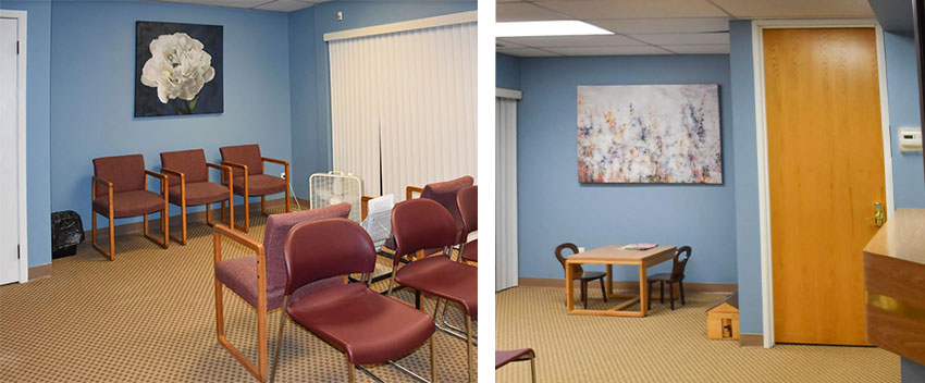 Existing office with new blue walls
Here is my advice:
First, changing out the lighting will do nothing to improve this room. We have three colours here and none of them relate to each other (except it looks like there’s some burgundy in the carpeting).
Overall, however, the READ is that they don’t relate. If you have to get a magnifying glass out to see the colour that relates, then that’s probably not the one you should choose in general.
Currently, the burgundy chairs look like they’ve been here since the 80s. The carpet was probably replaced in the 90s because it appears to be orange beige.
You’re right, as I’ve just said, the blue is a problem because it doesn’t relate to anything. Combined with the old chairs and orange carpeting, the resulting look and feel is more like a kids room blue and on top of all that, it’s also created a clean and dirty problem.
The blue is simply too fresh with the more muted, earthy, gold carpet.
However, don’t despair, there is actually a relatively simple fix for this, but I have taken the liberty of creating three options for you to choose from:
Option 1
The cheapest and easiest fix without repainting the walls is to replace all the burgundy chairs with white chairs.
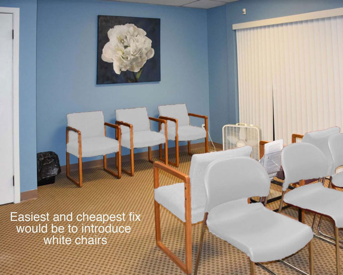
The white chairs will relate to your artwork, white vertical blinds and doors (since one door in this waiting room is already white, I would paint the orange wood door on the other side the same colour).
It will still look like you are ignoring the orange carpet, but that’s what it looks like right now with the blue walls that don’t relate to anything (eeek have I said that already?).
Even if you chose a colour that related to the orange carpet, the burgundy chairs still look older than anything in the room and should be replaced.
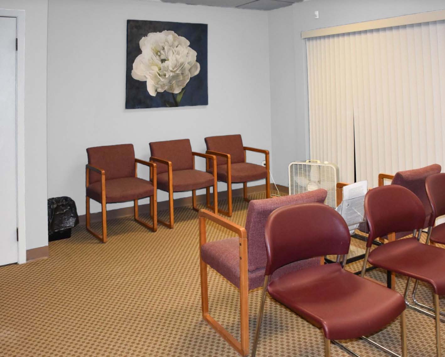
Since white is the new grey, I thought I’d show you what it looks like photoshopped in white so you could see that it would NOT be an option here. Very bad with the earthy, orange carpet.
Looks like a bald, unfinished room (like we’ve just painted the room with primer) which is what happens if you overdo white walls in an earthy interior.
Option 2
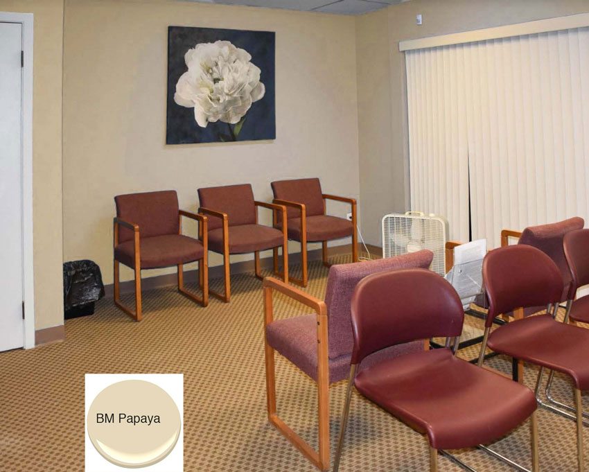
Paint the room a colour that relates to SOMETHING. You are always looking at the biggest items in the room when it comes time to choose the wall colour.
Burgundy or pink is out here because it would simply take the room back to the 80s.
Since the carpet is an orange beige colour, I have photoshopped the room so that you can see how much better it would be even if that’s all we do (Keep in mind the photoshopping isn’t perfect but you can get the idea).
Option 3
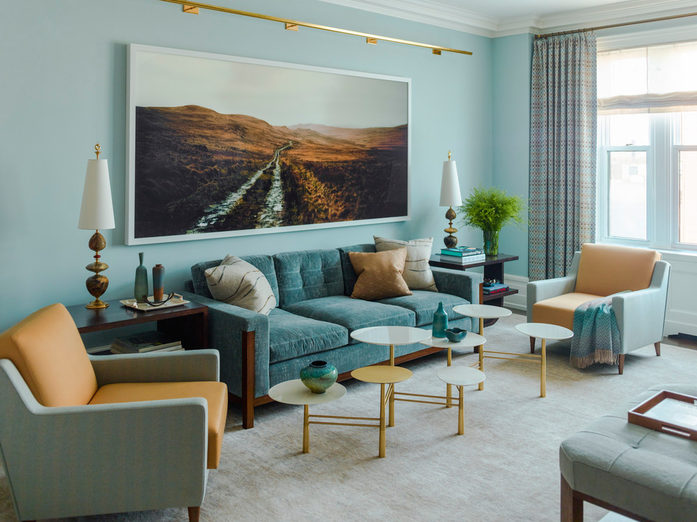
How do you make orange beige from the 90s look current? Well, I found this pretty inspiration photo that I’ve posted before:
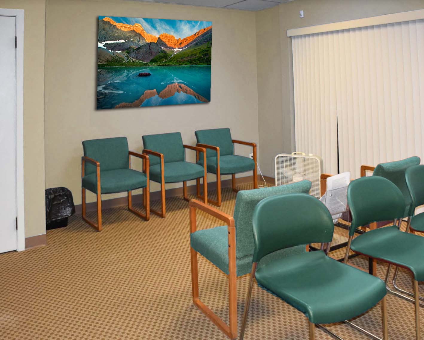
Here’s the room painted in orange beige with teal chairs and some landscape art to pull both colours together (below):
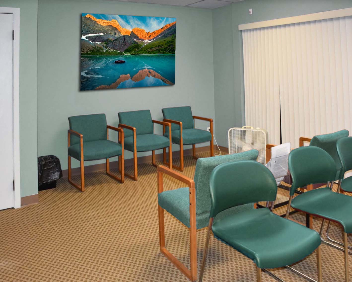
And here’s the room painted turquoise (below). Notice that the chair arms relate to the carpet which also pulls in the orange beige.
Over to you my lovelies. Which scheme do you like best? If you have some more advice for my lovely reader, feel free to post it in the comments.
I posted this particular dilemma because I think it’s a common one in any environment, residential or commercial. Obviously the blue was chosen because no one was interested in painting the room the same shade as the existing carpet, however a random colour that doesn’t relate to anything just makes everything OLD stick out even more, as we have just learned.
If you have a question that hasn’t been covered before for my Ask Maria column, take photos without flash and in good natural light (clean up the room the best you can) and email them here.
If you would like a room in your house to fill you with happiness when you walk in the room, our Get me Started package can help!
Related posts:
Ask Maria: How do I Know What my Style Is?
Ask Maria: What Mood Does Black and White Convey; Warm or Cool?
Ask Maria: Now that Beige is Back, is Painting my House Greige, a Mistake?



White chairs all the way!! Eazy peazy splendid fabulous fix! Bravo!
The last one! Great post and love seeing all the options.
The white chairs or turquoise room and chairs would be my pick. Orange beige with wine colored chairs is just dismal though. The existing blue paint may not relate but it’s at least a color and not a clashing neutral. (Not that the orange beige clashes; I just don’t care for it.)
wow…..great suggestions! it would be great if she could negotiate a new carpet when her lease is due to renew! or better yet….a wood floor. one caution though, my daughter is a dr. and she replaced 90’s carpet throughout her 3000 sf offices with hardwood and it is a noise problem now.
I specified Karndean flooring for a doctor’s office. It’s “luxury vinyl” and takes care of the noise problem but has the “look and feel” of wood. I was a little hesitant but they didn’t want the noise of wood – or laminate. We may change our above-ground rec room floor to it. Really nice company to deal with too. http://www.karndean.com/en/commercial-flooring.
White chairs for public seating – not practical.
Hello all sister Lovelies,
I would ask the landlord to give permission to have the carpet in the waiting room dyed. You might be surprised that it won’t cost as much to do that as it would to replace it. A friend of mine had beautiful light gray carpet and after a few too many wine stains she had it dyed a burgundy color and it was gorgeous. Wait a minute, yes, that was back in the 90s but I think you could find a color to hide that ugly orange beige stuff on the floor.
I definitely would replace the chairs but if you could introduce some more art with burgundy in it you could perhaps save the chairs. The one lonely print of the blue flower isn’t large enough and needs some friends to play with.
Karen
I guess it all comes down to “You have to repaint the room”. I think I prefer the last picture with the teal chairs. Great options, Maria.
I prefer Option # 1. Even thought the paint does not relate to the carpet, it is still the freshest look. The other options still look dated as they relate to the dated carpet. Too bad you can’t change the carpet as well.
Hi Maria,
I definitely like your idea/design to change chair color to white the best. It really refreshes the room but to pull it all together, I would in the future still consider changing the art work to colors with orange/beige/white. This would bring the whole room together.
Nice job!
Either of the last 2 pictures with teal chairs is best. However, most expensive. I think that the picture over kids table is pulling it together. The single flower pic should go down the hallway to other offices since seems off to room.. Buy bigger picture that works with the blue, orange and burgundy in room with more punch than other pic. There is an Art site that has many possibilities. Try this until carpet & chairs can be replaced.
The last two are great. I loved this post.
Turquoise walls, for sure. The artwork is inspired! But the hideous carpet and cheap plastic fan have to go.
I just want to point out the core of your great lesson is that that last option is using the correct undertone. The blue originally used is a cool undertone and this last color has a warm under tone like the carpet…
I think blue and grey are used incorrectly more than any other color…. so this tortoise is a warm version of blue and a perfect way to go with this carpet…
I think that the answer was that the blue colour isn’t greyed enough to work in this scheme, its too fresh and makes everything look dirty and old. The existing stuff that had to stay should have been what was matched the artwork comes last I would have chosen HC 145
Van Courtland Blue but since the paints done -get yourself to a used office furniture/ supply store, ReStore or a consignment store to pick up new chairs in darker blue
The carpet wouldn’t cost that much to replace- roll end I am thinking.
Since it looks like a doctors office the white walls and chairs will not work with the maintenance issues
If the room is painted orange beige, I think the artwork over the child’s play table could work over the row of three burgundy chairs – both for colour and size. A plant or two – especially a tall one in the corner by the window would improve the room as well without too much cost. However, if there’s more money in the decorating budget, I’d go with the last option. It’s a much calmer place to sit and wait.
The last version is my favorite. The light turquoise walls with teal chairs is perfect. Hopefully she can make that happen.
Next up would be addressing the vertical blinds. The space would look more contemporary if they were replaced.
I really enjoyed this post. I prefer option 3 because of the warm and calming effect it presents. We want to be relaxed at the doctor’s office, don’t we? The art work is breathtaking and pulls the orange tones and blues together. Love those chairs now! Can they be reupholstered? Maria, what color is the paint you chose for option 3? It is not showing up for me. Thanks. Be sure to send the “redo” photos so we can find out which one she picked.
All your samples were a great improvement , but hands down I like the last one. Teal chairs with lighter teal walls. What a difference!
The white chair solution is great but I anticipate that no waiting room is going to do well with white chairs long-term. The white chairs are going to get dirty extremely fast and consequently look even worse than the original problem. The teaL Chairs with the updated artwork would probably be the most practical solution.
Option 3 is my choice. It is very stylish and updated and cohesive.
Thanks as always, Maria, for excellent advice
No question about it. The last picture is the only way to go that will solve her entire problem.The turquoise chairs and light teal walls certainly update the look! She would need to also buy artwork like you suggested to pull it all together. If they won’t pop for recovered chairs then No. 2 choice will be the cheapest fix. No white chairs in a waiting room please!
I like the Ask Maria questions because you always come up with great advice!!
This kind of situation is why I don’t like landlords. : )
I agree with all that the final photo is much better. If I were to enter this office my impression would still be, ” Blech”. Maria, what would you do with a budge ? Even a DIY budget ? ~ C
I would change the paint to the BM papaya .. those chairs scream 80’s but I think it’s the best choice and it looks like a professional office .
Last picture is brilliant. Very professional yet welcoming. But I still hate that carpet.
I love your “Ask Maria” posts! It’s fun to see you problem solve. Thanks for the specific advice!
This is such a great post, love you Maria!
Wouldn’t black chairs also work? Black chairs would also relate to the art and would be more practical in a commercial space to hide the wear and tear. And what about layering some black and white indoor/outdoor rugs under the chairs to add more to pull the colors together. And maybe some real plants that will bring in another fresh/clean pop of color so the blue is not alone??? Fun post. Thanks for sharing!
I like the orange beige walls with the teal chairs. White chairs, really? In an office waiting room where there obviously will be kids since there’s a kids’ play area. Unless the white fabric is something that can be wiped clean (like a faux leather), I think they would get dirty really fast.
One no cost idea – lower the prints. Both pieces are too high. Obviously, changing the paint and the chairs would be great, but keeping expenses and flexibility in mind, I would choose BM Papaya. Get some fake plants and find planters with colors will pull together wall print and chairs. Or if you go with white or creamy chairs – still move prints and add planters
Nurse Kim here to say NO!!! to white chairs and walls in a medical waiting room. Nightmare to keep clean. My favorite is the last photo with light teal walls and deeper teal chairs. It’s soothing and professional looking. Love this Ask Maria series because you illustrate the problem and the solutions so clearly.
I agree completely.
Great post Maria! This office looks like a therapist/doctor’s office. The dear reader may have thought that the blue walls would be “calming”. From my perspective, having had a private practice for thirty years, it’s important to invest some money into your office. Looks as though this office is heavily used, white chairs would not stay clean unless you use leatherette fabric. I would go with option 3. Bottom line, new chairs and repaint.
Ok, I am thinking more in practical terms here. Although I like the updated white chairs, that would not work in an office setting. They will be so dirty in just a couple days. Practically speaking, the best choice is the last photo — repaint the walls and replace the chairs with a darker upholstery.
If she doesn’t want to repaint, and white fabric chairs are not appropriate for a public waiting room, what about blue fabric that complements the existing paint colour? It would be a similar look to Option 3, but instead of teal/orange it would be blue/orange, thereby avoiding the need to repaint. Eliminate the burgundy and it looks better!
Because the blue is a clean colour and the carpet is earthy. It’s also a clean and dirty problem! That’s the reason why I did not look for a fabric that brought in both colours. Hope that makes this more clear! Maria
Great suggestions, but…I have to disagree with your lighting solution. Changing the lighting WILL DEFINITELY impact the room! No matter how beautiful the interiors are, bad lighting will result in a bad look. Fluorescents are the bane of good design. If the landlord will change out the lighting (in addition to Maria’s suggestions) GO FOR IT! If he/she will go for LEDs…all the better. Look for lighting with 3000K and a CRI of 90+ and your interiors will be very happy indeed. Good luck! 🙂
Hi Lori,
Of course changing out lighting in general improves the look of a room, however, changing out the lighting will NOT magically make all these unrelated colours work! Will not change the fact that it currently looks like it’s painted a kids room colour. That was my point. And thanks for adding yours! Maria
Also…white chairs in an office?! Looks great, but won’t stay looking great unless you use a high performance fabric like Crypton fabric or have the fabric treated with a finish that envelops each fiber (like Nanotex). Using a vinyl is another option, but take care to make sure it is not “slid-ey” (where you can easily slide off the chair).
Yes absolutely white is not practical but if you apply this same dilemma to a residential situation it works! It’s a colour lesson, that’s what’s happening here 🙂 Maria
My vote is for the white chairs, it looks the freshest.
The BM Papaya walls and painting the second door white. It read as if she needed the least ex pensive option, so that is my choice.
If money is no issue then turquoise walls with teal chairs. Beautiful.
Turquoise room with teal chairs looks the most intentional and least haphazard.
I love your ideas and I always try to think what I’d do before reading your post 🙂 My fave is the teal chairs & walls looks wise, option 2 as a second cheaper choice. To my mind you’re spot on about the paint colours but it’s the chairs I find most offensive. Looks like they could do with an upgrade anyway. I wondered whether another option could be repeating the blue, orange beige (reads gold on my computer) and white – especially if you could find a fabric or artwork that contained them. Doesn’t solve the clean/dirty problem but nothing other than a major overhaul is going to be perfect.
Great post. I learned something
g. I would go with option 2 as most cost effective and still pleasing
I like the room painted in turquoise best. It definitely pulls your notice from the carpet.
I prefer the last one. Calming and quite pretty.
While the article is a very helpful color lesson, couldn’t another less expensive solution for the person who submitted this photo & dilemma be to repeat the colors of burgundy, orange-beige, blue, white, & wood tones?
Using some limited Photoshop skills at home, I tried these items from Target in the room & thought they worked (after eliminating the current large rose print & the black waste can–can they be used elsewhere?):
–Overseas Printed Canvas with Gel Coat 5 Piece Set (cheaper on Overstock) (you don’t have to hang up all 5 pieces in this room)
–Straight Fit 3pk Decorative Wall Art Set Blush – 16″x20″ – Project 62™
–Wood and Gold Geometric Decorative Wall Sculpture 22.44 X 22.83 – Project 62
–Abstract Framed Embellished Canvas 42″x24″ – Project 62
–Blue Vibes 3pc Tinted Gel Framed Wall Canvas Blue – Project 62
–Target has some neutral waste baskets that would blend in more with the carpet.
Is the wood door such a bad thing? Definitely easier to keep clean & it already matches the wood tones in the chair armrests & carpet.
Thanks!
Well in actual fact the least inexpensive solution would be too paint the room the orange beige to coordinate with the carpet, but I’m sure my reader will appreciate any and all helpful comments, thanks! Maria
Thank you for your reply & always helpful feedback, Maria!
Maria, this is a helpful post that easily translates to residential dilemmas. One of the reasons I enjoy your blog.
For this office, however, how about changing the chair fabric to a pattern that has the orange-y carpet color and the blue wall color in it. Would that work? Quick internet search for Sunbrella fabric in orange and blue brought up some striped fabrics that seemed like they’d work. (Sunbrella because it’s supposed to be durable and stain resistant, as I understand. I’m sure there’s other brand options. I’m not a designer. Just offering a suggestion and wondering whether that would work.) And probably switching out the artwork as well. I recognize the plastic chairs w/ the metal legs wouldn’t change so hopefully replacing them is an option.
.
Another question I had was I noticed you didn’t suggest refinishing the wood of the chairs. Is that because it’s orange-y like the carpet and, thus, works in this room?
Great question, refinishing wood is very expensive, as is reupholstering anything. A lot of people don’t realize that when they want to slipcover a sofa that is the wrong colour, or dated. By the time you’ve bought the fabric and paid for the labour, it costs the same as a brand new sofa. So the only reason to re-upholster or slipcover a sofa is if you love the classic and timeless style and it was VERY expensive to begin with.
Buying new chairs off-the-shelf somewhere for this office will be the least expensive solution. That’s why the colour scheme needs to change.
Thanks for your comment! Maria
Budget should be a four-letter word. It does have a way of limiting options.
Thanks for answering my questions.
Dear Maria and all,
Thanks a million for the suggestions! I especially appreciate the kind way you and your lovely readers addressed the horrible paint color I chose! The wonderful thing is that I understand what you mean by a clean blue color and how it makes the carpet look dirty (or even dirtier, haha!) from reading your blog and ebooks! Yay! Thanks for teaching me so much!
We will be replacing the chairs and, I agree with most of the readers that the last option looks and works best.
If I get black chairs, however, (which one reader suggested and are readily available within the very limited budget we have) I’m thinking the BM Papaya or something similar and replacing the big navy and white flower pic with something that relates might also work.
Open to more comments on that idea from anyone!
Thank you so much!!!
I would not introduce black, it will be way too heavy and overpowering given you have so many chairs in that room! Hope that helps! Maria
It helps SO much! Thanks a million for answering my questions and solving my difficult dilemma, Maria!
Even when it was “trendy”, burgundy with blond wood was a hideous combination! So, like you said, the burgundy has to go.
Now about white (or rather a creamy white) for the chairs – I think that is a GOOD idea. Why? Because if this is a doctor’s office, you want things to actually be clean not merely look clean. Hiding dirt, grime, snot, body oils and who knows what other contagious things is a form of false advertizing. I would want a fabric that can be cleaned every day and doesn’t spread disease.
When you enter an exam room the exam table has a fresh cloth or paper sheet. Hopefully, the doctor and nurse are wearing a realtively clean lab coat with short sleeves and, for men, no long tie. Really, what good is a clean exam room when you have just spent 30 to 50 minutes in a dirty waiting room? I worked in Infection Control for a number of years. There are now fabrics that are designed to reduce the spread of disease. Many contain copper which is bacteriocidal. Color is important for psychological reasons but clean is more important in a healthcare environment.
The last photo was the best. It brought everything together and nothing was glaring. I did not even mind the carpet in that Photo 🙂 The feeling is comfortable and warm/welcoming.
Another GREAT post Maria!! This scenario is all too familiar in so many homes, bedrooms, offices I’ve been tasked with choosing new colors. I think people who are very inexperienced think a design solution is color of some sort on the walls.
Love how you walked through the process. I would say repaint the BM Papaya; great option. If they have the $$$, I love the last one.
I had this exact thing yesterday; the best choice for this client was ‘man-tan’….she had a moment of, ‘wow, I am paying you for this boring beige color????” But she did get it finally. Unless she was willing to start from scratch, ManTan it is!
I thought the turquoise was a clean color. Ugh. Still learning . . .
Well clean and dirty is context. There are much cleaner turquoise shades and much dirtier. . . but the primary lesson here is that the colour needs to RELATE to something in order for it to work. Just like you can always find a cooler colour than the one you’re looking at and you can always find a warmer one. . . it’s relative. Hope that helps, Maria
I vote for the last photo with the turquoise walls and chairs. I, too, like the look of the white chairs, but the last color scheme is more practical in a waiting room.