


Today I’m sharing how I transformed bleak, battleship grey institutional hallways with a happy colour palette and vibrant artwork. I think this post will brighten your day!
After creating all kinds of love and happiness decorating five suites at Wilma’s Transition house (note: you can see all the before and after episodes over on my YouTube channel), we had just a couple days to address the bleak, institutional feel of the battleship grey hallway and common area.
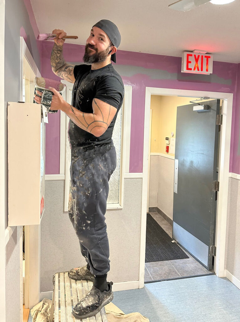
My amazing painter, Joe, from Bristle and Boss Painting dropped everything to come get it done ASAP before opening day. And my Director of eDesign, Tricia, was on the scene to help too.
THIS is when paint can do the heavy lifting
The existing mid-toned battleship grey walls (which is essentially blue grey) actually made the staff miserable. They hated the colour the moment it went up.
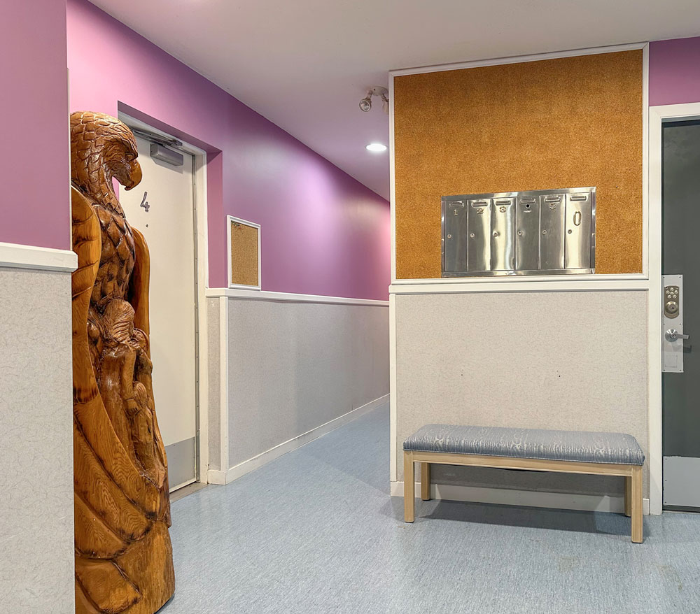
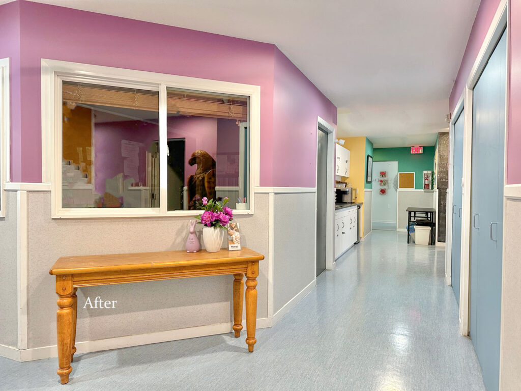
Fortunately, there was a pretty sky blue marmoleum floor, rather than a bossy taupe or beige one, so it was easy to add fresh, happy colours to the walls!
We painted the closet doors to pick up the blue floor and a pretty violet to match the society’s branding at the entrance.
Find colourful inspiration in some art
And Tricia and I went shopping for art for the common room.
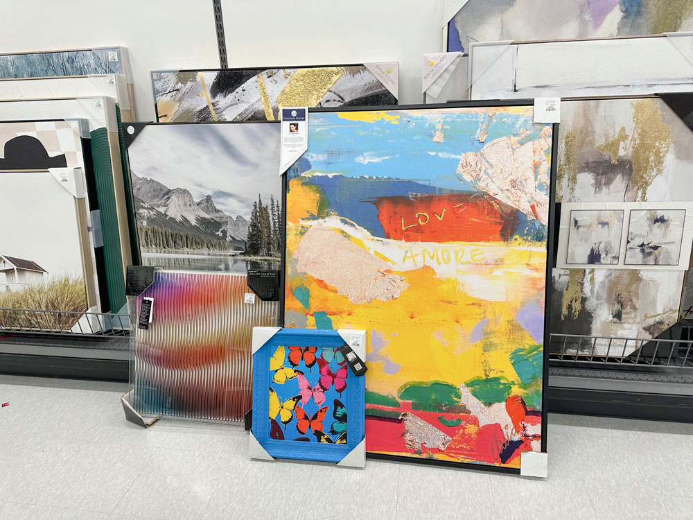
We started by looking for vibrant, energizing colour. It was me, actually who picked the large abstract piece this time! I think Tricia’s art curation is rubbing off!
And we found these fun butterflies and this amazing sculptural coloured plexiglass piece (above). Plus they had some charming kids artwork to hang in the space.
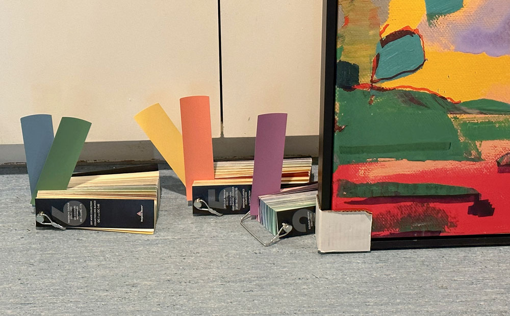
Here is the colour palette with the floor and the main piece of art (above). And below, the sad grey common seating area (before) just outside of the staff room.
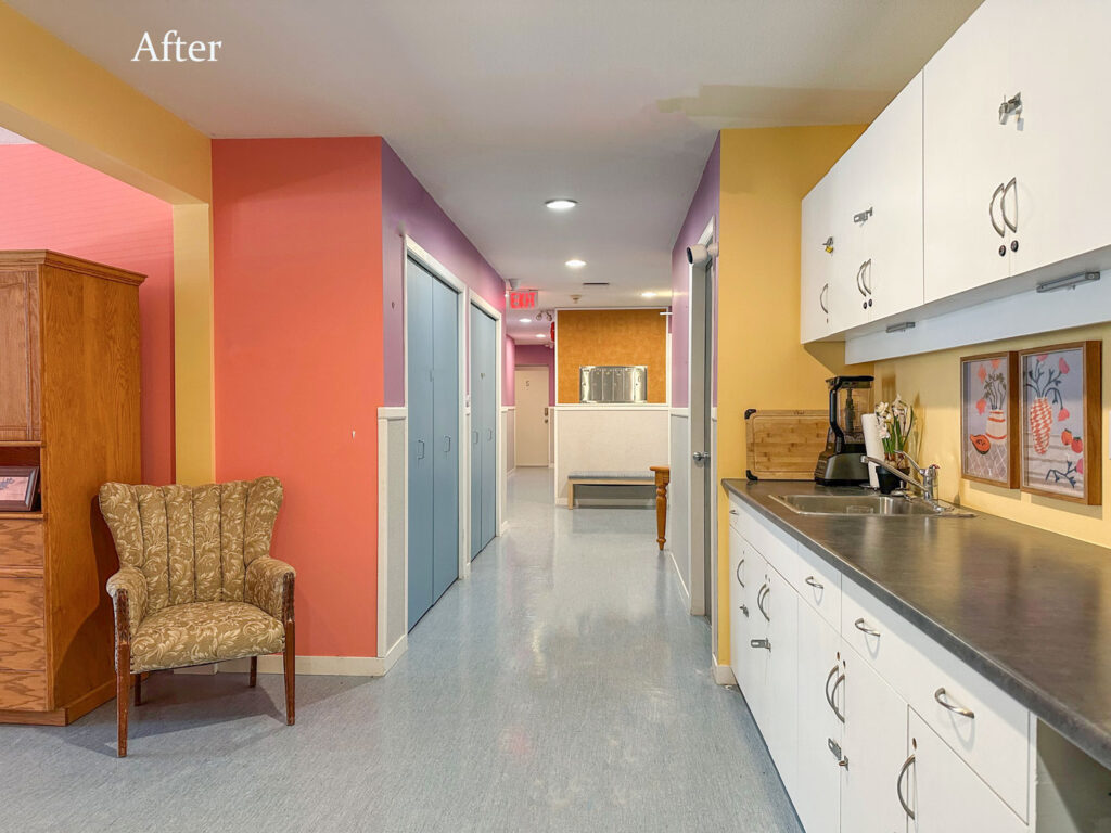
We chose the warm coral colour for this area and the transformation was dramatic! (below) My sister Elizabeth loved the coral so much she immediately painted her laundry room in the same shade and wondered why it took her so long to eliminate the taupe!
A couple of vibrant blue settees were donated (at the back of the room), and we found some colourful pillows to wake up the grey sofas and repeat the colours in the art.
Always add more lamps!
I just love the scalloped lamp shades, they add to the overall happy and whimsical vibe.
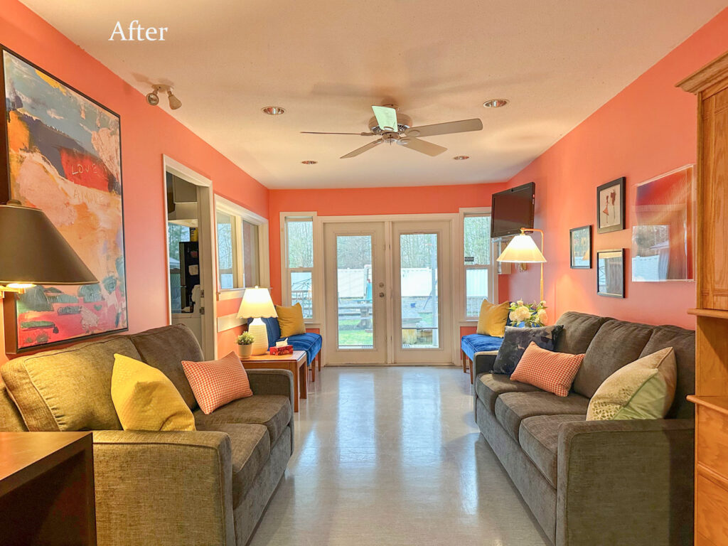
Now everyone wants to hang out in this room!
Painting the walls with vibrant colour
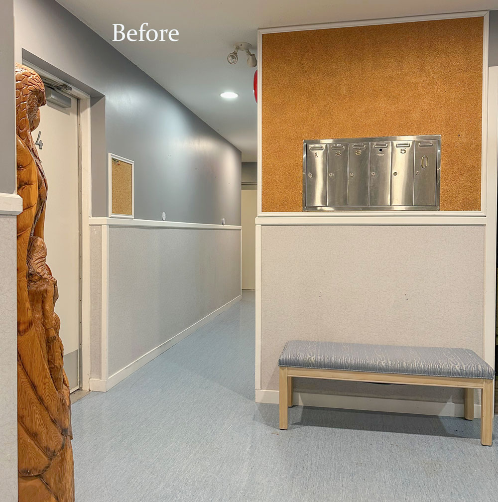
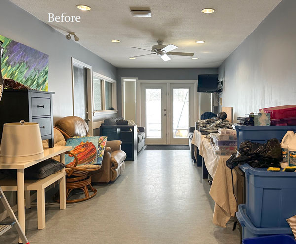
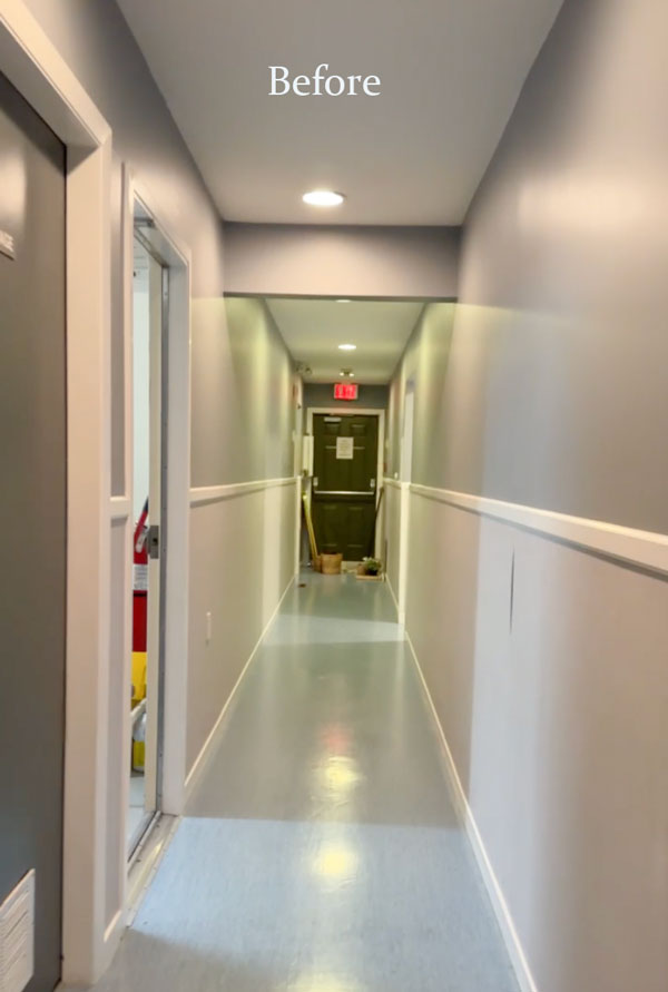
Before the whole corridor and lobby was just grey nothingness (above).
Now each hallway is defined by a joyous colour!
If you’re thinking, well that’s WAY too much colour for me! Remember that in an institutional type space, where opportunities for soft furnishings, texture and decorating is limited to nil. That means COLOUR does a lot of heavy lifting!
Wouldn’t it be a treat if more institutional type spaces (i.e. doctor or dentist offices) added vibrant colour?
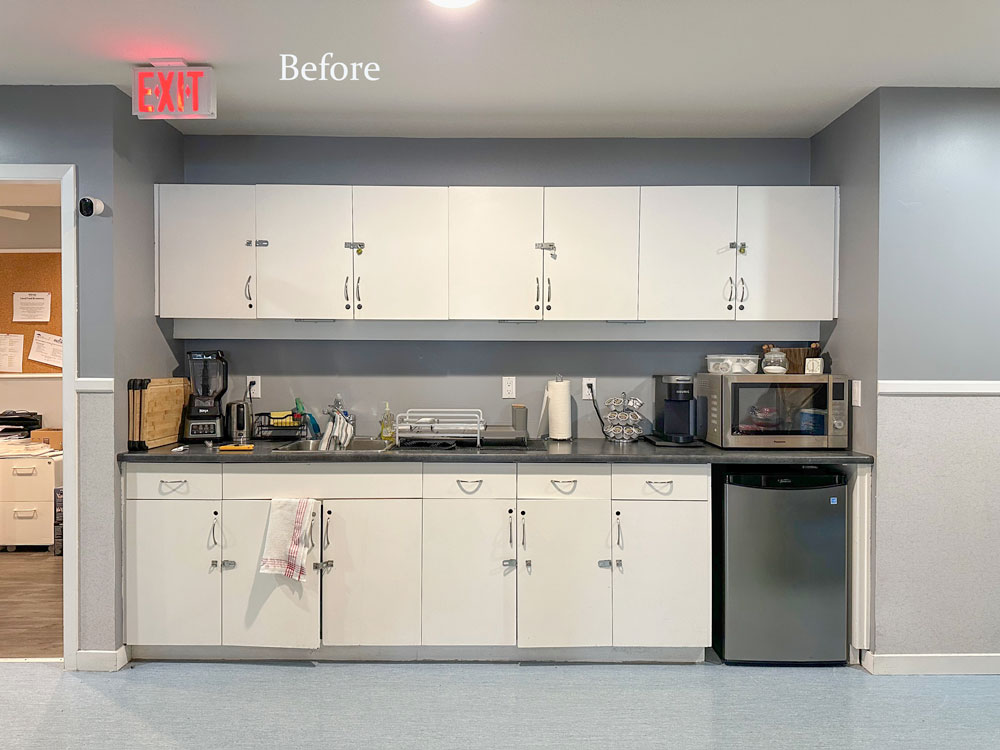
Here’s the lobby kitchenette before:
And here it is after in my favourite colour, sunny yellow:

The hallways felt so oppressive before.
And now, this cool green makes you feel like you are in some kind of soothing lagoon.
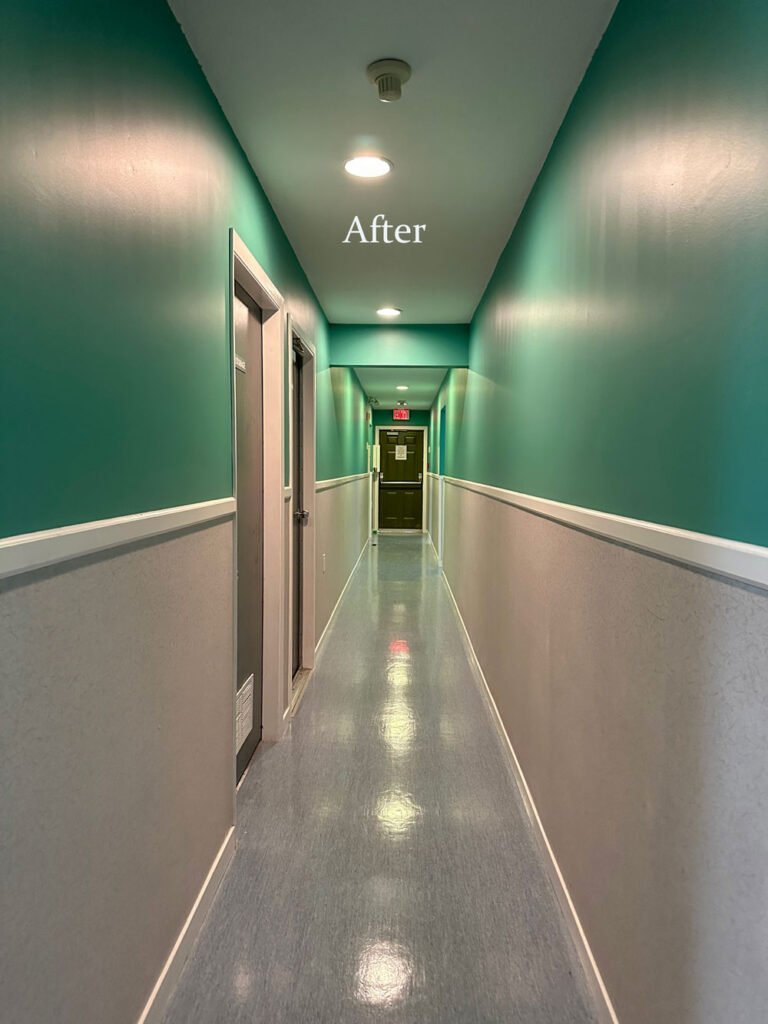
All it needs now are some happy tropical fish hanging from the ceiling and on the walls.
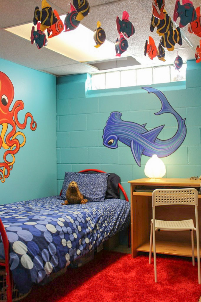
Related post: Best Ideas for Creative Kids Rooms Before & After
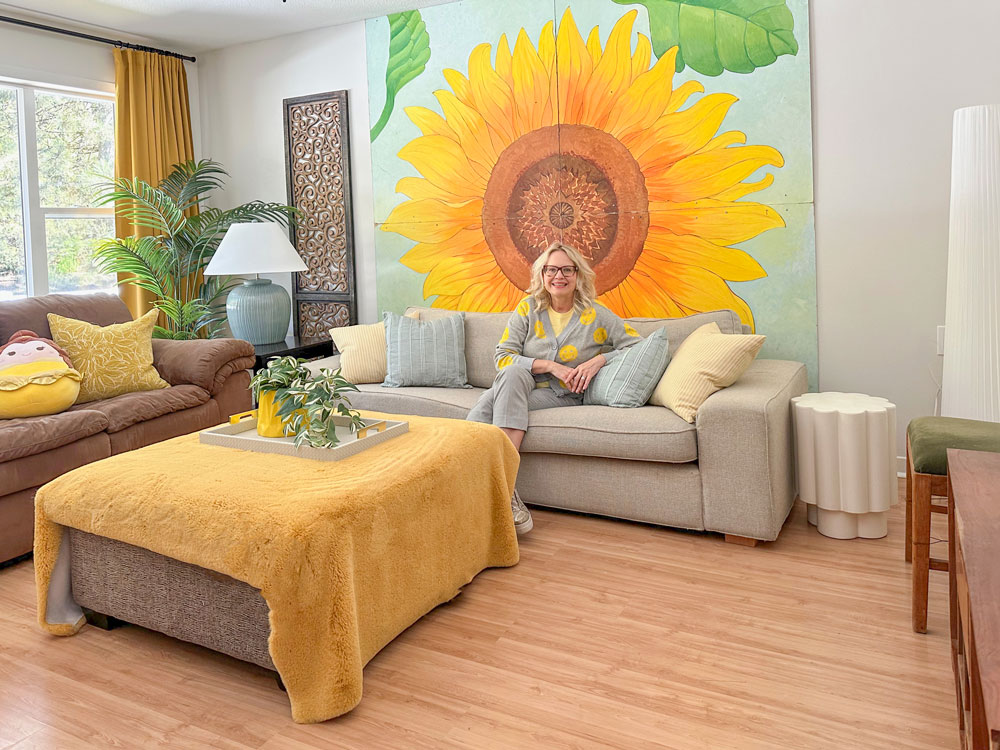
Now the lobby and halls make sense with the happy styled suites we created. My favourite, of course, is the yellow sunflower suite, you can see that episode here!
Biggest thanks to my painter, Joe, for making himself available to toil for two days straight to get this done before opening day.
Well that’s a wrap! It was pure joy to do this project. You can see all the transformations over on my Colour Rescue series on Youtube. The episodes are packed with tips and ideas for decorating, styling and making the best of what you’ve got.
Now it’s your turn!
If you’d like my help tranforming your room from blah to happy, check out my eDesign packages here.
And if you’re in the Lower Mainland, or the Edmonton area, and you’d like to have me Colour Rescue YOUR space, email me here with some photos of your space 🙂 Don’t worry, appearing on the video is completely optional!
Turn your side hustle into your dream job!
This spring level up your colour skills by joining me at my live True Colour Expert Training in Chicago!
Related Posts
The White Wall Trend is about to Pivot: Are You Ready?

An absolutely, stunning transformation Maria. Beautiful.
Love all that you’ve done, Maria! What a happy place to be whilst in transition. You’re a good woman and you’ve got a great team.
PS Where’s the lamp in the kitchenette?? lol
I love the “idea” behind and the living room coral (?) walls with colorful paintings worked particularly well. But the totality of color in all the spaces I find overwhelming as in,
I don’t know where to land, where to rest my eyes.
It feels as though there was a major sale on paint so you bought it all and went for it.
I can see how it could feel overwhelming if the colors were all in one space, but keep in mind that residents and staff will be walking through each individual color area, so their eyes won’t need to rest on a variety of colors. If anything, the different colors help orient them and guide them in the direction they are going. It would help me find my way if I know that I live on the purple hall or the green hall. Otherwise, I’d be lost! 😊
Benesse, of course, you don’t have to like the totality of colour… we all have different preferences which is ok. What I personally find not ok, is throwing out insults. What I can say, whether it’s a personal preference or not, the drab & depressing hallways & living spaces came alive once they were painted these beautiful colours and the ‘feeling’ when you walk into these spaces is pure joy! I keep imaging all of the moms and children coming from very traumatized situations and even if they don’t like every colour, I have every confidence they will love how these areas make them feel. Having been there I can easily say that these spaces are truly magical!
I agree with you…it’s not an insult to say you find it overwhelming. Different strokes (of paint) for different folks 🙂
Nobody is saying that finding the colors overwhelming is an insult. That’s a valid personal opinion.
The insult is this: “It feels as though there was a major sale on paint so you bought it all and went for it.” Anyone who has followed Maria for any length of time knows that her choices of color are intentional, not random. In this case the abstract painting shown toward the beginning provided inspiration.
These colors aren’t meant for a regular home. This is a shelter that needs to be a happy place like the name of Maria’s blog “Color Me Happy.” These women and children are coming from a dark life into potential happiness. Might some feel overwhelmed by the color? Maybe. But I think the majority will be energized by it. And that energy can help them transition to a better life.
Hi Maria, This is a spectacular makeover for the Transition house! I love the colors and especially that you found a spot for your favorite yellow in the kitchen area. As someone who has spent a lot of time in hospitals, Ronald McDonald Houses, and doctors’ offices as a parent of an ill child, and also as a volunteer painting murals in medical facilities, I can attest to the calming effect of color for patients, families, and staff. Your generosity in decorating all the private spaces and common areas at Wilma’s will be appreciated by everyone who lives and works there.The ripple effect of your dedication will go far and wide and you will probably never know how you changed the lives of moms and kids just by caring enough to design these beautiful living spaces. You have my utmost admiration.
Having worked in those spaces, the color reminds patients and their families that life is still ongoing, vibrant and alive. Don’t give up, rise up, lift up, and look up. What a way to beautifully demonstrate this to women and children coming out of some dark situations. Bravo!!
The transformation is amazing … just night to day. Really beautiful. It would be such a joy to be in those spaces!!!
My eyes go directly to the two vibrant blue settees in the entry and the way they interact with the coral walls.
Maria, you are the only decorator who says it’s better to get a sofa in a color you love instead of a neutral, which is a sentiment I’ve had for years.
People are so afraid that a sofa in a real color might lock them in as far as acceptable wall colors, but those blue settees against coral walls are my favorite part. And there are many colors that would’ve looked great with the blue settees.
These colors really make me happy! Everything is so vibrant! The seating area is amazing and I especially love the deep teal hallway. The saturation in that color is perfect and beautiful! And your painter is a cutie! 🙂
and he can sure cut a straight line!!!
What is the coral paint colour?
Maria, what a fabulous transformation! Those in need of such necessary services, especially those with young children, can find themselves frightened and uncertain – which is bleak enough already – the last thing they need is to be greeted with and surrounded by joyless, cold, institution-like walls. You’ve given them uplifting rooms and cozy, comforting spaces with your design. 🙂
Wow! Maria! You are so talented. What a transformation.
Fear no color!
I love colour. The office building I worked in was painted in those wonderful colour colours, with every floor different, and there was no mistake where you were when you got out of the elevator. Each lobby just looked happy. Then the miserable director had everything painted a depressing battleship grey. I was happy to leave it behind but I feel sad for the people who still work there. It’s akin to being in prison.
How beautiful! I absolutely love it, esp the abstract painting that served as the de facto mood board. Yay! (My one small suggestion is to raise that painting up as high as you reasonably can. Tall people like my husband always manage to crash their heads into the art behind sofas.)
This is absolutely beautiful! What a warm and welcoming place for these families. Incredible that all that painting got done in 2 days!
Those colors might also help someone know where they are. Anyone besides me start to leave the chair after a dental cleaning and have no idea which hallway takes me back to the entrance? Those dental offices are a maze! A little color at the end of the hall like this makeover and I wouldn’t be lost. : )
I LOVE the colourful transformation at the transition house. The before and after pictures show the difference spectacularly. I am in awe of how all the different paint colours were coordinated. I am thinking that the undertones were strictly controlled in order to achieve what you have achieved with all those pretty saturated colours. Brava! Seeing the photos is not a substitute for personally experiencing the feeling one would have entering this building but I’m thinking that the women and children who will be living there will be cheered just by coming in the door. I certainly was even just through looking at photos.
Hallelujah Maria! Every one of my healthcare projects suffers from beige or grey walls and a complete lack of colour…and AWAYS pastels. Nothing makes people more sick than that type of surrounding. It’s such a struggle to get those who make decisions move in a ‘colour’ direction. Good for you! I LOVE it!
Love the transformation! The colours are so uplifting.
Not just a world of positive difference – an infinite universe of positive difference!! Brilliantly executed, Maria! 👌🏻🌟
Maria, I love everything about your transformation of this shelter! Your brave use of color is a welcoming and happy contrast to the life these women and children are fleeing. I’m sure it will lift them emotionally and help them envision new possibilities for their future. And the staff will be energized to give their best. You poured your heart and talent into helping these marginalized women and children. I’ve been following you for over a decade and of all your “befores and afters” I think THIS one is the most important and meaningful of your many accomplishments! Well done! 👏🫶👍 And thanks to Tricia and Joe the painter too!
Such a huge difference!!! It felt institutional before, now feels like a home.
Best transformation ever! 💗💗💗
What a happy, happy place! An instant mood lift for the staff and the guests.
I think it’s a little loud as well, but I prefer dirty colors over such clean ones. Maybe it’s great in person?
I love it! I am so going to share this with my doctor!
Bravo! It looks beautiful!
Hiya Maria,
The mental health practice where I work is moving offices…and I sort of elbowed my way to my boss so that I can choose the paint colors. After all, no one else follows Maria! Of course, I bookmarked this page, and will be using the mood boards from a previous course. This new office also has a grey floor, and is also dedicated to lifting spirits in a holistic way. Wish me luck!