When you’re making decisions for your home, you want to know what’s going to look either current or timeless above all. Here is my take on the popular paint colours that are on their way out going into 2024.
In 2015 when I first suggested that ‘Grey is Out’ because back then we were about halfway into the grey trend, a lot of people lost their minds (just go read the comments).
But what I was really saying in that article was that there was nothing wrong with grey as long as it was used as a backdrop for colour NOT as the MAIN colour for absolutely every colour choice for the home.
So colour #1 that is going out of style truly out and has been for a while but it probably needs to be said here is mid-tone grey EVERYTHING.
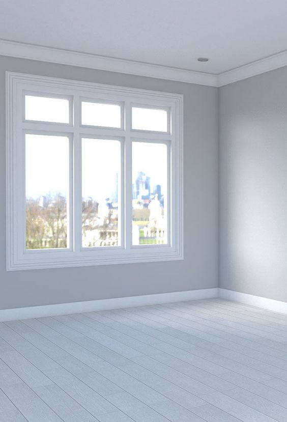
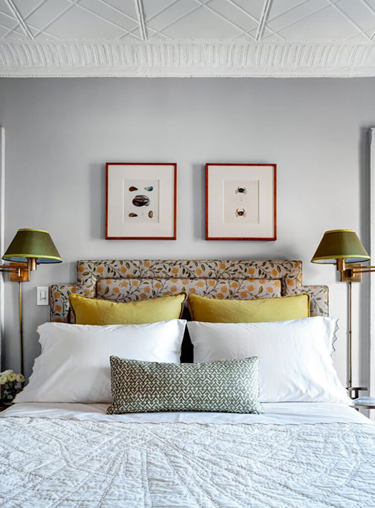
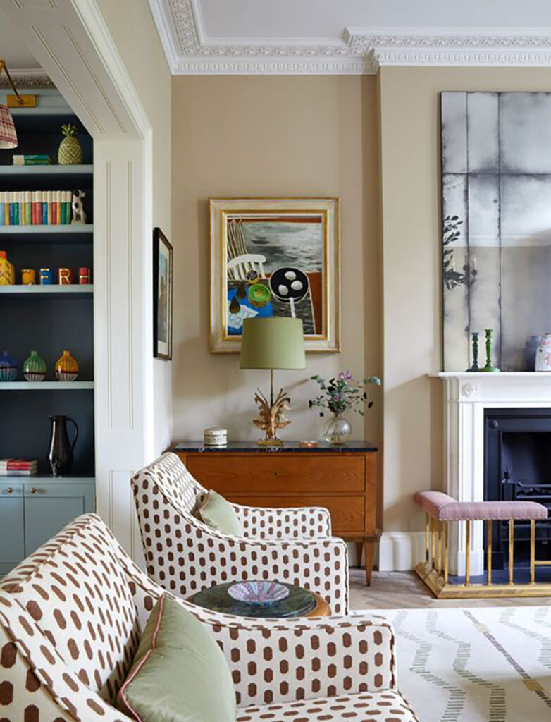
What to do instead: Reach for warmer pale wall colours like the complex creams to freshen up grey colour schemes.
Or, if repainting is not in the cards this year, make grey rooms look more current by layering in toasty earth tones like camel and brown or fresh colour like green or coral to create balance with warmth. Swap out area rugs, accent chairs, pillows, art and decor to update the look.
#2 Off White Walls
Someone had to say it and it might as well be me.
We are 5-6 years into the black and white trend and again, while there is nothing wrong with white. Even I thought it felt so fresh and new when it first arrived, it’s being overused much worse than any other trendy neutral.
I had a friend message me a photo of her house from the earthy tuscan trend.
Dark cabinets, pink beige tile and pink being carpet. She said “We’re selling our house and the real estate agent told us to paint everything White Dove do you think that’s a good idea?.
And the answer is no, because here’s what it will look like:
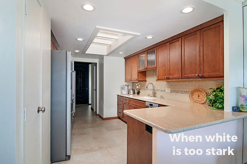
Not her house but this is the idea. Off White walls will look like primer in a house with finishes this warm.
It’s time to stop acting like off white is a colour. SW Alabaster won’t look like it has a “hint of oatmeal”. Certainly not in the context of earthy finishes. And not even with most upholstery and soft furnishings.
What to do instead: Off White is a great fresh trim or cabinet colour to contrast with friendlier wall colours. You can get a fresher look for the walls with much more subtle colours.
Enroll in my Expert Colour & Design Training to be the go to colourist in your area.
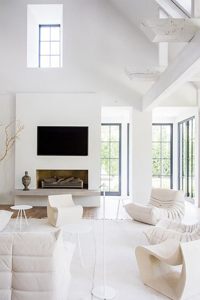
#3 True White Walls
Honestly, true white walls like BM Chantilly Lace or SW High Reflective White should never have been a thing except in the rarest of spaces. With furniture that is all super bleached white slipcovers. Or hyper minimal modern spaces that look better in blown out photos than in real life.
Throughout the white trend I have been calling this out. Brighter walls aren’t better. They don’t create light. They don’t look right unless they are in FULL natural light which is rare. And worse, they make your furniture look dingy.
If you painted your walls True White, the outlook is not great to get a better look via decorating alone.
What to do instead: take stock of the neutral undertones in your hard finishes and furnishing to inform the right pale neutral wall colour.
Click here to get my help choosing the perfect softer colour for your walls.
#4 Any kind of black paint
This side of the black and white trend, chances are high that you have some black accents in your home whether lighting, windows, hardware, furniture, etc.
However, if you’ve painted anything black, (and I’m crossing my fingers here that you didn’t paint all the walls in your open layout black), now’s the time to consider a softer look and get out the roller.
Warm, earthy tones in softer contrast combinations are coming fast. As are more adventurous vibrant colour combinations. And if you’ve kept the big things simple and versatile in white, like your countertops and tile, you’ll have an easy time layering in some of these new colours in accents and paint.
What to do instead: Instead of high drama colours in sharp contrast accent walls, drench the room in a softer mid toned to light colour for a current take on bold.
Remember to take any trend advice with a grain of salt
Someone messaged me on Instagram the other day and said “I painted my exterior white but if you think I should paint it a better colour I will”.
I responded “No, buy some furniture, the paint job is done and it’s certainly far from bad”.
It’s simply that everyone else’s house is white or black right now that’s all.
I’m just saying when this trend is done, you might have wished you spent a little more time obsessing about paint colours inside and out.
But if you are painting your exterior, my course on getting your exterior paint colours right will give you lots of options. A paint job is still not cheap especially for exterior. Get it here.
And I just received a note from Michelle who completed my two day workshop last October she said “Hi Maria, I’m in the midst of a renovation, I took your class last October and still can’t believe how helpful it was!”
Whether you’re a homeowner or designer, you will have a completely different vision and point of view when you’ve completed my Expert Colour & Design Training, there are still spaces left in Dallas, November 24 & 25, register here.
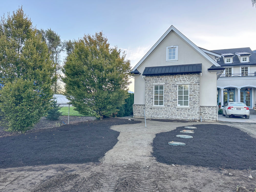
PS. My front garden beds are going in, my septic tank covers will be covered by dirt and plant material very soon.
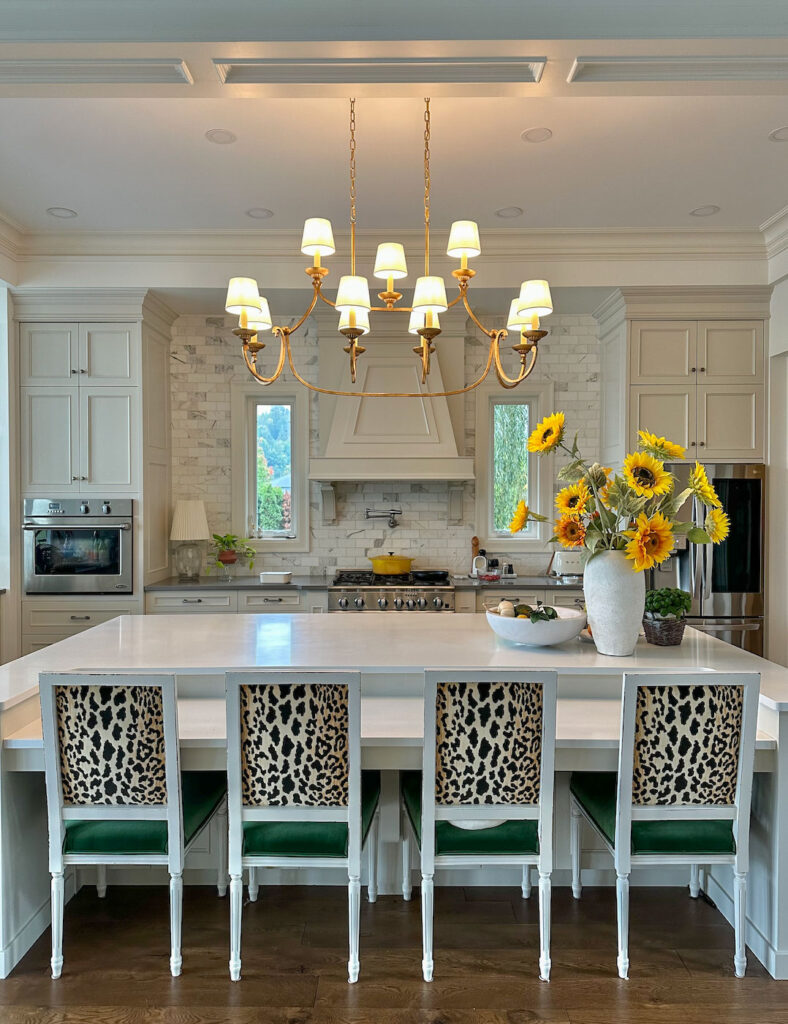
Also, the chandelier I’ve been waiting for was finally installed in my kitchen yesterday:
It makes me so happy!
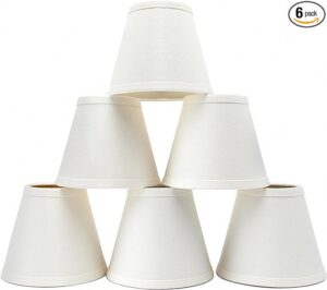
The shades are made for chandelier bulbs so you can buy them for your bare bulbs as well and I highly recommend that you do, they make such a difference.
The goal is glowy light everywhere which is not possible with ceiling spot lights and bare bulbs that make you want to squint.
Related posts:
Ask Maria: Which Undertone Should I Choose if I’m Starting From Scratch
How I Reply to Media Requests About Colour and it’s Effect on Mood



Oh, I have seen so much of #2 and #3! Or #2 but apply it to a cool grey paint with all warm tile and wood and it everything looked so dingy. While I do in fact have some whiter walls as well (SW Lunar lite in family room and kitchen) it’s a bit warmer and goes perfectly with my warmer white backsplash and other kitchen fixtures. With an open floor plan with few areas to transition to another color and not have it be jarring, finding a good “background” color to use as a canvas to put furniture and decor was challenging as the lighting varies greatly around the house. The rest of the house is SW Gossamer Veil which is almost a greige. What interesting was we learned the Lunar lite was too clean for the blinds in that area (made the blinds look a dingy cream), so we painted the blinds the trim color in those areas. One of those things you don’t realize when the blinds were taken down months before figuring out the perfect paint color due to a remodel so they weren’t there to compare when the test swatches went up. I took what I think was your advice, which was to wait to chose the color after the finishes go in, which was a good idea. There was so much honey oak around before, it definitely affected the wall color.
When doing the remodel we stayed in a house where everything, walls and trim, had been painted something very close to true white. You couldn’t open the blinds when the sun came in because it glared off the walls. I tried to do Zoom meetings and my camera had issues focusing even with them shut due to glare. It was crazy! Another rental (the remodel went on 6 months instead of the 3 planned) literally was crammed so full of furniture it was a hazard (and nothing was cohesive). It felt very unrestful, but was thankfully the place we stayed the shortest amount of time.
I have minimal black accents in my house (always repeated a few times in different sizes, but not overloaded), like picture or mirror frames, soap/toothbrush accessories, towel hooks (but not faucets or pulls), planters. The only thing we painted black was the brassy gold border/trim on my fireplace insert because that color needed to go.
I’ve learned a lot of color is taking your advice and pairing it with your personal life experiences.
I’ve learned I only like bright colors (indoors) in very small doses. I love blues and my husband likes them too, so that is where most of our larger bits of color end up falling. I wish I could like cream but after living with a peachy cream walls (and ceilings, lazy builders) for 20 years, I really never want to see it again. I’m stuck with it for my outside trim to go with the salmon/pink brick I have as it does go very well with that. I also pretty much can’t stand any color that was popular in the 70s that was so popular the last few years. I even have issues with some cognac as it’s so close to some 1970s oranges for me and the honey oak that made up every single wood finish in my house. Very, very sick of orange. Yellow isn’t my happy color like it is for you (and my husband isn’t a fan) and red is best in small doses. And my husband doesn’t like greens, so most of that is plants which is the one green he accepts.
So yeah, blue or neutrals for us, no matter the trend! At least I’m learning to pull them together in the right way. This blog has been so very useful.
We getting new furniture (finally!) and my husband wanted to get matchy matchy sets. I had to explain to him that no, that wasn’t happening and he still doesn’t quite understand why when I tried to explain. He still has the 1980s furniture sets and everything must match drilled in his head. I probably would too if I hadn’t had to take a crash course in decorating when a pipe burst and that aforementioned remodel had to happen.
Continuing my request to truly explain how to figure out a gallery wall spacing (set to size of the room), why you did certain layouts in your quick makeovers, how to design a corner wall, why you go behind some furniture but not others, etc. Your gallery walls come out so lovely and many I find online don’t feel right to me. I have a tricky corner wall in my living room which is the only place to hang art due to windows and open floor plan. I cannot center it on the couch as a staircase interrupts about the 60% mark of where the couch sits. The couch wall is the longer wall, the other corner the shorter one and the one highly visible when you walk into the room. Of course, there are also two “lovely” return air vents at the bottom of that one I have to leave breathing room for, but at least they are by the floor, not the ceiling, and 9 foot ceilings. The couch is 40″ tall…
Thank you again!
Beautiful chandelier! Worth the wait. 😉
Love your new chandelier! It is perfect in your space, allowing for your big bouquets. I know you like a little bling and this is certainly the jewelry of your kitchen.
The chandelier is so pretty!
Oh!! Your chandelier is absolutely stunning!
Are you ever wrong??
Just lovely. Question: What is the material used for the island countertop?
Thank you,
Galina
To piggyback on this, what is the cabinet paint color as well please?
I would love to know as well!
I love the chandelier and the outside of your house!
Maria,
Love the new chandilier.
On covering your septic tank cover. Remember you’ll need to access the filtres once a year to check everthing is working well and as time goes by,for cleaning.
And most plant material won’t grow on top because septic puts off heat and warms up soil too much. We can’t even get grass to grow on ours.
Strongly agree with AJ! I’m a wastewater engineer, and the last thing you want is to have your system fail due to a lack of timely maintenance because you didn’t have good access to your tank. If at all possible, hide the covers with something easily moved instead.
Wow Maria..I absolutely love your new chandelier!! I’m redecorating my first floor (L-shaped LR/DR, foyer and small kitchen) and I did think about switching my brass light fixtures to nickel or black, but I’ve always loved the warm look of brass or brushed gold so I’m sticking with new brushed gold fixtures at least in my foyer and LR/DR!! The walls will be creamy neutral. I have an oak kitchen so perhaps a black fixture in the kitchen (undecided). Sometimes you just have to stick with what you love and what makes you happy, no matter the trend or style.
I have SWooneddddddd over that chandelier!,,,,,
But my darn ceiling is tooooo low
We are always on the same page !
Love love love in your kitchen
I may have to move 😝
That’s a gorgeous chandelier, Maria!!!
Love your chandelier! Just ordered shades for mine!
The Chandelier is very pretty! I love new things! I know nothing at all about these septic covers and in a front yard. I live in the country and have a septic tank (covered of course) out in the side yard a distance away. On the subject of white I guess I’m in the minority. I love white! I have an open floor plan (20 years old now).My walls in my living room, dining room. kitchen, two bathrooms are all painted SW Alabaster plus my kitchen cabinets are painted the same color. I have a brown island, brown countertops (Caesar Stone) and dark brown hardware so I think the balance is good. My island has a white quartz top. My two sofas are white and my dining room chairs are white. and my dining table is brown. I do not know how to post or send photos and it would explain it all so much better. In my opinion it all goes real well together and my sofas do not look dingy. I am not sure what Maria is saying about SW Alabaster though. Is it good or bad to paint that much in the one color? I guess it is an off white color.
Oh Dear, is Dover White one of these colors you are referring to as going out? My husband did construction for NIKE and he insisted we paint the interior walls Dover White he thought it made everything looks so rich and warm at Nike. It is a new build Barndominium with concrete floors (stressing about the grey but small budget, they are staying for now) so my hope was Dover would warm the place up? Would love your thoughts.
Many years ears ago, I used SW Dover White for all my walls and even the ceilings. I still have Dover White in a guest bedroom. It’s neutral, but not terrible exciting. This year, I changed my foyer & family room from gray (BM Revere Pewter) to SW Alabaster. For the first time in 20 years, I truly love the results. It coordinates really well, with my dark brown hardwood floors, off white furniture and colorful artwork.
I have to defend SW Alabaster as well. It definitely doesn’t die into generic white here. It’s a soft beige and a good option for an open space that feeds into and off others. While I like the beige walls in the photo above as decorated there, that’s far too beige for this space and far too reminiscent of the beige walls/beige carpet/all brown furniture era that is too recent to forget yet.
I’m an SW Alabaster fan too. Years ago we were about to move into a retirement community cottage that was being painted some kind of gold inside! I squawked and said it was a dealbreaker so they handed me the SW fan deck and said to let them know the next day what I wanted. Long story short, I googled to find the most versatile off white and kept seeing SW Alabaster come up. When I held the tiny chip against the various finishes, it was great. It was even better on the walls and proved to be a wonderful backdrop for our art and wall-hangings and colorful furniture. We’ve since moved twice and the walls have been a warmer white, which is fine, but I still love SW Alabaster..
I think she classifies Dover White as a cream so you are safe (:
I wonder if Maria might have been referring to Benjamin Moore White Dove (OC-17)? I have it on my woodwork and often accidentally refer to it as Dove White.
Great chandelier! And such a gorgeous kitchen!
I love your chandelier, Maria! It is sooo much nicer than the lights you showed us a while back. It’s the perfect finishing touch for your lovely kitchen!
That chandelier is truly a “chef’s kiss” in your kitchen! Now think about either new bar stools or painting the wood a soft color as the white seems too white (crazy right?). Oh that light is just so gorgeous and I don’t want anything to detract from that jewel!
I understand the reason for the shades on the chandelier, but what if they interfere with the view? I’ve delayed putting a chandelier over the dining table in our small lake home because it falls right in the sight line from the entry door to the view of the lake. What would you do?
A view can be enhanced by something in the foreground. Guests may be enticed to come in further and see the full view! I thought I wouldn’t like our deck interfering with the view, but it just makes it better (although I did make sure the BBQ wasn’t in the sightline.)
Oh dear, #2 looks like my kitchen with the pinkish floor tile and backsplash. My cabinets are even darker, cherry spice. I wish I knew the best remedy. I’m not sure any wall color will make it better. Perhaps rip out and replace the flooring and tile and painting the cabinets white is the right approach. Is there a past article here that talks about updating a kitchen with the earthy Tuscan trend?
Hi Maria,
I love, love, love everything you do, and I adore your chandelier! That said, could fabric shades work in a smaller kitchen with a lower ceiling? I imagine they would get very dirty and greasy in mine.
100% worth changing out when they do get dirty in my opinion. However you are talking to someone obsessed with creating a glow everywhere! Maria
No color is “out of style”. Whatever the person likes is the right color. It’s just paint – it can be changed if they sell. I just finished building a home and painted my bedroom SW Online (gray with blue undertones). I told my contractor I keep reading that gray is out if style and he said that’s wrong. He told me that almost every remodel or new build they do the homeowner wants at least some gray paint. “Is neutral and will never go out if style “.
I’m going to go against the grain here and say I do not like that chandelier – but wow do I love those sunflowers! I’m in the process of painting my entire house in BM Chantilly Lace, and I’m so so happy with the results thus far. The reason I’ve gone all stark white is just as another commenter said, no color is out of style, it’s whatever the homeowner wants! I have just bought my first home, and for the last 16+ years I have absolutely adored Scandinavian and Danish styles. Their white walls with gorgeous wood grain MCM style furniture is all I’ve ever dreamed of for my own home, and now that dream is coming true. All of my furniture will pop off the walls (contraire to the dingy comment) Dingy may be the case if you’ve bought cheap particle board garbage or have very lived in furniture. Anyways, just here to say I don’t give a darn if it’s out of style, it’s making my heart sing.
Hola gracias por ofrecernos estos artículos de gran importancia para la área que actuamos es de gran provecho para actualización en nuestros proyectos gracias
This post on paint colors going out of style in 2024 was really interesting! I didn’t realize off-white walls and black paints were falling out of favor. It’s good to know these trends are shifting towards more vibrant and warm tones. Thanks for keeping us updated on what’s changing in the world of interior design!