“To plant a garden is to believe in tomorrow.” – Audrey Hepburn
No exterior is complete without a pretty garden
A beautiful garden has become a non-negotiable for me. In my career, thousands of exteriors have passed over my desk – and the clear lesson has been: keep the look simple, fresh and timeless and plant a well designed garden for curb a appeal and delight!
In our first home, we spent a decade putting down roots-quite literally. Just one year after moving in, we tore out the front and back yards and started fresh with a new garden.
I was so grateful for my virtual garden designer MaryAnne White. With her four decades of experience, she matched my enthusiasm and bossy opinions, and her aesthetic aligned perfectly with mine. Here’s our last house before the garden went in.
 Before
 Before
Thanks to MaryAnne’s expert guidance over the years, my gardens have flourished and become truly beautiful spaces.
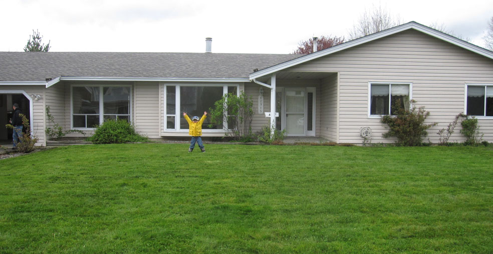
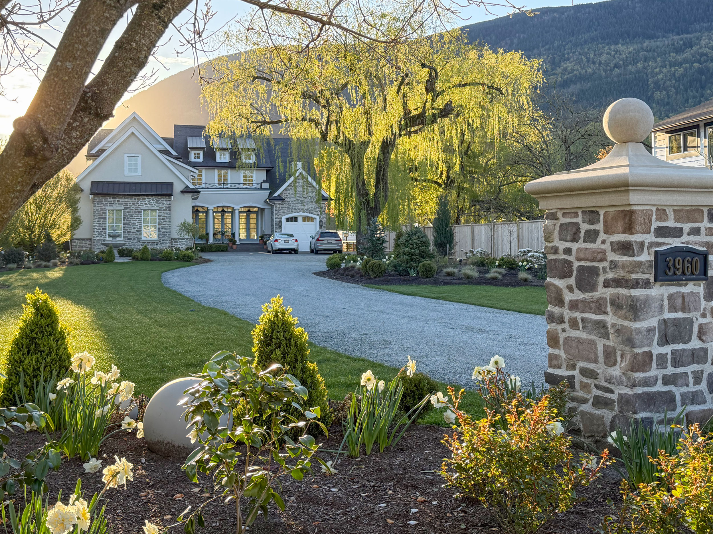
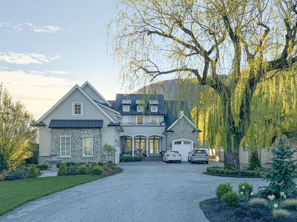
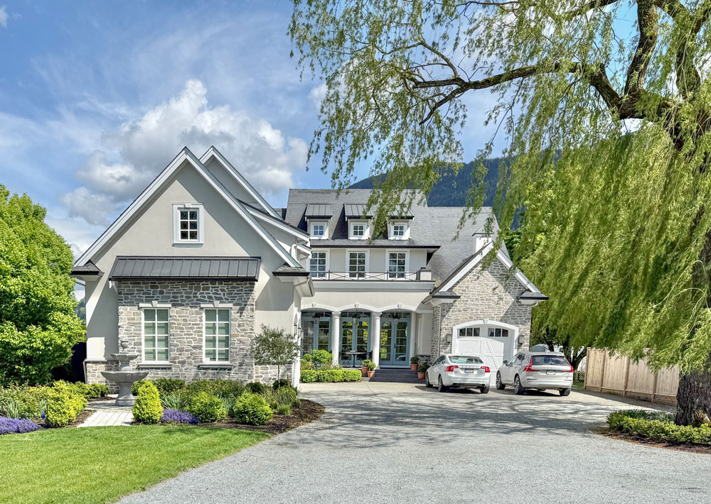
Our new house needed a garden too
When we moved into our dream home, we followed the same pattern: within a year, we transformed the garden yet again.
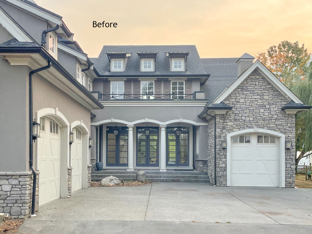
Here’s the before below. The paint palette was drab and the landscaping looked like an afterthought – as too many yards do.
 The property had been a Christmas tree farm, so there were “Christmas trees” plunked too close to the house in every corner. Poorly placed trees sadly are destined to be taken down – another reason why professional landscape design is a must.
Many more plants than you think!
It’s cute to cart home a baggie with a dozen tulips for your garden – but what I learned from MaryAnne is that if you want tulips you need to put on a show! At our previous rancher, I planted 500 tulips.
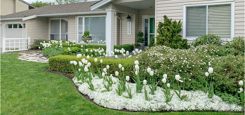
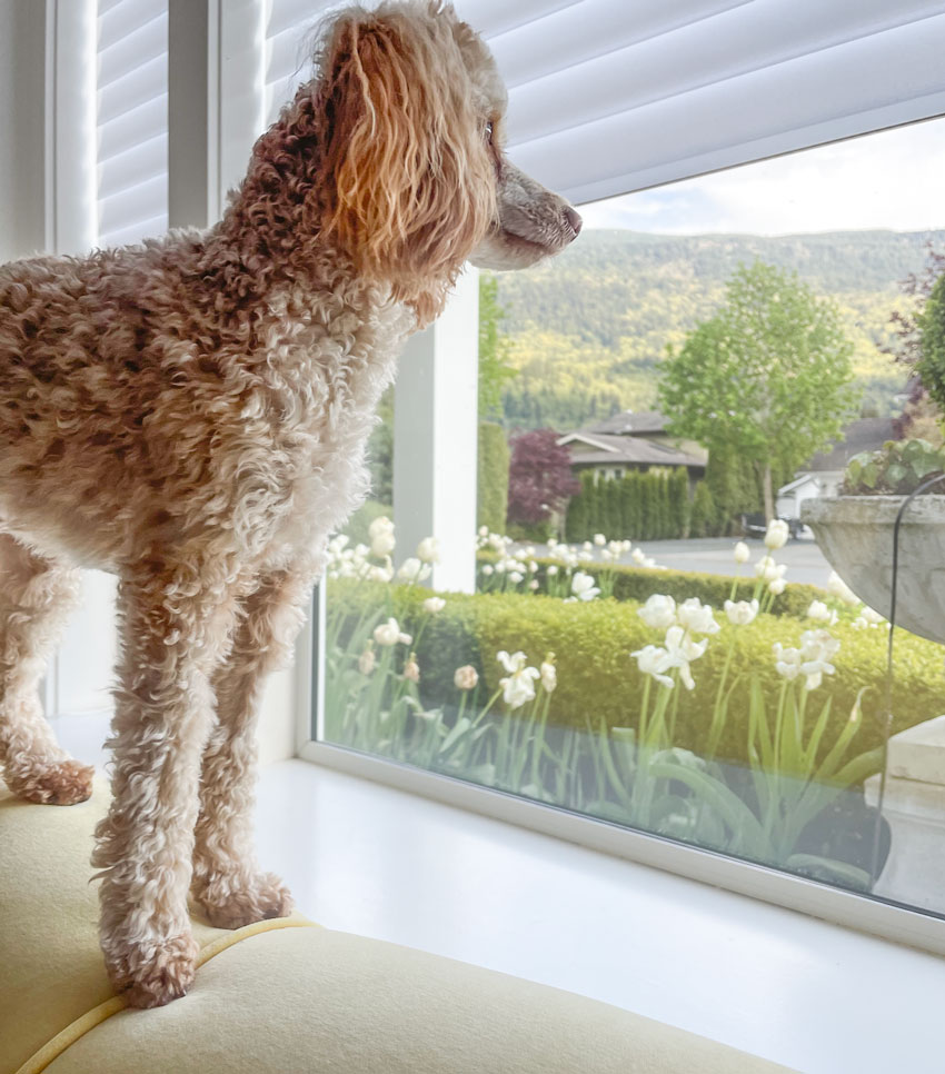
I intended to do the same last fall at our new place, but by the time I went to buy bulbs, it was too late and only daffodils were available-so I planted 1,000 yellow and white daffodils instead. The result has been absolutely spectacular!
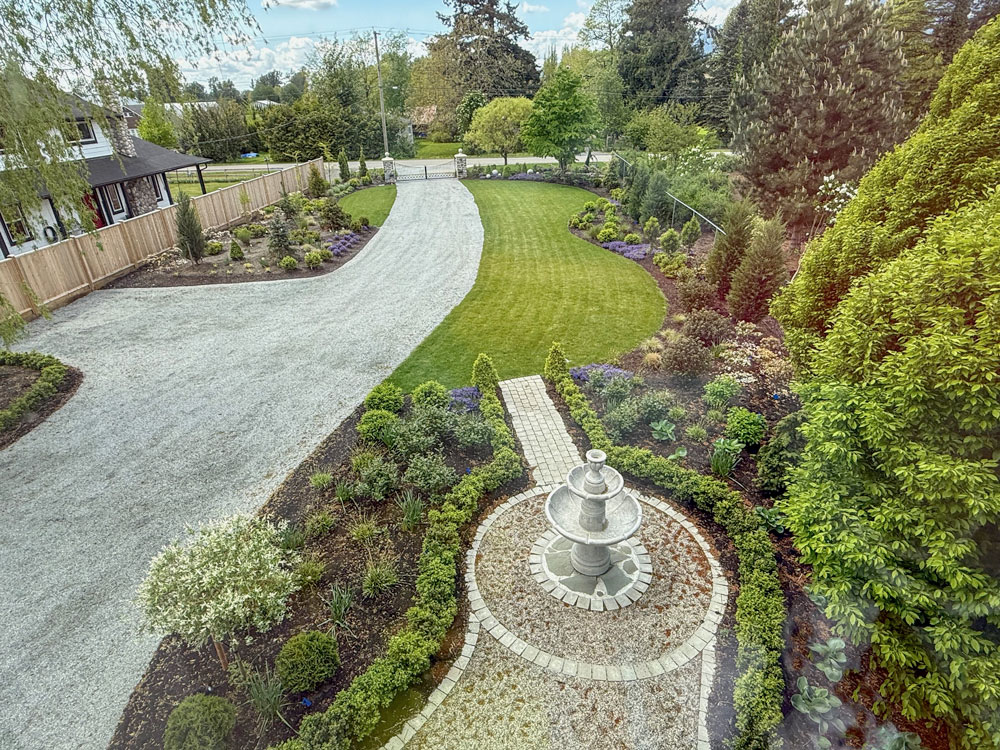
Practical considerations
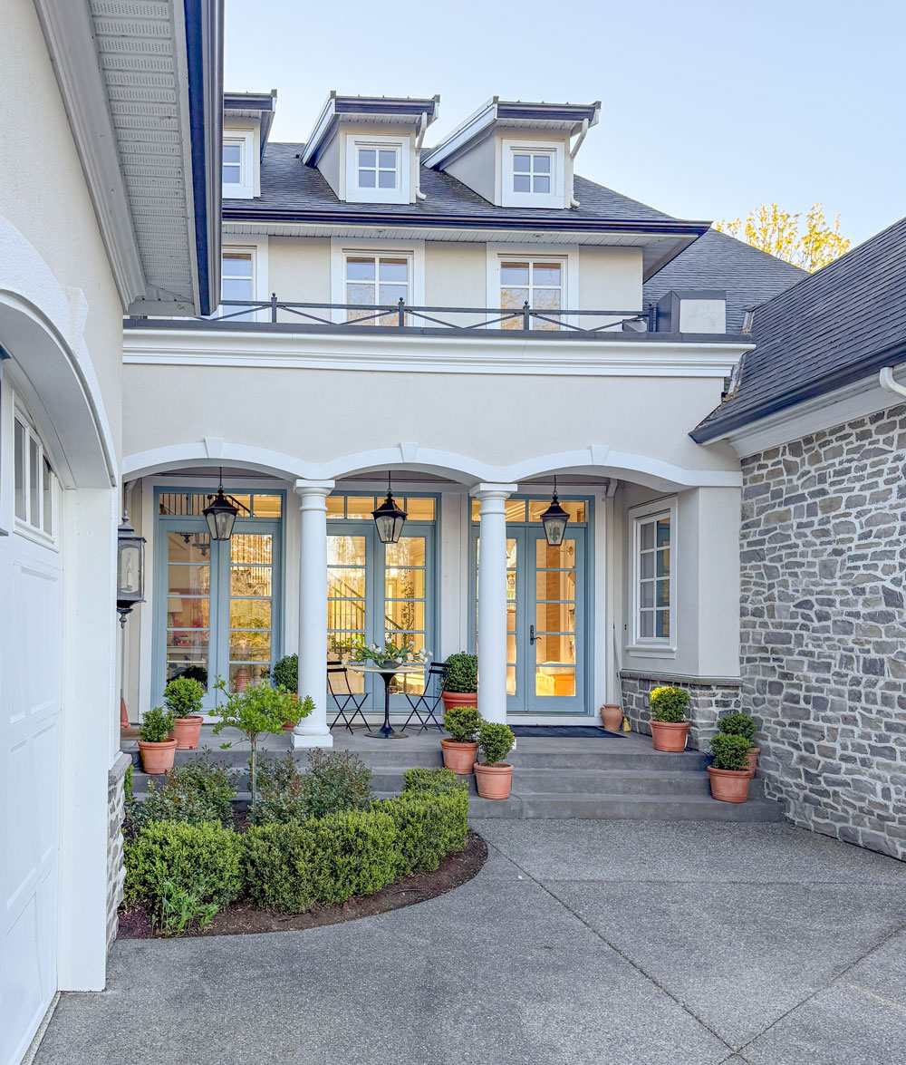
One of the features I appreciate most about our new garden layout is the well thought out extra-wide driveway and spacious parking area that MaryAnne designed (below).
When we first moved in, parking was a real challenge-we could only fit four cars, and getting out meant reversing all the way down a long, narrow driveway. It was completely impractical. Now, with the expanded driveway and parking bib, coming and going is so much easier and more convenient for everyone.
You can reach MaryAnne here for your garden design.
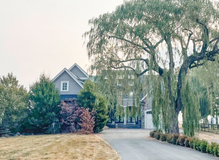
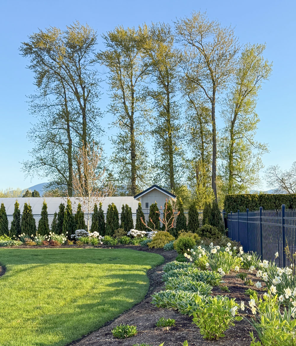
Mature trees add scale
I am very grateful for the existing mature trees that were already in the right location and did not need to be removed. Our willow tree is MESSY (requiring daily blowing and disposing of tiny leaves) but it adds beautiful scale to the house and gardens.
 After the paint and hardscaping went in
 After the paint and hardscaping went in
The two trees to the left of the house frame it so beautifully (below). More than one person has commented that it looks like something out of a fairy tale.
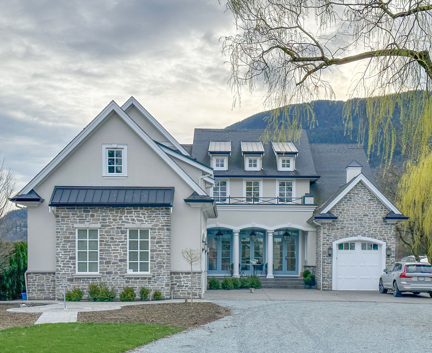
And paint!
It was also kind of a miracle that the exterior only needed a new paint job! Which happened last Spring!
Aside from the garden, a fresher paint colour made all the difference! I feel truly blessed driving up to this house and waking up in it every day.
The new exterior paint colour
Choosing the right colour was a process but what technically made it easier was the fact that I had to work with the stone on the house.
Embrace the limitation is a new phrase my Director of eDesign, Tricia Firmaniuk, has coined and that is exactly what you need to keep in mind as you make choices for your interior or exterior. The specific stone on my house meant that there were only a few good options for the stucco colour that would relate. And when you know how to work with neutral undertones, knowing that immediately reduces the overwhelming entirety of the paint fan deck down to an easily manageable few colours to test.
It’s the same with so many choices to be made for any home project. Embrace the limitations because it makes it way easier, for example, to choose your cabinet colour AFTER you’ve chosen your countertop. Or the paint colour of your open layout AFTER you’ve chosen a sofa or area rug for example.
Out with the old
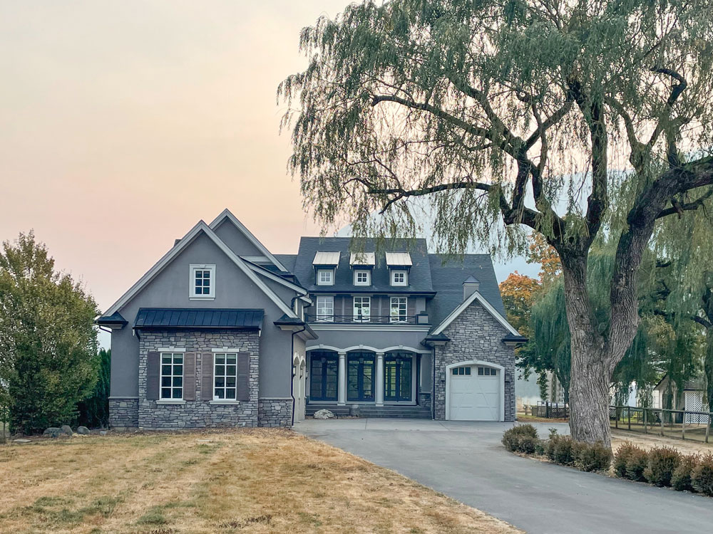
See how very drab the old colours were? They were chosen in 2012 when the house was built – during the grey trend. Since taupe is warmer than all three undertones of grey, and cooler than the beiges, it was the MOST specified and chosen neutral of the grey trend cycle. The original colour was BM Ashley Gray HC-87 or SW 9174 Moth Wing.

Understanding Undertones Colour Wheel | Get yours here
The pool house fixed with paint!
Looking at the back of the home, the scale of the pool house bothered me and I felt it needed a redesign.

Until it was painted. And now it looks right as rain:
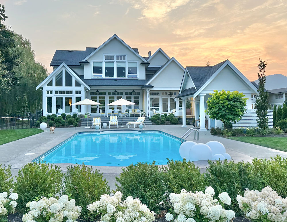
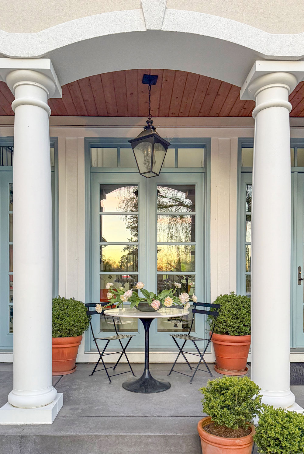
The fresher colour allowed me to decorate the back patio and pool deck with my favourite yellow 💛
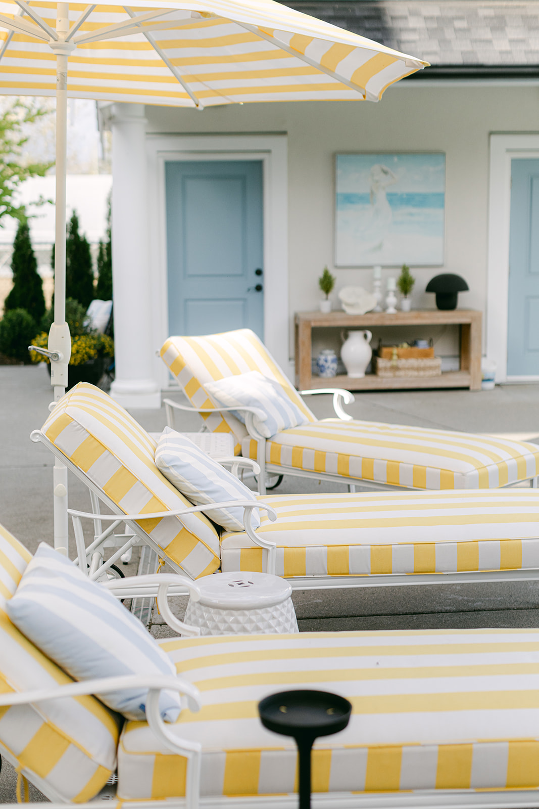
The French blue on the doors is the same as the doors on the front of the house, BM 1669 Saratoga Springs. similar to SW 2863 Powder Blue.
Start with large samples
Here’s how the testing process began. First, I knew I wanted to give the stone, a blend of green grey, violet grey and taupe, a fresher look with an over mortar treatment. So I tested mortar colours and amounts of coverage first because I knew the mortar would alter the way the colour of the stone reads overall.
Then I narrowed down my paint colour options with large samples. When you have the complete collection of all 9 undertones and whites (you can my hand painted boards here), (and you can get a Samplize set here) it’s easy to quickly hone in on the best ones worth testing further.
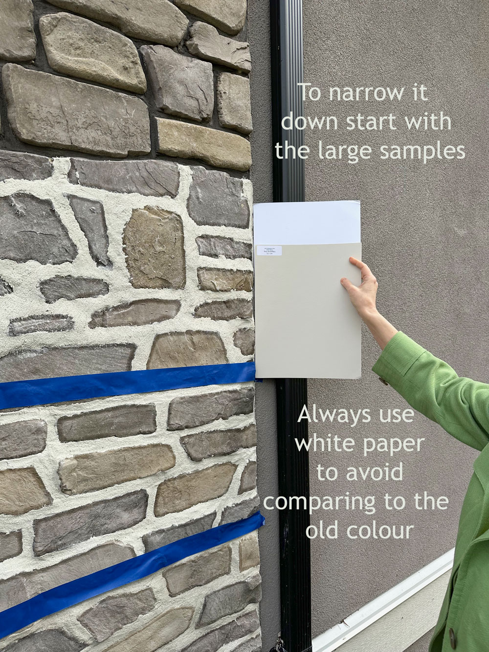
The right way to test exterior colours
The next step is to swatch larger samples directly onto the stucco. But not just anywhere and anyhow – you need to:
- Isolate the colours from the existing colour with a broad surround of white primer. Why? Because the existing colour will skew the way the new colours you’re testing read.
- Make sure you are viewing the test colour in direct relationship to the fixed element you’re coordinating with – in this case the stone.
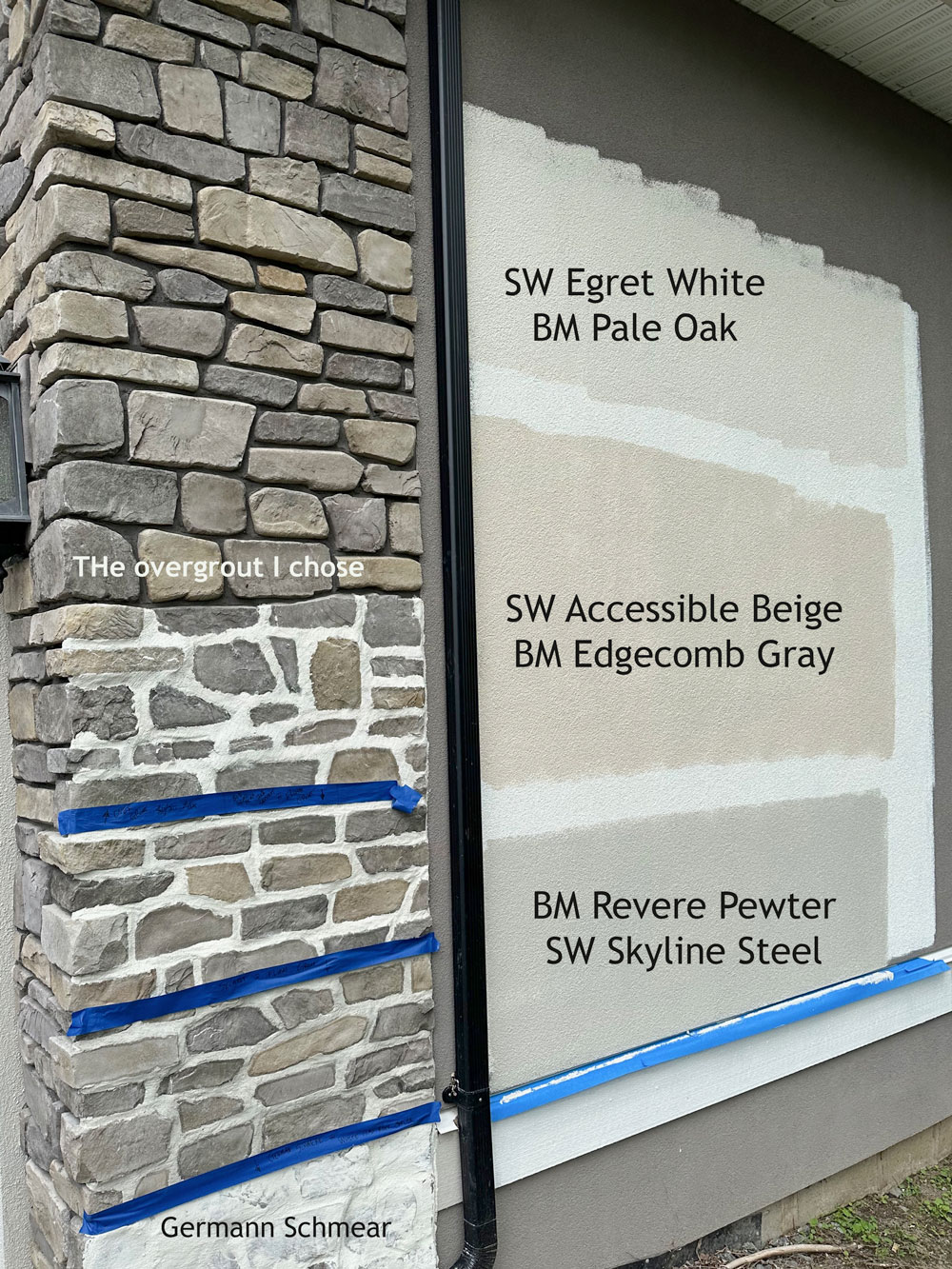
You can see that we tested a pale taupe (top), a light green grey and a slightly deeper green grey (bottom). The different grout options were bright white (top) to a light green grey, and at the bottom, we also tested a Germann Schmear – a technique where the mortar almost completely covers the stone.
I went with bright white mortar to relate to the white windows and trim.
Module 18 of my exterior masterclass goes into much more detail on testing exterior colours so that you can be sure the colours you’ve chosen are correct!
The transformation
I can’t get over what a difference the paint and white mortar made. You can see that the shadowed gaps with dark mortar in the stone before made it seem so much darker and heavier (below). The original trim was BM Grant Beige HC-83 or SW 6149 Relaxed Khaki, green beige. We had the trim painted a true white to match the white vinyl windows, BM Distant Gray 2124-70/ SW 7006 Extra White. These whites have just a touch of grey like most standard white vinyl windows.
If you have a fan deck and compare you’ll see how dark the trim colour actually is on the fan deck.
The colour we went with for the stucco is SW 7036 Accessible Beige or BM Edgecomb Gray HC – 173.
A pale green grey that looks like a classic cream without looking too yellow. The lighter taupe felt too white and greige (and I’m so over the white look right now that it’s so trendy from the modern farmhouse trend). The deeper green grey looked a tad too grey. I wanted it to look creamy and French Country. So of the colours that related well to my specific stone blend, Edgecomb Gray/Accessible Beige was the winner!
Remember though that while this pale green grey is perfect for our house, it’s a long shot that it is just right for yours! This is exactly the issue with shopping for paint colour ideas online. And polling around for people’s favourite colours. What relates perfectly to my stone is unlikely to be perfect for yours.
How to find the ideal colours for YOUR home
Transform your home’s curb appeal and eliminate colour guesswork with my Exterior Colour Selection Masterclass.
In just a few hours, you’ll learn the proven, step-by-step system trusted by design pros and homeowners alike to create a timeless, coordinated exterior-no design experience needed. Avoid costly mistakes, gain confidence in every decision, and finally love the way your home looks for years to come.
ENROLL NOW for 30% off and get lifetime access to expert guidance, curated colour lists, and all the tools you need to get it right the first time.
Here’s what some of my students are saying:
“Maria answers questions I didn’t even know I had. Or, rather, she gives solutions to problems that I would not recognize until it’s too late… This is such important information. Every builder/developer in North America should take this course.”
“Loved it, very comprehensive look at a daunting aspect of color selection!”
“It exceeded my expectations. The class went into good detail on each topic. Loved the examples with the Photoshop visuals.”
“Very helpful to get such great, detailed colour info on the various exterior components. Thank you for making more high-quality, in-depth training available.”
Last chance to train with me in Chicago!
I’m so excited about my upcoming Spring True Colour Expert Training in Chicago next week! If you want to come, there are only two seats left! I’d love to meet you there!
Related Posts
The Best Way to Choose Exterior Stone (Ugly is On Sale; Don’t Buy It)
Big Updates for my Exterior Masterclass
How eDesign Saved This Exterior from Black Windows; Before & After


Beautiful! Also, how much did your roof color factor in? What was the white trim color, please?
Beautiful, Maria! What a transformation from somewhat gloomy to absolutely enchanting! Last year, a week before my daughter’s wedding, my painter suddenly became available and I had just a few days to choose my exterior colors. I had been following Maria’s blog for a number of years at this point so I knew to focus on the stone on my exterior, as well as the style of my home. Now every time I pull into my driveway I am so happy to have learned so much from Maria. I knew at some point I needed to have the house painted, so going in I had narrowed down my choices to just three colors with the help of Maria’s color wheel and had painted big boards to test each one throughout the day in varying light. All this took a lot of time and trips to the paint store, so it would be 100% easier to take the exterior color course! I enjoyed the process and was very confident in my decisions, but for anyone who is nervous about getting it right due to the expense of supplies and hiring a painter, take the course!
Just perfect, Maria! Such a lovely home!
Seeing pictures of your home’s exterior and the gardens, both front and back yards, is so enjoyable! The weeping willow tree is such an asset to your property–it frames the house so nicely. We are in the process of relandscaping, and I think I’ll have a loot at Mary Anne’s site for some ideas!
It is so beautiful! I’d love to know a ballpark amount on how much landscaping cost on this house on just the front with Mary Anne’s design cost plus plantings. I would love to do this but need to determine a budget.
I don’t know if Maria ever answers here in the comments but I will give it a shot what render is your stucco?