Last week I wrote a post drawing attention to the fact that you can’t stick any trendy kitchen into any style of home. And it made me realize this is a huge conversation that no one’s really talking about but it’s a mistake we see every day in our eDesign department with homes we’re working on all over North America.
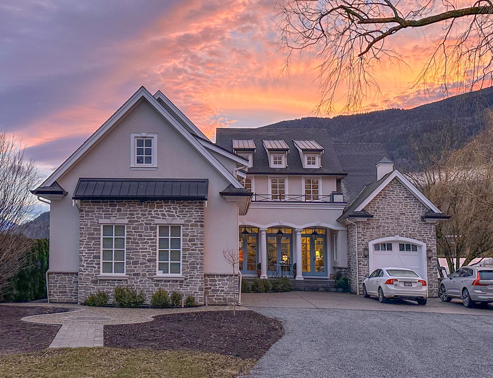
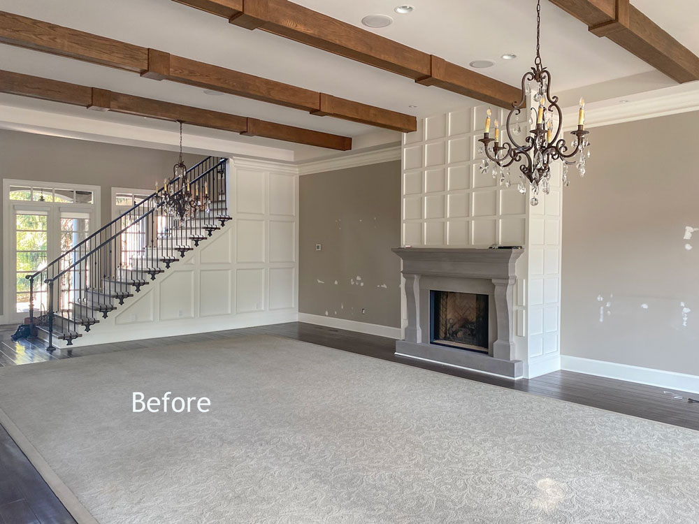
For example in the house we moved into last year (above, more landscaping coming soon), the millwork was beautifully done everywhere except the too-rustic ceiling beams and the busy grid millwork around the fireplace which in no way worked with the rest of the more refined mouldings (below).
So we changed it.
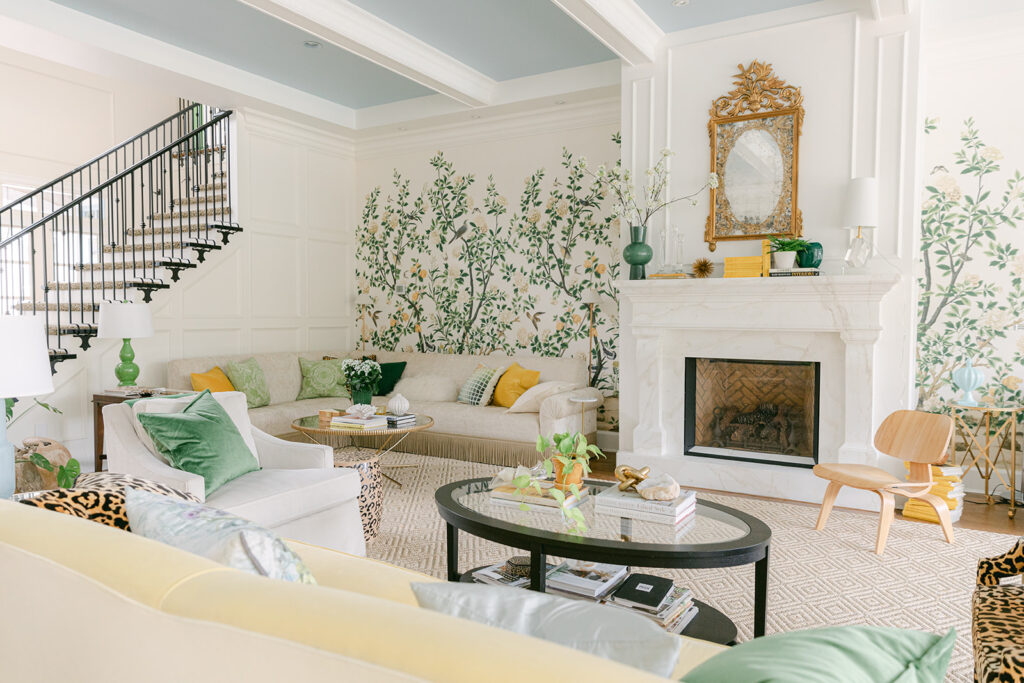
We encased the beams in moulding, painted them off white and switched out the grid millwork above the fireplace to picture frame moulding for a more traditional look that better relates to the rest of the millwork (below). I also had the cast stone fireplace surround faux finished to look like marble to relate to the marble backsplash in the kitchen.
An often ignored but important detail
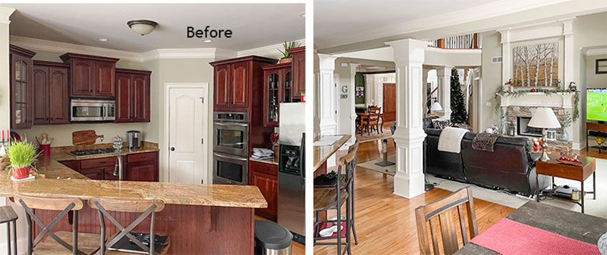
Just recently we worked with an eDesign client who had inherited this 90s kitchen (below). Looking at their photos, we noticed they had all this elaborate white millwork throughout that didn’t work with their existing kitchen. Nor did it work in their house.
English Countryside Kitchen
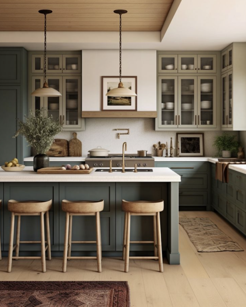
And their inspiration kitchens were cozy and warm, simple and rustic, on-trend green kitchens like this:
The advice I gave them was certainly not what they were expecting.
Check out my solutions for this client plus more on renovating a house with existing features in this weeks video:
Want help updating your kitchen?
If you’re tackling a full renovation, there are likely some points you haven’t considered. To get the best advice, custom to you and your specific home, check out my Create a Timeless Kitchen eDesign consultation here.
And if your kitchen needs a less involved update and you’re not sure where best to spend your budget, I will help you decide which updates will give you the most impact in my Kitchen Refresh eDesign package here.
If you’d like to learn how to make the right decisions for your home projects my ‘Create your Dream Home’ virtual course for homeowners is what you need, learn more here.
“I am now not afraid of making color or decorating decisions. Color isn’t all that scary” Nan Lemon
If you are a design professional OR you’ve decided 2024 is the year to start your dream career as a colour designer my True Colour Expert training will be in LIVE in Chicago May 14 & 15, 2025. register here.
Related posts:
The Style of your Home vs. Your Design Style









I adore your living room! And the beams on the ceiling are beautiful now that they are encased in moulding. I’m not really a fan of the rustic beam look which people seem to randomly install.
PS Thank you for the very educational video!
All your videos are educational but this is the best one yet! I so wish this message would hit the masses, so many homes on realtor.com could have used this advice before doing what they considered enhanced updates. Before I began following you I read many shelter magazines and none of the articles ever touched this topic. I think HGTV and others influence people to think if they are doing any updates they need to do what is trending to have the newest designs and materials. And I wish you could get yourself into the Big Box stores . . . That would save a lot of homes from disastrous “updates.”
What if your house is a 2009/2010 builder grade starter home in suburbia? I’m pretty sure the builder mass-ordered pink or orange beige tile backsplashes that are way out of scale to the kitchen, pink grey linoleum and it doesn’t work with the purple/grey/orange fake granite laminate counter tops and espresso wood cabinets. Its in every room in the house… I’m in the research stage, but how do I know if my house is traditional or ?. If I am to create something that flows from the outside in, how to I begin to research design/decor styles I like to see if they translate to the house itself. We’re drawn to mcm houses and style but it makes no sense with a little 2 story cookie cutter house in suburban Calgary.
Yeah, my house is from 2000 and I have no idea what to call this style. It seems completely void of style, to be honest. Except for this weird faux Grecian column in the dining room.
Ya it’s hard to know where to start. I feel like creating character out of a mish mash of beige is a really big challenge
You can post pictures and questions on Houzz.com or just look at other people’s pictures. People love to chat and give advice there. Or you can pay for a package with Maria.
I think you can mix some styles, but not all.
Was there an ‘after’ for the two homes other than yours? I scrolled through after several minutes and don’t think there was. Oh well. I really miss your written posts. You have a distinctive and fun-to-read voice in your writing, which I enjoyed reading. Plus I could get through the text and the photos more quickly than a video. I wish you would go back to written posts and do fewer videos.
Our architect’s original design had rustic beams in the family room and I deleted them for that very reason. Our house has crown molding in every room and it just didn’t seem to fit. I’m always encouraged when you “back me up”. lol
This insight is perfect timing while we are deciding on our mantel upgrade. Should details like the crown on the mantel shelf reflect the style of the kitchen crown since both are in the same open area?
Our builder put budget traditional crown in our dining room and foyer, the kitchen company used their supplier’s simple cove crown for above our shaker cabinets, and there is another type of larger cove with a groove/bead on the top/bottom edges on our office built-in. Is that normal or are we the Picasso of the crown world?!
Please, Maria, return to written posts, or do both video and written posts.