Five years ago, my oldest nephew Luukas (28) moved to Calgary from the Lower Mainland (where he’s from). He lived with a bunch of friends in a house to begin with and worked as a waiter. Then he met Sam (his current roommate) and they’ve been roommates and best friends ever since.
Background on Luukas
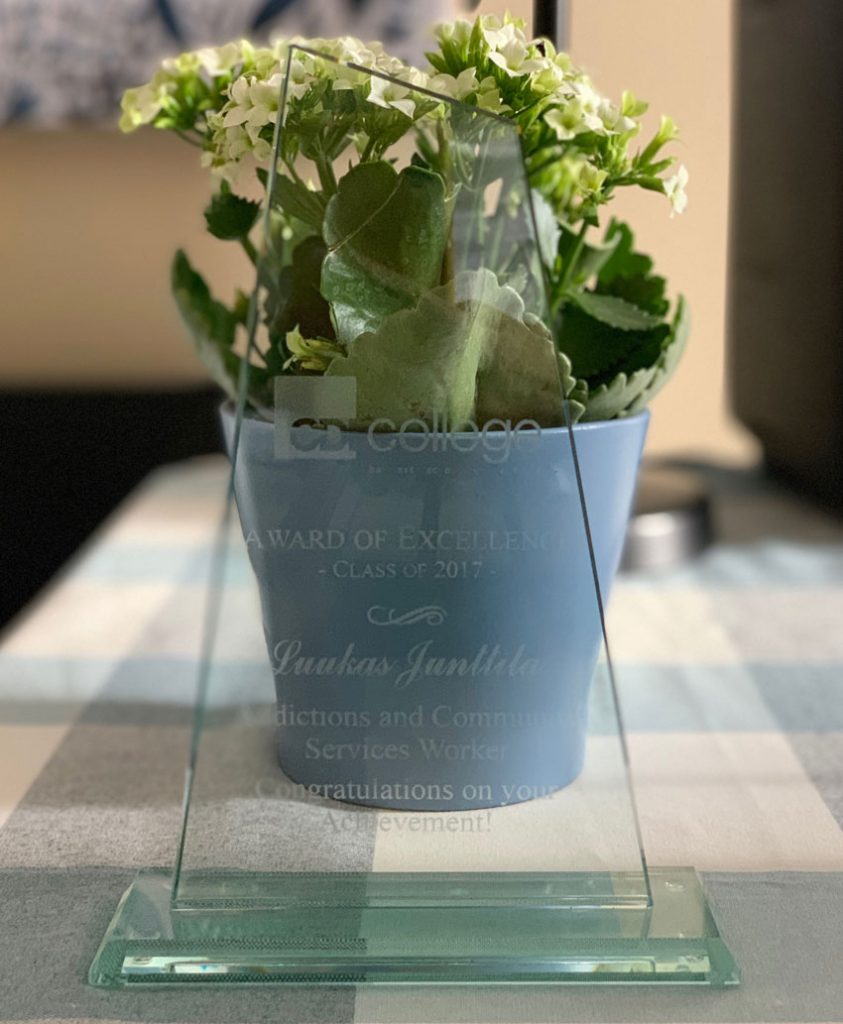
Then Luukas decided to get serious about a career and two years ago he enrolled in CDI College and got a diploma as an Addictions and Community Services Worker. He has been employed at The Calgary Drop-in and Rehab Centre which is the largest emergency shelter in North America.
To save money as he went through school, Luukas and Sam lived with two friends in a house (again). And, as you can imagine, without a maid, four guys in a house is not the best living arrangement. I promised Luukas when he moved out and found an apartment with Sam, I would come and make it a bachelor pad worthy of a designer’s nephew.
When I asked him what had him choose a career in social services this is what he said:
“I had never really considered going back to school but funnily enough I saw an add on Facebook for that particular diploma and thought “this is something I can do”. Something that uses my communication skills and overflowing empathy and started doing my research. Landed on CDI, went in passed the entrance exam and enrolled the next day.”
My nephew has a big heart and is a very sweet soul. I was thrilled to give him a sanctuary to come home to after the stressful work he does!
Styling makes an interior look high end
Many people think my decorating style is more high end than it actually is, because styling goes a loooong way to creating a look and a feel (something I spend a lot of time talking about in my live training, especially on Day 3).
And good styling most definitely makes any interior look more expensive than it is. There are many DIY bloggers all over the web who prove this every day.
You can put a bunch of high-end and expensive furniture in a house but if it’s not styled, no pillows, lamps, art, and accessories, the whole look still falls flat.
My first business was called One Day Design and quick transformations that are so easily achieved through styling are still my favourite projects by far.
I’m the decorating fairy
When I told Tricia (my senior colour designer) that I was going to Calgary to do this for my Nephew she said “You’re kind of like a decorating fairy”. And I loved that because it articulates exactly how I love to decorate.
Styling creates magic as you’ll see from the before and after photos below.
I especially love to wave my magic wand to help a well-deserving friend and I have done this many, many times on this blog here, here and here are a few examples.
Since I could only spare a few days to do this, I had to make sure any bigger furniture pieces were already there and the painting had to be done.
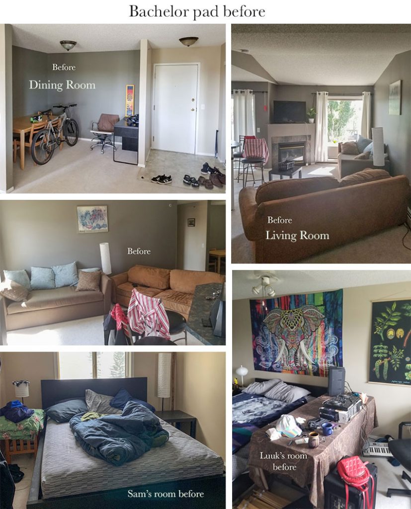
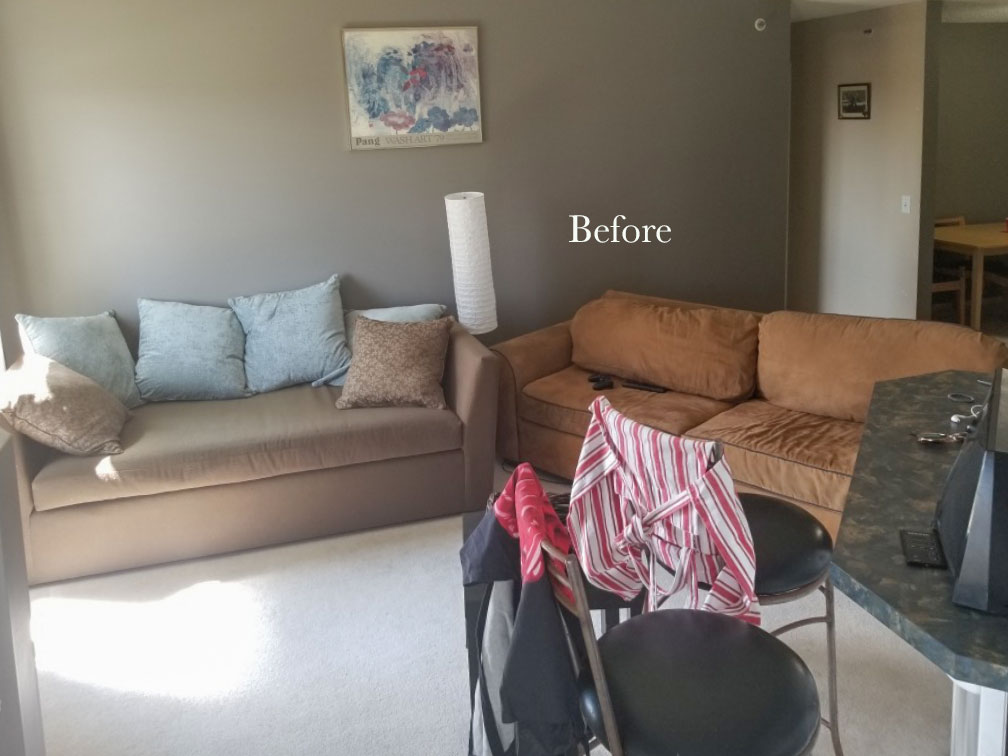
I asked Luukas to send me some photos of the existing apartment:
The brown daybed with the turquoise back cushions was staying. It was Sam’s sofa and much newer than the cognac coloured sofa which was going anyway as it did not fit in their narrow living room.
Luukas had the bigger bedroom (right) because he found the place (that’s their deal) but the trade-off is, he parks on the street and Sam’s car is underground.
Where to look for colour inspiration
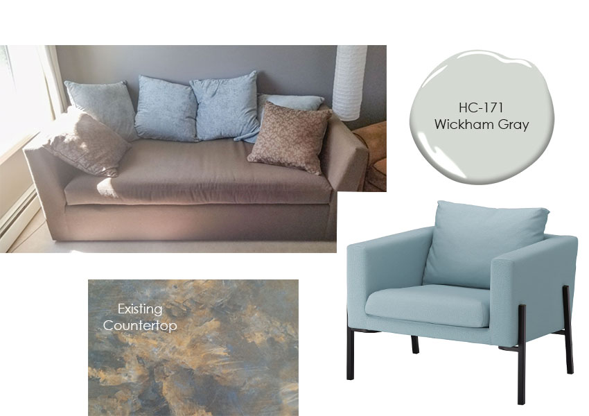
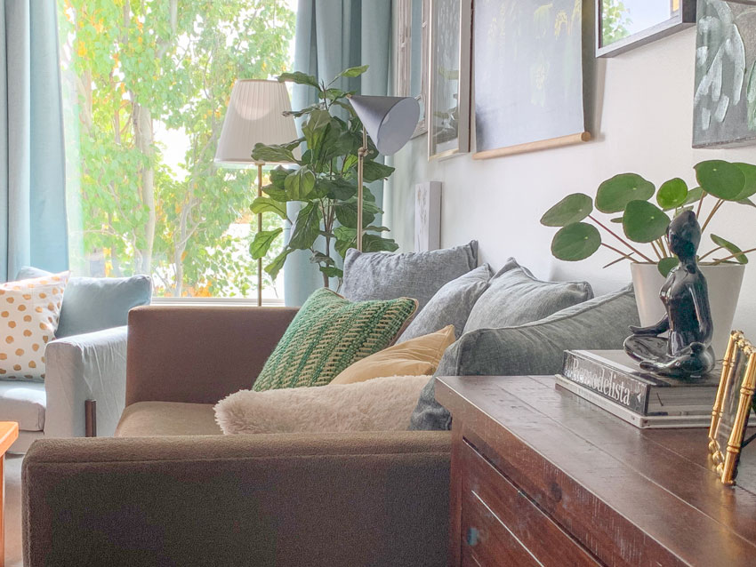
When I saw the dark pink beige colour of the existing sofa with the turquoise cushions, I immediately thought continuing with blue was perfect. Better if I could work with the existing turquoise cushions and one of the best ways to freshen up a dark pink beige is with a fresh blue.
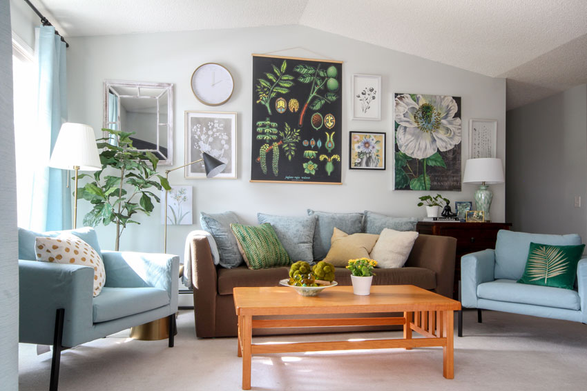
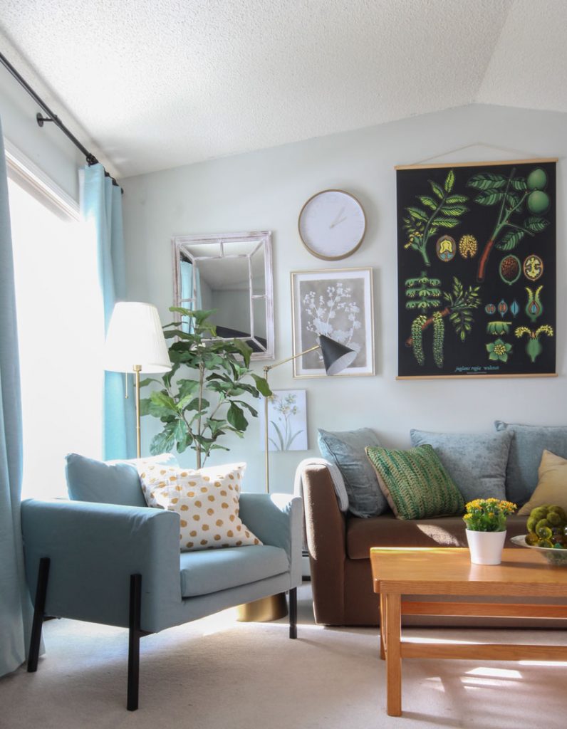
So I went online to IKEA and found an upholstered chair very close to the back cushion colour with a similar tract arm as the sofa. I ordered them and Luuk picked them up and I told him to paint everything BM Wickham Grey.
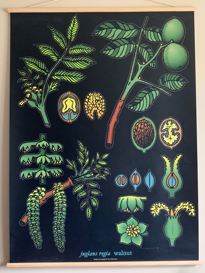
Then I was looking at his bedroom photos and asked him about the botanical art and Luukas said he loved green! So I suggested we paint the dining room a fabulous and dramatic shade of kelly green!
A mural or mirrors are best for a windowless room
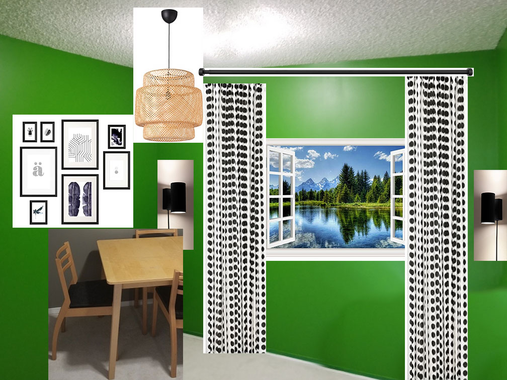
No one wanted to sit in that windowless room, so I thought a mural or mirrors with hanging drapes on each side to duplicate the look of a window would be amazing!
I found this removable mural on-line (below) and had it shipped to his apartment. And this was my original decorating plan for the dining room:
Related post: Need an Extra Window Somewhere? Do this Instead
When we installed it, the self-adhesive failed within five minutes. So I scrapped that idea, discarded the mural and went back to the plan that included mirrors (I’ll write a separate post on how we did it, for todays post, I’m mostly showing before and afters!).
My Mom and I arrived on Friday night and by Sunday night we were done! Monday we took photos and came home on the 6:30 pm flight.
Okay are you ready? This transformation is so fun:
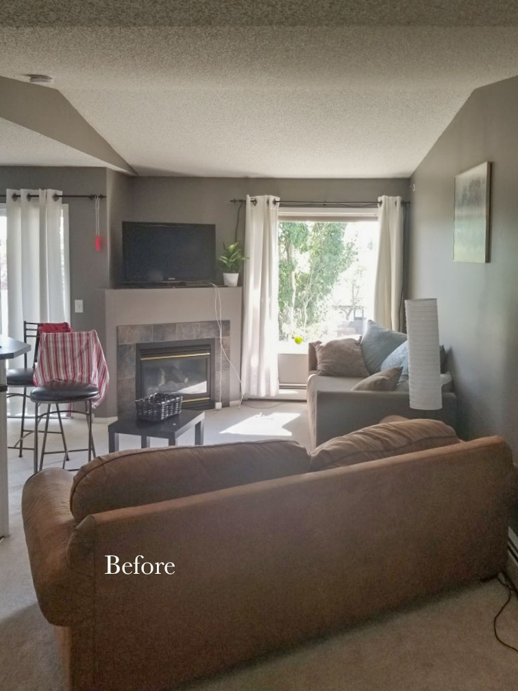
Here’s the narrow living room before.
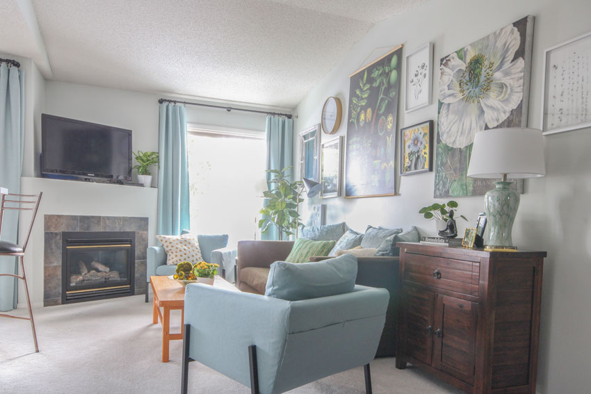
The drapes were way too low and my suggestion if you are buying IKEA drapes is, always buy the 1″ rod. Anything skinnier looks cheap. Plus, I’m really over the look of grommet drapes, we bought all the curtains from IKEA but used their rings and clips to create a more custom look.
Before
I LOVE the curtain rods we found for the living/dining room. They were from HomeSense and they simply curved around to be installed on the wall and didn’t need a finial. Since we didn’t have much room for stacking around the picture window, this looked the best.
Full disclosure
Obviously, because I’m posting this project on the blog, I added more detail than I normally would. Could I have left the old drapes if I was just the decorating fairy, in town to make things pretty, without a blog to post photos? Sure, but then the final photo for the blog wouldn’t have been as good.
Mom and I arrived Friday afternoon at 2:30 pm. By the end of the evening, Luukas and I had already been to HomeSense and IKEA.
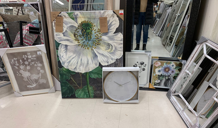
In Canada, every good stylist is grateful every day for HomeSense. Our home decor options are soooooo slim compared to what ya’ll have in the US.
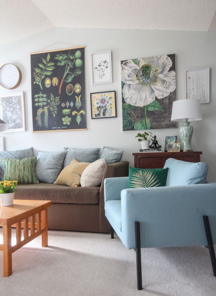
This is what we found to coordinate with the inspiration botanical
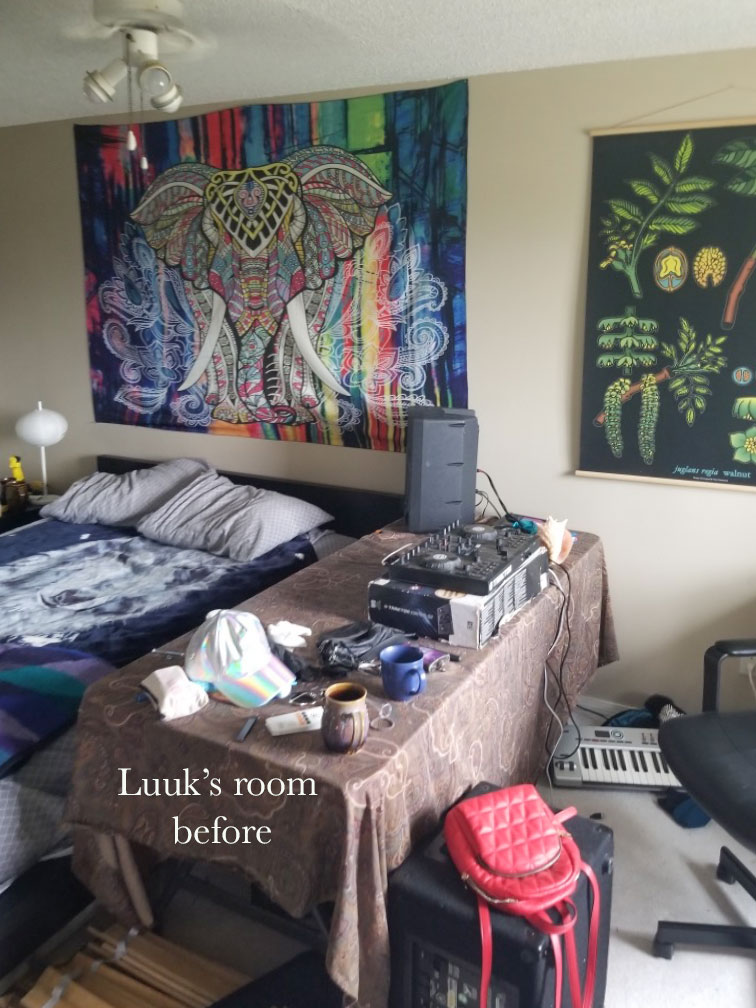
Using Luukas inspiration botanical which I had in my phone, we grouped all the rest of the art together. Luukas has a wide range of taste in art, as you’ll see when you get to his bedroom:
Gallery wall artwork
Before
After
After
After
Luukas loves plants most of them were here before I arrived!
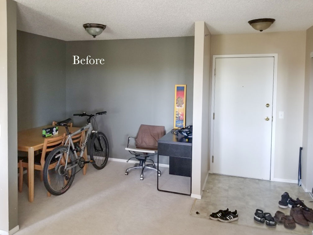
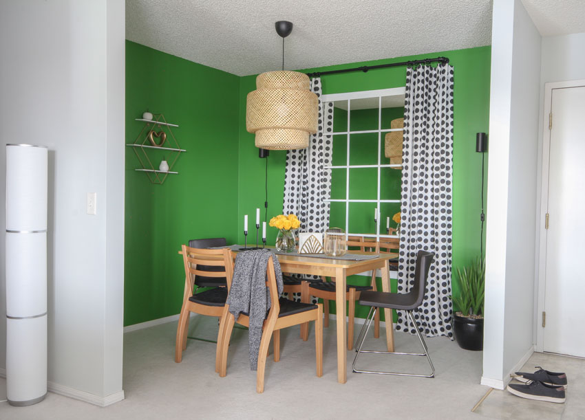
And here’s the dining room which is my second favourite after the gallery wall in the living room:
Before
After
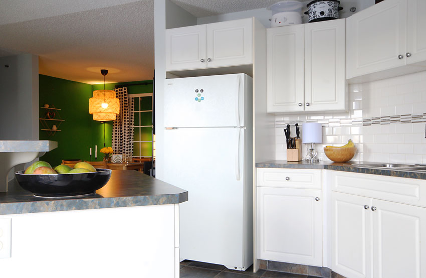
Here’s a view from the white kitchen! It did not need a paint colour (except for the walls) haha.
And of course I managed to find a spot for a lamp (below right):
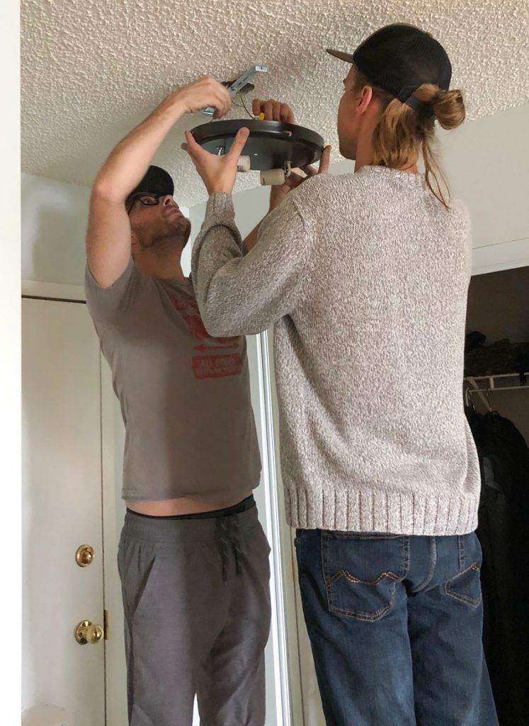
Here are the two best friends (below) changing the entry light fixture:
Sam installed all the rods and anything that required a drill (which was a lot) I couldn’t have achieved this result in 2 1/2 days without his help. Sam sells security software for a company called Tugboat. I’ve heard so much about Luuk’s good friend it was great to get to know him a little better this weekend!
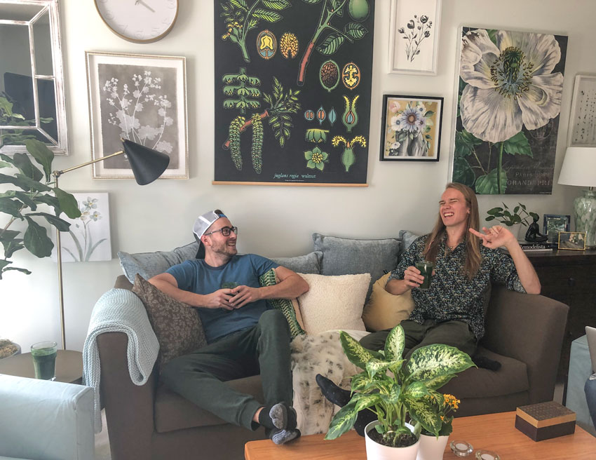
Sam and Luukas
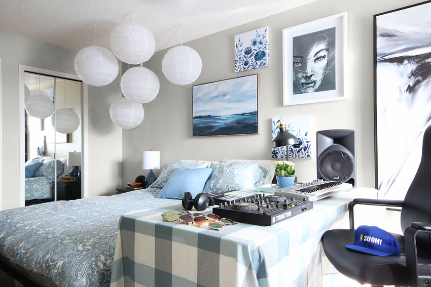
Here’s Luuk’s room with the botanical art that inspired the dining room transformation:
Before
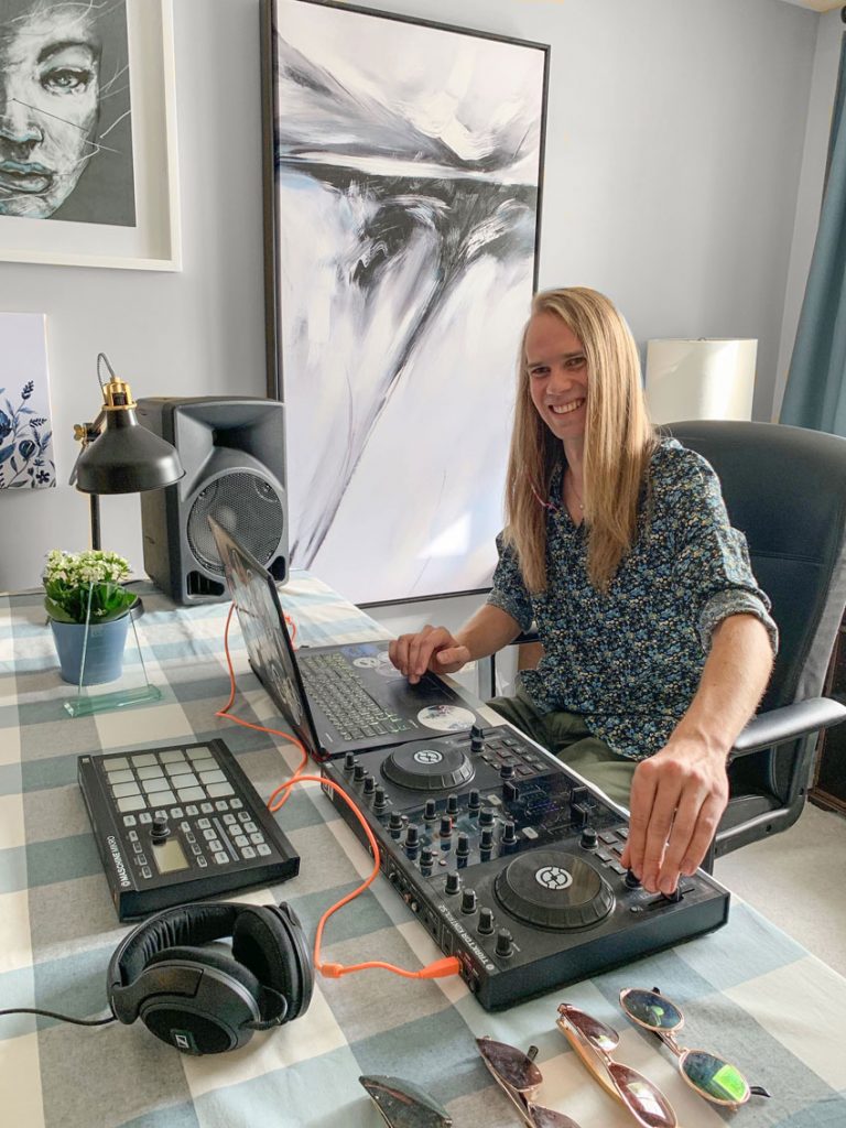
Luuk’s sound equipment station
Being in the master bedroom means Luuk also has room for all his sound mixer equipment. Luukas’ other passion is working as a part-time DJ.
For the past three years he has been working his way up the ranks in the local Calgary scene to become the purveyor of all things under the umbrella of electronic music. Luuk’s most recent project has been the Cosmic Robot, a new monthly dedicated to showcasing the latest in tech houses more cybernetic sound.
Luuk says “Music gives a soul to the universe, wings to the mind, flight to the imagination and life to everything”
I love my nephew!
Luukas Junttila (follow him on Instagram here to find out where to catch his next show in Calgary)
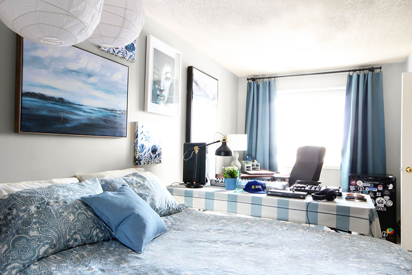
So of course, if you’ve been following me for a while, you’ll know I’m obsessed with lighting. Specifically, lamps with a shade. So I suggested we hang a few paper lanterns in this room. The effect was absolutely fabulous! So pretty at night or on a dark day!
After
I was especially happy to find the buffalo check tablecloth from IKEA that coordinated so well with the IKEA bedding (above)! It’s simply covers an inexpensive folding table.
Luuk’s music room/bedroom suddenly got a lot more inspiring.
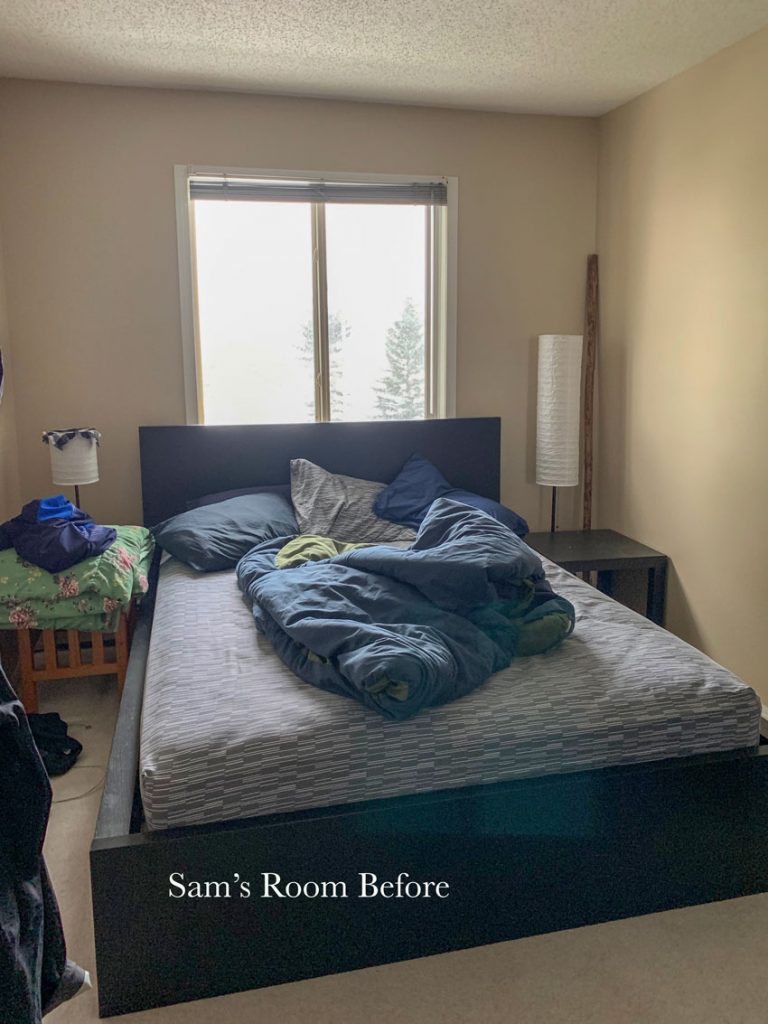
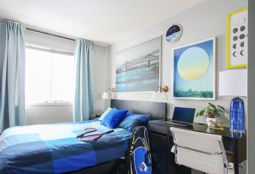
And of course if this apartment was suddenly going to get this amazing, I couldn’t leave Sam’s room out so I had him choose a duvet cover from IKEA.
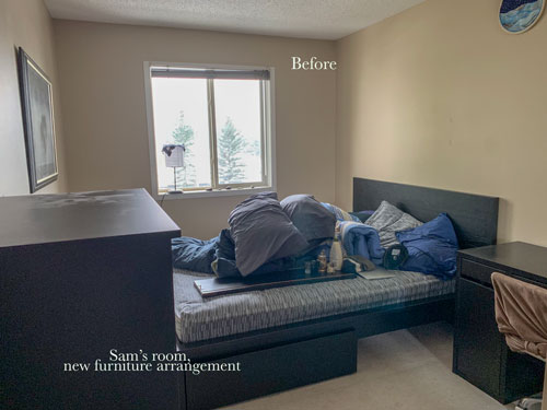
Since the dining room was being decorated, Sam agreed to move his desk into the bedroom. This was the new arrangement, much better:
Before
While at IKEA picking up the duvet cover, I saw this art for above his bed (below) and sent him a photo. He told me he loved it and later confided when he was there picking up necessities for their apartment he had seen it and loved it. It’s so fun when that kind of serendipity happens in decorating!
After I picked up the art, I popped into HomeSense (for the 3rd time) and saw the art with the moon (Luukas and I had already picked up the moon phases art on the right the first night, not sure where it would go and this was the perfect spot). He already had the little round needlepoint that stayed right in the same spot that it was from the original before pic!
And of course the blue lamp was perfect with the two sconce lights to complete the lighting in this room. His old light sits on the dresser (not shown) so now we have much more balanced light here, yay!
After
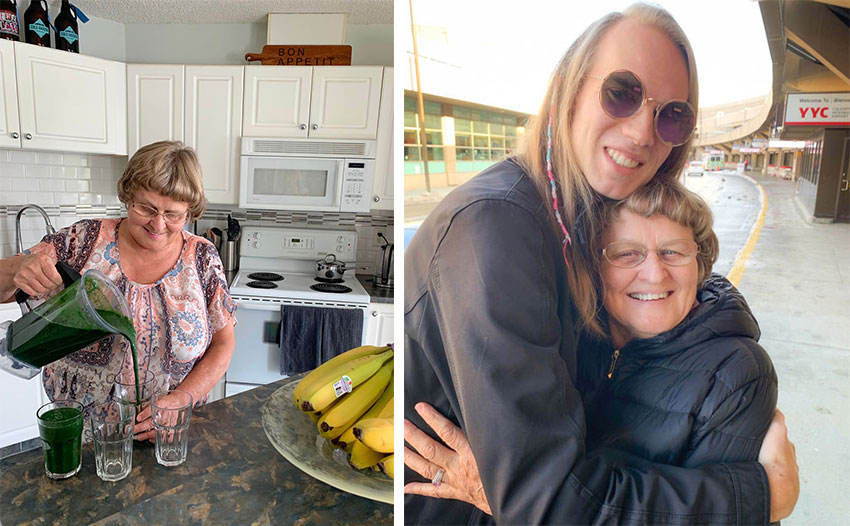
My Mom was the best! She made us amazing food, dusted and cleaned, pitched in wherever she was needed, imparted all kinds of wisdom and hemmed the drapes (since every window had to be covered).
And did I mention, constantly made green juice (of course). In fact she brought greens and all kinds of fresh vegetables from her garden!
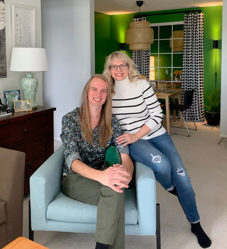
Here I am with my beautiful nephew in his new apartment makeover!
Luukas Junttila and Maria Killam
Whew. That was an epic 3 1/2 days and an epic post to write. I will post about the dining room mirrors later because it’s such a great idea for a windowless room! Decorators use mirrors every day to make a room feel bigger or to create a ‘window effect’ but this was a very inexpensive solution!
Here’s the before and after of the living room again:
After
Which room is your favourite?
I believe everyone should have a home that fills you with joy when you walk in the door! I’d love to help you create that either locally (in Vancouver or the lower mainland) or through my eDesign services here.
If you would like to learn how to create a home you and your clients love, join me in my Chicago course next week (two seats left) or Boston or Orlando in November, register here.
Related posts:
Elizabeth’s Library Room Transformation; Before & After












OMG, I enjoyed this so much. What an insanely wonderful transformation! I have a 32 yo son with Aspergers living in a dark apartment. He loves beautiful decor, and this is so inspiring, I’m going to send the article to him. Using these lovely outdoor colors of nature makes all of the dark beigy rooms come alive. The living room is my favorite. It’s all just delightful!
What an amazing transformation!! I have a son near your nephew’s age and while attending UBC, he lived with a bunch of fellows! What a disaster (a design wise disaster!). I love all the rooms and I just can’t chose my favourite! Brilliant job!!
What a beautiful transformation! Love the living room the best but really I love all of it!
Hi Maria,
Whew…that was a lot of work you all accomplished. I could never decorate a room that fast. I have to live with any new purchases for a while before I can even think about what the room needs next.
I hope they keep their new rooms tidy now. They’re still boys after all. ?
It really is a sanctuary now, and I breathed a breath of fresh air seeing every “after” photo. The living room is my favorite. I am impressed how that dark pink beige sofa fit into the decor to look appealing, surrounded by all those uplifting, fresh colors. You continue to dazzle, DECORATING FAIRY!
All I can say is ….
Decorating fairy nailed it
GORGEOUS!!!
Simply amazing! You are a talented designer.
This transformation is incredible!! I’m excited to hear about the mirror/window idea because it’s amazing! How did you decide on the Wickham Grey, it really transforms the room!!
Well the sofa cushions and new chairs from IKEA are turquoise and so is Wickham grey! And since the current trend is light and bright and that’s certainly what Luukas wanted, that’s what I chose 🙂 Thanks for your comment! Maria
Wow. Wow. Wow. LOVE IT ALL. What a great aunt you are. ?
I have followed you for many years, and I truly think this shows your versatility, eye for color and design, love of decorating, talent, and immense love of family more than any post to date. You have shown so many beautiful decors and make overs which I love to see, but this one is truly special. Well done!
Aw thanks Lynda, your comment made me cry (and my Mom too 🙂 x Maria
Maria, love the green and blue in the living room! It appears the vaulted living room has windows only at the lower end of the vault, i.e. not in the gable end. Does that let in enough light to take advantage of the vault? Is it easier to decorate a room with such vaults or one with nine foot ceilings instead? Building a new home and have to make a decision. Thanks, Kim
Hmmm. . . not sure but it is a really bright apartment. It’s a layout I’ve never seen, usually box apartment have a galley kitchen and this is so much better! Maria
He is a lucky fellow to have a decorating fairy aunt and grandma! Looks terrific and pulled together, so nice after all those years of bunking out. That green is really vibrant. The only thing I would consider changing is lowering the black botanical art just a tad so it either lines up with the large floral or is noticeably lower.
I also really love your portrait of him at the mixing table. He could use that professionally.
I also spy a “Suomi” hat–love it–it means strength, fortitude and guts. I come from Michigan’s Upper Peninsula, which has the highest percentage of Finnish immigration in the USA and where Aho is more common in the phone book than Smith by a long shot. Reminds me of home.
Yes AND Luukas is half Finnish since we’re all Fins 🙂 I thought about that too with the Botanical art but I was worried about it being too low with people sitting on the sofa! Thanks so much for your comment! Maria
Looks great!
Wow! Such an honest post, looks like talent and probably kindness…runs in the family. Hard to pick a room.!
The entire apartment is so super! The dining room is immense fun!!. But that living room is stunning and totally my favorite!!! Lucky young men. I love that pic of them sitting on the couch laughing – there’s an energy there that’s contagious.
Love it. The living room is fabulous but the mirror window in the dining room makes it something really special. It’s a trick I’ve considered over the years but never actually done. May I also add how much I enjoy your posts? I get too many blogs in my in-box and time really doesn’t permit a reading of them all. However, yours I never miss. I might not see it for a few days but as I scroll through on a “delete” mission I always stop to read yours! Thanks for the inspiration in this one!
Thanks Brenda, I appreciate that! xo Maria
As a guy, I think the bedrooms look great.
Not a fan of the living room’s floral gallery wall and fiddle fig tree – too cliche.
I would have kept the living room wall darker and chose one very large statement piece of artwork.
One of your best posts! Your love of family and design permeates every paragraph and photo. Bravo!
I am always amazed at how you work your magic. Looking forward to your mirror post. I am confused about mirrors due to feng shui rules about their placement, so would love your thoughts on that.
Such a transformation! The living room took my by surprise! Fabulous job! And sweet to do for your nephew and friend❤️
This is so great Maria! What an amazing project to be working on, and what an awesome group of people you all are!
Where did you put the bicycle? My husband has two that he keeps inside. The apartment looks great. I like the gallery walls. I panic if I have to decide where to put a nail in the wall.
Wish you were my aunt?
You are multi talented!!! Every time you show before and after I am just amazed at how you nail it!
I love it all, but if I have to pick.. the living room best.
Those guys are going to love that place now.
Simply wonderful in every way.
Amazing and simply-done transformation! It’s all so beautiful. I love the living room, and Luukas bedroom. Beautifully composed.
I LOVE everything you did with the apartment with the exception of the coffee table in the living room. I can’t actually decide what I don’t like about the coffee table but its like a flashing neon light – perhaps its the colour (kinda of orangey – which I don’t think goes with the rest of the items in the room) or perhaps its the shape (big, boxy and sharp looking) compared to the other items in the room. Don’t get me wrong – I would love the coffee table at my cottage but for some reason it distracts from the flow of the rest of the room and apartment in general – at least in my opinion.
I agree with you about the oak table. We found it on Craigslist in the beginning before I ever arrived and I didn’t manage to work it into the scheme in the end. . . . I was hoping no one would notice, haha! x Maria
Are the two sconce lights hard wired in or do they have electrical cords? Trying for a similar look.
The black ones are very inexpensive, from IKEA and just plug ins as you can see from the black cord! Thanks for your comment! Maria
This is such a great transformation! It’s hard when one is just starting out with their first real home as an adult, and you don’t know where to start. This is such a great example of how to do it. What is the green in the dining room?
oh I love this! what an amazing transformation! Your makeovers always make me smile. I just love what you do with colour, its just beautiful.
You truly are the decorating fairy.
Beautiful work!
What a gift! Your nephew does such important work. How fantastic that he has this happy space to call home.
It’s all fabulous Maria, but I love the dining area with the kelly green walls and graphic curtains. The photo of you and your nephew which shows the lighting on the green walls is fresh. And the cane light shade. Fairy dust sprinkled in all the right places. The guys will enjoy this swanky apartment. All good wishes to them.
They must adore you!
Wow! What a stunning transformation. You just keep topping yourself with these before & afters. I love every room but the living room is the stand-out for me. I love all the color and pattern.
This was a wonderfully fun read over coffee this morning! I’m an experienced redesign professional and this is a perfect example of how a trained eye can absolutely transform a space – giving a client the gift of beauty in their physical space – using what they have and adding things that need not be expensive, just well considered. This is my favorite of all your makeovers! The best projects are often more about a well deserving and lovely client – not posh spaces and huge budgets. Many thanks for sharing. TCE graduate 2015 – Malissa, North Carolina
I love this so much! You are my favorite designer! I love the living room most because of the artwork, but Sam’s bedroom is a close second
The picture behind the lamp is crooked. My OCD can’t take it. Burn the place down and start over.
Haha good idea 🙂 Maria
Love your enthusiasm and talent – and that you and your mom are so close. She seems like such a sweetie and she keeps the pace from start to finish. What a great space for the guys. Thanks for sharing.
I love it Maria! You are a wonderful aunt to your nephews! I have to say that as another lucky kid who had awesome aunts and uncles — they have helped shape who I am and have given me a real sense of family and a place of belonging. They are my “people”. This is truly a gift that you have given Luukas and Sam and I am sure that the time spent with them over the weekend will be remembered as a special time for you all. You are a gem. (And Luukas seems pretty awesome too!)
I love what you’ve done for Luukas! I live in Montana so have few shopping choices. I need drapes and have a corner window with no stacking room. If someone could guide me to a previous post that covers this, I would be very grateful. Thank you!
Hi Sue, what you need is a rod with an end cap that screws into the wall. This way you will have drape against the window but at least you’re not wasting 4-5 inches of window space already with a bracket and finial. Hope that helps, Maria
Why not just paint the coffee table since it doesn’t have any significant value (monetary or sentimental)?
Sure we could but we didn’t have time to do that. Anyway maybe perfect is boring 🙂 Maria
What a sweet blog of family helping each other out with their talents! I love what you did but my favorite is the dining room. Also blown away that you were able to put together such a cohesive living room with the sofa you started with.
Just amazing and beautiful!
I love the new living room. It’s fresh and inviting!
I am so glad you did this apartment. So many people live in a space this size and don’t know how to decorate it and make it more than a rental. I love every space and cant wait for my kids and their friends to see it (who rent apartments like this and have a small budget) Your Luukas sounds like a stellar human being.
OMG, that was just awesome, I feel as though I just went on a 30 minute “feels like a weekend” trip with you ! You wrote the entire weekend into such a beautiful and sentimental journey with your nephew ! And how sweet that you made his best friend feel so important, and Mom? Where would we be without her ?! She is just the most wonderful person, I have so enjoyed getting to “know” her lol. She is a trooper !!!! It is why she looks so youthful – she keeps moving ! Your heart and soul Maria, are just what this world needs, it is too bad that we cannot bottle it up and sell it in every HomeSense store, (and all the Pottery Barns for all of us in the U.S). Thank you for sharing, I forwarded that beautiful story and transformation to my favorite people.
What a feel good story that was!
oh, and if they bring any dates there- wow effect!
It all looks great! I especially love the living room. Love the photo of your mom with your nephew. What a sweet family you have!
You’re amazing! What a transformation.
So when are you going to get your own DIY transformation TV show?
Wow, Impressive, love the flow and the colors, everything works together, love it.
Beyond beautiful, your nephew is so lucky to have a talented aunt like you!
I would never have thought of the Kelly Green dining room, but it works perfectly!!
Wonderful makeover! I’m not always up for a gallery wall but this one is great! Every room is terrific. Thanks for your great posts. I’m a mostly retired Interior Designer, ( a couple of months from being 80), and live in Arizona. Would love to take you up on all your classes and products but it’s past time but love having found you! You do beautiful work!
Maria, I loved this makeover! It really will help them transition from students to adults. My spirit was lifted just by seeing the after pictures. It has to make even more of an impact in person! The love you have for your family and they for you is so wonderful. The young men must be over the moon with their new space!
Outta the park, Maria! ?? The living room is my fave ?
I actually gasped out loud when I scrolled down to the living room “after”. This is my all time favourite before and after room/post ever, anywhere. You are amazing. Talk about creating a look and a feel – your nephew’s smile says it all. The condo looks amazing and he feels great !
Omg Maria! What an incredible transformation is such a short time! You are truly a magician!! I am so happy for Luukas and Sam! Luukas is so lucky to have a beautiful, talented and generous aunt like you!! I am truly impressed by what you have done!!!
Love, Lea
I love posts like this! I have always believed that a house can be gorgeous on a budget. IKEA helps.
Beautiful family, Maria, and a great makeover. I love your use of blue throughout, such a calming welcome home each day for the boys.
Wow…
Perfect touch made big difference
The makeover is quite lovely. That green dining room is stunning. I appreciate that you worked with some things they already had. However, there is one thing that isn’t making it for me. The coffee table hits my color sense all wrong. Is it just me or would another not so orangish wood look better. I struggle with this issue in my house where the kitchen cabinets are orange or whatever color that coffee table is. I’ll need your service next year when we update our kitchen, but until then, what’s bugging me about that table? Thanks.
Great job Maria! Such a cool and sophisticated “crib” for these 2 young men. Their lady guests will definitely be impressed.
Amazing! The living room is my favorite!
Maria, have you ever used SW Divine White? I’m curious what “color” it is and any any thoughts you have about it. I’ve seen it used for years and was wondering if it’s still a popular color or if other neutrals have taken over.
Maria you sure found some terrific solutions for your nephew’s bachelor’s pad! I love that you found a picture as inspiration for the colors throughout. That was a lot of shopping in such a short time! Really like the way you created light in the dining room by using the mirrors to emulate a window and framing it with drapes. Very clever! I have always wanted to try that but the opportunity has not yet presented itself. You certainly are the master of color! Kudos!
Hi, Maria…It really looks amazing! Very cool!!! What a nice thing to do for your nephew! They must be thrilled! I especially like the gallery wall!!! You are such a good Auntie! And your mom, so sweet! 🙂
I like the orange coffee table. It reflects the orange colors in the botanical print and also is a pop of fun color. I thought you did that deliberately. Without it the room might feel too staid , or boring for two young men . The entire post is fantastic! Love your family.
I’ve always been lukewarm on gallery walls, but after seeing how it has contributed to the cosiness of your nephew’s sitting room I am going to embrace it for a long blank wall in my sitting room.
Just awesome! I love the colors and the fact that you helped those kids go from kind of a sad state to such a homey cool place. My son is in an apartment just like your nephew’s. He will only be there less than a year, but when he gets to a place he may hang around longer, associated with his first job, I think it would be so fun to do what you just did. Of course, I will need to fly in the decorating fairy. 🙂
I just love hearing about your family. You guys are so loving and giving to one another. It makes me very happy to see a family that wants to spend time together. You have something special. Thanks for sharing it.
I love to see epic makeovers on a budget! Your ideas are creative and transformational – the colours, the art, and the furnishings. This article is inspirational to those on a budget and who wish to make their home a place that is joyful and comfortable to live in. All of the rooms are fabulous but, if I have to pick one, it is the living room. Sensational, Maria!
Maria
This is AMAZING! Well done and in such a short amount of time! You look terrific to boot, must be all of the green juice!
Amazing. I almost expected to see you with a magic wand & some cute fairy wings!
Maria,
What a lovely family you have–they are SO lucky to be related to such a talented “Decorating Fairy!”Great to see your mom could go along to help, and congratulations to your nephew on his degree. I never would have believed you could bring such life to the brown daybed and am still in awe how you get from “A to Z” in lightning speed! Love Ikea (except for the assembly part)! My kids in apartments are never allowed to paint their walls, so they are always stuck with some “yuck” beige or “almondy” color.
What a great transformation Maria and great post ! It warmed my heart reading it ! I love the bedroom transformations- couldn’t help but think of how surprised & impressed I would’ve been myself as a woman in my 20s had I walked into that bachelor pad !
Warmest regards,
Lizzie
I love the style, it looks magazine perfect. I love how the tablecloth in Luuk’s room just ties everything together. However the more I look at it, the more it rubs me wrong. Except for a physical impediment, I don’t see why the big table should stay next to the bed. It belongs under the window, to take advantage of daylight and have a cozy space to focus at night. Work should be separated from sleep anyway. He can’t even get in bed without going all around it. So there’s that. Then it’s the lack of strong colour. From his red backpack and the elephant he liked so much he actually hung it on the wall, I would have thought he’d feel like himself in a colorful room. Same wall colour but a brick red bedcover, with pillows in hues inspired from that elephant. As for the table, I would have done anything possible to avoid a tablecloth, perhaps a thick untreated leather that he could cut to size and stick on top? It depends on what is available. In addition, musicians, electricians, technicians etc, have a lot of stuff and it seems there’s never enough storage space. So I would have gone for lots of storage options, under the table there’s a lot of free space for one or two desk drawers for all the pens, duct tapes, batteries, etc, an open closet/library style to put his books, IKEA boxes to categorize stuff and at least a basket to put his cables in.
What a transformation. The apartment and the incredible family passion are both touching. Luukas and you are kindred spirits, Maria, both full of empathy, love and good decor taste. All of your posts are impressive, but this one truly came from the heart of a gracious Auntie. Well done, in so many ways.