Wondering if your colour dilemma is a clean vs. dirty one? I’m sharing reader photos and my thoughts on this common colour mistake.
Thanks so much to everyone who emailed me with images they felt would belong in a clean/dirty discussion from my last post, as promised, I’m going to show you a few emails along with the photos I was sent.
Clean Vs. Dirty Colour Dilemmas
As usual, someone always makes a comment similar to this one “Maria, I will forever disagree with your use of the word ‘dirty’, if you’re reading this and you fall into this camp, read this post. Or, attend one of my Specify Colour with Confidence events where I show image after image and in the end you will see why ‘dirty’ (which is simply the opposite of the word ‘clean’) is the best way to describe a space where the colour scheme isn’t quite right and you can’t quite explain WHY. It’s just one more place to look.
This is the second comment that I receive a lot:
‘Muddy and clear colours live together in the world and nature every day. Think of shadows. It is the muddy colours that draw focus to the clear colours and make them pop. The Amish often artistically use this combination of muddy/clear colours in their quilts.’
I’m glad, my reader posted this comment because I think this helps everyone. So here’s the thing, rather than always looking at where you or your interior might be the EXCEPTION to the clean and dirty guideline, look at the following images like a learning experience.
We make colour decisions constantly in our day-to-day life, whether we are buying fashion or anything for the home, a colour choice is inevitable before the purchase is made.
Wouldn’t it be more fun, not to mention save you so much money if you made more correct and accurate colour choices, rather than living with mistakes you’ve made?
Or, even worse, you’ve spent a lot of money on a colour choice you don’t like (that you can’t afford to replace), so now every day, it stares at you and reminds you constantly that you made the wrong choice.
Okay, first up is this cream kitchen with this email from Molly:
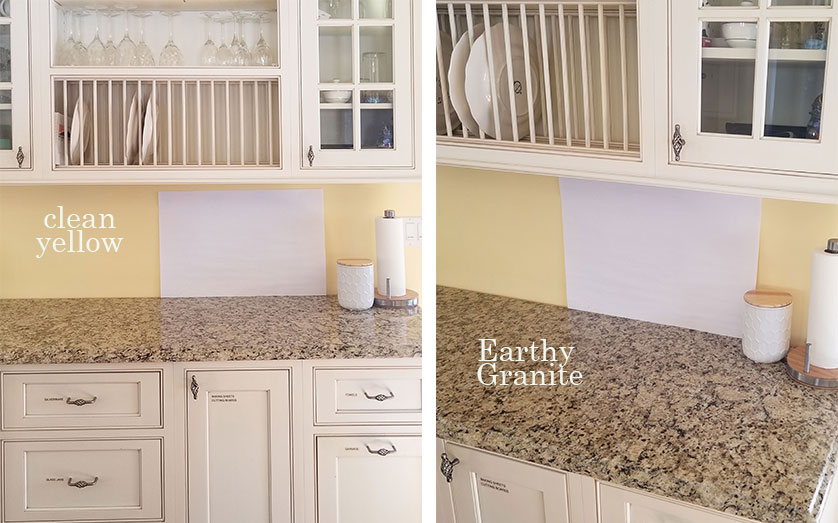
In response to your post today about clean and dirty, I am forwarding these photos to you. If you can make use of them for your clean dirty post you plan to write feel free. The cabinets are off-white or cream and the granite is new Venetian gold. The current paint color is BM Mellow Yellow 2020-50.
This one is easy to see right? The granite is dirty in comparison to the bright yellow walls beside it.
This granite is a combination of pink beige/yellow beige and orange beige and I would try BM Manchester Tan to make it feel like it relates. If you want something lighter and you can get away with it, I would also test BM Feather Down if there’s enough contrast with the creamy cabinets.
Next up is another kitchen and this question is from Lori:
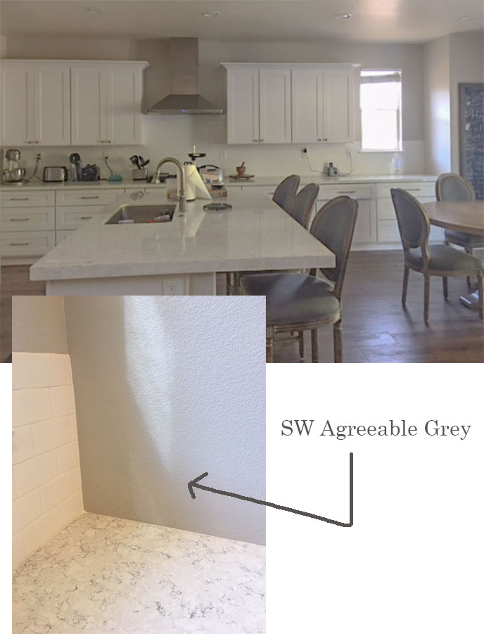
After reading your White is Complicated book and following your blog, I am beginning to think that my wall color is all wrong.
It is Sherwin Williams Agreeable Gray.
I don’t know exactly what my cabinets are but seemed to be similar to BM decorators white.
I knew something was off but I have been blaming the soft (yellow) white recessed lights, which are driving me crazy. This room faces west and does not get a lot of natural light.
Should I consider a cleaner cooler gray? My counters are Silestone Blanco Orion. Any thoughts would be much appreciated!
After I received these images, I asked Lori to send me a close-up of her countertops and the wall colour (above).
Okay so here’s my take on what’s happening in this kitchen.
There is nothing wrong with the wall colour. As you can see when you look at the above photo, it even relates nicely to the countertop.
I’m guessing Lori would be happier if the wall colour was simply lighter. Her kitchen is dark anyway and since we are seeing so many photos on-line of blown out, bright white rooms, this shade of grey might simply be feeling oppressive in this room. The same grey in a brighter room would lighten up during the day with the sunlight.
Here’s what’s really bothering her.
There’s too much grey in this room now.
Remember, grey came along to be the backdrop to bright and happy colours which have been on trend the last 7 or 8 years and when there’s too much grey, we start feeling depressed.
Grey on it’s own can be debilitating if the room doesn’t have other warm accents in it from wood tones or other textures.
Also, I love these oval back french chairs like anyone else, however, your kitchen chairs should technically not be identical to your counter stools. A designer would choose chairs that coordinate, not simply choose the same style. Just like a designer would not help you buy a matching dining room or bedroom set. They would choose furniture that coordinates.
Also, this many chairs in the same trendy grey fabric, also looks like they were all picked up at the same time from a big box store.
And one more thing, my reader mentioned the lighting (which is also a super common myth if the colours in a room are bothering you, this I go into great detail in my live workshops) changing the lighting will not remotely change all the things I’ve already mentioned that are the real reasons this room is not amazing yet.
But, there is hope!
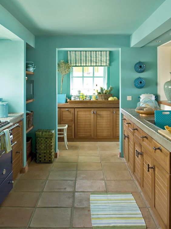
First, I would paint this kitchen turquoise and since there isn’t a lot of wall space, I would take the same colour onto the ceiling. Then it would feel like the sky! And turquoise would certainly bring the grey chairs to life!
Of course it doesn’t need to be this dark, several shades lighter would be just as gorgeous!
Don’t forget to style your kitchen.
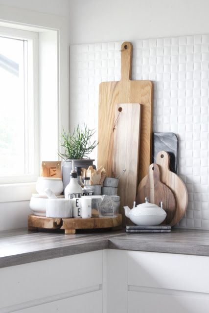
And then this kitchen needs to be styled! The right corner with the window above the countertop could have a vignette that looks similar to this one (below). This one is a little overcrowded but you get the idea:
Related post: Ask Maria, Will my White Kitchen be Cold?
Image source
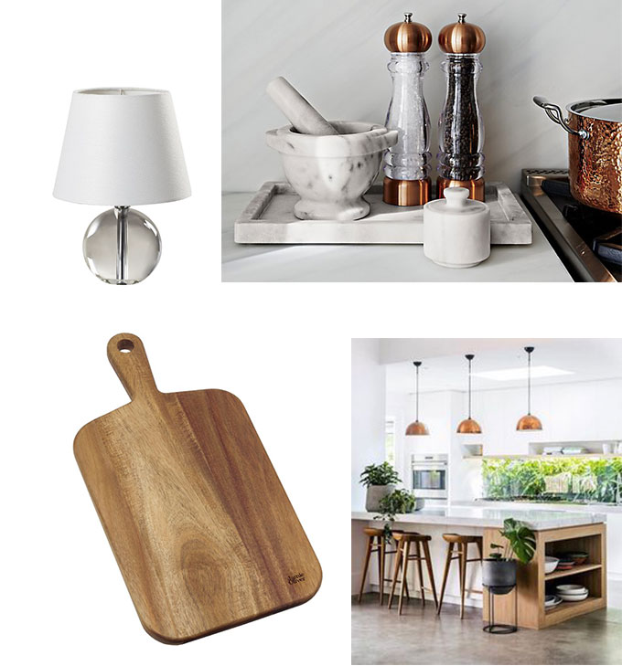
We need a lamp 14″ or shorter to be placed on the left side of the countertop in this kitchen which I would simply have ON at all times. A dark room looks so much more inviting even if no one happens to be in it, with one light on. Like an entry for example. My master bedroom is the darkest room in my home because it’s in the North facing corner, however, my table lamp in the sitting area is the first light I turn on every day and it stays on all day long.
We need a tray. This marble one (below) could be placed beside your stove with items like it’s been styled with but I also think a utensil container with spoons, etc is a great item to style. Add a few wooden spots to relate to the nearby decorative wooden cutting boards you’ll prop up to add warmth as well.
Table Lamp | Marble Tray | Cutting Boards
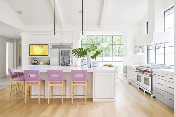
See the vessel on the island above with the plant in it? That could also be on your kitchen island at all times. Lasts a long time and always looks great.
Or instead of turquoise you could introduce pink. I’m loving pink because it feels so NEW.
Molly sent me another photo she snapped in her neighbourhood and this is what she said :
“This house just built in my neighborhood in Chapel Hill, NC is off. Maybe they were going for Carolina blue. Even our fire trucks are Carolina blue!”
So the stone on this house is varying tones of pink beige and taupe. The problem here is not that the earthy stone is causing the blue grey colour to look clean, it’s simply that there is no blue whatsoever in the stone.
This house would have looked gorgeous without the stone in this lovely shade of french country blue with the existing thick white trim.
Or, now that it’s too late to do anything about the stone, I would paint the front door blue too, and the windows on the big wall of stone would look pretty in blue as well.
Don’t just slap stone on your exterior.
Stone should never just be slapped up onto a house ‘just because.’ It should be a carefully considered and well-placed architectural feature.
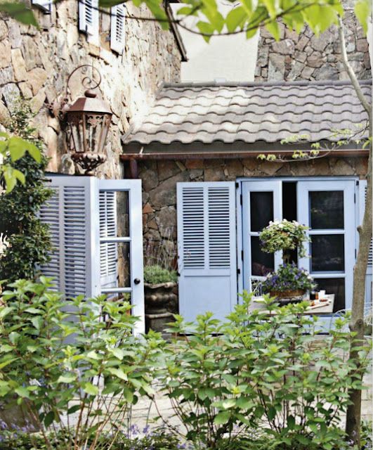
The stone on this house (below) is very different. European inspired exterior with well spaced out blue windows and shutters, it’s balanced.
Did you know we can help you choose the correct stone for your new build? Stone Consultation
Image source
And Molly, thanks again for another photo, here’s her note:
Saw this in Victoria, BC last month. Your training has me snapping all kinds of pictures on Vacation!
Is the colour of my trim too clean?
The yellow on this house is definitely CLEAN, however it technically does work on this pale grey exterior. It’s too clean with the surrounding orange brick (you can see the post here in the foreground), however what we are reacting too is that there’s not enough yellow yet.
If you’re going to paint the trim such a strong colour, you need to commit fully and also paint the fascia as well.
However, I’m never a fan of random colourful trim on a house, it just looks like “We couldn’t afford to paint our house so we painted the trim instead”. And it’s definitely an unsophisticated yellow for the exterior of a house.
Yellow is one of the trickiest colours to get right because it looks pretty on the paint chip but then screams way too bright when it goes up. Yellow needs to look dirtier or more muted on the chip to give you the right colour on your walls or your exterior.
This cute, cottage style house should have been painted yellow to begin with (below).
Is the colour of my rug too dirty?
Next we have a living room question from Kristin:
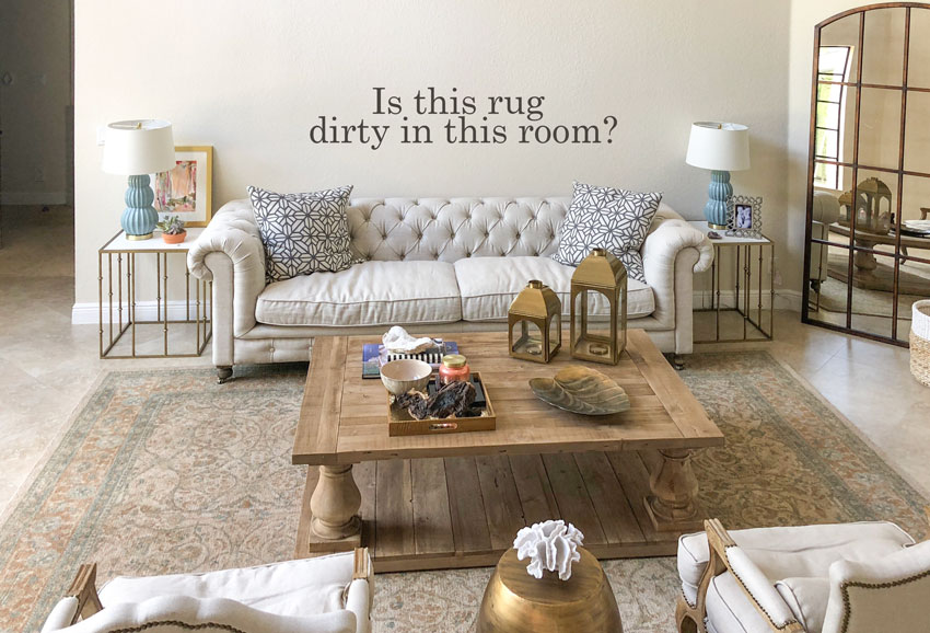
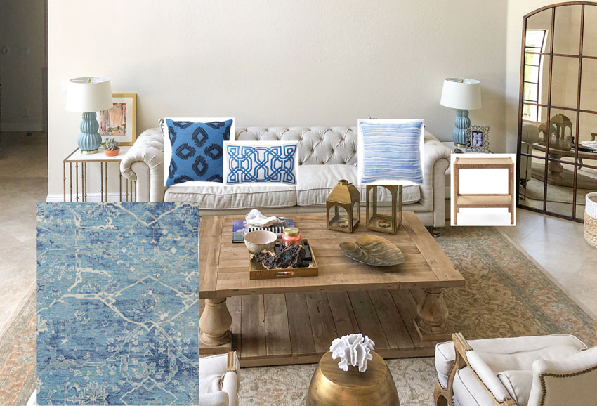
I have some photos for you of my formal living room which I have been struggling to decorate. One day it dawned on me that the rug I purchased is (I believe) pink beige and that is probably what is giving me such a hard time. It’s dirty alongside my sofa and chairs.
I keep thinking I should get rid of the rug and start with something new. When do you decide if it’s better to start over or keep adding to something you don’t love in hopes of making it better?
Here’s my take on this room:
Your area rug is indeed varying tones of pink beige, orange beige and green. And there’s no lightness in the rug, so in this new living room with all your new linen furniture it looks like your rug is definitely holding you hostage.
Since you’ve added turquoise lamps, I took the liberty of continuing with the blue theme with the rug and pillows that I chose below. Also your end tables are too wimpy looking compared to your coffee table, so I added some new ones. I noticed that my eye kept jumping to your mirror and the legs of your tables. They kind of match but not in a good way.
So when should you get rid of an area rug? When it’s literally killing the look and feel of the direction you want to take your colours and decorating.
Area Rug | Pillows | End Table |
This next question is from a longtime reader! Thanks so much, and here it is:
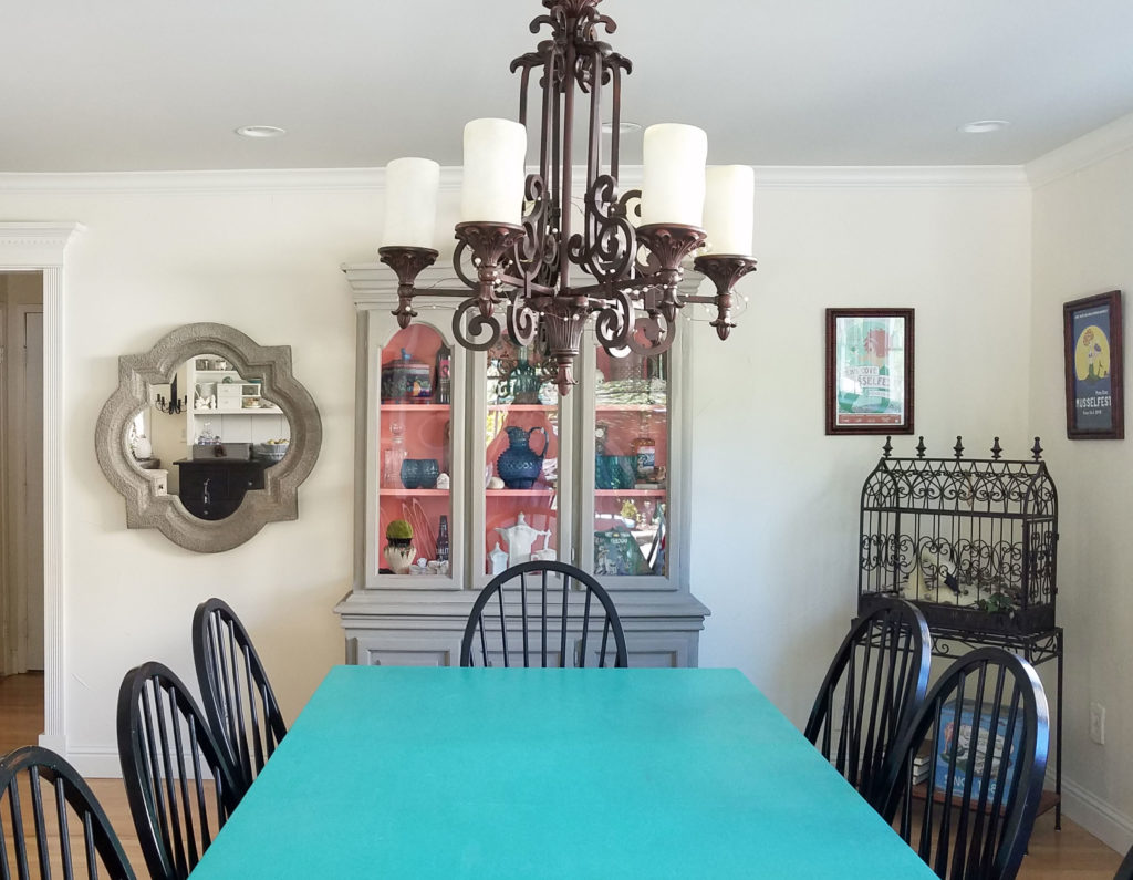
I am in the process of getting rid of dirty and moving to clean and this is where I have landed so far. This is my dining room. The dining table is too bright and the china cabinet too dirty and dull. Pretty sure this is a perfect example of what not to do.
I am considering Newberry Port Blue (NAVY) Cabinets but I can’t decide if it is going in the right direction. Oh, the linen white paint is going to be changed as well, it looks dirty next to the Santorini Blue dining table. To what? I don’t know.
Not an issue of clean vs. dirty.
I’m so happy Meghann sent me this photo because it’s another good example of a situation where the colours don’t relate. NOT clean vs. dirty.
Currently, there are 4 colours in this room that do not relate. Black, turquoise, coral, green grey and the creamy walls.
What’s missing, and causing my sweet reader to spin around and consider yet another unrelated colour like navy blue to paint the grey cabinet is there no unifying element like wallpaper, or artwork, or something to tie all these colours together.
Her china cabinet has some teal decor items but they in fact could be called dirty in comparison to the dining table.
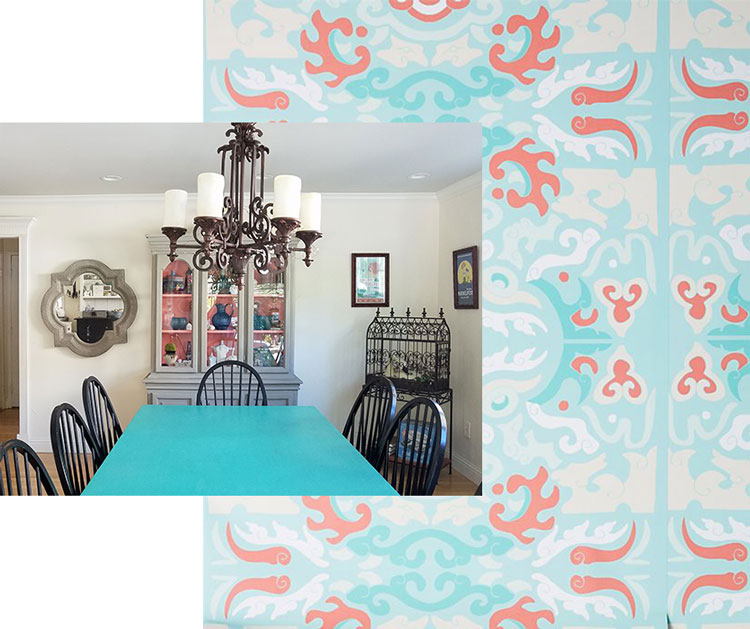
I found some wallpaper that picks up the colours in the dining room. I’m not in love with it, but you get the idea. If she installed this wallpaper or something similar, I would paint the cabinet white (or her trim colour if that works).
And I have one more from my neighbourhood that I snapped as I was riding my bike this morning. It’s a long weekend for the Canadians this August!
I’d love to have your feedback on this post? Was it helpful? Should I collect more images for another one? If you have a room where you think clean and dirty is an issue, clean up the room, take photos without flash and in good natural light and email me here.
If you would like to learn how to specify colour with confidence, check out my in-person training events here.
Related posts:
The Problem with an All Grey Room






LOVED this! Real examples with real potential solutions and suggestions so thanks for doing this. Looking forward to even more as we’re re-doing a room adjacent to a kitchen which will NOT be re-done. Need all the help I can get.
My name is Tara, too. So when I saw your post, I’m thinking, “Wow, did I already read and comment?” 🙂 I would have said the same things!
Great post, Maria. So much rich information and solutions!!
I have a few questions- if you paint the door dark blue in the stone house above, would that mean the current grey color can remain? And the cottage with the bright yellow trim- are you suggesting they should paint it pale yellow like the example below it? If so, what about the existing red brick.
I admit I was shocked when you suggested the existing grey-out kitchen be repainted a teal!! That’s bold… Such a good point about the chairs all being matchy-matchy.
I’m looking forward to anouther post like this one.
Thank you,
Tara
I’m saying the stone house with all the blue shutters and windows works. And yes the cottage would have been way better if the siding had been painted yellow! And I would paint the brick white, yes! Thanks for your comment! Maria
I LOVE this post because it lets me use my eyes to see and your on point discssion to help clarify the color issues.
I love posts like this one! Always helpful to see examples and how you would fix them. Thank you for sharing your expertise with us.
LOVE this post ..it helps those of us that haven’t had a chance to take your class, educate our eyes. When you answer ‘real life’ questions it explains WHAT the problem is ( not really a clean and dirty problem–but the fact that there are colors that don’t relate).
Love this post! So helpful to see real life “mistakes” and your suggestions are spot on. I love the rug new rug in the “hostage living room” Where is it from…It would work for my dining area.
Was this post helpful? OMG, yes! Should you collect more images for another one? OMG, yes!
It’s real world examples like these with your commentary and edited/photoshopped explanation examples that help me understand. I’m thrilled that I can usually spot the problem. I sometimes don’t know how to resolve it. (I’m not in the design profession) Did not see turquoise walls/ceiling in Lori’s kitchen coming. (or pink if she chooses pink).
Lori, if you paint turquoise or pink you HAVE GOT TO send a photo to Maria for a future post.
Well, not just Lori – any of you mentioned in this post. If you implement Maria’s advice, please send follow-up “after” pics so Maria can then show the rest of us.
Yes, keep posts like this coming.
Thank you !!
T
I second everything T wrote above! This was a fantastically helpful post Maria.
Loved this post! I enjoyed the pictures and learned from your comments. Really good and useful information!
Maria, this was a fabulous post. You should make it a monthly series. So helpful for understanding color. I’m going to share on my Facebook Page.
It is posts like these that show you are a true educator. They are hugely helpful, and yes, more would be great. Thank you!
Fantastic with the real life examples! So often this is where we end up after trying really hard and still having a space not quite work. I would love to see this as a monthly post too.
Oh my gosh, examples like these photos are incredibly helpful. Like other non-designers have said, I can usually look at a photo and know that something’s off, maybe even know what needs to change. The solution is more difficult. And, as so many ‘newer’ homes are open concept, getting the right colors and ‘flow’ for multiple rooms is a challenge. I’d love to see more of these ‘real life’ examples! Thanks for one of my favorite posts.
The clean dirty rule applies when designing flower arrangements too. I’m always looking for a balance when I have brides that come to me with clean vs. dirty flower ideas! And trying to explain to brides why something doesn’t always work isn’t easy.
I LOVE your idea for painting your reader’s kitchen turquoise! I hope she goes with your suggestions. It’s going to be beautiful! Which touquoise paint color would you recommend?
Dear Maria,
I think this is my very favorite kind of post of yours of all time! So, so helpful!!
I understood and agreed with every single one of your diagnoses and prescriptions. ? The only one I disagreed with the advice to Lori to paint her walls turquoise or pink. Although this would work, she might prefer to use a lighter grey, then add color with linen slip covers for her kitchen chairs (to disguise the fact they match counter stools). Then just add some green plants and a vase of gorgeous flowers.
I love neutral kitchens because they can so easily reflect the colors of the seasons with just simple styling choices.
Wonderful post, Maria! I have learned so much from you! Thank you for your generosity.
xo,
Lauren
Very helpful post, please continue. Your ideas are great.
I loved this! Seeing examples really drives the message home. Your suggestions/fixes are always spot-on.
I like Kristen’s living room, I think it just needs some art on the wall to draw the eye up and pull everything together. I do think the rug looks like old with new but I don’t think that’s a bad thing.
Meghann could look for a table cloth for the dining room, much easier and cheaper than wallpaper. Perhaps get rid of the chunky grey mirror in favour of something in a finer black frame, to better match the chairs and cool bird cage thing. I think the wall colour is fine.
Actually if she really wants to make the table colour work, even pink/coral placemats and other table styling (vase etc) could work.
Real life examples are so very helpful! With each situation I try to figure out what is wrong and sometimes I’m spot on. Other times times I don’t see it until you point it out, then I can’t not see it. Thanks for the education and someday I’d love to take your class!
This might be one of my favorite posts EVEH! I loved it and hope to see more of these. I tried with each one to “guess” what your answer was going to be. Let’s just say this – your answers just prove why you are the color expert and I am in technology! Thanks Maria!
Excellent post Maria. Would love to see more of these.
Would also like to see a post on ‘scale’ of pictures on walls. Totally disturbing!
Yes so helpful, yes more please.
Loved the post. It was like a test with the answers posted just below. I patted myself on the head as I came closer to your choices and the why’s. It is so much easier looking at someone else’s choices because of the lack of emotion. Then we get to our own decisions and the hand wringing begins.
Please have this kind of post at least once a month. This was fun!
Love seeing before and after. Makes everything make sense.
Sylvia
Thank you for helping us understand colours. I’m so pleased to get your emails with the pictures and your suggestions of how it can look better. This is all so helpful. Thank you Maria.
I think it is a very fun and interesting post! I think the examples from readers makes it even more interesting. I enjoyed it.
I would love more posts like this. Quick question…how do you know if you have enough counter space to dedicate some to styling? I love the look, but it seems like it might just feel like stuff in the way.
Well only you can be the judge of that, most recently I helped a client with an L shaped kitchen find a collection of 3 beautiful pots that we arranged in the corner with Kalanchoes (they usually last about a month) it transformed her kitchen and gave it the perfect focal point and still left her with lots of space on the rest of her countertops. Hope that helps! Maria
Loved it – really interesting! Maybe a monthly post…?
Great post! Sometimes we as designers don’t even catch every nuance. It has been so much fun reading your posts and realizing the mistakes that I made in the past. Super examples that your followers have sent in and it’s kinda like getting the answers to a test. I did wonder however that in the living room with the chunky table and dirty rug if eliminating the end tables that look too fragile, & replacing a wood tone like you did plus artwork that has the rug colors, pillows & accessories. (long run on sentence- sorry) Then using the blue either in the pillows or accessories would solve the problem? (That is if she didn’t want to replace the rug)? Would that be more expense than replacing the rug. To me that could be another solution. Your thoughts?
Yes, please keep this up! It really helps train my eye, even if I’m running to keep up with you on some of these.
As someone else suggested, if photo submitters implement your suggestions, follow-up photos–so ‘Before’ and ‘After’–would go even further towards my education.
Education aside, it’s just a whole lot of fun to read these analyses!
Truly enjoyed the post. I am curious about one thing…why did you choose to use the term dirty versus muddy? Did you feel that people just understood the concept a bit better using that term or do you feel there is a difference between a muddy color and a dirty color? Thanks again for a most interesting post.
I didn’t invent the term, I first learned it in San Francisco from Joanne Day of the Day Studio 20 years ago. And Dirty is simply the opposite of clean and that’s why it works so well in my opinion. thanks for your comment! Maria
Yes, I like this. I know you prefer not to repeat topics on your blog, but I think the various real life examples was really helpful. And I like the quiz style so we could try to make our own conclusion first. Could also do this on other common issues. One topic, like one of your readers mentioned, is when do you keep decorating to pull the room together and when do you stop and fix or redo an issue element. When can you decorate and style yourself out of something bothering you? You talk about this sometimes but I’d love to understand better via examples.
Please do more of these posts. They are helpful in looking at our own problem rooms . Love your blog .
How fun! Great mini-lesson on real and approachable decorating issues. Maria is so very generous to her readers to provide real-time feedback. It’s my favorite post so far. I’m new to MK since July 2018, have never followed a design blog in my life, and I’m feeling so fortunate to have found her! I’ve binge-read most of her blog, purchased the ebook HOW TO CHOOSE PAINT COLORS – IT’S ALL IN THE UNDERTONES (best bargain on the planet) and it’s changed my way of seeing the world in color.
Now I can actually apply this system in deciphering these before/after photos. Things are starting to click and make sense. I’ve got a long way to go, but aside from COLOR, she’s also showing me how to STYLE a space feel more balanced and not so “matchy-matchy. She says her core system is a ‘color system’ and anyone can understand it (and I’m trying, but I drive around town looking at painted homes/buildings and say to myself “remember…you can’t say a color is dirty or clean until you compare it to another color” and “choose ONLY ONE bossy pattern in a permanent surface of a room” and “most floor colors are like a pair of jeans, they go with everything” ), but it takes YEARS to develop her genius sense of style on top of her color instincts. I just love how practical she is without being dull in any way. She’s exceptionally gifted. Thank you so much Maria.
Michelle, thank you so much for your lovely comment! It made my day! I love my readers 🙂 x Maria
This was great. I totally enjoyed the examples and loved your suggestions!
Yes, I’m not into wallpaper, but that one to tie in the bright table with the coral was an amazing find. Made a huge difference in pulling that room together.
This is wonderful! So Helpful. Please show us more.
Great post, Maria! And I always congratulate folks for taking a leap and putting their own photos out there. This was a great quiz to keep our seminar lessons fresh and I just loved it. I laughed, I cried, I cheered for the hero!!! This would be a fun regular column to post. A big thank you for keeping us all fresh… or should I say clean?!?!
Haha, thanks Chris 🙂 Maria
In your workshop, the whole ‘clean’ and ‘dirty’ explanation really helped me understand why a lot of colors just don’t play well together. Thanks for another great post!
I love your insight on colours. I am confused by your comments on getting furniture that coordinates, not matches. What does this mean ? What is coodinated furniture ? What does it look like ?
Good question, the only way to properly answer it is to direct you to this post which visually explains what ‘coordinates’ means. And it’s something that takes designers a while to get good it, it’s not easy to do, which is why there’s a lot of ‘matching’ furniture sets out there for sale: https://mariakillam.com/coffeetables/
Hope that helps, Maria
Love this post! So helpful to see real life “mistakes” and your suggestions are spot on. I love the rug new rug in the “hostage living room” Where is it from…It would work for my dining area.
It’s linked underneath the image! Thanks for your comment! Maria
I feel like I learned so much from this post. I have a hard time picking up undertones sometimes so I feel like each time I read your posts I learn a little bit more on how to educate my eye. Thank you!
A fabulous and informative post Maria. Thankyou!!! Can I also suggest for Loris kitchen that there’s not enough contrast….the only bit I see in the photo is the black on the appliances. Also there’s no pattern in the room. I would love to see the counter chairs re-covered with a lovely patterned fabric and even a co-coordinating rug under the dining table. Applying design principles of tonal variation ie light tone, mid tone and dark tone (which is missing) and pattern for movement and interest would bring the room to life as well as using a bright colour.
Yes I agree with your suggestions, however french chairs like that are very expensive to upholster, it would be less expensive to buy new coordinating chairs (for anyone who is curious). Thanks for your comment! Maria
I would love to know what would you suggest to coordinate with the Louis dining chairs. I just can’t picture anything.
Thanks!
Maria, your transformation of the living room above is nothing short of a miracle! When I saw saw the living room photo I said to myself, there is no way to fix it! Then, I scrolled down and I thought you skipped it and went on to a totally new room. But no, you didn’t! Oh my, you made it sing! (An entirely different tune!).
Maria – I LOVED this post! I found it very helpful because in many of the photos the error was obvious and easy to see. What I like to do is formulate what I would do to make it better and then compare with what you have to say.
I say YES PLEASE to more of these!
Great post! So helpful! Yes, more please!
Yes! Please do more like this.
About the comment: ‘Muddy and clear colours live together in the world and nature every day. Think of shadows. It is the muddy colours that draw focus to the clear colours and make them pop…..’
—
Ask any artist who paints shadows – it’s all about proper use of color to create that shadow. Look closely at any painting and you will see that shadows are not ‘muddy’ at all. For a painting to be successful all the colors still have to complement one another and the shadows are no exception.
Hope this helps!
Hi Lee, The reason I posted that comment is not because I don’t understand what the commenter said, it was to suggest that there is context for applying this concept to colours in interior design that is helpful. Perhaps I wasn’t clear. Thanks for your comment! Maria
Terrific exercise Maria and would love to see more. Do agree with most of what you suggested however am on the fence about Kristen’s area carpet ‘holding her hostage because it appears old or there is no lightness in it’ compared to the rest of her furnishings. That stated and not to offend, but IMHO if anything is the culprit I feel it could be the large chunky coffee table (that is also duplicated in the full-length floor mirror) plus the layout of the furniture itself if she wishes a cozier and functional conversation area.
-Brenda-
Hi Brenda, I’m glad you brought this up because her furniture is basically white in comparison to the carpet which doesn’t have any white in it which is why I said it looked old. There is no such thing as a sofa so neutral that it doesn’t need to relate to the decorating in the room. Hope that his clearer! Thanks for your comment! Maria
I have a follow up question about complimenting and accent colors relating to existing finishes after reading this post. When can you use a color that does not relate to what’s there? I see the house shown with Carolina blue paint does not coordinate with the pink-beige & taupe stone so looks off and is not nearly as appealing as the charming European stone house with blue shutters you showed. But, the European house with yellow beige, pink beige and violet gray stone doesn’t seem to have blue in it, but the blue shutters look right on. Why is that? This is another topic I’d like to better understand — what makes accent colors work or clash? When can you choose a color that is not in the stone (exterior, countertop, tile)?
Yes, Maria, these ‘name the problem’ then ‘here’s the solution’ posts with ordinary photos is very helpful. As I am out & about my mind now races with color commentary after reading your books and taking your course. I want to discuss the color scenarios I see all the time (as my family will attest!) These kinds of posts are like taking that long weekend bike ride together and chatting as we go about what we see. What a gift to your readers! Thank you.
Great question, I think there’s also a whole other conversation about what colours work with the style of an exterior or interior. French country blue works great on the house that is actually european inspired, there’s balance with the blue and the stone is something you would expect to see on that stye of home, it’s great. The same french country blue seems wrong on the other house and would require more blue in order to balance it better, hence the windows and front door would have looked better in the same blue, however the style of that home is not french nor is the stone attractive at all.
So much of design takes years to ‘see’ because every house is different yet similar principles apply. Hope that makes sense, thanks for your contribution to this post Molly! Maria
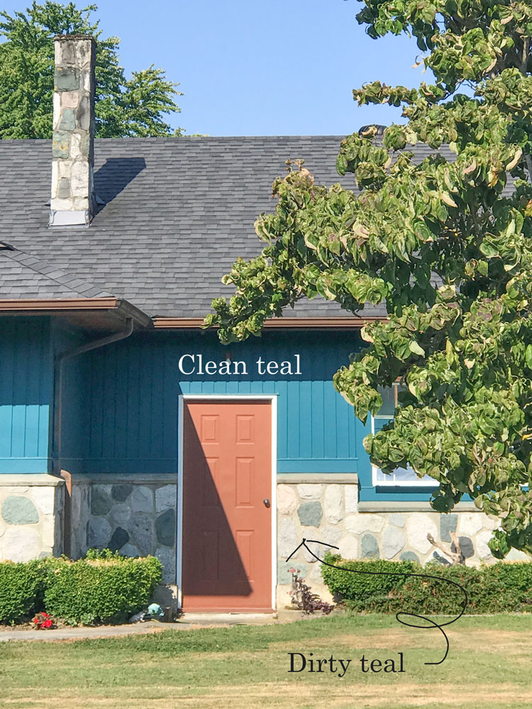
Clean teal (though dark and muted) in your last photo has me a bit confused. I would not have considered the teal siding was clean. After reading your books and taking your course I imagine the answer is “in comparison” the teal siding is clean. We can’t look at these clean/dirty colors in isolation I suppose. Is that right?
Yes that’s right, and it was not the correct teal to coordinate with the more muddy/muted/dirty teal in the stone. Maria
Awesome post. Please do more posts as the examples really help illustrate what you are teaching. Thanks!
MORE PLEASE :D. thank you so much for this fantastic post and for all your hard work at “spreading the word”. Your simply amazing !!
Hi Maria,
Isn’t the turquoise kitchen you used as an example a clean and dirty situation? I thought it was an example of clean and dirty until I started to read more.
No, you might not like the wood stained cabinets but in actual fact I chose that image because it has the ceiling painted. There is so little wall space left around kitchen cabinets that in this case, I think it would be gorgeous to just paint the ceiling and the walls the same turquoise given she doesn’t have any crown! Hope that makes sense. Maria
WONDERFUL post! These examples followed by your color expertise and specific corrective directions are gold mines to those of us struggling to apply your wisdom. I’d love to see more of these posts.
In fact, as a painter, I subscribe to weekly video training by a still life artist. I think you could take that idea and add it to your business. I know posts like this are time consuming but if you did one a week and charged your devoted Killamites a monthly fee ($10, 15, 20/month) for posts like the caliber above, it could be a worthwhile endeavor — for you and your trainees. Think of them as virtual, mini workshops reaching a wider audience. Please put me down as your first potential subscriber.
LOVE this post and those like it. It puts into action your wonderful class I took in CA last year and reinforces what you taught us. I keep second guessing myself and appreciate examples to see the before and then after suggestions.
Thanks, again.
Lisa
Great post, Maria! Seeing real world examples is really helpful!
I don’t know if Lori removed all styling before she took the photo of her kitchen, but, in addition to MK’s recs, I think her kitchen would look a ton better if she styled it with plants; meaninful, coordinating tchotkes; artwork; etc. Right now it looks like only appliances live there. 🙂
I love seeing these clean/dirty pictures and explanations! I’m not sure that I’ve seen you address outlets, outlet covers, and light switches. We are happy with the dirty colors in our home but recently upgraded to white outlets, covers, and light switches. Can that be a problem? Thanks!
This is helpful. But isn’t the turquoise kitchen photo (Barry Dixon) an example of mixing clean and dirty? The turquoise paint looks fresher and cleaner than the muddier/dirtier tile and cabinets… It certainly doesn’t look bad in the professional photo and the repeated turquoise in the styling helps, but if you were standing in the room itself wouldn’t you notice that the combination was off?
Loved this post…Not a designer and I’m not great at seeing colour. With your e-books and varied blog posts I am slowly but surely getting better at spotting what is not working and why. These real life examples are so helpful. Would love to see a monthly post along these lines! Thanks so much for sharing your knowledge.
Dear Maria,
Love this post! For Lori’s kitchen, very pretty by the way, I love your idea of brightening it with blue paint on the walls and ceiling of her kitchen. Would you consider painting the tan portions of the walls “white” to match the tile color for uniformity and then light blue (or turquoise, as you recommend) for the ceiling alone? As long as the rest of the home is not “dirty” colors, right?
Yessss! Please continue with more posts on clean and dirty, as they are so very helpful!
Hi Maria,
This post and similar exercises that you walk us through with at your color training are so effective to help the rest of us train our eyes to what you see and what is very important is that you are able to tell us what is wrong and why. This is what makes me confident to be able to say that I am a color expert trained by Maria Killam.
Thanks,
Sandy
Maria, I didn’t get a chance to comment on the images for real although I did in my mind. But I just want to say I loved the column and would love more along these lines. It reminded me of the wonderful 2014 Summer School you did where I felt I learned so much and felt so empowered. You are a fabulous teacher and your Color Training classes which are your business are increasingly successful as well they should be, but everyone knows that learning about and leaning how to are not enough. One has to practice, practice, practice. And there are those of us who will never be able to take your professional class for whatever reason. The 2014 Summer School as well as a “mini class” such as the 30-day series you did on undertones several years ago and this post are wonderful practice sessions – for all your graduates and for all of the rest of us. I think Amy’s idea of a series of mini classes like this post on different hot topics throughout the year would be a fantastic offering to all your readers. A lot of work and no money but surely a tremendous feeling of satisfaction and even excitement for spreading your message in ways that no one else can match. More, please.
Please make this type of posting a regular feature!
This was a great post. Easy to see what you were talking about!! Thanks for your great posts!! Love reading your blog!!
Love the photos with the narrative, SO helpful. When all you usually see are “perfect” pictures, you dont learn much because you haven’t seen the process.
Keep them coming!
I enjoyed this post and other ones where I can practice training my eye to identify problems and come up with solutions. Thanks!
I love this wallpaper. It might work for Meghan’s dining room. https://www.wayfair.com/decor-pillows/pdx/walls-need-love-colibri-birds-and-flowers-removable-10-x-20-floral-wallpaper-wanl3428.html
What do you think?
The unifying problem with these rooms is that, sadly, they are boring. Some of the boredom comes from not repeating an accent color….kind of putting a baby toe in the pool, but not diving in. Decorating well requires risk and boldness! I learned this from my mother. I once painted my indoor porch a beautiful grayed out white and painted the shutters and a bench a grayed out green or a greenish gray. All went well but when my mother came to look. she said O should paint the ceiling the dame grayish green. Oh no, I thought, too risky. But she convinced me and it was the bold move needed! Still no bold bright colors, but the risky move paid off! I still love it 5 years later!
LOVED this post….Yes, please do more of these!
Yes LOVED this post. Please, please more like this. So interesting. Thank you!
Dear Maria, so glad to have found your blog! I have just finished an interior design degree and love colour but really had little taught about it on the course. I bought your book how to choose paint colours but still struggling to notice some of the undertones. Unfortunately in the UK Benjamin Moore paint isn’t that common here. Valspar is now the main one supplied in DIY shops followed by Dulux or Crown . I have also been looking at Eco paints such as Little Green/ Paint and Paper / Farrow and Ball. I am hoping you might consider compiling little books of colour and whites for those of us in Europe. I tried to colour match the shades you recommended online but most are slightly off etc. I have my fingers crossed and just wanted to say many thanks for all your info and advice. No one else is talking about colour in ths much detail. I LOVE it!
Great post! Your comments are always so relevant and clear, as was your choice of photographs. I live in Los Angeles and it feels like everything has been about “dirty” colors for awhile. Now we have bright white Cape Code style homes popping up. Cleans are back and it’s fun. Thanks!
The use of the terms clean and dirty remind me of skin tone categories in old makeup advice articles. Who wanted to be “sallow” when the alternative was”fair”?
This is great constructive “exampling”! I love love love it! I could see 20 more. Some I trouble-shot. Some I didn’t. (Also loved the antique sari situation.) It was FUN AND functionally educational. I love looking at them and opining before I read yours.
Maria, I enjoyed this post very much and I do want to take a refresher. Can you enlighten me and explain how the turquoise room with the saltillo tile isn’t a clean vs dirty thing?
Thanks!
It is slightly cleaner but I think it works in this case, however my point in showing this image was to illustrate the wall colour continuing onto the ceiling. Hope that helps, Maria
This was so helpful. Many thanks to the brave contributors! More of this, please!!!
Maria, thank you for all the valuable information you share! I’m not a designer, but I’ve found your knowledge of undertones fascinating. I had an aha moment this morning as I was getting dressed to run errands. I put on pair of jeans and a white linen top. The jeans felt tight ☹️ So I changed into a pair of faded sage green jeans. The clean white of the top and the dirty green of the jeans looked terrible together! Clean and dirty! I’d never put them together in an outfit so why would I decorate that way! Now I understand what’s been bothering me about my bedroom! I would not wear my bedroom colors out the door and in public, lol! Beautiful soft, calming, muted dirty colors with bright white trim! Nope!
This was extremely helpful info and the photos certainly help readers understand the concepts you are explaining. Thank you for doing what you do, basically removing angst from the lives of many people in terms of their decorating woes! Stay safe in these trying times. I am hunkered down in Nova Scotia as the virus has just arrived here and I am so happy to have your blog posts to learn from during this time of social distancing! Wishing you all the best!
LOVE this post! Thank You! Working now on deciding on a siding color and have to keep our current roof, which is a reddish brown. Unfortunately chose that color to go with our current wood clapboard siding 5 years ago (so roof is still fairly new and cannot to re-do roof) as were not sure when we would be able to do the siding. The roof is nice, but finding the correct color scheme to go with this is a nightmare 🙂 I really love learning about the colors and undertones. I studied color theory a while back in cool vs. warm undertones but never knew there was so much more to it. I have been walking the neighborhood trying to figure out why certain houses and colors don’t work and others look so WOW! That’s how I found your website, in doing a search on colors 🙂 I am aiming for WOW for our exterior and trying to figure out how to get there 🙂 Thank you for your great information 🙂
Excellent post. I am new to your blog and love learning about colot.