
This past weekend we stopped in Fairhaven for lunch on our way down to Seattle. Then we did a little shopping in the town, it’s so quaint and pretty, I always love spending time there. One of the stores was Good Earth Pottery. This shop carries pottery from all kinds of local artists and it was full and ready for Christmas shoppers.
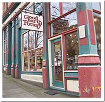
Since I’m on the look-out for accessories for my place I walked in. I was through the shop in minutes and was about to leave when the store clerk struck up a conversation with me. So I said “Colour is moving to fresh and bright, you should tell your artists to create more of those colours, it would fly out of here”. She said “It takes time to come up with new glazes, etc”. Which I understand. The whole store was filled with murky mixtures of colour combinations on all the pottery even though there were many beautiful shapes, jugs, vases, plates and bowls.

Then I found a bowl full of all these little pieces of pottery so I did end up buying this tiny vase (above) and a small bowl (below) for paperclips for my turquoise office.
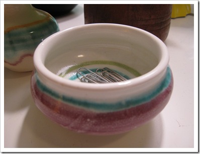
It took me 10 minutes to sort through all of them to find two that looked like they belonged together (the rest were entirely random colours which is usually the case. And these colours were fun: turquoise, orange, pink, yellow green and white. If the whole store was filled with more pottery that looked like this, I personally think it would sell faster.
 Pottery photos by Maria Killam
What I know (and it’s not much) about selling art in galleries is that to do so the artist often has to paint what ‘sells’. At least until you become famous and everyone wants your genre of artwork. But isn’t it more fun to do what you love even if it isn’t the ‘style’ or ‘colours’ that you love? If it sells, then you get to make a living making your art, what is better than that?
It’s the same with crafty, handmade beads and jewelry that is sold on street corners, in kiosks at the mall, craft fairs, ‘Saturday or Sunday’ markets, etc. I last 30 seconds at most of these stands because they are usually filled with random, multi-coloured necklaces, bracelets and scarves that don’t coordinate with anything I own that’s for sure. So if you make handmade jewelry, go in the stores and take a look at the colours that are selling now in fashion. And try and stick to 2 or 3 colours on one strand at the most!
It’s why if you are selling a product, hiring a colour expert to specify the right colours, is just good business. As the Colour Marketing Group says: ‘Colour Sells and the ‘Right’ Colour Sell Better’.
Related posts:
Happiness is. . . Having the Career that you Love
Why you Can’t Afford not to Hire a Colour Expert
Do you need Help picking your Logo Colour?
New to this Blog? Click here ; Subscribe to my free Monthly Newsletter; Become a True Colour Expert


Maria,
Color is our go-to resource for everything across the design field. Sometimes when we select what we like, and it doesn't go with anything, it may turn out as a focal piece in a new way.
So sometimes we say "it started out with this unusual piece I bought" then click-magic recreates us, using a different language, results in total fun, an aha moment, and magic happens!
Bette
Hi Maria, I can't help it — stylish or not, I wear the colors that look best on me, with the occassional trendy color thrown in. My favorite color to wear is orange, usually more muted, but sometimes the color of the fruit. I admit it makes it hard sometimes — I am not good in clear, bold brights, nor a lot of the gray that is in. Gray and orange work, though! Just like decorating, I think we have to do what we love and keep shopping until we find it.
I am wearing blue jeans, brown loafers, a brown T-shirt from the Gap and a brown and blue check shirt from Old Navy.
That woman had no idea how much help you gave her. Your advice is worth thousands of dollars to her, poor thing, I hope she ponders your comments.
Maria,
Take a look at white forest pottery – on line.
I think you will love it. Lots of white…but so lovely!
Interesting point about colours in the shops. I am going to take note!
pve
I have to agree with you on this one. At first I thought 'what a colour snob' but here's the thing: I don't buy anything from these kiosks because of all the random colours I get lost, overwhelmed and walk away. Maybe, deep down I'm a serious colour snob and didn't know it. : )
I have felt the same way in craft shops and stalls. There must be something you love about new colour or design combinations if you are an artist of any kind. There is no point in being driven by a batch of glaze colour, get out of your comfort zones, I say! (I don't want to offend you, just encourage you to add new customers to your regulars and have a bit of creative fun!)
Accessories, furnishings, collectibles, etc. are made with a crafted hand and not necessarily to 'sell' – There are far more people who like to have a handmade piece that do not coordinate' in color, texture, and style.
Although your post brings interest for the crafting industry to ponder, it truly veers away from what the crafting industry focuses its objective.
"Sell handmade collectibles from personal sentiment and point of view and not color trending or style trending" ~
The Craft and Hobby Association has goals and objectives like the Color Marketing Group. It's the difference in the color world and craft world that make this global venture interesting.
Great photos.
Maria, You are right on both counts. It pays to make products in trendy colors. Earth tones just aren't that popular right now. But it is also so satisfying to create art and products in colors you love. Inevitably, a few people will buy those products regardless of the color because of their artistic uniqueness.
At the Renaissance Festival here in Houston, I took lots of photos of different artists and their products to post as gift ideas.
I haven't done the pottery post yet, but like you, I kept running across earth tones. It seems that if you want to make 'natural' style products, most people assume that you have to use earthtones. But I think that is so limiting. I'm afraid many artists stick to what they love without reference to it's 'sell-ability' but then most people won't buy their products and won't get to enjoy the beauty of their creations.
With my fabric art, I have to constantly limit myself to what will sell. Making things in 'my' colors is something that usually makes sense only for myself. For most artists, I'm sure there is always a certain amount of 'conflict' between the two ideals. I sell way more yo-yo flower bags and quilted tote bags with bright colors than I do with antique and natural tones. But if I was going to make one just for me..I'd stick with the muted tones.
The question is always, "What is your goal?" If you want to sell..it has to be in trendy colors. Great reminder!
xo
Donna @ Comin' Home
I think there is room in the world for both sorts. Ignorance is not bliss in this situation though. Hopefully the store owner shares your thoughts with her artists. There may be some who are wondering why their pieces aren't selling. Others may know this is not the
"it" color and continue to do it because that is what they love.
I have noticed that I am wearing a lot of greens, blues and purples, with quite a bit more charcoal thrown in than there used to be.
I am with you Maria. Colour is back!! Hooray! The commercial motto in High Point is to "produce for the masses and live with the classes." It does set my teeth on edge. I like top down design. You have better taste than most people, so your opinion matters more to me than an "artist" who is trying to please the tastes of the general public, if that makes any sense.
Best,
Liz
Hi Maria. Love your blog. This post just struck the cord, especially the comment by Donna and ‘sell-ability’. I’m a jewelry designer and I cordially invite you to visit my gallery at http://www.etsy.com/shop/Nataliedesigns it’s…well…different from what you see at every mall now.
If you could comment on my palette it would mean a world to me or you might just simply ‘heart’ it if you’d like right on the site. Thank you so much.
Natalie
I guess some of both would be great for the selling point. Lots of people still use and love the muted colors and some are more into brighter colors. The earth tones I think have been OUT a long time now. There is plenty of earth tones in flooring, furniture, and even blinds are earthy looking that we don't need art or decor in these colors also. I love a bright piece of art or container of some sort in a room. It really pops and makes more of a statement than say a brown or muted colored piece would.
Hope she took what you said the right way and will talk with others about it also. It was FREE information that could help her business!
You wrote, “The whole store was filled with murky mixtures of colour combinations on all the pottery…”
In the bright crayola colors vs the subtle natural hues of nature on pottery, bright colors are often signs of cheap or commercial offerings.
The bright colors are gotten at low temperature firings, and in the not-so-distant past contained toxic chemicals.
Those “murky” colors are gotten from high fire pottery. High fire pottery is more expensive to make, and creates a more dense, water impervious clay wall.
Thus porcelain has subtly.
Stoneware, with its natural hued glazes, has subtly.
Earthenware is generally used for cheap mass produced ware covered with cheaply fired, highly colored glaze. (Earthenware gets elevated if used with other natural colored slips, or in a sculpture.)
We all want color, but brightly colored baubles are usually not found in a collection of high quality pottery.
So what you seem to advocate is that we all trash the artistic ware with intrinsic value and produce colorful cheap stuff for the masses… Isn’t that what we have China for?