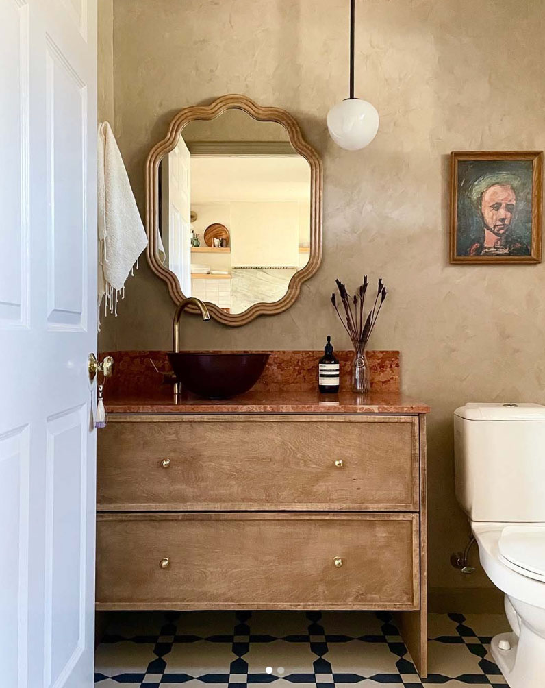
I’ve been saying beige is back for a couple years already and there are signs it’s picking up momentum. There are plenty of inspiring well-done designer examples of earthy beige kitchens and bathrooms going around social media. And very soon there will be a lot of DIY copies.
A wind change towards beige
I like to mark big shifts in colour trends on my calendar, and this morning at 1:07 AM when I couldn’t sleep, I opened my phone and saw these two bathroom renovations, back to back.
And here it is, the earthy beige after. Want to see the before? Scroll down.
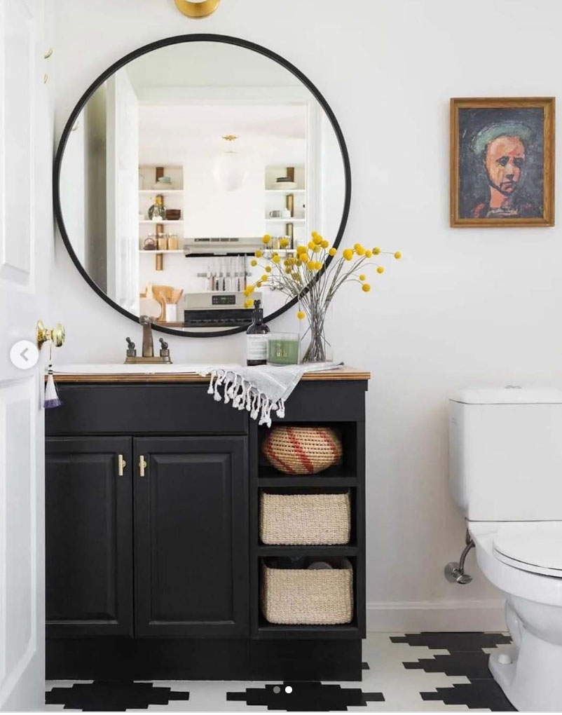
The before (below) is a brand new black and white bathroom which is probably less than 5 years old. That’s right, the same bathroom many homeowners and builders are still very busy installing.
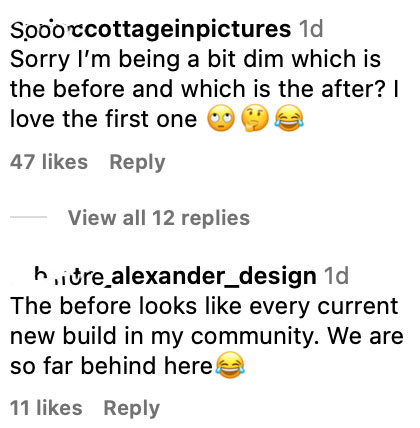
People were genuinely confused in the comments:
Another basically new black and white bathroom demolished
And then here was the next one, directly after the one above with more confusion in the comments:
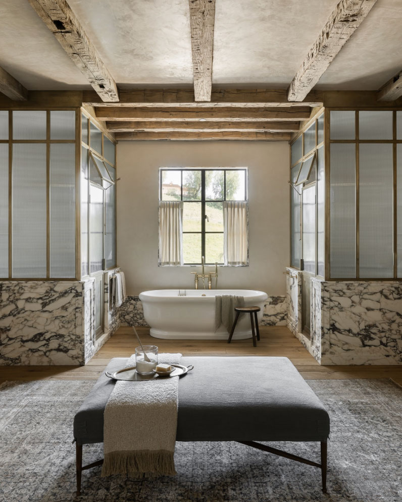
On top of great styling, there are some nice-to-have refinements in the remodel. Most notably a better use of the over large space with double symmetrical shower stalls. And a prettier better proportioned window centred on the tub.
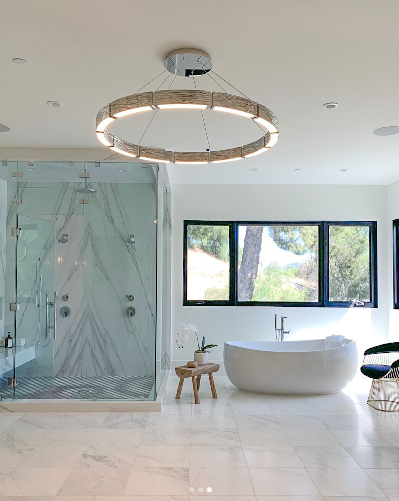
But the original was not a cheap bathroom (below) and it’s also brand new. It even had book matched marble in the shower.
And, I’ve been saying this since the trend started. When you install interior black windows in every room in your home, it looks odd if the black’s not repeated.
A last minute attempt was made with the modern black chair but truly what this bathroom needs is colour on the walls, a fabulous rug with a large ottoman and a light fixture that doesn’t make us feel like we are about to get transported somewhere else.
Read more: Are Black Windows the Best Choice for your New Build?
The housing (black) market right now
Here’s my take on what is happening out there in the housing market.
If anyone is out there right now house hunting and they want a brand new house?
What does the new build market look like right now?
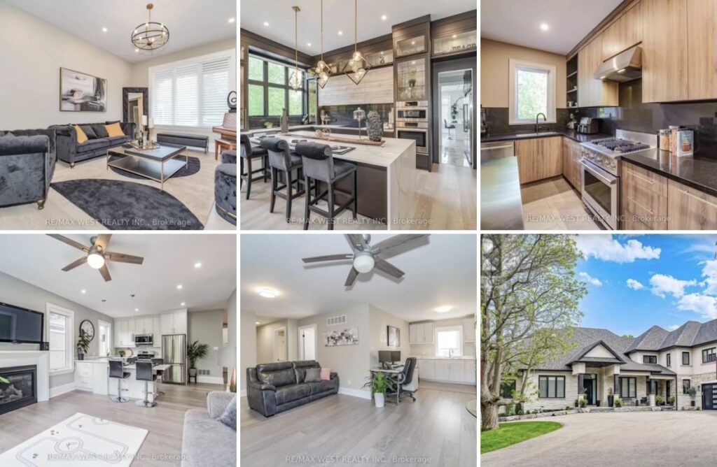
That’s right, BLACK (like this home below in Toronto that was just sold a few weeks ago):
By the time these house hunters have seen a fair share of harsh black, white and grey, completely colourless new builds, they are ready to rip out all the black and white no matter what it looks like.
And yes, it’s straight up wasteful. But it’s the bandwagon approach to installing trendy in the first place that is the problem. All that black was never a good idea.
Let’s create a timeless movement! Renovations and new builds intended to weather the trends. Who’s with me?
A less wasteful approach
So back to this basically timeless bathroom that got ripped out.
The windows in this last bathroom are not fabulous, the scale and heavy black overwhelmed the tub and soft marble shower, But overall, this bathroom was definitely not unredeemable. To be clear, the windows would have been much better in white.
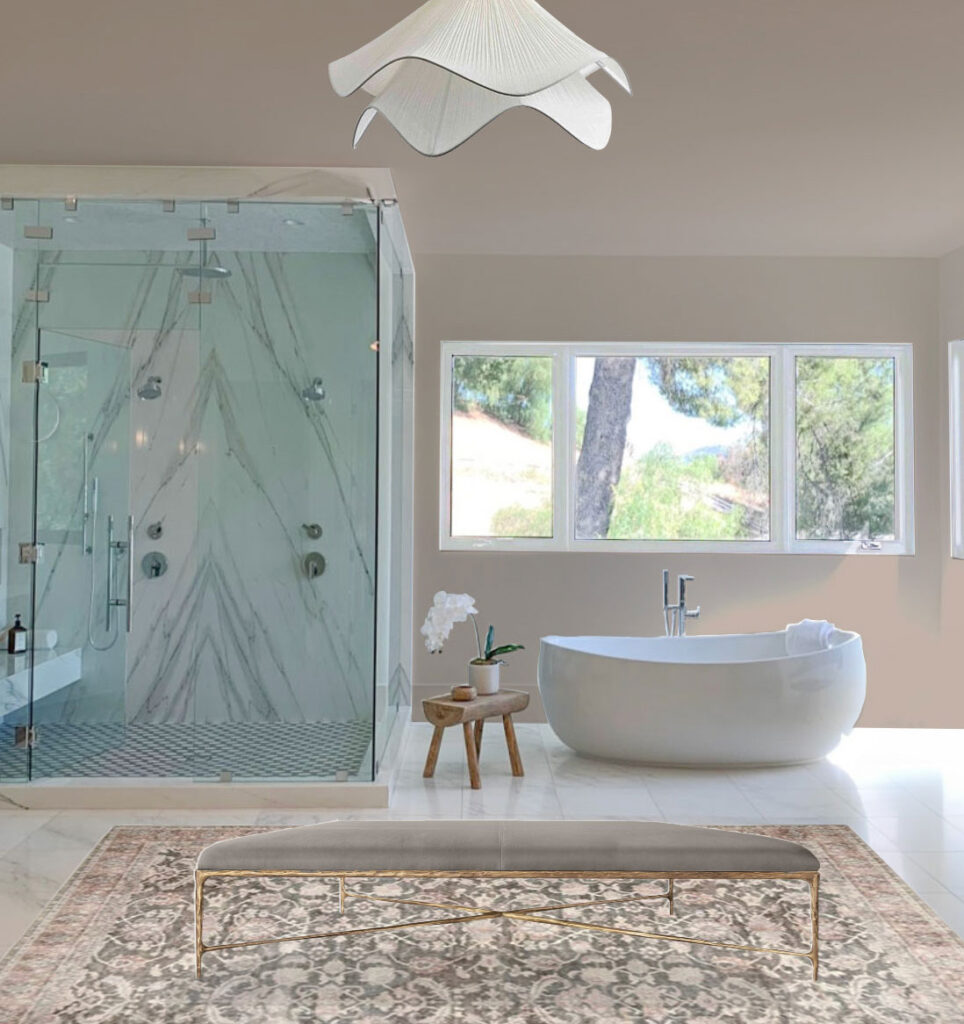
And we could get a warmer look with a warm paint colour, an updated light fixture, some decorating and styling. Here’s an example mocked up below going for a similar colour feel to the renovated after.
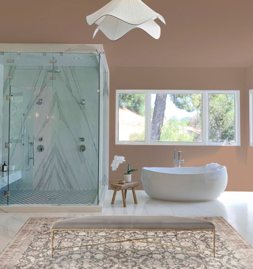
What these black and white bathrooms need more than anything else is colour and softness. Here’s a deeper earthy blush tone below.
And again, there’s a whole other conversation we could have about scale and the fact that this bathroom is too big which was why the designer added two separate showers in the reno. But did it really need to be ripped out before it even had time to get dirty?
The other thing that was done correctly in the original was to keep all the plumbing fixtures chrome. Which makes this fix much easier, all we have to do is paint the windows frames white, paint and decorate.
We could even add a wall of modern sheers to further hide the less than wonderful windows, just like I did here with one of my clients.
So, as I’ve said before my lovelies, if all else fails, decorate.
There is no need to rip out your brand new black and white bathroom when there are too many more interesting things you can spend your money on.
You can get my advice for refreshing your bathroom with colour and small fixes with my Bathroom Refresh eDesign package here.
Spread your money around. This is what I teach in all my workshops. This one for Homeowners and this one for new designers, and seasoned designers.
Related Posts:
A Tour of the Black Accents in my Home












I love the fact that you preach less wastefulness and less renovation. That is the number one thing that made me a fan.
Fiona – same for me as well!
Me too, Fiona! I’m team timeless and classic (and less waste) all the way.
It hurts to see beautiful stone that formed over thousands of years or even trees grown over half a century to be used and destroyed in such a short time span. Being thoughtful, loving what is selected (because you and not a magazine loves it), and respectful of natural resources is also an important design element.
My feelings exactly. It’s indefensible. That bookmarked marble was beautiful.
Same here! Classic is timeless!
Yes! Seeing how wasteful we are makes me sick. It’s bad enough with the poor quality good being produced, that HAVE to be replaced, but to add to it with tossing good stuff, all for lack of good styling…!!! Ugh! I love Maria’s anti-waste approach!
SUCH a relevant post Maria! So much so, that I’m going to share this with my followers today. Sending you all love to Canada!
Your ideas are great, Maria. I love to see your before and after pictures. But I am already sick of browns and beiges. I am now living in my parents house that I inherited and its all builders beige – so depressing. I wonder how long this brown trend will be around. (BTW the outside of my house is yellow.)
Honestly, that second bathroom reno looks like a misguided attempt to install a trendy, luxury bathroom in their overlarge basement space. The decorative wood near the ceiling looks like floor joists (though I know they’re not), and the 2 shower stalls could pass for storage rooms. The Before was lovely with the very minor improvements you made, Maria, and would have been sooo much more cost effective!
I agree with you, 100%. Maria’s photoshopped images were the way to go. The other one is too much, in my opinion. The first marble was gorgeous, light and airy- the renovated one is just heavy and overwhelming.
And PS, THANK YOU for your always-current advice to choose classic fixed elements, so we can be happy with our homes forever! I live by this! I think it’s a great principle for wardrobe too!
I loved renovating my home (taking your courses, using your color boards, etc.). It continues to give me pleasure. Having said that, I am dumbfounded by people whose happiness is so shortlived! The original bathrooms were stunning! Oh well, keeps contractors, tradesmen and designers employed!
Goodness, that Domino bathroom looks like a relic from the Tuscan trend. No wonder people are confused!
I like your suggestions for the second bathroom, but that shower is an eyesore. The glass surround appears to be tinted, so I would have to replace that too, but it would still be much less wasteful than a complete tear out.
I can’t be the only one that dreads living through beige bathrooms again. They have never felt polished or clean to me! Or maybe I’m just burned out on my blotchy beige tile. Maria is so good at warming up a space but still leaving it fresh and clean.
You’re not! I don’t like beige and don’t plan to use it.
Maria,
I went and looked at the old post (about using sheers in the bathroom) and using color instead of the trendy neutral really does remove a “time stamp” from design. That post was from 2018 and looks as fresh today as it did then!!
I was onboard for the gray trend but this black and white every where is very harsh and really over done -almost every new house I see is black and white
🙁
That is going to be VERY expensive to change!!
I too did not like the rustic looking bathroom remodel at all. I have always loved the classic white with touches of black and probably always will. I love black and white clothes also which always looks upscale. I do prefer the cream/light beige walls always and never liked the dreary gray look which I totally avoided. I feel sorry for those who used gray in expensive materials such as floors and tile. I’m so glad to have the beige tones back. People around here are still building the white/black FARMHOUSE look which really looks dated. However, I do like for houses to be more individual looking and have always liked white with black accents on older style houses. By the way, your new landscaping is beautiful and amazing.
In my area, builders and flippers are still stuck in the gray trend and have not even moved onto black and white yet. It’s pretty painful to see people still installing that gray LVP at this point, but I see it all the time. My own house has very warm and saturated orangey manufactured hardwood floors, which are also dated, but at least it is more natural looking and works with antiques. Having lived with both, I would take the orange over the gray any day.
I hate that earthy blush paint idea. Instead I would do blues and greens to liven it up. The earth tones do nothing for me, and I won’t be using them. I’ll stick with green grays if I want something that feels warmer. I think that black and white bathroom was just fine, and it’s worse with making it earthy, especially since it has a white toilet that now looks like a white elephant in that room.
I love the idea of using blues and greens!
I agree Stacy. I painted my bathroom BM Fantasy Blue, a lovely blue with light gray undertones. The color makes me happy everytime I walk in the room or pass it.
And that is the beautiful thing about a mostly white bathroom. You can almost introduce any colour you like. And that is the problem with a bathroom that is too earthy, the toilets, sinks and tubs that are white stick out and look wrong. Thanks for your comment, Maria
Maria, I so appreciate your advice about choosing timeless things – in my case, white subway tile and polished nickel faucets throughout the house. I also noticed how well the 2018 bedroom and bath you linked to in the article still looks fresh and current today!
Black and white and farmhouse decor have been so overdone. Glad to see it go. Warm neutrals are much more livable in my opinion and offer more versatility when styling.
I appreciate at least a nod toward less waste. Bathrooms serve a purpose — beyond that purpose, it’s all extra. I appreciate the desire to have an attractive bathroom (and house) — but in my opinion, these bathrooms are obnoxious in their size, scale, and decor. We’re killing our planet and its people so we can have big ugly bathrooms? Hate it!
Wow, I don’t like the beige bathrooms at all. Unfortunately, I think people will be ripping them out in less than five years. Although you preach against going for the latest trendy look, Maria, I think your dislike of black and white is leading to your cheerleading another trend. I think the black and white bathrooms are more classic.
You missed the point of my point, I redecorated the basically timeless black and white bathroom for y’all. What am I missing? 😬
Keep your finishes white (or white with a little black) and you can change your bathroom colours forever
I am so tired of the waste in the renovation industry. I really think the constant trend rotation is to get us to spend, spend, spend. It is frustrating. The second “after” bathroom reminds me of when Restoration Hardware was going hard on the deconstructed look. When they were selling ripped and beat up upholstery for thousands of dollars. That bathroom to me, looks dirty. Who wants to shower in a dirty bathroom? Yes, I LOVE the old world look, but there is a limit. Classic and timeless is where it’s at. Colour is also where its at.
Some color was all that was needed. I dislike this beige trend. Warm white is one thing, beige is entirely another. Just did my kitchen over – white/hale navy cabinets and black leathered countertops. According to the trends I’m hopelessly out of date, my white probably isn’t warm enough (I have always been more attracted to cooler colors). However – it made my kitchen so much more inviting, light and bright. Beige would have been massively depressing. That bathroom renovation was awful IMO.
This goes to show it’s sad and expensive to be beholden to trends. I’ve learned classic and timeless from you Maria. Different neutrals, undertones, appeal to different people. I say go with what you love, not the trend. Decorate and create the home you love, not what others expect. I live/love warm neutrals so that is how I surround myself. Gray never appealed to me. It’s interesting to see trends come and go. Thank you for sharing your beautiful gifts Maria!
I think it’s an argument for classic and timeless white tile where you can change up wall color and towels etc. Exactly what I think you preach. And changing those original bathrooms is soooo wasteful. Some people have money to burn but that’s not the way to spend it!
In the first bathroom that was redone to the beige trend I liked except that I believe the walls should have been left white. I also liked the black and white bathroom. Maybe liven it up some with colorful towels. I am not a fan of black at all but this seemed to be a small bathroom. The humongus bathroom with two separate showers was quite hideous. Just too too large. The changes you made to it made it much prettier with the white windows, ottoman, rug and light fixture. The beams at top were very ugly. Like the others I also like that you, Maria, want to redo a few things and not do a complete gut job.
I absolutely hate the two afters! You can’t plunck these bathrooms into a house unless the whole house matches that style. Then it will be the whole “Tuscan” fiasco again.
Totally agree with one poster that they look dirty.
It’s shocking to see such wastefulness in the pursuit of trends.
Our bathroom was renovated almost 20 years ago. I used a combination of silver gray and white tile before the gray trend and a very pale pink with a slight lavender tint on the walls. It was pretty then, and it’s still pretty now. The passion for the latest trend befuddles me.
I agree re: doing the most with what you have! The second bath confounds me! The first bath was useful for making your good point 🙂 Trying to understand why for the remodel–I went over and read the backstory. The owner of the first bath did both versions DIY. The *tile floor* wasn’t and isn’t, it’s stenciling! Both vanities are a hack. She had planned on tiling the floor but a valve burst! Found mold damage. The repair cost her $30K! So she had to redo the floor (and bath) on a budget. I finished her story filled with admiration!
I am a big fan of Amber Interiors, but that bathroom is simply awful! It looks like it wasn’t finished. It’s too busy.
In my opinion Americans need to stop remodeling, keep learning about classic design, and focus on furniture, lighting and decor. That is what pulls a space together! And consider a colorful sofa. We added a gorgeous moss green sofa to our open space, and it’s the first thing people notice. Thanks for that advice, Maria – loyal fan since 2009.
I can’t see where any color was added. I painted my bathroom BM Fantasy Blue. Such a lovely color. Makes me happy everyime I go in the room or pass by it. I always enjoy your posts and have learned much.
Did you notice the reflection in the mirror.. it looks like they ripped out the kitchen in similar fashion!
They didn’t. The owner has an IG highlight of the upgrades they did to the kitchen.
I’m not sure two shower stalls is a better use of space. Why would you need two shower stalls in the same bathroom? It isn’t a gym locker room where more than one person is going to be showering at the same time. Better use would have been to install a sauna instead of an extra shower stall.
The second bathroom is not the same bathroom in the before as the after. The view outside the window is different and in order to install the shower part ont he right hand side they would have had to remove a wall and build out as there is a window there in the before. The first bathroom looked nicer in the before photo but maybe they wanted drawers in their vanity instead of a cupboard. But what is totally weird in that one is the change of floor…why? It’s almost the same. I notice the toilet hasn’t been changed. And the room looks overdone with beige. I like the new vanity but not the top of it..that looks hideous to me..it just looks overdone beige and needs some white maybe..or black lol.
It’s the same room. The window was moved further left to the center of the wall, and the shower on the left is smaller than the original to make room for the shower on the right. You can see the same 2 bushes out the window in the after photo that are in the left window in the before photo as well as the same hill.
The bathroom with the beams reminds me of the renovation that is going on in France of an old convent. I follow the Pethericks on their YouTube channel and WOW what a wonderful journey it is in uncovering old beams and recreating lovely spaces. Does anyone else watch this renovation journey? Also, having just got back from London and the Cotswolds, I say again Maria, you should consider a trip there to see the classic cottages.
We’re in the process of looking for a condo. The older offerings have bathrooms that are all brown/beige if ‘updated’ it’s with that hideous horizontal glass tile in brown beige mix or weirdly, painted battleship grey! It’s the grey laminate or ‘skunk back’ as my DIL calls it that screams ‘I’ve been flipped…badly’ that’s just sad in a three quarters of a million dollar condo. The newer offerings or renovations are all black and white. Not terrible when the fixtures are white and the black is the faucet/ towel rack and glass shower door frame. Those can be replaced and sold but it’s the wall o’black tile in the shower or black counter top that makes us walk away especially when it’s already top of the budget.
After viewing hundreds of listings I will make this suggestion…if you are upgrading or renovating for resale DO NOT embrace trends. Go boring white with white subway tiles, buy the best quality fixtures you can afford, a simple frameless glass shower door and high end chrome or polished nickel faucets. Go for the quartz or granite counters in white or marble pattern and banish the vessel sinks. We’ve walked away from so many poorly done renovations because to do redo would be an extra cost although in our sinking condo market we might be able to bargain down…. If you can’t trust your own taste then hire a good designer and make your needs clear…..and don’t watch HGTV!!
Thanks for helping me avoid this mistake!
Every single new house in my area has black interior windows, except mine. I went for white. I just wanted the windows to disappear into the Simply White walls. It’s so much more harmonious with my super bright colors (art and mid-century modern furniture). I do have some black, in the staircase, fireplace, a few light fixtures, Eames chair and even a bar countertop. The black is a nice accent rather than overwhelming.
Even worse, most of the homes here were built in the 90’s and 2000’s with dark alder cabinets and trim, and now people are painting them all black. Yikes. I don’t know what the designers around here have against whites and colors. (Yes, this is primarily being done by designers.)
I guarantee that both of those “after” rooms were designed by professional interior designers, plus had a budget at least 2x that of the “before” room. In the powder room, the vanity is clearly custom and I bet that beautiful tiled floor is more expensive than it looks because the shapes are unusual (if it’s not, then I want to stock up!). The big bathroom is even more obviously a materials upgrade: thin metal windows, custom metal shower enclosures with the venting window at the top, a statement marble that isn’t replicable in quartz. Whereas the “before” bathroom’s book-matched marble shower walls could easily be quartz, and that means even if it’s real marble it’s not super high-end marble. The flooring of the “before” bathroom also looks like it could be porcelain faux-marble, and the glass shower enclosure has a bunch of large metal connector pieces that makes me think it was built from prefabricated panels rather than custom glass.
Overall I agree with the issues you’ve pointed out with the cold “before” bathrooms, but to make a fair comparison, you have to choose a luxury-builder/flip-grade beige bathroom that doesn’t exist yet 😛 Or choose a black-and-white professionally designed bathroom, but those look timeless enough IMO that people would still like it because the black would be correctly repeated and not overwhelming (note that even the beige master bathroom has black windows, just a much higher-end version with better design and placement).
Never mind that the design industry is guilty of 38% of waste in first world countries. This is one reason. Among the many reason to thank you for what you do for us designers, thank you Maria for finding ways for people to redirect homeowners from throwing out perfectly new rooms into the earth.