Let’s be honest about this black and white trend that’s been dominating design lately. It’s been like a security blanket for designers (and even homeowners) who get nervous when it comes to making colour choices.
And I totally get it – when you’ve got a couple of go-to whites in your back pocket, life feels so much simpler.
But here’s the thing: while these whites might not be the perfect choice for every space, they tend to fly under the radar because they’re so… well, nothing. They’re safe.
And that’s exactly why so many designers are clinging to them instead of embracing the wonderful world of colour that’s emerging in design right now.
What is timeless design?
The truth is, timeless design isn’t about playing it safe with neutrals – it’s about creating a versatile backdrop that lets you play with colour. When we limit ourselves to just black and white, we’re missing out on all the warmth and personality that thoughtfully chosen colours can bring to a space.
I’ve taught thousands of students how to do colour well. And why wouldn’t you want to take your rooms from OK to gorgeous?
So, if you’re with me on this timeless train, I want to share a few paint colours to ditch in 2025.
Say goodbye to these 4 paint colours in 2025
As a matter of fact, I have been going out of my way to specify anything but these colours throughout the trend. Because as a True Colour Expert and lover of colour, I always have a collection of gorgeous custom paint colours to offer instead.
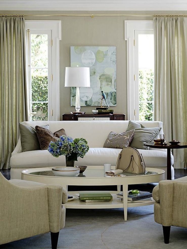
1. Skip the Stark White Paint
Going into 2025, the world is officially over boring, stark white walls. You know, that bright white that almost glows?
What to do instead: I don’t like to say I told you so, but I would like to point out that throughout the entire white trend I’ve stood my ground that very pale and fresh neutrals are better wall colours than white or off white. And I firmly stand by that still.
And fresh pale neutral walls will continue to be more versatile when the world starts painting every room brown-paper-bag beige again like they did in the early 2000s too.
2. Stop Using Black Paint on Your Walls
The shadow side of the white trend is, of course, black. Also a non-colour that, when it arrived on the scene 8 years ago looked bold, cool, edgy and austere all at once 😎
The black and white trend has become so mainstream that even Home Depot’s shelves are flooded with black hardware and plumbing fixtures. But here’s the problem – creating a sophisticated black and white design requires real skill and careful consideration.
Instead, what we’re seeing everywhere are poorly executed builder-grade attempts: homes plastered with chunky black trim, heavy black window frames, and harsh black accents that look more like random rectangles slapped onto white walls. It’s become a cookie-cutter approach that’s stripping homes of their character and charm.
Edgy black has become the unimaginative, utilitarian black of your most functional but boring don’t-know-what-to-wear-today black on black outfit.
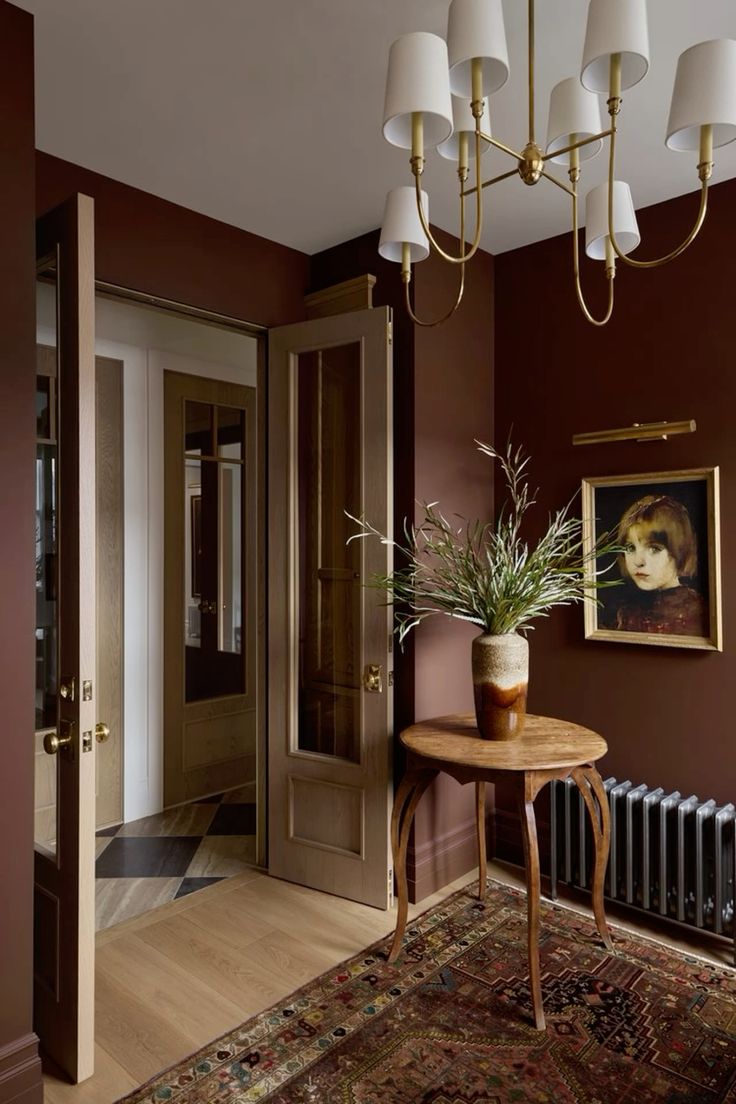
What to do instead: It’s time to choose softer, more refined accents for exteriors, paint colours, plumbing, hardware and lighting. And time for going bold with rich colours instead (like burgundy) of grabbing that can of basic black. A little black will always be ok, but we’re done with going overboard on black 😘
You can still DECORATE with black, and avoid making faucet, tile or paint colours black. See how I decorate with black in my home.
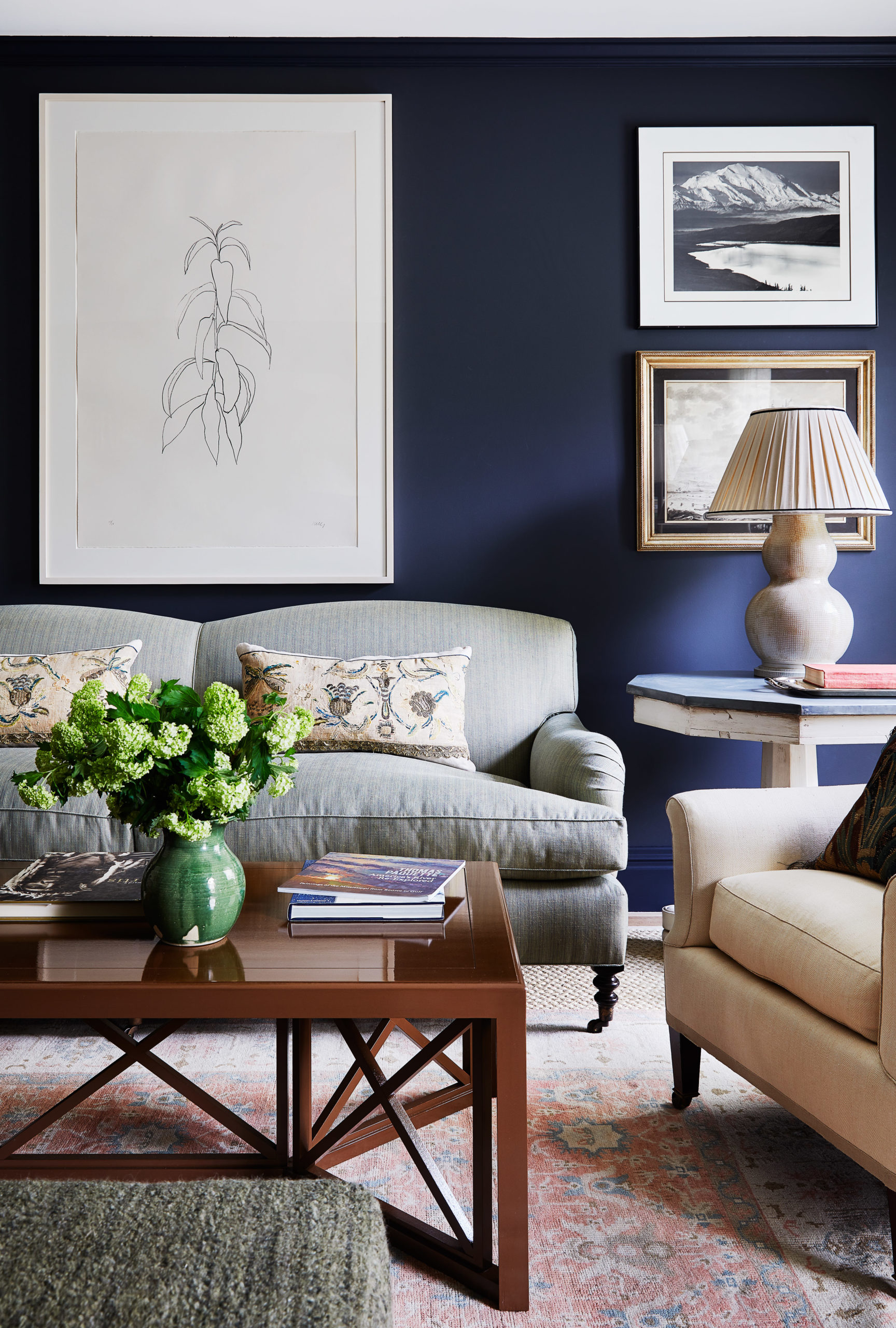
3. No More Charcoal Paint Accent Walls
Honestly, we’ve seen enough charcoal accent walls to last the next few decades. The softer, less committal black that took us over the bridge from the grey to the black and white trend is looking super tired as we head into 2025.
What to do instead: Listen, while I’m always preaching about choosing timeless finishes (big ticket items) for your home, paint colour is absolutely the perfect place to play with colour trends! And right now, we’re seeing these gorgeous, rich earth tones everywhere – those yummy caramels, toasty browns, dramatic plums and burgundies.
If you’re drawn to these warmer, moodier colours (and who isn’t after years of grey?), I say go for it! Paint is the easiest and most affordable way to experiment with colour. And if you really want to make a statement? Try colour drenching – painting your walls, trim and ceiling all in the same rich hue.
HOT TIP: It’s best to avoid choppy accent walls and just do the whole room.
4. Stop Choosing a Navy Paint Colour that’s Almost Black
Here’s what’s happening right now in the world of dark paint colours. As more and more people are starting to realize that black has become totally overdone (I mean, have you seen all those black and white exteriors everywhere?), they’re still craving that dramatic, high-contrast look.
So what are they doing instead?
They’re reaching for those super-deep navy blues that read ‘almost black’. And while navy can create that same elegant, dramatic feel as black – with a bit more warmth and sophistication – let me warn you that simply swapping black for navy isn’t the answer if you’re trying to avoid jumping on another soon-to-be-dated trend.
Remember, just because a colour is classic doesn’t mean using it everywhere is timeless!
I’m seeing this dark navy show up as a choice for a lot of exteriors. I mean, it is better than outta-the-can basic black, but the look is still basically the same.
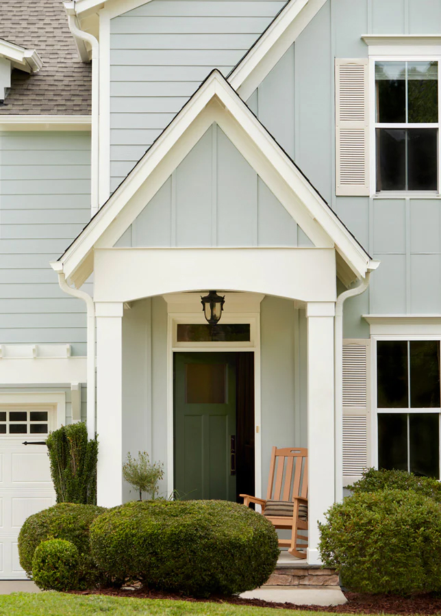
What to do instead: Opt for a soft and muted colour or a warm neutral for your exterior to completely move forward from the harsh black and white trend.
There are so many beautiful options that will give your home way more personality! I’m seeing my clients embrace those gorgeous muted colours – think soft sage greens, warm taupes, and those yummy earthy blues that read almost neutral.
These colours create a much more sophisticated look than the cookie-cutter black and white we’ve been seeing on every builder-grade home lately.
I’m not saying there’s anything wrong with beautiful greys or blues that feel cooler but what I’m seeing for 2025 is a definite shift toward more saturated, personality-filled colours that make a statement.
And here’s the best part – when you choose a colour with the right undertones (yes, undertones matter just as much outside as they do inside!), your home will have that timeless appeal that won’t look dated in five years when this high-contrast trend is finally over.
Need help choosing an exterior paint colour? I’ve got an eDesign service for that! Click here.
What are your paint colour plans for 2025?
That’s my roundup of paint colours to avoid going forward into the new year!
And to be clear, it’s my forever goal to help you steer clear of trendy choices you’ll regret when the trends shift. Here’s the thing – while I’m always encouraging you to experiment with paint colour trends (because paint is the easiest and most affordable thing to change!), my real mission is to help you avoid making expensive mistakes or choosing something that is on it’s way out… or that you’ll regret shortly after it’s done.
Don’t worry. I will always be here helping you navigate that.
I’d love to hear from you. Do you think the black and white trend will be going strong in the new year? Are you ready for a colour glow up? Which rooms are you painting in 2025?
If you know you want custom colours, but you’re not sure how to get it just right, I can help you with that! Check out my convenient eDesign consultations here!
Related Posts
Colour Trend Alert: Burgundy (It’s the New Red) + Brown
Better than White: My 6 Best Paint Colours for your Living Room


I hear you on the shift to warmer colours—I see it everywhere in furniture stores. The problem is that none of these new warmer colours match my furniture. Brown, beige and burgundy don’t go with anything in my home. Budgets are tight these days, and I can’t afford to replace everything to go with this trend. I suspect I’m not alone. I’ll be sticking to whites, greys, blues and some green. TBH, I still really love them.
To be fair, I don’t think Maria is saying to ditch cool colors at all. Blues and greens are some of my favorites as well and real color is always timeless. She’s only talking about popular neutral schemes and where they’re going.
I love navy and will not give it up. It’s been my favorite color my whole life and I will do accent walls in navy the rest of my life. I don’t want an entire room painted navy, but I like one dark wall. I don’t like warm colors, so I’m staying with blues and greens. Even my couch is light blue tweed. I have just about every shade of blue in my house.
I’m with you, Stacy. I love blue and my whole house has shades of blue, white, taupe and wythe blue. Blue feels like a neutral to me. My last kitchen had French blue cabinets that our cabinet maker refused to paint (because blue!), so my husband painted them. That was in the early 90’s when colors were not done in kitchens.. I’m going for a very similar blue in my new kitchen. I love it and never got tired of it in my last house. Picking carpet is the hardest for me. All those earth colors that look blah to me. I’m sure I will end up with a blue carpet.
We see your points. We might still be going for a starker white or an off white. We have an architecturally Italian small country home with 12′ ceilings and tons of natural light from three sides in the great room with light sandy colored limestone floors. When I look at Italian country homes on VRBO or real estate sites, they have mostly white walls in living spaces. And Italian design bloggers also say this is the case mostly. From attending one of your classes, I know that I will need to repeat the white around the room so that the walls relate. We are not trying to duplicate a real Italian country home, but since that is the architecture, we are trying to look “normal”. Then again, we are not really drawn to how the country homes are decorated or their red tiled floors. It was a fire safety architectural choice. We see the sense of how you look at this, Maria, but are not sure if the architecture allows for a pale fresh neutral. There is one Italian detail we like that I found looking at hundreds of pictures. Sometimes, they come down from the ceiling 20-30″ and put a piece of trim. Then they paint the ceiling a light color and bring that color down the wall to the trim. To us, it seems like this will bring some cozy to the large tall boxy architecture. We’ll see. 😀 Hello light, goodbye fake Italian tuscan trend colors. 😀 Same on the exterior. Goodbye tuscan tan, which they don’t do either, and hello to a dirty muted medium yellow that blends with the golden yellow California hillside colors. Thanks for all you do, Maria.
I’m glad you picked up all that actually black is more like Chorney like coal.
I know that would’ve been a quick fact check easily confirmed.
So many people painted their brick white and shutters black that there are just too many. I live in a creamy colored stucco house that coodinates with beige rocks. The roof and shutters are forest green so I love the outside look of my home. BUT inside I have a lot of cream with black accents which I love because it’s so easy to add seasonal color with flowers, pillows, decor, etc. I noticed that one of the newer “farm house” looking houses that was white with black accents has now been painted gray which is awful. It doesn’t go with that farm house look at all which now looks really dated.
I appreciate Maria’s advice, and also get people who are not beige-ish fans. This reply is for anyone stuck on flooring and wall color. We went with Drift of Mist on our main living area walls. It is a calming light greige, which harmonizes with beige and gray furnishings as well as almost any other colors. We chose Happy Floors Apollo Beige tile which has grey and beige streaks and blends so well w our paint. There are many variations and brands of this tile. We chose shades of blueish green for our bath and bedrooms, all slightly different but they harmonize from hallway view. Light beige carpets in bedrooms which can be topped w any colored area rugs when we want a change.I hope this helps someone get unstuck 🤞 Thanks Maria for all you do for us!
I have used Drift of Mist in our last 3 houses/office. It goes well with almost anything…I accent w/ olive greens/red/ warm muddy yellows.
Hi, I am sorry to say that I disagree about the dark navy wall. Applying it on a period house it is timeless…….
I have yellow walls and white trim so do whatever you love . . . yellow makes me happy! It is MY house!