Cognac is the perfect on-trend colour to balance the orange wood tones in this historic home. Add in a little blue and it transforms into a colour palette for a Star Wars-themed bedroom. Find out how a mood board helped guide this amazing room refresh!
Cognac & Blue Star Wars Bedroom
This is a guest post by my fabulous eDesign team member, Lisa. She has a gorgeous historical home and she recently did a refresh for her son’s bedroom, with his eager assistance. Lucky boy! What a gorgeous room.
It’s such an inspiration to see a popular theme done in a tasteful way!
A mom and son collaboration
My son has been begging me for a Star Wars-themed room for ages, and when he insisted on watching Maria’s Shop Online with Colour Confidence course with me, the idea was born, “Let’s test it out in your room.”
He was delighted and became involved in the whole process, which was so much fun. A mature 11-year-old, he is a super fan of anything and everything related to the famous trilogy from the late 1970s. He was ready for his room to have a more grown-up feel but still wanted to incorporate a Star Wars motif.
Establishing the colour palette
I knew the colour palette would need to have warmth to relate to the bossy orange-toned millwork and wide plank floors that are original to our historical home.
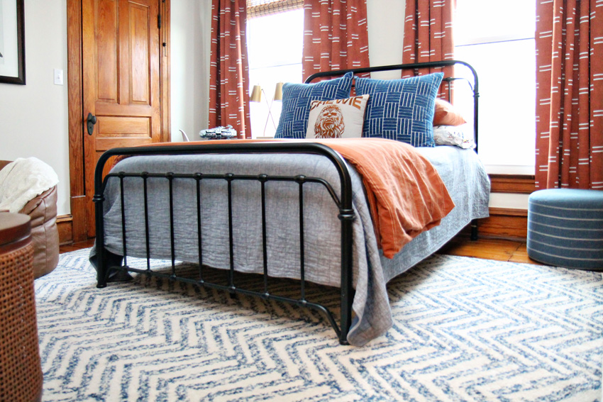
The versatile cognac/rust orange colour that is so popular was the obvious choice, as it pairs beautifully with our millwork. There also happened to be a deep orange in his bedding from his character sheets I found at Pottery Barn Kids. The stars aligned 😉
Then, following the advice in the online course, we pulled the blue out of the patterned bedding as a second accent colour. Tada! Instant colour palette!
Maria’s Large Painted Colour Boards made it easy and fun!
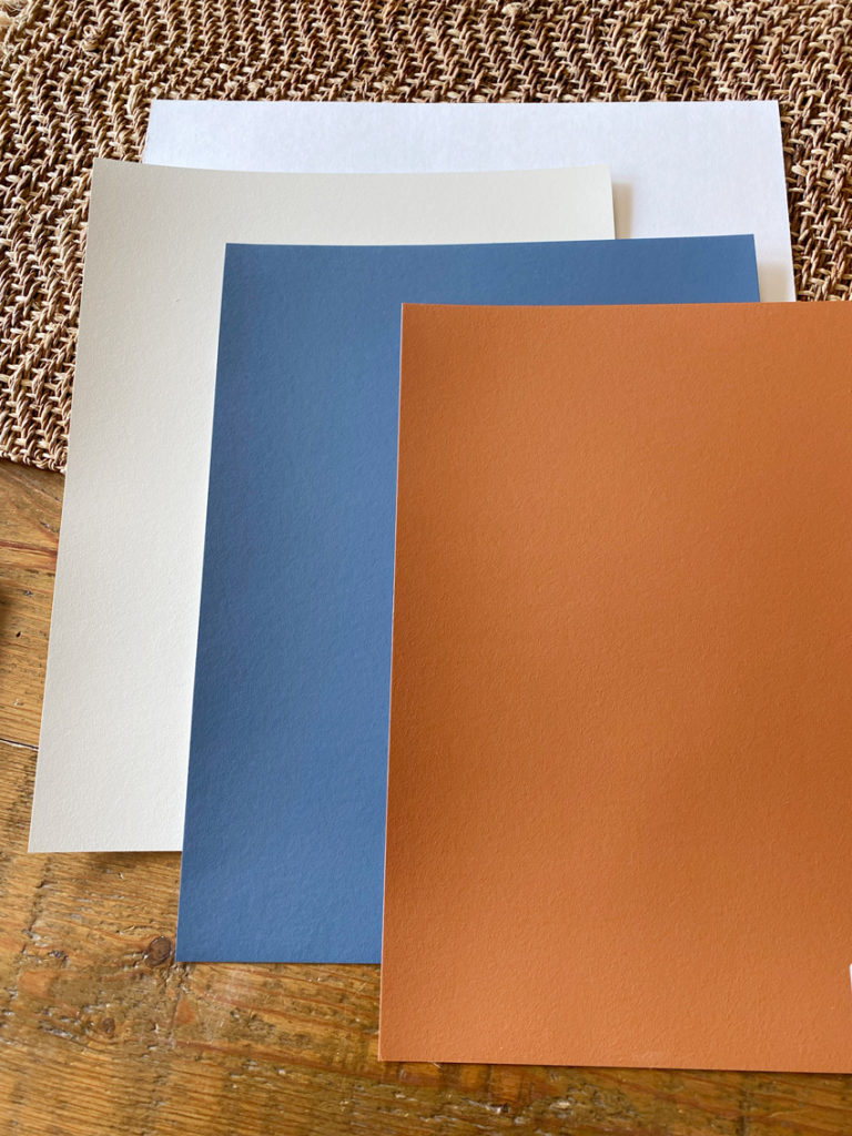
I used Maria’s colour boards, BM CC-780 Kensington Blue and BM AF-235 Warmed Cognac (both in the VIP Collection) to help guide me in any pieces I sourced when shopping in-store for decor. I never leave home without my colour boards (or paint chips) when I head out on a shopping trip to coordinate items to be added to any room.
The large painted colour boards really are the greatest tool for making shopping choices that are sure to be perfect once you bring them into your home.
For the walls, we went with one of the neutrals from Maria’s system colours, BM’s OC-30 Gray Mist. This is a pale green grey greige and it’s one of the colour boards from the Core Collection. Gray Mist is pale without being too stark in contrast with the wood trim, and will be versatile when he tires of the Star Wars theme.
We started with a mood board
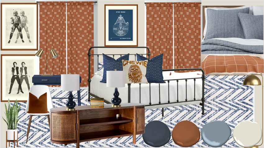
Once my colour palette was decided, I jumped on my laptop and made a mood board with my son using what we learned in Maria’s How to Shop Online Course.
I matched the existing colours in the quilt we planned to use to my Benjamin Moore fan deck, along with the colours I had already selected from the large painted colour boards. Then I added the corresponding paint dots to a mood board to ensure I had colour guides while shopping online.
The first item we picked out was a rug and then I started adding accents and furnishings that coordinated with the paint dots. Colour Tip: I also tried to make sure the background matched the wall colour I had chosen for his room.
Blue Chambray Quilt | Rust Duvet Cover Set | Blue and White Rug | Media Console | Drapes | Similar Gourd Lamp
Once we began adding colours and textures the room started to take shape on the screen. I was then able to make online purchases with confidence.
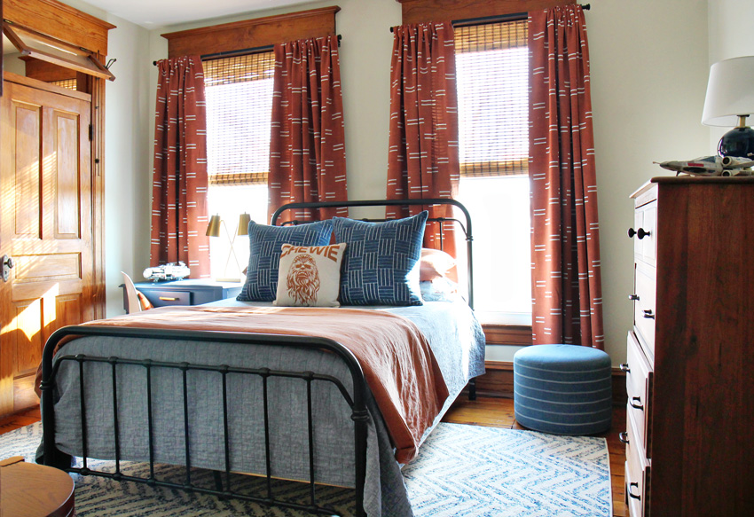
Here’s how it turned out!
Blue Chenille Pillows | Upholstered Ottoman
Most of the bedroom decor was purchased online at Society 6, Target and Pottery Barn Kids.
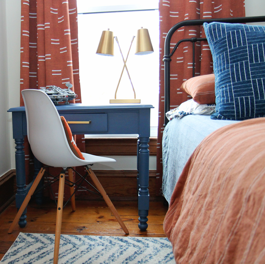
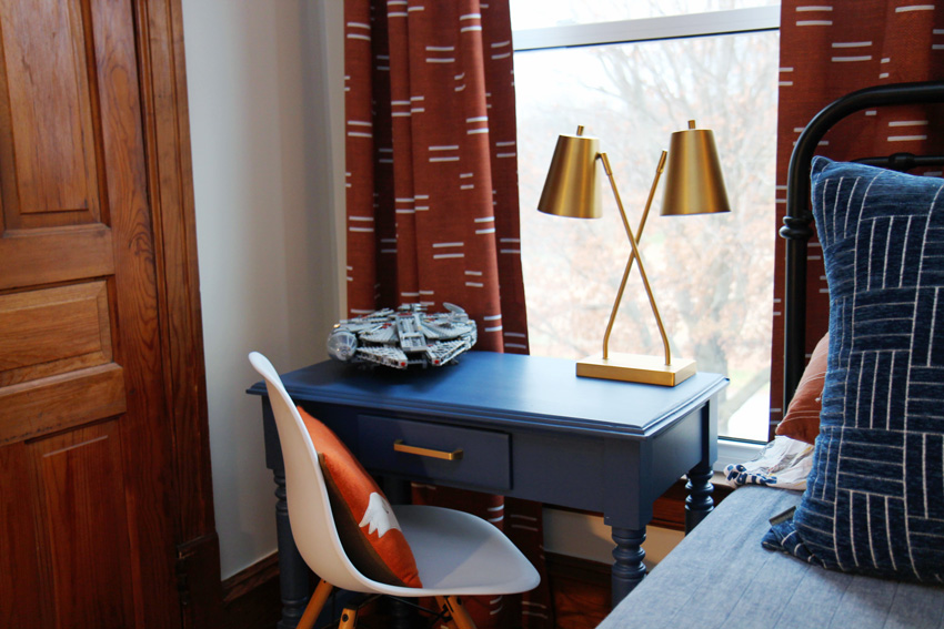
The few extra details like this vintage desk are what make this space so special. I found it on Craig’s List and revamped it with a couple of coats of Benjamin Moore’s Kensington Blue.
Brass Task Lamp | Desk Chair | Desk Colour: BM Kensington Blue
This desk is where he likes to build his Lego creations. He recently finished the Star Wars Millennium Falcon set and displays it proudly. It makes a nice vignette paired with a brass lamp.
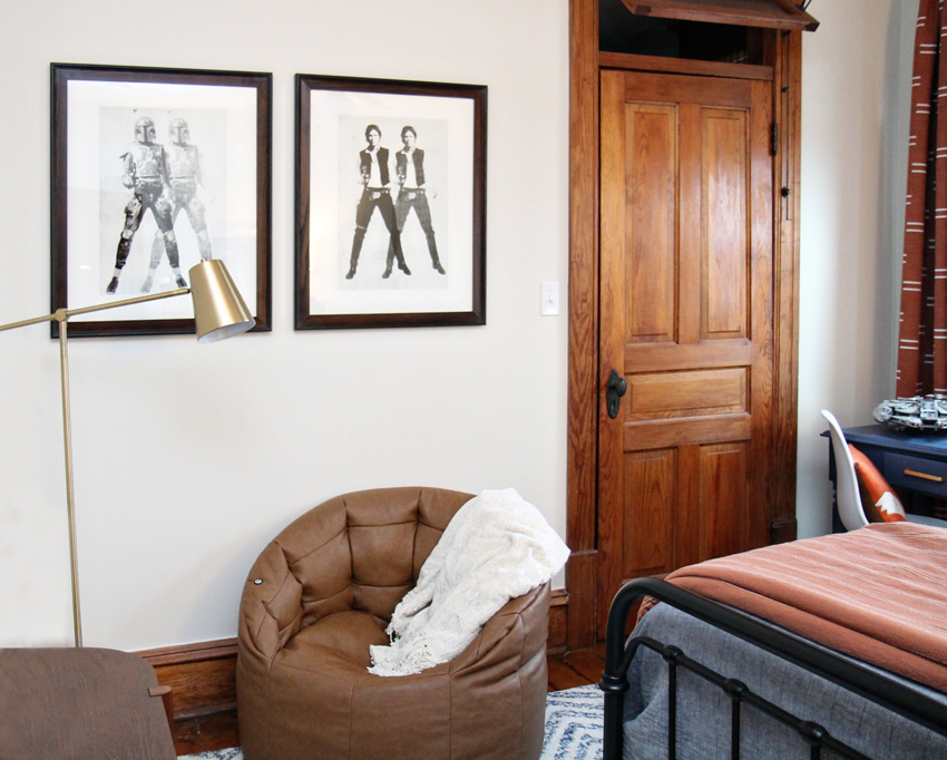
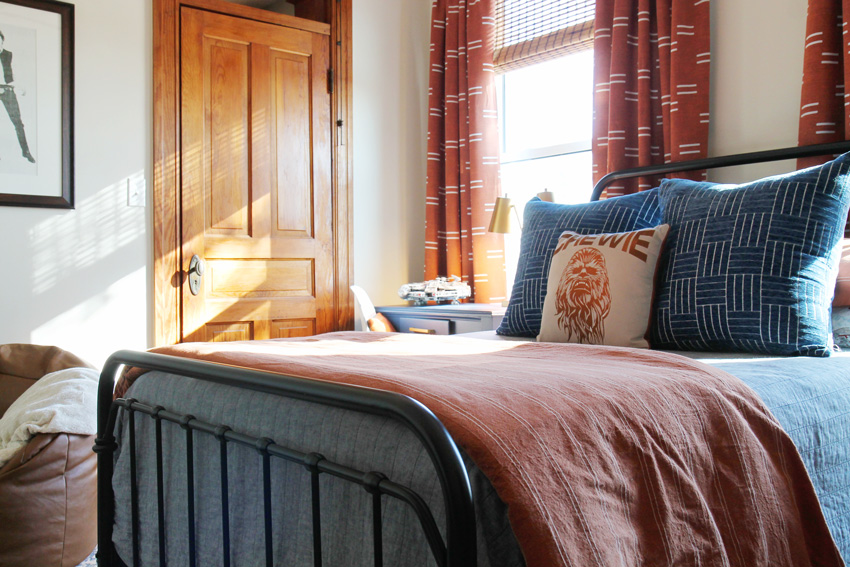
And don’t overlook eBay and Etsy when you are searching for one-of-a-kind items. Both the “Chewie” pillow and vintage prints were found on these sites and coordinated perfectly with the colours and theme of the room.
Bean Bag Chair | Cantilever Floor Lamp | Wall Colour: BM Gray Mist
Don’t skimp on lamps
Several lamps were added to this space to balance the light evenly throughout the space and create more visual interest. I went with a brass finish on the lamps to resemble the look of a Star Wars droid.
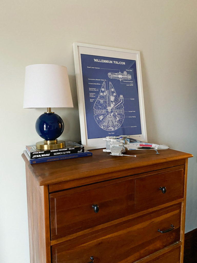
And added a cute little ball lamp that ties in both the blue and brass (below).
Repeating the wood tones
Warm wood accents were used throughout to repeat the wood finish of the millwork. Like this antique dresser that just needed to be oiled. I added a new set of black hardware to properly repeat the iron bed finish and bring it to life.
Remember, wood that has a strong colour in it needs to be considered as part of your colour palette. And, it needs to be repeated throughout the room – just like in this bedroom advice from Maria.
I brought in more texture with woven shades and the cane accent on the media console (pictured in the mood board).
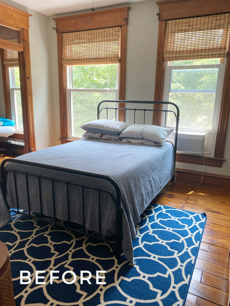
Go ahead and take a look at the before again…
And the after….
My son and I had so much fun and are both delighted with how his Star Wars bedroom design turned out! I love that it’s still a bit sophisticated and not too youthful. I think it is a room design that will grow with him.
———————
Thanks, Lisa! The cognac trend makes it easier to work with some of the more orangey wood tones out there — especially those in older homes with lots of natural woodwork. And it looks fabulous with blues!
If you are planning any sort of room refresh soon, get my Shop Online with Colour Confidence course here. I keep hearing from my readers who’ve purchased it that the mood board tips are a total #gamechanger. Are you missing out? Buy it here and get instant access.
Here’s what someone said recently about taking this course:
“Keep those pro tips coming. Who knew to order a sample rug? Since I’m not a professional designer I don’t know a lot of those tips. This course is the perfect “Action” course that follows the Specify Color With Confidence (SCWC) training. [The training] gave me an understanding. This course puts the [training] into practice.”
Related Posts:
The Best Colour for your Childs Bedroom Furniture (Before &After)
5 Budget-Friendly Ways to Style a Kids Bedroom; Before & After
Ask Maria: How Do I Decorate Around My Wall-to-Wall Pink Carpet












Wow I love the transformation of that bedroom .
Her and her son brought the room to life .
Love the Orange and the blue .
Awesome !!!
Wow! They did such an amazing job!
So impressed at how the colors work with the orange wood. The little desk and lamps are also great.
My only criticism is that the curtain rods are too short, so the drapes cover the window. Realize there’s not a lot of space to the left of the left window, but just a couple inches would help.
Great job.
Agree on the curtains rods being too short! (Love the fabric, though!)
I see your point, but in this case, I like the curtain rods just as they are. Too far on both sides of the window the rods would change the look of the beautiful window frames. As they are now, each rod seems part of the outline of the window as a whole and is, to me, very aesthetically pleasing.
I feel that the strong wood molding above each window would make wider curtains look odd. No?
I think they got it just right.
Thank you! You are certainly right about the rod placement – I so wish they could extend wider and above moulding as well, but with the deeper trim and less than a couple of inches of clearance at the top a curtain rod just looks crammed. I kept the rods a bit closer to side trim so I could have some wall space in center above bed for contrast with the draperies and to keep the curtains from getting caught up on the low, deep window sills, since he is constantly opening and closing these. So many challenges in an old home that make following the rules of design a bit tricky sometimes 😉
Now I see the reasoning behind for the rod length. It does make sense. Thank you for the explanation. Very helpful.
I completely agree. The curtain rods are too short and it takes away from the gorgeous wood trim around the windows
Maria, will having a cognac couch with medium brown neutral-cool floors (like say the color of Minwax walnut wood stain, but more medium in color) clash? The cognac color that is on trend now is great, but what if you wood floors aren’t warm? Then what?
I am so impressed with this young man’s newly decorated room. It goes so well with the style of the house, but satisfies his desire to live with his passion, Star Wars. My children are now grown, but if I had another young one, now I would know how to do a theme bedroom in a sophisticated way.
I would love to see a lived-in shot of the room, too! How are the books, toys, and other kiddo miscellanea stored?
Thankfully the door to the left of his bed is a giant walk-in closet that houses all of his books, toys and clothes!
Looks very nice! Wish my boys were young again. This would be so much fun to do. Did she change up the bedding from the Star Wars ones it first showed? The blue desk is my favorite. And the rug too. Good job!
Thank you! He has two Star Wars Sheet sets from Pottery Barn Kids (the ones in before image and the ones we link to in post), all in the same colour palette that we switch out quite often!
>>Gray Mist is pale without being too stark in contrast with the wood trim, and will be versatile when he tires of the Star Wars theme.
This is a very wise mother, LOL.
The room is amazing, and clearly a lot of thought and design expertise went into creating it. Great job, mother and son!
My only question — comment — constant thought, everywhere — is why is the bed in front of the windows and blocking the door? Could it be turned 90 degrees and placed with the headboard on the wall where the dresser is? Maybe there’s a reason, like a closet I can’t see or a radiator.
Idea for a post, Maria — decorating around windows for maximum flow and light.
It looks like there is a media console on the wall opposite the bed so my guess is if the bed were on the dresser wall, the console would not fit on the opposite wall with the door. That’s just a guess thought because that side of the room isn’t shown, and it’s hard to tell how long the console is!
Thanks for the sweet comments! You are right I am not able to fit a full size bed on dresser wall as there is a large radiator on one side and the doorway to hall on the other. I do love windows framing a bed though, for added interest and it allows for a pretty view from the long hallway it sets at the end of. We are lucky enough to have several large windows throughout our home so natural light is never a problem.
Love these colors!!
I love this for so many reasons – and the biggest is that it’s a historic home with the original woodwork respected and left intact. Great job, and so much fun. Smart boy, lucky boy!
The woodwork and floors are breathtaking. All woodwork is painted today because wood of that quality is no longer available.
The door to the left of the bed shown in the pictures is oddly placed to be an entry door to the bedroom and, given that most of the pics seem to be taken from the bottom right, I suspect that may be the actual entry door and the bedside doorway is to some sort of storage room or even to another bedroom which has its own entry door from a hallway. This is a historical home. and I remember my grand aunt and uncle’s farmhouse (which my grandfather built for them) had three bedrooms in a row on one side of the house, each with its own entry from the main rooms (no hallway), and the front and middle bedroom had a door between them. (That farmhouse is still in our family and would be considered “historical” today. As far as the bed placement in front of the windows, the room appears to be quite small and that spot is likely the best placement. It could be a big issue in some rooms and I’ve seen pics where it is, but, personally, this room doesn’t read that way to me. I think mom and son did a superb job!
The mood boards are so helpful! Love,y how your son was so involved! Curious, how are you getting things from Target? Assume you are in Canada?
Lisa is one of my virtual eDesigners and she’s in the US. Maria
It’s fantastic. Happy boy!
What a fun project for the mom and son to bond over! It looks great!
Lisa, “The Force” was certainly with you (Maria’s and your own talent)! 🙂 That room went from blah and boring to brilliant!! That your son got so involved bodes well for his future decorating skills in his next galaxy or room. Way to go!
What a lucky kid! He must be so proud of helping to create such a great space. It looks AWESOME!
This looks fabulous! I love the transformation as well as the theme! I also took Maria’s Online Shopping course and it has totally transformed how I shop online for my house now. I’m a graphic designer, so I create my mood boards in Photoshop. It’s a total game changer!
I love how adult this themed room is! Brava.
I appreciate the care and effort that went into this room but it is very somber. Seems too grown up.
Being the mother of two girls I can only imagine how hard it must be to decorate a boy’s room. This room looked so good I didn’t even notice the wall color and had to scroll back up the post to see what paint was used. It was refreshing not to see a boy’s room painted in blue and you could’ve easily have done that. I’m loving all of it, especially the blue painted desk, rug and the blue (is it quilted chambray?) bedding. I liked the modern touch of the brass lamps on the desk. The added curtains make it feel homey and everything ties in beautifully.
Fabulous! I love how the room is well-designed room and happens to have a theme, unlike many kids rooms that are a bunch of themed items purchased at one store and thrown in the room without much thought.
Great transformation- the link to the curtains didn’t work. Can you share where you purchased them? Thanks!
Hi Peggy, The drapes are fro Society6 😉
Great application of Maria’s principles! I love it!! Thank you for sharing all the details and links.