


A living room refresh prompted a more neutral Christmas colour palette for my director of eDesign, Tricia. See how she added both texture and contrast to her beige Christmas decorations for a pretty, yet seasonal take on an emerging colour trend.
For the last couple of years, I’ve wanted to create a more pared-back neutral look for my holiday decor. A few years ago I opted for a soft pink. But lately, since I have a huge crush on beige, I decided to finally commit to it this season. Plus, my newest living room refresh with my sexy cognac sofa prompted a more neutral holiday colour palette.
Beige Christmas Decorations
The way I see beige, it’s like a warm hug. As a neutral, beige is softer than white and warmer than grey. And I’ve noticed lately that even my wardrobe has lots of beige in it right now, accented with rust, green, gold and denim.
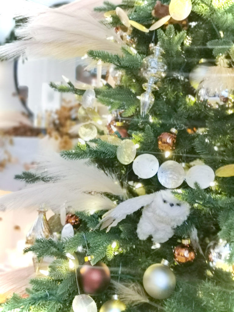
Remember last year when pampas grass was the newest pretty texture everywhere? Well, it was the BEIGE that I wanted for my tree. But you could only get real dried ones, they cost a premium, and they were sold out. And it doesn’t grow in Edmonton.
But this year, you can find affordable faux pampas grass stems just about anywhere. So I jumped on board! I picked up a bunch of stems and indulged myself in creating my vision for a soft, neutral tree with loads of feathery texture, beige and brown.
Take a look 🙂

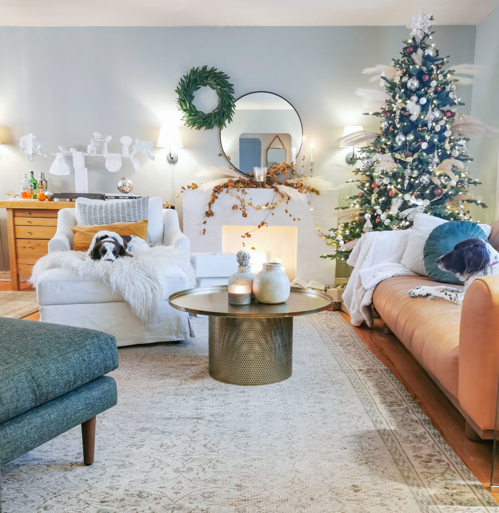
Stanley is really more interested in the new neighbour’s orange cat that hangs out in our front garden than in my subtle, neutral decorating 😉 The dogs jostle for that spot on the ottoman.
Similar Pampas Grass Stems | Capiz Garland
My home is modest in size (read: tiny), so the dining room tends to be heavily used – and not just for dining. It’s a place for gathering, working, homework, arts and crafts, and more. So I kept the decorations pretty minimal in here.
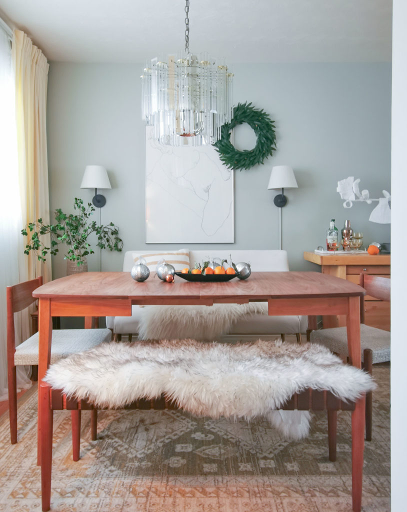
I’ve always had a soft spot for earthier creams, beige, olive – you know, weird murky colours from the bottom of the pond. And this year, because my room is relatively neutral with my new cognac sofa and sage green walls, it was time to mix in more of these muted colours.
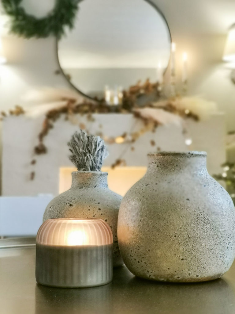
Stone Vases | Candle
Tips for Christmas decorating with neutrals
When you’re decorating with neutrals, you don’t have the bolder interest and appeal that more saturated colour relationships give you. That means you need to play around with contrast and TEXTURE to create more intent with your decorating.
The fluffy texture of the pampas grasses is ideal for adding softness to my Christmas tree and contrasts the pine branches nicely. Also, I found these gorgeous garlands made of pearlized beige capiz rounds to brighten up the tree and add some sparkle. They have an understated burnished shimmer that reflects light in all kinds of interesting ways.
![]()
And there’s my other pup, Mabel in the window seat. She’s already 14 and a half and snoozes away most of the day snoring loudly, ha ha.
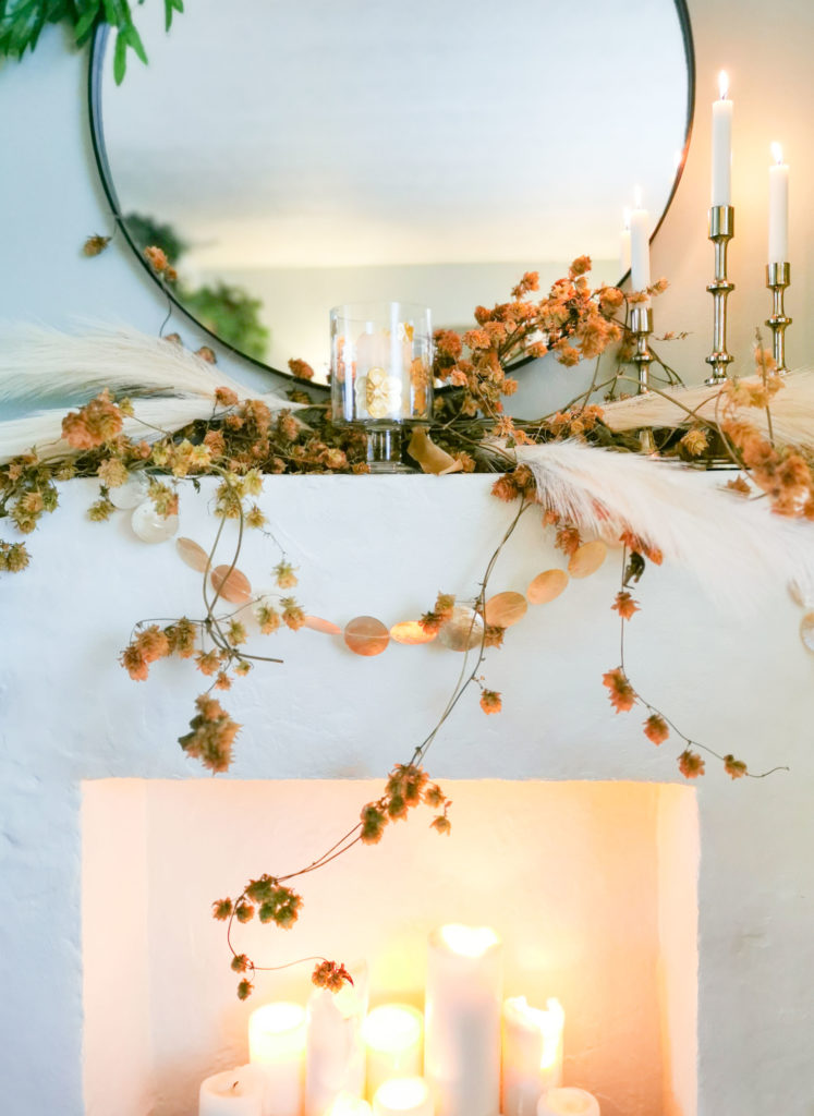
For the mantel, I wanted to bring in some contrast with brown. I simply went outside and made a big mess clipping and tying strands from my frozen wall of hops, which is our deck shade in the summer.
We leave the dried hops up all winter for the birds, and it’s a huge mess to cut them down each spring. They are pretty wild, and would not be tamed, but I am happy with the natural look of these stems.
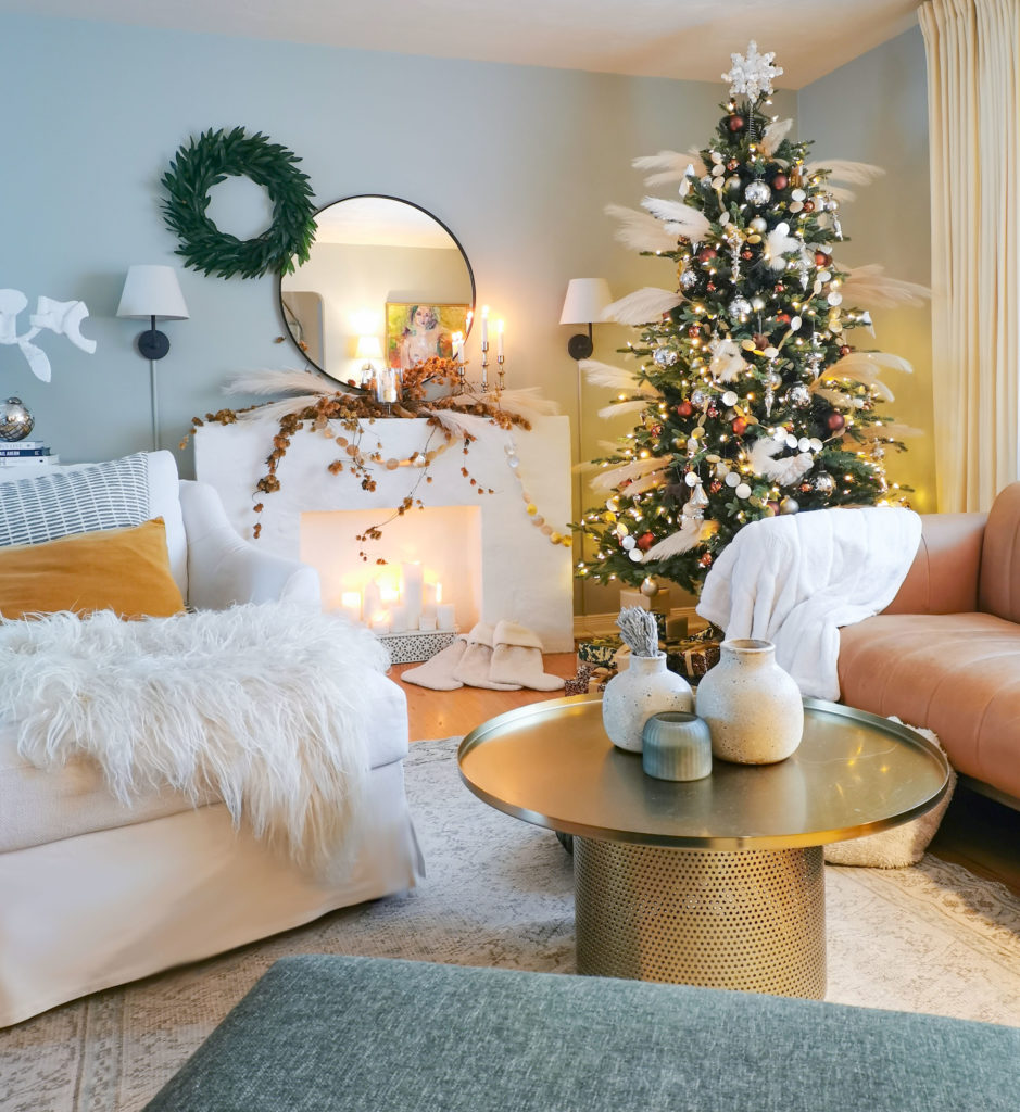
Area Rug | Brass Coffee Table | Cognac Leather Sofa | Plaster Sculpture
The beige trend
Beige is fast emerging as a colour trend. And this isn’t the brown of the 90s we’re talking about. This is a lighter, and more serene pale beige. Since grey has gone beyond the full saturation point, beige quietly snuck in as a warmer alternative and is quickly becoming the dominant NEW neutral everyone wants.
While I personally love beige, I find that it remains pretty divisive. Would you agree? For some, beige is almost like a dirty word. We’ve noticed recently in our eDesign department that clients are requesting warmer neutrals, ie “Maria, can I have a darker, warmer white?” but it’s almost as if they are afraid to say the word beige.
There will always be those who will steer clear of the “nothing the colour of lumpy oatmeal.” But I think that’s at least partly because we have all seen our share of beige (and now frankly, grey) rooms done badly.
Challenge accepted!
So how about you? Are you ready to embrace beige again? Do you know the 5 undertones of beige (well in this post I only cover 3, my system developed over the years)?
Happiest of holidays to you all and all the best in the New Year!
Thanks Tricia!
PS. Just announced, Pantone’s Colour of the Year is Peri – a periwinkle blue

From pantone:
“At its core, Very Peri is a combination of the digital world that everyone has grown accustomed to and the physical world, or what is seen in nature. The Pantone Color Institute has identified periwinkle blue as a color that is present in digital design and gaming, while also existing in the outside world in the form of flowers and bluebirds, among other things. This represents the merging of the two worlds in our current lives, a balance which will continue in the foreseeable future.”
A great way to start infusing Very Peri into your space is through accessories that can easily be swapped in and out, or for those feeling more bold, you can go right to painting an accent wall or ceiling that creates depth.”
I’ll take a periwinkle accent wall over a black one any day!
Over to you my lovelies, have you added pampas grass to your Christmas decor this year? And who’s decorating with periwinkle blue?
Related posts:
2020 Holidays Feel Different, and so does My Living Room

Periwinkle has been my go to from the first can of paint I bought! I’m glad to see such a pretty shade as color of the year! The last time I liked one it was radiant orchid.
Hi Tricia. I love your rooms and your style. That was a great article.
My eye kept being drawn to that amazing circular coffee table in your living room. Could you tell us a description and where are you got it?
Thank you.
Jennifer
Hi Jennifer, it’s from Article Furniture
I laughed with the mention of the ” lumpy oatmeal” comment. We had golden oak stained windows, doors and trim and I because the adjoining bathroom in my master bedroom that had tiles in it which were brown, gray, blue and beige, had no choice but to choose a color from Valspar called “Oatmeal” Haha! It’s a nice color that I’ve now identified in Maria’s system as a darker green beige.
My husband still likes the oatmeal color and fought for me to keep it, but after 8 years with this wall color, I’m over it. I think beige done right is always a “do”, I’d just personally find a very pale shade of beige to use this time around if I had to. I went with Benjamin Moore Glass slipper in my bedroom this time around as I’m more into comforting what I personally call watery “emotional support colors” and painted my home in colors of soft blue, blue green and a green gray to ground it all in.
I’m also loving earthy warm colors and your sage wall color and the sexy cognac couch. It feels so cozy and inviting I just want to sit and chat in your living room with a glass of wine in my hand! Your Christmas tree is also beautiful and unique!
HI Maria, we added pampas grass to our outdoor urns as we grow so much of it. Great ideas in today’s post for incorporating the “new” look beige into our interiors.
Love what you have done with the space! I generally do not like most of the colors in your pallette, but you have brought them together to form something beautiful. Congrats!
Absolutely charming, Tricia!
Tricia’s Christmas decorations are lovely, but I am very depressed to hear that beige is becoming a trend. To my eye, beige is not a “warm hug,” it’s a dreary color that drains the life out of any room it dominates. The only thing worse than beige on its own is beige with brown. It reminds me of every dorm room and apartment in the 70s. I’m glad gray is going away now, but please don’t replace it with sad old beige.
Absolutely beautiful room and decor! And I am so glad that beige is back, well in my world it never really left!! Thanks for sharing and Merry Christmas!
I love your sofa and mantle. However, that Christmas tree looks like It was dive bombed by kamikaze white birds! 😉. Poor birds.
Totally my thought! The tree would be lovely – but without the pampas grass fonds ; )!!
And the brown branches on the mantel are to scraggly and wild as well. take them off and all will look peaceful and festive!
That is a rude, unnecessary, and uncaring comment. Keep it civil, please.
Jeanne, what a horrible, snarky thing to say to a REAL live actual person who has kindly shared her home with us numerous times over the years. It’s not “funny” or “cute” because you added a winky face.
I never got on board the gray train! Give me a neutral which leans toward beige every time. About 5 yrs ago, I found a retired SW color, Heritage Tan(?) or Heritage Beige(?) with the help of a consultant.
It’s t he perfect “no color” color, very elegant and is slowly being used all over my home.. looks very current. I’m a murky, bottom of the pond person, too! Lol. Your tree is lovely. Enjoyed this!
Lovely tree! This post makes me laugh as pampas grass is common here in Texas and people find if they plant it that mice and other animals will nest in it so it kind of has a bad rap but it’s beautiful. I’ve had a beige tree, though I call it neutral, for several years. I mix a lot of white in mine. I love it! Your tree is beautiful and I love the hops. I don’t think I have ever seen any.
I have always loved periwinkle, just look in my closet. I have many Jasperware accents throughout our home.
With beige coming back, my home will be right on trend when I put it on the market next year. Win!
I know beige is divisive but not sure why. There are a lot of light shades of beige that look beautiful on your walls and make the perfect backdrop for your furnishings and art. I would pick a light beige over grey any day, even when it was on trend, and white is too stark for most homes unless it’s very contemporary. I think if people look on the lighter shade of beige, they will appreciate the soft, warm colour.
I also added faux pampas grass to my tree this year! I recently refreshed my living room with a robins egg blue sofa, medium brown hardwoods, cognac leather ottoman, and navy accents. Supply chain issues resulted in some pretty sad selection of Christmas decor in our local stores, so I wired together strands of pampas grass ( I ripped apart a Fall wreath )with eucalyptus leaves and tucked them into my tree. I added my vintage mercury glass ornaments and some navy ribbon. I think it’s my favourite tree to date… all neutral with just the pop of navy. I love your living room, Tricia, especially your mantel. Foraging your hops was genius, it adds such wonderful warmth and texture to your room. Thanks for sharing and Merry Christmas 🎄
The only neutral I like is greige.
I only like beige when it’s a background in a print with colors. It could be because I don’t look good in beige.
That said, this room looks great. Really love the hops on the fireplace!!!
We just got back from a Thanksgiving vacation at the Arizona Biltmore in Phoenix. Their stunning Christmas tree in the lobby was laden with….pampas grass!
/Users/ghuff/Pictures/Photos Library.photoslibrary/resources/derivatives/5/54F7F839-110A-4CFE-94DD-5B1C85CEADA5_1_105_c.jpeg
I have no idea if that picture went through. Every time we passed through the lobby people were standing around studying the tree. It had tiny twinkling lights and tiny bells (like the trees out on the lawn made completely of rows of bells strung on horizontal bands of wire) and clear ornaments. Although seemingly unadorned at first glance, it did not go unnoticed. And for the Thanksgiving day buffet in the newly restored Gold Room, the table decorations also featured pampas grass in with the other items. The whole effect was beautiful.
No, that photo is not visible to us. But here’s a short video of the pampas tree being assembled: https://www.instagram.com/p/CXCZHu3sqWn/
Tricia, your room and tree are gorgeous! I particularly love the capiz shell garland. May I ask what the white sculptural thing is that’s on your liquor chest? I can’t figure it out. As for beige, I certainly like it better than grey. I prefer a very light beige as I think it’s a great backdrop.
Love it!! Tricia it is so pretty. I’m a more neutral kinda girl so this sits in a perfect spot with me lol. I have silver, gold, greys and a touch of black going on for Christmas. It’s elegant and sparkly and happy. Neutrals can be veryyy happy. Your home is beautiful. I too have a smallish house and yours looks just perfect. Lots of Texture and S. T. Y. L. E. going on. Thank you for helping to convince the masses that soft golden colors are peaceful, beautiful and comforting. Lol. Take care.
Hi Kim, it’s a sculpture by https://susanowenkagan.com/
Tricia, your beige holiday decor looks so pretty with your pale blue wall color!
As for periwinkle, I recently painted my front door a lovely periwinkle hue by sw called scanda. While my family and I love it, I wondered maybe others might not feel the same as it’s kinda out there. So thanks for sharing this post, I feel so much better about my own taste now!
I love this kind of textured, lower on colors but not boring kind of room! The hops are my favorite element that balances the more stiff items in the room well (but I lean kind of organic modern Lauren Liess type style). We should just call beige “sand” and point people to all those lovely pale sandy colors for a bit more warmth than white! No mid tone beiges though, thanks. I’ll mix pale yellow-beige and mid brown natural items all day long with a bit of black and white for good measure.
I thought beige…. boring until I saw your photos and witnessed beige… beautiful. Just lovely. Great job Tricia.
I painted my bedroom medium peri and master bath a slightly darker shade. It has been eleven years and I still smile every time I enter the room. Can’t wait to buy periwinkle products while they’re available; such trends pass so quickly and before everyone’s on to the next big thing.
Tricia, what a beautiful room, thank you for sharing it with us.
I like beige and I like gray. And I am very happy with the color Maria specified for my kitchen that I also used in the adjoining rooms – Sherwin Williams 6070 Heron Plume. It is a greige that I believe hits the sweet spot right in between beige and gray and is a lovely, pale background color. The longer I live with it the more I like it and to anyone looking for a color like that, I recommend considering (testing) it.
I love Tricia’s Christmas decor and I am happy to hear beige is coming back. I have never liked grey except in flannel pants and skirts and fuzzy sweaters. I have lived through white a long time ago and found it cold and clinical. I have Standish White, which used to be one of Maria’s yellow beiges, in my entire main living areas, but may switch to another beige to better match tiles, carpets, etc. In an open concept house, beige is the only option if you don’t want white, greige, or grey. I do like to have colour in furniture and curtains, and lots of white. Tricia has another blog here on how to jazz up beige.
I love periwinkle too and have it in my daughter’s bedroom.