Why do so many houses with exterior stone look bad? Bottom line, you must choose your stone or brick first, and then you can coordinate the rest of your exterior finishes to relate. Remember, ugly is on sale – you don’t want to buy it. Here’s more colour expert advice on how to choose exterior stone.
Suddenly in the last week, we have sold quite a few New build packages because it’s that time of year where the new construction plans are getting underway. It got me to thinking about exteriors and this post that I started writing a couple of months ago, but totally forgot about.
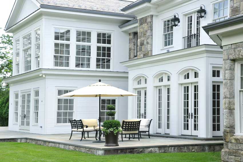
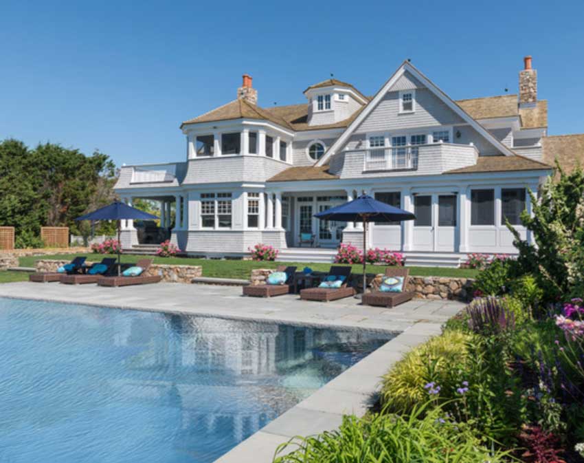
Image via Sotheby’s
One of my True Colour Experts posted this dilemma on our private Facebook page:
What to do? I have my first opportunity to work with a builder and help buyers with exterior and interior colors and finishes for 40 homes over the next few years. The challenge is that he has partnered with a building supply company and together they have limited the choices in order to keep cost very low.
There are 8 choices of fugly faux stone and he wants it on every exterior. Most of the tile (beige and blotchy) and carpet choices are awful. To get pretty results I would have to choose the same 2 or 3 combinations for each house! I’m considering walking away, would you want your name attached to a development of homes that looks like this? I’ve dreamed of an opportunity like this but yikes! What would you ladies do?
Most of the advice other True Colour Experts were posting was telling her to walk away. Otherwise, you can’t say you were there. That’s a lot of time spent, on a design you can’t feature in a portfolio.
However, in the end, she decided to talk to the builder before she turned down the job to find out if she could sell him on the idea of classic and timeless.
Upgrade if Necessary – Don’t get stuck with your builder’s choices (they may not be a colour expert)
Why was everything so ugly? Because ugly is on sale. And too many builders don’t give it a second thought.
If you are working with a builder and are unhappy with your standard choices, UPGRADE. Yes it will cost more, but not as much as the renovation will cost later.
I had a designer in one of my courses last year who told me that she had signed up to attend my workshop because she did exactly what this designer was about to do.
She specified exterior colour combinations for subdivisions.
She told us that with the list of colours and materials she had to work with, only 3 out of 7 homes would end up clad with an attractive combination of materials because she needed 7 different combinations so that the entire subdivision wouldn’t look like rows of identical houses.
What she learned from my colour workshop is that there was no magical way to make the ugly finishes look better, other than at least coordinating the undertones so they all worked together.
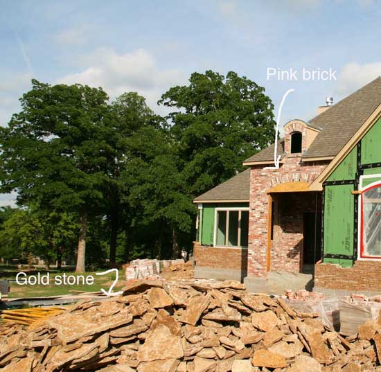
For example, although it seems like pink-beige is a dirty word on this blog, that’s only when consumers buy it blindly, because they think it’s neutral.
Read more: Why Pink Beige Should be Banished Forever
Coordinate Your Neutral Undertones
If you coordinate your finishes so AT LEAST the undertones work together, at the very minimum, you’ll achieve a harmonious result – even if it’s not the most attractive combination of materials.
Did you know that every selection for your exterior is a COLOUR decision first? The most valuable lesson you’ll gain in my Exterior Colour Selection Masterclass is how to narrow down your choices to a select and optimal few.
You don’t want this to happen in the middle of your new build (see below). A few years ago, I received this photo from a distraught client who found my site after she put a halt to this installation until she could figure out how to fix it.
It’s the same with stone for exterior. Stone from the earth is primarily earthy (surprise!) unless it’s manufactured, in other words, faux. And if you don’t want fake stone on your house, and you don’t want an earthy house, then be prepared to edit your stone
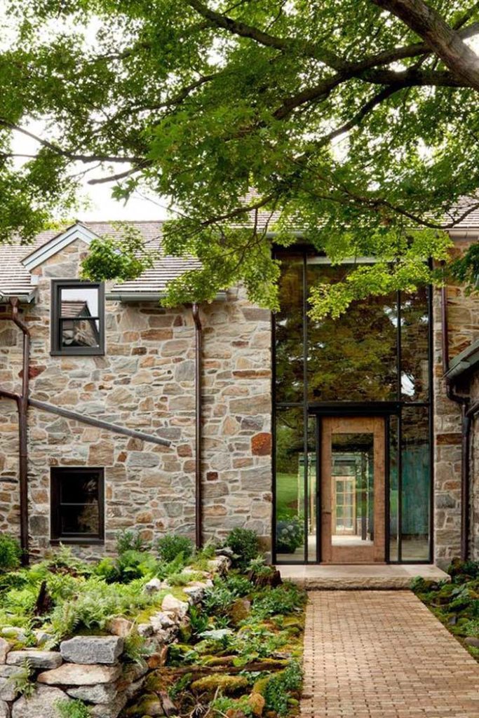
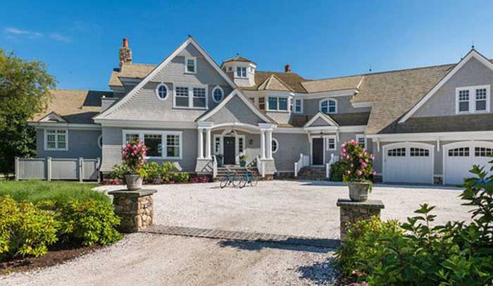
image via Lushome
Edit Your Stone Pallets
Designers do this all the time with their clients. Take out most of the ORANGE or BROWN or just BLOTCHY stone, for example, so that the remaining pile gives you a result on the front of your house that is way more attractive than if you let the stonemason just ‘do his thing’ and install every single stone sitting in the yard.
Either that or work with the earthy colours like this house (above), with the butterscotch cobblestone walkway and stained wood door. The result will be way prettier than ignoring the earthy colours which so often happens.
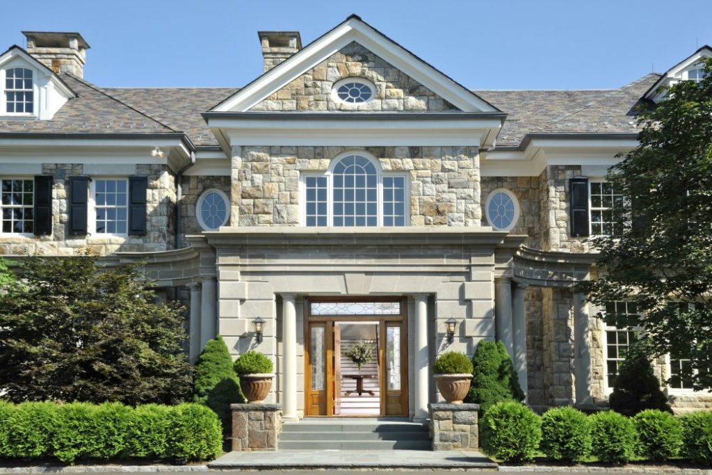
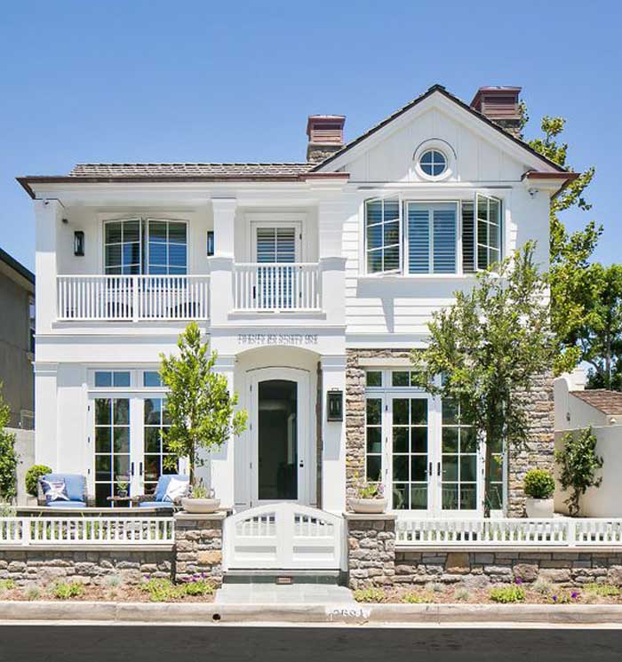
Image via Sotheby’s
In this image (above) the doors are stained a honey maple colour to coordinate with the warm undertones in this stone house.
Choose Your Stone or Brick FIRST
Bottom line, you must choose your stone or brick first. It’s astonishing how many consultations I’ve done where the client is obsessed with the field colour of their house and are surprised when I take them right back to a conversation about which STONE or BRICK they will choose for the exterior of their home.
A couple I consulted with last Fall, hired me to help them with their exterior colour scheme. They found my site AFTER they received their suggested colour palettes from their designer.
They kept talking about the siding colour, but the drawings had stone on half the house, so when they finally understood that the stone had to be chosen first, they said “Neither our architect, builder or designer told us that we had to start with the stone.”
Here’s my theory on WHY this couple (two years into the planning stage) was STILL in the dark about this.
It’s because, neither the architect, builder or designer, wanted to have a conversation about COLOUR with their clients. NO ONE wanted to go there because they had no idea how to navigate a conversation about colour or what they should suggest.
How I know this, was that their suggested colour schemes were WRONG.
When I saw the colour choices they had been given, I started to rattle off all the neutral undertones and how they didn’t go together. The husband listened for about 30 seconds and then cut me off:
“This is why we hired you,” he said.
In the end, I even sent them back to their architect (with a photo similar to this house above) to tweak the exterior design. There were way too many unnecessary arches and alternating shingles vs. siding on their Cape Cod ‘Somethings Gotta-Give’ inspired house.
This takes me to my last point:
Question Your Architect, Builder and Designer
image via HomeBunch
I have often tweaked the installation of stone or brick during a consultation when I’m looking at exterior elevations and find myself thinking WHY?
Just because an architect specified it, doesn’t mean it’s automatically going to be fabulous.
On this house (above) the stone on the right side was unnecessary. Looks great on the fence, that’s where it should have stayed. To my eye anyway.
So listen, if it doesn’t look right to you on the plans, it’s not going to get better in real life. Better to get a second opinion, rather than go along and build a house that does NOT fill you with happiness when you walk in the door.
Building or painting your exterior this season? Get help with your colours here.
Or, get help immediately when you enroll in my Exterior Colour Selection Masterclass and then jump to the video lesson you need right now.
Related posts:
7 Steps to Choosing Brick or Stone for your Exterior













If I ever build, I am definitely doing one of your new build consults, this is excellent advice! I wish you could save the world, er, I mean all the new builds in my area from everyone else’s sore eyes. 🙂 I am constantly amazed, though, at the multitude of sins that can be covered when you stick with the same undertone rather than try to patch up something you don’t like with a different undertone/look that ends up making the eye sore stick out more. (I guess it’s kind of like a bad haircut…you’re better off going with it than fighting it, at least until it grows.)
I often wonder why some builders even got into the business.
MONEY! 🙂 The big bucks they make on other people’s inability to sort out good taste from bad taste! Lol!
As we look to move to Texas, I can’t bear some of the newer developments because they use pinky brick & yellow done together. It’s hideous. I told my husband I’m not living in that, & I certainly can’t have it across the street either!
What part of Texas, Beth? There might be other options, depending on your city.
Maria,
I couldn’t agree more! This is a great topic – and timely in my area as well. Must be that time of year. I’ll be sure to share this. I also agree with the last photo and the excess stone. On the fence would have been sufficient.
Love this post. I have a dream to save all of the developments in our area. Once upon a time I was going to build. After I reworked the house plan and all the design choices the builder asked for my designs. I think this is great advice and I wish her all the luck with her new job.
Great read. Thank you.
As always Great advise. BTW-On The last house it looks like they ran out of stone.
So what did that person with the job offer end up doing?
I don’t know, I’ll ask her and let you know! Maria
Hi I’m the one Maria was writing about-
What happened was that I had a meeting with the builder and let him know that most of the available finish choices were dated and/or unattractive. He was open to letting me add some extra stone, carpet, countertop and tile choices! So, I did decide to work with his clients! Thanks for asking!
Love this post! I wish everyone would read it. There are several new developments going up in my area and they are over using gray. Almost every house has some shade of gray and then they throw in some pinkish stone either on the walkway or even on the house. It is disgusting! I wish I had the nerve to sit down with the builder to educate them on color choices. It looks like they have chosen the colors by committee.
This post is exactly what I’m dealing with – except mine is a 20 year old, one story house on a cul-de-sac that I just bought. I have a medium gray roof and yellow beige stone work. Right now the siding is a pale, dirty looking gray. I am really struggling to find a color for the siding that will tie the roof and stone together.
Ah! I can see limiting choices but hopefully enough to work with. I think it is fabulous you assist in these decisions. At one time we did have a semi custom home- one of the last built in a tract of over 100- around 14 years ago. You had to pick siding, windows, brick, and roof but there were limits. They suggested going around the neighborhood to pick. As long as that combo was not too close we could do it. There were some bad choices out there! Pink with yellow/gold yikes! Before all of this started I had really wanted a white home with black shutters and door ( a traditional combo) but that was not an option… this was the beige trend! Luckily white was an option for the windows and trim. I wanted a brick in red with no orange/gold which was like the last sample. From that we went with gray siding, only one shade and amazingly a blue based, and dark gray roof. When we were done – we were told we were the only ones with that combo – well we shunned beige! Today the exterior still looks good. Inside.. well another story!
A very informative post Maria! Fortunately I live in an older area where lots are large so many of the older homes are being replaced with new ones. That said; there has been a total of six new builds on my street alone and though they all vary in design and fixed elements there is one in particular that when I go by I shake my head as the choices in stone, siding, trim and roofing is sadly a nightmare as nothing seems to go together though the architectural design itself is pleasing. To conclude; IMHO it is a perfect example ‘as what NOT to do’ … ºÛº. -Brenda-
We’re going to be doing an addition soon, and our zoning requires a percentage of the exterior be stone or brick. The more I look at our existing, it looks like they somehow have butterscotch brick with a pinky mortar. I’m scratching my head on matching that. Great advice though.
Great article! I’m hoping to build a house in the mountains of WNC so I’m taking this all in and hope to have a consult with you when we get a little closer. This article made me realize that we need to pick the stone for the fireplace (which fits the woodsy setting) before or in conjunction with the interior colors. Wow! That’s two mistakes you’ve prevented!
Maria, I can feel your frustration! I would be so angry, really. Your crusade to educate is an uphill battle. But keep going!
One day, many more people WILL see the waste in ill chosen expensive materials.
Tha definition of ignorance is hidden in plain sight. It means to IGNORE a truth that is already there.
As Churchill well said,
” Nevah [my translation] give up!”
❤️Paula
We just visited our son and d-i-l in their new build home in north Texas….oh my. Home after home after home with ugly combinations of brick/stone/siding. The interior selections were not much better. They had very few choices in cabinets, carpeting, tile, paint, light fixtures. They were told they were the only ones to choose that specific granite to go with the already installed medium gray tile floor. I can’t imagine what the other buyers picked from the select few available to go with that gray tile floor. My d-i-l keeps saying, ” it’s not our forever home”. Builders really really need help when it comes to these options. Surely not everything on sale is this ugly.
Another great post! LOVE your blog, LOVE your insights!!
I really enjoyed this article, and I totally agree. However, you had me worried a bit at first because, in the email you sent linking to this post , you had positioned the excerpt stating, “….would you want your name attached to a development of homes that looks like this? …” directly above the photo of the drop-dead gorgeous stone mansion (via Sotheby’s)! I thought, “My, if this house isn’t pretty enough for Maria– I guess I must not have any taste, because I think this is beautiful…..LOL! ” (Did you do that on purpose to get our curiosity up, heh, heh?) I’m relieved to learn that that mansion was one of your GOOD examples of stone exteriors! Whew!
By the way, as a former architect, I can attest to the lack of color training (beyond the basic art 101 color wheel blah, blah) in architecture school—at least that was the case way back when I went to school and at my university. Most architects’ I’ve known would say that their favorite interior color was white–and I always thought it was because they didn’t really feel comfortable working with color! Maybe that has changed, but still, just like any other profession, not all architects are equally talented, and many are better at understanding construction and building codes than great design.
Maybe you could write a book about color theory for architects that could become required reading at architecture schools!
Great article. I too want to save all the builder homes in our area…and I AM a builder! Pressure is always on to make our homes look great…but, of course thanks to Maria’s class they do:)
Im on an HOA board and have the task of choosing colors for 29 exterior patio homes. The homes all face each other with a small “park” in the center. ALL of the homes have very pale gray roofs with reddish orange brick on either side of the garage doors. ALL OF THEM! Right now many of the houses have a minty green, peachy beige, or pinky beige paint. uck! I want to choose colors that will update the look of the entire neighborhood. Any thoughts on a variety of color schemes?
Maria, based on some of the comments I think you have the opportunity for another design package . . . Harmonious exterior colors for developments and HOAs. I know there are many opportunities just in Florida alone, either new or aging and ready for a re-fresh. Most of the “re-fresh” colors I have seen would have been better just re-painted the original colors. Hard to believe they were actually approved by a HOA board. No consideration given to the colors of the tile roofs, tile in the pools, neighboring homes, etc. Thank you for all you do to help the environment and landfills with your Classic and Timeless education.
I always thought I had a good handle on color. I could see blue in red or green in gray when friends would just shake their head at me. I am doing a new build and have gone through the Online training on Exteriors over and over and I am still confused. Can I use white vinyl windows with warmer colors? Or do I need to stick to clean colors or grays? And If I do white vinyl they will automatically be white on the inside. I wanted to do cream on my cabinets/trim. The vinyl color has me stumped!
You can have different colours on the exterior and interior but it just costs more. White windows are bad with earthy stone or dark, earthy colours but they are fine with lighter colours which is what the trend is now. Hope that helps, Maria