


There is nothing wrong with using ‘trendy’ colours for exterior, however what I’m pointing out here is that if you are looking for a more ‘timeless’ look, I would not recommend the current ‘trendy’ neutral.
I would choose a colour, combination of colours or combining colour with a neutral.
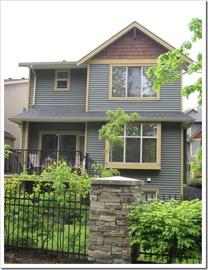
Notice how the trim and field colours alternate which creates a cohesive colour scheme on a row of homes that are essentially the same.


I much prefer the brighter colours on this street – it would be wonderful if more cities embraced colour on exteriors! Notice all the white though which is lovely and crisp and very necessary with the clean colours!
If you would like your home to fill you with happiness every time you walk in, contact me for on-line or in-person consultations.
Related posts:
How to pick Exterior Colour without a Designer
Exterior Undertones
Exterior in Grays – Before & After
New to this Blog? Click here ; Become a True Colour Expert


I got to that last image and WOW! Now that is a fun row of houses!
I see houses like these all the time, everywhere. They're great and I think it will still look good in many years to come.
Now, the last picture is pure Fiesta!!! 🙂
xo
Luciane at HomeBunch.com
Very good point. It's a huge investment painting the exterior and we don't want to have to do it often. Did you ever see the homes in Garrison Crossing in Chilliwack? They are fantastic and I adore the colours used. I'm working on a client's home there now.
Love the livliness of the row of house at the end but the more retrained colors are the ones that will stand the test of time in my humble opinion though if you live on a tropical island or in Key West those fun colors are just perfect!
Maria– Color is so personal to a house. Your examples are beautiful and the last is just eye candy!
I had to decide recently between vinyl siding and painting our house. Will go with paint! Vinyl is so limiting in color.
Loretta
I'm about to do this and I'm going "trendy" with browns… is that awful? I was thinking SW Latte & Kilim Beige.
Love your blog!!
-Shannon
I always always learn something interesting from your blog. Wishing and hoping that I can afford to take your course some day….
Hi Shannon,
Your colour choice is not 'awful' just trendy but I would be careful on those with exterior, as they have a red (pink) undertone.
Maria
Probably, I would paint my house one of those 'safe' muted colours..but sometimes I would love to think that I would splash out and paint it a bright in-your-face colour..alas..only in my dreams! Great for those that dare!!
Maria,
The exterior of a home is a big investment, and I agree that non-trendy neutrals are always a safe choice. If you want to add personality, paint the front door! It's much easier to change if you tire of the colour.
Wendi 🙂
Have you been to Charleston? You would love those homes!!
Those homes will look lovely for years to come. Nice to see when a development like that has put obvious thought and concern to their exterior palette. My post today speaks to creating the kind of variety + flow in your interior palette that I'm seeing in this exterior one. xoxo Kristie
http://thedecorologist.com/wp/how-to-create-a-color-palette-for-your-home
I've talked to cops who HATE that kind of housing. They ask someone which fence a fleeing burglar jumped or ask a strayed child what color their house is, and the witness/child can only say "a grey house" and that's half the ticky-tacky block.
In my old neighborhood, mixed among the boring white ones with green shutters, or brick with tan trim, we had "the rock house with the turquoise trim", the "white house with the purple and yellow fence", the "pink and turquoise house", and a few others to use as points of reference.
I now live in a sea of tile and tan roofs covering tan stucco. It's BORING!
Ew, Maria, thank you! That's the last thing that I want (pink)… we need to lean more green. Maybe Northampton Putty with Bleeker Beige or another beige?
I stink at this — I need to take your class!
I was looking at SW Dapper Tan b/c I think it's got the green undertones that we need but online reviews said that it's ugly.
How do I find colors with a greenish undertone that are also pretty?
Thanks!
Shannon
Shannon- Stop fishing and please just hire Maria to do an exterior color consultation.
Check out the houses in
St John's NL, you'd adore the colours! So wonderful with all the gray and dreary weather
they experience.
Beyondbeige, didn't realize that I was fishing… but thanks for your concern???
Maria, I will e-mail you.
Thanks!
Shannon
Love the last picture – live in Santa Monica, 27 years. Didn't recognize the street so I checked Dabble Magazine/Santa Monica issue. And yes, Santa Monica is every bit as much fun as the article says.
The street, however, is from the article on Puerto Rica. Enticing. Expedia here I come
how true maria, but i had not considered beige nor gray as trendy, but of course it is.
what a great development with that interjection of individuality
debra
Hi Shannon,
Pretty is always about the context it's in; however greeny grays look better on exteriors than pinks so you're headed in the right direction!
Maria
I love your examples here Maria!
Hope all is well.
xo,
cristin
Don't forget property values when the colors are good.
When the whole neighborhood is right, property values go higher again.
In gated communities this adds up to millions.
Alas, older gated communities have HOA restricted colors REDUCING property values in the span of a decade. Again, millions on the table, but in the wrong direction.
Exterior colors change via global location. Blues of Provence don't work in Stone Mountain, GA.
Garden & Be Well, XO Tara
Amazing houses Maria! I see what you mean. I love that last set too..but being a chicken would probably go live in the first set. LoL!
xo
Donna
My sister in-law chose the colours for those places! She is pretty pumped that you blogged about them.