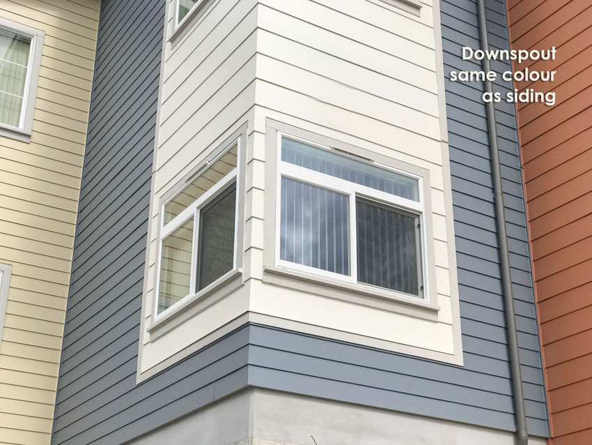
Years ago when colour still mystified me and I was constantly talking to other colour experts at colour conferences and at other colour courses looking for mastery, I’ll never forget one conversation I had with a colour designer who specialized in exterior colour.
He said, “The problem with using neutrals on exterior (especially the CURRENT trendy neutral) is if you introduce that colour–and right now that’s charcoal–at the end of the trend cycle, which is normally approximately 10 years, that building will instantly date 10 years right after the painting has been completed.”
“That’s why I never choose grey for any exterior I work on.” he said.
I was struck by this because I was asking him about ‘the colour of stone’ (which if you own my exterior webinar you’ll know exactly which colour I’m talking about) in that conversation and he just looked at me blankly like he had no idea what I was talking about.
Here’s a good example, no one and I mean no one, is asking me for brown exteriors right now because that trendy neutral went out of favour around 2009. And the farther you live away from the core of a metropolitan city, the longer it took for brown to go out.
Therefore, if you were to paint your exterior chocolate brown TODAY. Your house would instantly look like it was painted about 10 – 15 years ago.
Stay tuned, I have a great example of this at the end of the post.
Just to be clear. There’s nothing wrong with some brown or a little charcoal, it’s in the same category as the statement “Every room needs a hit of black”. It’s just when EVERYTHING is chosen, almost by default, in the current trendy neutral, that your interior or exterior will scream TRENDY.
In my Mississauga Specify Colour with Confidence workshop just two weeks ago, I had a participant ask me about a house her son was building. It was primarily orange/red brick and I suggested a charcoal roof and charcoal windows.
She hesitated, then protested “But isn’t that trendy?”
“Yes, if the entire house was charcoal from top to bottom? But charcoal looks great with orange/red brick.” I said.
“That makes sense”, she replied.
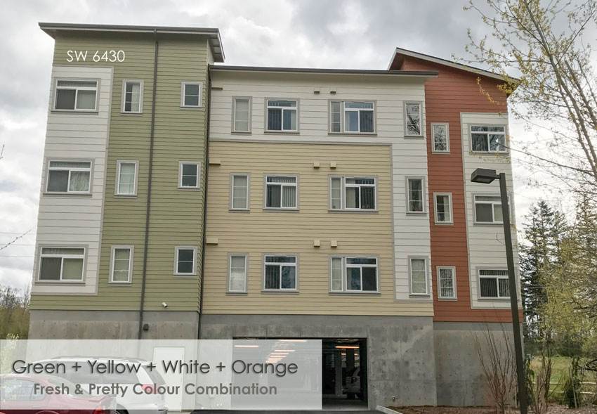
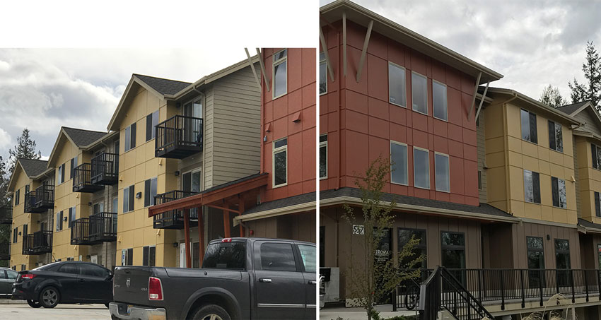
Last week, I drove by this new apartment complex and I noticed them immediately because of the colours.
What made them so pretty was that browns and charcoals were not the majority colours.
And here they are:
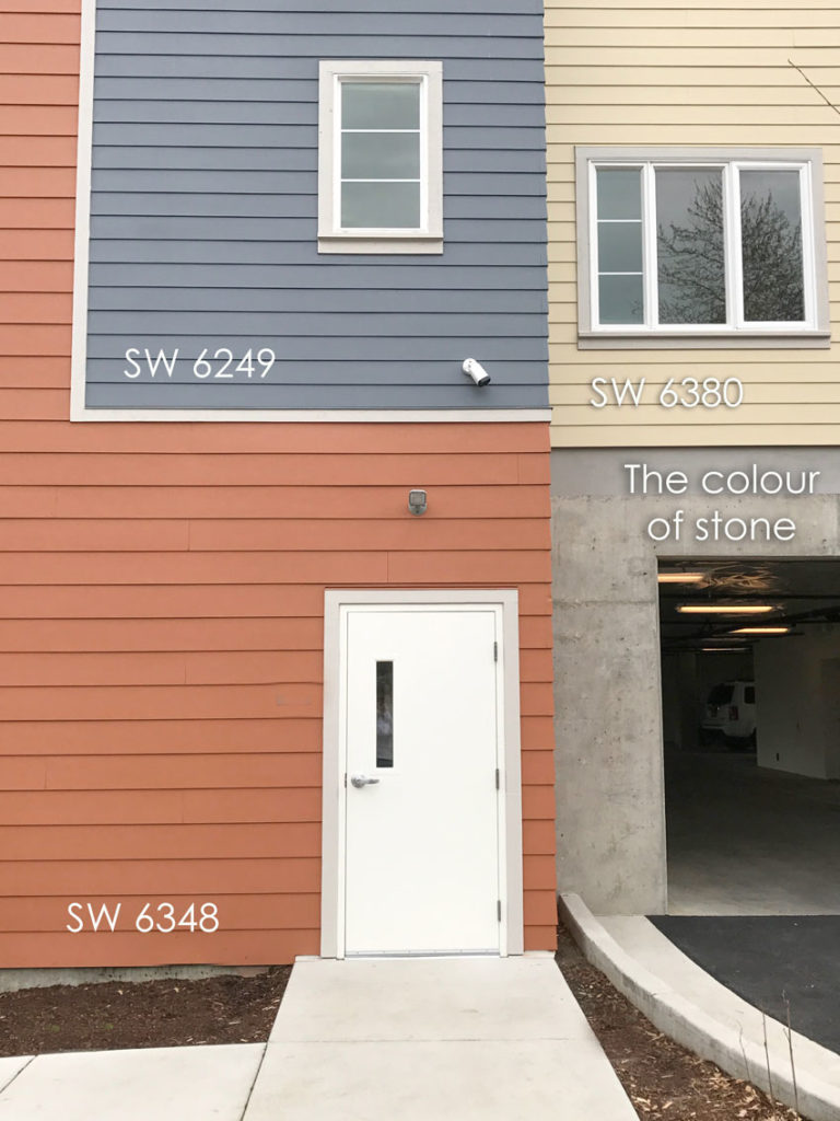
I matched them up to Sherwin Williams colours.
I like that the colour of stone (the cement foundation) is repeated around the window casings. If they were white that would not have worked against the areas of the building that were painted white.
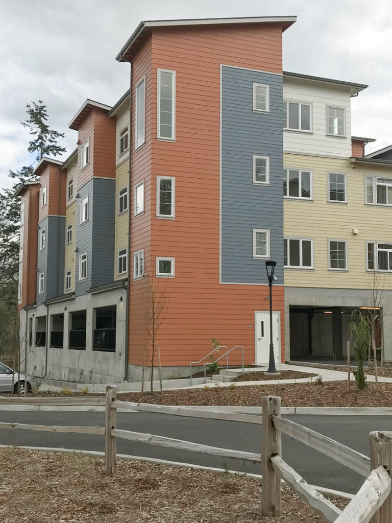
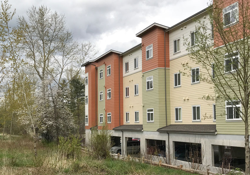
There were three buildings in slightly different colour combinations. This is the second building, the first is on the right with the burgundy on the bottom.
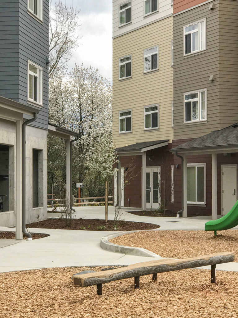
This was the third one (above).
The curb appeal side, driving down the street, pretty with Spring cherry blossoms.
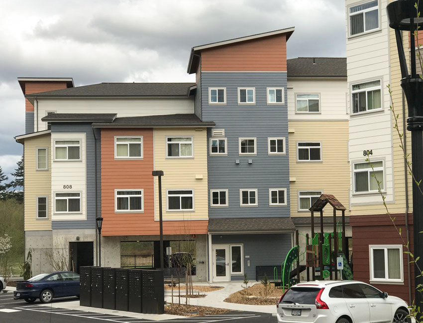
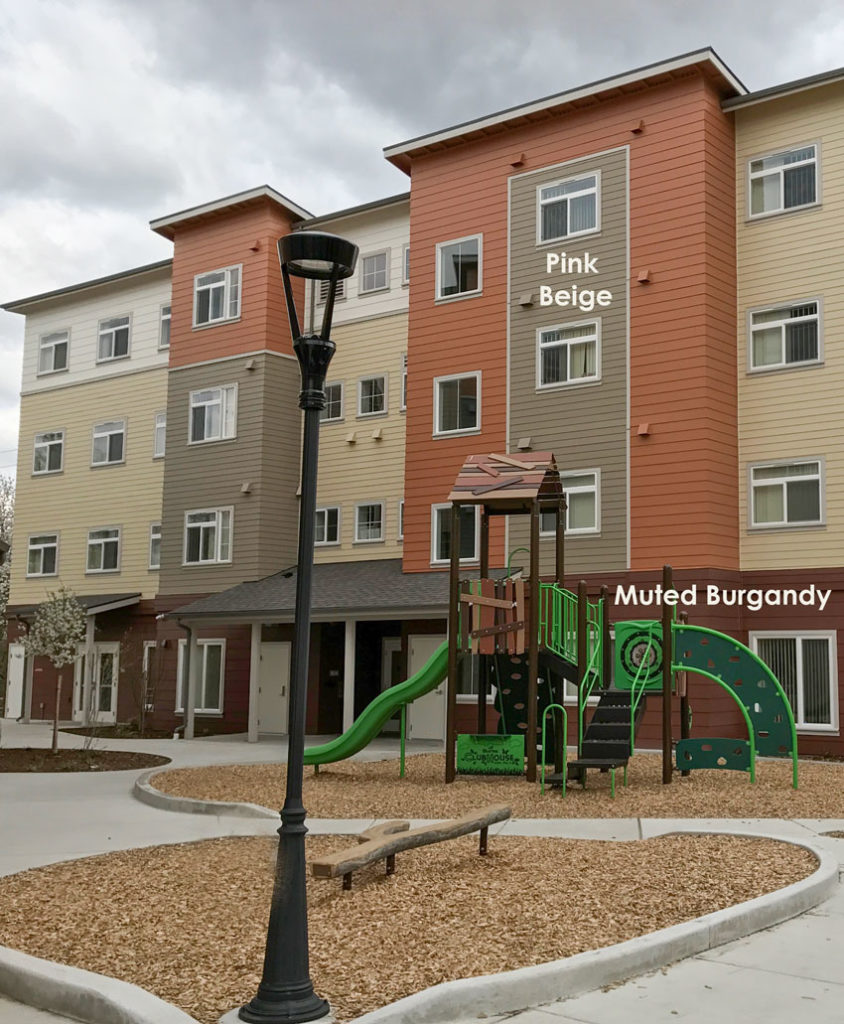
Here’s the first building, above, on the right.
Photos by Maria Killam
You can see here that the burgundy could have been forgiven (even though it was too muddy for these colours) but the dark pink beige colour really looks dirty with the cleaner colours around it.
In my training, you’ll learn that creating flow on any exterior or interior is about keeping clean colours together and dirty colours together. You’ll also learn that clean and dirty are relative just like warm and cool. You can always find a cleaner colour and you can always find a dirtier colour, therefore, our in-class exercises, where you’ll discover how to compare colour to get the correct combination are very important.
Overall, I think this complex is very pretty. It’s rare that I’m compelled to take photos driving by any building.
I didn’t have to drive far down the same street to see a perfect example of ‘what not to do’. Here the combination of rust, yellow, sage green and brown look like a combination of the 90’s and the 2000’s all together.
The rust and yellow makes the brown look dirty because it’s not dark enough. The sage green just dies between the orange and yellow because it reads more like a neutral here than a colour strong enough to stand up to the others. And the black railings do relate to the roof but it’s not enough.
Casings would have made this building more attractive, but I would NOT have painted them black. I don’t understand what the colour blocks of black are doing beside the windows here. They read like half a shutter.
Overall this palette falls flat.
Colour is happy. Colour is Classic.
And just like the colour designer I mentioned at the beginning of this post, NEVER specified neutrals for the colours he designed for commercial exteriors, apartment buildings, hotels and shopping centres, the same holds true when you see such a great set of examples.
There are WAY too many charcoal and brown exteriors that we drive right by without a second look, don’t add yours to the collection.
Which colour combination is your favourite?
If you need help with your exterior colours this season see our eDesign packages here.
If you would like to be trained on choosing the perfect exterior colours, download my online training here.
Related posts:
10 Tips to Transform Your Exterior
What Colour Should Your Concrete Driveway Be?



Just wanted to note that the downspouts don’t match the siding — they’re charcoal gray. That’s a classic choice for disappearing into most buildings and looks great with brick as well.
See Farrow & Ball’s down pipe: http://us.farrow-ball.com/down-pipe/paint-colours/farrow-ball/fcp-product/100026.
HI Liz,
OH, haha you’re right only on that one picture do they match perfectly. Well they should be painted to match the siding to everyone who is reading.
Thanks Liz,
Maria
Hi Maria
Great post .
I’m not feeling those apartments to much for my taste .
To me they scream look at me .
I see them doing apartments all over our city like that .
One is done with greens and tans and one with blues and tans every other one in the complex.
I think that is going to scream outdated .
I think if you search colors you can find colors for the outside of your home that you don’t know what yr it was painted .
When I drive through neighborhoods I’m shocked at how many homes all look the same and r painted brown ,
Was brown the only color we had ten years ago?
Same with Gray is Gray our only color?
I personally don’t want either .
Thanks
Hi Maria,
Very interesting post and the comments about exterior colors from the designer you mentioned. I couldn’t live in any of those apartments! I think the color combos just hurt my eyes! I am a New England girl, who still likes the gray exterior,not charcoal, and crisp white trim. I have had 3 homes that all ended up being gray and white trim. I think of it as a nice backdrop for the green shrubs and flowers that I so love to plant.
Yes medium tone heritage greys are great, it’s charcoal or deep browns that I think scream trendy.
I think the first group looks cheerful. I wouldn’t like the mix for a home but for multiplex ok. Sometimes multiplexes that are too plain look industrial or institutional to me.
It is difficult to paint large apartment buildings with no character of their own. This was an attempt to add character with paint. It was a nice try, but, IMO didn’t quite make it. Too many colors on a connected group of buildings for my taste. The white and pale yellow are the biggest losers. I think such a large expanse of siding calls for colors with some weight. The best combination, IMO, was the pinky beige with the rusty-orange. (skip the rest of the colors on that building including the burgundy,
I obviously have seen a lot of buildings if I think these are great and no one else does haha. It doesn’t change my opinion though, which I’m clear is just my opinion, doesn’t mean it’s right.
Show me a pretty building in greys these days and someone has just tipped the colour scheme over with too much charcoal or too much black and instead of classy, I see debilitating.
The lesson of this post is that colour is better than the trendy neutral, so whether you agree or disagree, that’s all you need to get.
Maria
Colour-block buildings are obnoxious in my eyes. They put these huge swaths of unnatural colour way up in the air, and seem to be the developer’s effort to make an otherwise prison-like building “fun”. An example of this is the Solstice buildings in Guelph Ontario: https://dynamicmedia.zuza.com/zz/m/original_/b/c/bcfd043a-8330-4105-9407-33b4e11355ae/B822092670Z.1_20150903164221_001_GK31HR7A3.3_Gallery.jpg. Driving by it was an assault on the senses.
I think the biggest issue with apartment buildings is not their lack of colour, but their insistence on using utilitarian structures that hark to machinery and “progress” rather than attempting to dialogue with their surroundings. These buildings are made even worse in Guelph because these: http://d3exkutavo4sli.cloudfront.net/wp-content/uploads/2014/11/arkell-lofts.jpg “West Coast Style Condos” have gone up directly across the street. It’s literally one of the most jarring parts of the city.
I wish architects who worked with developers would actually draw from classical sources. It’s surprising how pretty an all brick building can be with small amounts of ornamentation.
Christina, Your example was exactly what I just mentioned. . . waaay too much black and charcoal which killed the entire colour scheme.
Very bad. . . thanks for posting it!
Maria
Well, I can’t lie. I hate the buildings, but I generally hate color blocking anyway. It doesn’t help that they are done in colors I dislike. I’m not sure they’ve done anything wrong . . . maybe it’s just me. I also hate accent walls unless the architecture calls for it. I know these are polarizing issues. 😉
There is a complex of two-story townhouses near me that are painted in three different colors, but each townhouse is completely in one color. The colors are green, beige, and yellow-gold. They look great, but the green is the prettiest. In fact, the green is so fresh and pretty, that I always wish they were all painted that color.
The only neutrals I like for houses are crisper cleaner colors like white or cream. I also like black and brown if there is lots of white or cream trim. The only beige color I like is greige. I also dislike gray houses, unless they have a lot of white trim. Otherwise, they look like institutions to me.
I love medium green houses when the green is a color found in nature, and it’s very popular where I live in the mountains.
Hi Maria,. What I like most about your posts, after your explanations, is the comments given by each reader. I get a lot out of them!
First of all I would like to add my two cents. I believe that exterior colors can look good or jarring to the eye depending on which hemisphere you live in. If you live on the east coast where the weather is cold and dreary, then bright colors probably look totally out of place. However if you live on the west coast where it is warm and sunny most of the time, then happy color blocking for instance could be fun and refreshing. Of course the color needs to be put together as Maria has taught. Also I agree that a lot of the builders do not have a lot of imagination as far as building style but it is all about money and the most economical way to construct a building and unfortunately it is building a box.
I personally didn’t mind the apartments that Maria has shown. At least if you got drunk one night and could see color you could find your way home! Haha.
Fun post and she makes that “gray” matter in your brain work harder!
The range of comments on here illustrates why I came to despise doing commercial exteriors. And as a result, have really cut back on them. No matter what colors you suggest to a group, someone will hate one of them. Especially if you try to do anything creative at all. The larger the group required for approval, the worse it is. Since they can’t agree, typically what is chosen is the most boring of all the schemes you submit. And then, God forbid there be one interesting element like a door accent color – they will change that to brown or gray, too.
Hi Juli, very enlightening comment, thanks! Maria
Sounds like Groupthink
“Groupthink” is a psychological phenomenon that occurs within a group of people in which the desire for harmony or conformity in the group results in an irrational or dysfunctional decision-making outcome. Group members try to minimize conflict and reach a consensus decision without critical evaluation of alternative viewpoints by actively suppressing dissenting viewpoints, and by isolating themselves from outside influences.
I like these! (not counting the last picture).
I think they are probably a good compromise between which colours look good under a blue sky vs. an overcast sky (that difference can be quite dramatic); looking like the inside of a child’s toy box vs. looking drab and depressing; looking crazy/out of place vs. being overlooked.
I like the overall impression of these buildings – not too much, not too little; with a welcoming atmosphere.
The maroon colour IMO does nothing good though – they should have kept it raw or a light grey.
Hope I am not piling on, but I have to put in my 2 cents. I am not big on color blocking, feature walls, etc., so I am probably predisposed not to like this look, but I really do not like it all all. I wonder if it is the combination of the colors (not bright but “happy-ish”) against the gray skies. I agree with the reader below who said that bright fun colors work in bright fun places, etc., and this almost seems like the builders were working too hard to draw attention to the buildings. (It isn’t too too bad in the 4th picture but it doesn’t work from the various angles, at least in the pictures.) The incongruence doesn’t work in this case, for me.