


When you read this interview, you’ll see where I came up with some of the best questions I’ve been asking the colour experts on this blog! This interview [about me] is the un-edited version (with photos to keep it interesting) of the one published in BC Home this month:
[BC Home] What is your favourite colour?
[MK] Yellow. It’s the colour of sunshine and happiness and I have loved it for as long as I can remember with orange coming in as a close second.
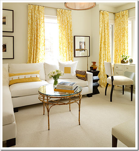 Interior by Sarah Richardson sent to me by one of my first subscribers, Victoria Austin – Thanks!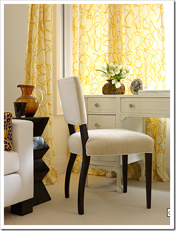
[BC Home] What colour would you like to see banished from all paint decks?
[MK] Pink Beige. My colour theory students have asked me why I dislike the colour so much and I guess it’s because I’ve seen too much pink beige carpeting from the 80’s.
Also it’s an easy mistake for a non-professional to make. They are thinking “hmm. . . light brown, that has to be the most neutral colour right?” But just like you can’t do ‘light red’ because it’s pink, light brown is pinky beige. And on the paint chip it looks like such a lovely warm beige until you get it all over your walls (or your tile, countertop, backsplash, etc) and see that it’s pink. I have had so many clients say to me “Please come and help me select a beige, every one that I choose ends up pink!”
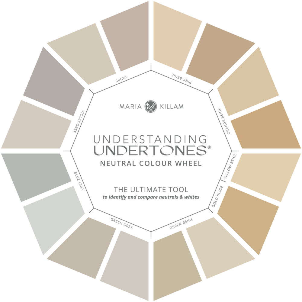
Maria Killam Understanding Untertones Colour Wheel
[BC Home] How would you describe your own personal style?
[MK] Collected, traditional and colourful. Walking into my home fills me with happiness and I like to create that kind of environment for my clients as well.

[BC Home] Where do you like to shop?
[MK] The homes I decorate for people always end up styled and finished, so I’m always on the lookout for accessories. My first stop is usually Homesense because if you can’t find it there for a song, then you know you are going to pay more going forward. I also love the Pottery Barn for accessories I can’t find anywhere else (in Vancouver anyway) the Urban Barn for end tables and occasionally a great piece of inexpensive, colourful art. And I always go to Chintz & Co for the best silk flowers.

[BC Home] What was your biggest design faux pas?
[MK] The very first decorating course I took in the 80’s (when faux finishing was still hot) my instructor described how she faux finished 70’s brown paneling by first covering it with drywall mud to create texture, then she sponge painted flowers in 4 different colours. Well I did the same thing for my bachelor uncle’s house (which I was decorating at the time) but it ended up way to busy. I had to fix it as I painted and the wall ended up red with forest green stems and navy blue flowers! Every time I came to visit I would cringe looking at that wall until it was finally painted out last year!
[BC Home] When it comes to design, what’s hot?
[MK] What’s hot is the combination of yellow and gray. Not surprising since yellow is Pantone’s colour of the year for 2009 and gray is the next best neutral to go with it.
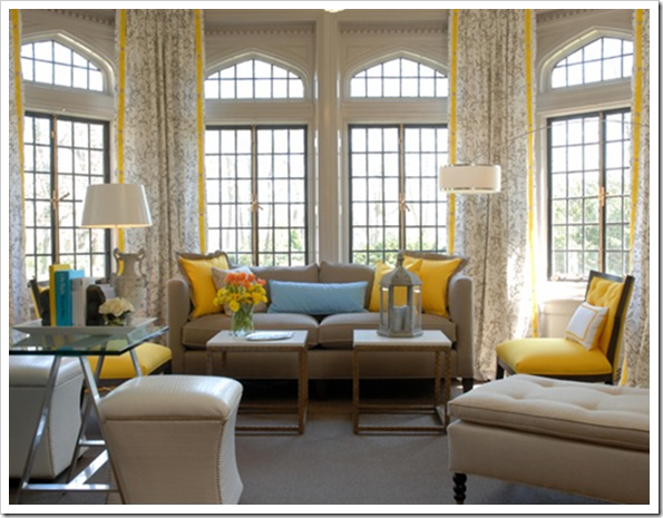 Interior by Eileen Kathryn Boyd
[BC Home] What’s tired?
[MK] I’m over the brown trend. It works to ground a space (just like black) but I think all those espresso brown kitchen cabinets will soon go white because as people move away from one trend they usually go to the opposite extreme.
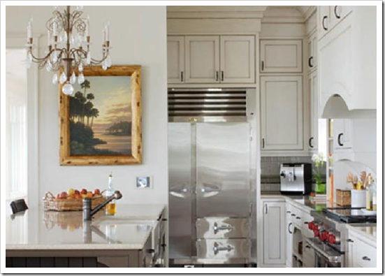 Image from Verdigris
[BC Home] Can you give me a tip or two on hiring a designer for a rental space, i.e. on the client doesn’t plan on staying at forever. For example, what design elements can pack a maximum punch for a minimum buck?
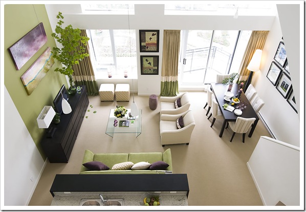 Interior by Maria Killam Colour & Design
[MK] Every home we live in has custom requirements for furniture. I would always recommend a sofa and 2 chairs over a sofa/love.
They are easier to move around to accommodate a new space. Also the dining table in this space was from IKEA for $300 and the chairs were custom, however in a new space, a different table could be purchased using the custom made chairs.
The picture frames are from IKEA are a classic way to create maximum impact when you have a lot of wall to cover. In this loft, photographs from my client’s travels were used to personalize the space in addition to adding drama and colour. And of course the row of MALM dressers ground the focal point wall and also provide extra storage.
Related posts:
Maria Killam Colour & Design on the Cover of BC Home

Congratulations Maria on a WONDERFUL interview!
The photos of your work are stunning and so expressive of your personal style! It is very fresh and welcoming. I love the amethyst and green together.
Also agree on the pinky beige decks….:):)
love, kelee
Great interview and beautiful pictures! I love the interior done by you – so beautiful and clean. And of course, Sarah Richardson can do no wrong in my book! She is the one who made me second guess my love of French style since I admire her transitional look so much.
Thank you for explaining the pinky/beige disaster. I did it here, my 1st home, 22 years ago.
Ugh. Lived with it 3 years before having money to change it.
Great interview/pics.
Garden & Be Well, XO Tara
Great interview, and I love the images. I'm still cannot get enough images of your client's townhome – just stunning.
What a lovely kitchen. I like that it has country look but with a very fresh and modern approach.
Great interview and totally cool pictures. You are very talented.
Nice interview, Maria! I like the yellow with white – looks very bright and crisp.
I've just read both of your BC Home mag interview posts and I'm blown away!! How fantastic for you to be showcased in this way; you so deserve it!! Love what you did in Kareen's place… heck, I love what you do period!
All the best,
Victoria @ DesignTies
Great interview. You know, you're really making me see the good side of yellow. And anyone who knows me, knows I dislike yellow. For no apparent reason, that's probably why I'm swayed so easily. Of course, it's hard not to be swayed when looking at rooms you've designed or posted on your blog. You always find the perfect example for whatever you're discussing, I love that.
What a wonderful feature. I wish we could buy that magazine in the states.
I love that room! Where did the chairs (in the living area) come from?
great interview, you are so right about beige pink (that's my current walls – my mistake!!!) hahaha, have a look at my blog now with pics of the colour dilemma I'm in – I'd love your opinion on that problem!
* I'm so happy to see you recognized this way (!), and in such an interesting manor, and Sarah's yellow room is d-i-v-i-n-e-ly HAPPY as well as LOVELY!!!
That YOUR fave color is yellow actually comes as NO SURPRIZE to me, Maria… it seems to match your delightful personality AND even your looks!!!
CONGRATS & as always, thanks!
Linda in AZ *
It is nice to get to know you more! Would love to get a peek of your home! I think I would love your style.
Yellow and gray is one of my favorite color combos in fashion as well as interior design..I also swoon over gray and camel together… Happy Sunday!
Hi Trell,
The chairs in the living room are from Stylus (made to order sofa's) they do COM with designers so it's not quite as expensive as getting it completely custom made. I love them too, I've used them in a master bedroom with another client as well.
Maria
I meant to say I am so bummed that my dark brown walls in my kitchen are becoming passe already!!! I have been contemplating lightening them up…but do not have a clue as to what color to do… the space is large and open.. ooohhh..LORDY!
Maria– You are a genious! I just love everything you do! Congratulations on this article — it is so well deserved! Wishing you the best!
Maria,
I re-crown you "Dame Maria Killiam" to the color world and Master teacher to us in the universe of blog-space.
I am so EXCITED for you! Cheers to your focus and shining star moments, may there be many more this year!
Bette
I know the pinky beige all too well because my first house was a log cabin and I asked my 6 year old neice what color house she wanted to live in, she said "pink" so I painted it the beigey pink ! yikes, they still have it that color….
Your pics are beautiful.
Great post. I 100% agree on the pinky beige! I also don't like peachy creams!
I just love the green & purple colour scheme in the loft that BC Home featured. It's so pretty and fresh and different — I haven't seen many green & purple rooms. Nobody would ever guess you used so many Ikea pieces in the LR/DR!!
HomeSense is totally my go-to store 🙂
Tell me about pinky beige…. when we moved into our house, over half of it was pink and the kithen & FR were pinky beige and the kitchen still has pinky peach oak cabinets. Ugh!!
Kelly
those polka dot ottomans are DIVINE! love all your work really! so great!
I recently came accross your blog and have been reading along. I thought I would leave my first comment. I dont know what to say except that I have enjoyed reading. Nice blog. I will keep visiting this blog very often.
Betty
http://dogfurniture.info
Great interview-I love that room from Eileen Kathryn Boyd-I cut it out of my Traditional Home before getting rid of the magazine !
Maria: You are so talented, I learn something new about you each time I read a post. Great advise all the way around.
Ruthie
This is a great interview. I agree with you on pinky beige, but my mother actually likes it and has decorated her home very nicely.