
Okay, so for the last six months or so, I’ve been writing posts that specifically address questions about lighting.
Because everyone loves to blame the light whenever their paint colour turns out wrong.
And I’m here to tell you that light is not actually that bossy.
What’s usually bossier is the neutral undertone you chose.
As I’ve proven over and over, here, here and here.
In each of the posts I just linked to, in the end, the paint colour was much bossier than the lighting ever was.
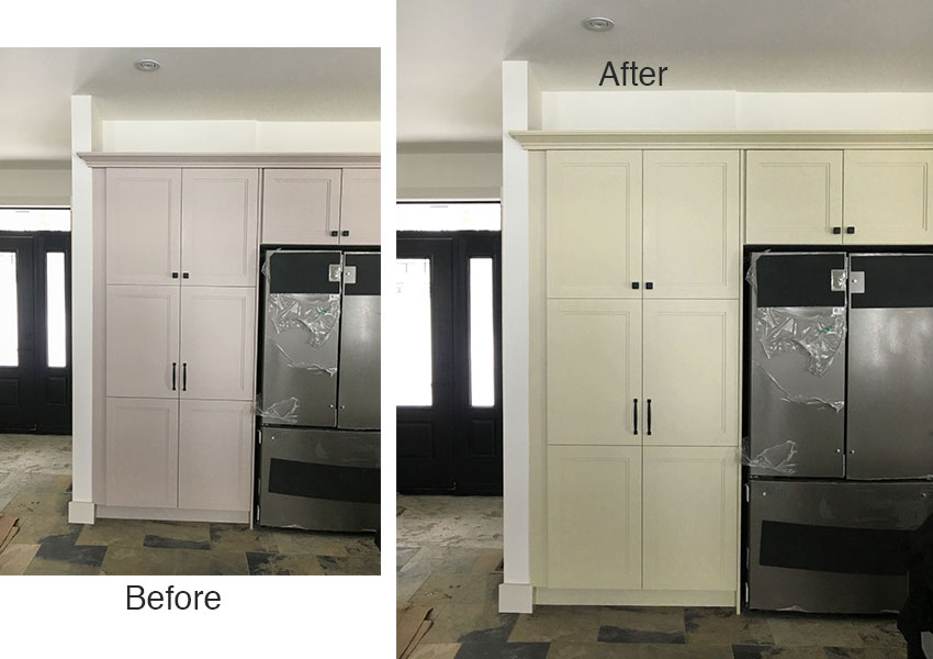
I asked you, my lovelies, to send photos where you were convinced it was the light that changed the neutral colour and made it look wrong. In one of the examples I received I could immediately identify that the neutral undertone of the cabinet colour was not related to the neutral undertone of the flooring.
What’s the fix here? Before you stress over the minutiae of what your lighting is doing, first make sure your colours relate to the other finishes in the room. The right colour relationships often have more power than what the light is doing.
You can see the cabinets (below left) are a violet taupe, when a better choice would have been a green beige (below right).
That’s why, in the example above, changing the light bulbs wouldn’t fix the colour problem. For one thing, while a warmer, more yellow light bulb may make the taupe look creamier (more yellow), it would also make the floor even creamier than it already is. And you’d still have cabinets that don’t relate to the flooring.
So before you blame the lighting, yet again, ask yourself if your neutral undertones relate to the other neutral finishes in the same room.
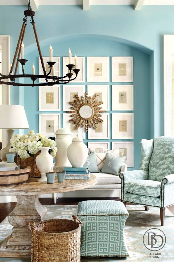
What about when you chose a soft robins egg blue that looked just perfect on the paint chip and it looked screaming baby blue instead when it got painted on the walls?
You could understandably think lighting is the culprit here in making the colour look too intense or wrong, but it might not be. It’s really easy to choose a blue that’s too clean—one that becomes amplified when it’s on ALL the walls, and not just on a tiny chip. You may simply have needed a more muted blue to create the effect you were after.
What’s the fix here? First make sure your colours relate to other furnishings in the room.
And decorating can work miracles to make a strongly painted room look beautiful. A room with vibrant colour on the walls needs to be well decorated to look “right,” along with relating the wall colour to some of the furnishings.
This room (above) has a very intense blue on the walls that may have looked a bit crazy before it was balanced out with all the sophisticated decorating you see.
So, before you despair over your lighting, make sure the new colours you introduce to your room relate to the finishes already there, and consider what a boost of good decorating can do.
What if your issue isn’t solved by those two tips and the lighting REALLY IS to blame?
I did get two examples of rooms where the lighting was the problem. And both of them were white kitchens.
Here’s one of them, sent by a thoughtful reader who had the foresight to take a photo BEFORE everything was installed, AND after it was styled (below):
And here’s her question:
We just moved into our dream home. I picked a lot of colors and looks from your blog. It was SO helpful.
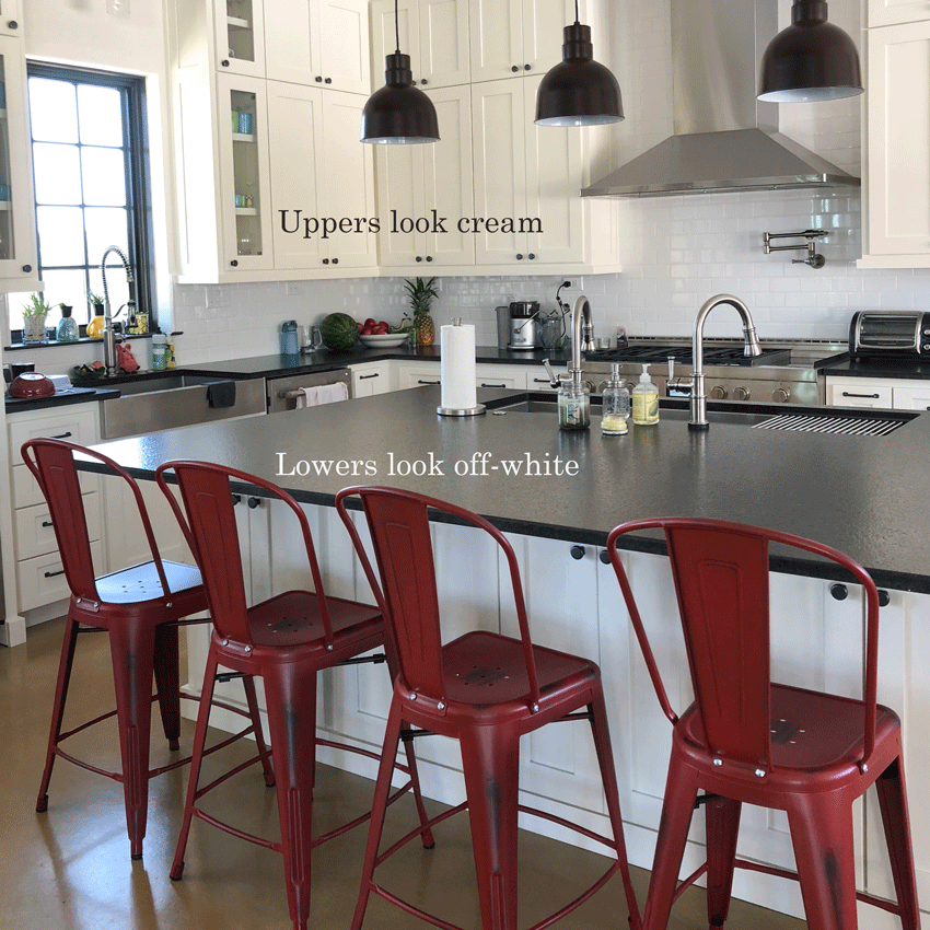
But as you can see, in my kitchen, the upper cabinets look cream while the bottom cabinets and island look off-white.They are all painted SW Alabaster White. The subway tile is an arctic white and wall color is Shoji White.I even took an upper cabinet door off to make sure it matched the bottom cabinets and it does. It drives me crazy. Thoughts?
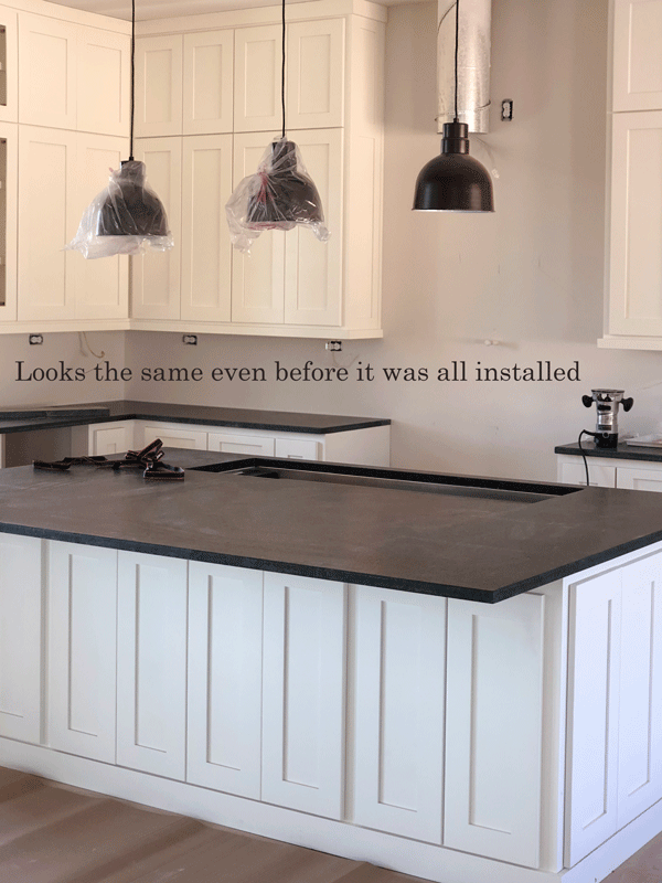
I could clearly see that the uppers did look cream while the lower cabinets looked off white. I considered whether the white of the backsplash, true white, could have been making the uppers look relatively more “cream.” But as soon as I saw this photo she also sent (below) showing the kitchen before the backsplash was installed, I could see the same discrepancy between the read of the cabinet colours.
I then sent her this note:
“Well, that is a fascinating colour dilemma. . . what’s on the other side of your kitchen? Can you send me a pic? And does it ALWAYS look more cream or only at certain times of the day or year. . . Your subway tile is a true white which doesn’t help but you also have a pic without the tile (above) and it still looks more cream, so that’s interesting.”
And then she sent me these additional photos. To the right of the kitchen is a window in the dining area and across from the kitchen island is their great room (below):
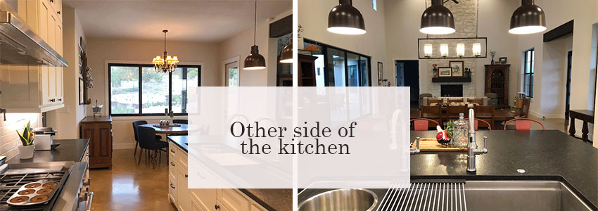
And then this note:
“Interestingly I had left all the lights on after dinner (not typical of me) and noticed when the sun went down the cabinets match. We have 15 hours of sunlight here in south TX and we’ve been in the house such a short time I hadn’t noticed that before. “
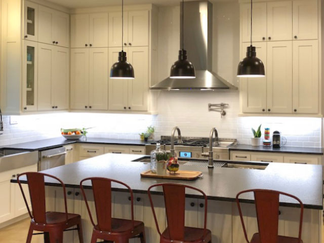
A good test to see if lighting, not your colour choice, is the problem, check this—if the light changes at one point, and then changes back at another point, it may well be a lighting issue.
Whites and creams reflect. That’s what white does. So they are most dramatically influenced by the temperature and quality of light. This is why, counterintuitively, a light colour won’t come to life in a dark room.
Whites don’t “add” light, they can only reflect the available light.
For this reason, whites and very light colours will also readily reflect back a green cast from your landscaping outside the window, which is a fairly common complaint. Tricia, my senior colour designer, wrote about how she helped soften the effect of a green reflection in her living room here. Whites can reflect a very warm orange- or red-toned wood floor, or any brightly coloured element the light bounces off of.
But I wouldn’t go repainting or tweaking the white of your cabinets in an attempt to “correct” the problem. It’s MUCH more important that the white you choose for your cabinets relates to the whites in other finishes, such as countertops or tile.
When working with whites, you probably need to accept some change in how they look, given that their main characteristic is high reflectance. Unless you design a lighting plan to use all day long, you are working with available light.
In the kitchen you see above, the quality of light hitting her uppers is clearly warmer than that on her island and lowers. There is really no way to control that.
The ONLY thing you can do is get decorating and create enough interest so you’re not looking at the difference anymore. Kudos to her, that’s just what she did, and she did a lovely job.
In the picture below, you can see a pretty room that’s been painted Sherwin Williams’ Alabaster. The room is flooded with natural light, which is the only way white walls come to life. In this room, Alabaster looks like you would expect—creamy off white. It’s lovely how it matches the cast stone fireplace mantel.
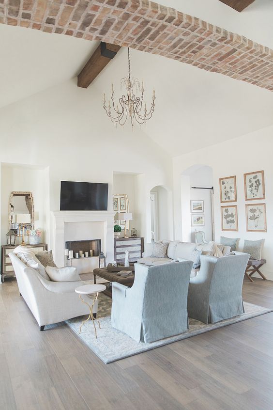

In this foyer (above) Alabaster looks lovely and crisp on the millwork in a light-filled foyer space.
Recently, I was in a clients home where her cabinets were painted off white and they looked perfect with her countertops and backsplash. They were just right in the natural daylight.
But as soon as we turned the warm, incandescent lights on, the bulbs turned the cabinets a creamy yellow.
That’s when you know you need to fix the lighting to get it right.
I have been told by kitchen designers that 4000 Kelvin is the best lighting for a kitchen. And if your whites are looking too yellow when you flick on the lights at night, trying a cooler bulb is probably a good idea.
This is s specific issue of the lighting casting yellow, and it’s a relatively easy fix.
Now I am not a lighting designer. I can’t pretend to be able to tell you how to optimize your kitchen lighting plan. I’d love it if any of you lighting designers out there would chime in in the comments and share any insight you may have about the best way to light a white kitchen.
But as I’ve said, MOST of the time getting the colour right to begin with is more important than the lighting. Then it will be right under a majority of conditions.
Most often, when we’re blaming the lighting as the reason the colour in a room doesn’t work, we’re asking the wrong question. The first question you ask is not, “How is the light affecting the colour?” The FIRST question to ask when trying to determine what isn’t working about a room is this:
DOES THE COLOUR RELATE TO WHAT’S ALREADY HAPPENING IN THE ROOM?
Because the real reason is usually that the colour doesn’t relate as well as it should. The neutral undertone might be wrong, the blue might be too clean to relate to the other elements in the room. The white may be too creamy or stark to relate to the hard finishes. And so on.
And if you’re working with whites, you can expect more issues with reflection and the quality of available light. But generally, I would not paint a kitchen any colour other than the right white, even when the light is uneven. And once you have the right white, I would get on with decorating and styling to bring the room to life.
Over to you my lovelies. Do you have a room where lighting changed the colour? I’d love to see it. Take photos (without flash and in good natural light) and send them here.
If you need help choosing the right colour, we can help with our eDesign packages here.
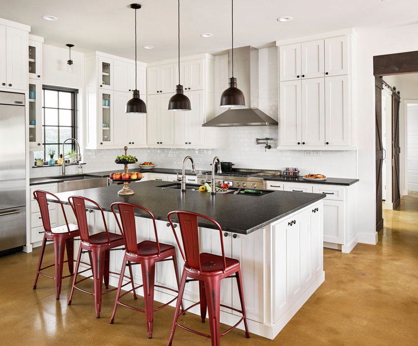
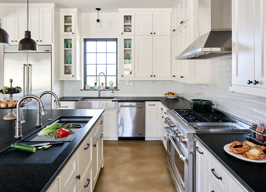
PS. My client from Texas sent these professional photos of her kitchen along with this note:
“Thanks for all you teach and share. My neighbor and longtime friend, Lori turned me on to your blog when I was building my house. She said all of the whites she chose were based on what you’ve shared. I believe you featured her French Texas Hill Country house in your blog a couple years back. She’s got quite the eye for this kind of stuff and she’s as equally baffled by my cabinets.”












Hi Maria! Love your blog!!! Curious as to the double faucets on the kitchen sink?
We are going to build a new house in FL and I’m collecting ideas… It will be our “last” house as we have now hit the 70’s. Looking for easy to clean and aging in place ideas – taller toilets, rounded edges, etc.
We have had white kitchen cabs in a few homes and I’m done with cleaning all the nooks and crannies – we both cook! Looking to do a light wood instead, flat faced for easy maintenance. I see all the drips and splatters, he doesn’t, It must be the testosterone…
Hi Gail… we have a 5 foot Galley Sink which required us to have 2 faucets. It’s definitly a conversation piece and gets a lot of use in our kitchen.
Looks to me like they have two separate sinks! I am guessing that is why there are two faucets.
Very nice.
I love white kitchen it looks a lot bigger than in dark colors.
Great, informative post, Maria. Could that golden floor be somehow reflecting on them too? Very pretty kitchen!
Interesting problem –the good news for me is because my kitchen doesn’t get a lot of light (one small window over the sink) I keep most of the lights on all day. So hopefully when I redo my kitchen-and paint my cabinets white, I won’t have this problem. 🙂
Gorgeous kitchen!!!! It is baffling as to why the doors under the island look different, but I think the only one who will notice is the owner – especially with those fun red chairs! If it really bugged her she could add a color to the island like your green, but it is so beautiful as is!!
Visited my sister in law this weekend and she was eager to show me her newly remodeled bathroom. She said she wanted to play it safe and stuck to shades of gray. Overall it’s fine, but the grey ceramic on the floor has green/beige undertones, the vanity has blue or violet, and the mirror is another shade. And the walls are a creamy off white. She is very happy with the results – sometimes it’s a blessing not to notice these things!
Here s a thought on the “cream uppers off white lowers” kitchen. It may be caused by the unfortunate interplay between the shiny floor and the daylight. In a typical room, upper portions of walls receive less daylight than lower / middle sections of walls. (This has to do with the size and position of windows vs. room height). In this kitchen, the plentiful natural light is reflected off the lowers, giving the off white impression, but further up, the strong yellows reflected off the floor accumulate, not being dissipated by the weaker daylight. I am curious what would happen if, as an experiment, the floor was covered by a non-reflective rug or just a piece of fabric. Also, by a strongly reflective surface of a non-yellow color. Would different colors and different reflectancy of the floor affect the uppers?
Love this post, love this kitchen! I know lighting isn’t the end all of color but it is something to address. We moved into a home where the lighting was terrible, all yellow CFLs and while the paint color wasn’t my favorite (Khaki Shade SW 7533 & Mediterranean SW 7617 for the most part), the bulbs were not doing it any favors. It has been a chore to replace all of the bulbs in the recessed lighting, fans, vanities, and other fixtures to color correct before even beginning to paint. I’m trying to neutral things out without going too blue with daylight bulbs or too warm with soft white. I’ve been at 3200k for the most part, but will look for the 4000k for the kitchen, thanks for the tip. I love this kitchen and can possibly see how the (creamy)white/black color combo could work to update my Tuscan tan tile kitchen floors-this kitchen does seem to have (dare I say) an “orange” (warm at the very least) feel to the floor in a much, much better/current lovely design.
Annie, I did exactly that….black (soapstone) countertops and light cream cabinets, backsplash and walls to work with my Saltillo floors…all with Maria’s inspiration. It’s lovely and timeless. I was lucky to find soapstone with a few gold veins…even a few copper spots…at a huge discount since everyone wants solid blacks and grays these days. The gold nailed the look with the Saltillo. A few wood touches warmed the space up. You’ll love it!
This blog was so informative! My plans are to paint my muslin colored cabinets white. My walls (in living room and dining room and hallway)are already Alabaster. My subway tile is the white and I have a dark brown with white specks for my counter top. I get my lighting from my living room and dining room (all open)facing the West. My decision is whether to use Alabaster for the cabinets or say swTrue White or another white. My sofas are a bright white that sits near by with white linen curtains. My home is fairly small but the openness and tall ceilings make it appear larger. I can’t wait to paint my cabinets but I want to choose the right white as it will be the last time I paint since I am 74 years old now. Thanks again for the insight and the pictures. The pictures help tremendously!
It may seem like a splurge, but I was SO glad I purchased Maria’s color boards. I also took her online course about choosing whites. Repainting is a pain as well as an expense, so I wanted to be armed before I made a decision. I do hide my boxes of boards under the bed, some things are just too hard to explain to spouses…..
Correction: my kitchen, living room and dining room face the East, not West with several windows in those rooms.
I was in this exact same situation with a client several years ago. We had just painted her kitchen cabinets off-white, and the upper cabinets had this gold tone to them, while the lower cabinets and island were off-white. We went around and around trying to figure out what it was. I hadn’t a clue. Then I started looking around the other side of the room, and noticed out of her sliding door, there was small guest house in her backyard and it was painted a gold beige (Tuscan home). So I took a large white foam board and asked her to hold it up. When she did that, suddenly all the icky gold beige immediately disappeared, and her upper cabinets were lovely off white again! The gold beige outdoor building was the culprit, and I told her it should immediately be painted another color! I learned that day just now much surrounding buildings, swimming pools, neighborhooring roofs and greenery can all influence what’s happening inside your space!
Thank you for sharing this!
That would bother me immensely. If this was My kitchen, I would paint the uppers a colour, leaving the lowers white. That way it would be a nice contrast and look intentional.
Wow, your reader’s new kitchen is absolutely beautiful! She did a great job. On the subject of lighting, it has certainly created a dilemma of sorts for me. As our older lightbulbs go, I am replacing them with LED lights. It was time to replace the recessed lighting in my kitchen, so I went to Home Depot to have a look. Choosing LED bulbs is kind of hard. There are three choices, super cool, cool and warm. I went with a warm bulb in my kitchen, as suggested by the lighting person at the store. It is closest to what I had before and works good for me. Then, the potlights in my adjacent family room needed to be replaced, so I went with the middle choice of cool. They were horrible!!! Way too cool, they made the room way too bright and florescent feeling. So I went back to the store and switched them out to the warm. I ended up putting the cooler bulbs in my upstairs hallway, but I absolutely hate them. They are so blue and bright! I guess the point I am trying to make is that even though there are three choices in LED bulbs, it takes some trial and error to figure out what works, and they still aren’t inexpensive.
You can return light bulbs!! I do it all the time if the color isn’t correct. The best LED price I have found to replace our 40+ recessed lights is on amazon. You have more color choices, 3200 is what I have used, but based on this I may try 4000k. You can get economy boxes to save at little, but it does add up. I couldn’t stand what we had and didn’t want to wait for them to burn out, they are in our basement waiting to be donated.
This natural light color contamination from the outside can really gum up the works for a room’s color plan.
I have found a solution that has worked for me.
Where possible hang very sheer white sheers to sit within the glass area of the window. They don’t have to very full and either poly or natural fiber is fine.
The white of the sheers acts like a theatre light gel and do a pretty decent job of cleaning up the ‘offending’ color. As a bonus, sheer sheer’s do a wonderful job of refracting the incoming light and spreading it within the space.
Best to you!
@Jo: Totally agree as have used sheers for the same purpose and found they can act as ‘a buffer’. If one feels they are too ‘granny’ in appearance, consider a roman shade rather than a pleated or rod pocket heading. -Brenda-
One thing about blue paint is that it fades over time. We had our bedroom painted what seemed a soft grayish blue, and at first it was rather bright. Over ten years it has faded to a really soft, amorphous color that is quite wonderful. I also had our basement stairwell painted a brighter blue than I should have chosen, probably in reaction to the brown it was before. It too has faded, in five years, to a softer, gentler blue. I like blue and dislike repainting, so it’s great that time has such a marvelous effect.
We have one of those rooms where the lighting changes the color. Our bonus room has windows on three sides, facing east, north, and south (but that window is blocked). A designer specified SW Paper Lantern, which actually looks like pale, soft yellow in the natural light of the room, and is fine. However, at night when the recessed lighting is turned on, the walls turn neon banana. YUCK!! I called the designer to come take a look, and she suggested leaving the overhead lights off and using lamplight instead. Ok, but not always practical. We figured out ourselves that the recessed bulbs needed to be whiter light, rather than yellow. Changing out those bulbs helped a lot, but didn’t totally solve the problem in the stair wells. It’s been seven years now, and perhaps time for a new paint color!! 🙂
I noticed you said that white walls come to life in a room with lots of natural light but won’t in a dark room. My house has 10 foot ceilings but both front windows and back windows are covered with tint (yuck) and we have covered porches in front and back. The walls are a yellow beige and I would like to lighten them but I realize white won’t work. Should I just leave them or try to lighten the house with a slightly lighter yellow beige (our tile is yellow beige)?
Hi Karin, I can’t give you accurate advice without photos, but I’d love to help, it probably doesn’t need to be more yellow being unless you like that colour, but I would need to see your house! You can purchase help for just one colour here:
https://mariakillam.com/product/interior-paint-colour-consultation/
Beautiful kitchen! I love SW Alabaster. The second set of photos looks much better. I have a feeling she won’t focus on the color issue after awhile. At least that was my experience with my big color mistake.
When we bought our house back in the ‘80’s, the previous owner had painted it gold with green trim. It had to go! I had trained as a color consultant (remember “Color Me Beautiful”?) so I had a basic understanding of undertones and I carefully chose a pretty taupe-tan without yellow undertones. I even painted samples on the house, not realizing I needed a white background to get it right. To my shock and dismay, the color had purple undertones and looked slightly lavender on the whole house. Purple is my favorite color, but not on a house! I cried, but I refused my kind husband’s offer to change it, as he knew I would. 🙂 Once we painted the trim and shutters the right white, it only looked lavender in certain light and I grew to like it.
Your posts are always so inspiring and thought provoking! This certainly is a good lesson on how light can affect the look of a room! I too wonder if she covered the floor with a soft blue or yellow undertone rug if it would change the paint color? Interesting subject!
Maria,
Was it you who mentioned putting a lamp in the dark corner of a kitchen? Or am I remembering that wrong? I’m trying to find a lamp for my dark corner and I don’t even know where to start.
Thanks!
West Elm sells a short one that you could install underneath a countertop. Yes lamps all the way, everywhere and anywhere, they always give more atmosphere to a room at night! Maria
Having just redone all the lighting in my house, I’ve found that the color of LED lights can indeed make a huge difference in the way colors look. 3000k is very warm, and easy on the eyes, and is more similar to an incandescent bulb. This is what it looks like she is using in her kitchen. “Daylight” lightbulbs are 5000k and are pretty stark and cool. I’m willing to bed that if she changed the bulbs in her kitchen to 5000k the problem would disappear. However, I find 5000k to be too harsh on the eyes, so 4000k might be a good compromise.
I forgot to add that if the problem was happening during the day with the light off, something else must be at play, like a reflection of some sort.
Yes, in this case it obviously has nothing to do with the kitchen lighting! Thanks for your comment! Maria
Just an observation – it’s very difficult to see your example pics because a filmy haze goes over them when the Pinterest logo pops up in the corner right when they are viewable on the screen. It doesn’t go away until the pic is almost entirely scrolled past, so there’s not a clear picture until just before or just after the screen. When you’re talking about undertones, it’s hard to see your point since the picture isn’t in focus.
That is interesting, yes it does do that. . . but as long as your curser is not on the photo, the Pin button won’t pop up! Thanks for pointing that out! Maria
Hi Maria, great post! I’m not specifically a lighting designer, but I do lighting plans for clients upon occasion and have blogged about this.
I cannot in my wildest dreams ever imagine using 4,000K in a kitchen (or elsewhere). It’s waaaaay too blue of a light, which distorts colours and is very harsh on the eyes and your brain!
Unless I have an elderly client (our lenses yellow with age), I would specify 3,000 Kelvin units for lighting, at the maximum.
Usually I specify 2,700K for pendants and recessed lights, and 3,000K for the under cabinet lighting (where colour is not so important, but good lighting is.) This creates beautiful soft lighting that enhances the room and our spirits.
I absolutely love your quote “Whites don’t “add” light, they can only reflect the available light.” Best decorating quote ever!!
Bravo!
I repainted my kitchen cabinets, choosing a whiter off white. It turned out nicely except 1corner looked art gallery white. So when I painted the upper cabinets, I added a little bit of a white with a strong yellow undertone and I was very satisfied. Also painted the cabinets around the fireplace the same white and it looks much warmer.
Hi Maria,
I can’t imagine how frustrating it would be to discover a color problem in a new forever home.
Knowing me, I’d try to ignore it. Unless it was so blatant that all the decorating in the world wouldn’t save it.
If I can learn to live with my hubby’s ugly recliner, I can adapt to slight color variations.
Your reader’s home is lovely.
Hello! I am moving to FL and trying to pick out a white paint color. Currently, the kitchen cabinets are a creamy/yellow. What undertones would you recommend to make them look less yellow?
A super dark colour on the walls is the only thing that will make your kitchen cabinets look less creamy/yellow. Or if you kept going with the same colour as the cabinets.
That’s it. Nothing else will magically change the colour of your cabinets.
Hope that helps,
Maria
Bought a home recently that has painted cupboards that have a pinkish hue to them pretty much all day (there are no uppers but will be adding a couple). There are two fairly large windows…one facing north and one west. The walls are painted white and there are black counter tops. The attached dining room has a very large window and it had been painted a deep dark navy. It was overbearingly dark and cannot imagine it during the winter months with so much darkness. Would like to change the counter tops to white but will the more light reflect more of the pink color (burnt embers)? Would like to get away from the pink into a different color base in the dining room but not sure that’s possible. What are your thoughts? Enjoy reading your posts and have learned so much!
Susan
I am having this same problem with blue undertone. We are remodeling and I just spent thousands to have my cabinets repainted. They are Sherwin Williams Extra White. They have a blueish cast to them. My countertops are a creamy white.
I planned that color thinking it would be a good choice not to have the cabinets and counters run all together, but they are not as different to one another, so it looks like a mistake rather than an intentional plan. I am trying to find the best backsplash to use that could tie together the counters and cabinets and downplay the blue tint. I don’t know what direction to go? My two kitchen windows are on the East and the adjacent family room is on the North, so I don’t get as much light in here. I have already changed my lighting to be warmer, but during the day I don’t keep the lights on. I also have shutters next to my cabinets that are going to need to be repainted because they are a dingy white from the orginal paint years ago. I am afraid to use the same white as the cabinets because I don’t want to multiply the problem, but if I use a different white I am afraid it could make the cabinets look bluer. Not sure the answer.
I have the same cabinets and you recommended painting the open concept area balboa mist but after painting a bit; it’s pulling really pink/purple. I’d love to know what colour they’ve used on the walls in this case. Beautiful.