This reader wants to install a wavy white accent tile in her bathroom. Is this a fad that she’ll regret in a few years? Here’s my colour expert advice for white accent tile.
I was on CTV Morning Live a couple of weeks ago! If you’d like to see my segment, watch it here.

I recently received a question from a reader that made me smile so I’m sharing it with you:
Dear Maria, After years of wanting a “cool” bathroom, I discovered your blog and binged on your articles. You convinced me.
I’m ditching glass tiles, skinny horizontal accents, and patterned tiles! I must pursue a timeless elegance.
But. . . how about these long wavy white/cream textured tiles? Are they also a fad that’s going away? Must I bid farewell to them as well?
Clueless AND sleepless in Los Angeles
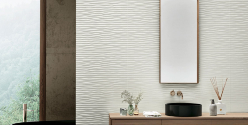
Should I install wavy white accent tile? Are they also a fad that’s going away?
Here was my response:
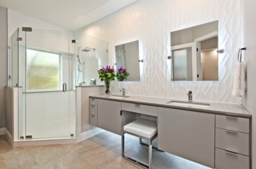
“Pretty much. Wavy white accent tiles belong in a super modern bathroom and frankly, I’ve never seen them installed where I think they look good except for in those inspiration images you included in your email (above and below).
So if your bathroom is identical to these images, then maybe it could work. It’s rare that an inspiration image translates to a beautiful bathroom in real life. Boring now = timeless later! Hope that helps!”
Read more: First Rule of Design; Boring Now Equals Timeless Later
All images above from Houzz
Notice even in this inspiration bathroom (above) the tile floor does not belong in this bathroom at all. And the only reason we are still looking at it is because the wavy tile is visually separated from it by the vanity.
Here’s the thing, wavy tile is a statement and a pattern ALL BY ITSELF. Even if it’s white.
It does not belong with any other pattern or tile except a very plain solid white or colour. The end. That’s why in all my 20 years of being in this industry, I’ve never walked into a bathroom with wavy, modern tile and thought, “This is perfect, I love it.”
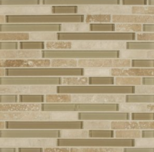
You’ve done it again! Thanks to your no-nonsense wisdom I can now bid adieu to those mod wavy glossy tiles!Indeed – I was just lamenting to a girlfriend – why is it that whenever I’m shown a real life remodel picture by a contractor, or even a friend – that I think “meh” and my heart sinks a bit? It’s NOTHING like the pictures on Houzz! It’s been a conundrum that had me scratching my head for the longest time. And now I discovered your blogs and read an article where you point out the importance of whole assembly (e.g. accessories) – I understand – that must be a large part of it, as well as matching undertones, having simple classy selection, all that.In other words, sadly I’d never have one of those breathtaking bathrooms – I’m not into decoration savvy enough to put the whole package together.Well. Not all is lost. That’s all the more reasons to opt for classic and timeless. I’m now even considering hex and subway tiles – two tiles I vowed NEVER – ha!Thank you for opening my eyes before I made an expensive and irreversible mistake. You know your post ‘One More Reason to Skip Accent Tiles Altogether’?That article along with THIS tile picture (below) was the game changer.How did you know I’ve been lusting after skinny, horizontal accent mosaic tiles forever? And that i was thinking beige-khaki-neutral? Ha! Yet when I saw the photo of this brown mosaic, i was like yawza! I can’t have this happen to me!! Seriously, a disaster narrowly avoided. I noticed the article was a decade old, yet still so relevant.
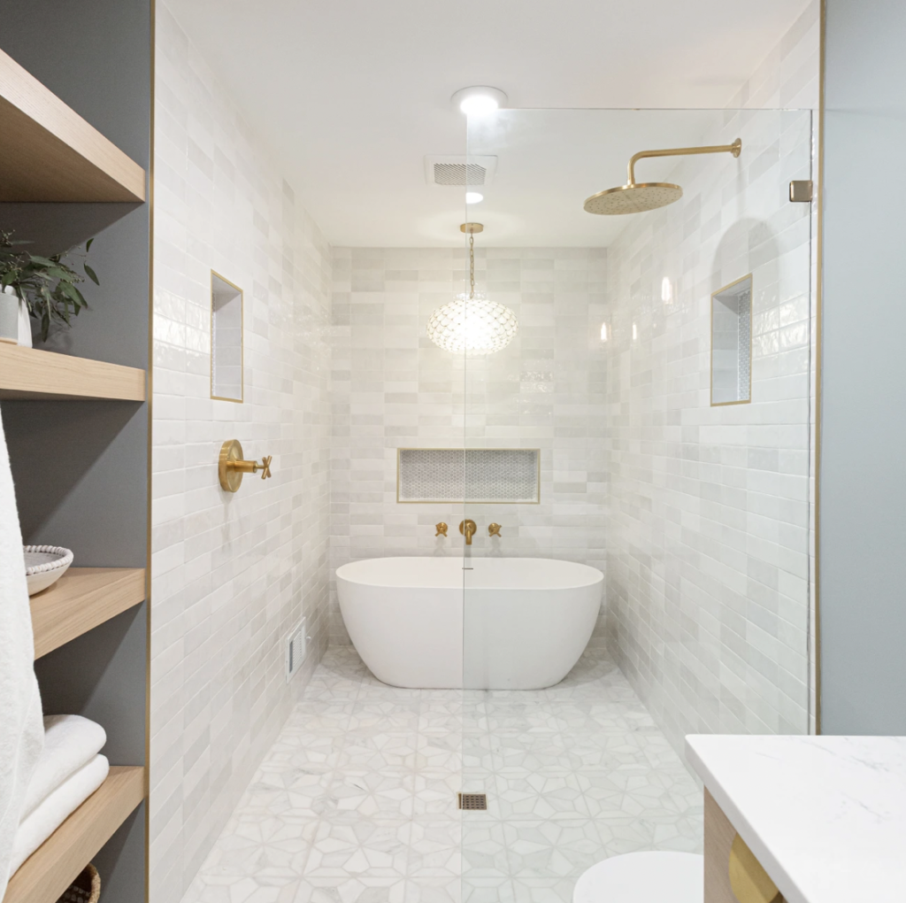
Now I’m thinking more along this line (below).
Link bait image (Please let me know if you have the source for this image
The challenge will be to find classy expensive looking marble-like tiles, as I have read that honed marble is high maintenance and expensive. Just discovered gold tinged Calcatta marble, love them more than carrara because of it’s warmth – alas they appear to be even more expensive. I dislike white subway tiles (always seemed cold and clinical) so it’s going to be a challenge!
Thank you again and please wish me luck.Sincerely,Still largely lost but with a bit more sleep in Los Angele
“Whoa, what an honor! I think your writing style is da bomb! Personable, relatable, unwavering and straight to the point. Very refreshing and your personal style shines through.
Glad to know I’m not the only interior design challenged soul. I don’t trust my judgement so I hired an e-designer (long before I discovered you) but I had to come to YOU to get straightened out, because I’m too easily swayed by every trend and the designer is too nice to be blunt.”
Never paid much attention to bathroom design before, but now that I’m finally doing it, I was all over the place.“Glass pencil mosaic tiles”? Awesome!“Morrocan Patterns?” So unique!“Minimalist beige?” High class!“Art Deco gold and black?” How opulent!“Shiny 3d wavy tiles?” Modern cool!The problem is – they won’t look magazine worthy in my modest 8’x9′ bathroom, in an 1947 original tract home by LAX!!You are so right. Thank you
At least once a year, I have to write a post about the perils of accent tile right? And this exchange was the perfect segue.
Enough said.
If you’d like help with your bathroom, take advantage of my Create a Classic Bathroom Package today. We currently have two packages in stock, if they are sold out, add your name to the list and you will be the first to be notified when they open up again.
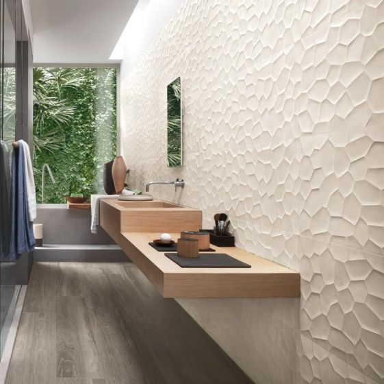
PS. I know what you’re still thinking. Maria, where’s the bathroom with wavy tile that you think works? Even in the above examples my reader sent, the first image doesn’t show the floor so that one doesn’t count. Okay, after an extensive search online, I found one and here it is:
The floor tile appears to be wood look tile in green grey tones but at least it does look like real wood. And the warm wood vanity warms up this grey and white bathroom nicely, in addition to the picture window at the end. This tile is not wavy, but it’s the same idea.
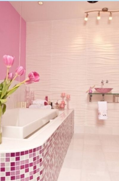
Okay found one more I like as the day progressed (below). I love the solid wall of pink tile and then the random checks in pink and white with the solid white floor.
Click on the link above and you’ll also see the rest of the images that do not work. Wavy beige tile with tiny hex tile floors?! The look should be clean and sharp if you’re going to use these wavy white accent tiles.
Related posts:
A 10 Year Review of Accent Tile; Should you Install the Current, Fad Tile?






So many of those cool tiles are also expensive, which is unfortunate. When I remodeled my bathroom, I spent the money on the huge shower basin (cast iron with porcelain), the custom cabinet and the quartz countertop. The surround is Kohler lux stone, which is not cheap, but it’s plain. However, it’s across from the vanity, so it doesn’t steal the show from my fabulous, expensive vanity and mirror (which I framed myself!). You don’t get whiplash looking at this and that and the other thing….the focus is the gorgeous cabinet/countertop and mirror. Dramatic choices, like from some of the photos, belong in hotels, where they remodel more often because they get less careful use, and being stylish/trendy is appropriate for a hotel. But for your home, just exercise restraint and then hang lovely pictures or objects that make it personal. I hung my son’s baby handprint and footprint in 3″ frames on one side of my vanity, for example! And above that is an antique straw beach hat.
LVP…Luxury Vinyl Plank…glad I looked that up bec it might be what I need, if I finally spruce of my neglected baths.
Bathrooms are hazardous, no matter your age. Recently, my son’s young colleague slipped in the tub and broke her neck.
Horrible story, I realize, but slipperiness should always be considered!
I had decision fatigue when I remodeled our bathrooms (amid a TOTAL redo). I stuck with classic, per Maria’s advice and although I wish I had gone with a slightly cooler vanity, overall Stacy’s comments and Maria’s advice to jazz it up with decorating will be the solution. The essentials are classic and I will be able to update as trends change. I liken it to owning a great black dress that you can wear year after year with different jewelry, shoes, bag and other accessories and still look fabulous. One thing I would like to throw in for those who are remodeling for senior citizens. Consider a high quality LVP for the bathroom. The bathroom is the most frequent site of falls – a ceramic tile floor becomes a very slippery surface when wet and makes for an extremely hard landing. Since the goal of my renovation in my home was to make it a forever home, we opted for very good looking LVP. I really like how it looks, and I know it will be a safer space as we age. This advice will only pertain to a small group of readers, but it’s something to consider.
LVP- Can you recommend some brands that really look great? Thanks
The brand I used was Coretec – I used their highest quality. I was reluctant to look at it – I thought it would look cheap – but I knew based on my experience with aging loved ones that ceramic floors are treacherous. My carpenter convinced me to take a look and I was convinced. So much so, that I changed my mind about hardwood floors and went with a different style throughout my home. I absolutely love my “hardwood” floors in the house. And I was a dyed in the wool lover of real hardwood. Not for everyone, but if you are thinking of aging in place it’s the way to go. Not as slippery and a much better landing if you happen to trip.
I put vinyl plank flooring into a rental townhouse I owned (after the previous tenants burned 27 holes in the carpet). It looked fabulous. But it was incredibly slippery when you had socks on. It wasn’t where it got wet, so I don’t know about that. But be careful with your choices.
What about “handmade” look tiles in white/off white/cream? It kind of looks like that is what is used in the pretty image above, so I am thinking these are OK.
I saw wavy tile used in a bathroom renovation on a home for sale on Zillow recently. I cringed because I’m sure the reno wasn’t cheap, yet the tile was so inconsistent with the rest of the house and looked out of place. The new buyer will eventually have to replace it. A waste of money.
As an alternate opinion, I’m putting these in my house which IS a going to be a modern/transitional house. And in my case I am an artist (used to be a ceramic artist), and textures like that are my heart and soul. I have loved them since I first saw them almost 10 years ago and before they were trendy. I also really dislike marble and I disagree that it is classic and will never date. (Remember how popular it was in the 70’s, and then later we all thought it was awful?) Now it’s all carrera marble, which I personally am sick to death of seeing, and I think in 10 years everyone will be thinking it is dated because it got overdone. But here’s where I totally agree with Maria. I personally think the most important thing is simplicity. No border tiles, no inset niche tiles, no mosaic backsplash tiles. That’s what I see done wrong in all the Houzz photos that I think are terrible. Too many ideas in one space, too many different tiles which often don’t even match in undertone.
Does anyone on this thread have an opinion of using 12×12 floor tile in a small bathroom that will have larger white subway tiles on the walls and a white vanity? I was planning on 2 inch white hex floor tiles but now am concerned it will be too clinical looking. so now I am thinking about larger tiles with a subtle warm grey pattern. Thoughts welcome. I am in a quandry.
Stick with the white 2” hex tiles. The 12×12 with a warm grey pattern will likely have an undertone which may limit your paint color choices considerably. Go have a look at Maria’s fabulous master en suite reno. She used white 2” hex tiles!
Maria,
Are the white subway tiles with slight waves, a different topic? Would those be considered modern wavy, or still classic because of the subway and subtlety?
Thank you for all your knowledge, we are constantly learning and growing because of your generosity!
~Netty
I think the 12×12 tile will make the room look dated. You could use a marble look hex instead of a solid, but keep the undertone in mind. Will it coordinate with the rest of your bathroom and what’s going on in your house? A larger hex may look beautiful too and there are some that are textured without being colorful. I’ve had small solid white hex floors before and found them to be a cleaning nightmare.
Go with the hex! It will be great!
I fly Alaska Airlines a lot, and have an Alaska Lounge membership, The women’s bathrooms at SeaTac in the two new Alaska Lounges (N and C Gates) have the wavy white tile on the walls , with lights behind the mirrors, and it all looks fabulous. I even took pics I was so imporessed– The bathroom design of white, golden brown wood and black, works perfectly with the rest of the Lounge. — The huge new Lounge at N gate is great.
This is the trickiest thing of all time because new designs look unique and fresh…until they don’t! I always have to rein myself in too.
On a Otho it totally unimportant note…I don’t correct English often because I’m the worst…but I made this error the other day too😅
I believe the word is segue…not segway.
Karma…Auto correct just got me too!😂
That should read “on another note” not “ortho”…sheesh.
Hey – thanks LA for asking the question we all have….. and better still, thanks Maria for your reply. We too want the WOW and the hubby loves the texture shower wall and black floor. After a covid long reading of your blogs, the texture tile choice has gone away with the only solid argument I could make- can’t clean/ wipe down texture wall to stay ahead of hard water marks! Can you please address the designer bookmark panels?? If done in white and creams with subtle veining, is that trendy or timeless??
So many different interesting perspectives and stories here makes me want to chime in with one of my own. My house in suburban Philadelphia is a standard 1950’s of the area – not a classic – but not quite modern except for the ranch layout. It was built well, with one pink and one blue tiled bathroom. This must have been before matching fixtures were a thing as they were all white, even the tub. The tiles were set into the plaster walls, and were curved around the entire bathroom including shower surrounds, doors and and the 2/3rds of the walls. But the COLOR! Not having the budget to reno both bathrooms down to the studs, I found a “temporary” solution and had the walls and the shower stall and tub stall “refinished” in white. Then I had the pink and blue floors retiled with marble hex. I figured that would last me for a few years. Over the years, I ‘ve changed the wall colors, the sinks, and one toilet (the other is in perfect condition and has the old fashioned “Standard” brand label on it. and installed a new clear glass shower door. I’ve kept the original Hot and Cold chrome faucets in the shower and tub and they still are as shiny as new. Life went on and it’s 20 years later – no chips, no scratches, no bubbles on the tile finish and I see no need to change the now white 4×4 tiles to white subway. The size of the tile fits the era of the house, even though the color white might not, and everyone comments on how beautiful it is (because of the way the tile is set into and surrounds the whole bathroom). It has stayed shiny since it was refinished and since the grouting was also covered, no need to scrub. All this to say that Maria is right (in case you doubted it ). If I were to do a new bathroom, I would keep the hard surfaces and fixtures simple and classic, but also relevant to the time period of the home. I wouldn’t necessarily use subway tile unless the house was built prior to 1940’s, but I would keep it simple and neutral. And although I like the zellige, I think it will be like the Tuscan trend in the future and date any renos done at this time. I also agree with Cindi that if you are building a very personalized modern home, you can go with something that is a “timeless” love for you (in her case, ceramic) as long as you keep it simple and appropriate to the house, which is always good design,
Dona, I love your story, very heartening. Do you by any chance know what process you used to refinish?
I have heard that one can only count on a refinish lasting for 2 years, but maybe that is just the bathtub, not tiles on the wall?
Thank you, Winni. We used a local francise of Perma-Ceram. I’ve had great luck with the product. No scratches or chips or peeling on the walls, tub, or shower surround and we only use a gentle cleaner. The finish has remained glossy and there is no need to scrub as the grout lines were sealed during the process as well. I guess this could be downside if you would like contrasting grout, but I’m fine with white on white. Good luck!
Well I personally love some of the wavy tile. We’ve used them in a few of our bathroom reno’s , on the shower walls, with penny round on the shower floor. The homes styles I would describe as Transitional. However we chose tiles from Floor and Decor and Lowe’s, which have a slightly more subtle texture. They looked gorgeous and we got a lot of positive comments on the bathrooms. They are easy to keep clean. We did not put them on the walls however, although it would have looked great above the vanity. Our vanities were not super expensive custom pieces so the tile would not compete. If you really love them keep everything else simple but elegant. And know yourself – some people need everything very calm, but others love the excitement of textures. The Lowe’s tile has a matte finish and we’ve used it as a backsplash in a sleek modern kitchen. It added subtle depth to the shiny finishes.
Perfect timing on this article. We are planning to put the white wavy tiles from Floor &Decor in our hall bath at our lake house. It will surround the tub/shower which will be hidden by a shower curtain so it will be a surprise when you slide the curtain open. The floor has small marble grey and white hex tiles. We thought since it’s a lake house the waves would be fun! The floor is already done. The shower tile is purchased, but not installed yet. This is a vacation home which receives only seasonal use. I considered subway tile, but I wanted something a little more fun and it’s still white. Am I making a mistake?
You could get away with it if your entire lakehouse looks like this: http://cdn.home-designing.com/wp-content/uploads/2015/02/vacation-house-interior-design.jpg
Otherwise it is “new tile” in “old lakehouse”.
HUGE mistake. Can you really live with that or are you going to be in the mood to rip it all out and replace it when you’re tired of being “seasick” in 5 years. Also, nobody is going to get the “fun lake house” joke.
I want to know if the reader managed to find classy-looking marble-look porcelain tiles, and if so, what they are! Because the more I look, the more my eye gets trained to the variation of real marble — but I’m OCD and really can’t handle the upkeep of marble, regardless of cost. Where is all the high-end faux marble? I would be happy to pay real-marble prices to get the look without the maintenance!
Take a look at Virginia Tile. They carry a line called Terra Bella. We just purchased and installed what I think is faux marble, although the showroom designer talked it up as if it was real marble. What do we know?.. The tile installer actually laughed at how much we paid for faux marble, it was not cheap. Oh well, I think it still looks stunning 🙂
Did you look at Bedrosians? https://www.bedrosians.com/en/product/list/?criteria=Magnifica
Or these from Bedrosians: https://www.bedrosians.com/en/product/list/porcelain/marble-look/?sort=best_seller&pageSize=60
Read your blog with great interest and you were the person who convinced me to paint my kitchen cupboards (in Melbourne Australia) many years ago.
However I just wanted to say that we used large white wavy tiles on our last bathroom renovation about five years ago and I love them! The room is very simple – grey floor tiles, white glossy vanity and walk in glass screen shower enclosure. We never use shower curtains here. I wish I could send a picture as people always comment on how attractive the room is. The tiles are easy to clean too. Maybe they will date one day but compared to what we had before which was in keeping with the Federation style house I wouldn’t swap them in a million years!
Great Morning Live Maria! So agree with your aesthetic about tile! Always good to read more about it!
Source of photo: Bedrosian Tile and Stone, Gallery Pic
Maria – this is a comment about the picture above with the tub and shower head in the same area, enclosed with glass doors. Do you think this is a look that will be around for a long time? Prior to the pandemic, we had an estimate done for the hall bath, and the contractor’s office came up with a similar design and called it a wet area. It took up about 6 feet in length of the bathroom, but I’m not sure I really liked it, as opposed to a tub/shower combo built into an alcove. Am I being too old fashioned? When you would use the shower, the tub would get wet as well, and then you would have more to clean. Plus, I think about squeezing in along the sides and back of the tub to clean the floor – yikes! I’m not as young as I used to be! Post pandemic, we will be considering the bathroom remodel again.
What do you think of this design, and I would be interested in what some of your blog follower’s would think as well.
We stayed in the Eliza Jane hotel in New Orleans that had the attached bathroom with that type of layout. Such a beautiful bathroom; those windows! But we realized that it wasn’t a shower we would want to use every day. And this bathroom had tons of room to clean around the tub.
https://cdn.vox-cdn.com/thumbor/TsSOeQ1e8hqnUFyQde0HfZ1eWtA=/0x0:7655×5171/1520×0/filters:focal(0x0:7655×5171):format(webp):no_upscale()/cdn.vox-cdn.com/uploads/chorus_asset/file/12787017/The_Eliza_Jane_Publishers_Editors_Bathroom.jpg
I’ve seen the wavy white wall tile on the Modern Homes Tour here in Atlanta. My first thought was “dust!” With all the dust and pollen that filters in here, we might as well live on gravel roads in the country. On steamy bathroom walls, that will soon be mud. You’d need to be devoted to spending time cleaning or have a good maid service (and often!) to rock this look.
Thanks for sharing, this is mind blowing.
AAAAAAAAAARGH! (Runs away screaming) MY EYES! MY EYES!
Clicking that last link in the article needs to come with a warning of some kind. OMG.