Ever wonder if shutters are right for your house? I’m answering a reader question and sharing my thoughts about whether her house needs shutters and showing you photos with and without shutters, so you can be the judge too.

I am looking for a new colour to update the 2nd story siding color to present a cohesive fresher look for resale on this house with aged cedar shake roof.
Currently the siding is BM Bleeker Beige (green beige undertone) and the garage door is (unfortunately) pink beige. Other houses in town with Lannon stone use taupe for trim and small sections of siding, but those houses do not have siding running the full 2nd floor. I want to avoid the two stories looking obviously different in color, yet still move the house forward.”
Question 1: Is a yellow beige or a taupe undertone better for the siding and garage?
Question 2: How deep in color should I go for the exterior color to match the stone?
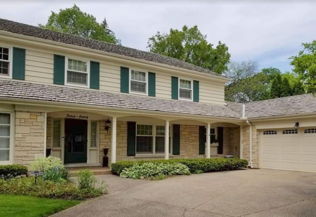
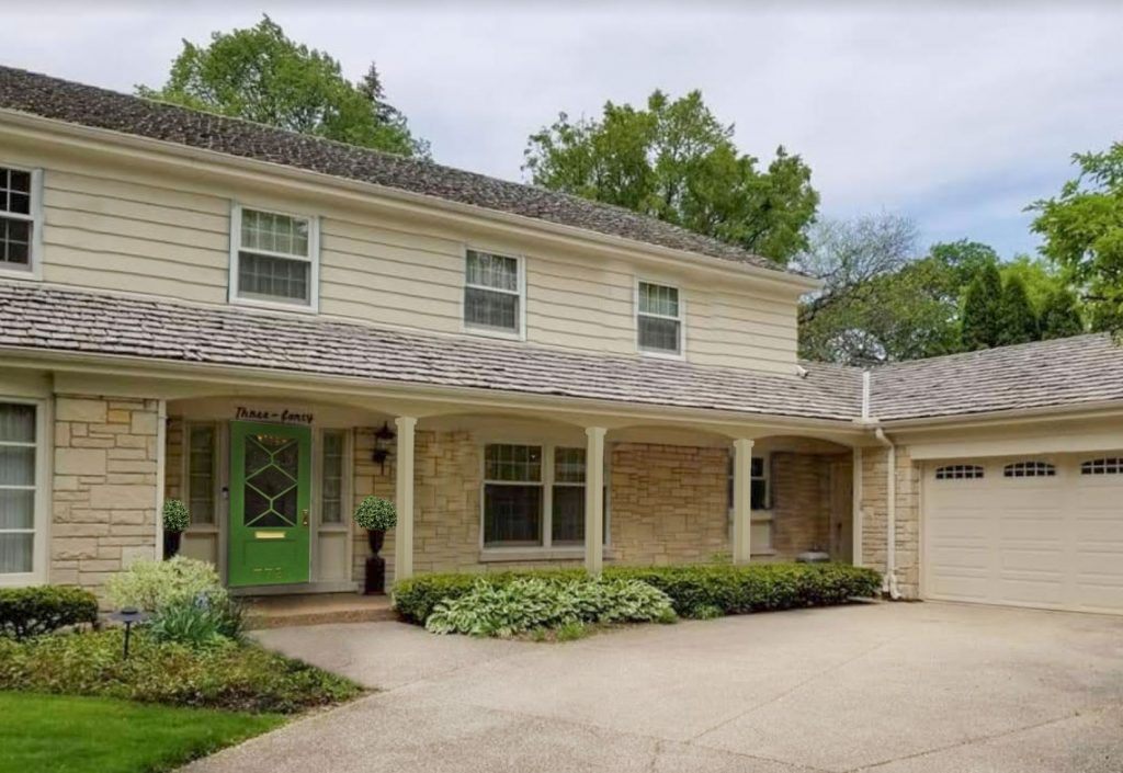
Before
What colour should my house be?
So the answer to question one is that Bleeker Beige, a green beige, is perfect! Just paint your garage door to match.
Sometimes we don’t see the right answer because we are not asking the right question.
Beige isn’t trendy (yet), so you might be craving something that looks more ‘of the moment’. But it is always better to make the best of the bossy element. And the creamy beige does an exceedingly good job of tying the upper and lower stories of your house together to create a coherent look. If you were to go any lighter (say a lighter green beige like Manchester Tan) or with a darker taupe (like Kingsport Gray HC-86 for example), it would look disjointed.
The answer to question two then, is that any colour that is darker or lighter than the stone is not going to give you a coherent look like the existing colour does.
Does my house need shutters?
So what can be done? I would tweak the shutters.
It takes some practice and experience to know what to consider. In this case, the issue is not the paint colour at all.
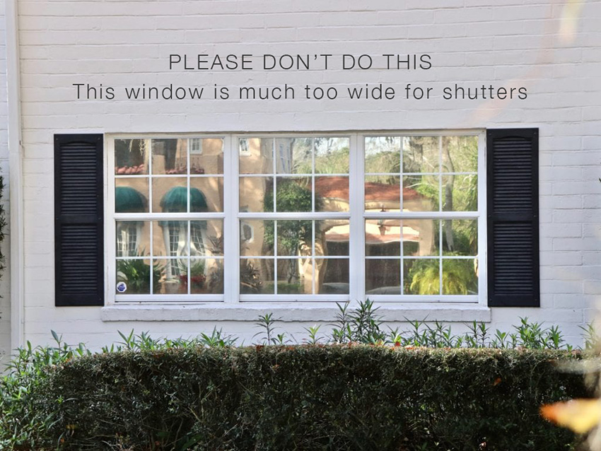
First, I would definitely remove the shutters on the ground level. They are distracting, heavy and not symmetrical or balanced. And the one window is too wide for shutters.
A good rule of thumb if you are considering adding (or trying to decide whether to keep) shutters: if your windows are wider than they are tall, they won’t look good with shutters.
Why?
Because shutters should look like they could actually close over the windows. They are much less successful, and often an eyesore, when they look like skinny parentheses on the sides of a wider window.
And I would tweak the colour of the shutters too. While forest greens are currently trending, in the context of creamy beiges, they will still look dated.
Because every trend that comes back is always used in a new way. Forest green looks new and now in the company of black, white and greige.
So I would paint the shutters a deep taupe like Benjamin Moore Dragon’s Breath 1547. The neutral tone-on-tone look is more sophisticated and connected to your pretty roof.
Here is what that looks like below with taupe shutters and the lower level shutters removed:
Taupe shutters, lower level shutters removed.
Isn’t that so much better? And the porch looks much fresher and more inviting.
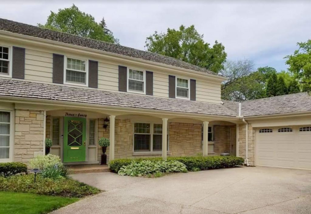
I added a bright green door to connect to the landscape.
Here is a hot tip for front door colour: when your entrance is in the shadows under a portico or porch, a dark or muted door colour will die. Use a brighter pop of colour than you think you want for the best effect.
In the end, the fretwork on the new door is too much because of all the french country mullions on the windows, I would go with a simpler square grid to match your windows instead. However, the door itself is pretty so I left it photoshopped on the house.
Back to the shutters that are not perfect yet because they look flat. Like graphic, painted on stripes rather than substantial shutters.
So what if they were removed altogether? Often, removing shutters creates an updated look and is worth considering.
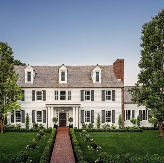
Look at this updated colonial house below. Without shutters it looks fresh and updated and in line with the simplicity of the white farmhouse trend.
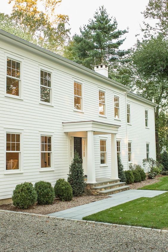
Via Zsa Zsa Bellagio Designed by R C Keaser & Co. and Nancy Thiel
However, I also think that if you wanted to change the look of this house (above) in time, you could certainly add shutters back for a more traditional look again. It would still be pretty and timeless like this house below.
In other words, I don’t think that removing the shutters is always an update, if you have the right kind of windows, it’s more of a style option.
Here is how my reader’s house would look with the shutters removed.
My conclusion? I think this house has a more charming traditional look with the creamy palette and stone. Plus, the windows above are perfectly proportioned for shutters. So I prefer it with shutters on the upper level only.
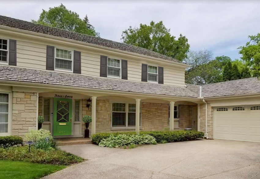
Here’s the before again:
Before
And here it is with photoshopped dark taupe shutters.
I want you to notice what is not perfect yet. The problem is very subtle, but see if you can spot it (I already hinted at it earlier).
So here, in my opinion, is the ultimate solution for this house, and again, it’s not a colour (see below).
After
Can you spot the difference?
We changed out the shutter style to a raised panel shutter that is more sculptural. In other words they look thicker and no longer simply painted on. And they are slightly slimmer. This is the detail that I think would make this house look just right.
Well my lovelies? Which do you like best on this house? Shutters or no shutters?
You can find more on shutters including ideas for getting the colour just right, and when they work and when they don’t in my all NEW Exterior Masterclass. Watch the first module free. The $200 discount has been extended until this Monday, March 13, 2020.
Here’s a review I received this morning: I learned a great deal. You spoke to many things I would never have considered and presented your ideas in a clear, concise format. Loved the quick pace, because I didn’t feel like any part of the presentation was a waste of time, and if I wanted more time to absorb something, I was able to pause and repeat.
For any of you who have already purchased the Masterclass, you will be receiving 3 new modules including the Porch, Deck, Fencing and Paving module which is available NOW (below). I just finished taping it this week!
Just a reminder, this is how to access your account:
- Go to: MariaKillam.com/my-account
- Enter Your Username and Password
- Forgot your password? Simply follow the “Lost your password?” prompts on the page to reset it.
If you would like my help with whether shutters are right for your house, and what colour they should be, you can use our eDesign consultation for shutters here.
If you have a question for my Ask Maria column email me (with photos) here.
Related Posts
Exterior Accents Change Everything: Before and After
A New Build Conversation about Exterior Stone: (It’s All in the Undertones)
White and Cream; The New Trend Taking Over Your Neighbourhood


I really like the changes to the shutters…removing the ones on the first story and changing the color to brown and the style of the ones on the second story. It all looks much more cohesive and inviting than it did before, Maria. But there is something about the green chosen for the front door that doesn’t work for me personally. Maybe it takes me back to a green I didn’t like in my crayon box. 🙂 I’m not sure If I’d prefer a different green like the grass color or whether I want to move away from green entirely. What other type of green or a different color entirely would be another option, Maria? And would changing the color of the planter pots on either side of the door to coordinate with another door color make it work better? I’m drawn to a rustic red or an aubergine…but don’t ask me to explain why, except that they would work with the stone and house paint. And I like those colors better than green. 😀
I so agree! And it seems like it’s mixing dirty colors with clean colors, I thought that was a no-no.
HATE the green door…otherwise good update!
Hi Maria
YES Keep the upper shutters.
What an amazing update! I loved all your ideas!
Please keep ’em coming!
Cheers
denise
The stone reads orange beige to me. Would a more orange beige color work?
I so enjoyed this redo with your before and after photos. Subtle changes can make all the difference! I’m here in Charleston where we need shutters and use them at least once a year at least during hurricane season. In the historic district, the uppers are always louvered while the lowers are paneled. As a result of the predominance of “useful” window shutters, I’m really disturbed by those which look like they won’t actually work.
Thank you,
Allyson
Same thoughts here on the door. Love all the other suggestions, but the ‘clean’ green doesn’t feel right to me with the other ‘earthy’ colors. I’m curious, too, about other color choices. Or perhaps a wood door with lots of glass and a light-colored wreath or swag coordinated with light-colored flowers flanking the door?
Another subtle thing is the white trim around the 2nd floor windows. That is distracting to me. Shouldn’t that trim be painted the same as the body color?
Love the green door and the other changes you made 🙂
Boom, paneled shutters, narrower. Perfect.
Another boom, free, are those pots/plinths at the front door. Front door zone is small/tight. Planters making it smaller.
Pull the pots/plinths forward, off the front porch, into the garden. Left/right of front door. Right of front door, just to right of post, about 1.5′ out. Left of front door, just to left of ‘post’, same distance out.
Spending a little money, another change, making the entire front porch bigger, usable, creating flow. Taking away the ‘prison’ effect of existing plantings at the front porch. Remove plantings, to right of front door. Lay stone, matching house. Use existing planters somewhere else. Instead, use 3 large Versailles planters, in Weathered Bronze, 2 to right of door on stone, 1 to left of door, in the garden.
In those Versailles planters? Single huge, rounded boxwood in each.
On the porch, add, too right of double hung windows, a reproduction vintage wood ‘bench’, stained same color as your new shutters. Site copper watering can and trug on bench, Felco pruners in trug.
Finally, spending a little more money, replace existing square columns with round columns. Too many squares and right angles on this house. Round, boom. Contrast. Same reasoning for shape of rounded boxwoods.
Adore the cedar shake roof. Had one growing up. Time passed, Mom/Dad began using asphalt shingles. Awful.
Garden & Be Well, XOTara
Vintage Wood Bench, below.
https://www.google.com/search?q=wood+bench&source=lnms&tbm=isch&sa=X&ved=2ahUKEwjRvLagg97oAhVZCM0KHcpyCSEQ_AUoAnoECA0QBA&biw=1536&bih=754#imgrc=xaEVC1iNakjjbM
Trug, below.
https://www.google.com/search?q=trug&source=lnms&tbm=isch&sa=X&ved=2ahUKEwjG76TJgt7oAhVILs0KHcF8B6wQ_AUoAnoECBMQBA&biw=1536&bih=754#imgrc=uMGVzyGrslO_9M
Versailles Planter, below.
https://www.google.com/search?q=versailles+planters&source=lnms&tbm=isch&sa=X&ved=2ahUKEwiejenl_t3oAhWMZM0KHbM5A2kQ_AUoAnoECAwQBA&biw=1536&bih=754&dpr=2.5#imgrc=sP-j9tqqEEHY4M
Felco prunners, below.
https://www.google.com/search?q=felco+pruners&source=lnms&tbm=isch&sa=X&ved=2ahUKEwiiyOP-g97oAhXHKs0KHRjWAxIQ_AUoAnoECA4QBA&biw=1536&bih=754&dpr=2.5#imgrc=6bX1DUMoURcPhM
Hi Tara, your ears must be burning because I mentioned you at the beginning of my latest masterclass 🙂 Thanks for your thoughtful comment! Maria
Removing the shutters made all the difference in the world in my opinion. Also not sure if I like the green door. Maybe a yellow? Anyway you always come up with an excellent “cure” for any remedy. Look forward to the next writing.
Love these “Ask Maria” posts!! Very informative and helps me think through not only the color but also the the design! Thanks Maria, these posts are is a ray of sunshine in this difficult time!!
Spot on as usual Maria!!
LOVE the very last after photo! Such an overall improvement. The bright, clean green door is jarring to my eye. Could you perhaps do a follow-up post on what other door colors would work here? I was thinking a medium brown wood door with lots of glass. That would still relate to the cedar shake roof.
Love the raised panel shutters on top floor only .
Beautiful with Green Door
What an improvement and so simple to execute! We recently added shutters to our white farmhouse style home. We have white vinyl windows, and black shutters gave it more detail and a more traditional look. I made sure to follow all the correct size/placement rules and also added functional hardware and shutterdogs to make them look authentic and not just “stuck” to the house. It made a huge difference in how they look!
I loved Tara’s suggestions to take this house’s curb appeal even further, but I also think large hanging pots inside each arch could be so pretty!
My thanks to those who identified the reason I didn’t like the green door when I commented at 5:00 a.m. and was too sleepy to put it into words :-)…the color is too clean.
Absolutely love these posts and reading your followers comments. In this time of boring shut ins your posts are the highlite of my day!
As for me I rather like the look of NO shutters. It is a cleaner look and more cohesive . I definitely would like to see a darker front door because the fresh green gives me a sense of clean/dirty relationship. Tara’s suggestions sound intriguing and
would like to see them implemented.
I like my old brain to keep working so this kind of a post is fun! Thanks Maria.
I love your suggestions, Maria! The house looks so much better. I, too, would like to see suggestions for other colors that might be used for the front door, as that particular green doesn’t feel “just right” to me. I also like Tara’s suggestions. How kind of her to share her expertise! Also, I just wanted to say, how much I LOVE these “Ask Maria” posts. Please keep them coming! I appreciate how you explain things so clearly.
Let’s assume on some houses that siding is vinyl and one wants to remove not replace shutters.. There seems like there will be a couple of issues…holes in siding where shutters were attached and likely that the siding will have faded and it will be noticeable once existing shutters are removed. Also, I would think there will be holes in brick/stone as well. It seems like removing shutters works better on wood siding that could be patched then painted.
Yehaw! I feel like I “got it right”!!! I prefer your final look: shutters above, none below, color… It’s a winner in my book! 😁
Thank you so much for this post. I prefer the image with the shutters removed. The stone and shake roof merit attention and, to my eye, the absence of shutters allows for that. I like the more involved suggestions in the comments, but a simple and easy one would be to add a plant with a little height past the third post, counting from the left end.
Definitely like the shutters on top with none below. Could also keep the existing shutters and install them with hinges and holdbacks to eliminate the flat and painted on look. Agree with you about the style of the front door and the idea of a pop of a strong pop of color there, just maybe a slightly different shade?
Hi Maria,
What I love the most about shutters is the style, eras and places they transport us to.. They remind me of sunny cities near the sea 🏝 and give the house warm vintage look .. HaHa, this is really funny photo of parentheses shutters 😅 I agree that the house has too many different structures and colors that require the shutters within the same palette .. I adore the cool and pretty fresh green door .. 👌🤩
I love the change in shutter style and colour and the removal of the lower ones. Such credible advice!
This is a very informative article!!
I have this same style home! Cedar shake siding, lannon stone, shutters and front porch columns. First of all, what style home is this? Would it fall into some sort of modern colonial? I can’t tell. Second, is it always bad to have the cedar shake siding stained a different color than the lannon stone?
I love reading all of your blogs with such great insight and information. Can I ask how you would handle a brick ranch with the windows/ shutters inset? If I remove them, there will be empty spaces on either side of all the front windows. 3 triple bedroom windows and 1 giant living room window. Also below the bedroom windows there is white paneling…would you just do a decorative panel on each side of the window? I would love to share a photo. Can I upload it here in the comments?
What if you have 2 windows that are wider than they are tall and the rest are all perfect for shutters? What do you do in that case? Shutters or no shutters? I have a raised ranch house and the largest window in the front of my home is 57″ Wide by 69″ long and is divided into 3 panes. I have a double hung in the back of my house that is also wider than it is long.
Regarding door colors, if you have white window trim, do you paint the trim white on your door or paint it all the same color and not do the trim white? Saw that when I googled the paint color Urbane Bronze and of course, it was Joanna Gains’ work. I liked it and never thought of doing that before. Wondering if I should draw that much attention on my front door as I have a front door with an oval shape window in the center on one long vertical rectangle fixed side panel as we had to replace the door and my husband went to the store and picked it out. Now, reading your blog I’m noticing all our mistakes! I’m not replacing that door anytime soon so how do you make it less noticeable with paint choices and trim colors? So I guess my question is what do you do with a mismatched door?
I bought your White Is Complicated ebook last weekend and it’s right up there with the best $27 I’ve ever spent! THANK YOU for sharing your talent with the rest of us!
-Holly
Holly