If you’ve been following me for any length of time, you know I’m not afraid to call out a trend when it needs a caution sign.
But first 🇨🇦 HAPPY CANADA DAY!! 🇨🇦 to all my Canadian friends!
Dramatic Calacatta Viola Marble
I’m talking about the highly trending calacatta viola marble of course. It’s decadent and exciting and all over our feeds. But just like any dramatic “look at me!” finish, it’s tricky to incorporate and balance with other finishes and decor.
But if you love it, who better to get the low down on how to make it work than me!
Here’s why I would proceed with caution. And if you absolutely love it, I got you!
Because I want you to have a home you love forever. Far beyond any fleeting crush 💛
Working with a dramatic “look at me” countertop
Working with a visually demanding material like this high contrast marble is nowhere near as effortless as those perfectly styled photos would have you believe.
So let’s get into my 5 (cautious) guidelines for working with viola marble.
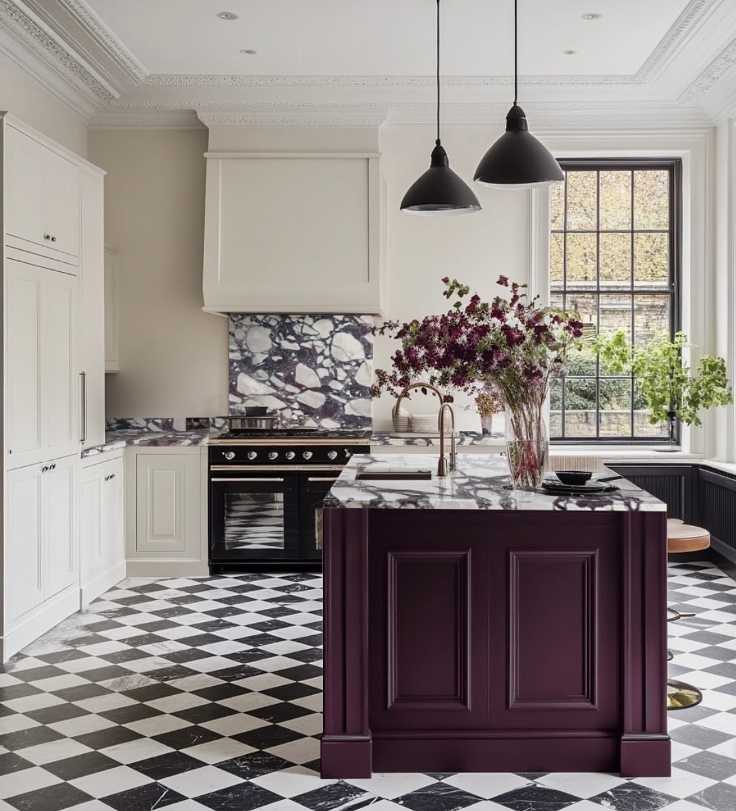
1. Star power means you need supporting actors
If you’ve been following me for awhile, you’ve probably heard me talk about pattern allowance. I cover this and other nuances about combining hard finishes like countertops and tile in detail in my Create Your Dream Home workshops.
My pattern allowance guideline is: choose only ONE pattern in your hard finishes. Everything else needs to be plain and solid and supportive of the star of the show.
One big exception to this rule is Viola Marble. A rich wood floor balances it well, but if you need a tile floor to pair with it? It’s so strong it needs a bold supporting player. Like this black and white checker board floor below.
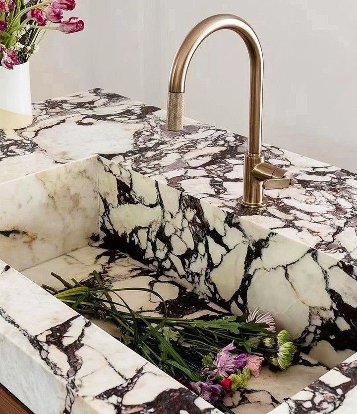
2. Viola Marble isn’t neutral
This is not like white marble with subtle pale grey and gold veining like the quieter and more versatile Carrara and Calacatta Gold. It’s got striking VIOLET veining and a PINK ground. So if you love plum, purple, burgundy and pinks and are happy to decorate with them forever, it could work for you! But if you’re expecting a versatile neutral, I’d use some restraint and choose one of the less dramatic marbles.
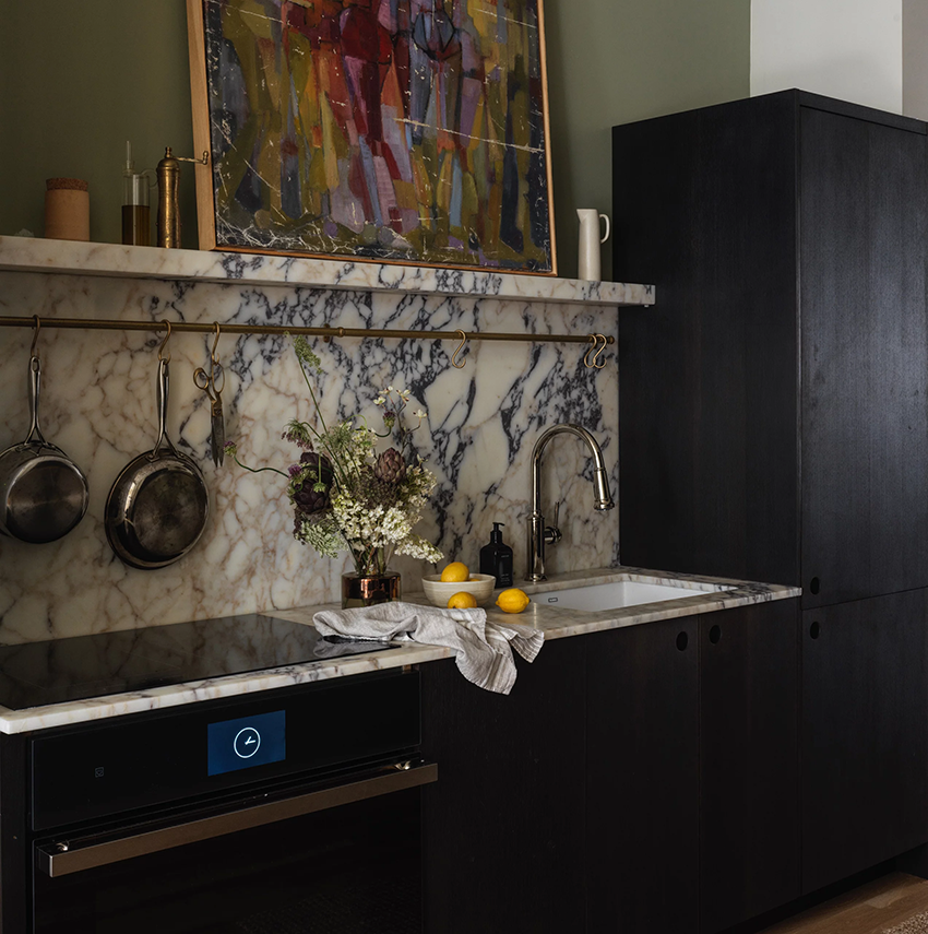
3. It’s picky about wood tones
Another way the colour of this marble is more finicky is when paring it with wood tones. It loves deep violet red walnut type wood finishes. And pale oak on the very extremes of pink looking finish. But anything in between is likely to look too yellow or orange to pair with this marble.
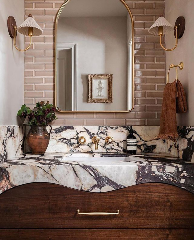
Calacatta viola marble with mauve subway tile and walnut cabinet Calia Stone Boutique
4. Your installer and fabricator need to be masterful
This is not a material just any regular contractor will install perfectly. The directional veining means that if careful consideration isn’t paid to cuts and placement, it could end up looking a lot less magical than you envisioned.
Facebook feeds I follow are full of posts from dismayed homeowners asking: “Would you accept this?”, “I’m so disappointed I wasn’t expecting. . . “, “I hate the way this looks and they won’t fix it”.
 Not beautiful yet
 Not beautiful yet
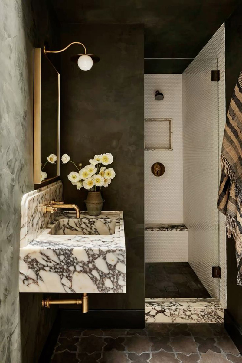
5. Choose a smaller application than your entire kitchen
The entire tone of the main area of your house is ideally set by the style, materials and colours in your kitchen, so it make sense to stay as versatile and timeless as possible for the kitchen. It’s an expensive renovation to have to do simply because you fell out of love with a demanding finish. So the smartest way to indulge in this trend is to try it in your powder room or a bathroom. It’s much less of a commitment and it doesn’t need to dictate the decorating of the whole house.
Navigating the honeymoon phase of a trend
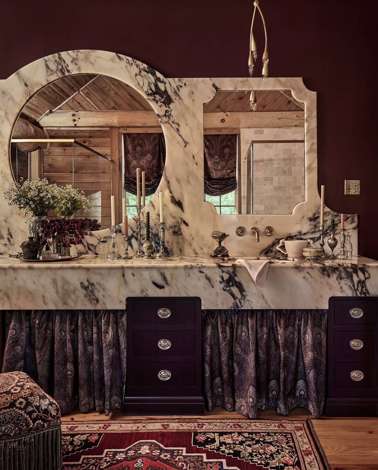
Again, I want to sprinkle these guidelines with some caution. Because a high drama finish like Viola Marble aren’t the easiest to work with if you aren’t working with a seasoned designer. In this new and shiny honeymoon phase of the trend we are just seeing it installed by the pros right now and it’s spectacular. That’s because all the details have been considered (like that architectural digest image above—so good). But if you’re loving it and considering it, I hope these guidelines are helpful 💛
So over to you! Are you in love with Viola Marble? Or taking a pass?
If you would like the invaluable peace of mind you get from a easy to follow, beautiful and timeless plan for your next bathroom or kitchen project, check out my eDesign packages here.
And if you’re a DIYer through and through and eager to learn all you can about planning your project well, sign up for one my fall session Create Your Dream Home workshops!
Related posts:
Magazine Worthy Kitchen Designs Cannot be Easily Copied


This marble is too busy for my eye. However, I could probably live with it close to forever in the powder room with mauve tile.
This trend will go in the bin of what were they thinking ten to fifteen years from now.
Hard pass. This is not timeless, it’s trendy. Further, the busy-ness of the pattern is something I would tire of immediately.
Wow that is overwhelming I could only possibly do it the small bathroom .
That defiantly takes center stage
Remember when everyone was ditching their busy granite because it looked like a lizard? IMO this is far worse.
Wow, I have a strong negative reaction to that marble. The only place it would work for me would be in a centuries old church as a floor tile or pillars or a palace. It is simply too dramatic for a normal home or even a mansion. It needs an extremely large space for the scale to feel appropriate. I think that’s what bothers me the most–it’s so dramatic that it seems very contrived to use it in a home. I would never recommend that for anyone renovating or building a home. It belongs in a church, a very large church.
Even in a church, or cathedral, it would compete with the stained glass windows. perhaps a grand foyer of a hotel or museum.
It is beautiful, but I would not use it in a fixture. I’d happily include a vase, bowl or small side table made of it in my styling, but no more than that.
My favorite use of this marble is the vanity top with the mauve tile. It’s done really well. Trends in small doses for me. Otherwise, I don’t see it as timeless and would never use it big.
It’s way too busy (and too purple) for me!
Definitely has a “blue cheese” vibe! There are too many others that are much easier to live wtih.
I love blue cheese, but not as a countertop!
In the right design and setting, it works. Most people don’t have the right house for it. It needs dramatic architecture. Even with the right house/design, I wouldn’t choose it for myself.
Not a fan even if I had the money to purchase. It’s scary looking.
I found this trend to be striking, as in striking the eye with a blunt object. While interesting to look at in pictures, in real life it would be tough. Very large homes with the right lighting (maybe moody) might get away with it. In just your average home it would be almost offensive to the eye. The pictures above are just one area. I would love to see a video of the room or area and how it relates. It’s like some of the style “influencers” you see. Online the outfits look edgy and cool, walking down the street in real life they are just ridiculous and out of place. Decorating to distract from the very loud patterned marble wouldn’t work down the line, it’s front and center all the time.
I see this marble in my design magazines as well and I find it just too in-your-face.
It’s not Calacatta Viola specifically but the “busy pattern on huge scale” trend in general. Just, no.
It’s become obvious to me that after years of following you I’m firmly entrenched in the concept of TIMELESS hard finishes. And this marble is not that! Thank you!
This is exactly what I was thinking! Haha
1. That’s too much 2. that purplish red wood is reminiscent of something cheap, don’t know when or where. 3. My father invented the Texas Ware mixing bowl, at Plastics Manufacturing Company( now defunct) , you might remember the spotted mixing bowls. As a child they reminded me of *barf*and the busy granite of the 90’s did as well, especially the earth tones. So at least it wasn’t brown, and that’s good.
I’m not a fan of this marble, but I love my Texas Ware ‘barf’ bowl 😉
Cheers to your dad (or his memory if he is no longer with us).
I could never live with a finish that looks this messy. Who decided to make this a trend?
I don’t find it pretty at all… It’s busy, in-your-face, and overpowers the space. Someone wrote that this viola marble “belongs in a big church!” Couldn’t have said it any better!
I love the ‘it belongs in a Church’ comments – I’m thinking an ancient European Church full of dark-varnished paintings. Or, letting my imagination run away with me, perhaps in the secluded castle of a centuries-old very rich vampire. (not that there’s anything wrong with that) Great topic, thank you Maria.
Ah, yes! In the vampire castle any random blood spills would blend right in!
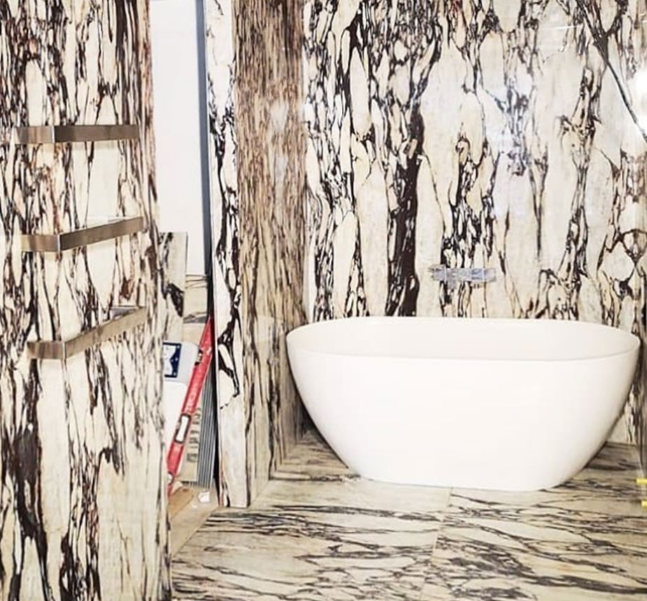
The Starel Stones image is AI.
Fun way to pop a boring utility room. Period.
If I bought a home with this marble in it like one of these images I would want to pull it out, no matter how spendy it was. And I am not generally a neutral lover–I love color and patterns, but this is like a little marble monster taking up all the visual space.
YES! Love it! I’m an uber creative gal who loves deep and dramatic colors! I appreciate your insights on how to style this gorgeous marble. I am using Calacutta Viola Lux (Revolux Ultra brand) to top my espresso cabinetry. When I saw the slabs in person, my heart stopped! I knew instantly that it was the one for me! Thanks again for showcasing this beautiful stone!