Transforming exteriors with elevated, bold hues that stand out against the common, predictable neutral schemes is one of my favourite colour projects! And this multi-unit housing complex was no exception… So I came up with 5 colour palettes to take this condo from meh to magnificent!
I love creating colour palettes for multi unit housing complexes and commercial buildings. To present COLOURful palettes that are beautiful and elevated. Because it’s most common for condo boards and investor groups to play it “safe” with a neutral palette.
Colour is timeless
And if you’ve been following me for a while, you’ll already know that colour is more timeless than the “safe” neutral of the moment. Why? Because the macro colour trends are defined by the current trending neutral. 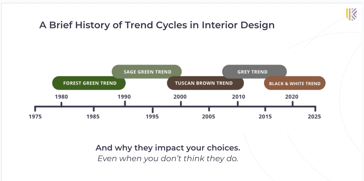
A history of Macro Colour Trends – Sage green and ginger wood tones in the 90s, deep chocolate browns, espresso and beige in the early aughts, followed by grey and now black and white with cognac.
And because of this, if you choose the “safe” black and white scheme of the moment, you’re giving your project a clear timestamp.
There’s noting safe about it. The dominant neutral scheme of the moment is just predictable, and not very much fun. Certainly, no one is rushing it to take a selfie in front of it.
On the other hand, you can’t tell me WHEN a colourful street of row houses was painted based on the specific hues can you?
Help me choose a colour palette for our condo (that isn’t ______)
Here’s the condo image, submitted by a long-time follower:
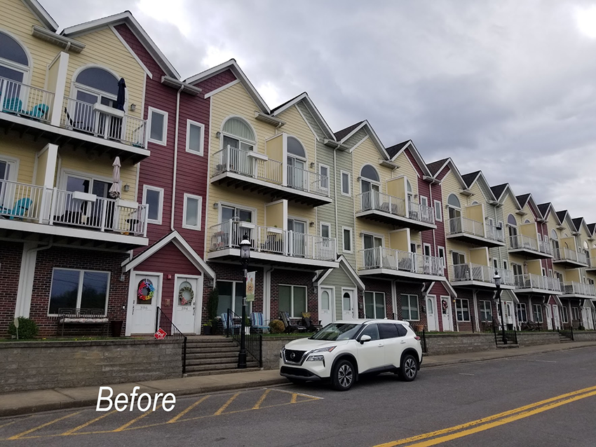
As you can see, the complex already had a COLOURful scheme. But it wasn’t amazing yet. The red is much too heavy and the yellow and green don’t have enough contrast.
Also WHERE the colour was placed also needed re-assessing.
My reader was worried that her Strata would choose the trending neutral scheme of the moment. Which is what right now my lovelies??
That’s exactly right. Black and White.
Which would have looked something like this:
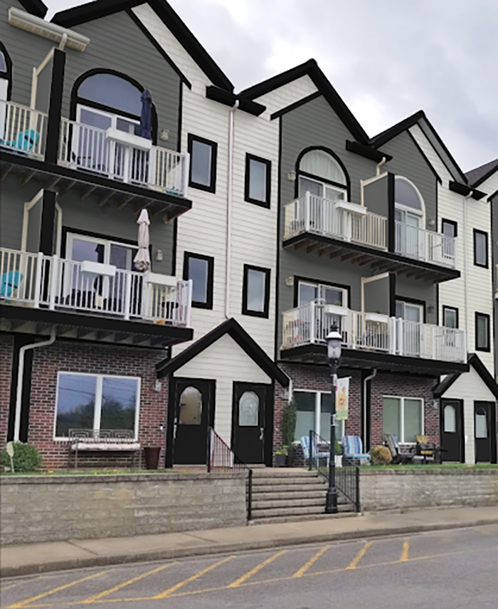
Mock up of the typical black and white exterior scheme
What’s particularly bad about this look is the heavy linear black soffits, fascia and trim everyone is doing.
I was in Calgary last weekend to decorate my nephew’s new apartment, you can see it soon on my YouTube channel here! Driving around the city I noticed this complex with a similar layout.
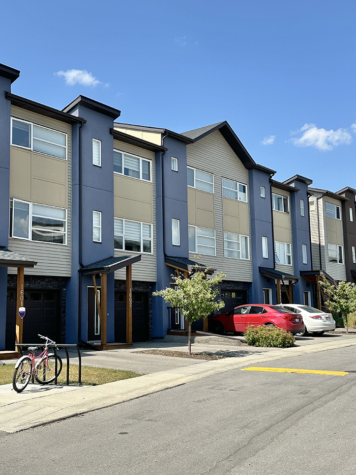
The navy with a purple undertone was a welcome relief from all the black, white, grey and cognac colour schemes out there right now but we didn’t need the black fascia or the downspouts in black. In addition, the pink taupe siding is not working with the gold panels at all. This is what happens when you don’t understand neutral undertones.
Read more: Trending Colours in Commercial Exteriors
5 Condo Colour Palette Recommendations
My team and I assembled several colour combinations for this condo community recently via eDesign.
After trying several configurations in photoshop, we decided that the sections above the porticos (red and green in the original scheme) should be a relatively neutral to sit back visually, and the sections with the balconies highlighted in colour. This, we found, would make it look more like traditional row houses.
Here are some of the schemes we came up with:
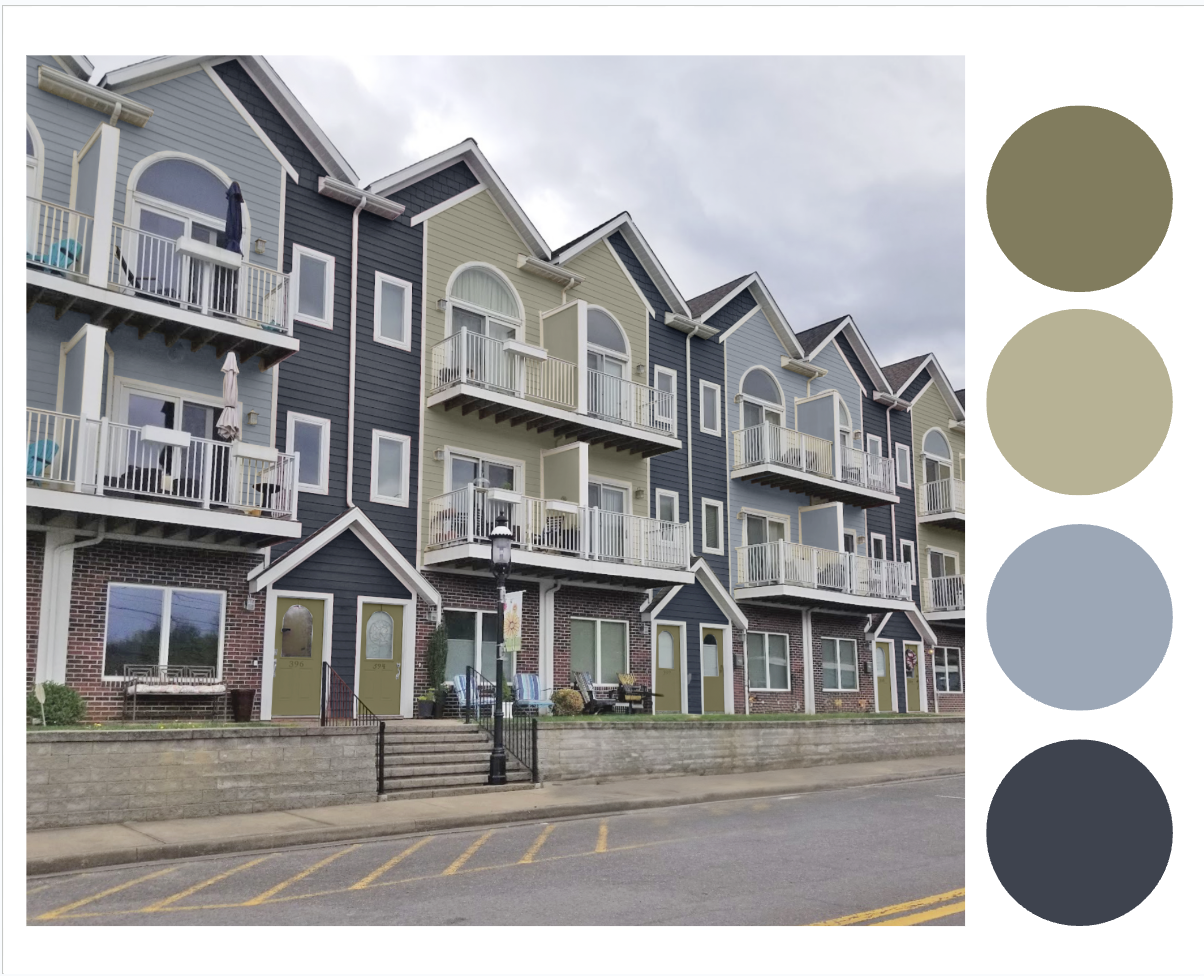
Colour Palette 1
In this combo the “neutral” is really a muted navy. A blue and green scheme is always a popular choice and relates naturally to landscape and sky.
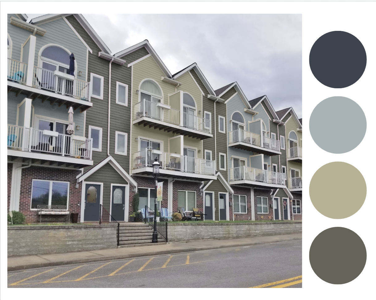
Colour Palette 2
This is a variation on the theme with a more neutral deep olive backdrop colour.
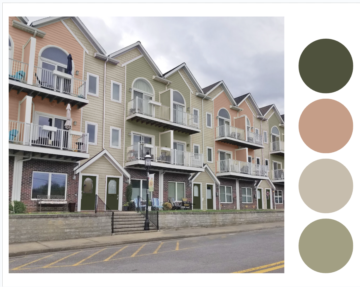
Colour Palette 3
This warm salmon, and green combo, inspired by historic row houses, was a favourite among my team.
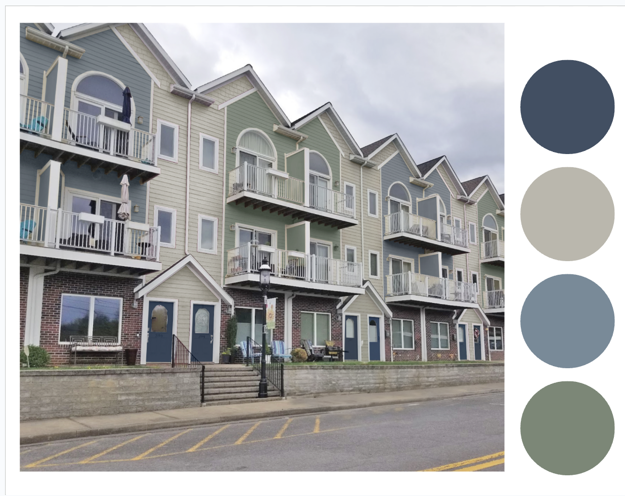
Colour Palette 4
Here’s a blue and green combo where the accent colours are deeper and the neutral pale. This is the scheme the board ended up going with. You can see how they tested the colour below:
Colour Palette 5
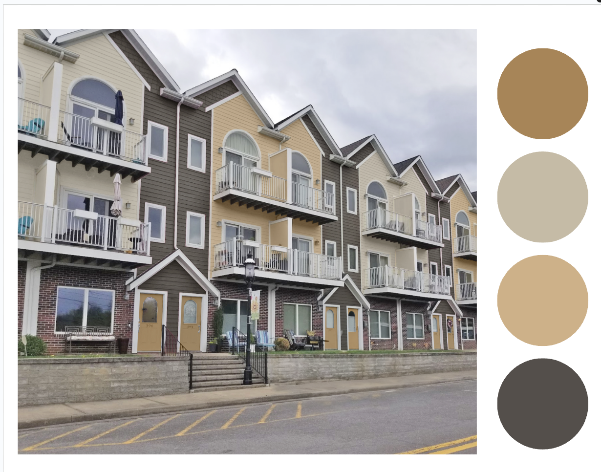
We threw this one in since trends are warming up again and because I love yellow. This muted gold, beige and bronze scheme is almost neutral without being flat and boring.
Tips for testing exterior colour
We ask our clients to paint up large samples of each colour and view them in the bright exterior light. These are the colours from Combination 4.
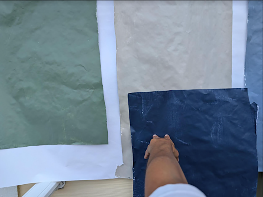
They also had a creative solution for comparing two schemes they were considering.
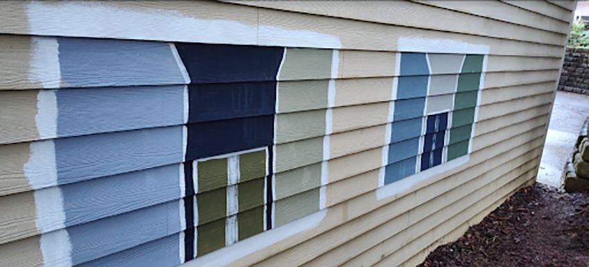
My client had this to say about the consultation:
Your presentation (and the fact that I have followed Maria for a few years now) made the process simple. I forwarded the presentation to the committee members. One of them initially responded by wanting to keep the front doors painted white regardless of color scheme. I hoped this was a knee-jerk reaction and waited about a week to schedule a committee meeting.The HOA selection committee met last week. We decided to test the paint for color schemes 1 and 4. The fact that Maria convincingly conveys her expertise throughout the explanations and instructions in the presentation made it easy for me to convince the hesitant member to agree to test the schemes with the door colors that you selected. My husband and I then painted samples on the side of the building. He suggested painting the samples similar to how they would appear on the front of the building to help the other committee members envision how the colors relate to each other.The “mock up” test paint on the side of the building was enough to convince the concerned member that painting the front doors would make the front of the building look more appealing—I held a white piece of paper over the “doors” so she could see how that looked. The dark blue door color for scheme 4 is one that this member thought was most amenable to the majority of our neighbors’ choices of patio furniture and door decor.What I like most about the color schemes in the presentation is that I felt confident that the committee couldn’t go wrong by selecting any of the color schemes. It was just a matter of what the committee preferred. The explanation about changing trends helped the committee understand why picking colors is a more timeless approach. The committee feels confident about selecting a color scheme that we think will complement the natural surroundings of the park across the street from us.
Build + Renovate with Confidence – Free Zoom Event this month!
If you are planning a new build or renovation project in the next year or so, don’t miss my FREE Zoom workshop.
Navigate your new build or renovation projects without regret! I’ll help you get your decisions in order.
Both events are limited to the first 1000 guests, so add it to your calendar and ARRIVE EARLY!

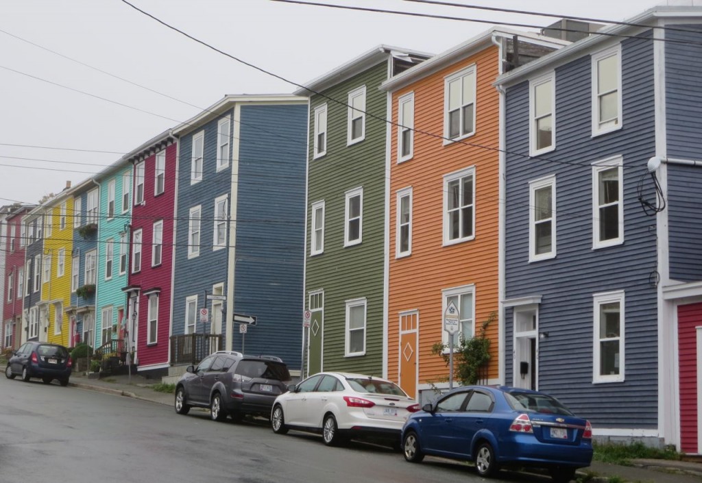 St. Johns NFLD, Canada




This is one of my favorite posts ever. I love spotting well-designed, beautifully painted projects like this. We have some great examples in my East Coast city. It is such an antidote to the tedious black-white-grey schemes that too many builders are defaulting to. I never get bored of the colorful buildings.
Loved this post! I would choose #1 🙂
I noticed the red brick wasn’t mentioned at all in the mock up descriptions. How was it considered in color palette choices?
I think #4 was a perfect choice. I esp like how it complements the existing street and sidewalks, which are not going to change anytime soon.
I agree. That’s my favorite also.
#1. All the others are dull and boring in my opinion.
Great post that shows the power of color. However, I have found in large complexes like this, residents want to differentiate their front door from their neighbors (hence the door decor mentioned by the client). Easier for visitors to find their home if you can say, the blue door and your neighbors blue door isn’t immediately adjacent. Having ALL the doors the exact same color, and not relating to the colors painted on their individual facade seems like a missed opportunity.
EXACTLY!!!!!!!
4 was the one that resonated with me. Excited they chose that option.
Yes, you are the color expert BUT your “History of trend color cycles” is off by a decade. I am into color and I know because I lived it.
The 1980’s were all about blues. The greens did not come into play until the mid to late 1990’s. Then your order does follow correctly. Just the “years” are off. The “blue” craze lasted a long time for inside and out.
Thankfully the grey for indoors is OVER!!! Short lived and gone….yay.
CLIFFHANGER!!! What are the paint colors they chose??? #4 was my favorite too!
I am wondering the same. Interested to know what green grey that is on the chosen board.
Love palette #5. Are those colours resourced from a Benjamin Moore collection?
Love palette #1 for first choice or palette #2 for second.
I liked the #4 the best because I think it would appeal to the most people. I also really like #5 which is very different from the rest. We had some apartment buildings near us built in the gray trend. They were okay if you wanted to go home to a prison every night. I would never want to live there.
I love colour palettes 1 and 2., but I’m disappointed that the colours weren’t identified. Can you please post the brand and colour number? Thank you!