Looking for a timeless black floor tile? I helped my client narrow down some timeless black tile options for her primary bath and then we styled it using her photography art as inspiration. Check it out!
⭐️ HELP WANTED ⭐️
We are looking for a Virtual Junior eDesigner and a Partnership Manager, see both postings here.
Trendy vs. Timeless Black Tile
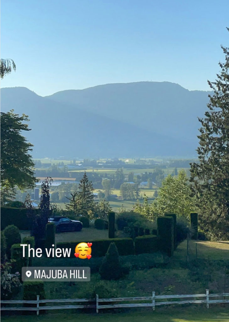
I met Margaret in July 2021 when she came to my studio for a consultation on the finishes for her renovation. She lives on Majuba Hill just 5 minutes from my office. This is their view (below):
Margaret and her husband brought a range of tiles from trendy to timeless so it was easy for us to narrow down the finishes to the right ones.
If you follow me on Instagram, you already saw her powder room here.
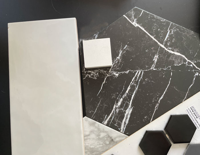
We chose subway tile and this marble porcelain hex.
And we chose all the paint colours before Margaret selected the purple and orange art (her own photography) she installed in the end.
Styling a Primary Bathroom
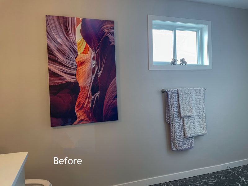
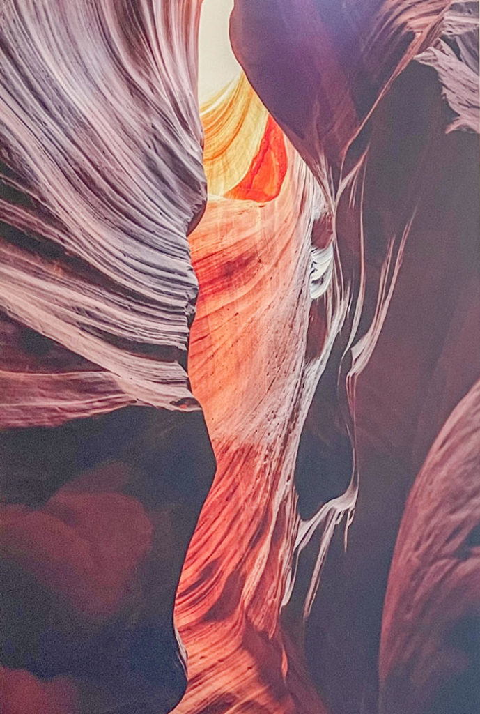
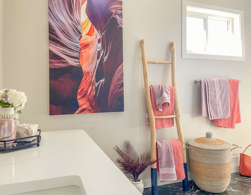
My client Margaret has had lots of her own photography blown up as artwork in her home, this was the piece she had made for the primary bath.
When you’re building or renovating, most people don’t know exactly what the decorating will look like in the end so if you end up installing a fabulous piece of art in a bathroom or dining room for example, this is a good time to repaint.
I decided to style up the bathroom so I could show you the end result:
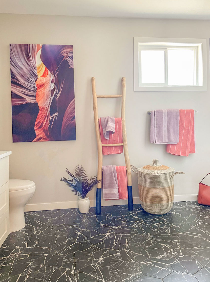
The wall still needed something because the art looked a little lonely and the window placement on this wall was awkward.
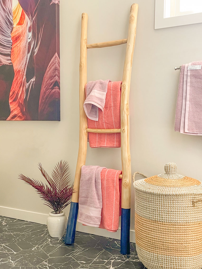
So I decided it needed a ladder with some towels.
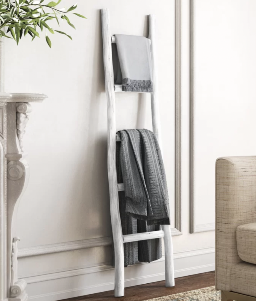
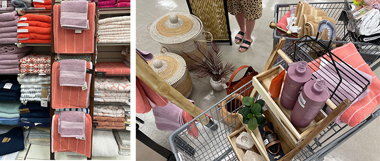
I took this photo (below) with me to HomeSense to see what I could find and found a ladder with some towels to match the artwork (below left).
Then as I walked around the store, I got a little carried away. Even down to shampoo bottles that matched the colour scheme (below right).
And here’s the after:
This porcelain stone look hexagon looks so perfect with her art, I love it so much! Similar here
HOT COLOUR TREND TIP: And because there’s just a little black in this room, it doesn’t immediately say, ‘We renovated in the black trend’. Making black the default choice for everything would have clearly labeled this bathroom inside the trend.
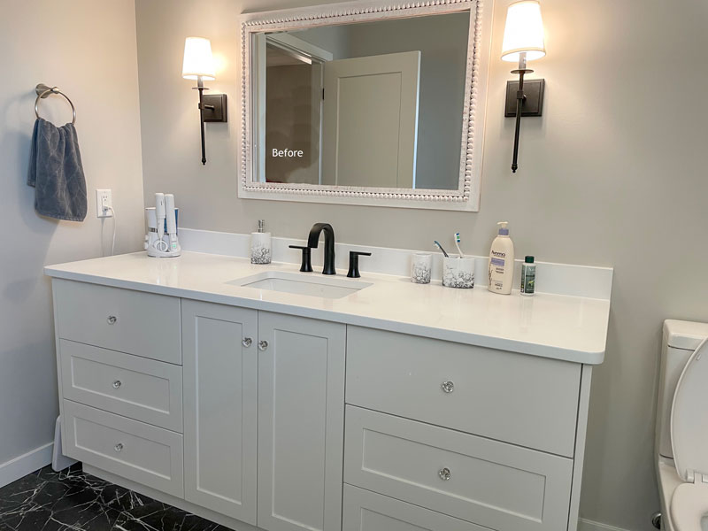
The vanity before needed some more black accessories.
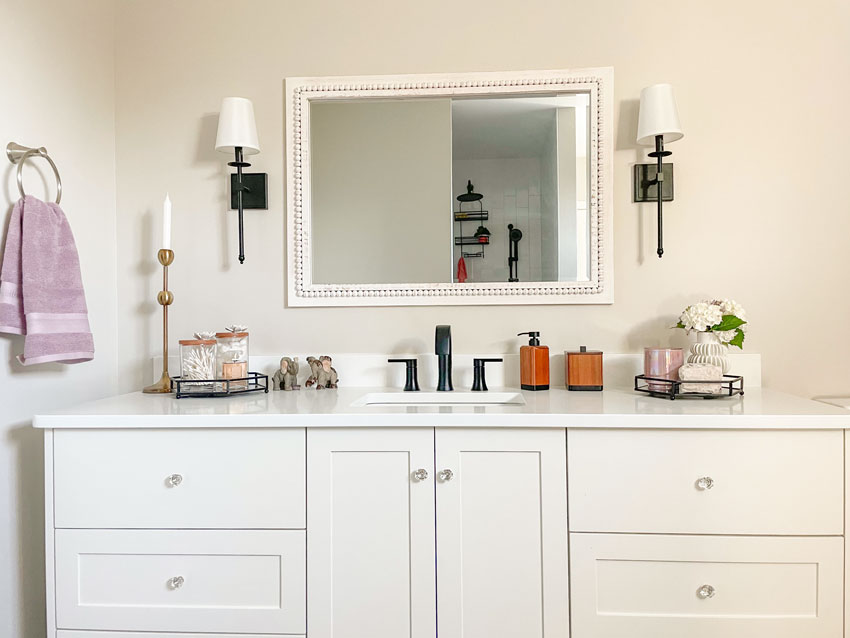
After:
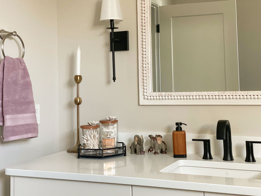
Margaret picked up the mirror from HomeSense in her travels. Remember the basic rule of mixing metals is to do it twice. Here the knobs and towel ring are both brushed nickel.
Sweet elephants from Margaret’s travels are displayed here too:
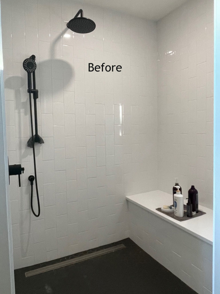
She has a walk in shower with a bench.
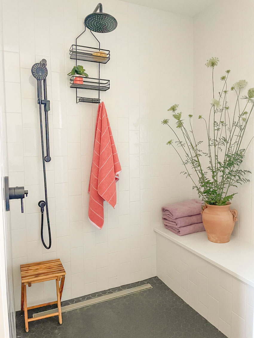
To be clear, last year I didn’t have the same opinion I do now about black plumbing fixtures (because it hadn’t been as overdone as it is today) but here because it’s a room without any glass. I like that the black plumbing fixtures repeat the black floor tile.
After with a few colourful accessories to brighten up the space.
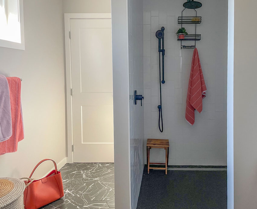
This doorway goes into the primary bedroom.
Here’s the before and after again:
Since this wall was the focal point of the bathroom and it’s what you see every time you walk down the hallway, it needed to be more important.
More art would have worked as well (perhaps 3 pieces in a grouping) but I love the look of the ladder even better because it helped turn it into a luscious feeling spa bathroom, especially because the shower is in it’s own room.
So there you have it, my lovelies, one more tile selection to add to your classic and timeless files. And, if you have dark hair, this one is perfect for you!
If you’d like your bathroom to fill you with joy when you walk in the door, see my Create a Timeless Bathroom package here.
To become a True Colour Expert, the best place to learn is my Virtual Specify Colour with Confidence events this Fall. The early bird price expires September 5. Register here.
Related posts:
Ask Maria: Are These Tiles too Cool for My Own Good?










Stunning tile! Another example of something I would never have chosen but is absolutely perfect. It would especially work in a house with one silver haired and a dark haired person.
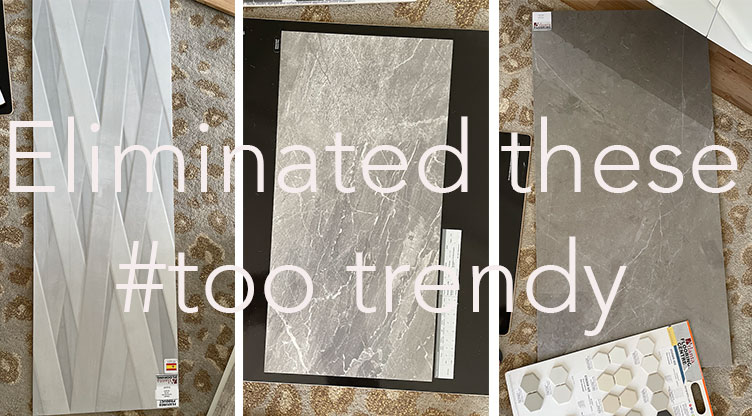
Interesting choice on floor tile…I like it. While I now have a distinct bias for selecting “timeless” choices (Thank-you Maria!), sometimes I struggle with that distinction. In this case, should I assume the middle and far right choices of floor tiles that were deemed to be “too trendy” are based on the grey color as opposed to the design?
Wow! That is a stunning makeover! Love how you brought it all together ❤
We will, hopefully, be redoing our master bath in a handful of years. Like Sharon, I never would have considered the large hex tiles, but I really like them. Your client’s photography is amazing.
The bathroom looks wonderful. I have a quick question – why wasn’t the photo hung level with the top of the window?
I now see what you mean now about picking a color from artwork for your wall color…I so much want this room to be painted a deep orange coral, like the color of the purse that is sitting there. The whole room would be festive!
And with the timeless finishes you chose she could pick coral with this photo and blue or whatever with another photo and can always easily update. Yes, the finishes you picked for that are perfect. Your method is starting to click for me!
Can you explain what is more trendy about the right tile than the busy black and white hex that went on the floor instead? I’m not seeing trendy in that taupe tile on the right. Thanks
A bathroom clad in 12″ x 24″ grey or taupe tile means it was renovated or built in the grey trend. A black and white bathroom can be painted almost any colour to switch things up down the road and as long as you repeat it sparingly like we did here, can be a timeless look forever. Also smaller scale tile belongs in a more traditional/transitional house. Large tiles look best in bathrooms in modern homes. Hope that helps, Maria
Yes, thanks. Interestingly I was recently looking for tile for my modern entryway and it is very hard to find non-12×24 large format tiles these days. I wanted 24×24 and only about 5-10% of large format tiles were available in that size, and all special order. Even the hardware stores used to stock 24×24 tiles and now it’s all 12×24.
I used 30×30 floor tiles in my modern bath, but 12×24’s in showers because the scale seemed more appropriate..
I agree, the rectangle trend has taken over so much that there are very few of the square options anymore (and it’s in some sort of pink or orange beige). It’s so frustrating!
I just don’t see that very busy black with white scribble hex tile being timeless. Yes, hex is timeless and suits a traditional home but this look is very modern. And, I don’t think black taps, etc. are timeless but a passing trend.
It’s black marble… and I think a little black is enough to create a timeless look. And it’s my opinion, doesn’t mean it’s right. Maria
Wow, I love the subway tiles installed vertically, what a great way to stick to a classic, but update it a little bit!
I’m sure your interior design client is over the moon happy!
Margaret is a person after my own heart with her large print of Antelope Canyon near Page, Arizona. It is a sandstone slot canyon and is one of the most beautiful places I’ve ever visited! I have a 3’x4’ metal print by another artist hanging in our living room over our fireplace. Needless to say, purple, orange, yellow and red play happily in our living room and it makes me smile. Maria, your choice of a southwest style ladder is perfect.
To me, the white or off-white modern squiggle design on the tiles fights with the traditional shape of the tiles.
Well it looks like black and white marble which is why I liked it. . . and it’s a little black NOT a lot since it’s only repeated in the hardware and lighting. And it’s not for everyone. Maria
I love the tile but I’m wondering what the wall color is. Could you share, please?
Your new home is beautiful! I am curious though….what is the color and sheen of the white trim?