Warmer colours, more texture and less contrast are just some of the interior design trends forecasted for 2022. See which colours you’ll be seeing more of in the coming months in my complete 2022 trend report.
Who decides what’s trending?
Mystery surrounds trends. Where do they come from? It’s easy to imagine retailers scheming to sell us the “next big thing.” But that’s just not the way it works. Honestly.
The truth is trends are driven by consumers’ and creators’ shifting interests. We get bored of one thing, so the next sparkly new thing catches our eye. We seek out what’s different or new. The pendulum swings back and forth. In other words, YOU help drive trends.
Think of a trend as a general direction in which something is developing or changing.
And if there is a general direction in what creators and homeowners are looking for in interiors right now, that can be summed up in one word. It is warm.
Dakota Johnson’s Home via Architectural Digest
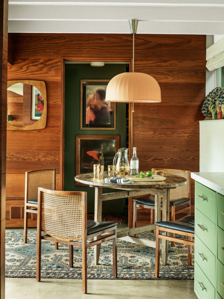
Warm woods trend
For starters, lots of wood is showing up in our feeds, even 70s wood panelling.
While we’ve been seeing warmer colours coming for a few years, it’s safe to say that heading into 2022, it’s here. Earth tones have moved from the fringes to being firmly rooted in mainstream design.
In our eDesign department, the look of inspiration boards from clients has shifted from lots of blue and white into moodier iterations with an abundance of wood, mellower warm wall colours, and muted moody accents.
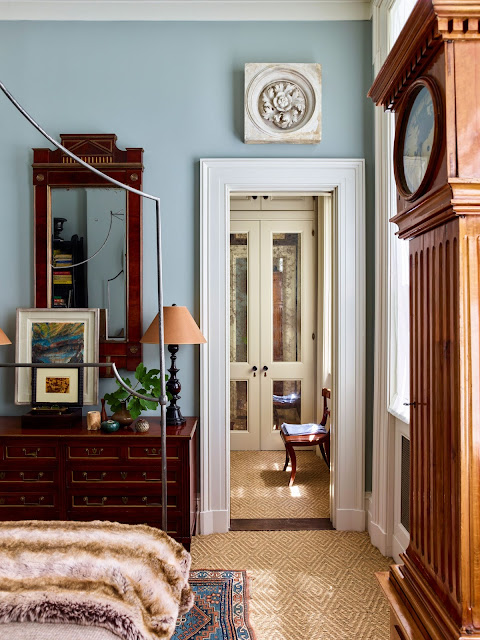
White Oak and natural pale woods are still going strong (and with good reason, it’s the perfect balance between warm and airy) for flooring and cabinetry. But furnishings in richer, burnished browns and even red tones are bringing elegance to spaces. Makes sense too because vintage and antiques are popular as ever.
What I know for sure though, is that we are well past all the mass-produced greyed weathered wood pieces (hallelujah!). And just because darker wood tones are trending, it definitely does not mean we are going back to 90s espresso and Ikea black-brown for furniture.
Trends in texture for hard finishes
And texture. Everyone is looking for texture, not only in textiles but also in hard finishes.
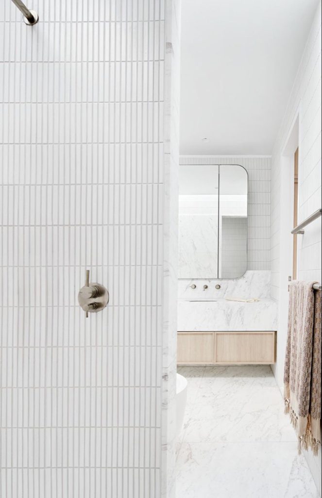
Finger mosaic tile in particular is everywhere. It looks suspiciously similar to pencil mosaic tile except cleaner. It’s missing the busy variation in colour, staggered pattern, and cold glare of glass. The new finger tile is typically laid in a vertical lined-up grid and comes in solid colours, often with a matte glaze.
Since these tiles read more like a solid colour with texture, it’s a trend I can get behind, especially in white or cream. It definitely belongs in a more modern home though.
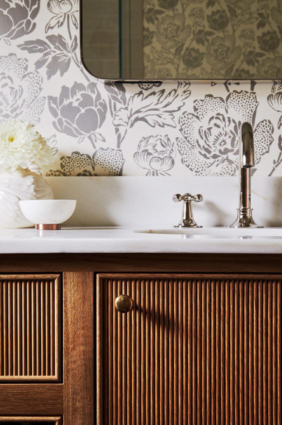
Cane and reeded woods are the newest texture for furnishings and cabinetry. This type of wood adds texture and interest in a fresh way. But I predict that reeded woods will be more of a fad than a long trend. But cane is a timeless texture when used right.
The return of stone tile
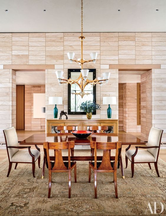
While marble continues to be a luxurious, timeless choice. But pale and subtly coloured stone like limestone, basalt, and travertine are being introduced as warmer alternatives. And you can see that modern linear stack again (below).
What do I think about stone tile coming back?
BTW, it doesn’t mean your diamond-laid tumbled travertine backsplash is back in style (sorry). But travertine mosaic floors like hex and herringbone are becoming a viable option (think: old material, new pattern), especially if you’re already working with pink beige.
HOT TIP: if you like the look of natural stone tile floors, opt for a similar look with a pale green grey limestone tile instead – this will help you avoid the bossy pink undertone of travertine.
Checkerboard patterns are hot
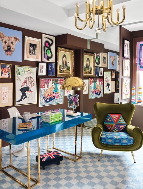
In the room below, there is a simple blue and white checkerboard area rug that adds an airy vibe to a room with a novel, playful use of dark brown. Notice that the grounded brown is balanced by plenty of cerulean blues.
When brown is trending, warmer blues are always tagging along to freshen things up.
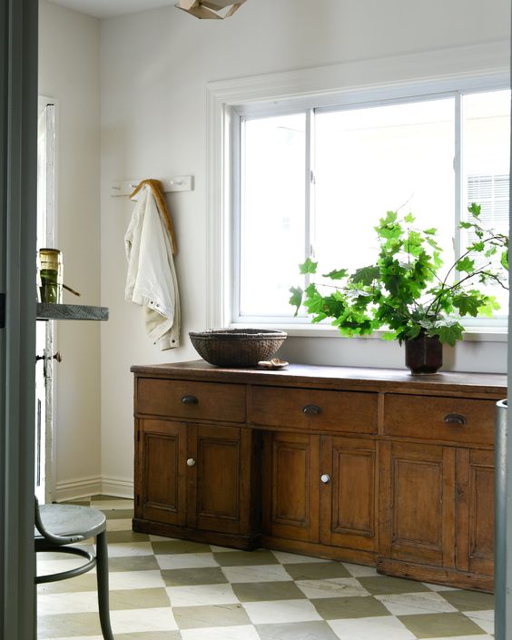
Checkerboard is the hot pattern for flooring. This classic pattern is showing up in painted wood, marble, simple vinyl, or in area rugs. The graphic checkerboard grid is surprisingly versatile in black and white, grey and white, blue green, or red and white.
White or cream is usually what makes it look fresh.
2022 colour trends
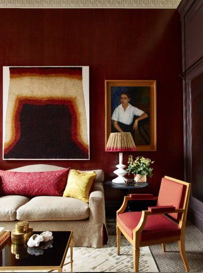
Red is also having a moment again. But not the saturated patriotic reds so much as the earth reds. The reds I’m seeing are rusty reds or burgundy.
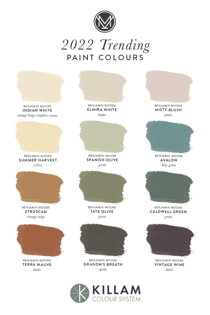
Rich and muted greens are of course still going strong. Green kitchens are still very popular and will be for a while. And all browns (cool almost grey bronze, or warmer chocolate, or cinnamon) are here as a softer alternative to black. As well as toasty orange and yellow-based hues (yay!) like rust, cognac, gold, terracotta, cream, and beige.
Of course, this time around saturated earthy colours look a bit different in interior design. They are more often paired with fresher colours and white.
My updated VIP Collection of large painted colour boards captures the range of new and timeless colours. If you haven’t ordered your set, hurry and get them here (note: they are currently back-ordered until the end of January).
Here’s a sample of the trend colours that are included.
Embrace saturated colours
And if earth tones are not your thing, don’t worry! What’s also notable about the way interiors are trending is that overall, there is a much broader sense of inclusivity in design trends.
There is no longer such a strong consensus on what is OUT. Unlike in the Tuscan trend 20+ years ago, this time around it’s not a complete faux pas to embrace more saturated colour. Not at all. What you really love is always the right choice for you!
While the trend that’s notable and new is a turn towards warmer, earth colours and wood, there is still plenty of saturated colour and fresh looks being done beautifully. And more than ever before, there is a wide range of furnishings and case goods that suit a variety of tastes. Even if your favourite decor retailers begin to tip the balance on their shelves toward the more grounded hues.
And you can absolutely include some brighter accents in an earthier colour scheme for the best of both worlds.
Consider warm cerulean blues, orange-reds, yellows that are on the richer end like saffron, and greens. Conversely, an excellent strategy to indulge in warmer tones if you have a cool black and white, grey or neutral colour look is to layer in some bronze, cognac and gold.
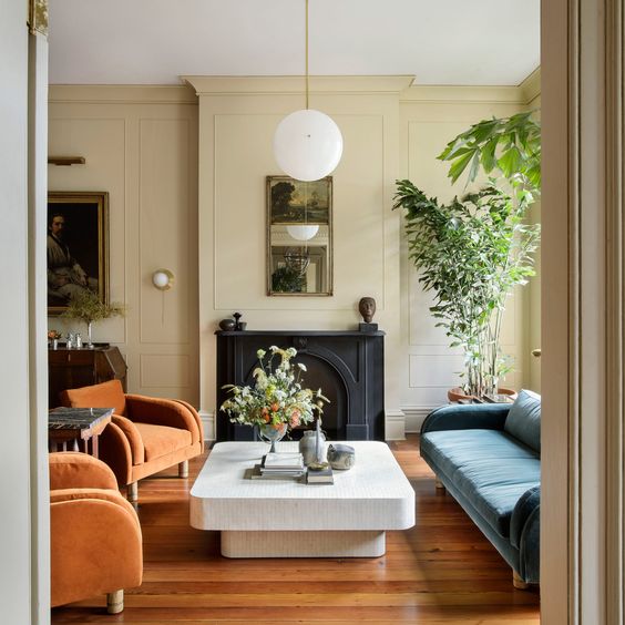
Some of my favourite details in the room below include beige walls with a sexy black fireplace mantel, rich orange and warm blue accents, and of course, accents of white.
Less contrast, earthy aesthetic
Basically, what’s trending is a move towards making the severe, high contrast look of the black and white trend into a softer and more liveable palette.
The appeal of the hand touched and earthy also means that a mellow Mediterranean aesthetic (think: more Spanish and North African than Tuscan) is here too. Arches and curves are everywhere including arched windows and pass-throughs and rounded corners.
So maybe another single word that captures the direction trends are moving going into 2022 is soft. It’s been a rough couple of years on us all and we could all use some comfort and a warm hug.
Do you have a favourite trend that you’re really excited about?
Related posts:



Totally makes my morning to see my paint colour finally made Maria’s top trending list. Maybe 2022 will be my year after all….
I totally agree with all the Soft look. It´s just what we need right now in our homes! Thank you Maria for such a wonderful article.
Besides rich wood tones, I’m not here for any of it.
I think the reeded furniture looks really cool, when well executed…but I worry about the logistics of cleaning, with all those crevices to catch dust and dirt, so definitely place it on the trend list. Love the new colors added. I used Dragons Breath on my sister’s doors and fence in 2014 – she had a 70’s house with metal windows that weren’t quite black. It’s a lovely moody and intense color.
I hate cleaning as much as anyone could, but I love the reeded look so much it would be worth it to me.
I hope it’s not just a trend. Reeded furniture has existed in the past, so it does have some history.
Thanks, Maria! I am both happy and sad that trends are coming around to my personal taste (layered, textured, warm, saturated). I’m happy because it makes it easy to shop for decor. But I’m sad because it means that our style could seem outdated once this passes as a trend. Oh well!
Don’t worry about it. My style has been in and out many times over and I couldn’t care less. I decorate just the way that brings me joy and suits my lifestyle and tastes. No regrets so far.
With the return of warmer woods, I’m wondering if we will see the return of stained wood trim or if white trim continues to be the timeless choice. What do you think, Maria?
There is nothing that hasn’t been around at least twice already, so naturally it will become the mainstream once more, as there is no more you can turn to.
The trick is learning what you really like and curate it, creating your own sense of style and aesthetical taste, that can and will help you avoid the wandering eye to the next shiny new thing that comes out.
That can save you a lot of money and aggravation, and avoid over consumption and pollution of the planet as well.
Ok I am going to ask this. How can a black fireplace be sexy when it is just a fireplace no brains no feeling no nothing just a metal fireplace? I just don’t get it!
Enjoyed the blog but not a “sexy black metal fireplace.”
It isn’t that the fireplace is sexy in and of itself. It’s that the fireplace is dressed in black. It’s the color and how we respond to it, which is very individual.
What? Really Arlene!
I guess it means that gives out a sexy vibe in terms of the mood.
Agree!
I’m excited by the reeded furniture. Detailed and glowing wood finishes are something I can get behind. I love the move towards warmth. I like rattan too, but it wears out eventually, unlike wood which ages beautifully. Many of the pictures here are a bit too ‘earthy’ for my taste but I already had a toned down black and white executed in medium-dark brown wood and cream.
I cannot like finger tile though. It is too similar to the lines of ‘feature’ tile that have dated so badly. Plus any tile that has more grout is a bad thing to me. The bigger the tile the better for me! The only time I can accept a small tile is when it is a proper statement mosaic.
Does this mean that my cognac colored cherry cabinets are back in style just when I was ready to switch to a beige-y white?
It was only a couple of years ago that I read that prices on vintage and antique furniture (brown furniture) has come down drastically. I read that several dealers in Paris had closed down; it was that bad. Millennials were buying mid-century knockoffs or the real thing or Ikea.
Now I read that millennials are discovering antique and vintage that isn’t mid-century for a change.
My husband and I are in our early thirties and definitely feel like old fogies in our love of vintage wood furniture…we don’t like “modern farmhouse” and never went for mid-century. Oh well, more inlaid walnut for us!
Maybe they will want their parents’ furniture then…
we can only hope lol
So glad to see the warmth returning. We redid our 1960s hardwood floors a year ago leaving them with their natural, warm, yellowish tone and painted all the walls BM Natural Wicker which is a nice cream. We have a few antique wood pieces, a warm cherrywood end table and warm French country coffee table all mixed with a green/blue leather couch & loveseat and linen-coloured chair – colour and warmth and we love it. I change the 5-6 pillows on couch/loveseat every 3 months with the seasons to create a warmer or cooler look depending on their colour – it’s fun and buying just the pillow ‘covers’ means they’re easy to fold and store until needed again.
I would love to see Maria do a blog post on light switch / electrical outlet plates and heating / air-conditioning vents. The more bold the wall color, the more they stand out like a sore thumb. And heating vents along the floor: unavoidable but ugly. Match to flooring, walls or trim? It seems like this would have been discussed in the past, but I can’t find it using the search feature.
I recently spray painted all my ceiling ducts to match the ceiling color. At the Benjamin Moore store (in California) I was able to buy cans of spray paint in any Benjamin Moore color I wanted. It was a new machine they just got. Now they all Match the ceiling and they look great 😊
I doubt there’d be a BLOG POST on such a simple subject. They sell floor vents to match your floors. Or plain wood you can stain. Paint your registers and electrical if they clash with the wall. All mine match the white trim.
Spot on, as always, Maria! Wonderful post and it makes me happy to see that we are seeing such variety in what’s trending for once (rather than very specific style choices that everyone then is bound to get sick of, e.g. “farmhouse”). Lots of timeless, eclectic and individualized design, which means lots of inspiration and options for our own homes too.
What do you think of Tate Olive for a house exterior?
Curious if you would go with white trim or off-white trim with Tate Olive. I love that colour for an exterior.
I am very happy to read this blog. I remember 25 years ago when our bathroom tile in our old house needed replacing we did checkerboard (forest green and white!) I am happy to see it return. Love the paint colours. Also, my powder room has the same wallpaper as the one in the blog, only green.
Maria, do you remember when my kitchen was painted Summer Harvest and you suggested tweaking it a bit to Standish White to match the tile a bit better? Now Standish White is our whole house colour.
This time last year, I purchased Pottery Barn’s Channing Persian-Style Hand Tufted Wool Rug in red to replace a gray/white chevron area rug in the living room. It just felt right, even though it’s more traditional. A year later, I still love it, and Maria’s post about warm colors making a return validates my choice. I think it’s all part of the Maximalist trend that’s been going on. I’m not a fan of orange, like Maria, but persimmon is a delicious, rich way to incorporate a red/orange accent and can be paired with blues and greens without looking too Americana.
So “Americana” is bad and something to be avoided – especially with the woke crowd – but cheap knock off imitation Persian rugs from big box chain stores are “traditional” and we should be happy they lasted a year. And make sure you avoid red then call your orange “persimmon”. People are HILARIOUS.
Are there any Sherwin Williams colors? That is what we mostly have here but the designers always post about bm. I would like to see more recommendations for SW.! Thank you, Denise
Maria has the entire SW line in her consultation. Also Behr if you want.
I have olive, sage green, coral and beige throughout my house. I love warmer colors and consider them timeless. I’m glad to see them returning and am beyond thrilled to say goodbye to all the grey of the last few years.
Trend Alert: The new “traditional” is now anything from Pottery Barn. /s
I like the new textured white tile also. I saw a 12 x 24 with a white wavy design and it gave me the same feel as a white beveled subway tile. Thinking about using it in my shower to avoid all the grout. Hoping it can become a classic.