There is a consistent pattern you’ll see when you help people make colour and design choices every day – everyone puts off having to make an actual definitive colour choice.

This has never been so obvious as in the white trend. When you think the answer to every colour decision you need to make is white – it feels easy. Like you don’t have to make any decisions at all.
And decision fatigue is real. So is decision avoidance.
Of course, then you have to face the decision of which white? In my system, I’ve reduced the overwhelming world of whites into 4 simple types:
Blue White, True White, Off White and Cream
Along with a categorized list of my favourites so that that decision is at least much easier!

The Four Gradations of Useful Whites on the back of my Neutral Colour Wheel – all about simplifying colour decisons.
But white walls are NOT the answer
And, as I have maintained, throughout this craze for stark white walls, white walls are much too stark a backdrop for the vast majority of rooms.
And now most of us have seen that right? When white walls look shadowed and dingy from a lack of natural light. Or they look sickly green because they are reflecting exterior light that isn’t direct (because white reflects after all, it’s white). Or they make your furniture look dirty because it’s too stark.
So when I hear (yet again):
“But Maria, I just want a paint colour with NO undertones so I can add whatever pops of colour I want,”
What I’m really hearing is “I’m afraid or unwilling to make a decision.”
But at SOME POINT you WILL have to buy a sofa or you won’t have any place to sit.
You will have to choose a countertop so you can start using your kitchen.
And the sooner you make those choices, the easier it will be for you to make all the right choices after that.
Like the palest neutrals in the CORRECT undertone to relate to your finishes like tile or countertops.
And your large neutral upholstery pieces, like your sofa, will look much prettier, more perfect and custom.
Want help making the right choice? Join my True Colour Insider Community here.
Freedom in creating constraints
But here’s the hiccup I want to help you get past. To choose the perfect pale neutral for your walls, you actually have to make these choices BEFORE the paint.
And this is the tricky step for most.
Here’s what several decades doing colour and design has taught me – making that decision much earlier on in the process than you think will give you all the freedom to make your house stunningly beautiful!
Delaying your choice of a neutral or colour, on the other hand, is exactly how you find yourself sitting in an underwhelming and drab room where nothing is working and you’re wondering what to do next.
Constraints create concrete problems to solve. They are where creativity shines!
Find the magic first
A contractor who was recently in my house declared to me that when he saw images of my house online, he was convinced it was AI.
That’s because a truly well-decorated home is surprisingly rare. The reason? Most people aren’t sure where to start with decorating, so they play it safe with every choice-opting for the most neutral, risk-free options instead of creating something unique and personal.
I know, it’s easier said than done. But when you avoid making any real statement, you can suddenly find yourself in a room where everything is some shade of greige or beige. The pieces don’t quite harmonize, and nothing feels quite right-it’s all just a little off.
So here’s how I did it:
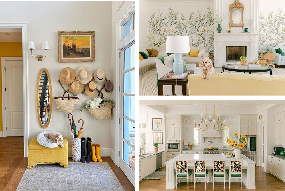
- First, I made mood boards. MANY of them. I knew I wanted to keep my yellow sofa and I wanted wallpaper in my living room.
- I embraced the limitations of working with that yellow sofa along with the limitations of my green beige kitchen. This helped me narrow the field dramatically!
And that is a good thing! I didn’t have to consider all 8 of the other neutral undertones – green beige it is!
And the wallpaper? I knew I wanted something botanical or landscape themed and it had to work with my yellow sofa.
Choosing custom paint colours
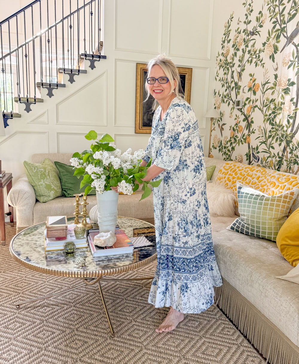
It was because I chose the wallpaper to work with my sofa first that I was able to pull the pretty custom yellow paint colour, BM CSP 955 Hannah Banana and my sky blue ceiling colour, BM CSP 610 Intuition into my living room.
The decision to move my large scale floral art into the primary bedroom allowed me to choose the custom lavender colour for the ceiling.
This room is a still work in progress, I’m using the drapes from my last house in here, one step at a time.

Because I embraced the limitations I already had, I was free to make bold, joyful color choices right from the start. By making intentional decisions that pointed me in a clear direction, I opened the door to more creative possibilities.
You can’t do that if you’re trying to keep all your options open, life works the same way.
The freedom to do it well
Years ago, when I decided I wanted to become a world renowned colour expert and I taped it with a post it note to my mirror and that gave me the freedom to pursue it relentlessly. If I had stayed waffling and dabbling with the elusive tried and true corporate career path, NONE of this would have come to be.
Making that commitment gave me the freedom to create this life I love.
So if you struggle with decisiveness in life or in decorating, let me give you this permission: making a decision will always be better than not making one. Accepting that you cannot do or have everything-actually creates freedom. In the end, not making a decision is still a decision after all!
Once you commit, you are liberated from endless options and can focus your energy on what matters most.
When it comes to decorating, go for that beautiful area rug or piece of art or fabric you love! Commit to it and create a beautiful home that brings you joy 💛
And if this little pep talk didn’t help because you hesitate to commit to any design choice out of fear you might regret it later, my best advice is this: your dream of creating a home you truly love is much more likely to come to life if you seek some creative guidance. Sometimes, a little expert help is all it takes to move past indecision and achieve a space that feels just right.
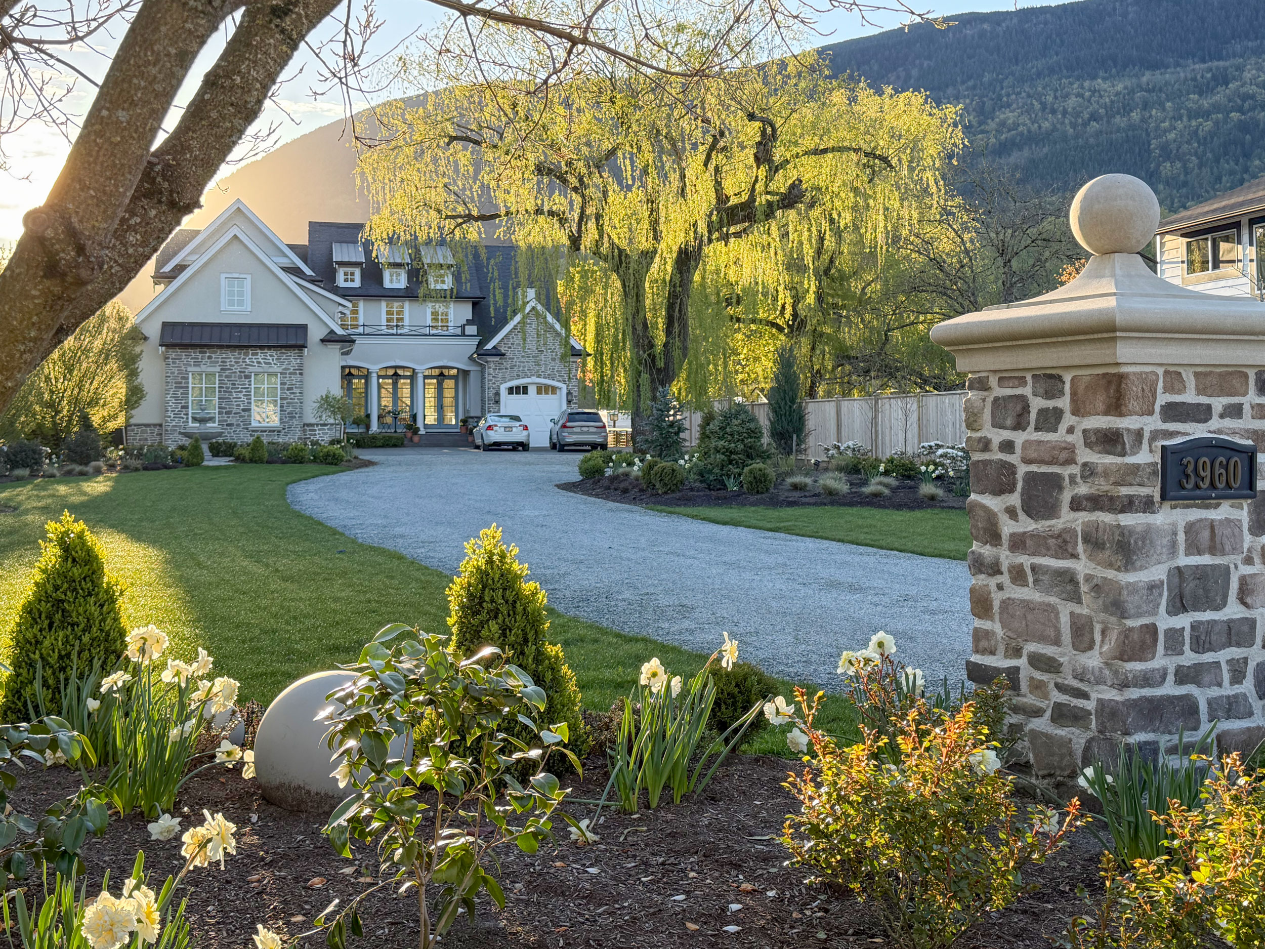
After all, there is no way the garden in my last house or this one would look as fabulous as it does without the creative genius and experience of MaryAnne White, my virtual garden designer.
I could go to the garden store and wander around and ‘commit’ to plants that I like but how does it all go together? Is it in the right place? The same principles apply to design and decorating.
Bottom line. It’s time to stop waiting for the paint colour to propose and take matters into your own hands. Choose that countertop or that area rug so you can get married and live happily ever after. And then you and your house can live happily ever after.
My Create your Dream Home workshop is available to register into for this Fall here.
My Dallas Dates are open for my True Colour Expert Training, register here.
Related Posts
Are you Waiting for your Paint Colour to Propose?
How to Create a Colour Palette for Your Living Room; Part 1


Great advice! I will be decorating with green in many different variations throughout my new home build. I chose my limitations with grey green stone for a kitchen backsplash and I installed the same stone in a wine room and on a wall for continuity. I am considering going bold with a green sofa in my great room instead of an off white sofa. The safer choice would be to choose green occasional chairs for the great room. We shall see…
I’m slightly obsessed with sofas that are a “real” color. (Not that I get to vote or sit on yours.) Have fun choosing!
A green sofa would be quite the commitment however both my husband and I love Green! The home is on a golf course so it’s an appropriate choice.
can you really use all greens in one open space? I have sagey green bar stools in kitchen and white kitchen but minty green art work that works together?
Yes absolutely! I have previously used green in an open space. Green is the star but there are supporting colors to round out the color palette. Green will be used throughout the home so that every room as a touch of green and the whole house will feel cohesive color wise.
I love this messaging and I hope it will be effective in getting the word out. Reading and learning your system has been a major mindset shift and once it clicked, I will never go back!
I think our two cats are eyeing the wonderful tassels on your couch as I’m typing! Lovely design, of course. I had clients like that who just wanted “a neutral that would go with everything” so the appointment should be quick. I’d tell them so called neutrals were harder than “color” colors.
Learning that undertones help dictate color choices was so freeing when I first heard about it. because it helped whittle down all the potential choices in the world. I had orange wood floors, so I found a green pillow in a shade that looked great. From there, every other choice had to coordinate with my green pillow and orange wood floors. And that made life easier, not harder!
I appreciate knowing you’re still using some old draperies. I feel less self-conscious about mine now.
What a great post! I make decisions but then I always find that I doubt my decisions half way through the process and then get really worried that I made the wrong choices. In the end it usually all works out and I love it but the process kills me lol. I love the idea of embracing the limitations and working with it. It’s a great way of looking at it. I love your colour wheel and I recently have used it to choose the pavers on the exterior patio and walkway to go with the stone on the wall on my house. They look fabulous together. Next up will be the plants. I would definitely love to know what you love and recommend for exterior planting. Thank you!!