I had the best day today, I kept jumping out of the car taking pictures of the painted ladies in San Francisco–way more fun for me than a museum. I was in colour heaven!
You all know how I feel about pink beige.
Here it is with orange. See how dirty it looks?
A yellow or green beige (if it had to be a neutral would have been much better).
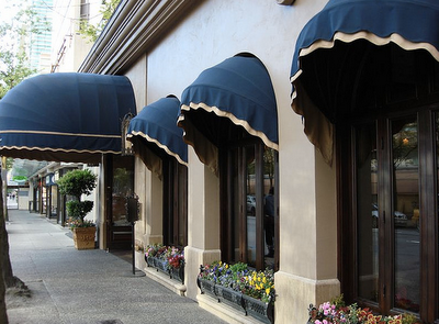
I think one of the only combinations where it works is the Wedgewood Hotel in Vancouver (below).
Photo by Maria Killam
Here is the same colour but paired with navy blue because blue is fabulous with pink beige.
So that’s it. If your house is pink beige but you can’t afford to change it yet, get out the blue paint. Or cream. Cream goes with earth tones including brown and white goes with fresh including black.
Green gray works too but it will feel 90s. Navy blue or other shades of fresher blues really makes this colour appear current and sophisticated.

flickr
So there. I know you probably thought you’d never hear me say anything good about this colour, but there is a first time for everything! I will share the rest of the painted ladies when I’m back home.
If you would like your home to fill you with happiness every time you walk in, contact me for on-line or in-person consultations.
Related posts:
While you’re here, subscribe to this feed so you don’t miss out!


Funny, now when I look at color, I feel as though you are perched on my shoulder saying, too pink, too green, too dirty….ah, just right. I think you should come with every can of paint, sort of like a jeannie in the bottle!
Pinky beige does work with navy! I love that combo.
pve
There is nothing worse than trying to match that pinky beige brick which seems to be prevalent in all the 80/90s era subdivisions in my area. Now you've found the answer. There should be a run on navy paint at the local Benjamin Moore stores. Another great lesson, Maria.
This week a homeowner asked to be rescued from what he called his "magenta" house – very pinky beige + yellowy white trim that looked filthy. I wondered, "Where's Maria and her camera?!" He wanted beige – but no green, yellow, pink or orange undertones. Hmm. His mother is an artist; undertones jump out at him. (Love the navy.)
Maria,
That's the key to "make it work" bump up the color with sophisticated trim elements. Using shutters, awnings and window outline trims. It balances out the overall colors and fills undertones. It's all an illusion!
Bette
Yes, you are so right! The navy blue does the perfect job of making this iffy color legit!
More, more, more on exterior colors, please! I am loving all of your advice in this area. Can't get enough!
What a difference, Maria.
Thank you for another great color lesson.
Undertone is the key!
xo
Brooke
The architecture in San Francisco is fabulous. A real treat for the eyes.
The navy is fabulous and your image is a perfect illustration of how to make pinky beige look right.
cheers
Susan
What a great illustration of (and solution to) the pinky-beige problem.
Maria, you and I agree on pinky beige. I think here in California we have beige and beiger on our homes and it is Yucky but you have shown how to make it look fresh and current, great examples!! Kathysue
The navy totally works!!! Great example, Maria!
San Francisco is a design mecca. When I was going through design school we went there almost every weekend to get inspiration. The city is so iconic and has so many lovely homes, and streets. Everything there is inspirational. Not to mention the full gamut of everything traditional to full blown contemporary to the outrageous! Its fabulous!
The navy is definitely the way to go. The first pic looks a little sickly. They just clash a bit, but the neutral navy plays well with the pinky beige for sure. 🙂 More San Francisco please! Can't wait for more pics later…
brilliant.
and so true!
xx
I love those navy awnings!… and the architecture of the building in just beautifully simple and classic… ~Terri
That is just amazing! I love seeing how the right color combination can 'fix' a bad color! Your blog is such an education on color Maria. I'm really looking forward to more of the photos you took. You teach me to 'see' with new eyes!
Thanks,
Donna
I had to laugh today Maria! I thought..oh boy…here we go again with the pinky beige! I am not a fan either, but love it with the navy! another good lesson today!
Funny, I hate pinky beige to!
I like this! Navy blue does look great with the pinky beige. Every one with a pinky beige home…paint your trim navy blue!!!
Nancy
Yes, definitely agree. Navy looks fanastic. I met a lady in the paint store the other day who SPECIFICALLY said she wanted a "pinky beige" to go in her living room. She also had lots of pink accessory fabric. After reading your blog it was all I could do to not burst out laughing.
Oh my goodness, I am just reading this blog… after all this talk from you and Kristie Barnett in Tennessee about pinky beige (week ending 2/6/2011 after the Atlanta Colour Class). Yes… pinky beige works on exteriors, namely my own house. I have it on my soffits and side and rear gables. And it so perfectly matches my brick… which incidentally, reminds me of the picture of the hotel you are showing. Whew! I was feeling a little Pfaklempt (sp?) over the pinky-beige because I so love it in small doses and as a backdrop for other cool colors. Of course, I am a novice decorator, with barely any training. Anyway, love, love, love this old post and all your posts. Happy Colouring… 🙂