


IKEA may know a thing or two about the black and white kitchen trend. And, if you are planning a black kitchen design around this trend (say, black kitchen cabinets or black countertops), you don’t want to miss these key details. Here’s what IKEA knows about black kitchens, that you don’t.
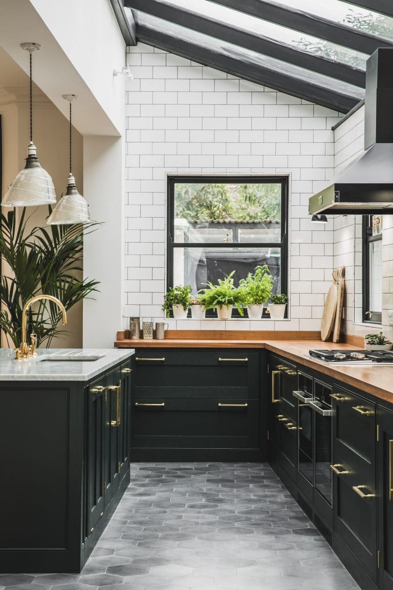
Western Living | Maybe black countertops, one row of black uppers and black paint is enough?
What IKEA Knows About Black and White Kitchens (That You Don’t)
Last week I met with a client who was buying an IKEA kitchen for their new home and we were looking at the whites in their brochure.
I haven’t been into IKEA to look at their kitchens in a while, so on the weekend, when I happened to be nearby, I popped in with my fan deck.
This way, when I’m specifying white for trim for a client (in person or in my eDesign department) installing a white IKEA kitchen, I know which white is right.
Anyway, I was struck by how much black IKEA had everywhere.
Every display throughout the store led with black. Whether it was black vases in the flower department or black lamps in the lamp department.
Why? Because black is the new grey of course.
Black is the new grey
I have mentioned black kitchens in a few posts here and here. But this trend is so big, I don’t think one post will drive this point home.
I snapped some photos as I walked through the showrooms because I want you to notice something here about IKEA’s display kitchens that you might not have seen on your own.
Let’s be clear, this is a company whose revenues are in the billions and they are in the business of selling kitchens (and everything else of course) so the way the kitchens are displayed are not by accident.
I’m trying to remember if there were ANY grey kitchens on display at all. White, but primarily black, was huge.
Let’s walk through the three kitchens that I snapped:
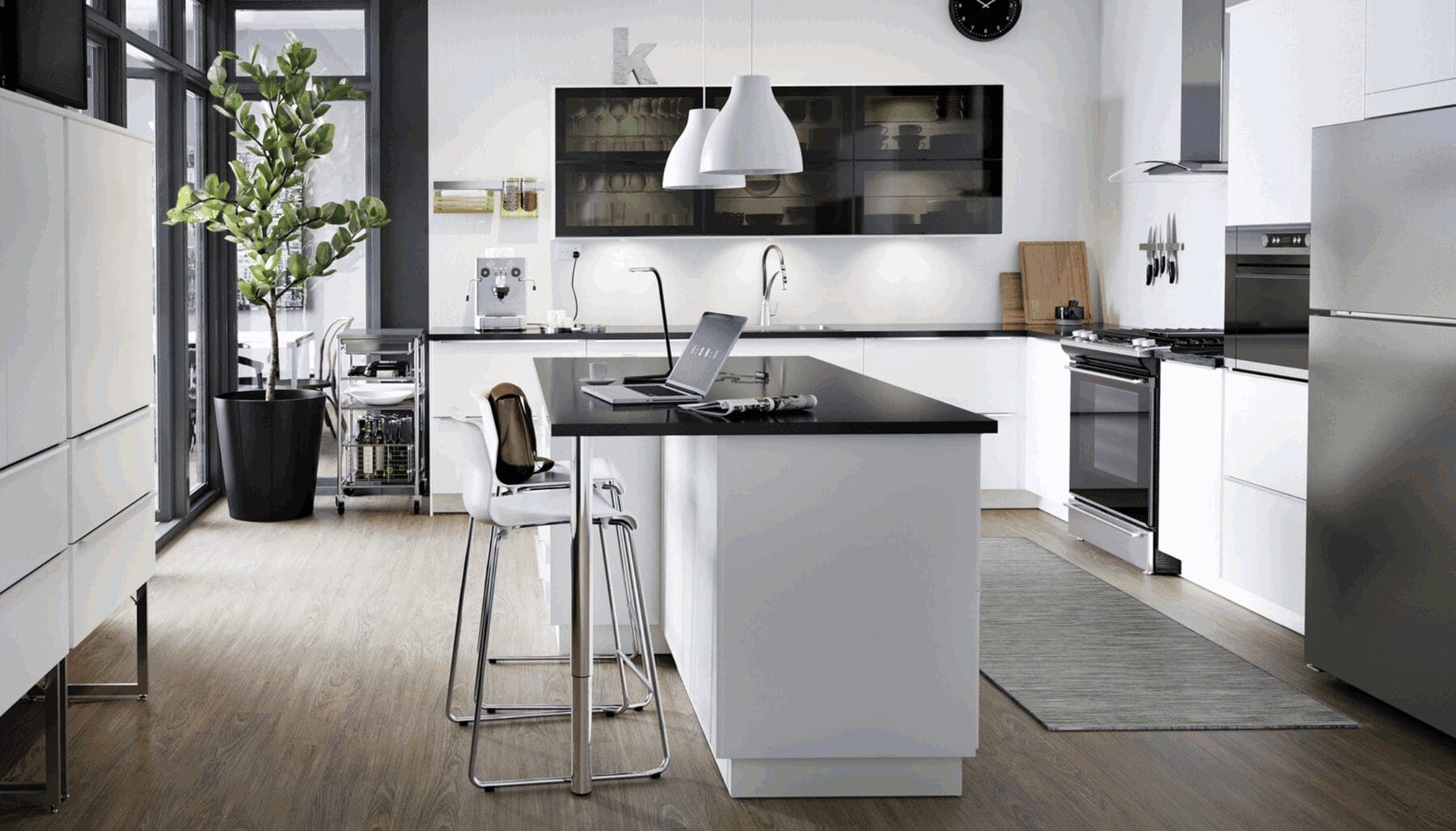
Black Kitchen Design with a huge window and no uppers or shelves
Notice, the focal point of this kitchen is the huge window that is almost as low as the countertop.
Also, there are no uppers or even any shelves on either side of this window.
This makes the kitchen feel spacious, light and bright.
The countertops are also white with a white (some would say boring) subway tile backsplash.
Lots of lighting everywhere, which is always critical to achieving a look and a feel.
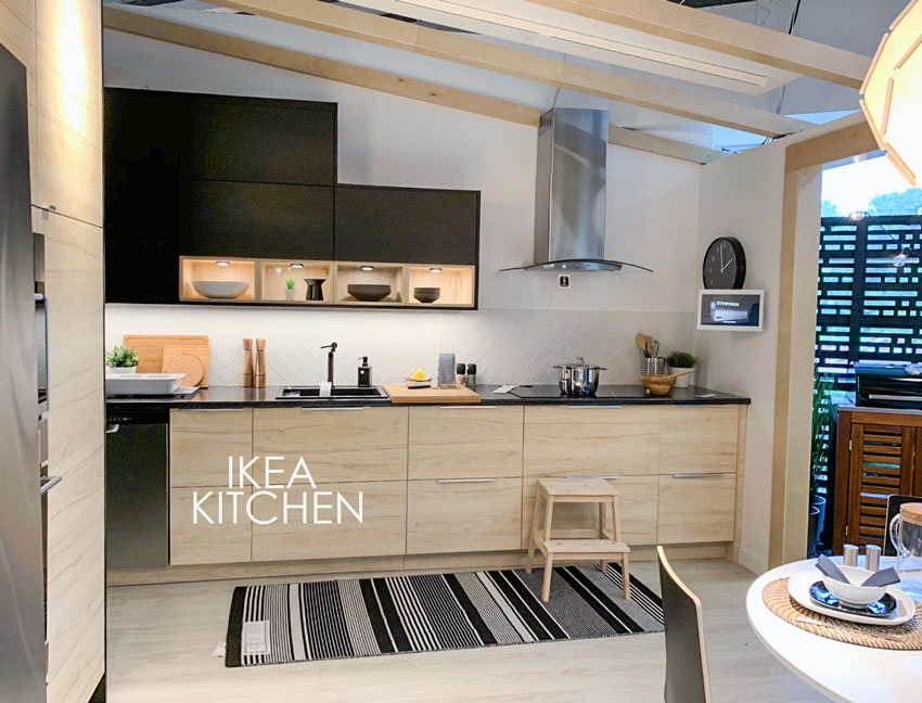
Black Kitchens Combine Light Wood + Black
In this modern kitchen, the light and bright feeling has been achieved by the pale wood floors, pale wood lowers, high ceilings with matching pale wood beams and the display (and of course lit) shelves in the uppers.
There’s ‘space’ between the modern hood fan and the cabinets which also coordinates perfectly with the modern, slab cabinets.
The black uppers have been repeated by the black countertops and the backsplash is white to keep it feeling fresh and above-all-things bright.

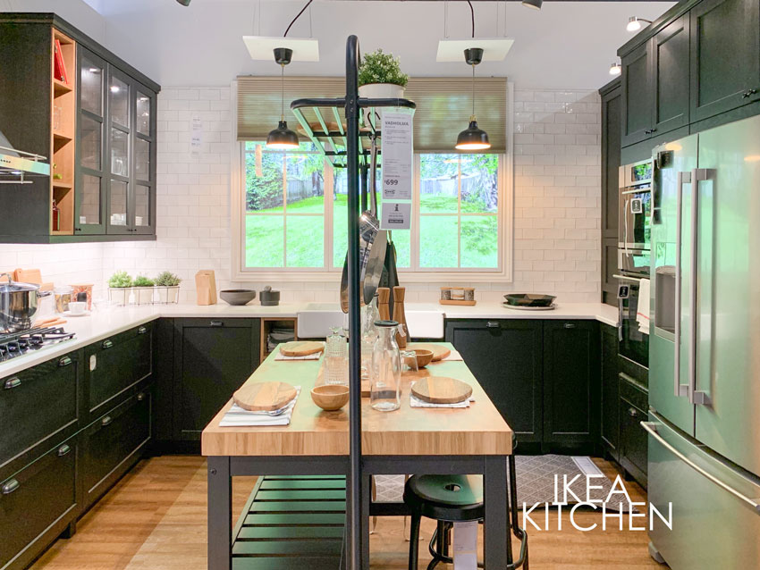
All windows above the uppers
This kitchen seemed to be the most busy, I could not get a photo without someone standing in it.
Why?
Well my guess is because the entire focal point wall of this kitchen, with black lowers, was ALL WINDOWS.
And that brings me back to my point.
The average consumer does not notice these details.
What your kitchen might look like if you don’t consider the same details
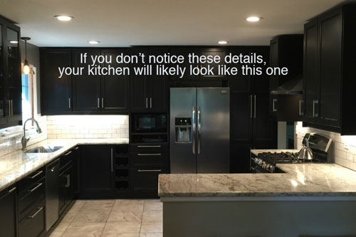
But what they DO NOTICE is how great IKEA’s kitchen feels inside the store.
And they make the decision to go with a black kitchen.
And, my lovelies, that’s how the average house, without windows like these, without all the extra lighting, without the well-planned and executed details, will end up with a black kitchen and it will feel as bleak and dark in most homes, as the average espresso brown kitchen did back in the Tuscan brown trend.
And after all is said and done, they will wonder why it didn’t feel like the kitchen in the showroom.
This (below) is the kitchen I talked about in this post: Ask Maria; What Mood Does Black or White Convey, Warm or Cool?
Notice again, the lack of uppers, the low windows, the butcher block countertops that add warmth and of course the expanse of white subway tile that lightens and brightens.
And this takes me to the reason I wrote this post.
What everyone wants way more than the perfect paint colour, is a look and a feel.
That’s what we spend three days in my Specify Colour with Confidence workshops talking about.
Every image on the screen is an opportunity to learn ‘Why does this room work? What would make it even better?’
Because I’m training your eye, so that you’ll be able to see things that others don’t see, just like the kitchens in this post.
We’ll talk about WHY. Why do the colours in this room work and another room they won’t work at all.
We’ll talk about decorating and styling, because choosing the perfect paint colour, or the perfect countertop colour, or the perfect cabinet colour, all contributes to the final result but does NOT give you the final result.
Decorating does that.
And we’ll compare colour for three days, because THAT is the secret to explaining the WHY.
I spend very little time talking about paint colours with my clients.
That’s definitely all THEY want to talk about because it’s the thing that’s keeping THEM up at night, but that’s the easiest part for me.
What I want to know, is which rug is going into the great room, what colour should your sofa be? How many lamps can you fit in this room?
You want a colour for your island? Maybe we should choose the blue buffet that you want in your dining room first so we can then coordinate it with the blue island you want in your kitchen, for example.
Because that is how flow is created.

Here’s what Mikki Brizendine said about my Live Workshop:
Interior Design is my second career.
I was a public school teacher for 15 years before returning to school to get my certification and launching my own business in 2015. The spring of my first year, I got a client who wanted a white. Easy enough, i thought! After specifying two different colors and personally paying for the re-do (Yikes!) I realized I needed help. I did some googling and needless to say I found you! I immediately bought White is Complicated. I have gone on to purchase and read all your ebooks (some more than once), I look forward to every new blog post, have gone back to “catch up” on old blog posts, and have gotten all your color board sets and use them faithfully with each and every client.
Last Christmas, my husband gifted me with your live training so I was able to attend your class in Atlanta, GA, this past Spring. I believe we were your first class to receive the new color wheel at the training and have been using it ever since.
Training your eye whether you’re a homeowner embarking on a big renovation, or a new build or a stager, decorator, stylist, interior designer, colour consultant, architect, is so important, and best of all learning how to choose the right neutral for ANYTHING, in addition to the perfect blue.
There’s so much more to learn, it’s the reason we get so many people willing to fly across the country to VOLUNTEER for free at the back of the room after they’ve completed the course the first time.
And if this isn’t the best colour/decorating course you’ve ever done, we’ll give you a full refund with our happiness guarantee.
You’ll pay half now and the other half 3 weeks before the course starts.

Thank you so much for this post. I spend so much time trying to figure out what makes
Those showrooms look so good- why do we all like it? I really appreciate you breaking down what happens between the showroom and the real life home. So helpful.
Also your analysis reminds me so much of resumes. We train ourselves to recognize good and bad but it’s much harder for people to know why their own turned out bad.
There are probably a million more examples like this. Which makes me want to hire a professional for everything. A practiced eye is so valuable.
Penelope
I wish everyone in America would pay attention to what you say about kitchens. Very, very few have large windows, let alone walls of windows, which is the only thing that makes a partially black kitchen begin to work. People jump on these bandwagons and end up with the dreariest kitchens. I’ve looked at thousands of kitchens in real estate listings; if I read “recently redone kitchen” before seeing the pictures, I brace myself for something awful. I’ve seen kitchens with as many as four hard surfaces with clashing undertones. An old (50s or earlier) kitchen is easier, and less expensive, to redo than is one of the more current monstrosities. I’m not making fun of people; I just think it’s sad that what should be the happy center of a home so often ranges from blah to much worse, primarily because people are ignorant about design and builders make horrible decisions.
The other thing about black surfaces is that they reveal every speck of dust or dirt, and the undried and unpolished swipe of a sponge leaves its mark. People think white kitchens are hard to keep clean, but unless you have dogs and kids spraying dirt everywhere, they’re quite easy. You see spots and swipe them before they have time to build up into the grime that accumulates, unnoticed, on wood cabinets.
Well said Kay! Thanks for your thoughtful comment! Maria
Great post on black Ikea kitchens! Those details are the kinds of things that we who can’t visualize well don’t realize until after the fact when things don’t look right. Many of us don’t have enough space to forego upper cabinets/shelves so black may not be a good option unless it’s just used for lower cabinets with some lighter uppers, which may be tricky to pull off without professional help. “Boring” white or cream with black or other accent colors may be easier to make look good for some of us with not particularly large kitchens. Your insights are so helpful!
I have always wanted dark cabinetry with a white counter and also never really liked uppers ( even in my ‘white’ kitchen, my uppers are only over my fridge). I must have known something wouldn’t work but just couldnt articulate it. Thanks Maria
Great post! I’m curious if anyone has insights about the quality of an Ikea kitchen over the long term? We are considering a kitchen renovation, but need to keep it on a fairly tight budget for numerous reasons. The Ikea kitchens are very appealing, but I worry about how they will hold up under daily wear and tear.
I did black cabinets in our guesthouse 7 years ago…just cause I liked it…now it’s everywhere…I used no uppers, just open shelves that I designed from one of your blog posts. White walls and beadboard painted white…I love it, and am so glad I did it. Wanted to send a photo in this reply but couldn’t figure out how. Glad I did a white kitchen in the main house though…we live at the beach!
Wouldn’t dream of going with something as trendy as this new black fad. Recently totally updated our Tuscan Kitchen (with some help from Maria’s EDesign) to all white cabinetry, Dreamy Marfil Cesarstone Quartz counters and you guessed it, subway white tiles. Added some accessories to warm it up a bit and we love it! Comparatively speaking, I’d call it “boring” but we believe it’s the best choice (and look) for the long run. I remember reading about the number one rule of design as “Boring now equals timeless later”…wonder where I heard that? 🙂
Haha that’s exactly right Ken! I’m so glad you’re happy with your kitchen! Thanks for your comment! Maria
Thanks Maria. Spot on as usual!
I’ll be the first to admit that IKEA puts together very appealing displays, but on a functional level, no way I’d be content with minimal or no upper cabinetry. All that bending and straightening to retrieve/replace items, no thanks! My back doth protest!
Entertaining and enlightening analysis, as usual, thank you.
I’ve had black with grey/cream/tan in my house for the last 5 years. I chose it because my floors were light cream and it needed the contrast. Lots of plush black velvet upholstery with silver accents and brown antiques. The black and cream was amazing, always elegant and simply looked wonderful at night. I’m not surprised that it’s trending now because pale floors have been trending for a while.
I’m so over it for my new house, which has dark floors. I’m moving on to navy and cream for my living area, turquoise blue with green or Farrow and Ball’s Borrowed Light with teal and coral, for the bedrooms and cream and aqua for the kitchen. Right now I’m very into cream colors, such as Farrow and Ball Wimborne White and their Pointing. I just love the way light moves across that matte surface.
HI Morgana –
I too live in California where we get a lot of daily sunshine. I’m planning a new build and am contemplating the back wall to be all glass windows and doors, likely black. Are you saying that after 5 years, you no longer love your neutral palette? I do not want to build something that will feel dated very soon and I’m not ever one of those brilliant people who’s ahead of the trends. lol. Thanks
Oh, and I forgot to mention in my house with black furnishings the back wall of the house is glass. Seriously, for the entire long length of the house, there”s only about 12′ of wall interspersed between windows. In an area of California that has 300 days of sunshine a year. And at night I have 3 level of lighting because with that much black you can’t have too many lamps. I can’t imagine black working in a dark house. I had fun throwing in leopard print rugs and ottomans. It’s surprisingly hard to find leopard print rugs. Lots of drama.
I wear black, but don’t want much in my environment other than an accent. Been seeing black kitchens here in Southern CA for long enough that I expect they’ll be out soon. Along with the gold accents and black window frames. Ugh, I has both in the 80’s and will never go back. those black window frames are only for a very specific kind of home IMO.
Great post Maria! How interesting that your IKEA has windows that overlook actual scenery. Our local IKEA showroom is very nice but definitely lacking those gorgeous windows in the kitchen displays as they would be overlooking a freeway. I think only about three of the dozen or so kitchen displays feature white or light natural wood cabinets and the rest are dark wood, black, or a modern stainless/high gloss color look.
We just closed on our first house, a ranch that was flipped in 2015. They picked the cheapest black slab doors available from IKEA along with butcher block counters and dark espresso laminate floors. There is just one window the galley-style kitchen and so the overall effect is very very dark. At least the backsplash is a nice clean white. A renovation to replace all our doors and drawer fronts with a white or cream shaker style doors and upgrade to white or black quartz or granite is on our long term wishlist for the house! I just don’t know what to do to brighten up the grayish-brownish modern tile in the bathrooms that feels lifeless and cold when paired with the green-gray paint, dark brown vanity, and espresso brown faux hardwood tile floors….
I agree. I have a white kitchen which is unfortunately also the thoroughfare between the living area and the door into the back garden. I also have two dogs, one of which is large and black. I’ve never found my white kitchen difficult to keep clean. That really is a myth.
The windows definitely save the black kitchens. Our rental has a white kitchen with black counters. If it weren’t for a wall of low windows over the sink it would feel too dark, even with the white cabinets. But I’d never noticed that until this article. Thanks for pointing it out!
Firstly, my colour wheels arrived today, I am SO excited. Thank you for your generous offer Maria. I’m having a little fun.
It seems Canada and Australia are on a par with trends, the black kitchen is arriving in show homes here too. Standing in a lighted or sun-lit room and looking with admiration as viewers do, I wonder it they consider what this pristine pool of darkness will look like after cooking a meal. Or the kids get a drink of water, or worse still, finish eating and have sticky fingers. I note the greenery through the windows is also a foil to the black cabinets.
Mary, are you doing the work yourself? IKEA kitchens are great for the DIY-er. If not, it may not save you as much money as you think.
Wow so much we don’t know. You are brilliant Maria. In the last picture I am surprised how the counter top goes up to meet the subway tile. Our home is 15 years old and has a rolled top up the wall. I am considering replacing the countertop to get rid of the rolled up effect. Is this put if style?
My first thought when I saw the first photo you posted was, “that’s a white kitchen – the cabinets just happen to be black.” Timeless! When we were planning our kitchen renovation I spent over a year doing nothing but studying photos of the kitchens I liked so I could be sure I understood why I liked it, what made it work, and whether it was something we could replicate. I am in a design-related profession so my eye is already fairly trained. And it still took me that long!
Maria your posts are so inspiring! I have not been in an Ikea store for ages so now I am definitely going to check it out! There are so many reasons IMHO that black kitchens will look dated and dingy in no time. There are so many pretty things to see in a display but if you fall in love with it and decide to put it in your own space without considering all the details that Maria has pointed out, you may learn to hate it! (Whew long run on sentence) Of course we all know that light is so important in any room to make a project come alive and it especially should be considered in a kitchen. I like the idea of just painting a center island and repeating the color whether black or any color in accessories or even floating shelves. Good post as usual!
Not only is black the new gray in kitchens, but I’ve been using it as an accent for a couple of years, and this past year pushing it further–just painted a master bedroom, with 12′ high ceilings and tons of light and moulding Benjamin Moore Wrought Iron. It’s gorgeous. Thanks for this post, I haven’t been to Ikea in awhile either.
What exquisite timing for your article to arrive in my inbox! My dreams of a white kitchen just flew out the window.
We have just purchased a new-build “spec” home that has nice upgrades etc but we have to go along with the designer’s choices, including a black kitchen – no changes allowed since everything has already been ordered. I have only seen the black cabinet sample and white with black speckled granite countertop sample. I am definitely going shopping for white subway tile backsplash after reading your advice! There is only one kitchen window, lots of upper cabinets. I guess I will be trying to incorporate some wood to warm it up? We won’t really be able to afford to make any major changes for quite a while. I hope I like it when it all comes together- too late to back out now!
Mary, I’ve never had an Ikea kitchen, but one of my good friends redid her kitchen with Ikea about 14 years ago. I’m thinking about adding a kitchen area when we were configure out house to include an STR and using Ikea. I asked her about it a couple of weeks ago and she said it still works great. She has replaced her wall tile just to update. She had 2 hyper young boys when she redid her kitchen and she cooks just about every meal, so it’s held up well.
Wonderful post Maria. It is spot on. When we go furniture or kitchen shopping we have to look at the entire display space, windows, colours, textures and the lights. I love that you point out the value of lights and that they will give kitchens such an important look and feel. Lights and lamps are so important everywhere and in the kitchen they have such a functional role we often forget to use them to also create ambience.
Depending on where you live and how many winter months and fog you have, a black kitchen with uppers may be the worst idea, but with windows, less black uppers or cleverly placed ones, lights and plants you can bring the brightness inside. Maria you are a genius and I cannot wait till you bring once of your seminars to Europe!
Ηey Maria from Greece.
Today you mentioned what I always say to my clients for the upper cabinets. It is a huge difference when the kitchen has no upper cabinets. It feels totally different and airy no matter the colour. Of course the big windows it’s a big issue too. I try to design my big units from floor to ceiling -like the one you have in your example- in a lighter colour, woody or lacquer because it doesn’t look like a smudge at the end. I have to say that most of the clients of course don’t like the idea of no -or fewer- upper cabinets for storage reasons and don’t like open shelves too, for cleaning reasons. My advise is: Choose a lighter colour unless you have these windows or no upper cabinets.
This is in response to Mary who asked about the quality of IKEA kitchens in the long run. My sis completely gutted and redesigned her kitchen using IKEA all by herself. She loved the options for those “quiet” close drawers. She said the “bones” of the components were the strong points. My sister used 100% IKEA, but there’s a kitchen design house that uses exclusively IKEA cabinetry for their interiors and then custom designs the outer “skin” components like doors and drawer faces. Customers know going in that they’re paying for the good but inexpensive “bones” of IKEA while getting that custom designer look for about half of what a typical custom design studio would charge. The New York Times did an article on the two guys who do the custom IKEA hacks for a living. Very interesting article! Look up Michael Andersen and Jeppe Christensen. Founders of the design firm REFORM. http://www.reformcph.com Thank you Maria for another interesting article that speaks to me. My kitchen has partial black cabinets!
We have black in our kitchen, with butcher block tables in the nook and dinning room. We love it because there are three large windows in the kitchen and we have a medium floors and stainless steel plus lots of live greenery and light. It has the feel of all your good examples. We don’t have IKEA cabinets, but I can say their kitchen designs are strongly the inspiration for ours.
This article is so great! I’d love to see more showing what can go wrong (like the fail above). For example, in the comments of every kitchen article on Houzz, people post their own kitchen remodels. And most of the time they are not good. White ones in particular almost never look that good, and it’s due to details which cost more and I believe amateurs don’t understand the need for.
Thank you for the article…gave me some confidence to continue to dream about my classic white kitchen! My friends give me a hard time about it. With that classic white kitchen, Maria can you have white appliances too? I have a vintage stove so should my white be that white?
And notice the abundance of green plants! Great post, thank you, Maria <3