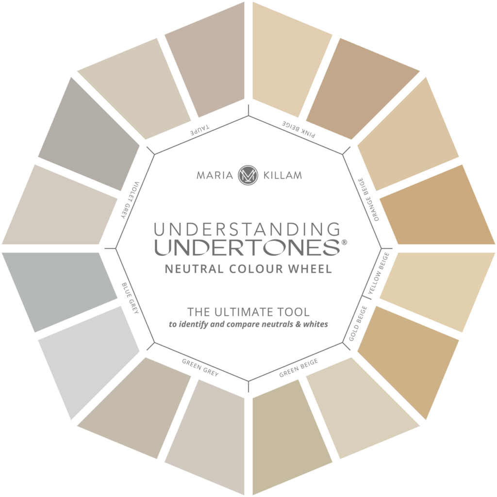
Here are the ones that don’t work together.
When can you decorate with pink and yellow?? In nature, with flowers. Inside of interior design, this means, clean fresh palettes only if you are combining pink and yellow:
It’s pink beige and yellow beige that don’t work in the same room.
During the beige trend (way before grey arrived on the scene) I had so many people say to me “Please come and help me choose a beige, I ALWAYS end up with pink on the walls”.
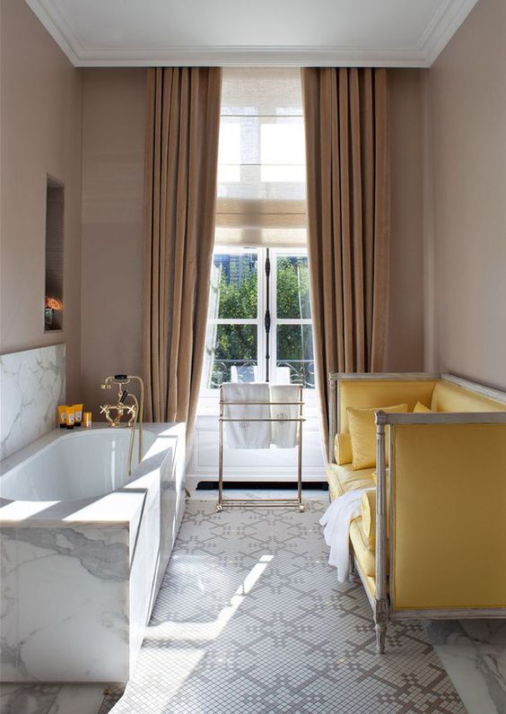
Here’s a great example of pink beige walls and drapes with a yellow sofa that perfectly illustrates what I’ve just said.
When you combine yellow and pink beige or yellow beige and pink beige, it often creates a clean and dirty combination.
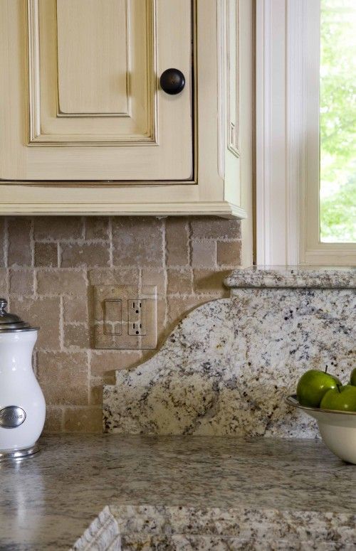
Here’s an example from the Tuscan brown trend that was a really common installation.
Yellow beige glazed cabinets with pink beige travertine and yellow beige and gold granite (below).
Here you can see that pink beige backsplash looks dirty when compared to the yellow beige cabinets.
Granite mostly just looks good with plain subway tile. Cream would have worked perfectly here since that would have been the shade of white that would have related to both the countertop and the cabinets.
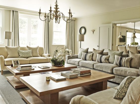
Here the two loves seats are yellow beige and the sofa is green beige. They don’t clash but it looks like someone didn’t want to commit to a colour so they just kept choosing another neutral undertone.
I had a student in my colour theory class who was worried I spent too much time talking about beige and the undertones of beige in our first class. However, as a designer or DIY homeowner, you must be able to see the difference while the samples are small otherwise it’s too late once your flooring or drapery has been installed.
If you would like to learn the difference so that you can walk into any space and know what is not working and how to fix it, become a True Colour Expert by attending one of my live workshops!
What’s the undertone of the sofa in this interior by Jamie Drake? Now you’ll know!
Download my eBook, How to Choose Paint Colours: It’s All in the Undertones to learn how to get colour to do what you want.
If you would like your home to fill you with happiness every time you walk in, contact me.
To make sure the undertones in your home are right, get some large samples!
If you would like to learn to how choose the right colours for your home or for your clients, become a True Colour Expert.
Related posts:
What everyone should know about Gray
New to this Blog? Click here ; Subscribe to my Monthly Newsletter; Become a True Colour Expert
While you’re here, subscribe to this feed so you don’t miss out!


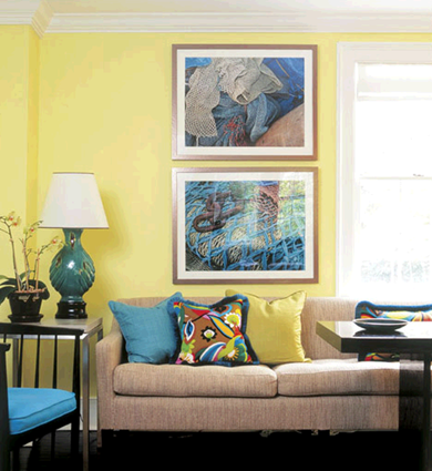


You really see the world in a different way, don’t you? I think that is the sign of an artist. When I am in an art phase, and reading all sorts of art books, I see the world in a whole different way.
So, I am guessing that the Jamie Drake sofa has a yellow undertone? Even if I am not very good at judging the undertone in paint, it is nice to be aware of it.
hey…I thought pink and yellow undertones don’t go together? that IS a trick question! 🙂
I guess it works because of the pink tones in the art, and bringing the yellow to the sofa…still I’m not in love with this combo…
great post!!!
It IS a pinky beige sofa and I thought it was such a perfect image to show what not to do (in my opinion). He’s used such a clean, bright yellow for the wall colour and accents. The ONLY thing that remotely makes it work is the art and the colour in the patterned cushion but even that’s a stretch.
And as I tell my students, you can do anything you want when you leave this class, but you can’t give me a palette with clean and dirty colours together while you are here, cause in this class I’m training your eye to accurately see undertones!
It’s harder than it looks!
take that yellow cushion off the sofa, and it’s even worst…I do like the way he uses a pattern to tie everything together…maybe that’s the solution.
Ciao!
Hope you’re having a great week 🙂
Wonderful post. I’m such a color freak. In my fashion days I was the color approver under the light box. I rejected most of the time. The factories hated me. lol. I go crazy with pinky beige. This was great.
What a great, insightful post! Yes undertones rule the world, especially when picking a neutral.
People by beige to be ‘on the safe side’ without paying attention to it’s determining undertones and then are shocked when it ( couch, wall color, bedding etc.)doesn’t seamlessly blend in with their decor. ( Ask my mom who still doesn’t understand why her living room looks pink 8 hrs out of everyday! )
Jamie Drake obviously loves to play with colors in all of his interiors- I just LOVE him for that, but I agree this is not one of his best examples…
I suppose he was inspired by the blues and pinks from the art work- – who knows. I hate to say it but the ‘off-ness’ of it all makes it look a little like a hotel room to me. So sorry Jamie…..
I love this blog! The one thing most architects fear … is COLOR! I could tell right off the bat that the couch had the pink undertones and that it really didn’t go with the yellow. Thanks so much for sharing your world with us!
Looks pinkish to me, but what do I know. See! I need to take your class.
I had such a hard time choosing a white for my living room. I had sample pots of about 20 Benjamin Moore whites and painted cards and moved them around. I analyzed and analyzed but noticed that things looked different in every light! It is complicated. I finally chose Soft Chamois but it was too light and I needed to go back and get them to double the colour twice! Have you ever noticed that Benjamin Moore’s light colours seem to go on the wall much lighter than their sample cards. I used Gray Wisp also in a bathroom and it was so pale!
Anyway, beige is tres complex and I am glad you are giving it justice!
Back soon, Terri
I see salmon tones – the same tone that was highly use in Victoria during the 80’s (lol)
I wish I read this about 3 months ago! If you get a chance, would you mind stopping by and giving me your opinion on my Dining room post? Thank you!
You see, now that I know the sofa has pink undertones I see it, but I was convinced it had yellow undertones! I need to defer to the experts. If you lived in Atlanta, I would hire you every time I painted a room.
I’m so glad I found your site. I work on educational projects for a paint company and you are giving me some great ideas. thanks
Oh wow! All I see in that sofa is pinkish beige. The same thing I am convinced I see on my family room walls that I want changed now. Great post and teaching/training, Maria. I believe my daughter is contacting you for help with her color choices soon. Wish we lived in your area and could take your class. It would save us a lot of time, frustration and money!
~~ Victoria
And yes, it does look “dirty” compared to the other fresh and bright colors he chose for the rest of the decor. I am looking for undertones in everything now!
Have a SIL who just recently built a new home. When we walked in the first impression by ALL of us was OMG PINK overkill …. but it was actually a Beige. Sad to say it is horrid! Even the Hardwood Floors looked pink particularly in the main living area which was a Northern exposure.
What undertones do you usually see in different types of (unstained) hardwood floors? Red oak? White oak? Thanks!
Hi Camille,
All wood floors have an undertone that should be considered when picking wall colours, most are in the realm of yellow, red and orange but when people ask me this question usually they are wondering about which wall colours could potentially clash when looking at wood tones (good post idea actually, hmmmm.)
The only time you really need to worry about it (and there are exceptions to this) is if you have a cherry or mahogany floor in your dining room for example, and you want to paint it red, even that is not wrong but then you want to make sure that the red you choose for the walls doesn't clash with the red undertone of the floor.
Hope that helps!
Maria
Wow…never thought of the floor undertones. Of course, it makes perfect sense. Couldn’t find a post on the floor color issue yet. White oak, for example, has many colors in it.
I am trying to decorate my first home and am so confused by all these beiges….how can you tell if something has a certain undertone??? our couch is light brown, and the carpet is beige, but when i painted the walls beige, they looked yellowish. so i tried a different beige, and it looked grey. the other colors i would like to use are blues and greens, but im not sure if this is possible with the carpet color? green and blue with gray doesnt look very good to me. help!
Hi Jessa,
Beige doesn't necessarily look beige until you choose the right one for your space (if that is what you want), the first one you chose was probably a yellowy beige and the second one a greeny beige (which is why it looked grey).
Unfortuntely it's too hard to tell you what to do but if your sofa is light brown maybe it's a pink beige and you should try one of those (since that's the only option left).
Try bradstreet beige (it's got a pinky undertone).
Blue & green, could be used as well but it has to be grayed enough so that it works with your sofa and then you just need to repeat those colours in the room to make it work!
Maria
Hi Maria!
So happy to have found your site…you have educated me and now I see why some of my colors just don't go. Thank you! Your analysis of the spa above using Alexandria beige prompted me to post. I am painting my daughter's room, white (very white like simply white) trim; bedding is C&B Marimeko Tamara linen color bedding….she will use accents of bright green, dark teal and perhaps a raspberry type color for pops of color. Since her bed frame and bedroom furniture is white also we are thinking of painting the accent wall where her bed will be BM Alexandria Beige and now the work begins….looking for an "off white" for her other walls that coordinates with Alexandria Beige….something soft yet making the room look bright and clean. I trust and admire your expertise…..what BM colors would you recommend that aren't too yellow. Her bedroom, by the way, faces south with two windows so much natural light in the am. Thank you and thank you for providing me with a much needed education on color!
Hello again, Maria!
After painting our sample board, Alexandria beige we have decided that appears to be the perfect color for the accent wall and now looking at BM OC-9 through OC-12, Ballet White, White Sand, Clay Beige and Muslin….my daughter is thinking OC-10 white sand???? would this work? Her trim will be painted an old Pratt & Lambert color called "off white" which is what our entire house is painted, although that can change if need be. Does it appear we are in the right direction or am I way off? Again, many thanks for your knowledge and expertise!
Hi Diane,
Definitely at least Muslin so the other walls don't look too stark next to the rich brown!
Sounds beautiful!
Warm regards
Maria
Thank you so much for taking the time to respond, Maria! We will sample Muslin as well. The accent wall is not a large wall nor is the room very large so we may go a bit lighter than Muslin but I see your point about the vast contrast….good point and I wouldn't expect any less from your expertise. Wish you were in the US! Thank you again!
What a timely article…for me, at least! I am looking at floor tile for the master bath. The shower and tub walls are yellowy beige mosaic tiles…circa 1983. But they still look good…at least that's what I am telling myself since I cannot afford to change the whole room, yet.
The floors HAVE to be done. There is a terra cotta carpet in the room (dumb move on the part of the last owners). Now I know what to look for. Great information!
Thanks so much!
Warmly,
Jane (artfully graced)
Jane
I am way behind the times reading this, but for what it's worth, thank you, I think this will certainly save me some headaches in the future. I looked at the sofa photo and thought 'pinky', and wasn't at all sure it looked good with the yellow – so relieved to see you saying the same thing.
Having 'invested' heavily in pine furniture when I bought my first flat (orangey?) I am only now realizing why it looks so yukky with our current dusky lilac walls. In fact, I'm embarrassed to type that here. 🙂
Hi Maria,
I've been reaidng your blog for a month now – hours at a time. I went looking first for info on paint finishes and found your fab article. I am painting my kitchen and have a number of slabs on the wall and can't decide. Can you help?
My kitchen is full of wood with what I think is an orange undertone. Cherry cabinets, brown granite island, grayish with specs of tan formica countertops around sides, and pale beige backsplash. (previous owners chose these – we have to live with it for now).
Off the kitchen are these rooms and BM colors:
dining room: woodacres
family room: dunmore cream
hallway: shabby chic
All trim is linen white.
I want it neutral (it's currently pear green which after reading your blog, makes no sense)- and was thinking of walls linen white too in a pearl finish.
Other options:
China white
Etiquette (an Aura color)
Abalone
Edgecomb gray
Gray owl
Any advice is much much appreciated.
I've read all your articles by now, recently subscribed, and am hooked!
Thanks a million.
Hi Allison,
I would not go to a dirty looking trim which is the effect you would achieve with anything other than white or cream.
Ivory white would work nicely with your existing colours!
Thanks for reading my blog!
Maria
I am amazed you were able to find the time to respond — thank you thank you! I am going with linen white in a pearl finish (suggested from another article you wrote on paint finishes -pearl is good for kitchens)and think it will look good with the already linen white trim in a semi-gloss (in that article you also show trim/walls in same color, different finishes).
You are a real pro – I can't wait what you're going to write next.
Someone else asked this question in another comments section — but can we take your class online? I would love to take it.
Thanks for this post! I'm a quilter and have always been told I have an eye for colours in quilts. After Reading this post I'm a little stumped, I'm making a quilt with turquoise and whites being the dominating colours, with just the slightest bit a kelley green and corally pink for accent. The White fabrics all have a green beige design on them and I'm just wondering if it will work with the little bit of pink and a lot of turqouise. I guess my question is with this pallet would the green beige be the best choice. Since I'm using this quilt as the jumping off point for redecorating my lounge with these colours I want to get it right 😉
HI Diana,
That sounds like it'll work to me as once you mix them on a quilt you can usually pull it off. All greens go together! Sounds beautiful!
Maria
hi
So delighted to have found this site.
i guess I have made every mistake there is in choosing a beige wall color. Taking a cue from my kitchen counters which are similar to BM's Lenox Tan, what would be a good beige wall color.
if I don't want to showcase the orange in my cabinets, am I correct in assuming that I should avoid a beige with a green undertone.
Appliances are white.
Thanks
Linda
Hi Linda,
Well if you painted them GREEN then perhaps the cabinets would look more orange but I don't think there's anything wrong with a green undertone in the beige, if your countertops are Lenox Tan, then I might consider Hazy Skies, OC-48.
Maria
Hi
Thanks so much for your suggestion. I painted the wall Quincy tan but it was just too dark and too green, Then I tried Powell Buff ( too yellow) then Monroe Bisque ( too green ) then Putnam Ivory ( too peachy ) then Shaker Beige and evn that does not look right. Too pinky.
it's not the paint. it must be the undertone in the cabinets ( orange oak) the backsplash tile ( which now looks pink ) the counter which is a laminate called travertine or the porcelain tile floors.
I'd like to rip it all out and start again.
I wish that I lived closer to you. I'm about as far away as possible and still be in Canada. I'm located in NL.
Thanks for your suggestion of Hazy Skies
Linda
Maria, I just LOVE your blog. I am usually terrible with colors, but I am learning with the help of your blog! I never realized why the color of beige in our kitchen was different from the rest of the house when we purchased it. Now, I know why! The floors are a pinky terra cotta and the beige has pink undertones! The rest of our house has wood floors that have an orange undertone and the beige has a different undertone, I think it's a green undertone…. I still need to learn more though! I can really see the value of hiring a color professional! Thanks again!
I had this exact "pink beige" sofa with a "yellow beige" wall situation with a client today!! I was so happy to have the exact words to explain to her why the room was not working. Thanks for making my job easier!!!
Please help! Your post was extremely helpful. I painted my DR in Valspar Tawny (not Tawny Bluff just Tawny). I continue to see pink or peach undertones on the wall that husband doesn't. Can you verify this. Not sure if I like the color with the burnt orange drapes that have dark brown curved lined throughout. The carpet definitely has yellow undertones. Pls help on letting me know if my current color works or what suggestion would you give. Thanks, Tamara
Hi Tamara,
I don't have the Valspar deck but Tawny sounds pink to me. If you see pink it's there (80% of men are colourblind to some degree).
If your carpet has yellow undertones then I would go with a yellow beige or yellow that would look way better with the orange drapes as well (love that combo), I would consider something like HC-35 Powell Buff or Vellum if you want more yellow.
Maria
Thank You! This totally explains why the beige paint I selected for a bathroom briefly turned into a disgusting 1950s pinkish beige (that make-up colored color). The color was picked using the two tiles shaded teal/taupe and shades of chocolate/milk chicolate to be "not greenish" which probably guaranteed a pinkish undertone beige.
The minty-green toothpaste-coloured paint that was already on the walls forced my eyes and brain to see pink because all the green receptors I had were used up and exhausted by the mint.
LESSON: Don't look back when you are painting, and don't judge a color until you have at least one really good coat of the it on all the walls.
I could easily have second-guessed myself into gallons of futile attempts to find something that wasn't 'too pink". Now that the minty-fresh walls are all repainted, it looks like the color I thought I would get, and plays nicely with the teals of the floor and the chocolate of the cabinets. Yes, I'm chasing a trend here but the affordable fix for sound, but ugly, walnut cabinets involved gel stain in deep coffee.
Thanks Maria, please tell me who is/makes HC? Is it available in the States?
HC colour are Benjamin Moore's Historical Colours!
Maria
Perfect I know them, thanks!
Great post! It always amuses me when my clients look at me like I'm crazy when I try to explain that the beige we are looking at is too pink or too yellow, or green… when I put other beige colors next to them, they can begin to understand the differences and subtleties.
Hi Maria, I come back to this post over and over again. Thanks so much for providing us this resource. I've been comparing my beiges to your examples. Shenandoah Taupe, greenish, and Weimaraner, pinkish? So much to learn!
The couch is pink…..
It's like, bam, in your face! I don't like pink or yellow for walls so that pic is a double whammy…
I just discovered your blog and love it. But now I have spent so much time on it that it is very late at night and I think I not understanding everything. When deciding on colors do not mix muddy with clean colors and do not mix pink, yellow or green undertones. Are these separate rules or are they related somehow. I am choosing a sofa, chairs, curtains for a room with HC 101 hampshire grey and I am getting nervous. It is essentially a muddy green I think. SO I should make sure not have a pink beige for the sofa right? But a yellow beige works and so does a green beige? I want to use blue and orange in this room as accents. Is that too many color choices? I could go on with questions but I will stop here and hope that you can give me a quick answer.
Hi Hariklia,
That's a good question. The short answer is that you should just pick one 'beige' to decorate with instead of mixing them up. And yes keep pinky beige out of the picture entirely. Orange would work, it depends on which blue, but I would stick overall to 3 colours (neutrals not included in that count).
Hope this helps,
Maria
Hi – great article! I always knew there was a reason all the 'beige' I chose looked like skin on the wall (ick).
I have orangeish / red mahogany trim and floors along with a navy ish blue sofa. I want to neutralize the walls – but not go WHITE. Should I go with a green beige or a yellow beige? I'm even willing to go slightly darker. I think that a clean beige would work better than a dirty beige because I have white curtains.
I am a huge fan of your post and now my friends and family is too.
My floor is littered with paint chips and weeks later I STILL am stuck. I have the soon-to-be-in-style gray carpet with purple undertone (I am fairly sure) I tried greens (no) taupes (nice, but does fit the feel of the furniture) so am now to beige. I have a pile of beige paint samples. It's a bedroom (maybe a baby room someday) and I really don't want it to be dirty looking, but full-on yellow is too much. Any suggestions on what would be a pretty beige to go with a purple gray carpet? (or any other ideas?)
Wow, I feel so amazing – I guessed pink. There's some hope for my beige ability yet. Ha! The color gods are mocking me – I still feel the need for intensive color therapy. I've always used BM HC-27 and now I'm looking around thinking these walls look a bit buttery. Maybe not a good mix with the sage rug (tv rm) or the merlot in the dining room. Just repainted walls 4 mnths ago – whoops.
hi there! stumbled upon your blog and really enjoy it so far. maybe you can help me on my quest! i am painting my and fiance's condo. so far, i have "leafy rise" in Valspar in some of the walls in kitchen and "fioli ballroom" in Valspar on bottom parts of dining room (some in kitchen as well). i really like these two colors. i need a color (was thinking light beige) for top part of dining room (against Fioli ballroom, separated by a chair rail) and throughout rest of living room.
it is an open floor plan, with tall ceilings in living room and skylights. i need something beautiful and i'm sure you can help!! open to your suggestions! right now i have a pink beige and not really sure about this ….
hope to hear from you soon!
thanks so much, elizabeth
Hi Elizabeth,
I don't have a Valspar deck so I can't check out those colours, I can help you on-line though, email me for my rates at [email protected].
Thanks for reading my blog!
Maria
thanks Maria! I e-mailed you! 🙂 Elizabeth
Hi, Maria,
Love your post. Thank you for sharing.
We are moving in a house with 80's oak cabinets, floor and trims. After reading your posts, we decided to paint the cabinets and trims white, but are not sure what undertones the floor has. Can you share more on floor undertones?
Thank you!!
To be really picky and accurate I think it is a red undertone in the sofa. Not only do yellowy beiges and pinky beiges conflict but I think you have to be careful with yellows and reds to avoid the ketchup and mustard syndrome. The sofa and wall here has a mustard and hotdog effect. Ick.
I am relieved to have found your blog right before setting out to paint the whole interior of our newly constructed home. Your writing about beige has been especially helpful! We want to keep our paint neutral because we are likely to need to resell the house in a few years. I think we need a yellow beige in our living room to go with our caramel-gold with sage green and red paisley sofa and red chair. Floors are cherry laminate. The living room is part of a great room with kitchen (espresso cabinets) and a small dining area, with tall ceilings and light from the north. Am I right that a yellow-beige or green-beige would work here and is there one on the lighter side that you like? I am struggling with this one. Your advice would be greatly appreciated.
I have a beach home that needs to be painted from top to bottom. Colors chosen so far seem to have a gray or maybe have some brown in the undertone (??) NOT SURE? – Sherwin Williams “Cay, Sherwin Williams “Eider White”, SWilliams “Accessible Beige” and SWilliams “Lemongrass. I love Benjamin Moore but when with SWilliams because of the costal cool color palette cheat sheet booklet they provided in their store. I felt like it was an easy cheat sheet, ha! My dilemma? Choosing a first level paint color to match my Kraftmaid “Canvas color cabinets” which seem to have a gray undertone as well, along with my Typhoon Bordeaux granite countertop. The main color will travel from the kitchen, through the family room up the steps into the upstairs hallway so I have to pick a neutral that will work with the SW colors already painted.. Any thoughts or suggestions would be greatly appreciated. I have to decide by this Friday 🙁
I am currently redoing several rooms after a car drove into my house (really). On the advice of a friend who’s house always looks good, I chose a gold color for my living room. The painters put one coat on and I nearly had a heart attack. Terrible. I chased the painters away until I can come up with something else. After a month trying various yellowishish hues, and getting a headache every time I walk into the room, I finally realized that I need something with a green undertone. Am currently looking at BM’s Danville Tan or Crown Point Sand. The thing is, I have white wood blinds on the windows, and don’t plan on changing them. I live on a busy corner (hence car driving into house) and usually keep blinds closed. Will the Danville Tan be too dark with the white blinds? What colors of trim would work? Thanks.
Hi Helen, your neutral paint colour should relate to your furniture or fixed elements. YOu could do anything from Simply White, to Cloud White to Ivory White with Danville Tan, however your trim colour should relate to the fixed white in your house if you have one. Maria
I love your book and all your color information. I just graduated from a university with a BFA in interior design and they really lacked teaching us about color, which is so important. So thank you for continuing my education. The only thing I’m missing is how to know what colors go with others. I understand all the undertones and what that means, but how do I put it all together now. For example if I walk into a room and the floor is pink beige and the countertop is a taupe. How do I know what colors will compliment these or which to steer away from?
In the color bonus book you explain a little for a few colors, for example “Pure White works well with Carrara marble as the blue undertone of Pure White is the right match for the grayish blue tones”. But is there something that can help me with everything else? Thanks!
I recommend my colour workshop, you can find the details here: http://offers.mariakillam.com/true-colour-expert-workshop/ maria
Needing help today. I have Sherwin Wms Renwick Beige walls in kitchen, with a tile floor in same color family just deeper tone, maybe slightly more brown in it, and yet had hoped to pull off a gray olive in kitchen cabinets. But the beige looks to have a very pink undertone. I have brick chimney focal point in kitchen (with some chalky/pink tones but alongside copper and SW Toile red accents too. The counter top is 1990’s black speckled formica (has grays/blacks/coffee/and shell-ish pink speckles)…. which stays for now. I need 1 -2 cabinet colors to choose from [plus should I do uppers one color and lowers another??]. This is a traditional 1990 farmhouse feel with short cabinets and a closed soffit so the upper cabinets will be truly adjacent to the Renwick Beige. The kitchen opens to a family room with a wall of same brick (which also has gray and brown tones and a greeb-gray mortar) plus a wood paneling that’s walnut/green undertone. Is there ANY way to choose a kitchen cabinet color here?? My trim is SW Natural Tan. NOT very much contrast to the Renwick Beige:( Help!
I’m starting to see the world in undertones. Nothing will be the same ever again! Thank you for sharing your well-put-together insights.
Would you say Paris Rain, Porter Paints, a grayish green, is a “sage” green. Love this color, but is it now dated…it coming back?
Hi Sharon, I’m not familiar with their paint line, sorry about that. Maria
Oh My! I feel like I am doomed! We have travertine floors with our cabinets, built ins and stairs all in maple (yellow). Can any wall color bring these two No No’s together.
Yes pink beige. . . my ebook will list the best ones to try https://mariakillam.com/product/how-to-choose-paint-colours-pdf/
Hardwood floors are basically neutral like a pair of jeans. Hope that helps, Maria
Hello Maria! I have enjoyed reading your blog, especially the articles regarding trends and de-tuscanizing a home. My home was built in 2014 and is Mediterranean architecture. Not sure if I have a question maybe a statement. I think the exterior and interior of a home should be complimentary. While my home is brighter due to furnishings it does have many Mediterranean throughout
which makes sense given the exterior.