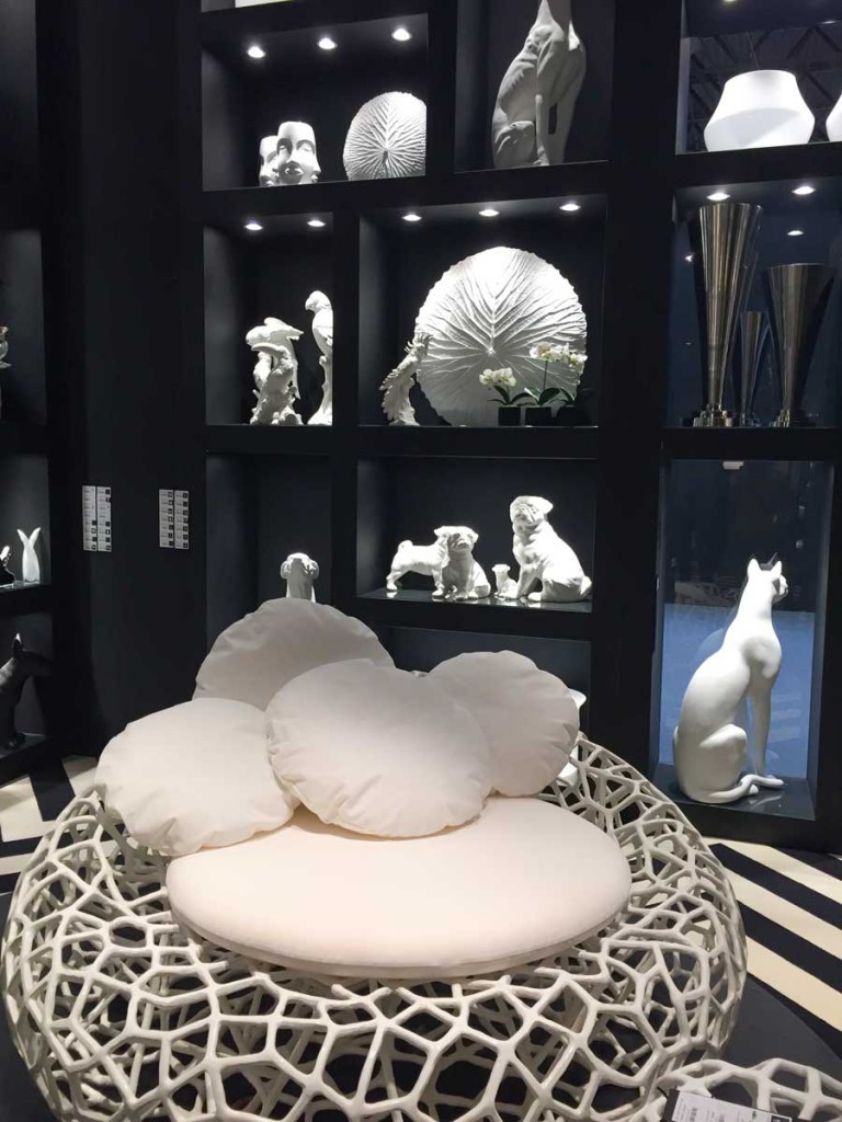
Photo by Maria Killam at Maison & Objet
When I wrote my trend report from Maison & Objet last week, truthfully, I was kind of depressed that all evidence points towards black as the next trendy neutral after grey.
In this case, I hope I’m wrong.
It seems that in my 20 year colour career I’ve now seen trend colours go full circle around the wheel.
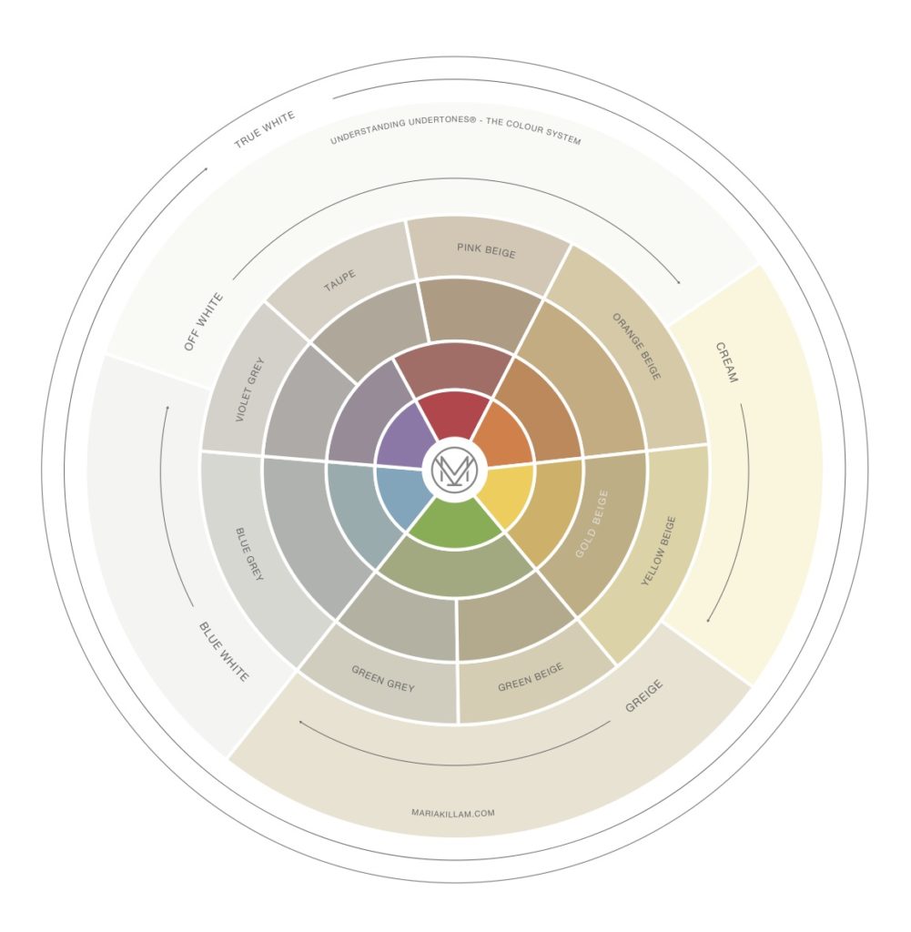
Understanding Undertones – The Colour System
When you think about it, if I had started my career around the same time as the grey fresh trend arrived about 7 years ago, I would not have discovered my system (yet) because I would not have had time to specify the boatloads of beige which is where I first uncovered the world of neutral undertones.
By the way I tweaked the wheel (above) from the last one, see if you can spot the difference.
Anyway, I grew up with peach and turquoise because that was the 80s. I remember not liking turquoise for YEARS after that because it occurred to me as being extremely dated. Yet my Mom kept decorating and wearing turquoise (and never stopped) because she loves that colour. And she still loves pink. Many of you have seen her Windsor Smith inspired pink living room here.
Then when turquoise came back with the brown trend in the early 2000s, I fell in love with it. My master bedroom is painted that colour.
When I talked about black in that trends post, many of my readers posted very astute comments like “Every room needs a touch of black”, etc.
Interior by Maria Killam
While this is absolutely true, and I have black in my living room as well (above), what makes me less than thrilled about black being the new ‘trendy neutral’ is that it will surely become overused just like charcoal is right now and just like brown was overused during the tuscan brown trend.
I was at a dinner party on the weekend and talked to a guest who was renovating her condo. She was installing solid grey tile in her entry, bathroom and kitchen and showed me a photo of a very busy granite countertop in shades of grey. She informed me that she had no idea what her backsplash was going to be yet. Because of course, most people think that the backsplash needs to be just as interesting as the countertop, right?
But you and I know better.
Related post: First Rule of Design: Boring New Equals Timeless Later
Her current kitchen was installed in the 80s. It had flat cherry cabinets, grey, laminate countertops and black subway tile.
So she was essentially taking out one set of trendy finishes from one era and installing the next trendy colour.
Which is what most people do without even realizing it.
So here are 3 questions to ask yourself before you buy any hard finishes for your house. That’s if you want to keep the look classic and timeless (above):
Question #1: Will someone visiting my house for the first time know WHEN it was installed?
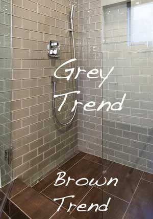
- What this means is, a bathroom filled with brown tile will place your renovation in the brown trend (above).
via Pinterest
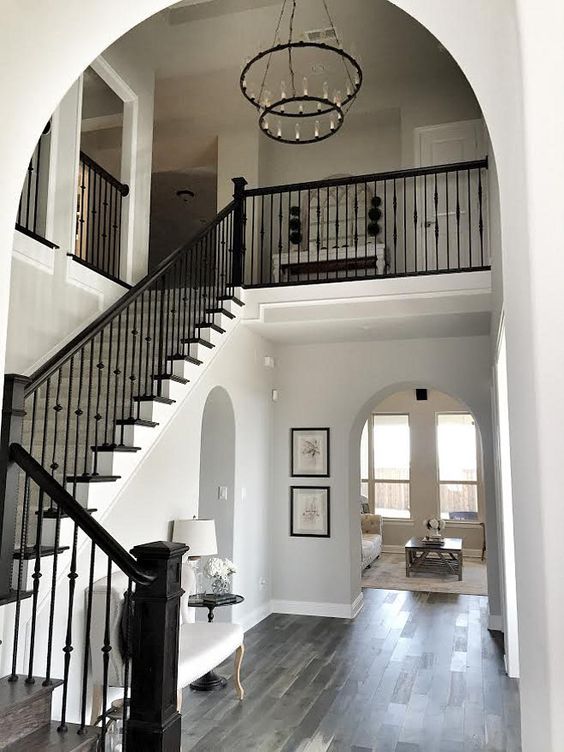
- Laminate or hardwood floors with lots of grey tones in them will place your renovation in the grey trend.
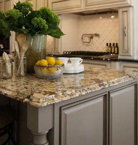
- A gold granite countertop with a travertine backsplash = the brown trend.
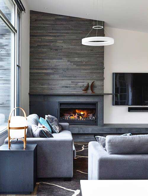
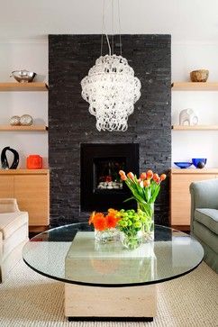
- Stacked charcoal stone fireplace = the grey trend.
Image via Houzz
Here we have a lovely contemporary space decorated by a designer. Pretty right? You might ask, Maria, besides the fact that it’s clearly from the grey trend, what’s wrong with it?
Nothing.
But here are some other classic mistakes that people make:
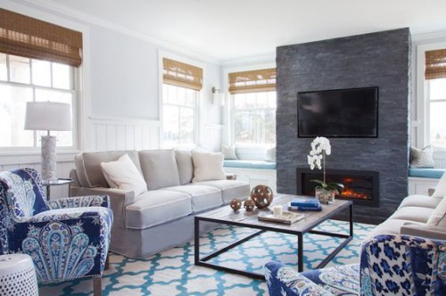
Here’s a living room with a charcoal fireplace (above). While this room has also been attractively decorated, you’ll notice if you look that the charcoal here is not neutral.
It needs to have bee repeated somewhere in order for it to look correct. In this case, it should have been in the chairs instead of the navy blue in the patterned fabric.
So in the end, this is a bossy colour, even though the person who installed it felt sure that it was as neutral as white (even though we know white is not neutral either).
Related post: White is a Snob
Charcoal stacked stone
Here, I’m guessing the previous fireplace was brick and this couple decided to update the fireplace.
All the colours and millwork in this room are 90s. The fireplace looks brand new (and wrong for this space) while everything else just looks dated.
Question # 2: Does this limit my colour choices when I want a change?
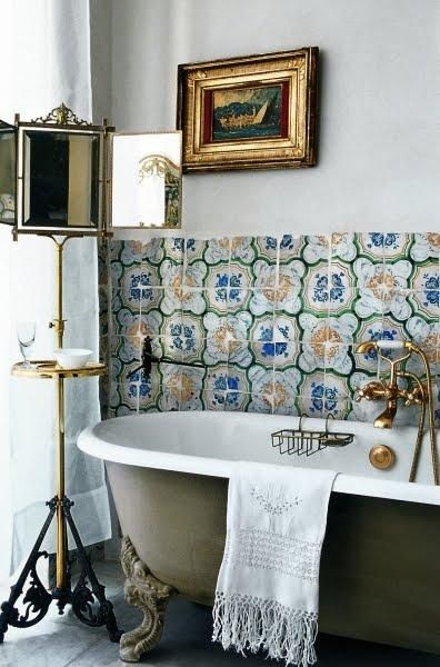
- Multicoloured encaustic tile will limit your choices to whatever colours are found in the tile.
So before you jump down my throat because I’m suggesting there’s something wrong with the above bathroom, just listen for a second 🙂
All my posts are designed to help you create a classic and timeless house. If it’s too late, you’re reading this and realize that you’ve installed something that doesn’t fit into what I’m talking about then consider that this doesn’t apply to you.
This post is only going to be useful for the person who is about to pull the trigger on a bunch of hard finish choices and because they read this, perhaps they choose a less busy countertop or instead of the accent tile in the backsplash, they do subway tile instead.
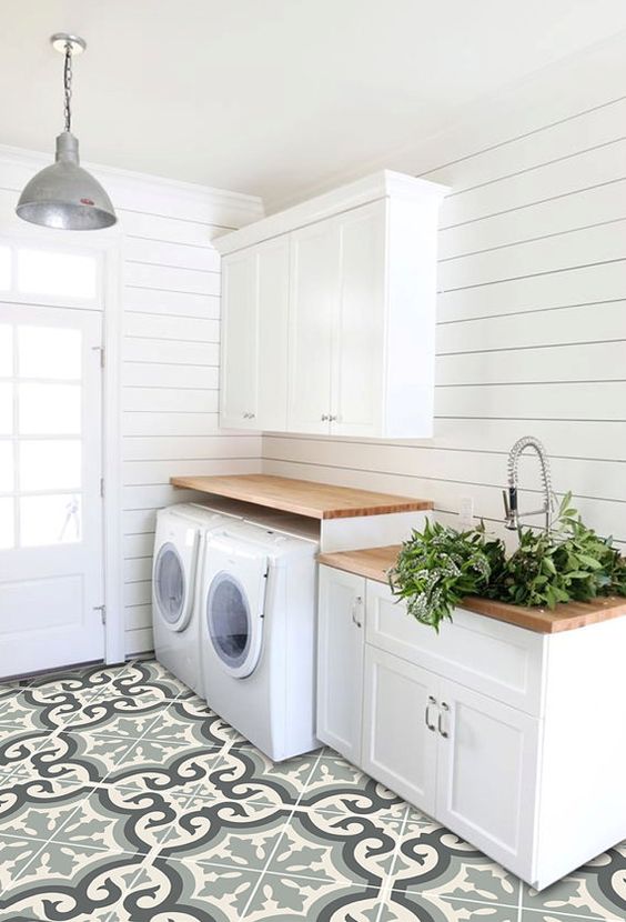
And here’s the other thing. While the bathroom above might find it’s way into a magazine, this laundry room below, will not.
Why?
It’s attractive enough right?
via Pinterest
The problem here is that the scale of this tile is way too big for this room. This tile belongs in a restaurant or a lobby.
This is the biggest issue with trendy tiles. While we like what we see in a magazine, if we’re not design professionals the chances of making the wrong choice in your house will be much higher and that’s why the next homeowner will simply want to rip it out immediately.
Which is why I write these posts because I’m trying to save the world from so must waste.
And this is why I maintain that this tile while pretty and yes we love it right now, should only be installed in the right house, with a design professional who knows what they’re doing.
Photo by Maria Killam
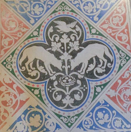
The scale of the tile in the above laundry room was actually the same scale as the encaustic tile in the St Chapelle church in Paris. Which was much larger than the laundry room.
- An earthy granite countertop with 4 colours in it limits your colour choices forever.
Question #3: Have I fallen in love with it?
- You don’t need to fall madly in love with each tile or countertop you’re installing. If you’re waiting for each choice to jump out and say “Marry me, marry me?” then there will likely be nothing timeless about your choices because while each one might individually be pretty, together it will be too much. Remember you can do one pattern in each room for hard finishes. After you’ve chosen one. You’re done. Every other finish should be a solid.
Related post: Are you Waiting for your Paint Colour to Propose?
- If you need 3 finishes but you only really love one of them, that’s enough. All the other tiles and finishes are there to support the first one that you’re building the room around.
Trendy choices are usually not a good idea unless you installed them and immediately sold your house. If you install something trendy when everyone’s in love with it, you have a window of time where this was potentially a good idea.
That is, if it was done well and you didn’t end up with a bunch of mistakes while trying to coordinate patterns in your hard finishes or getting your neutral undertones wrong.
Let’s do a recap shall we:
Question #1: Will someone visiting my house for the first time know WHEN it was installed?
Question # 2: Does this limit my colour choices when I want a change?
Question #3: Have I fallen in love with it?
Trends are interesting. Less than two years ago I was still saying “Brass is coming, brass is coming”, now it seems like our interiors are dated without brass because it’s EVERYWHERE.
All I’m imploring you to do is use them all sparingly like accents.
Comments from my black trends post were everything from:
“YAY!!! My black leather sofa and chairs from the 80s are finally “in” again!!! I’ve waited a long time! LOL.”“I think trends are great for accents, but I could not live in a jewel toned, black and gold environment.”“I love black interior doors and black sweaters in the winter, and that’s about it. Is it ok to be “meh” about trends and just stick with what you love? Or is that considered “having no taste.” I still love white and grey and beauty with a bit of vintage. All those pics felt like an assault on my senses.”“Just bought a black desk the other day. Glad to know black is still in style.”
So think of trends like a fashion show, clothes that we would never wear but they get interpreted into the fashion that we do wear.
“Stick with what you love”, is advice that only works for someone who even knows what that is. I have worked with many clients who would have no idea where to start, design is not their gift and so they don’t shop because whatever they bought in the past didn’t add up to beautiful.
However, what I would like you to keep at the back of your mind is that if you keep your ‘trendy neutrals’ to about 20% of the total colours in your house, it will stand the test of time.
Happy Monday everyone!
_____________________________________________________
Here’s a note I just received from Karen Jacobsma who attended my course in October 2015:
I attended the Specify Color with Confidence Course in Corte Madera (San Francisco) in October, 2015 as a complete novice. I left for New York the day the course ended and specified colors for the offices of an industrial property of which my husband is General Partner and earned enough to pay for my course.The next month I did the same thing for a commercial office building we own in Oregon and earned enough to cover my hotel and travel costs. That was fun!However, I started following Maria and took her course to help me deal with a large Tudor home that we bought two years again Atascadero, CA that was a former B&B. It is a “house divided” between clean and dirty colors. Now that we have lived here two years, I am ready to make my own decision about “who’s the boss.” I’m working with an architect now to do an exterior facelift and some BIG decisions need to be made. I really would love to take the course again. There was so much to absorb the first time.



Since 1st coming upon your site many years ago I have tried to make purchases that are in my style yet also classic & timeless – luckily that happens to be my style and works for both my home and clothing 🙂
I do hope that with the new black trend we don’t begin seeing all dark & black interiors!
Darlene
http://www.BundleMeBaby.etsy.com
Maria: For me, location and style are also important. For example: the bathroom with the clawfoot tub and the patterned tile might look great in a Spanish Revival style house in California or Arizona but completely ridiculous in a 70’s ranch in New Jersey. There is just no connection. But if Spanish tile makes your heart go pitter patter then do it.
Well here’s where I would go along with your first comment which is absolutely true. AND I would recommend that you DO NOT buy tile that makes your heart go pitter patter. That’s the biggest problem with renovations today, is that’s what everyone’s doing and designers out there are saying “That’s okay, buy what you love, it’ll work out”. Well as we have seen on this blog, time and time again and AGAIN in the examples in this post, it MOSTLY DOESN’T WORK OUT.
When people buy the tile that they love without taking into consideration (or knowing) how it will look in their house, that’s when we end up with a mess that the next homeowner can’t wait to take out.
Thanks for your comment! Maria
Amen!
In this latest version, on the inner most ring, I see colors that are less clean (more grayed) than in the original. I really like how you’ve changed the splits in the outer rings away from the rigid 6 sections which allows us to think about pink-beiges and taupes as being neighbors without such a stark wall between them. It looked great to start, now it looks finessed!
Or…….you the homeowner is stuck with for an eternity!
When I look at your color wheel, I don’t understand it. What is the relationship between the colors? How do you use the wheel?
My colour wheel shows what the undertones of each of the primary colours look like.
And I would recommend that YOU DO NOT use the colour wheel in general when decorating your house. I don’t use a colour wheel when I start choosing colours for anyone. I start with the rug, the art, the countertop, the tile, there’s no colour wheel in sight in my offices except in the colour theory binder where I first learned colour theory.
Hope that helps,
Maria
I think you’re spot on about black being the next trend. Just looked at the 80-page idea book from CB2 and the fall Crate and Barrel catalog and there’s so-o-o much black in them. It feels heavy and depressing to me but it’s helping with a problem in our home that we bought last year — a master bath with LOTS of black marble and grey fixtures. Ugh! I’m going to put dark blues and wood with it and let it be. My husband, who likes it, is happy!
Btw, you asked about porcelain tile that we would recommend a while back. Porcelanosa is awesome (main store in Anaheim, CA in U.S.). It’s like going to the museum — so beautiful AND durable AND they have sales once or twice a year.
Thanks Jenny! Maria
Maria , wow some of that huge colored tile I couldn’t do
I am not sure why guess it’s just my personality
But some of that would totally stress me out
To many colors and way to much pattern going on.
Less is more and that includes tile / countertops most hard surfaces
Let that throw rug or pillow do the talking in a room .
I see the tweak you made in the wheel, Maria! You extended the Taupe wedge so that it crosses over into the Red-Violet area. What do I win? 🙂
Yes you totally win, when I print this wheel, you will get one 🙂 Taupe starts at pink and goes more purple which is why it’s in both and I missed that when I originally had it designed.
Great eye!
Maria
I would add a third question, “How expensive will it be to replace.” When I remodeled my kitchen in 1988, the pinky/peachy trend influenced some of my choices. FORTUNATELY, my cabinets were a lovely creamy, off-white and I had painted ugly fake brick backsplash the same color. The countertops were peachy-pink, but it really was no effort to replace with another color when they became dated. Now, I know laminate counters are not high-end, but I loved that I was able to inexpensively swap them out, re-paint the walls and have a new kitchen. At around the same time, I decided a new suite of appliances was in order so I had a nice upgrade.
So, I may plunge into a new color trend, but only on things that can be replaced without breaking the budget or that don’t cause a chain reaction when I do replace.
So true. I stage houses all the time and think, “Why????”
Check the date on the LA class – 28-30
Eeeek, thanks Beth! Maria
I give up. I’ve been going back and forth between the two wheels and cannot find what you did. I don’t think what others have identified is correct. Please tell!
My personal prediction has been ‘navy blue’ as the new neutral, for about a year now and I’m hoping I’m right. And, it looks great with ‘hits’ of black. I’m seeing more and more evidence that it’s gaining momentum.
Let’s all lend our own interpretation to the classics in our ‘fixed’ pieces, so they aren’t soon dated, and use the trends sparingly and with integrity. No regrets!
Navy is definitely one of them. Just like in the 80s it was black, forest green and navy.
Maria
Maria, do you think painting cabinets in the upper in one color and the bottoms in another color is trendy?
No I think it should be custom to the design of the kitchen. It doesn’t work for every house. Maria
That’s so true. I wanted to go with two-toned kitchen cabinets pretty badly..until I realized my future kitchen, with many many more uppers than lowers, won’t support this look, and it will be much harder to pull off and make it look beautiful and considered for the house.
Boy-oh-boy! Those marketing people sure try to get us to spend our money. In our homes & fashions. Always changing things!!
Back in the early-mid 2000’s Pottery Barn (& every other store) was selling a lot of black furniture & rugs. And I fell for it hard! The items I bought back then have since been replaced or painted.
I’ve since discovered I prefer antiques. I think they add more soul to a room instead of all new. But I do like to add trendy accents. Easy to replace.
Thanks Maria, for teaching us how to spend our money wisely.
Yes I was hoping for Navy blue too, because that’s what I’m using in my current remodel. i think it remains a classic. This much black is crazy depressing, I will not be entering this next “trend”, however on the plus side, with black you can still use clean colors.
One of the things that made the brown decade so awful for me was that I was always wanting clean colors (and back then you could only find that in “cottage style” magazines), so I hope we don’t go back to dirty colors any time soon!!
When I think of black in decor, all I think is “cheap,” like the RTA furniture from big box stores and plain black picture frames and collage frames to go with scrolly wall art.
Oh my gosh, I know so many culprits of this cheap/tacky stuff! I think matte black is key, I love black but yeah some of the designs I’m seeing still are resonating as 80s to me.
Love this post, this is a great refresher on what I’ve learned from you over the years. Thanks! I also noticed the color wheel had changed in the Violet/Taupe wedge, but couldn’t put my finger on exactly what had changed until the commenter above pointed it out. Nice!
Ok Maria, So here is an honest question: I feel like EVERY kitchen being installed these days is white. So in 10 years when someone walks into a new kitchen that is White and maybe has marble counters- Don’t you think they are going to say “Man- that was installed in 2016.” I have been a Maria Killam convert for long enough to know that you think white cabinets are timeless (I think so too), and marble is a fairly timeless material. How do you answer your first question (will someone know when it was installed) when *I think* timeless materials are the trend??
Here’s what will date a white kitchen, the functionality and design of them which always keeps being improved no matter what colour the kitchen is. For example microwaves are no longer on a dorky shelf they are in a tower. . . we are doing more kitchens with no uppers and decorative upper shelving which means that we have pantry walls where before we’d have uppers and lowers. The questions in this post apply to a white kitchen, does this limit my colour choices forever? No. That’s why a white kitchen will ALWAYS be more timeless than any other colour. If someone has another suggestion for a more timeless kitchen, I’m all ears 🙂
Hi Maria! I did all white cabinets when building my home in 1994. Then, I updated in 2008 with Carrarra marble counters and stainless hardware. Painted Walls are a fabulous (no longer avail!) Laura Ashley “Twine” (Taupe-y white) color. Still looks great 22 years later!
Could not agree more! which is why after duly considering about 36 different off white trim colours…I am back to Cloud White.
My unrelated-to-this-post (sorry!) question is this: I want the walls to be one shade darker than Cloud White. Enough that one can see that they are different but not a bold contrast. Haivng gone through every BM colour and rejected them all, I am wondering if Cloud White at 1.5X or 2X would achieve that? have you any direct experience before I shell out for more custom paint pints/quarts (which are frequently misleading because the quart formula is sometimes not a straight 1/4 formula of the gallon in the same base). Many thanks (and for reference I like Farrow and Ball White Tie as a nice subtle contrast to Cloud White trim…at least based on the impression from a tiny paper colour sample in their chart).
No that is a bad idea and will not give you the look you want. What you need is the right greige, (which will be based on what’s happening in your house right now) you can find the answer in my white ebook or you can buy an e-design colour consultation here:
https://mariakillam.com/product/interior-paint-colour-consultation/
Hope that helps,
Maria
As for the timelessness..I think the trick is to listen to the style of the house, be sensitive to its location, and make the kitchen a good place to be in, whatever it means for you.
Then people won’t say “Ah it was installed such and such year”..they’ll say “Oh what a cozy/cheery/magnificent/gorgeous/cute/(insert your own) kitchen!”
Much like when we see an interesting old lady we don’t think “hmm when exactly she was born?”-but we think “what a grand dame” or “what a kind smile” or “you can see the wisdom in her eyes”.
You know that she is an old lady. But so what:)
This is one of your best posts ever!!!! You summed
up so many basic points with examples!!! I learned
a lot!!!
Great post, Maria, I could not agree more! A lot of lessons that I’ve learnt the hard way.
Anyone who missed Maria’s post of 9/8 (which I did, was on vacate) should go back and view those images to get a real sense of what she’s communicating with the trends. It does have a decidedly 80s feel to it. Some of that is OK, some of it is not – in my opinion.
Forest green will NEVER be back for me, I don’t care how trendy it becomes. Black, on the other hand, is a timeless color. That said, it is also very powerful. Like red, too much of it is overwhelming. Too much black becomes heavy, even depressing. I like to think of all these colors as tools or cooking ingredients – they need to be used appropriately or combined in the proper proportions.
Love this post. Years ago my husband and I travelled extensively and collected quite a few antiques. We now live in a Morroccan style community of all white stuccoed homes. There are arches, lovely Morroccan lanterns, and yes black and white everything. The interior of our home is white wood, white plaster walls with black tile backsplashes and rustic woods. We have killims and old persians everywhere with lots of succulents,palms and greens. For some reason the white, wood, black tiles and old antiques and killims looks timeless and appropriate for the lighting and heat that we encounter. I find it fascinating that what works in one area of the country doesn’t in another.
Just finished signing onto finishes for a new home with a suburban home builder who limits your selections based on floor plan. This meant limited selections, but kept everything as neutral, timeless as possible. This was hard, because 90% of their selections fell into the trendy: lots of greys, busy tile backsplashes, wood tile flooring, which I think will trend out. Have you done a post on wood tile? Love your advice, helped me tremendously, a follower for years !
About the laundry room… I agree that the tile is large, and a trendy color and pattern, so therefore not timeless. But is it too large to work? I think it would look great to put the tile motif on the wall (ie, 4 tiles, creating one motif) over the sink. Then hit the room with a bright accent accessory. Your thoughts?
So all “wood tile” will be considered trendy. Right? Even when the colors in the wood tile are classic and neutral?
What are thoughts about natural stone pebbles as a shower floor? Earthy, organics don’t seem trendy. BUT are they? I would love some thoughts:)
No, if wood tile actually looks like wood when installed, it’s way better than regular tile which is super trendy instantly. Natural stone pebbles in a shower floor says cottage or country? Sounds lovely Maria