Today was my first day at High Point Market! Jam packed with all kinds of educational opportunities as well as events, so many products to see, it was fun and very busy!
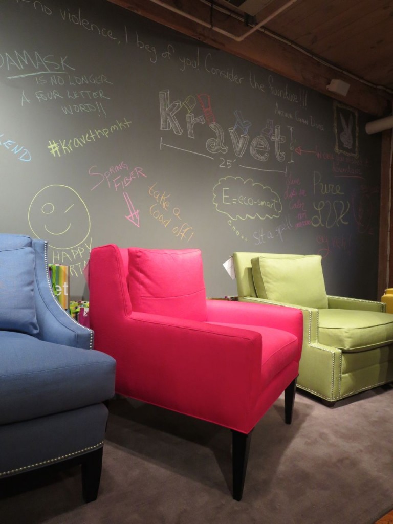 I’m starting off with this image because it was the first thing that greeted us at the Kravet party in the afternoon, I loved the hits of colour in front of the blackboard.
Colour is everywhere this market, that of course, is not news! Blue in every shade should definitely have been the colour of the year in 2014 (by the way I predicted blue in 2013 but as many of you know, radiant orchid was chosen instead). But I’m not bitter about it, no sireee.
Maria Killam & Windsor Smith
I met the fabulous Windsor Smith! I am a big fan of her work. When I rebranded three years ago, I stared long and hard at her logo trying to figure out how I could get MK to fit together like WS (below), but I could not do it. K is a hard letter (literally) and especially because my last name is already Killam. What can you do with that?
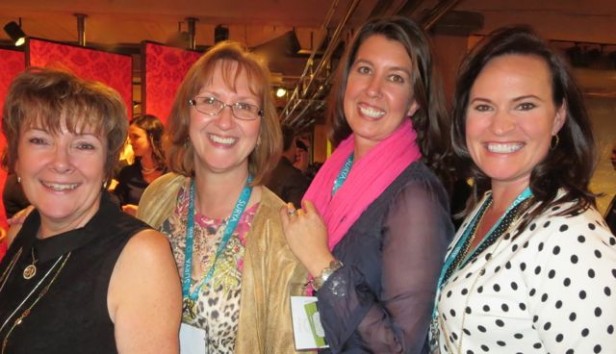
Left to right {Denise Gaquin, Cheryl Kinsey, Christine Shepard, and Susan Kindel
I met some long time blog readers and some new ones ; ) ; )
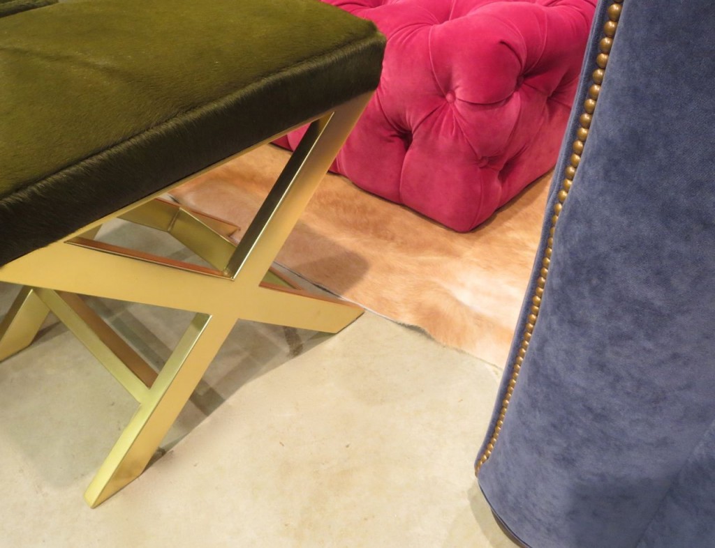
Check out this muted olive green ottoman hanging out with the clean fuchsia and blue.
Olive green is on my radar lately. It is here but in small doses.
Remember before the brown trend everyone had an olive green sofa? Well, it’s coming back but of course this time paired with clean colours. I’ve talked a lot about how basically muted greens are the only muddy colours that can be intentionally combined with clean colours.
Attending market is not only about seeing all the new trends but there’s so many great educational events to attend!
This morning kicked off with a conversation moderated by Thom Filica and Newel Turner about the new wave of designers and how their business has changed after being featured in House Beautiful.
During Q&A time, someone asked if any of the designers on the panel shopped with their clients and everyone agreed that this was not a good idea until the vision for the house was firmly established and the client was onboard with it which takes time. Even a designer attending market for the first time will be overwhelmed by the incredible amount of furniture and accessories available.
One of the designers laughed and said there are only so many pieces of furniture chosen by the client where you can say “That’ll be great for the 4th floor guest room”, or “How about the closet in the 4th floor bedroom ; ) ; )”
Here are some I picked out that look interesting:
Amazon Marketplace 101 – Selling on Amazon
Untangling the Web: How Blogs and Social Media are Transforming
Boomers vs. Millennials: The Great Debate
2015 Color Trends presented by PPG Paints
Go here to see where you can fit in an event into your schedule!
And don’t forget, tomorrow (Sunday) I’ll be speaking at Antiques by Zaar about the colour White:
Go here to see the Design Viewpoint Series of events.
I’m so excited to see you tomorrow! xoxo Maria
Related posts:
Trends from Spring Market 2014 at High Point
If you would like help creating a palette for your home, become a client. Online or In-person.
To get your exterior colours right, download my How to Choose Exterior Colours with Confidence webinar and get my go-to list of colours.
Download my eBook, How to Choose Paint Colours – It’s All in the Undertones to get my complete step-by-step system on how to get colour to do what you want.
To make sure the undertones in your home are right, get some large samples!
And, if you would like to learn how to choose colour with confidence, become a True Colour Expert






Whoa!! You are “hangin” with some “hotties!!” WS, TF, eeek…NT!!!! You go girl!! franki
I planning a kitchen update and will be refinishing the cabinets. Would you still advise a white kitchen or should I paint olive green? How long will this trend last?
Oh no, definitely white. I should clarify that it might just be a fad in the end. I’m not a fan, just reporting the facts 🙂
looks like you are having a blast! keep us posted!
Ahhh….The guest room. Where bad furniture goes to die. I’m working on my guest room right now. But I’m using my existing furniture. Not ready to buy new yet.
I’m sorry House Beautiful but that kitchen looks more blue to me.
Olive green has always been a big favorite of my boy friend, Nate Berkus. But I’ve never been a fan of green. Any green. Sorry Nate, sweetie.
Thanks for the update, I’m looking forward to hearing news about the new trends and am happy to hear you’re enjoying market so far. It appears they have some interesting events lined up. Knowing how well you explain color makes me wish I could hear your presentation, sigh…. have fun!
The HB kitchen appears teal on my monitor and I’d guess it would appear very dark on any monitor, very claustrophobic to me. Olive green? Wow, not my fave last time around on furnishings, hope it’s more attractive this time.
Olive green…..not a fan, parhaps it was the avocado green stove and my mothers olive green drapes trimmed in gold and olive that went with the gold and olive striped sofa with matching chair growing up that killed it for me!!! Thanks for update Maria, looks like fun!
Maria, What a fun experience attending market!! I used to come back so jazzed up I couldn’t even sleep. Anyway I am glad that you are having a wonderful time and seeing first hand what is in store for us this next season. As far as olive green, I have to agree with all of the naysayers above. I lived with it for so many years that I learned to hate it. I love happy colors! Sorry to hear it is back again but that is my opinion.
Have a wonderful time but watch out for the parties. They are fun but oh, the next day!
I agree with Caroline. Can’t stand olive (except on my plate.)
I like olive green…especially when viewed through a frosty vodka martini. But that kitchen would look downright ominous without the extravagantly staged island.
I actually don’t mind olive green or any shade of green, really, but I veer away when considering green in decorating my home because green seems to be the most volatile colour around. It seems like every year or so the shade of green changes, more so than other colours. So for those trend followers two years ago who jumped on emerald, or like me last year who used some Kelly green, and now olive is the shade — we are changing it up again to olive. Not a big deal if it’s throw pillows and accessories, but if you purchased a sofa or invested in some draperies, cha-ching! Love green, but it makes me nervous!
HB kitchen looks teal to me too and, of course, you mention its not as yellow so any self-respecting bowl of olives would be lost in that room. One of my favorite pix is the one you used in your 2009 post on “Do All Greens Go Together?” – the one with the olive walls that almost looked warm brown (lots of yellow in them) and the wonderful fresh green armoire and coffee table with the bunch of yellow tulips. The color as exemplified in the HB pic doesn’t look new or exciting or interesting to me.
By the way, when you get home, interested to read your take on BM’s 2015 color choice Guilford Green HC-116.
Great luck with your presentation this afternoon – lucky audience – the rest of us still have to wait a couple of weeks.
Just found this blog from 2011…always ahead!
https://mariakillam.com/benjamin-moore-guilford-green-living-room/
Thanks Mary Anne 🙂 x Maria
Not a fan of green whether in the house or in clothes, always feel it makes people look jaundiced, not flattering at all. If I have green in my home, it’s in plants. I guess if you have it in a throw pillow, that’s fine but never in a major piece. You look to be having fun, enjoy your trip.
I have to say, the Olive Green ottoman is a bit of a shocker for me…much like the gold/brass look making a comeback! Reminds me so much of my grandma’s house in the 70’s. I automatically see orange shag carpet in my mind. 😉
Looks like you’re having a great time!
Jill
Maria…I was playing around with M & K and it can be done. Hard to explain…but a narrow oblong box, with what looks like an M (made with two upside down “V’s”) touching the top and bottom of the box. Turn the box on its side and the inside of the M (bottom and middle) looks like a K. If you used different colours or a double line for the M and the K they would be noticeable.
You are so sweet! I’ll have to figure this out when I have some time! thanks! x Maria
Good luck on your presentation.
Green works nicely in interiors because it flows to the views outside. However, green is a tough color for most people to wear (can wear olive pants but top is better w light blue or red or colors that work better w skin tones) so, green isn’t flattering….imagine an olive or avocado bathroom!. My LR used to be Fernwood Green but I had to lighten it up w lots of white and blue Aqua or yellow, depending on the season. Now it’s Navy, white,ivory and hits of scarlet&scrim son……neutral creamy walls since Navy & red are so strong. Don’t like the bluish olive kitchen at all…so DRAB..that’s why they often call it olive drab. Martha Stewart always loved Greens, every shade. That’s enough of my 2 cents…lol
I just read somewhere yesterday that Guildford Green is the new Benjamin Moore Colour of the Year for 2015….it’s a beautiful silvery green. I must say I like it. I’ve never been a fan of olive green, btw. I’ve always thought of it as a drab colour!
I would say green is trending a little bluer than Guildford green, I have been specifying that colour for years, I definitely would not call it ‘of the moment’. Maria
Oh YEA! My Aegean Green on my house is ahead of it’s time!!!!
(I’d still like it even if it wasn’t.)
I love almost any shade of green, including olive. Guess I’m in the minority, but glad to see it’s making a comeback!
I could only live with olive in small “hits” which seems more the trend you’re speaking of rather than whole rooms. That olive kitchen is depressing! My front room (used as an office) has been painted a deep jade green for quite awhile now and it’s still an attractive shade to me.
Something I’ve discovered about myself and my reaction to olive green in decorating: If it’s olive green tufted velvet, I love it. If it’s anything else — a lacquered tray, a paint color, anything — I can’t stand it and think it looks like a 60’s refrigerator. But in velvet, I love it! Weird, right?
I have only recently finished getting rid of all of the Providence Olive paint in my house (along with a lot of camel brown, I’m not sure what the exact colour was though). When I moved in they were the 2 main colours in the house, with a side of little boy room blue and slightly greenish yellow…..ewww. No olive green trend would make me bring that back, even in small amounts.
Kudos for you Maria for picking blue as the Olof of 2014…I see it in EVERY home magazine and catalogue…at my HS reunion last weekend Soooo many women wore blue dresses; cobalt, navy, sky blue, blue turquoise. I wore navy and white cheetah wrap dress.i really haven’t seen orchid anywhere! Cheers to a fun time in NC
Color
It was a pleasure to meet you yesterday at Zaar Design Center! I really enjoyed your presentation and learned a lot about whites. Thanks for letting me hang out! Enjoy Market!
I am thrilled with the news that green is back. Wonderful post, Maria.
My mother still talks about how a decorator in our small town loved aqua and olive in the 50’s and it was in everyone’s house. It is an interesting combo but I’ll stick with the ever trendy white and black, for now. Thanks!
Love greens, but olive? Never.
So do you think a green based beige paint would allow for ‘clean’ looking accesories? Or will it look like that ikea rug you posted a while ago with a beige background and bright clean colors in front?
I am actually liking aspects of the Olive green (any idea what shade it is?) kitchen above. Since my re-do-ready kitchen is quite dark – shadowed by large trees, would not a richer colour like this (or a rich barn red/burgundy) bring more light into it? Not every single surface that is possible to paint as above LOL, but say olive cabinets with lighter walls or vice versa? Or counters and floors? I read your post on this, but perhaps it doesn’t apply to kitchens?
The only room i have yet to redo: the olive green den, my least favorite color. It is the smallest room in the house with only one average sized window. Amazingly, just about EVERYONE that comes over is drawn to that room and comments on how they love the color and coziness. Hence, I have not yet painted it admiral blue, accenting with camel and cranberry.