Here are the top colour trends that dominated High Point Market this fall. Join us as we explore room design styles, ideas and inspiration to help you incorporate some of the most-seen colour trends into your interior decor in 2020.
Two of my team members, Tricia Firmaniuk and Kristy Robb toured High Point Market (I was in a relationship mastery course in Maui and couldn’t be there) last weekend to bring you the colour trends for 2020:
______________________________________
Kristy and I packed it in last weekend at High Point Market. We toured so many showrooms full of gorgeous vignettes. Here are the top NEW colour trends we spotted as well as a few we’ve seen before but are still going strong.
Grab a coffee, we have SO much to show you!
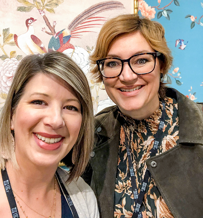
Kristy and Tricia
What’s NEW in colour for 2020?
There was a clear shift towards deep and moody colour this market. But of course, it was a FALL market, and who doesn’t like to indulge in some smoky palettes this time of year? We noticed deeper colour, especially on walls, was a persistent theme. White walls were scarce.
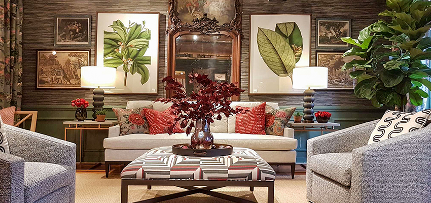
This rich and moody room at Thibaut was a stand out for me.
The room above hit on many of the trends we were noticing. Antique and botanical art we posted about here. Dark walls and woodwork made the light sofa, art and textiles stand out. Geometric prints, and leafy-green mixed with white made the heavier palette and antique art feel modern and new.
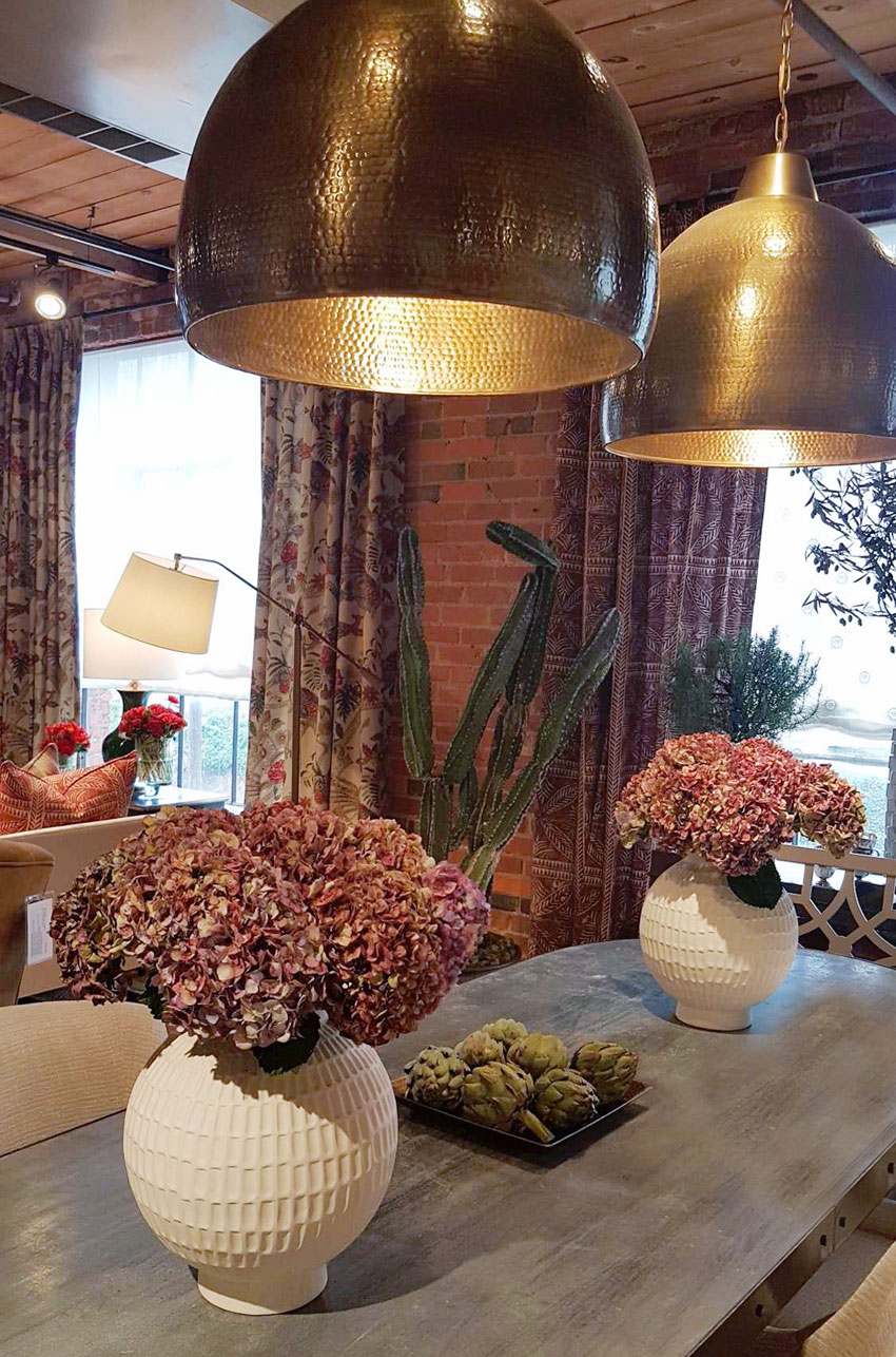
Also at Thibaut, warm brass pendants mixed with deep reds to create a rich tone-on-tone look with the brick walls.
While not as ubiquitous as green, wine and rich burgundy reds were well-represented too. The Thibaut showroom is always a highlight, and they captured the rich fall palette beautifully (above).
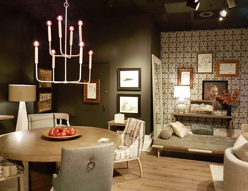
There was plenty of atmosphere at the Vanguard showroom. Black walls, dramatic wallpaper and grey upholstery create a masculine look. Oversized lamps and round tables with sculptural pedestal bases could be found everywhere too.
Wood finishes were often cool and natural, cerused or washed like this table above. However, there were some noticeably warmer and more traditional wood tones beginning to make an appearance.
Here’s the Scoop on Grey
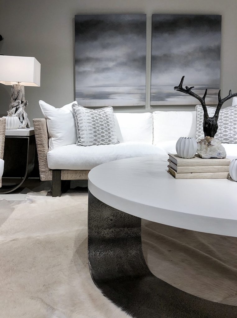
Every brand had their token grey room. But, there was noticeably LESS grey to be seen than before. Many of the grey rooms were layered with ample fresh white, like this room at Bernhardt.
White and grey at Bernhardt
Bernhardt is a popular furniture brand that still sells lots of grey, However, Trish, our showroom guide pointed out that they have been receiving feedback that buyers would like to see more colour in their line. So, they styled some blue and white rooms too.
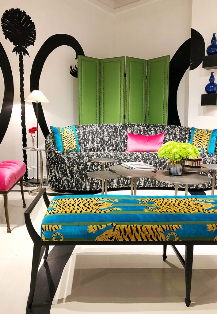
And surprisingly, their feature showroom was an designer-in-residence collaboration that was easily the boldest, most fashion forward vignette we saw all weekend (below).
High colour, graphic black and white by Designer in Residence Nick Olsen at Berhhardt
The Black and White Trend
Black and white was most often bold, contemporary and glam.
Black marble was mixed with graphic prints, rather than farmhouse, rustic or industrial – looks which decidedly took a back seat at this market.
Black and White at Century
Green was the star of the show: (all shades of sage, olive, and forest green)
Kristy and I agree. If we needed to land on ONE colour that ruled them all at High Point Market this season it was GREEN. Maria first blogged about olive green coming back in 2014. It took a while for it to hit mainstream.
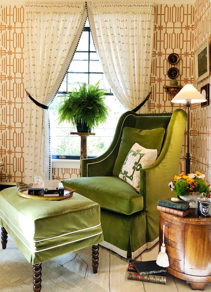
Traditional wood tones, geometric camel gold wallpaper and beautifully tailored green velvet in one of our favorite rooms by Kristen McCory for Aspire Show House
Greens of all kinds were represented. However, sage, forest, leaf and olive greens dominated. Greens that reference nature, rather than cooler and cleaner ones like kelly green or mint.
Library Chic Style Trend
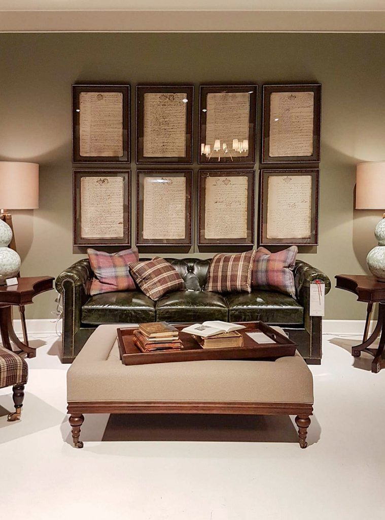
Green velvet is not really news, but there was also an abundance of olive and forest green leather upholstery. “Library Chic” is the term that came to mind when we spotted all that green leather paired with miles of wood and dowdy plaids in deep green and burgundy.
I was expecting to see more earth tones this season and while colour trends are definitely warming up, I was surprised to see so much sage and burgundy plaid. This room at Century felt like it was pulled right from the pages of a 90s playbook.
I’m not sure I’m ready for that yet, are you?
“Library Chic” vignette with sage green walls, olive green leather sofa and earthy plaid at Century
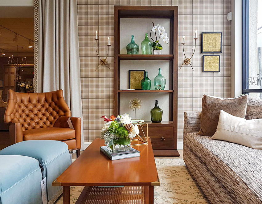
More plaid and warm wood with green accents were styled below at Wesley Hall.
Green and Pink Colour Pairings
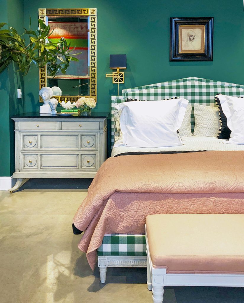
But there were also plenty of fresher rooms featuring green. Most often green was paired with pale or blush pink, as in this gorgeous room by Mary McDonald at Chaddock.
Deep green and pink by Mary McDonald for Chaddock
Pink, Taupe and Gold Combinations
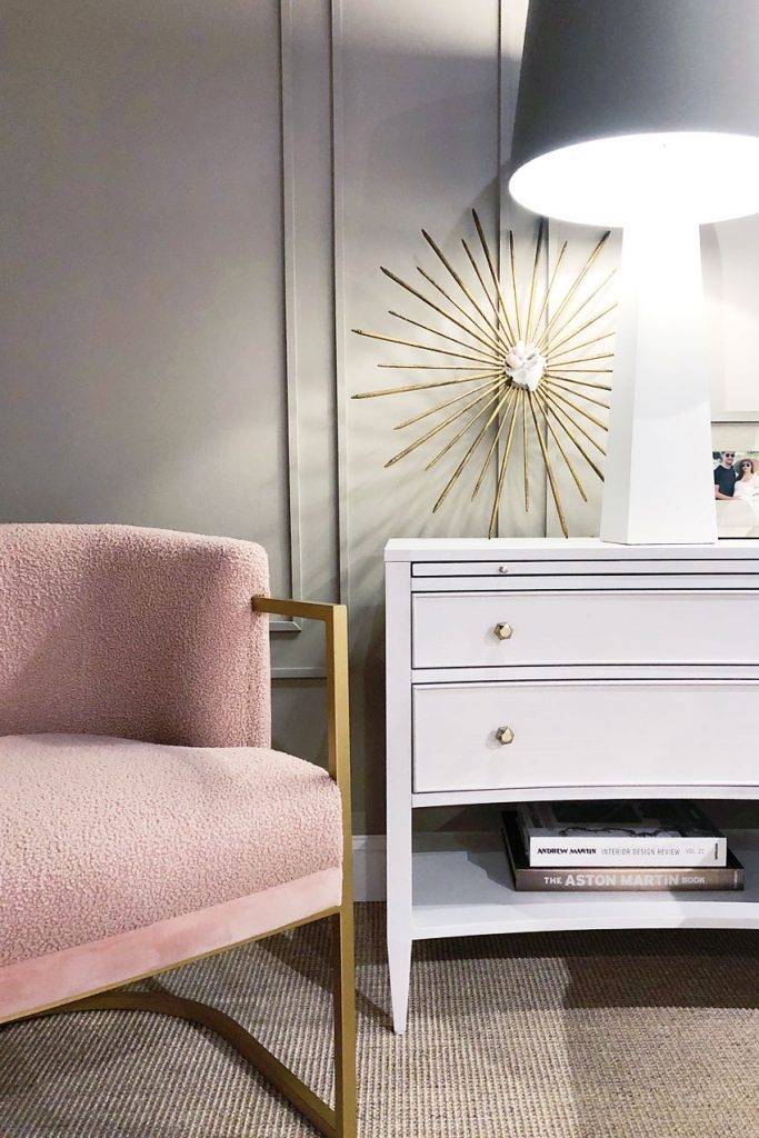
Pink Boucle Chair by Miranda Kerr at Universal
Pale pink is still going strong, as Maria noted when we talked about this post, it’ll have its 10 year trend moment just like the 80s. It might be time to stop referring to it as a totally ‘feminine’ shade.
Miranda Kerr’s collection for Universal featured pink paired with glam gold, white and taupe. She also used lots of mother of pearl, lacquered white finishes and lucite, which could be seen in showrooms everywhere too.
Cozy Texture
This fuzzy textured chair (above) was part of a huge trend. We noticed tactile boucle accent chairs and even sofas everywhere we went. Most often they were white or cream, but sometimes they were in pretty pastels. And they are SO inviting when you’ve been on your feet all day.
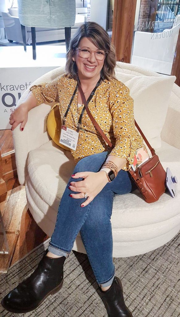
Kristy couldn’t resist this cozy boucle chair at Kravet
Blues were Cooler
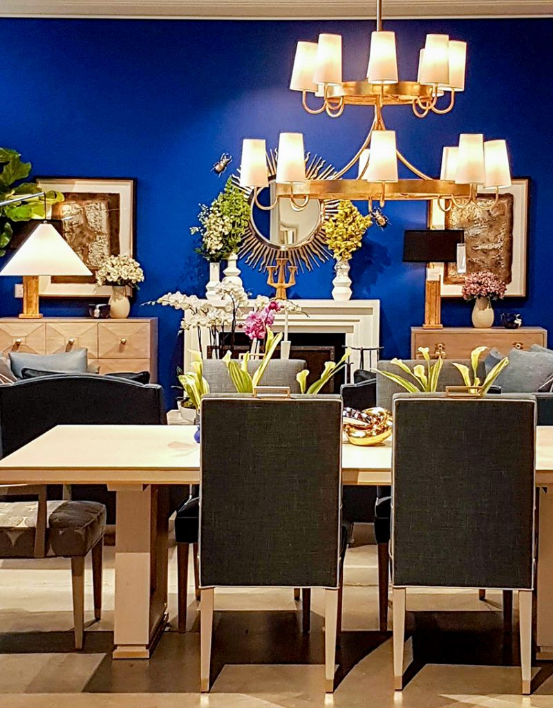
Also at Chaddock, designer Larry Laslo did a breathtakingly bold and artful room in electric blue. Deep, saturated cobalt and ultramarine is so modern and of the moment. It is also classic (think Yves Klein Blue). He balanced it with light wood tones, lots of white, gold, spring green and hits of black.
Larry Laslo for Chaddock
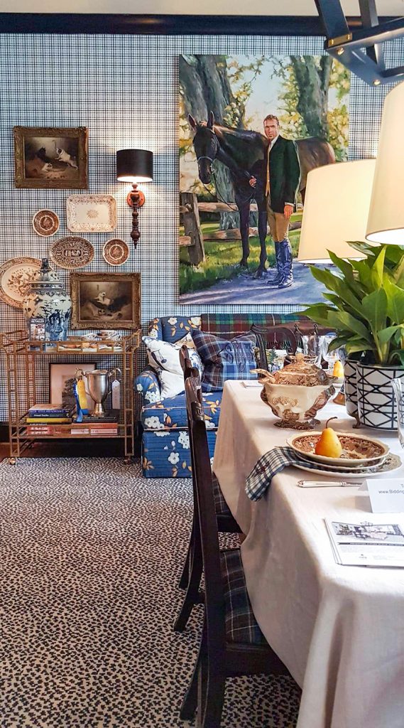
Also striking in blue was this fabulous reinterpretation of the equestrian estate style by Scot Meacham Wood at the Aspire Show House. It featured Sherwin Williams’ colour of the year, Naval, on all trim and woodwork. And smart blue and white plaid on the walls with rich traditional wood, vintage art and gorgeous pattern play.
Scot Meacham Wood for Aspire Show House
Notice all the plaid again. In this room I think he did a great job of making it new by pairing it with the animal print rug and floral sofa, not to mention all that crisp blue and white.
Blues were either deep cobalt or navy, or they were cooler light and medium tone blues like slate and sky blue. Of course, perennial chinoiserie blue and white are still around as well. Conspicuously missing was the warm blue range of aqua and turquoise and the coastal look they are often associated with.
Let’s talk about brown.
Yep, there was brown. It was not an overwhelming take-over-the-world amount of brown like we saw in the Tuscan trend. But it has returned as an option now that it is no longer vehemently banned by designers everywhere. In other words, it looks like we now have enough distance from the overuse of it that we can begin to add it into the palette again.
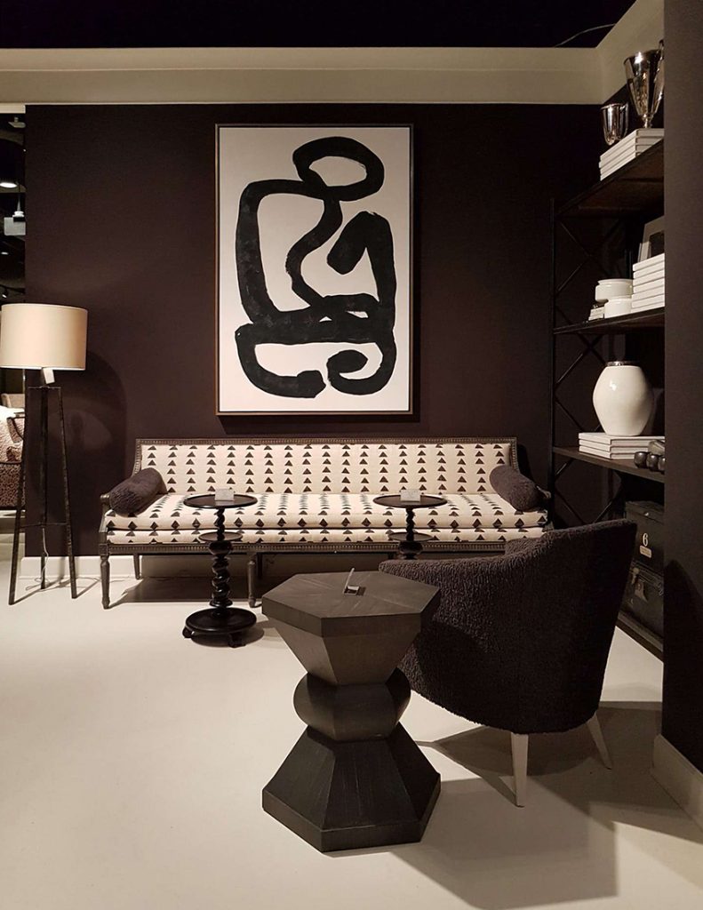
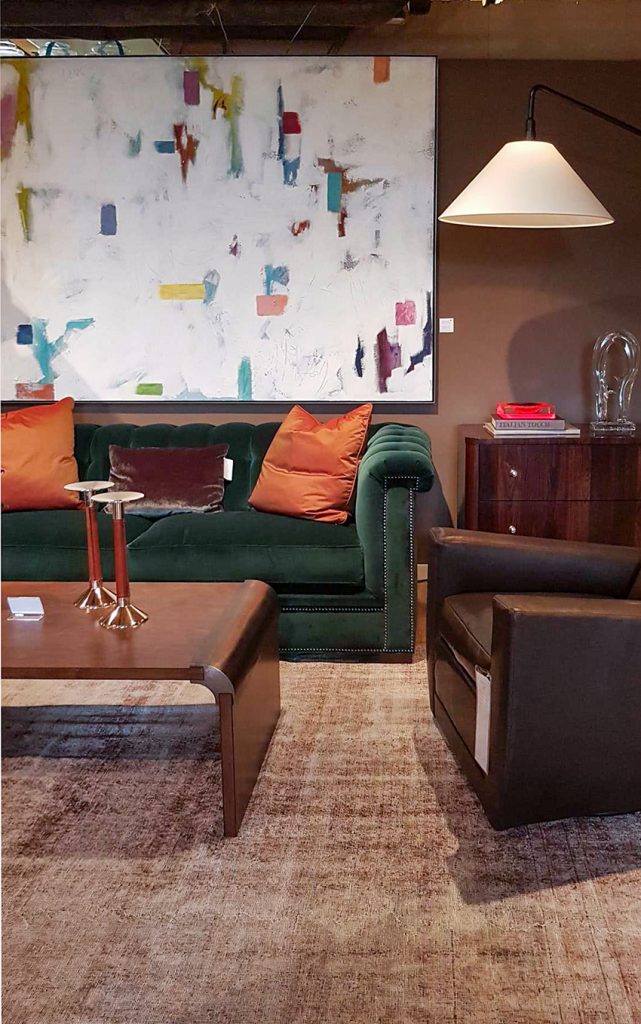
Brown is always well-represented in leather chairs an unpainted brown stained furniture pieces. But there was much more brown framed art, and deep chocolate walls.
A large white painting looks crisp against chocolate walls with a forest green sofa at Hickory Chair
Gold Metals and Textiles
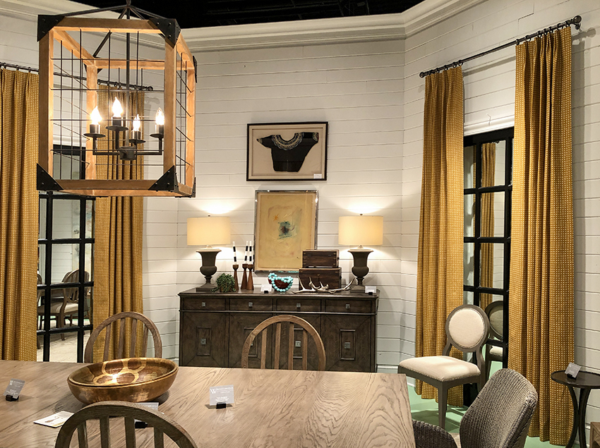
Brass and gold hardware, lighting and accent furniture is clearly not going anywhere (more on lighting trends in a post coming soon). But deep gold tones could also be seen as an accent colour in upholstery and textiles. Often it was used to warm up black and white. Or combined with greens and pinks for a more retro mod feel.
This white shiplap room with gold curtains and black windows is the most “farmhouse” look I remember seeing, by Lauren Liess for Woodbridge Furniture
I think it’s safe to say that colour was moodier at this market. Again, this could be in part, a reflection of the season. However, it looks like designers everywhere we went were indulging in cozy palettes with touches of lodge, country estate and “library chic”. Designers, after all, are astute at picking up the mood.
I personally have a weakness for cozy fall fashion and decor, especially earthy palettes of olive and mustard. So the moodier vignettes of this fall market really tugged at my heart strings.
I’m sure the industry would LOVE if we would all get in the habit of completely redecorating for the season. While I won’t be jumping in to order an olive or plaid sofa, it sure is fun to change out some styling and vignettes each season to keep things interesting and fresh. So I hope we’ve inspired some ideas!
My creative juices are flowing from our tour of High Point Market, I might hunt for some bold botanical prints and antique pictures to layer some patina into my rooms this season. And, all my paintable surfaces will be under scrutiny to see if I can make them a bit richer. I love changing it up.
Will you indulge in any of these top 2020 colour trends?
How about you? Will you do some redecorating for the fall season? Of the rooms we shared, which is your favourite?
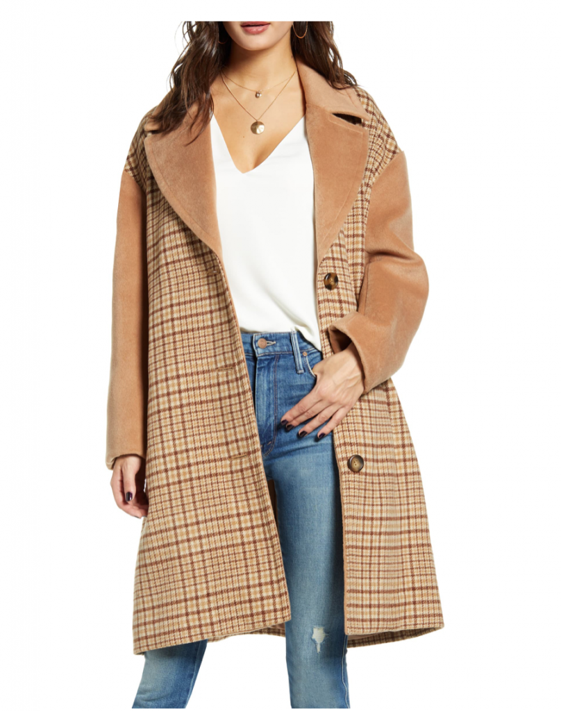
How do you feel about the 90s plaid vibe sneaking in at the fringes of interior design again? It’s already making a comeback in fashion. Nordstrom has so many variations of plaid.
The other big news from the market is lighting trends. There is so much to show you we decided it should be its own post… so stay tuned!
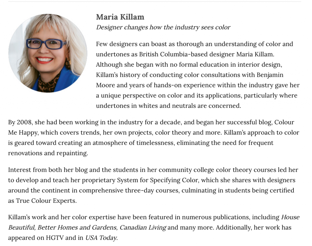
PS. I’m happy to announce that I was named a top innovator for 2019 for Kitchen & Bath Design News along with other fabulous colleagues in the industry:
Related Posts




Congratulations on this most recent award, Maria. It is both well deserved and a credit to your continued contribution to the industry in this vital, often misunderstood area.
I’m not sure I’m ready for the 90s to come back as you say! 🙂 I have to be honest, I find earth tones so depressing — I have been really thriving with the light/bright/clean color trend for the last several years. I also have been really enjoying the more casual styles of the last 10-20 years such as the cottage and farmhouse looks (as long as they’re not over the top — shudder!). SO….. as the trend moves into these warmer/earth tone modes, how can we committed bright/clean/casual people survive without looking dated and dowdy? I’d love any tips/advice you have on adapting to the trends while maintaining the elements that make you happy!!
Hi Angela,
Well the moody dark colours are always combined with black because black is so dark but I don’t see entire houses going darker anytime soon. But you might paint your dining room or a library room a dark colour. . . thanks for your comment! Maria
Bravo ladies. Well done post. I personally am here for all the rich moody tones and plaid. I love seeing green going strong, as well as deep navy blue. Although the sage and burgundy caught me a little off guard. Not sure I’m ready to go back to the early 90’s just yet, to be honest. And I couldn’t love the country estate vibe more. Seeing animal prints paired with plaid made my heart sing. And I’m glad to see farmhouse and gray finally taking a backseat.
Wonderful to see green everywhere…such a versatile and happiness inducing colour.
Wow I loved the first room. Earthy and rich. I don’t think I could embrace the brown room with its green sofa and orange pillows. While I like all those colors, that room was 1970,s all over again. Brown carpet even. No! You ladies may not have been alive or raised in 1970 but I was. Avacado green, orange, and brown. Counters were even orange on brown cabinets.
Congratulations on the award! Love the green velvet chair and the green room divider. Outside of those items not a single showroom made my heart sing. Plaid for me personally belongs on flannel shirts and not in my living room.
Love this post so much. My first custom sofa in the early 90s was ordered from the High Point Market. Being from NC we would head over every few years. I’ve been in Florida since 1996 and miss a lot of the deep southern charm of the Carolinas. Anywho, I have brown walls in my dining room that are only 3 years old but I was feeling like that were somehow dated and now I feel inspired that I can continue to make them work. I also have a green leather chair that I have always loved. Additionally I just ordered a set of 6 large botanicals that are now behind my sectional and have been introducing green in my new family room more and more. I have always loved warm and rich tones so I’m really happy to see color coming back with a fresh look. Oh how I wanted to join you in Orlando especially since it’s your last Florida class. I’m glad to see you filled your spots.:)
Love green, always have, always will. More importantly, Kristy’s black boots in the boucle chair picture are awesome, can I know the brand? Thank you!!!
Great post! Interesting how things are shifting to more color! I’m soooo ready!
Oh yes! I love a warmer palette. Greens are wonderful when used in a modern way and I’ve always liked golds and oranges. But I’ve never been into plaid; not even decades ago when Ralph Lauren’s equestrian trend was hot. I’m so glad the white and gray trend is finally receding. Thank you for the report, Maria!
Bring on the plaids, tweeds, cozy leather, antique chandeliers and chesterfields! I’m ALL in. Actually, I’ve never been out. 😀 What I’m seeing here is a hint at what is to come. #grandmillennials
https://nypost.com/2019/10/16/millennials-with-old-souls-splash-out-on-grandma-chic-homes/
I love the library chic. I think plaid is timeless, and gives contrast to busier florals. Out of all of the decorative trends which I have experienced twice, this one I am excited to welcome back. The beachy look is silly for those of us who live inland where half of the year it is dark and cold. And this allows for so much more personalization.
We just re did our living room with butterscotch, peach and a slightly bluish hunter green. It is awesome and cozy and snuggly.
I think I would’ve been in a state of depression had I been at High Point with you. There is not one single room shown in this post that I would want as my own. Not one! Maria, your beautiful living room/dining is more my style and I wonder why we don’t see more light, bright, cheerful inspiration.
Great write-up ladies.
I really loved the second room, the one with the cactus and exposed brick wall. Such beautiful colour combinations.
Not too keen on some of the others.
So nice to see “moody” tones back, the autumn colours.
What one poster called cheerful colours and Maria calls “clean” colours, are mostly childish looking. Nice for kids’ rooms, but not many adults would want to live with those. Though I must admit, I have a soft spot for bright pink on the exterior of houses.
I love the Thibaut room, especially those big botanical framed prints. I’m also loving the plaids, but not on an entire sofa or any large surface. Smaller doses of it work better for me, like throw pillow covers that I can switch out when I’m ready for something else! Anyone know what the Thibaut prints are called? I’d love to have those two in my dining room.
I like the moody colors but can easily like clean colors too! Not a pink fan at all. Loved the greens and botanical prints! Burgundy/maroon doesn’t surprise me at all. I am a wedding florist and have had 6 “wine and blush” weddings since April 2019
Congrats on ur award, Maria! ?
I’m afraid I’m w those who find almost all of the pics above depressing — and just very unappealing ?
Might my light, timeless ‘transitionally styled’ home be akin to walking thru a 70s split level w orange shag everywhere one day? ?
Congrats on being named a ‘Top Innovator’ Maria! It is well deserved!
First of all I want to congratulate you on being one of the top Innovators in the industry! You are making it to the top as you should be! So proud of you!
I loved looking at all of the new vignettes at market and their color choices which proves that everything that is old is new again! Maybe it is my age but trends seem to turn around faster than they use to. I love the rich colors but it seemed like they were on trend longer so I guess that is why they are called classic. When the light bright colors of last year emerged, I felt so happy like a weight had been lifted! So I guess that was the spring of the year and now we are back to winter and fall. I really never wanted to see olive green again but combined with pink and other fresh greens I will finally accept it!
Thank you for your inspiring post and your tireless effort to present them!
Great photos and post!
Thank you for sharing these. I have always loved mostly greens but also blues and botanical prints. I’m intrigued by the many shades of green too and really enjoy the “leaf” green how it brightens the moody colors up! I can’t say that I’m in love with any of these rooms but do appreciate taking it all in and seeing what’s new! Even so, my favorite room here would be the plaid room.
Congratulations on your selection as a Top Innovator for 2019. The write-up they did on you was super interesting and informative and I’m so proud to know you. As far as colors for 2020, I’m over the moon with the return of greens, especially leaf and olive green and any green with yellow undertones. These are my favorite nature greens. Just hope I don’t have to depend on nature only or nature and botanical art and that the right colors will appear in other objects and accessories again. I’m looking forward to seeing homes done in colors other than blue and white or grey and white.
Cheerful translates to “childish”? That’s ridiculous. I do cheerful and receive compliments and requests for help to decorate other’s homes regularly. Now a pink home exterior would probably make me lose my cookies.
Oh, my goodness, the “library” looks like a very nice man cave. I can envision men drinking bourbon, and smoking cigars and pipes. Many of the pictured rooms are nice, but the 90’s? Been there, done that, and I do not want to repeat. I like rooms that are light and uplifting, like the rooms in your house, Maria. Congratulations on your award! I’m happy for you!
Show rooms and runway models have so much in common. They put it all out there, unashamedly, and all at once. You can be inspired by the creativity, but also understand that in your real life just like the latest fashions may not be suited for your particular body type, pieces if it will translate into your every day wardrobe. So if you don’t get the decor vision just by seeing these rooms, don’t get frustrated, the trained eyes of the marketing world via stores like Home Goods and Target are already prepared to sweep you off your feet. Also, this is of course why we love Maria and her team who help decipher for us some of this confusing charm of design. Thank you for all the ways you give of your self to us Maria (and team)! I love reading these every week!
Thanks Nancy for your kind words and you are exactly right! x Maria
Congratulations, Maria! You deserve it!