When I said the grey trend is out, I didn’t mean that you shouldn’t decorate with grey ever again. Grey can be timeless as well. Here’s what you need to know about decorating with grey in your home for the most timeless look.
You don’t have to stop decorating with grey
You’ve probably heard me declare that the grey trend is over. And it is.
Everyone with an eye on design has seen much too much of grey in the past couple decades. It’s that fatigue, you know, when it no longer looks new, that has us fall out of love with even the most tenacious trends.
Grey has hung on right alongside the black and white trend because if we were to compare which neutral was the most–well neutral–grey would win over beige. The brown (Tuscan) trend ended in 2008 and it took a few years for the consumer to let go of that trend too, but grey seems to be hanging on, and this is the reason.
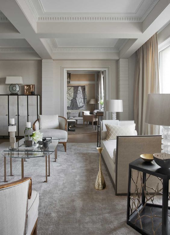
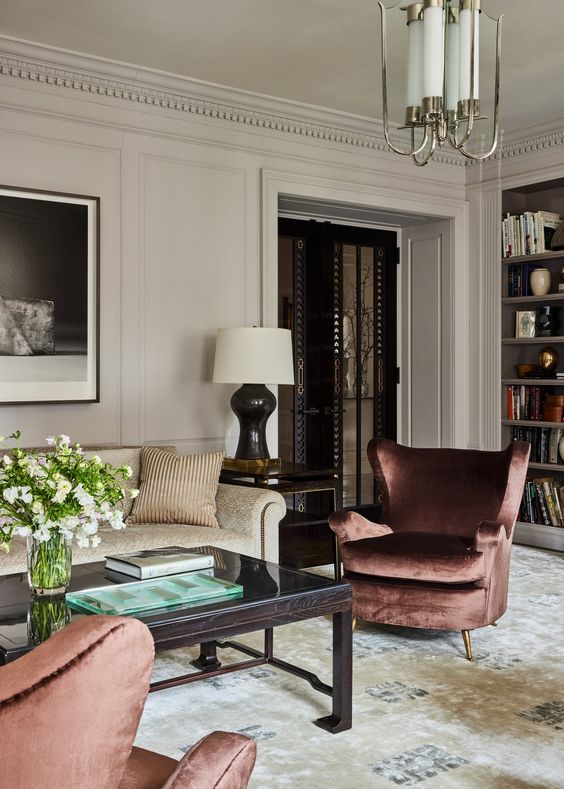
Elegant grey interior by Deniot
But here’s the thing. Grey can also be timeless.
Trends are not black and white (well right now they are, but that too will pass quickly).
And yes, black and white is also timeless.
So how can a colour be simultaneously dated and timeless?
It’s how the colour/neutral is used that makes all the difference.
Is grey marble dated in 2023?
For example, I’m constantly being asked if blue grey Carrara marble or any marble with grey veining for that matter, is now dated.
Because it’s grey. And well, grey is dated right?
So here’s the thing. A well-decorated, styled and designed room will never look dated. Marble, for example, is absolutely timeless except when it’s used in a dated way.
No matter what colour or neutral is trending, there is one thing that will ALWAYS make it look dated. And that is: Overusing the same colour/neutral or not using the colour/neutral well.
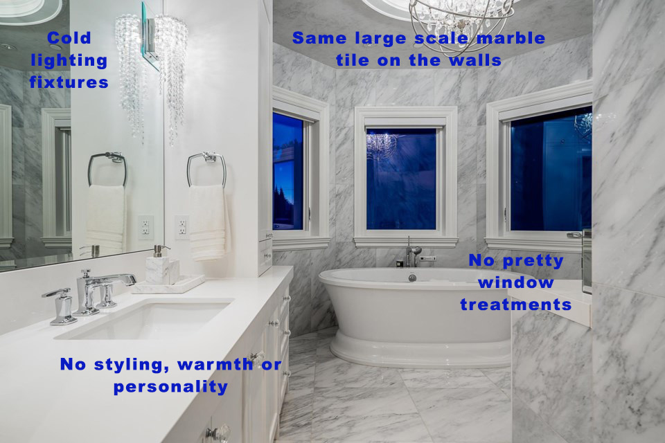
What makes grey marble look dated? Marble looks dated when there’s way too much of it. And when it’s not balanced with any contrasting colour or warmth.
One of my lovely readers said it perfectly: I hate it when it looks like “sale at the marble store!”
So remember, marble can be absolutely gorgeous. However, marble will always look timeless when:
- it’s not cladding the entire room
- there are shifts in scale, like in the cut of tile
- it’s balanced with colour and warm accents
How to warm up your interior colour palette
At the moment, it’s time to add some “earth” to your “fresh”. For almost two decades during the earthy trend cycles, I spent most of my time helping clients move their overly earthy (brown, espresso) spaces to a fresher look. Many of you remember, it was a time when rooms were filled with absolutely everything in a variation of brown, gold and beige.
In order to make these rooms feel “fresher” it involved layering in more off white, cream and complex creams for better balance.
Now everyone seems to be fascinated with COOL neutrals as we move past the grey trend and into the black and white trend. I’m constantly helping clients add colour, warmth and more earth tones to their all white-on-white-on-black or all-grey spaces.
Balance is what makes timeless design
So while trends in neutral colours do exist, the beautiful rooms that look amazing both before and after any trend cycle tend to have balance. The most beautiful rooms were not created by choosing everything in the trendy neutral palette of the moment (i.e. all grey, all white, or all black).
Let’s circle back to grey marble. Yes, marble is going to look dated if it’s wall-to-wall for miles and paired with stark true-white walls, leaving no visual relief.
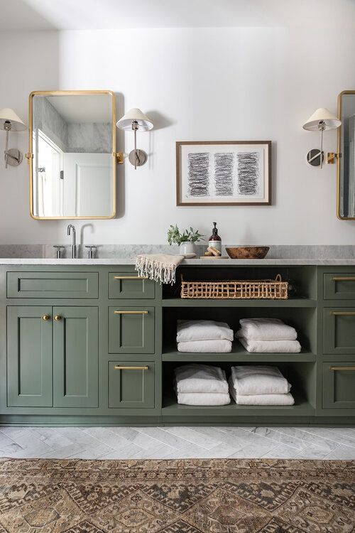
But here’s where grey marble doesn’t look dated. Paint the room a gorgeous COLOUR, layer in wood tones, textiles, cozy textures, and personality. In a room balanced by colour and texture, marble will always look right as rain.
Timeless decorating is about creating beautiful and visually satisfying relationships between materials and colours in your rooms. Learn how it’s done here.
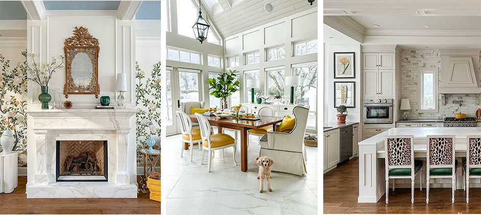
When I installed Calacatta marble in my new dining room during the renovation in the Fall, a few people wondered the same thing – is this marble going to look dated? Sure, my home has marble but it’s layered, without being overdone. There’s colour, wood tones and cozy textures for balance.
Speaking of my sunroom, it will be completely wrapped in a colour sometime soon!
Faux Calacatta fireplace surround | Calacatta porcelain 24″ x 24″ Sunroom tile floor | 3″ x 6″ Calacatta subway tile backsplash
Which colour of grey is the most timeless?
The colour of natural grey stone will always be timeless. Pale limestone is typically a green grey. And that doesn’t mean it’s dated now that grey is not the trend neutral of the moment.
Like white marble, limestone has been used for millennia. It’s absolutely timeless.
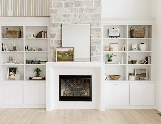
Where you may go wrong with limestone is when you choose a blend it with too much variation in tone. All those variations quickly become bossy and busy-looking. Because if you have stone with two or more neutral undertones in it, the colour palette becomes more complicated. This is a common problem in cultured stone.
It’s difficult to repeat the neutral undertone when you have more than two neutral undertones in the stone. And this is not very versatile for decorating.
Whereas, a single neutral undertone in a smaller tonal range behaves as only one versatile neutral you need to work with (like in this stone below). Big difference.
Pale neutrals are always timeless
The other way to make sure your limestone is timeless is to go with pale stone. Pale green grey and greige will always be timeless and versatile.
Pale greige colours that are just a step or two more shaded than whites, and pale green greys will remain some of the most useful colours for paint and fixed finishes. They are a blank canvas backdrop that make it easy to decorate with a wide range of colours.
Just because we have moved out of the grey trend, doesn’t mean you should immediately discount a great neutral paint or quartz colour just because it has the word “grey” in its name.
One example is Caesarstone London Grey quartz. It’s a beautiful pale green grey countertop option.
And Benjamin Moore Classic Gray is a pale green grey greige that looks like the perfect shaded white in many bright rooms.
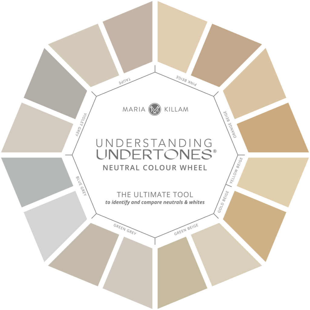
Paint colour names can be truly deceiving so it’s a much better plan to get to know how to work with neutral undertones to avoid mis-characterizing colours based on their names alone. Did you know that Sherwin-Williams Accessible Beige is actually a perfect warm green grey?
Get a neutral colour wheel here.
Did you know that some of the most versatile and beautiful greys are in found in nature and architecture?
For example, natural limestone, raw concrete, plain mortar, and naturally weathered wood, are all versions of green grey. That makes green grey a particularly versatile undertone to work with. And, it’s completely timeless as long as the room is not grey from top-to-bottom with no visual relief.
Creating a balance with grey is timeless
As trends shift to more colour than we’ve seen in awhile and the “safe” neutral choice starts to look more like beige and brown (yes, that’s on its way as soon as the stores sell out of all things grey), it will be time again to add more cream and white to create balance.
But for now, we are still very much in a trend where what the vast majority of less-than-fabulous rooms need more warmth and colour.
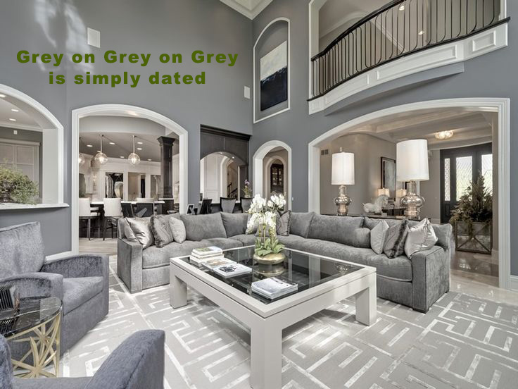
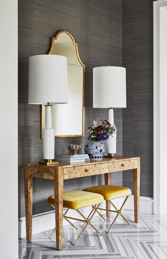
So if you find yourself underwhelmed in a what feels like a white box with black accents or much too much grey-on-grey, here’s what you can do. Look for ways to layer in warm cognac brown, wood and at least one warm accent colour.
In other words, balance your snowy fresh room with some grounding warm earth tones. Balance your desaturated grey room with some colour to add life.
Is grey a dated neutral?
Again, this is not the right question to help you decorate your room more beautifully.
Here’s a better way to think about neutral trends. The problem with grey (or any trendy neutral) isn’t whether it’s on-trend or dated. Instead, when considering ANY neutral, ask this question: “Is my room visually balanced?”
This is the RIGHT question that will help you move forward. It’ll also make decorating more fun. And to make things easier for you, I’m starting a new weekly “trendy or timeless” series on Instagram, here’s one I posted recently.
Don’t forget, the best rooms don’t look like the rooms you see on the showroom floors. They look like YOU live there. They’re filled with YOUR personality!
If you’d like more training on how to create a timeless home you’ll love forever (that includes decorating with neutrals and colour), register for one of my Virtual Specify Colour with Confidence workshops today.
⭐️ READER SURVEY: We want to hear from you!
Please take a few minutes to answer our reader survey here. We’re giving away two $200 gift cards! We appreciate your feedback!
Related posts:
Two Best Ways to Decorate a Room With Grey Floors
How to Choose a Pale Neutral Wall Colour (for my new kitchen)
Creating Flow with Marble Finishes: My New Fireplace



My problem with gray has been seeing flipped or new builds that put it on every wall, gray wood floors, and then think some white tile will make it all better. We have been browsing some homes for sale and it’s everywhere. A little gray used judiciously is beautiful. My childhood home’s exterior was gray with black and white and would still look classic today (although the next owners painted it a darker gray that wasn’t really classic at all.).I especially appreciate the point about “busyness”. Can’t abide that personally, visual chaos really bothers me.
I came here to say much the same thing. Also casually looking at homes. I am seeing rustic New England farmhouses renovated with cool gray walls, gray wood floors, etc. It’s awful.
Maria,
What are your thoughts on using BM Pale Oak as a whole house color, using decor as accent color?
I painted the majority of the walls in my home with Pale Oak a few years ago, I paired this with White Dove trim. It is absolutely gorgeous and I’m still in love with it. It is a neutral but it has warmth to it. I’ve never been a fan of gray, it’s just too cold for me personally.
Pale Oak was one of the recommendations Maria gave us when we our open concept edesign consult — based on our existing backsplash and some furniture that was staying, she recommended taupe greige for our paint color. Pale Oak is beautiful but it has a pink/violet undertone that happened to come out pretty strong in our house/lighting, so we are going for her first recommendation which was BM Fossil. If Pale Oak relates to your hard finishes and you either don’t see the violet or the violet doesn’t bother you, I say go for it – it is a beautiful color!
Such a well timed topic, Maria! It’s always nice to have more ammo for the arsenal when it comes to explaining things to clients! Thank you!
Great, spot on post! Too much of anything is too much.
To me if a home’s photos look l Iike they are black and white photos, they are dated and not attractive. And agree, they are everywhere.
Great post. What maters most, in my experience, is that the colors and items in a home should represent the personality of those living there. I need to be surrounded by object I love or have meaning.
I loved my dark blue gray kitchen and eating area. The fabric I used brought the gray to life. Had it until we did a major remodel. By major, I mean, we moved the house, added on and remodeled the entire home with the exception of two bedrooms and upstairs bath. I was sad to see the gray go but it was time for a change.
I have had my Caesarstone London Grey quartz countertops for going on two years now, thanks to your specifying them, Maria. I love them so much, wiping down kitchen countertops has become my favorite chore. They are indeed a beautiful neutral backdrop for the colors I love to decorate with.
That is what I had always said. It is not what you use but how you use it. I always liked beige and warm tones so I use them in an updated way even through the cool tones grey phase that was trending, which I never took part in as I don’t like cool tones as much.
Yay! I appreciate the green-gray validation. I just used Farrow & Ball Shaded White all over walls and ceilings in my open-plan house—it’s a greige with a green aspect—and have been thrilled with it, despite wondering if I should go for an earthier beige neutral.
I love your examples, Maria. I see that mixing gray tones with warm tones creates a wonderful contrast that is not suffocating, as all-any-one-color tends to be. Having stayed in several corporate apartments lately, I can tell you that the gray on gray decor is alive and well. It’s awful but a few well chosen, colorful accents can make a huge difference. Same is true of too much brown/beige, which is my problem at home. The gray tones mixed with warm tones, wood, and color are inspiring.