I have always wanted to install a timeless penny tile floor and I finally made it happen in my primary bathroom renovation. Here’s a look at the floor tile colour and pattern I chose, plus some of the changes we made in our bathroom design.
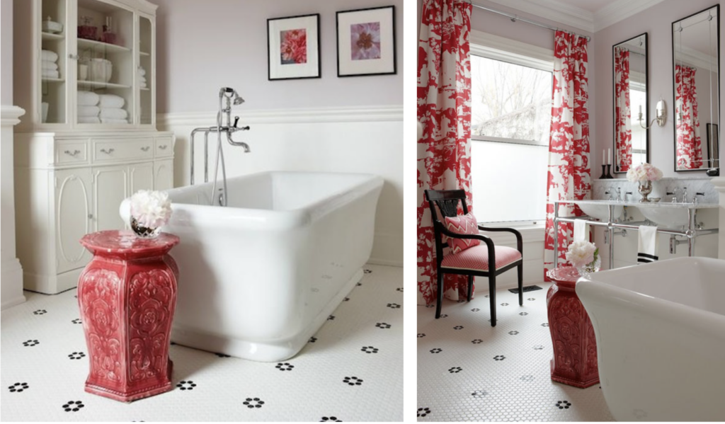
After I completed the renovation of our main bathroom in the last house (below) there was one thing I would have changed.
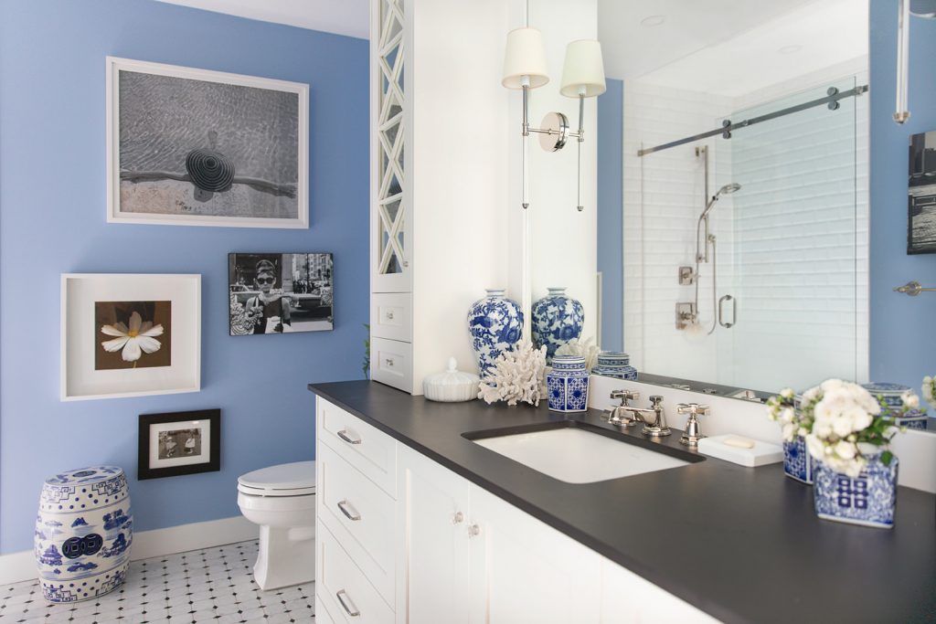
See the rest of the bathroom here
Since I’m obsessed with flowers, in the end I wished I had chosen a white penny floor tile with black flower accents instead of the Carrara marble diamond tile. However, during my search 5 years ago, I couldn’t find any floor tile with a flower pattern so I chose this instead (above).
Timeless, small scale floor tile
Both floors are a timeless, small tiles that you would expect to find in a traditional bathroom design.
But, sometimes you have to go custom to find what you really want.
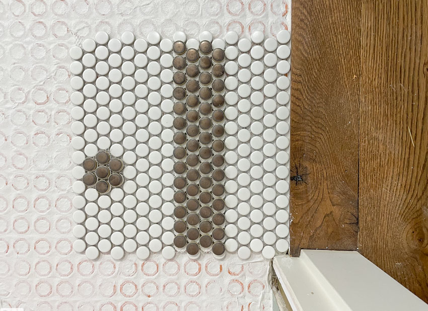
So while planning our primary bathroom renovation this time around, I knew exactly what I would choose. This was my inspiration photo:
Penny tile colour for my primary bathroom
I chose a copper-coloured penny tile because I was doing a wood stained vanity in medium brown that also related to my medium brown white oak floors.
To be clear, black and white would have been a good option as well. But since I was customizing the tile instead of buying it in 12 x 12 sheets, I chose the copper tile because it was available. Plus I like the way it relates to the hardwood floor and vanity. So pretty!
One of my favourite podcasts right now is Dear Alice. During one episode, they talked about tile and how one of their tile installers had called them and said, “Did you know there are 16,000 pieces of tile here?” They replied, “Yes, other people might buy tile in a sheet but generally that’s not what we do.”
In other words, they prefer custom designed tile floors too. 😉
Admittedly, this is the most expensive way to do it. If you want a similar look for much less, I recommend finding something similar in a 12×12″ sheet.
Regardless, I’m really happy with how it turned out.
Choosing a custom floor tile pattern
HINT: Don’t glue down your floor tile pattern until you’re absolutely sure!
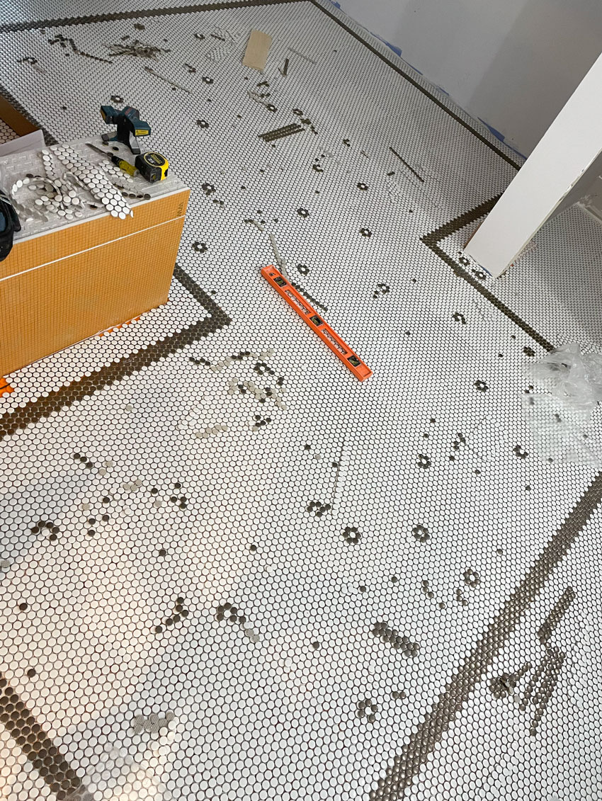
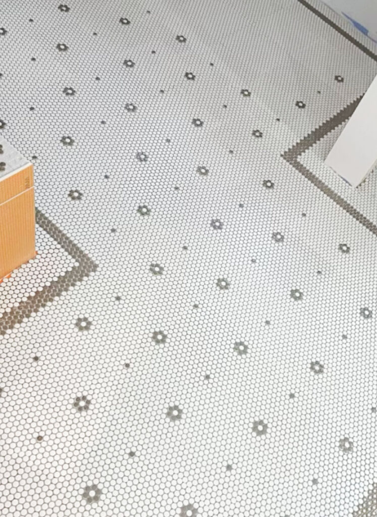
This was the first round of the design (and the tile was not grouted yet). This is where I decided that I didn’t like the border running in front of the tub (see that jaunt in the top right corner) and so I had it reconfigured to go around the back of the tub, along the wall.
I also wasn’t a fan of the polka-dot style of the flowers. I realized that placing a white penny tile in the center is what truly would transform this pattern into little flowers.
Here is an in-progress photo showing just after the moment my tile installer moved the border (below). I also adjusted the border to only 3 tiles wide instead of 4. So much better.
And here’s what my design looked like when it was finished. Remember, be sure you are in LOVE with your pattern before it gets glued and grouted. That’s why my installer dry-laid all my tile so we could approve it before he installed it.
Floor patterns are tricky. Like anything else, looking at a 12×12″ square of pattern or a smaller version of the larger pattern might look just fine. But once it’s installed on a much larger scale, you may find that the pattern isn’t quite working for you yet.
This is also the reason that I sound like a broken record when it comes to comparing paint colours with large painted samples.
Additional primary bathroom decorating details
My entire primary bathroom renovation isn’t quite complete yet, but I’m sharing a few more pretty details with you here.
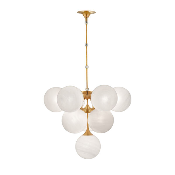
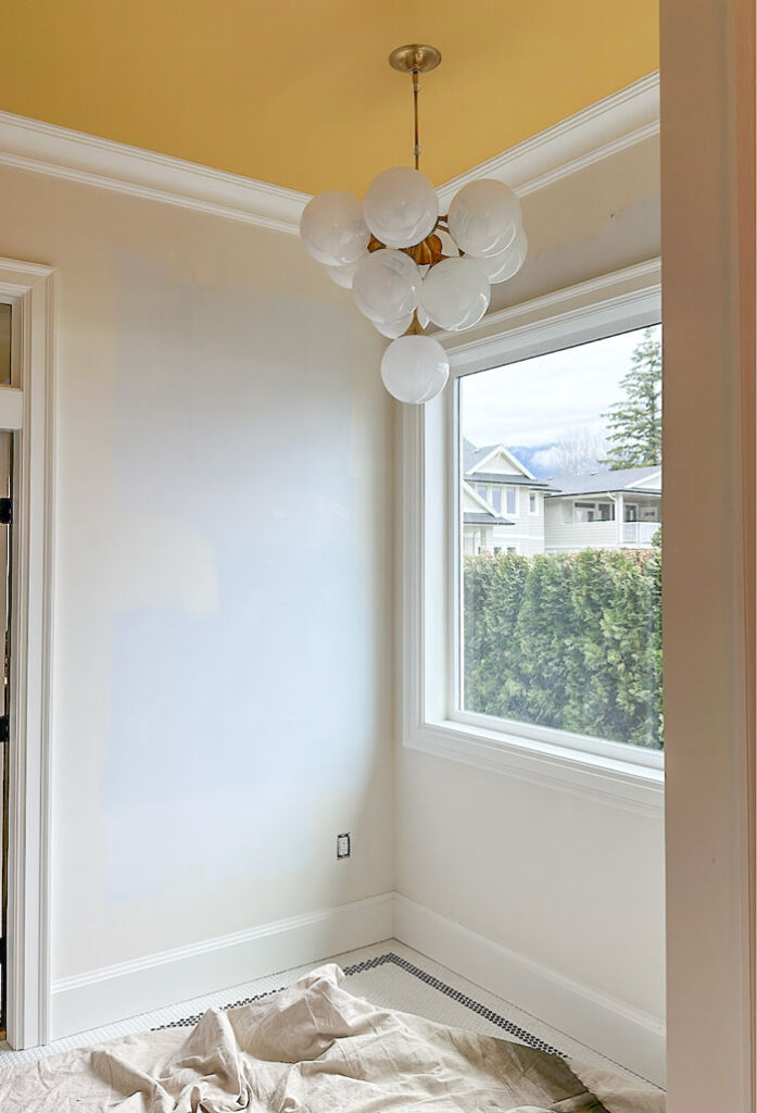
When my bubble chandelier arrived (above) to hang above the tub (I have 10 foot ceilings that’s why I can have one there), it was in the box weeks before it was installed. I worried it would be too big because when I ordered it, in my mind the globes were half the size. Scale can be tricky to visualize.
So, I messaged my good friend Lisa Mende, an incredibly talented designer, and she told me it would be perfect. And she was right.
Sometimes even designers need to get second opinions when it comes to choosing decor and lighting. I’m lucky to have a few that I trust!
Painting my bathroom yellow – the happiest colour
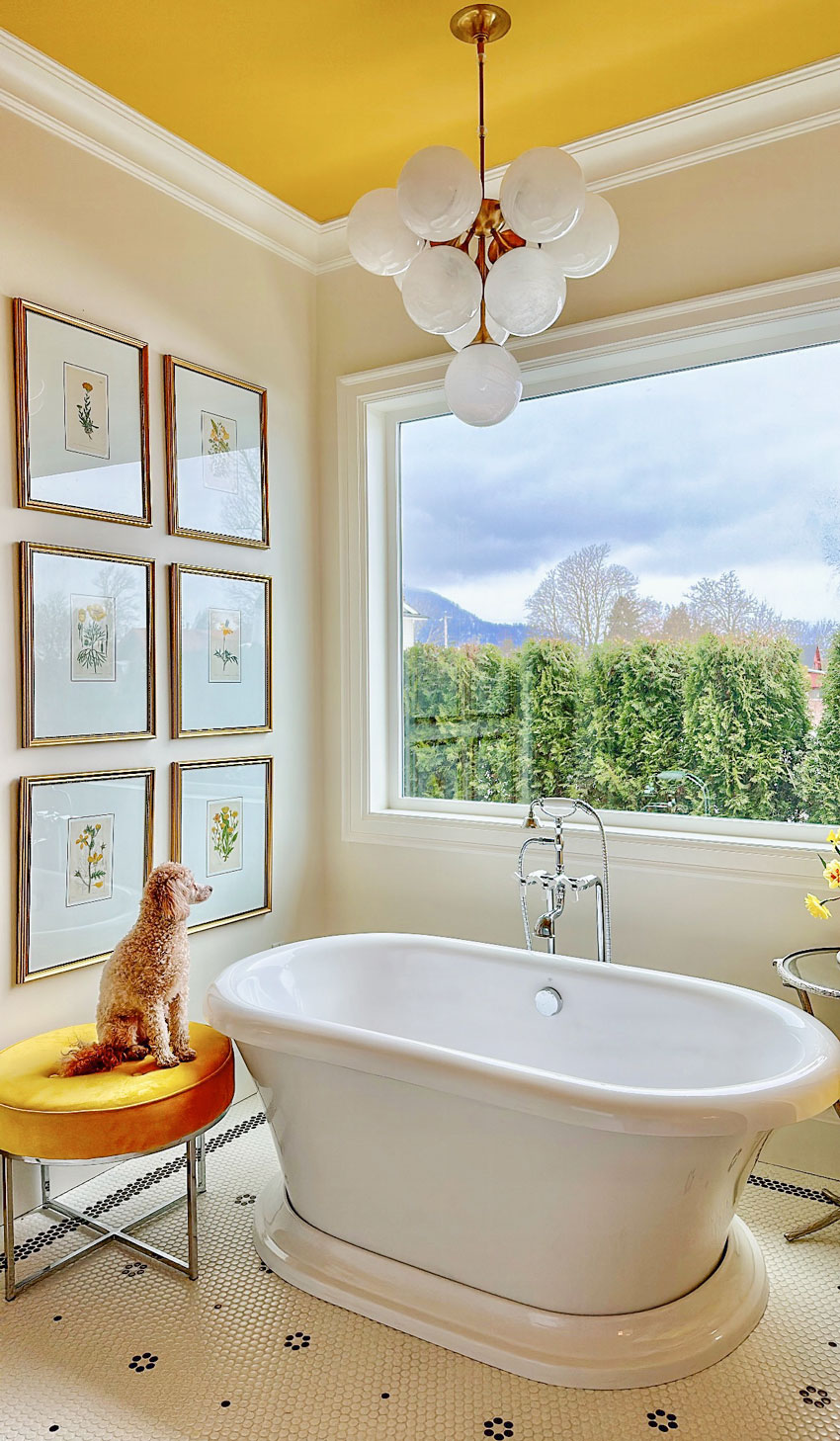
I painted the ceiling a truly happy and delicious gold paint colour from Benjamin Moore called Hanna Banana. I love the contrast shown in this view from the tub below.
Paint colour: Benjamin Moore Hanna Banana
The less-than-lovely bathroom before the renovation
This was what the bathroom looked like before, when we took possession of this house (below).
The space had three small windows, two in the shower and one in the toilet room. We moved the shower to the opposite corner so we could install a single large picture window over the tub.
And since we are renting out our last home (still available!!), I switched out the tubs. I really love my DXV bathtub from my old house. And this one also makes for a really nice tub in the rental bathroom.
New picture window in my bathroom = light + view
The new window we installed in this bathroom is a total game changer! It’s hard to imagine a primary bathroom without a decent window! I will be adding a row of sheers for a luxe look that still lets in light but provides a little more privacy for bathing.
Find out where else we added windows here.
And here’s the corner with the botanical wall art I had hanging in my last bathroom (below). I love this art wall and was glad to be able to use it again. Lucy loves the view.
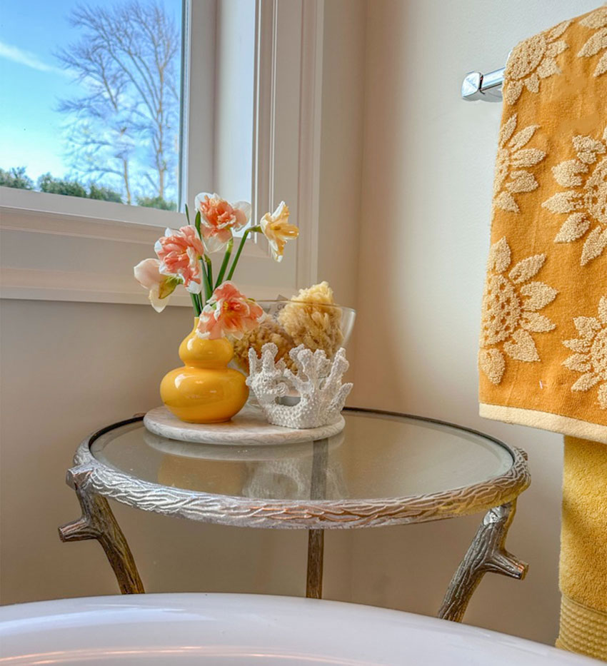
A colourful reminder that Spring is coming with an arrangement of stunning daffodils placed in the other corner.
I realize this is just a small part of my overall bath design, but since the floor is now installed, I couldn’t wait to share it with you. Have you ever created a custom floor tile pattern? Did you like how it turned out?
Penny tile is a timeless small scale floor tile that works great in bathrooms in traditional houses.
Stay tuned for more bathroom reveals as the room comes together.
Become a True Colour Expert and learn how to create timeless bathrooms for your home or your clients in my two-day workshop.
Related posts:
Maria’s Timeless Primary Bath Reveal: Before & After
Is your Bath Perfect or Just Perfectly Nice?








Lovely. I have always use a mosaic tile since my house was built in 1941. I am, however, considering going to a larger format for the next round of renovation because the mosaic grout always seems dirty and is nearly impossible to keep looking clean. What color grout do you think is easiest to maintain?
That was my first thought when I saw Maria’s email about her floors. There is a grout in the US by Custom called Prism that’s supposed to be easier to keep clean.
-Have you ever created a custom floor tile pattern? YES in my master bathroom.
-Did you like how it turned out? LOVE LOVE LOVE IT!
I just redid a bathroom and used penny tile. It’s a really small room so I didn’t make flowers, just added a single black tile to make the accent dots but it turned out beautifully and I’m really happy with how it suits my vintage home.
Hi, Maria. Love your new bathroom floor! I am also inspired by botanicals and all things nature and classic. My fav colors tend to be green and brown, with happy pinks and oranges! It’s hard sometimes given what’s available to avoid trends but I’ve learned a lot from you. We also have a custom floor pattern in a bathroom, love our tiny hex border. Thanks again for your coaching; you have improved our home even where other designers have not. Tried to submit a bathroom photo but 🤷🏻♀️
LOVE IT!!! Love the colors, the floor pattern. It’s Stunning!!
WOW! What a gorgeous transformation, Maria! I love every detail in this bathroom. I never realized that the darker tiles were a copper color. They usually read black when I’ve seen your pics on Instagram. They even look black on the last couple of pics of this post. Either way, I love them! Adding the large window is a game changer and elevates the space tremendously. It’s so fun to get to share this journey with you 🙂
Hi Maria – Your bathroom looks beautiful! What color is on the walls?
Info is on her other post:
SW Incredible white!
I was looking for the color, too. It is very pretty.
This colour is close to BM Navajo white, it was mixed using my primary bedroom paint after the first colour I chose didn’t work for me. Maria
Maria…can I ask what grout color you are using? I can only imagine it’s white?
I’m interested in your thoughts on a comment I heard from Nate Berkus (on an Instagram Post) who said in one sentence to always match your grout to the tile and in the next breathe said to never use white grout. 🤷♀️
Actually now that I’m really looking…the grout doesn’t appear white. Can you share which color you used? 😊
It is white yes. Maria
I love the pattern of the penny tile, but I don’t love the copper. You broke your own rule of going timeless! Now, if I were to buy your home, I’d be forced to replace the tile with black and white, the timeless tile you always recommend!
I agree. Surprised at choosing copper color. Wouldn’t want for myself, black is classic. Seems blog is now for her to share her remodel, confusing to me and less helpful.
This is a much-needed wake up call for me. I was somewhat blindly following online design advice, including from Maria, rather than using my own brain and intuition. I will now take advice with a grain of salt, realizing we each have our own preferences and definitions of what “timeless” means.
Timeless doesn’t equal appealing to everyone. It is about longevity. I have a completely different design style from Maria and still often use her advice.
Your opinion means you have your OWN style – Kudos to you!
Confused by this comment. She didn’t break her own rule. Maria has always preached that color choices should relate to other hard finishes (in this case, the wood floor and vanity). She explained that earlier in the post… and that black and white could have worked as well. And, copper IS timeless as far as I am aware.
Copper has been around forever. The warmth of the copper is much better with her fixed finishes and wall and ceiling colour choice. Beautiful.
EXACTLY Copper is a natural element in the periodic table of the elements. Billions of years.
Given I have a medium brown vanity that matches it perfectly, which is also a timeless way to warm up a white bathroom, it’s unlikely that the next homeowner will be in a rush to replace it with black and white. I was simply saying that black and white (Obviously) would have also been an option. In my Specify Colour with Confidence workshops I show a home where the kitchen had been renovated 3 times since the bathrooms were installed and they all still had the original basket weave tile (even though it was peach and white) or a hex tile (even though it’s forest green and white) and no one had replaced them? Why? Because that is what you would expect to find in a traditional, timeless bathroom. NOT 12 x 24 trendy TAUPE tile from top to bottom as my original very expensive bathroom had. Hope this clears things up for those that are confused. Maria
Love the copper penny tile. As always, your attention to detail is spot on. A stunning primary bath!
What a beautiful bathroom it will be! Love that yellow and the bubble chandelier. I am in the very early stages or planning our primary bath reno and was looking at that exact kind of tub. I wanted to have a tub filler installed window side just like yours. Would you mind letting us know how it is cleaning back there? I’m not sure how much clearance to give to be able to get the floor clean especially around the tub filler nooks and crannies. I love a claw foot but prefer this base for cleaning purposes and wondering if I should just go with a tub faucet installed on the wall for this reason too… any words of wisdom Maria?
I installed a black and white penny tile with flowers in my guest bathroom! No border because it’s a much smaller bathroom and it would have created an awkwardly narrow rectangle inside the border. I also had the flowers one solid color at first, and then decided to go for a clearer daisy look with a white tile at the center. I used a combo of 12×12 black and white flower tile, 12×12 white hex tile, and a small amount of 12×12 black so I could peel off a few tiles piece by piece to add more accent flowers. It was a cheaper way to get a custom look. My tile installer took pictures afterwards and told me it was the first time he’d taken pictures of a completed project!
I just love the rich yellow colors and (obviously) the flower tile in your new bathroom, Maria!
I would love to see a picture. 🌸
Scrumptious! I love how committed you get to your design style. Who paints their bathroom ceiling gold? OMG! Just love it. What is your opinion on painting ceilings a color like that without crown moulding?
I love your new bathroom floor! It’s perfect. And the whole room feels like sunshine. Timeless light.
Love that yellow ceiling! The penny tiles are gorgeous. They remind me so much of a bathroom in an apartment my brother rented in the1970s. It was one of those beautiful smaller buildings on Beach Ave in Vancouver built around the 1900s. So much stunning architectural detail including the timeless penny tiles. Im sure the tiles were lovely in the 1900s like they were in the 1970s as well as today. Also adding the white tile in the centre really made the flower. I can’t wait to see the rest of the bathroom!
Love it. Really beautiful—and I’m not a fan of orangey golds! But it’s perfect for you, of course. And so vastly improved! I always marvel at how ugly an expensive bathroom can be.
When we remodeled our primary bathroom in 2005 (timeless, and still looks wonderful), all the tiling was custom. I designed a long, open shower to replace the tub and separate shower there previously, tiled in a silvery gray two inch square ceramic tile. The floors (including the shower) are white penny tile with flowers in the same gray, just like yours! I had them scattered rather than perfectly symmetrical. The continuation of the floor in the shower looks great. I have loved using that bathroom every day for nearly 18 years. In all that time, the only changes I made were higher end knobs for the cupboards and different lighting. The old sconces looked too large, so I found smaller replacements. Unfortunately, none of the beautiful lighting fit in the small spaces where the sconces had to go. It was very difficult to find something the right size. So the sconces are nothing special, but at least they’re the right size.
The change from the first tile design to the second–with the narrower border, the lack of jogs, and the white-centered flowers is a design lesson in itself. From OK (but a bit clunky) to elegant. Beautiful!
I love everything I can see so far, Maria! It’s happy looking. The chandelier scale is perfect – I suppose those globes look smaller up near the ceiling than they looked in the box.
Fabulous! The copper tiles and golden yellow ceiling would not be my choice, but I know you love yellows and can see how all the components work well together. Can’t wait to see it all finished, especially the floor border. They can be tricky and sometimes remind me of the lines bordering or running thru backsplashes.
Your light fixture is the bomb! Makes me happy and makes me think a soak with a view and glass of bubbly would be fitting! 🙂
I too love flowers and botanical prints. Could you please share the source or where you found so many in same scale? Did the same company also do the mats and framing? Also what do you do to protect your prints from light thru that window? I live in S California. love light coming in, but everything fades even w windows to help reduce that, especially when opened of course.
I bought them all from a vender at High Point Market already matted and then I bought gold frames for them from Wayfair. Also this bathroom is north facing as was my last bathroom so I don’t have to worry about fading, however Etsy has lots of botanicals! Thanks for your comment! Maria
Another question is how to protect artwork from the inevitable steam and moisture in a bathroom. Do you have tips for that?
Good ventilation is a worthwhile investment for the bathroom, and not just to protect artwork.
Everything you have done here is perfection! I’m surprised at how much I like your yellow ceiling now that you have the stool, towels, and botanicals bringing it all together. That bubble chandelier is beautiful and just the right size with your high ceilings. I’m in love! 💕
To me, what I especially love, is that you took the dot from the centre of the flower and added it amoungst the white tile. It almost looks like the flowers are scattering in the wind across your perfect floor!
This is exactly what I am planning in my small, bathroom renovation. I will add a roll-top slipper tub with ‘X’ taps plumbed through the wall in an unlacqured brass — a marble top vanity with more of the same wall faucets as the tub (it’s a very small vanity so I can splurge a little).
Penny rounds are the least expensive option which is a bonus, because it’s my first choice regardless. I’ve pinned your examples so I can use them as guides when it comes time to design my own version. Thanks as always, Maria!!
They might be inexpensive to buy but the labour is THE MOST expensive. If you don’t have a good tile installer you will actually see the 12×24 sheets in the floor potentially. Maria
I like the tile but I have to say I love even more that the free standing tub is actually far enough out from the wall to be able to clean behind it! So many people are putting free standing tubs in a place you can barely put your hand behind—so impractical.
Oh wow. I love it all! The yellow/gold ceiling. And the light is to die for! I just love it immensely. The bigger window is fantastic. Pooch (can’t think of it’s name) is guarding the room so no one will mess it up! ha I love the tile too. Someday I would like to change the tile in my house but the budget won’t
allow it right now. Can’t wait to see the final reveal.
Yes, the custom penny tile is stunning…but I couldn’t get over the yellow ceiling! Now, that’s a great use of color!
I love everything in your new bathroom, Maria. The penny tile, the yellow ceiling and bubble chandelier, the large window… all gorgeous.
With regard to the tile border, are my eyes deceiving me or did you switch from 3 tiles wide to 4 tiles wide in some areas?
The chandelier on the gold ceiling is a chef’s kiss! Any smaller and the light would have looked under sized. Can’t wait to see the finished room.
I love your tile floor. What a great design lesson. Thank you!
Would you mind sharing the source for your light fixture? I think it might look good in my sunroom. 😊
Beautiful. Love your custom tile – the design is perfectly balanced. Just gorgeous!!
Hi Maria, what material are your penny tiles? Most penny tiles that i see are ceramic, but I saw you mention in another post that you arent a fan of most ceramic tiles.
Sorry I mean porcelain!
love love love love love! Thanks for walking us through the process! In the midst of a penny tile floor design myself!😘