The core insight of my method for choosing colour is testing with large samples. This is the best and only way to see if the colour you’re considering is right–especially with neutrals. Because the minutiae of the correct undertone, as in the one that screams, “Yay we nailed it” and the wrong one that looks like we-tried-to-match-it-but-we-failed is so subtle.
Testing with large samples = the right paint colour. Pretty simple right?
Whether you’re a True Colour Expert or completely new to choosing colour, comparing large samples directly to your finishes and furnishings is the ONLY way to see the subtleties you need to see.
Your path to perfect paint colours just got easier!
I’m thrilled to announce my partnership with Samplize to streamline your paint colour selection process. For years I’ve been helping people like you navigate the complex world of paint colours. And now? I’ve carefully curated collections of the most reliable, versatile paint colours – and now you can test them effortlessly in your own space.
Samplize offers large paint samples, delivered overnight to your doorstep! This is so much EASIER and cheaper than rolling up your sleeves and doing the messy work of painting your own from those little tester pots.
And I’ve curated all the best and most useful colours for you in my Samplize collections!
Just to be clear, I still offer my large hand painted samples (in neutrals and colours) because they are made from good quality, durable poster board. This means they will last a long time–especially helpful if you’re someone who specifies a lot of paint colours for clients.
However, even for those of you who have my large paint samples, your clients still need their own samples after you’ve chosen the colours. Getting them from Samplize is a great solution.
My colour boards include the complete system of 50 neutrals and whites. But now, with Samplize you can buy just one, or a few, or as many samples as you need. And not only in Benjamin Moore and Sherwin Williams but also Behr, PPG, and Farrow & Ball. 🎉
And, managing your paint colours just got even easier because the bottom of each sample has two smaller colour samples with the paint name and number that you can give to your painter and one you to keep for your files.
⭐️ Get the essential companion to your Samplize paint samples here.
The right way to test your wall colour
When choosing a paint colour, most people brush a cluster of paint swatches directly on the wall. I can’t stress enough how important it is to understand why this is the LEAST useful way to sample colour.

❌ Don’t do this!
Why? Because the existing paint colour on the wall and the visual confusion of other samples clustered together distort the read of each colour.
And because what you want is a portable sample you can move around and compare to everything in the room. You can stick your peel and stick Samplize sample anywhere you want, but I would first move it around and make sure it relates to all the major finishes and furnishings in the room.
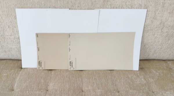
Pro tip: put a larger white poster board behind your sample to isolate it and show the colour more clearly when you’re comparing it to everything in your room.
My Favourite Samplize Paint Colour Collections
Here are a few ways my Samplize collections will make your paint colour choosing life easier:
1. | The Best Neutral Paint Colours
So many of you have asked what paint colours are used on my neutral colour wheel. Here’s the thing, the neutral colour wheel paint colours are custom, because it’s designed to be used with ANY paint system in the world. BUT……..
Now you can shop the closest paint colour matches in Sherwin-Williams and Benjamin Moore at Samplize!
Here’s how these samples will HELP you when you’re using the neutral wheel.
When you compare my neutral colour wheel to the carpeting throughout your home, and you can’t tell if it’s either pink beige or green beige (really common with carpet) – now all you have to do is order the large samples and prop up them up next to your carpet and watch as the true neutral undertone reveals itself. One will emerge as a better match because you can see it at SCALE!
In other words, one undertone will be the winner, but you need to be able to compare with a large enough sample so that you’ll actually end up with the correct neutral paint colour for your walls.
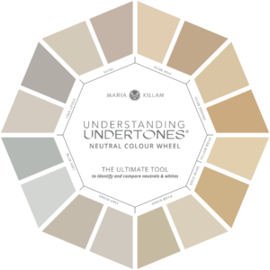
Why is comparison so crucial when choosing paint colours?
Many elements in your home – from carpets to tiles to fabrics – contain multiple undertones. To create true harmony, you need to identify the dominant undertone, or the OVERALL READ, as I like to call it. It is the one that reads strongest overall.
And you can’t do that with a teeny, tiny paint chip.
Because the difference between the correct neutral and the one that’s close but wrong is often so subtle that you can’t fully be sure you’ve nailed it until you’re comparing more than one.
2. | The Best White Paint Colours
If you’re looking at any paint brand’s collection of hundreds of whites, it’s easy to get overwhelmed.
Been there! But I discovered the simple way of choosing the best white while working on a client’s guest bedroom many years ago. I was looking for the white that matched her coverlet and that’s when I realized that all the best whites essentially fall into four categories (from cool to warm): blue whites, true whites, off-whites, and creams.
She had hired me to get a custom bedskirt made for her bed. When I walked into the room she stated, “I want the bedskirt to be off-white like the coverlet, and NOT the cream of the carpet.
That’s when I had the ‘aha moment’ that created 4 categories to make choosing whites WAY EASIER.
So if you’re trying to find the best one for your walls, trim or cabinets you’ll want my white ebook AND the best and only whites you’ll ever need – I have curated them for you here.
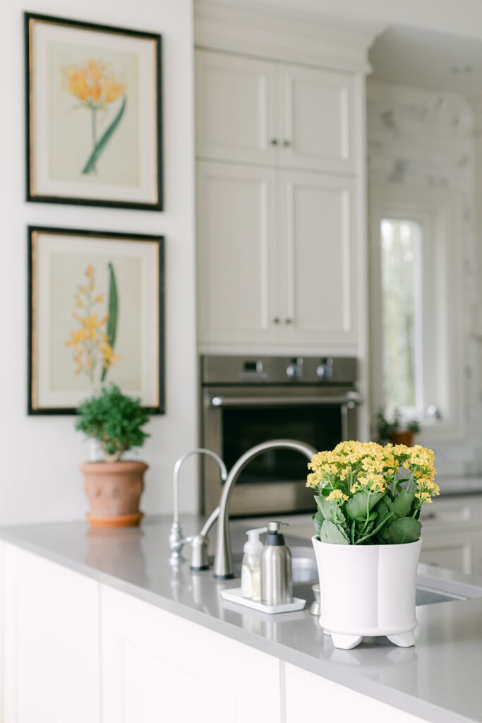
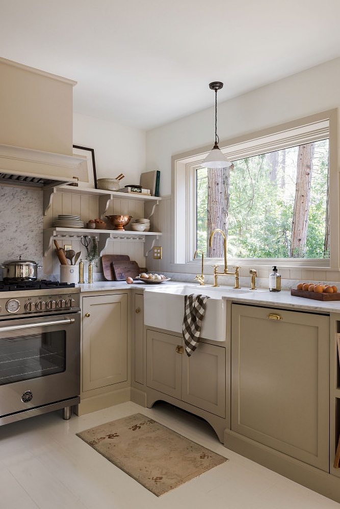
3. | The Best Modern Warm Neutral Paint Colours for Kitchens
Are you painting your kitchen cabinets this year? What would it be like to finally be able to walk into your kitchen and smile every time because the colour is perfect?
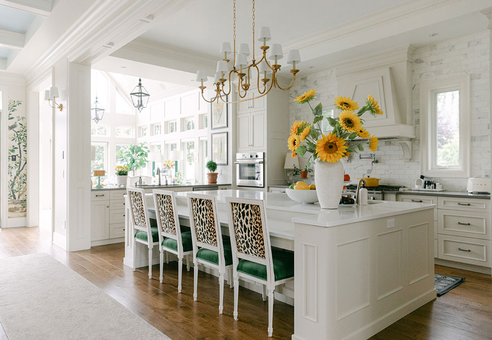
Kitchen trends are moving more and more towards creating a refined space that feels like it fits with the rest of the house. We’re just not throwing up endless rows of serviceable-but-boring uppers flanking an industrial hood fan anymore.
Kitchen design is getting a lot more sophisticated, have you noticed that?
 Town and Country Living
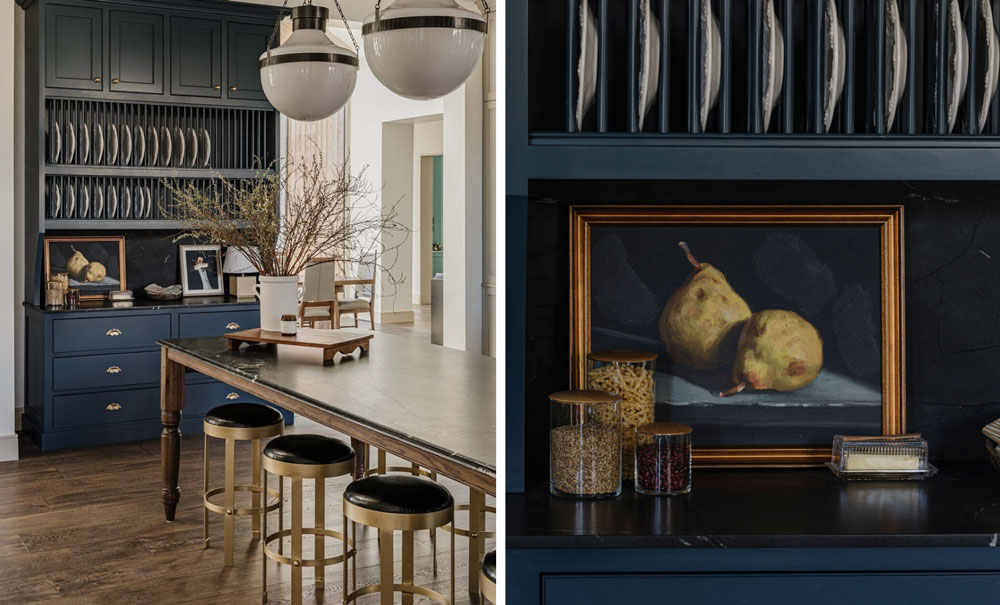
Now not only do you need that cute vintage gold framed painting but you also need pretty details, accessories and probably a well placed cutting board in just the right brown shade along with a plant or two. You’re creating a whole vibe that says HOME.
 Shaker Kitchen project in a listed farmhouse | Photo credit: Searle & Taylor
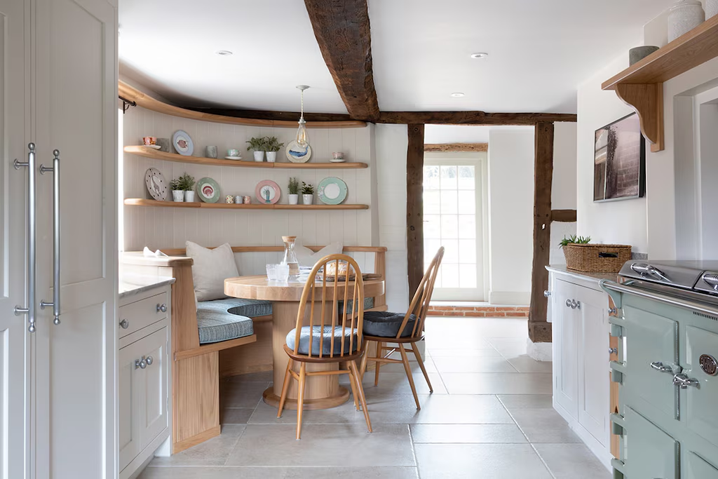 Shaker Kitchen project in a listed farmhouse | Photo credit: Searle & Taylor
Basically if you think of your kitchen and the word ‘charming’ doesn’t come to your lips when you describe it, well it might be missing something.
Often, the best step is to paint the cabinets a pretty colour. But it is a big colour commitment, pressure is HIGH – so I’m here to tell you, I’ve got you!
One thing I know for sure about trends, is that you don’t need to sift through hundreds of paint colours. Because all we’ve needed in the past 8 years is a couple whites and a few blacks (because that is all anyone wanted), and now that kitchens are warming up, we just need a selection of those perfect modern neutrals that have been taking over your feed.
Just like that. . . your kitchen cabinets, and with the right colour choice–even your countertop–might have just come forward to 2025.
I have curated the 9 best neutrals for kitchens right here.
4. | The Best Blue & Green Paint Colours
One of my best but not-so-secret tips for injecting life into a kitchen, especially if you need to work around countertops or tile you’re not in love with, is to choose a pretty blue or green for your cabinets. So I’ve also curated these paint colours for you into collections at Samplize:
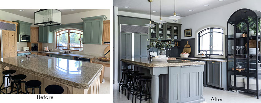
Depending on what your countertop actually looks like, choosing a dramatic colour can distract the eye from that granite you hate (above).
It will make it SO much easier to find the best one. You’re welcome!
5. | The Best Pale Neutral Paint Colours
Pale neutrals are always a timeless and versatile choice. Throughout the craze for stark white walls, I have insisted that a barely there neutral wall colour will look more custom and sophisticated than the trending whites and off whites. And they will remain more versatile and liveable than any darker trending neutrals (yes, brown paper bag pink beige walls are coming again!).
Pale neutrals are the Goldilocks colours. Perfect backdrops for decorating with a range of accent colours from muted and earthy to fresh and clean. They create a soothing airy feel and flow beautifully through open layout homes (the majority of homes nowadays).
You can pick and choose or order the whole collection of the best ones in Benjamin Moore or Sherwin Williams to see which one best flatters your sofa, countertops and carpet or tile. And forget having to sift through hundreds of options in any paint collection.
2 Ways to Choose a Neutral Paint Colour for Your Open Layout
This is often one of the most difficult decisions in a new build or renovation. But I’m going to teach you two places to look to find the perfect neutral for your open layout.
Create Your Dream Home in 2025
Spots fill up fast in my homeowners training. Get the details here.
Related Posts
A Blue Kitchen Refresh Before & After
Why a Beige Kitchen is a Tricky Design Project
The Best Sherwin-Williams Paint Colours for Warm Kitchens


I am surprised you’d partner with Samplize, an American company, when we have our own Canadian equivalent, Hello Paint, which offers excellent service and the exact same product.
I’m so glad you asked this question, I partnered with them because they asked me! Maria