


I love it when my clients send me before and after photos from my eDesign consultations because it’s so rare! And we all love a good before and after right?
Jann from Newton Custom Interiors is a window coverings expert who lives in Illinois. It was time to give her home a fresh new look and she needed advice on what colours to paint her oak kitchen cabinets.
Plus she had a lot of oak furniture and needed a plan, here is what we did:
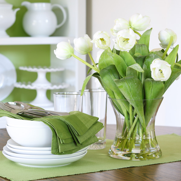
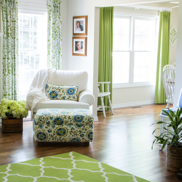
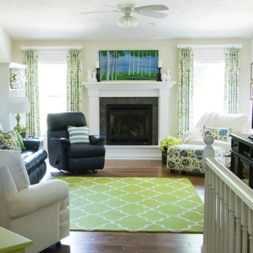
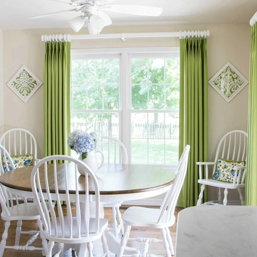
Jann had a navy leather couch and chair that her husband really wanted to keep. She had already picked out a floral fabric that had lots of bright colors in it to use in the room. After she had selected the fabric, she saw a picture I had posted, and in it was the same floral fabric in an ottoman. That became the inspiration picture for the living room (below).
after
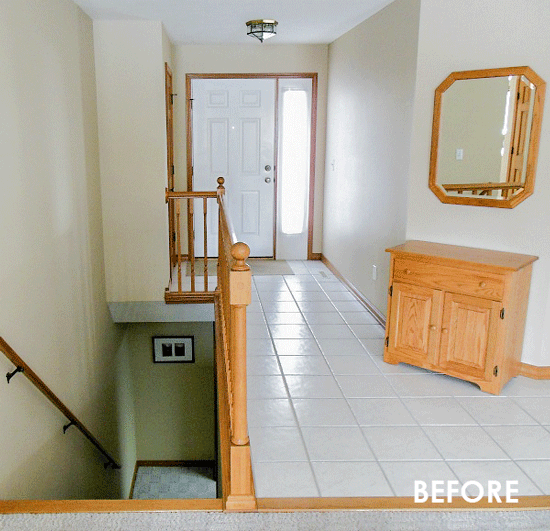
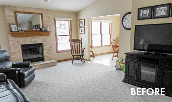
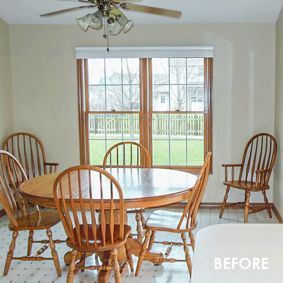
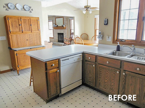
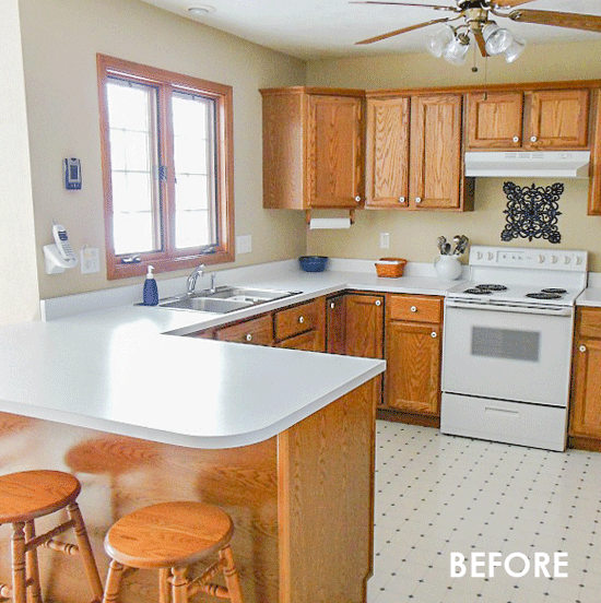
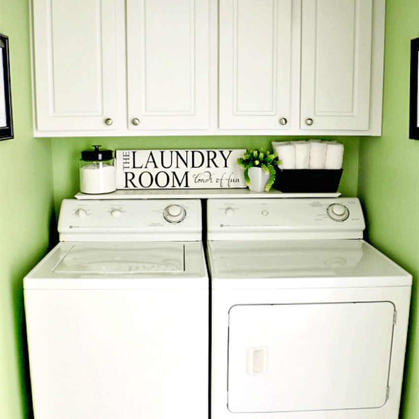
Jann is in the business, so she knew choosing fabrics was easy, but she wasn’t as sure about what to do with all of the orange oak furniture. The only newer piece of wood furniture that she had that wasn’t orange oak was the tv cabinet, which is black (below).
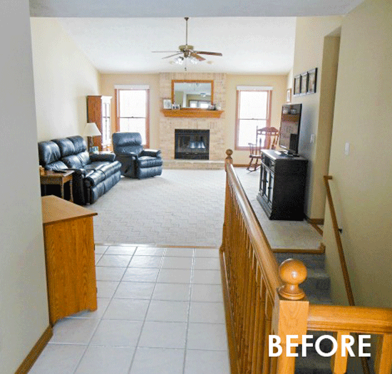
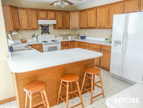
Before
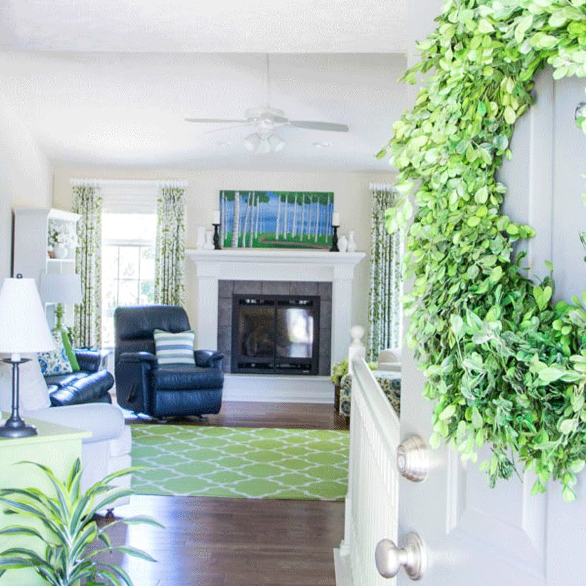
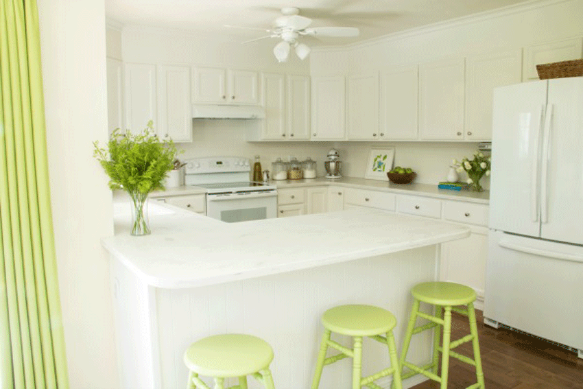
After
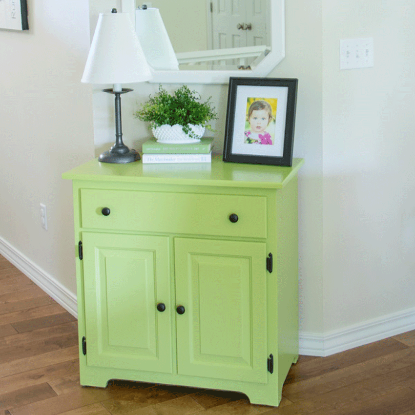
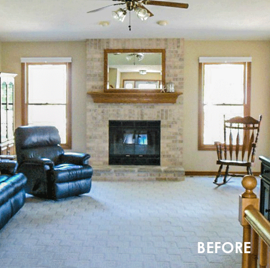
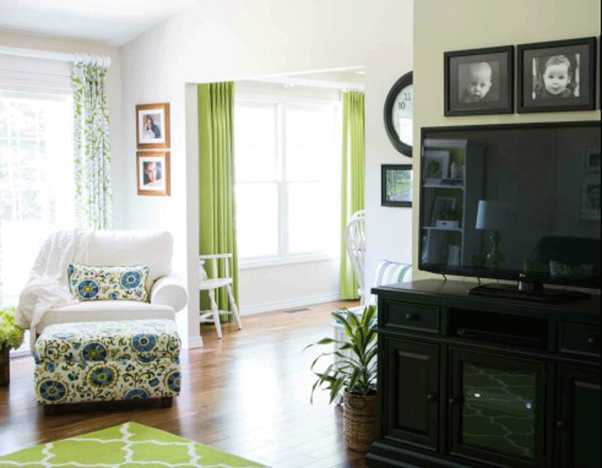
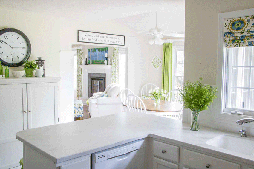
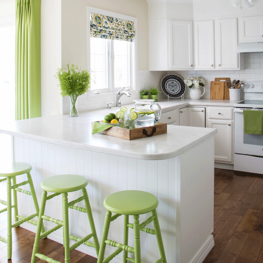
“You gave me lots of great suggestions for painting the orange oak pieces. And warned against using too much black, and I’m glad we took your advice.I especially loved your suggestion of painting the green cabinet in our entry a fun green. I also used the same green (Pittsburgh Paint’s Fern Glow) in our small laundry room, pantry and on the back walls of two bookshelves. And I also painted two lamps on our end tables green, and had our kitchen stools painted the same green color.I also took your suggestion of staining the top of our dining table a darker color, and painting the base of it white. The same white that we used for all of our cabinets and trim – Benjamin Moore’s Chantilly Lace. You had suggested painting the chairs navy, but I opted for white instead.In the kitchen we added a white subway tile back splash. The counter tops are Corian’s Rain Mist.You gave me 3 suggestions for wall color. I wanted a soft, pale neutral that would not compete with all of the bright colors. We went with Benjamin Moore’s Ballet White, and I still love it!We went with a medium brown hardwood floor for a timeless look and a bright green rug, like you suggested.We decided to take out the brick fireplace since we had never liked the brick that the builder had chosen. We love the white fireplace surround.Thanks for all your help, we are so happy with how it turned out”
Before
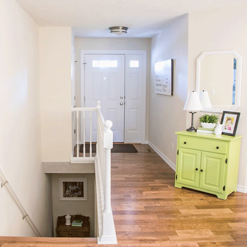
After
After
Before
After
Before
After
Before
After
Before
After
Before
After
Before
After
Before
After – Photography and styling by Jann Newton
Thanks so much, Jann for sharing your fresh and happy home with us!
I have also recently added a new build package to the collection of eDesign packages that we offer:

Get a classic and timeless house for the price of one mistake, or one decision that you’ll have to live with for a very long time.
You can purchase it here.
For anyone who is building or remodeling their kitchen, you can get guidance for all of your colours and finishes along with suggestions for details like lighting and hardware with my Create a Classic Kitchen eDesign consultation.
And you can find the other eDesign consultation offerings here.
Related posts:
Ask Maria: How to Coordinate Finishes with Oak Cabinets

Looks great – I especially love the before and after pictures of the table and the window. The after looks so much warmer and more inviting than the all the oak.
Thank you! great ideas and encouragement in this blog and bravo to the homeowner for paining out her oak cabinets and furniture. Looks fabulous, balanced, clean, fresh and very inviting.
All I can say is WOW!! Incredible difference. Great advice from a Maria and the results…,yep. WOW.
Fresh and lovely. This is a great transformation, and noting the Pantone colour of the year, ahead of the pack.
I reposted this to my F/B page. This is wonderful; I hear clients say — WAY too often –” Oh, you CAN’T paint the oak!!”
HA!! Yes you CAN!!
Wow. Wow. The power of paint! And a great colorist!
Sister!
Once again you knocked me out. I love how you listened to your client’s concerns and transformed their home into a place they truly love. This is a home that welcomes family and friends with a smile & hug. Beautiful.
I think white paint fixes everything. Of course it has to be the right white. And this certainly was! Beautiful!!
Just curious, did they paint the ceiling fan too? It looks the same, but white… (I have one that I’m considering painting and wonder if it’s a good idea)
I’ve painted multiple ceiling fans and they’ve come out really nicely and have held up for 10 plus years.
So lovely to see all that orange oak disappear! I wish I could make my ugly orange wood floors disappear but unfortunately I live in a rental. Sigh
I’m blown away with the after photos. Very simple changes that made a huge difference. Loved the new kitchen update.
Beautiful transformation. Can Jan share the fabric she used on the ottoman (same as pillows and kitchen shade) and the drapery fabric. Really fresh and clean.
I like all the changes, now everything has energy and the green colors are fresh and inviting. You hit another home run. The before and after pictures are instructive.
Wowsa! This house looks like it’s had a total remodel! New flooring, countertops, paint and fireplace surround plus the right fabric. I love it. This makes me want to flip a house!
~ C
Oh my gosh . . . what a HUGE transformation. The kitchen is especially cute. Love the bright green, navy and white. Just beautiful!!!
Wow this is absolutely gorgeous! I just LOVE the freshness of the green and white with a few dashes of blue. How absolutely beautiful. I can’t believe it’s the same room. This new look would really lift your spirits. Well done!!
I love it. I’m a green lover, but I can’t imagine anyone living that. I am looking at that new build package…it has my name on it!
Lost some letters “can’t imagine anyone NOT loving that”. 🙂
nice updates! fresh! But i agree with you. I would prefer the dining chairs to be navy also! The table needs that contrast.
I really did not think the leather pieces could work but they do. It’s always nice to see people keep some of their older stuff and make it fresh. Love the green.
Such a fresh and lovely transformation. Love those colours, and the blue accents work so well.
I love all the painted furniture. I recently had a new experience with Sherwin Williams and thought I would share . My daughter asked me to choose a paint color for her nursery and I happily obliged. Using my large color boards, I was sure that BM Snowfall would be a nice backdrop for some clean accent colors she had chosen. I was shocked when a week later I returned to see a very distinct, green undertone on her beautiful walls. I was sure it had to be the north facing room or the green roof outside or my imagination! How surprised I was to learn that she had asked SW to color match and they did not tell her that they had three BM colors called snowfall. They just picked one and that one was very green. Since the room now had 4 coats of paint on it, we had a husband that said, “no” to more paint. To make things even more confusing , I went to SW in my hometown to buy Snowfall to paint the nursery furniture. I was bewildered when they did not tint the quart of paint and told me the best match was SW Extra White. I later learned that they could not color match a quart. I had to buy a gallon, which I would have gladly done. So now I had two paint colors that were neither what I had specified. You can imagine my attitude when I sent my daughter for a flat SW Extra White for the ceiling and they sent a bucket of Ceiling Bright White with the explanation, “that’s what people use on ceilings”. We made changes to our accent colors and have a lovely room but that was a learning experience that cost me some sleep. Now I know to tell SW the number of the paint color not just the name and to buy in gallon sizes or just bite the bullet and make the 50 mile trip to the BM store.
I’ve had this issue a lot more frequently, now that light wall colors have become trendy. Beware when testing whites: because they have so little pigment in them, if the formula doesn’t break down evenly by 4 (from gallon to quart), it can skew the color quite a bit. Yes, it’s an added expense to try in a gallon of the real paint you are going to ultimately use, but it’s the only way I know to assure you are looking at the “real color”. Or at least, in this case, Sherwin-Williams match of your intended color.
I’m not sure what you mean when you say they had “3 Snowfalls” in their computer. All 3 under Ben Moore with different formulas? That seems unlikely. Or was it that several paint brands had a “Snowfall”? That is highly possible. In fact, certain names like “Antique White” or “Navajo White” you will see recur under many different pain companies. When you order a color, ALWAYS provide the paint brand, the number code, and the name. I see painters who just want to give the number- but if they (or the person tinting) are off by one digit, you will get a totally different color. The color name serves as a cross-check. Just my 2c.
Hi Christina,
I recently painted some vanity cabinets BM Snowfall white, so my eyes perked up when I read your post. However, what I was told by Benjamin Moore is that the colors labeled “Snowfall White” are exactly the same color, but it has different numbers in the different collections it is apart of. For instance, it has a different number in the “off-white collection” (OC_119) and another number, 2144-70, where it is on a strip in another collection (I forget which one). And you can definitely see that, by looking at the darkest colors on that particular strip, that there is some green in that color, LOL! Would you agree with that, Maria? There is another color called “snow white”; perhaps that is the “third” color Sherwin Williams was referring to? My vanities don’t look greenish at all, however. (I was looking for a white that would still look very white but be a warm white–the next step after Chantilly Lace toward the warmer side of whites. Maria, I’d love to know what white would be the next warmest after Chantilly Lace? )
Also, I have noticed that Sherwin Williams’ brighter white color samples all see to have a slight green tinge to them, so perhaps that contributed to your color-matched snowfall white looking so green. I am not sure if it is just the SW sample chips, or if in real life this is true. None of their whites seem truly as bright or white as Benjamin Moore’s can get. So I wonder if Sherwin Williams’ base has a green tint in it that can’t be overcome in a very bright white. Has anyone else seen this green tint to their white sample chips? Maria, what is your opinion?
WOW! What a great testament to a Maria consultation and a fabulous makeover! And it hits home to those of us who like our existing furniture but just want a new look. The oak is such a great wood and it is nice to see it just be painted instead of being replaced. Which type of consultation was purchased for this? And what type and color is the fireplace surround?
Did you notice the new wood on the bar front? And the living room fabric was carried to the kitchen in the picture frames by the dining area. I’m still in awe, every time I reread this post!!!!!
Ohmygosh, super cute!
Oh, the power of paint! Wonderful transformation! HOW did she talk her husband into painting all the oak window trim and the banister?
Love the idea of navy chairs. At least the bar stools could be navy. It would add pop!
Woah! Talk about BEFORE and AFTER!! Fabulous. I can only imagine how long all of that took! It’s an inspiration to get red of my ugly oak railings. 😉
I am inspired! A TRUE TRANSFORMATION!! Very impressive! I received a color consult from Maria several months ago for a condo on a lake our family shares with my husband’s family. It has a lot of oak and oak cabinets as well. Life got in the way for a while but soon I can carve out time to begin and complete by summer so we can ENJOY it! Thank you for the inspiration/kick in the pants! HA! And I can also show my husband what a difference it makes!!
Wow this is amazing. Great plan, great action on homeowner’s behalf! This was a HUGE undertaking! The detail! So worth it! These people must be so happy everytime they walk through the door!
Beautiful transformation! She is fortunate that her oak cabs were shaker style instead of those with the curve on top. When people talk about not painting oak cabs successfully, the latter might be the ones they’re thinking of.
What a wonderful and timely post for me, Maria. My oak kitchen cabinets will be painted white, my appliances are white and I crave sunny yellow green. And this year finally and hopefully, new floors throughout my home will happen. I have some oak and some knotty pine pieces and some painting will probably be required and Jan’s project is very inspirational. Floor color is still an issue for me. Jan’s “medium brown” hardwood looks lovely and warm in her home which gets a lot of light. Any “brown” flooring in our very shaded homes (eaves on all three sides) makes me feel as through I’m trapped in a cave and can’t wait to get to the light at the opening, and, since most of my neighbors who have replaced flooring recently have chosen brown” whether laminate or wood-look tile (hardwood is out), I’m “escaping” frequently. Happily, Maria, you’ve done some very helpful posts on alternates to “medium brown” flooring which are continually referenced. Thanks so much for the treat of this very inspirational post today.
Beautiful transformation! So many of my customers have that orange oak, and now I can show them whats possible. I too would have done the navy stools, and would have switched up the greens a little more so that it didn’t all match so much.
How inspiring!
Nice job, I to have much oak in my house and of course after seeing the after photos, I have been inspired to paint oak trim. What color and brand was used for the after photo’s?
amazing transformation, I would never have thought of using that colour of green. I also have the orange oak trim
which I hate. We have painted the lower floor trim & doors white and still need to do upstairs. What type of paint is used on the table and chairs
Hi Maria, I read this post, closed it, but have come back to comment because, once again you have come up with beautiful solutions updating a home without it costing a fortune. Making the customer comfortable using many of their original pieces. The home really has been transformed from a dated 80’s feel to something current and fresh. Great job! No wonder i recommend your course to YOUNG and older designers alike! You have a wonderful eye for detail and your system of colour really is trans formative as the above post illustrates! I send you and Terreeia loads of love!
So fun! Fantastic job and thank you for the inspiration!!
love this makeover! so fresh with the white and spring green.
question: when painting the dining room chairs and table, what paint sheen is used, i.e., gloss, satin, etc.?
same question with the kitchen cabinets and bannister, what sheen would you reccommend for these?
So… if your answer for every single kitchen, in every single house is: paint the whole thing white, and do a subway tile back splash, and white counter tops… because ya know… it’s TOTALLY classic and timeless!
How is that ‘design’ exactly?
That’s finding a cookie cutter mold which works in most situations, and then repeating it over and over again like a broken record. That’s not design. That’s a crutch.
An all white kitchen doesn’t work in this house. The kitchen doesn’t look good at all in this house, with this layout. It ends up looking like a white box. Waaaaaay too clinical, waaaaaaay too stark. It totally lacks personality and style.
A two tone kitchen, with the bottom cabinets being a blue, or blue green, and the uppers white would have worked a lot better. Or the entire cabinets in a green gray. Or the entire cabinets in a color, which would be a starting point for the pallet in the rest of the room.
Kitchen cabinets painted in the home do not hold up long term. Period. You cannot get a factory finish paining them at home… which means that you’ll have to paint them again in 10 years anyways, because by then, your kitchen paint will look beaten to hell.
Which means that painting kitchen cabinets -unlike trip, doors, and window woodwork- give the perfect opportunity to play with trends, or colors the client is really into in that moment in time: they’ll have to repaint anyways by the time they’re sick of the color/the trend is over.
I really don’t see how prescribing the EXACT same kitchen for every client, for every house, for every situation, somehow counts as ‘design’ anything.
HI Emily,
Thanks for this comment because I’m sure others think the same thing so this is a great question! The reason why I preach subway tile and white (and by the way not EVERY kitchen has to be white, a painted colourful kitchen is also usually more timeless than the current trendy neutral OR a wood stained kitchen) is because MOST people in actual fact get complicated or way too trendy with their hard finish choices or their kitchen cabinet colours.
My advice is often for the person looking for THE ANSWER who is about to make a huge mistake ON THEIR OWN and WITHOUT THE ADVICE OF A PROFESSIONAL.
And I stick to the same advice, because I have literally, without exaggeration, been in thousands of homes over the years and the thing that EVERYONE hates when they inherit a house from a previous homeowner is ALWAYS the accent tile. ALWAYS and without fail. Unless the house is brand new when everyone is still looking for those trendy pieces.
As a blogger, and a designer, you need to have an aesthetic that people can resonate with. And shhhhhh don’t tell anyone, but I have made a lot of money sticking to my ‘it’s subway tile and that’s the end’ position because for most people SUBWAY tile is the exception and NOT the rule.
I will bet a lot of money that your neighbours are NOT installing white subway tile in their house. They are doing something special and highly trendy that will immediately date. Here’s a post where I talked about that: https://mariakillam.com/datedkitchenfloors/
Thanks again for your comment. My advice is NOT for everyone for sure, it’s only for those who resonate with the idea of having a CLASSIC and TIMELESS home.
Maria
That still leaves the fact that white on white on white simple does not work in THAT kitchen. Because of the U-shape room, and the fact that there are no other accents, textures, or details to work with, it looks like an empty white box.
White uppers and bottoms are not the right choice for this house and this kitchen.
While the old kitchen looked dated, the new kitchen looks cheap. Cheaper than it looked when it was basic builder cabinets.
White and subway tile can look awesome and timeless in some kitchens. In this kitchen it looks cheap and washed out. Uninspired, and yes, dated. It wouldn’t look dated in other kitchens, but in this one it does.
Which is exactly the issue: I’m not saying white and subway tile doesn’t work. I’m saying that white and subway tile doesn’t work in EVERY situation. And when white and subway tile is the only thing you manage to prescribed, regardless of the situation, and regardless of whether or not it’ll work, you’re not designing, but being a one-trick-pony.
Finding a good trick that works 99% of the time is great, especially when you can build your brand around it. But being a designer means being able to recognize the 1% of time where the trick doesn’t work, and being able to prescribe something else in those situations.
In this situation, the trick doesn’t work. Going with a color, to accent the client’s personality, would have been a better choice for THIS kitchen.
I’ve seen you do awesome kitchen in white on white, and usually you’re right, and what a house needs is a timeless white on white kitchen, but in this case, that just wasn’t the case.
Your blog fans and your client are all in awe of how amazing this kitchen currently is, because it’s a lot better than what it was before, and because they like your style (that’s why they read you/hire you), but I’m sure that if you, as a designer, step back, and look at those photos, and imaging the difference a color on those lower cabinets (or both) would have made, combined with a classic (subway tile or not… but certainly no trendy accent tile) black splash, you would agree that THIS kitchen would look better not being white on white on white.
White on white on white isn’t the only way you can achieve a classic timeless look, and you know that.
Because of how box like and dark this kitchen is, and how much shadow there is in it, white on white on white doesn’t look flatter for it.
You should have stuck to your own advice and went with something darker to counter the fact that there’s so many angles and shadows in this kitchen. It’s simply not open and airy enough to pull off white on white, and you know it…
You did the client a disservice here by sticking to your brand.
Hi Emily,
Your point is well taken and this client requested white on white. I’m the first to recommend colour at any time, that’s what I do.
I will write an upcoming post about my opinion on different coloured lowers and uppers because I’ve been getting requests for that post recently.
I think she did a beautiful job and it’s just my opinion and doesn’t mean that it’s right.
Thanks for your thoughtful and passionate comments 🙂
Maria
I’m not saying that two tone was the only way to go, just that it would have been a better option.
Other good options would have been going with all white cabinets, but a more contrasting back splash (a heavy gray Carrera, or painted bead board, for example, NOT ‘trendy accent tile’), and more contrasting counter tops (black for example) and a more contrasting wall color.
Likewise doing both uppers and bottoms in color, and keeping the counter and back splash white would have worked.
There’s tons of ways this kitchen could have looked timeless and classic, instead of shady and washed out. There simple isn’t enough contrast in it, and the room cannot carry all that white.
As far as saying that “your client wanted the white on white”, that’s a cop out. As the designer it’s our job to steer the client in the right direction if what the client wants will not work. That’s what they hired you for. If the client knew well enough that a white on white kitchen would work, she wouldn’t need you to tell her to do that, she could do it on her own.
It was your job to tell her “white on white kitchens are awesome, but it’s not the best thing for this space, and here’s why”.
You know an all white room requires lots of light and openness, you’ve made posts to that effect.
You know that white in shady rooms with lots of angles, and directional light, looks dull and gray, you’ve made posts to that effect.
You know that it’s your job as the designer to tell your client when what they want is wrong for their house, no matter how good it might look in another house, you’ve made posts to that effect.
This kitchen is pretty much a picture you could have used as an example on one of your ‘how not to use white’ posts, because it goes against several posts you made advising the blog on ‘why whites are tricky’. It’s a perfect example of how too much white, in the wrong room, looks terrible.
Blaming it on ‘the client wanted it’ is an excuse. It’s a matter of white on white kitchens are your brand, it’s what you’re known for, it’s what people expect from you, it’s what your fans want to see, and why your clients hire you. You agreed to give your client the white on white kitchen ‘she wanted’ because it’s your brand to do so, not because you stepped back and decided that it was the best option for that specific space.
@Emily: Re your last comment regarding the kitchen space. Personally if I were in the market of a home and seen this kitchen; my thought would be I could personalize it very easily with some colour; particularly the cabinets as they now provide a white base for painting. That said; one must also take into account many do not have the financial status to go with some of the finishes you suggested (the Carrera Marble for example) as for a black countertop IMHO no thank you, as I currently have black appliances and they alone are a nightmare to keep clean. To conclude, I feel it is a wonderful upgrade on the whole regardless again IMHO that I feel it may lack some texture. Great job Jann! -Brenda-
Emily,
You may not feel that Maria is an outstanding, or even competent designer but you must agree that she is an exceptional diplomat!
I was surprised to read comments that seemed so confrontational on this website. They feel more like attacks than attempts at communication.
I admit that may be the only reader that sensed this authoritative attitude coming from your computer. Nevertheless, I commend Maria for her for considerable finesse in answering your messages.
Could someone share the process for painting woodwork, furniture, etc. preparation, type of paint, primer, etc.
I have replace d the oak in my house but have more trim and woodwork to paint.
Hi Connie, I didn’t post that here because I figure that post has been written a million times but I’ll see if I can find something that might help! I’ll post it here when I do!
Thanks for your comment!
Maria
Hi Connie, here’s a post that might help http://www.ninahendrick.com/white-painted-cabinets/
@Connie: I have done many paint projects where wood has been involved, however will warn you due to the grain of Oak, often it is almost impossible to camouflage. (In other words, you will not get an entirely smooth surface.) That said; there is an amazing product called Wunderfil that is classified as a filler however it is labour intensive to use if you want ‘a smooth as silk’ finish. Also shall mention if you wish; web search my Pinterest page under HOME DIY PROJECTS mrsben2 as there is an abundant of information re products, preparation and painting that may assist you. (Just follow their links.) GOOD LUCK! -Brenda-
P.S.: IMO the best ‘ primer’ on the market today for coverage and performance …. is Zinsser’s Bullseye 1-2-3 and please note that I am not a spokes person for them.
And I like the changes so far, so fresh and bright. I find it lacks a sense of who these people are…. I hope they are able to personalize it more.
What an amazing transformation. No wonder your client is thrilled. I don’t know about you Maria, but for me, even though I’ve done this a while, I am still surprised often at how much a space can change just with paint and fabric.
Thanks Jann and Maria for sharing! I feel like all the houses where I live in the midwest United States look like the before pictures. It was a bit disheartening when we moved here. I love seeing how they can be transformed into something beautiful! It gives me inspiration and hope for the future of my house! Thanks again for sharing!
I have to go middle of the road on this one. It does look fresh and inviting….but when she tires of it…and she will….there’s a lot to change…again. I don’t see timeless here….but is there such a thing? It’s the same pallet throughout the main rooms and I can see why. That fabric set the stage. I would have added another color to use here and there to change it up from one room to the next without repeating it everywhere. Just my opinion. It is well done, and a happy client is what matters regardless. I’m not a fan of white on walls. My generation already did that and I always considered it to be the solution for those who fear color. No commitment. I would like to suggest your client purchase some large plants in some interesting pots, especially for the livingroom to pull in nature and veer away a bit from that pallet. I predict all those white walls out there will be getting painted in the near future. It won’t be long now. Just saying…..
What a cheery space! I love the inspiration fabric and the blue/green/white color scheme.
I also think the dining chairs would be better navy or at least the stools would. I would also paint the handrail on the staircase black. The owner might also consider getting a larger natural, neutral (sisal, jute, seagrass) rug to put under the green in the living space. It would add texture and warmth and make up for the green rug being a bit small. (A bigger green rug would probably be too much.) Also consider moving the chest of drawers into the entry way closer to the door and adding a rug there. These are meant as suggestions for small twesks, not criticisms. The homeowner did a get job and it looks great if she doesn’t change a thing.
Hi juli, Yes , they had 3 Snowfalls listed under BM colors. I had the salesman let me look at his screen. Companies do use the same names but these were listed under BM. I know, it was shocking.
Wow! Looks fabulous. Can’t decide which room I like best. All clean and fresh. Love all the white appliances and the new floor, too. Great job, Jann and Maria!
I love the transformation as a whole! When I saw the before pictures of the sofa and chair that were staying, I thought, “how is Maria going to make those work?”, but they look fantastic in the new living room scheme!
I actually thought the original brick was unusually pretty, but the old oak mantel and paint color wasn’t doing it any justice. Was it just too “earthy” to work with the new color scheme, Maria, or could it have been made to work if the client had wanted to keep the brick? Just wondering.
I’m curious how you came up with Ballet White, out of all the dozens of whites out there? Could you explain your thought process? If I had to guess, I would guess that the very slight pink undertones (at least I think I see some pink in it) counterbalanced the green? Just wondering.
By the way, you were so very gracious in your kind response to Emily’s rather harsh critical post about the white on white kitchen. I thought the kitchen looked so pretty in the first two photos. The third photo of it perhaps isn’t doing it justice because you can’t really see the backsplash tile at all, (at least on my monitor it isn’t showing up) and some of the more colorful features of the space, like the window shade, as you would in real life. No one ever said, “I want my kitchen to be darker, or more gaudy,”, LOL. I imagine that when you are standing in that kitchen looking around you, taking it all in, it is a wonderful light-filled space. Stainless steel appliances would add some extra “sparkle” or zing, but most people can’t afford to just run out and replace new appliances just for asthetics–especially after all the money they just spent! I’m sure that the client is likely planning on eventually adding stainless appliances eventually.
I wish more people would could hear Maria’s advice about white kitchens and simple classic backsplash tile and take it to heart! I have looked online at many, many homes for sale over the last several years, and there aren’t too many for sale with all white or mostly white kitchens, or even kitchens with just white subway tile backsplashes! I can’t tell you, though, the countless ones I’ve seen with gaudy mosaic backsplash tile that clashes with the busy granite countertop, (not to mention the often horribly clashing undertones in the various finishes!) The few white kitchens I have seen, though, do really look great in real estate photos, by the way. We will be moving soon and I would feel very blessed to find a home with a simple all white, or mostly white kitchen like this one!
I like how this shows a home transformation that relates to a space most Americans can afford to own. It is lovely. How were the various items – furniture, cabinets – painted? With a brush or sprayed? Homeowner or professional painter? Thank you.
I am interested in knowing this, too.
Here’s a post that might help http://www.ninahendrick.com/white-painted-cabinets/
Thanks for following me!
Maria
What I really like about this before and after story is it contains so many great examples and is so inspiring! The difference it makes to just paint the trim or furniture, replace the fireplace surround, flooring and painting kitchen cabinets. Not everyone can or wants to do all it once. While I think the kitchen is quite lovely, it would still be easy to make minor modifications such as stainless steel appliances, removing some uppers and replacing with warm wood shelves, lighting.
I too would be very interested in a post on painting kitchen cabinets something other than white/cream and having more than one color. It seems that most are a shade of grey (trendy) or some pretty shade of blue (personal preference). And how does this fit into the definition of timeless, which for me is what most people wouldn’t mind and I won’t get tired of.
Did they paint the wood trim or just replace it? If painted, would it be easier to remove it, then paint, or paint it while attached to the wall?
I sure would like to know how she painted the appliance garage/rolltop doors on the stand alone piece in the kitchen. I replaced mine with a regular door when I updated my cabinets.
Maria, superb job with the redone kitchen. We are getting bids to remodel our kitchen and the plan is for new countertops and backsplash to replace the lavender tile in both areas. I have found a few pictures of white backsplash and countertops with birch cabinets like ours which we will keep. My preference for countertops would be quartz or white marble. Our floors are white tile. My question is, do you have a package available for remodeling rather than building a new space which you list above? Or, are they one and the same? We plan to update our baths also with quartz/marble countertops too.
Dear Christina re your email dated Jan 12. We are sorry to learn of fhe difficulties you experienced with your local Sherwin Williams store. Not sure exactly what the issue was and why it could not be matched correctly. Our objective is to assist designers and homeowners im obtaining the best paint and colours for their projects. Our head office designers are always happy to assist and answer your questions or concerns. We want all ensure our customers are happy. Are you in Canada or the US.
Lorraine
Wow, beautiful transformation. I noticed the client had a Hoosier cabinet in the kitchen area but I did not see it in the after photo. I’m just wondering if she painted it or replaced it with another piece of furniture as I too have a Hoosier in my eating area. This post has definitely inspired me to paint my oak table and chairs. Thanks for sharing this project.
I love the green, so fresh. I think white does work in this case. But the kitchen with white on white on white is too much. I would have gone with a very short backsplash and painted the rest of the backsplash a color, and probably also the wall above the cabinets. But even all white is better than what they started with.
Very nice transformation for the most part. I think Emily made a valid point about the kitchen not quite looking right. It’s too white. The white ceiling fan would be better being a pretty light fixture. The appliances don’t help. I think a slightly more interesting or different color counter would have looked better.
Wow what a transformation! It looks so bright and happy now! Love the selection of pattern and color. She is now up to date and looking stunning! Such good advice that you gave her!
[…] The Best Way to Update Oak Furniture; Before & After […]
Wow, I’ve been eyeing an oak dresser for years but was hesitant to update it because I was afraid of losing its original charm. Thank you for sharing this amazing transformation! I’m definitely inspired to give it a try now.